Open demo

CSS code

HTML
<div><span class="lbl">Option cards</span><div class="stack">
<label class="ccard"><input type="checkbox" checked><span class="bx"></span>
<span class="ccard-body"><b>Email notifications</b><span>A summary when something needs your attention.</span></span></label>
<label class="ccard"><input type="checkbox"><span class="bx"></span>
<span class="ccard-body"><b>Weekly digest</b><span>One message each Monday with the week ahead.</span></span></label>
</div></div>
<div><span class="lbl">With a price</span><div class="stack">
<label class="ccard"><input type="checkbox" checked><span class="bx"></span>
<span class="ccard-body"><b>Priority support</b><span>Replies within one business day.</span></span>
<span class="ccard-price">+£19/mo</span></label>
</div></div>
<div><span class="lbl">Tile grid</span><div class="tiles" role="group" aria-label="Teams">
<label class="tile"><input type="checkbox" checked>Design</label>
<label class="tile"><input type="checkbox">Engineering</label>
<label class="tile"><input type="checkbox" checked>Marketing</label>
<label class="tile"><input type="checkbox">Operations</label>
</div></div>
CSS
.stack{display:flex;flex-direction:column;gap:13px;align-items:flex-start}
.ccard input,.tile input{position:absolute;opacity:0;width:0;height:0}

.ccard{position:relative;border:1px solid #e2e8f0;border-radius:12px;padding:15px 17px;background:#fff;
  display:flex;align-items:flex-start;gap:13px;cursor:pointer;transition:border-color .16s,box-shadow .16s;
  max-width:420px;font-size:.92rem}
.ccard:hover{border-color:#cbd5e1}
.ccard:has(input:checked){border-color:#2563eb;box-shadow:0 0 0 3px #dbeafe}
.ccard:has(input:focus-visible){outline:2px solid #2563eb;outline-offset:2px}
.bx{width:20px;height:20px;border:2px solid #64748b;border-radius:6px;position:relative;flex:none;
  margin-top:2px;transition:background .16s,border-color .16s}
.bx::after{content:"";position:absolute;top:1px;left:6px;width:5px;height:10px;border:solid #fff;
  border-width:0 2px 2px 0;transform:rotate(45deg) scale(0);transition:transform .16s}
.ccard input:checked+.bx{background:#2563eb;border-color:#2563eb}
.ccard input:checked+.bx::after{transform:rotate(45deg) scale(1)}
.ccard-body b{display:block;font-size:.92rem;margin-bottom:3px}
.ccard-body span{font-size:.8rem;color:#64748b;line-height:1.5}
.ccard-price{margin-left:auto;font-weight:700;font-size:.95rem;white-space:nowrap}

.tiles{display:flex;flex-wrap:wrap;gap:10px}
.tile{position:relative;border:1px solid #e2e8f0;border-radius:10px;padding:9px 16px;background:#fff;cursor:pointer;
  font-size:.86rem;transition:background .16s,border-color .16s,color .16s}
.tile:has(input:checked){background:#0f172a;border-color:#0f172a;color:#fff}
.tile:has(input:focus-visible){outline:2px solid #2563eb;outline-offset:2px}

@media(prefers-reduced-motion:reduce){.ccard,.bx,.bx::after,.tile{transition:none}}

Bootstrap 5 code

Requires: Bootstrap 5.3.8 CSS

HTML
<div><span class="lbl">Option cards</span><div class="vstack gap-3 align-items-start">
<label class="card choice-card"><input class="form-check-input" type="checkbox" checked>
<span><b class="d-block mb-1">Email notifications</b><span class="choice-card-desc">A summary when something needs your attention.</span></span></label>
<label class="card choice-card"><input class="form-check-input" type="checkbox">
<span><b class="d-block mb-1">Weekly digest</b><span class="choice-card-desc">One message each Monday with the week ahead.</span></span></label>
</div></div>
<div><span class="lbl">With a price</span><div class="vstack gap-3 align-items-start">
<label class="card choice-card"><input class="form-check-input" type="checkbox" checked>
<span><b class="d-block mb-1">Priority support</b><span class="choice-card-desc">Replies within one business day.</span></span>
<span class="choice-card-price">+£19/mo</span></label>
</div></div>
<div><span class="lbl">Tile grid</span><div class="d-flex flex-wrap gap-2" role="group" aria-label="Teams">
<input type="checkbox" class="btn-check" id="tm1" checked><label class="btn btn-tile" for="tm1">Design</label>
<input type="checkbox" class="btn-check" id="tm2"><label class="btn btn-tile" for="tm2">Engineering</label>
<input type="checkbox" class="btn-check" id="tm3" checked><label class="btn btn-tile" for="tm3">Marketing</label>
<input type="checkbox" class="btn-check" id="tm4"><label class="btn btn-tile" for="tm4">Operations</label>
</div></div>
CSS
/* Bootstrap .card as the click target; the checkbox is a Bootstrap .form-check-input */
.choice-card{--choice-accent:#2563eb;--bs-card-bg:#fff;--bs-card-border-color:#e2e8f0;--bs-card-border-radius:12px;
  flex-direction:row;align-items:flex-start;gap:13px;padding:15px 17px;max-width:420px;cursor:pointer;
  font-size:.92rem;line-height:1.3;transition:border-color .16s,box-shadow .16s}
.choice-card:hover{--bs-card-border-color:#cbd5e1}
.choice-card:has(.form-check-input:checked){--bs-card-border-color:var(--choice-accent);box-shadow:0 0 0 3px #dbeafe}
.choice-card:has(.form-check-input:focus-visible){outline:2px solid var(--choice-accent);outline-offset:2px}
.choice-card .form-check-input{--bs-form-check-bg:#fff;width:20px;height:20px;margin:2px 0 0;flex:none;
  border:2px solid #64748b;border-radius:6px;cursor:pointer;transition:background-color .16s,border-color .16s}
.choice-card .form-check-input:checked{background-color:var(--choice-accent);border-color:var(--choice-accent)}
.choice-card .form-check-input:focus{box-shadow:none;outline:0}
.choice-card .form-check-input:not(:checked):focus{border-color:#64748b}
.choice-card-desc{font-size:.8rem;color:#64748b;line-height:1.5}
.choice-card-price{margin-left:auto;font-weight:700;font-size:.95rem;white-space:nowrap}

/* tiles: Bootstrap's .btn-check toggle buttons */
.btn-tile{--bs-btn-bg:#fff;--bs-btn-color:#1e293b;--bs-btn-border-color:#e2e8f0;--bs-btn-border-radius:10px;
  --bs-btn-padding-x:16px;--bs-btn-padding-y:9px;--bs-btn-font-size:.86rem;--bs-btn-line-height:1.2;
  --bs-btn-hover-bg:#fff;--bs-btn-hover-color:#1e293b;--bs-btn-hover-border-color:#cbd5e1;
  --bs-btn-active-bg:#0f172a;--bs-btn-active-color:#fff;--bs-btn-active-border-color:#0f172a}
.btn-check:focus-visible+.btn-tile{box-shadow:none;outline:2px solid #2563eb;outline-offset:2px}

@media(prefers-reduced-motion:reduce){.choice-card,.choice-card .form-check-input{transition:none}}

Tailwind 4 code

Requires: Tailwind CSS 4

HTML
<div><span class="mb-4 block text-[.72rem] tracking-[.12em] text-slate-500 uppercase">Option cards</span><div class="flex flex-col items-start gap-[13px]">
<label class="relative flex max-w-[420px] cursor-pointer items-start gap-[13px] rounded-xl border border-slate-200 bg-white px-[17px] py-[15px] text-[.92rem] leading-snug transition-[border-color,box-shadow] duration-150 not-has-[:checked]:hover:border-slate-300 has-[:checked]:border-blue-600 has-[:checked]:ring-3 has-[:checked]:ring-blue-100 has-[:focus-visible]:outline-2 has-[:focus-visible]:outline-offset-2 has-[:focus-visible]:outline-blue-600 motion-reduce:transition-none"><input type="checkbox" class="peer sr-only" checked><span class="relative mt-[2px] size-5 flex-none rounded-md border-2 border-slate-500 transition-[background-color,border-color,color] duration-150 peer-checked:border-blue-600 peer-checked:bg-blue-600 after:absolute after:top-[1px] after:left-[6px] after:h-[10px] after:w-[5px] after:scale-0 after:rotate-45 after:border-r-2 after:border-b-2 after:border-white after:transition-[scale] after:duration-150 after:content-[''] peer-checked:after:scale-100 motion-reduce:transition-none motion-reduce:after:transition-none"></span>
<span><b class="mb-[3px] block">Email notifications</b><span class="text-[.8rem] leading-normal text-slate-500">A summary when something needs your attention.</span></span></label>
<label class="relative flex max-w-[420px] cursor-pointer items-start gap-[13px] rounded-xl border border-slate-200 bg-white px-[17px] py-[15px] text-[.92rem] leading-snug transition-[border-color,box-shadow] duration-150 not-has-[:checked]:hover:border-slate-300 has-[:checked]:border-blue-600 has-[:checked]:ring-3 has-[:checked]:ring-blue-100 has-[:focus-visible]:outline-2 has-[:focus-visible]:outline-offset-2 has-[:focus-visible]:outline-blue-600 motion-reduce:transition-none"><input type="checkbox" class="peer sr-only"><span class="relative mt-[2px] size-5 flex-none rounded-md border-2 border-slate-500 transition-[background-color,border-color,color] duration-150 peer-checked:border-blue-600 peer-checked:bg-blue-600 after:absolute after:top-[1px] after:left-[6px] after:h-[10px] after:w-[5px] after:scale-0 after:rotate-45 after:border-r-2 after:border-b-2 after:border-white after:transition-[scale] after:duration-150 after:content-[''] peer-checked:after:scale-100 motion-reduce:transition-none motion-reduce:after:transition-none"></span>
<span><b class="mb-[3px] block">Weekly digest</b><span class="text-[.8rem] leading-normal text-slate-500">One message each Monday with the week ahead.</span></span></label>
</div></div>
<div><span class="mb-4 block text-[.72rem] tracking-[.12em] text-slate-500 uppercase">With a price</span><div class="flex flex-col items-start gap-[13px]">
<label class="relative flex max-w-[420px] cursor-pointer items-start gap-[13px] rounded-xl border border-slate-200 bg-white px-[17px] py-[15px] text-[.92rem] leading-snug transition-[border-color,box-shadow] duration-150 not-has-[:checked]:hover:border-slate-300 has-[:checked]:border-blue-600 has-[:checked]:ring-3 has-[:checked]:ring-blue-100 has-[:focus-visible]:outline-2 has-[:focus-visible]:outline-offset-2 has-[:focus-visible]:outline-blue-600 motion-reduce:transition-none"><input type="checkbox" class="peer sr-only" checked><span class="relative mt-[2px] size-5 flex-none rounded-md border-2 border-slate-500 transition-[background-color,border-color,color] duration-150 peer-checked:border-blue-600 peer-checked:bg-blue-600 after:absolute after:top-[1px] after:left-[6px] after:h-[10px] after:w-[5px] after:scale-0 after:rotate-45 after:border-r-2 after:border-b-2 after:border-white after:transition-[scale] after:duration-150 after:content-[''] peer-checked:after:scale-100 motion-reduce:transition-none motion-reduce:after:transition-none"></span>
<span><b class="mb-[3px] block">Priority support</b><span class="text-[.8rem] leading-normal text-slate-500">Replies within one business day.</span></span>
<span class="ml-auto text-[.95rem] font-bold whitespace-nowrap">+£19/mo</span></label>
</div></div>
<div><span class="mb-4 block text-[.72rem] tracking-[.12em] text-slate-500 uppercase">Tile grid</span><div class="flex flex-wrap gap-2.5" role="group" aria-label="Teams">
<label class="relative cursor-pointer rounded-[10px] border border-slate-200 bg-white px-4 py-[9px] text-[.86rem] leading-tight transition-[background-color,border-color,color] duration-150 has-[:checked]:border-slate-900 has-[:checked]:bg-slate-900 has-[:checked]:text-white has-[:focus-visible]:outline-2 has-[:focus-visible]:outline-offset-2 has-[:focus-visible]:outline-blue-600 motion-reduce:transition-none"><input type="checkbox" class="sr-only" checked>Design</label>
<label class="relative cursor-pointer rounded-[10px] border border-slate-200 bg-white px-4 py-[9px] text-[.86rem] leading-tight transition-[background-color,border-color,color] duration-150 has-[:checked]:border-slate-900 has-[:checked]:bg-slate-900 has-[:checked]:text-white has-[:focus-visible]:outline-2 has-[:focus-visible]:outline-offset-2 has-[:focus-visible]:outline-blue-600 motion-reduce:transition-none"><input type="checkbox" class="sr-only">Engineering</label>
<label class="relative cursor-pointer rounded-[10px] border border-slate-200 bg-white px-4 py-[9px] text-[.86rem] leading-tight transition-[background-color,border-color,color] duration-150 has-[:checked]:border-slate-900 has-[:checked]:bg-slate-900 has-[:checked]:text-white has-[:focus-visible]:outline-2 has-[:focus-visible]:outline-offset-2 has-[:focus-visible]:outline-blue-600 motion-reduce:transition-none"><input type="checkbox" class="sr-only" checked>Marketing</label>
<label class="relative cursor-pointer rounded-[10px] border border-slate-200 bg-white px-4 py-[9px] text-[.86rem] leading-tight transition-[background-color,border-color,color] duration-150 has-[:checked]:border-slate-900 has-[:checked]:bg-slate-900 has-[:checked]:text-white has-[:focus-visible]:outline-2 has-[:focus-visible]:outline-offset-2 has-[:focus-visible]:outline-blue-600 motion-reduce:transition-none"><input type="checkbox" class="sr-only">Operations</label>
</div></div>

About this set

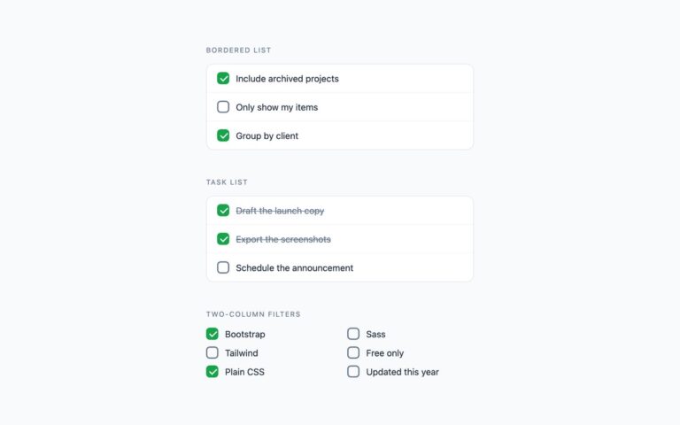
Checkboxes where the whole card is the click target. The set has bordered option cards with a title and a one-line description, a card that adds a price on the right for paid add-ons, and a compact tile grid where each tile turns dark when selected. Use the option cards for notification and preference settings, the price card for checkout extras, and the tiles for tags, teams or filters where the option names are short. Each card is a label that wraps a real checkbox, so a click anywhere on it toggles the input. The checked card gets a blue border and a soft ring through :has(input:checked), and keyboard focus is drawn on the card through :has(input:focus-visible). The Bootstrap version builds the cards from .card with a .form-check-input inside, and the tiles from .btn-check toggle buttons. The Tailwind version uses has-[:checked] and has-[:focus-visible] variants on the label. Several cards can be selected at once; for a single choice, see the radio card set.

What’s included

  • Option cards with title and description
  • Add-on card with a right-aligned price
  • Tile grid that fills when selected
  • Whole card is the click target
  • Bootstrap tiles use .btn-check toggle buttons

Accessibility

Each card is a label around a real checkbox, so its title and description form the accessible name and the checked state is announced. Tab reaches every card and Space toggles it. The focused card shows a 2px blue outline offset from its border, and the tile group is labelled with role="group". Border, ring and colour transitions are disabled under prefers-reduced-motion.

Customise it

Plain CSS: change #2563eb and #dbeafe in the .ccard:has(input:checked) rule and #0f172a for the selected tile. Bootstrap: set --choice-accent on .choice-card and the --bs-btn-active-* variables on .btn-tile. Tailwind: swap blue-600, blue-100 and slate-900 in the has-[:checked] classes.