About this set
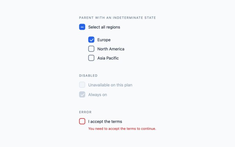
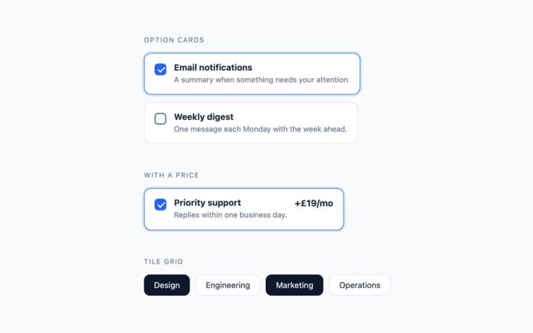
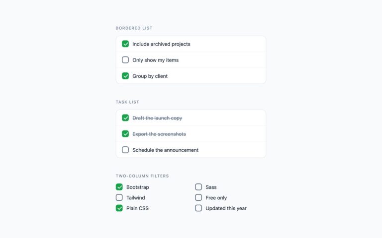
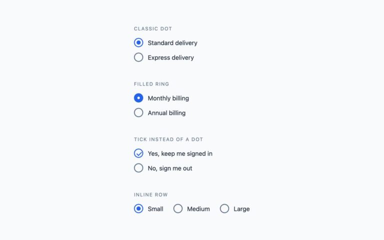
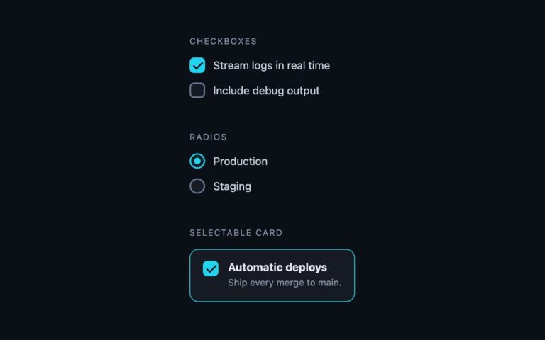
Four custom checkbox shapes that cover most forms: a square box that draws its tick, a rounded square, a circular checkbox and a heavy-mark variant that fills with near-black and draws a thicker tick. Use the square or rounded square for ordinary form options such as remember-me and newsletter consent, the circular version where a row of choices should read as softer status marks, and the heavy mark for task-style completion. The plain CSS version keeps a real input inside each label, hidden with position absolute and zero opacity rather than display none, so it stays in the tab order and in the accessibility tree. A sibling span draws the box, and its ::after pseudo-element is a rotated border that scales in when the input is checked. The Bootstrap version uses the native .form-check and .form-check-input, restyled with a few CSS custom properties and Bootstrap’s own SVG tick. The Tailwind version uses peer and peer-checked utilities on the same hidden-input pattern. Because the label wraps or targets the input, clicking the text toggles the box, and the browser handles Space and form submission as it would for any checkbox.
What’s included
- Four shapes: square, rounded square, circular and heavy mark
- Real checkbox inputs, hidden without display:none
- Tick drawn in CSS (Bootstrap uses its own SVG tick)
- Visible keyboard focus ring on the box
- No JavaScript
Accessibility
Each checkbox is a real input with its visible text as the label, so screen readers announce the name and the checked state. Tab moves between boxes and Space toggles them. Keyboard focus draws a 2px blue outline around the box, and the unchecked border reaches 3:1 contrast against the page. The tick and colour transitions are switched off under prefers-reduced-motion.
Customise it
Plain CSS: change #2563eb in the .chk input:checked+.bx rule and the width/height of .bx. Bootstrap: set --choice-accent and --choice-border on .choice. Tailwind: swap blue-600 in the peer-checked: classes and size-[22px] on the box.