Open demo

CSS code

HTML
<div><span class="lbl">Parent with an indeterminate state</span><div class="stack">
<label class="chk"><input type="checkbox" data-check-all aria-controls="regions"><span class="bx"></span><span>Select all regions</span></label>
<div class="chk-group" id="regions" role="group" aria-label="Regions">
<label class="chk"><input type="checkbox" checked><span class="bx"></span><span>Europe</span></label>
<label class="chk"><input type="checkbox"><span class="bx"></span><span>North America</span></label>
<label class="chk"><input type="checkbox"><span class="bx"></span><span>Asia Pacific</span></label>
</div></div></div>
<div><span class="lbl">Disabled</span><div class="stack">
<label class="chk"><input type="checkbox" disabled><span class="bx"></span><span>Unavailable on this plan</span></label>
<label class="chk"><input type="checkbox" checked disabled><span class="bx"></span><span>Always on</span></label>
</div></div>
<div><span class="lbl">Error</span><div class="stack">
<div><label class="chk"><input type="checkbox" aria-invalid="true" aria-describedby="terms-msg"><span class="bx"></span><span>I accept the terms</span></label>
<span class="chk-msg" id="terms-msg">You need to accept the terms to continue.</span></div></div></div>
CSS
.stack{display:flex;flex-direction:column;gap:13px;align-items:flex-start}
.chk{position:relative;display:inline-flex;align-items:center;gap:11px;cursor:pointer;font-size:.92rem}
.chk input{position:absolute;opacity:0;width:0;height:0}

.bx{width:22px;height:22px;border:2px solid #64748b;border-radius:6px;position:relative;flex:none;
  transition:background .16s,border-color .16s}
.bx::after{content:"";position:absolute;top:2px;left:7px;width:5px;height:11px;border:solid #fff;
  border-width:0 2px 2px 0;transform:rotate(45deg) scale(0);transition:transform .16s}
.chk input:checked+.bx{background:#2563eb;border-color:#2563eb}
.chk input:checked+.bx::after{transform:rotate(45deg) scale(1)}
.chk input:focus-visible+.bx{outline:2px solid #2563eb;outline-offset:2px}

/* indeterminate: set input.indeterminate = true from JavaScript */
.chk input:indeterminate+.bx{background:#2563eb;border-color:#2563eb}
.chk input:indeterminate+.bx::after{top:9px;left:4px;width:10px;height:0;border-width:0 0 2px 0;transform:none}
/* disabled */
.chk:has(input:disabled){cursor:not-allowed}
.chk input:disabled+.bx{background:#f1f5f9;border-color:#e2e8f0}
.chk input:disabled:checked+.bx{background:#cbd5e1;border-color:#cbd5e1}
.chk input:disabled~span:last-child{color:#94a3b8}
/* error: aria-invalid on the input, message linked with aria-describedby */
.chk input[aria-invalid="true"]+.bx{border-color:#dc2626}
.chk-msg{display:block;font-size:.78rem;color:#dc2626;margin-top:5px;margin-left:33px}
.chk-group{margin-left:33px;display:flex;flex-direction:column;gap:11px;margin-top:11px}

@media(prefers-reduced-motion:reduce){.bx,.bx::after{transition:none}}
JavaScript
// "Select all" parent: checks or clears its group, and shows indeterminate when only some are checked.
document.querySelectorAll('[data-check-all]').forEach(function (parent) {
  var group = document.getElementById(parent.getAttribute('aria-controls'));
  if (!group) return;
  var kids = Array.prototype.slice.call(group.querySelectorAll('input[type="checkbox"]'));
  function sync() {
    var n = kids.filter(function (k) { return k.checked; }).length;
    parent.checked = n === kids.length;
    parent.indeterminate = n > 0 && n < kids.length;
  }
  parent.addEventListener('change', function () {
    kids.forEach(function (k) { k.checked = parent.checked; });
    sync();
  });
  kids.forEach(function (k) { k.addEventListener('change', sync); });
  sync();
});

Bootstrap 5 code

Requires: Bootstrap 5.3.8 CSS

HTML
<div><span class="lbl">Parent with an indeterminate state</span><div>
<div class="form-check choice"><input class="form-check-input" type="checkbox" id="all" data-check-all aria-controls="regions"><label class="form-check-label" for="all">Select all regions</label></div>
<div class="vstack align-items-start choice-group" id="regions" role="group" aria-label="Regions">
<div class="form-check choice"><input class="form-check-input" type="checkbox" id="rg1" checked><label class="form-check-label" for="rg1">Europe</label></div>
<div class="form-check choice"><input class="form-check-input" type="checkbox" id="rg2"><label class="form-check-label" for="rg2">North America</label></div>
<div class="form-check choice"><input class="form-check-input" type="checkbox" id="rg3"><label class="form-check-label" for="rg3">Asia Pacific</label></div>
</div></div></div>
<div><span class="lbl">Disabled</span><div class="vstack gap-3 align-items-start">
<div class="form-check choice"><input class="form-check-input" type="checkbox" id="ds1" disabled><label class="form-check-label" for="ds1">Unavailable on this plan</label></div>
<div class="form-check choice"><input class="form-check-input" type="checkbox" id="ds2" checked disabled><label class="form-check-label" for="ds2">Always on</label></div>
</div></div>
<div><span class="lbl">Error</span><div>
<div class="form-check choice"><input class="form-check-input is-invalid" type="checkbox" id="terms" aria-invalid="true" aria-describedby="terms-msg"><label class="form-check-label" for="terms">I accept the terms</label></div>
<div class="invalid-feedback d-block choice-feedback" id="terms-msg">You need to accept the terms to continue.</div></div></div>
CSS
/* .choice restyles Bootstrap's .form-check; change --choice-accent for the checked colour */
.choice{--choice-accent:#2563eb;--choice-border:#64748b;
  display:flex;align-items:center;gap:11px;padding-left:0;margin:0;min-height:0;font-size:.92rem}
.choice .form-check-input{--bs-form-check-bg:transparent;float:none;margin:0;width:22px;height:22px;
  border:2px solid var(--choice-border);border-radius:6px;cursor:pointer;
  transition:background-color .16s,border-color .16s}
.choice .form-check-label{cursor:pointer}
.choice .form-check-input:checked,
.choice .form-check-input:indeterminate{background-color:var(--choice-accent);border-color:var(--choice-accent)}
.choice .form-check-input:focus{box-shadow:none;border-color:var(--choice-border)}
.choice .form-check-input:checked:focus,
.choice .form-check-input:indeterminate:focus{border-color:var(--choice-accent)}
.choice .form-check-input:focus-visible{outline:2px solid #2563eb;outline-offset:2px}
/* disabled: flat greys instead of Bootstrap's 50% opacity */
.choice .form-check-input:disabled{opacity:1;background-color:#f1f5f9;border-color:#e2e8f0}
.choice .form-check-input:disabled:checked{background-color:#cbd5e1;border-color:#cbd5e1}
.choice .form-check-input:disabled~.form-check-label{opacity:1;color:#94a3b8;cursor:not-allowed}
/* error: Bootstrap's .is-invalid, with a darker red for contrast */
.choice{--bs-form-invalid-color:#dc2626;--bs-form-invalid-border-color:#dc2626}
.choice .form-check-input.is-invalid{border-color:var(--bs-form-invalid-border-color)}
.choice .form-check-input.is-invalid~.form-check-label{color:inherit}
.choice-feedback{--bs-form-invalid-color:#dc2626;width:auto;font-size:.78rem;margin:5px 0 0 33px}
.choice-group{margin:24px 0 0 33px;gap:11px}

@media(prefers-reduced-motion:reduce){.choice .form-check-input{transition:none}}
JavaScript
// "Select all" parent: checks or clears its group, and shows indeterminate when only some are checked.
document.querySelectorAll('[data-check-all]').forEach(function (parent) {
  var group = document.getElementById(parent.getAttribute('aria-controls'));
  if (!group) return;
  var kids = Array.prototype.slice.call(group.querySelectorAll('input[type="checkbox"]'));
  function sync() {
    var n = kids.filter(function (k) { return k.checked; }).length;
    parent.checked = n === kids.length;
    parent.indeterminate = n > 0 && n < kids.length;
  }
  parent.addEventListener('change', function () {
    kids.forEach(function (k) { k.checked = parent.checked; });
    sync();
  });
  kids.forEach(function (k) { k.addEventListener('change', sync); });
  sync();
});

Tailwind 4 code

Requires: Tailwind CSS 4

HTML
<div><span class="mb-4 block text-[.72rem] tracking-[.12em] text-slate-500 uppercase">Parent with an indeterminate state</span><div class="flex flex-col items-start">
<label class="relative inline-flex cursor-pointer items-center gap-[11px] text-[.92rem]"><input type="checkbox" class="peer sr-only" data-check-all aria-controls="regions"><span class="relative size-[22px] flex-none rounded-md border-2 border-slate-500 transition-[background-color,border-color,color] duration-150 peer-checked:border-blue-600 peer-checked:bg-blue-600 peer-indeterminate:border-blue-600 peer-indeterminate:bg-blue-600 peer-focus-visible:outline-2 peer-focus-visible:outline-offset-2 peer-focus-visible:outline-blue-600 after:absolute after:top-[2px] after:left-[7px] after:h-[11px] after:w-[5px] after:scale-0 after:rotate-45 after:border-r-2 after:border-b-2 after:border-white after:transition-[scale] after:duration-150 after:content-[''] peer-checked:after:scale-100 peer-indeterminate:after:top-[9px] peer-indeterminate:after:left-[4px] peer-indeterminate:after:h-0 peer-indeterminate:after:w-[10px] peer-indeterminate:after:scale-100 peer-indeterminate:after:rotate-0 peer-indeterminate:after:border-r-0 motion-reduce:transition-none motion-reduce:after:transition-none"></span><span>Select all regions</span></label>
<div class="mt-6 ml-[33px] flex flex-col items-start gap-[11px]" id="regions" role="group" aria-label="Regions">
<label class="relative inline-flex cursor-pointer items-center gap-[11px] text-[.92rem]"><input type="checkbox" class="peer sr-only" checked><span class="relative size-[22px] flex-none rounded-md border-2 border-slate-500 transition-[background-color,border-color,color] duration-150 peer-checked:border-blue-600 peer-checked:bg-blue-600 peer-focus-visible:outline-2 peer-focus-visible:outline-offset-2 peer-focus-visible:outline-blue-600 after:absolute after:top-[2px] after:left-[7px] after:h-[11px] after:w-[5px] after:scale-0 after:rotate-45 after:border-r-2 after:border-b-2 after:border-white after:transition-[scale] after:duration-150 after:content-[''] peer-checked:after:scale-100 motion-reduce:transition-none motion-reduce:after:transition-none"></span><span>Europe</span></label>
<label class="relative inline-flex cursor-pointer items-center gap-[11px] text-[.92rem]"><input type="checkbox" class="peer sr-only"><span class="relative size-[22px] flex-none rounded-md border-2 border-slate-500 transition-[background-color,border-color,color] duration-150 peer-checked:border-blue-600 peer-checked:bg-blue-600 peer-focus-visible:outline-2 peer-focus-visible:outline-offset-2 peer-focus-visible:outline-blue-600 after:absolute after:top-[2px] after:left-[7px] after:h-[11px] after:w-[5px] after:scale-0 after:rotate-45 after:border-r-2 after:border-b-2 after:border-white after:transition-[scale] after:duration-150 after:content-[''] peer-checked:after:scale-100 motion-reduce:transition-none motion-reduce:after:transition-none"></span><span>North America</span></label>
<label class="relative inline-flex cursor-pointer items-center gap-[11px] text-[.92rem]"><input type="checkbox" class="peer sr-only"><span class="relative size-[22px] flex-none rounded-md border-2 border-slate-500 transition-[background-color,border-color,color] duration-150 peer-checked:border-blue-600 peer-checked:bg-blue-600 peer-focus-visible:outline-2 peer-focus-visible:outline-offset-2 peer-focus-visible:outline-blue-600 after:absolute after:top-[2px] after:left-[7px] after:h-[11px] after:w-[5px] after:scale-0 after:rotate-45 after:border-r-2 after:border-b-2 after:border-white after:transition-[scale] after:duration-150 after:content-[''] peer-checked:after:scale-100 motion-reduce:transition-none motion-reduce:after:transition-none"></span><span>Asia Pacific</span></label>
</div></div></div>
<div><span class="mb-4 block text-[.72rem] tracking-[.12em] text-slate-500 uppercase">Disabled</span><div class="flex flex-col items-start gap-[13px]">
<label class="relative inline-flex cursor-not-allowed items-center gap-[11px] text-[.92rem]"><input type="checkbox" class="peer sr-only" disabled><span class="relative size-[22px] flex-none rounded-md border-2 border-slate-500 peer-checked:border-blue-600 peer-checked:bg-blue-600 peer-disabled:border-slate-200 peer-disabled:bg-slate-100 peer-checked:peer-disabled:border-slate-300 peer-checked:peer-disabled:bg-slate-300 after:absolute after:top-[2px] after:left-[7px] after:h-[11px] after:w-[5px] after:scale-0 after:rotate-45 after:border-r-2 after:border-b-2 after:border-white after:content-[''] peer-checked:after:scale-100"></span><span class="peer-disabled:text-slate-400">Unavailable on this plan</span></label>
<label class="relative inline-flex cursor-not-allowed items-center gap-[11px] text-[.92rem]"><input type="checkbox" class="peer sr-only" checked disabled><span class="relative size-[22px] flex-none rounded-md border-2 border-slate-500 peer-checked:border-blue-600 peer-checked:bg-blue-600 peer-disabled:border-slate-200 peer-disabled:bg-slate-100 peer-checked:peer-disabled:border-slate-300 peer-checked:peer-disabled:bg-slate-300 after:absolute after:top-[2px] after:left-[7px] after:h-[11px] after:w-[5px] after:scale-0 after:rotate-45 after:border-r-2 after:border-b-2 after:border-white after:content-[''] peer-checked:after:scale-100"></span><span class="peer-disabled:text-slate-400">Always on</span></label>
</div></div>
<div><span class="mb-4 block text-[.72rem] tracking-[.12em] text-slate-500 uppercase">Error</span><div>
<label class="relative inline-flex cursor-pointer items-center gap-[11px] text-[.92rem]"><input type="checkbox" class="peer sr-only" aria-invalid="true" aria-describedby="terms-msg"><span class="relative size-[22px] flex-none rounded-md border-2 border-slate-500 transition-[background-color,border-color,color] duration-150 peer-checked:border-blue-600 peer-checked:bg-blue-600 peer-aria-invalid:border-red-600 peer-focus-visible:outline-2 peer-focus-visible:outline-offset-2 peer-focus-visible:outline-blue-600 after:absolute after:top-[2px] after:left-[7px] after:h-[11px] after:w-[5px] after:scale-0 after:rotate-45 after:border-r-2 after:border-b-2 after:border-white after:transition-[scale] after:duration-150 after:content-[''] peer-checked:after:scale-100 motion-reduce:transition-none motion-reduce:after:transition-none"></span><span>I accept the terms</span></label>
<span class="mt-[5px] ml-[33px] block text-[.78rem] text-red-600" id="terms-msg">You need to accept the terms to continue.</span></div></div>
JavaScript
// "Select all" parent: checks or clears its group, and shows indeterminate when only some are checked.
document.querySelectorAll('[data-check-all]').forEach(function (parent) {
  var group = document.getElementById(parent.getAttribute('aria-controls'));
  if (!group) return;
  var kids = Array.prototype.slice.call(group.querySelectorAll('input[type="checkbox"]'));
  function sync() {
    var n = kids.filter(function (k) { return k.checked; }).length;
    parent.checked = n === kids.length;
    parent.indeterminate = n > 0 && n < kids.length;
  }
  parent.addEventListener('change', function () {
    kids.forEach(function (k) { k.checked = parent.checked; });
    sync();
  });
  kids.forEach(function (k) { k.addEventListener('change', sync); });
  sync();
});

About this set

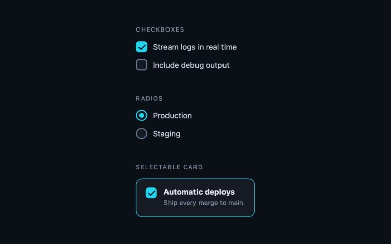
The checkbox states a real form needs and most snippets skip. A select-all parent shows the indeterminate state, a dash, while only some of its regions are checked; it checks or clears the whole group when clicked and updates itself as the children change. A disabled pair shows an unavailable option and an always-on option that is checked and disabled, both greyed out. An error example marks the terms checkbox with a red border and a message underneath. Indeterminate cannot be set in HTML, so the set includes a short script that reads the group from the parent’s aria-controls attribute and keeps parent and children in sync; the other states are pure CSS. The plain CSS version styles :indeterminate, :disabled and [aria-invalid] on a hidden input with a drawn sibling box. The Bootstrap version uses .form-check-input with its built-in indeterminate dash, .is-invalid and .invalid-feedback, with the disabled greys adjusted. The Tailwind version uses peer-indeterminate, peer-disabled and peer-aria-invalid variants.

What’s included

  • Select-all parent with a working indeterminate state
  • Disabled and checked-plus-disabled options
  • Error state wired with aria-invalid and aria-describedby
  • One small dependency-free script, shared by all three versions
  • Bootstrap version uses .is-invalid and .invalid-feedback

Accessibility

Every checkbox has its visible text as the label. The indeterminate parent is set through the DOM property, so assistive technology announces it as mixed, and it points at its group with aria-controls. The error checkbox carries aria-invalid="true" and aria-describedby pointing at the message, so the message is read with the control. Focus shows a 2px blue outline, disabled inputs are skipped by the keyboard, and transitions stop under prefers-reduced-motion.

Customise it

Plain CSS: change #2563eb for checked and indeterminate, #dc2626 for the error, and the #f1f5f9/#cbd5e1 disabled greys. Bootstrap: set --choice-accent on .choice and --bs-form-invalid-color for the error red. Tailwind: swap blue-600, red-600 and the slate disabled classes.