Open demo

CSS code

HTML
<div><span class="lbl">Classic dot</span><div class="stack" role="radiogroup" aria-label="Delivery">
<label class="rad"><input type="radio" name="a" checked><span class="rd"></span>Standard delivery</label>
<label class="rad"><input type="radio" name="a"><span class="rd"></span>Express delivery</label></div></div>
<div><span class="lbl">Filled ring</span><div class="stack" role="radiogroup" aria-label="Billing">
<label class="rad"><input type="radio" name="b" checked><span class="rd rd-fill"></span>Monthly billing</label>
<label class="rad"><input type="radio" name="b"><span class="rd rd-fill"></span>Annual billing</label></div></div>
<div><span class="lbl">Tick instead of a dot</span><div class="stack" role="radiogroup" aria-label="Stay signed in">
<label class="rad"><input type="radio" name="c" checked><span class="rd rd-tick"></span>Yes, keep me signed in</label>
<label class="rad"><input type="radio" name="c"><span class="rd rd-tick"></span>No, sign me out</label></div></div>
<div><span class="lbl">Inline row</span><div class="inline" role="radiogroup" aria-label="Size">
<label class="rad"><input type="radio" name="d" checked><span class="rd"></span>Small</label>
<label class="rad"><input type="radio" name="d"><span class="rd"></span>Medium</label>
<label class="rad"><input type="radio" name="d"><span class="rd"></span>Large</label></div></div>
CSS
.stack{display:flex;flex-direction:column;gap:13px;align-items:flex-start}
.inline{display:flex;gap:24px;flex-wrap:wrap}
.rad{position:relative;display:inline-flex;align-items:center;gap:11px;cursor:pointer;font-size:.92rem}
.rad input{position:absolute;opacity:0;width:0;height:0}

/* classic dot */
.rd{width:22px;height:22px;border:2px solid #64748b;border-radius:50%;position:relative;flex:none;
  transition:border-color .16s,background .16s}
.rd::after{content:"";position:absolute;inset:4px;border-radius:50%;background:#2563eb;
  transform:scale(0);transition:transform .16s}
.rad input:checked+.rd{border-color:#2563eb}
.rad input:checked+.rd::after{transform:scale(1)}
.rad input:focus-visible+.rd{outline:2px solid #2563eb;outline-offset:2px}
/* filled ring */
.rad input:checked+.rd-fill{background:#2563eb}
.rd-fill::after{background:#fff;inset:6px}
/* tick instead of a dot */
.rd-tick::after{inset:auto;background:none;border-radius:0;border:solid #2563eb;border-width:0 2px 2px 0;
  width:5px;height:10px;top:3px;left:7px;transform:rotate(45deg) scale(0)}
.rad input:checked+.rd-tick::after{transform:rotate(45deg) scale(1)}

@media(prefers-reduced-motion:reduce){.rd,.rd::after{transition:none}}

Bootstrap 5 code

Requires: Bootstrap 5.3.8 CSS

HTML
<div><span class="lbl">Classic dot</span><div class="vstack gap-3 align-items-start" role="radiogroup" aria-label="Delivery">
<div class="form-check choice"><input class="form-check-input" type="radio" name="a" id="a1" checked><label class="form-check-label" for="a1">Standard delivery</label></div>
<div class="form-check choice"><input class="form-check-input" type="radio" name="a" id="a2"><label class="form-check-label" for="a2">Express delivery</label></div></div></div>
<div><span class="lbl">Filled ring</span><div class="vstack gap-3 align-items-start" role="radiogroup" aria-label="Billing">
<div class="form-check choice choice-fill"><input class="form-check-input" type="radio" name="b" id="b1" checked><label class="form-check-label" for="b1">Monthly billing</label></div>
<div class="form-check choice choice-fill"><input class="form-check-input" type="radio" name="b" id="b2"><label class="form-check-label" for="b2">Annual billing</label></div></div></div>
<div><span class="lbl">Tick instead of a dot</span><div class="vstack gap-3 align-items-start" role="radiogroup" aria-label="Stay signed in">
<div class="form-check choice choice-tick"><input class="form-check-input" type="radio" name="c" id="c1" checked><label class="form-check-label" for="c1">Yes, keep me signed in</label></div>
<div class="form-check choice choice-tick"><input class="form-check-input" type="radio" name="c" id="c2"><label class="form-check-label" for="c2">No, sign me out</label></div></div></div>
<div><span class="lbl">Inline row</span><div class="d-flex flex-wrap gap-4" role="radiogroup" aria-label="Size">
<div class="form-check choice"><input class="form-check-input" type="radio" name="d" id="d1" checked><label class="form-check-label" for="d1">Small</label></div>
<div class="form-check choice"><input class="form-check-input" type="radio" name="d" id="d2"><label class="form-check-label" for="d2">Medium</label></div>
<div class="form-check choice"><input class="form-check-input" type="radio" name="d" id="d3"><label class="form-check-label" for="d3">Large</label></div></div></div>
CSS
/* .choice restyles Bootstrap's .form-check; change --choice-accent (and the fill in the SVGs) for colour */
.choice{--choice-accent:#2563eb;--choice-border:#64748b;
  display:flex;align-items:center;gap:11px;padding-left:0;margin:0;min-height:0;font-size:.92rem}
.choice .form-check-input{--bs-form-check-bg:transparent;float:none;margin:0;width:22px;height:22px;
  border:2px solid var(--choice-border);cursor:pointer;transition:background-color .16s,border-color .16s}
.choice .form-check-label{cursor:pointer}
.choice .form-check-input:focus{box-shadow:none;border-color:var(--choice-border)}
.choice .form-check-input:focus-visible{outline:2px solid var(--choice-accent);outline-offset:2px}
.choice .form-check-input:checked,
.choice .form-check-input:checked:focus{border-color:var(--choice-accent)}
/* classic dot: accent dot on a clear background */
.choice .form-check-input:checked[type=radio]{background-color:transparent;
  --bs-form-check-bg-image:url("data:image/svg+xml,%3csvg xmlns='http://www.w3.org/2000/svg' viewBox='-4 -4 8 8'%3e%3ccircle r='2.2' fill='%232563eb'/%3e%3c/svg%3e")}
/* filled ring: Bootstrap's own look, a small white dot on the accent */
.choice-fill .form-check-input:checked[type=radio]{background-color:var(--choice-accent);
  --bs-form-check-bg-image:url("data:image/svg+xml,%3csvg xmlns='http://www.w3.org/2000/svg' viewBox='-4 -4 8 8'%3e%3ccircle r='1.35' fill='%23fff'/%3e%3c/svg%3e")}
/* tick instead of a dot */
.choice-tick .form-check-input:checked[type=radio]{
  --bs-form-check-bg-image:url("data:image/svg+xml,%3csvg xmlns='http://www.w3.org/2000/svg' viewBox='0 0 20 20'%3e%3cpath fill='none' stroke='%232563eb' stroke-linecap='round' stroke-linejoin='round' stroke-width='2.4' d='m6 10.5 3 3 5.5-6.5'/%3e%3c/svg%3e")}

@media(prefers-reduced-motion:reduce){.choice .form-check-input{transition:none}}

Tailwind 4 code

Requires: Tailwind CSS 4

HTML
<div><span class="mb-4 block text-[.72rem] tracking-[.12em] text-slate-500 uppercase">Classic dot</span><div class="flex flex-col items-start gap-[13px]" role="radiogroup" aria-label="Delivery">
<label class="relative inline-flex cursor-pointer items-center gap-[11px] text-[.92rem]"><input type="radio" name="a" class="peer sr-only" checked><span class="relative size-[22px] flex-none rounded-full border-2 border-slate-500 transition-[background-color,border-color,color] duration-150 peer-checked:border-blue-600 peer-focus-visible:outline-2 peer-focus-visible:outline-offset-2 peer-focus-visible:outline-blue-600 after:absolute after:scale-0 after:transition-[scale] after:duration-150 after:content-[''] peer-checked:after:scale-100 motion-reduce:transition-none motion-reduce:after:transition-none after:inset-1 after:rounded-full after:bg-blue-600"></span>Standard delivery</label>
<label class="relative inline-flex cursor-pointer items-center gap-[11px] text-[.92rem]"><input type="radio" name="a" class="peer sr-only"><span class="relative size-[22px] flex-none rounded-full border-2 border-slate-500 transition-[background-color,border-color,color] duration-150 peer-checked:border-blue-600 peer-focus-visible:outline-2 peer-focus-visible:outline-offset-2 peer-focus-visible:outline-blue-600 after:absolute after:scale-0 after:transition-[scale] after:duration-150 after:content-[''] peer-checked:after:scale-100 motion-reduce:transition-none motion-reduce:after:transition-none after:inset-1 after:rounded-full after:bg-blue-600"></span>Express delivery</label></div></div>
<div><span class="mb-4 block text-[.72rem] tracking-[.12em] text-slate-500 uppercase">Filled ring</span><div class="flex flex-col items-start gap-[13px]" role="radiogroup" aria-label="Billing">
<label class="relative inline-flex cursor-pointer items-center gap-[11px] text-[.92rem]"><input type="radio" name="b" class="peer sr-only" checked><span class="relative size-[22px] flex-none rounded-full border-2 border-slate-500 transition-[background-color,border-color,color] duration-150 peer-checked:border-blue-600 peer-focus-visible:outline-2 peer-focus-visible:outline-offset-2 peer-focus-visible:outline-blue-600 after:absolute after:scale-0 after:transition-[scale] after:duration-150 after:content-[''] peer-checked:after:scale-100 motion-reduce:transition-none motion-reduce:after:transition-none peer-checked:bg-blue-600 after:inset-1.5 after:rounded-full after:bg-white"></span>Monthly billing</label>
<label class="relative inline-flex cursor-pointer items-center gap-[11px] text-[.92rem]"><input type="radio" name="b" class="peer sr-only"><span class="relative size-[22px] flex-none rounded-full border-2 border-slate-500 transition-[background-color,border-color,color] duration-150 peer-checked:border-blue-600 peer-focus-visible:outline-2 peer-focus-visible:outline-offset-2 peer-focus-visible:outline-blue-600 after:absolute after:scale-0 after:transition-[scale] after:duration-150 after:content-[''] peer-checked:after:scale-100 motion-reduce:transition-none motion-reduce:after:transition-none peer-checked:bg-blue-600 after:inset-1.5 after:rounded-full after:bg-white"></span>Annual billing</label></div></div>
<div><span class="mb-4 block text-[.72rem] tracking-[.12em] text-slate-500 uppercase">Tick instead of a dot</span><div class="flex flex-col items-start gap-[13px]" role="radiogroup" aria-label="Stay signed in">
<label class="relative inline-flex cursor-pointer items-center gap-[11px] text-[.92rem]"><input type="radio" name="c" class="peer sr-only" checked><span class="relative size-[22px] flex-none rounded-full border-2 border-slate-500 transition-[background-color,border-color,color] duration-150 peer-checked:border-blue-600 peer-focus-visible:outline-2 peer-focus-visible:outline-offset-2 peer-focus-visible:outline-blue-600 after:absolute after:scale-0 after:transition-[scale] after:duration-150 after:content-[''] peer-checked:after:scale-100 motion-reduce:transition-none motion-reduce:after:transition-none after:top-[3px] after:left-[7px] after:h-[10px] after:w-[5px] after:rotate-45 after:border-r-2 after:border-b-2 after:border-blue-600"></span>Yes, keep me signed in</label>
<label class="relative inline-flex cursor-pointer items-center gap-[11px] text-[.92rem]"><input type="radio" name="c" class="peer sr-only"><span class="relative size-[22px] flex-none rounded-full border-2 border-slate-500 transition-[background-color,border-color,color] duration-150 peer-checked:border-blue-600 peer-focus-visible:outline-2 peer-focus-visible:outline-offset-2 peer-focus-visible:outline-blue-600 after:absolute after:scale-0 after:transition-[scale] after:duration-150 after:content-[''] peer-checked:after:scale-100 motion-reduce:transition-none motion-reduce:after:transition-none after:top-[3px] after:left-[7px] after:h-[10px] after:w-[5px] after:rotate-45 after:border-r-2 after:border-b-2 after:border-blue-600"></span>No, sign me out</label></div></div>
<div><span class="mb-4 block text-[.72rem] tracking-[.12em] text-slate-500 uppercase">Inline row</span><div class="flex flex-wrap gap-6" role="radiogroup" aria-label="Size">
<label class="relative inline-flex cursor-pointer items-center gap-[11px] text-[.92rem]"><input type="radio" name="d" class="peer sr-only" checked><span class="relative size-[22px] flex-none rounded-full border-2 border-slate-500 transition-[background-color,border-color,color] duration-150 peer-checked:border-blue-600 peer-focus-visible:outline-2 peer-focus-visible:outline-offset-2 peer-focus-visible:outline-blue-600 after:absolute after:scale-0 after:transition-[scale] after:duration-150 after:content-[''] peer-checked:after:scale-100 motion-reduce:transition-none motion-reduce:after:transition-none after:inset-1 after:rounded-full after:bg-blue-600"></span>Small</label>
<label class="relative inline-flex cursor-pointer items-center gap-[11px] text-[.92rem]"><input type="radio" name="d" class="peer sr-only"><span class="relative size-[22px] flex-none rounded-full border-2 border-slate-500 transition-[background-color,border-color,color] duration-150 peer-checked:border-blue-600 peer-focus-visible:outline-2 peer-focus-visible:outline-offset-2 peer-focus-visible:outline-blue-600 after:absolute after:scale-0 after:transition-[scale] after:duration-150 after:content-[''] peer-checked:after:scale-100 motion-reduce:transition-none motion-reduce:after:transition-none after:inset-1 after:rounded-full after:bg-blue-600"></span>Medium</label>
<label class="relative inline-flex cursor-pointer items-center gap-[11px] text-[.92rem]"><input type="radio" name="d" class="peer sr-only"><span class="relative size-[22px] flex-none rounded-full border-2 border-slate-500 transition-[background-color,border-color,color] duration-150 peer-checked:border-blue-600 peer-focus-visible:outline-2 peer-focus-visible:outline-offset-2 peer-focus-visible:outline-blue-600 after:absolute after:scale-0 after:transition-[scale] after:duration-150 after:content-[''] peer-checked:after:scale-100 motion-reduce:transition-none motion-reduce:after:transition-none after:inset-1 after:rounded-full after:bg-blue-600"></span>Large</label></div></div>

About this set

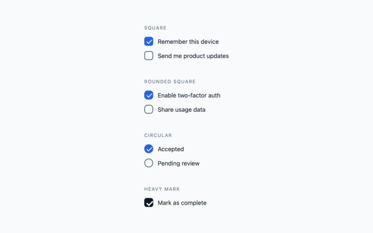
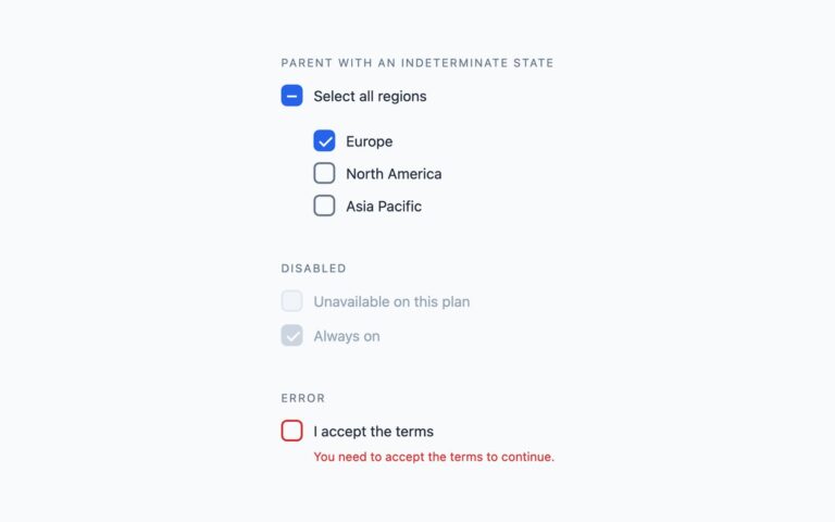
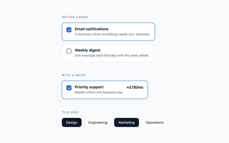
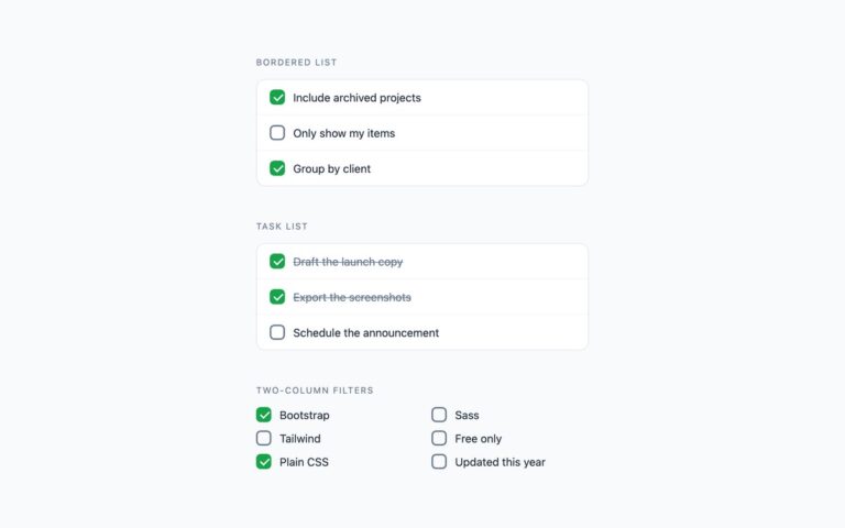
Four radio button treatments for one-of-many choices. The classic dot keeps a light ring and scales a blue dot into it when selected. The filled ring turns the whole circle blue with a small white centre, the look Bootstrap uses by default. The tick variant draws a check mark inside the circle instead of a dot, which suits yes/no confirmations. The inline row lays three short options side by side for sizes and similar compact sets. Each option is a label around a real radio input, hidden with zero opacity rather than display none so it stays focusable, followed by a span that draws the circle; its ::after pseudo-element is the dot or tick. Radios that share a name form a group, so the browser handles arrow-key movement and single selection. The Bootstrap version uses .form-check-input radios with the dot and tick supplied as SVG background images through –bs-form-check-bg-image. The Tailwind version uses peer-checked and after: utilities.

What’s included

  • Classic dot, filled ring, tick and inline row
  • Real radio inputs grouped by name
  • Each group labelled with role="radiogroup"
  • Dot or tick scales in on selection
  • No JavaScript

Accessibility

Each radio has its visible text as the label, and each group has role="radiogroup" with an aria-label. Tab moves into a group and the arrow keys change the selection, as with native radios. Focus shows a 2px blue outline around the circle, and the unselected ring reaches 3:1 contrast. The dot animation is disabled under prefers-reduced-motion.

Customise it

Plain CSS: change #2563eb in the .rad input:checked+.rd rules and the size of .rd. Bootstrap: set --choice-accent on .choice and edit the fill in the SVG data URIs. Tailwind: swap blue-600 in the peer-checked: and after:bg- classes and size-[22px].