Open demo

CSS code

HTML
<div><span class="lbl">Checkboxes</span><div class="stack">
<label class="dchk"><input type="checkbox" checked><span class="bx"></span>Stream logs in real time</label>
<label class="dchk"><input type="checkbox"><span class="bx"></span>Include debug output</label></div></div>
<div><span class="lbl">Radios</span><div class="stack" role="radiogroup" aria-label="Environment">
<label class="dchk"><input type="radio" name="e" checked><span class="rd"></span>Production</label>
<label class="dchk"><input type="radio" name="e"><span class="rd"></span>Staging</label></div></div>
<div><span class="lbl">Selectable card</span><div class="stack">
<label class="dcard"><input type="checkbox" checked><span class="bx"></span>
<span><b>Automatic deploys</b><span class="dcard-desc">Ship every merge to main.</span></span></label>
</div></div>
CSS
.stack{display:flex;flex-direction:column;gap:13px;align-items:flex-start}
.dchk{position:relative;display:inline-flex;align-items:center;gap:11px;cursor:pointer;font-size:.92rem;color:#cdd3de}
.dchk input,.dcard input{position:absolute;opacity:0;width:0;height:0}

.bx{width:21px;height:21px;border:2px solid #6b7891;border-radius:6px;position:relative;flex:none;
  background:#161b23;transition:background .16s,border-color .16s}
.bx::after{content:"";position:absolute;top:1px;left:6px;width:5px;height:11px;border:solid #0b0f16;
  border-width:0 2px 2px 0;transform:rotate(45deg) scale(0);transition:transform .16s}
input:checked+.bx{background:#22d3ee;border-color:#22d3ee}
input:checked+.bx::after{transform:rotate(45deg) scale(1)}
.rd{width:21px;height:21px;border:2px solid #6b7891;border-radius:50%;position:relative;flex:none;
  background:#161b23;transition:border-color .16s}
.rd::after{content:"";position:absolute;inset:4px;border-radius:50%;background:#22d3ee;
  transform:scale(0);transition:transform .16s}
input:checked+.rd{border-color:#22d3ee}
input:checked+.rd::after{transform:scale(1)}
.dchk input:focus-visible+.bx,.dchk input:focus-visible+.rd{outline:2px solid #22d3ee;outline-offset:2px}

.dcard{position:relative;border:1px solid #232a36;border-radius:12px;padding:15px 17px;background:#161b23;
  display:flex;gap:13px;cursor:pointer;max-width:400px;font-size:.92rem;transition:border-color .16s}
.dcard:has(input:checked){border-color:#22d3ee}
.dcard:has(input:focus-visible){outline:2px solid #22d3ee;outline-offset:2px}
.dcard b{display:block;font-size:.92rem;color:#e6e9ef;margin-bottom:3px}
.dcard-desc{font-size:.79rem;color:#8b93a7;line-height:1.5}

@media(prefers-reduced-motion:reduce){.bx,.bx::after,.rd,.rd::after,.dcard{transition:none}}

Bootstrap 5 code

Requires: Bootstrap 5.3.8 CSS

HTML
<div class="choice-dark">
<div><span class="lbl">Checkboxes</span><div class="vstack gap-3 align-items-start">
<div class="form-check"><input class="form-check-input" type="checkbox" id="k1" checked><label class="form-check-label" for="k1">Stream logs in real time</label></div>
<div class="form-check"><input class="form-check-input" type="checkbox" id="k2"><label class="form-check-label" for="k2">Include debug output</label></div></div></div>
<div><span class="lbl">Radios</span><div class="vstack gap-3 align-items-start" role="radiogroup" aria-label="Environment">
<div class="form-check"><input class="form-check-input" type="radio" name="e" id="e1" checked><label class="form-check-label" for="e1">Production</label></div>
<div class="form-check"><input class="form-check-input" type="radio" name="e" id="e2"><label class="form-check-label" for="e2">Staging</label></div></div></div>
<div><span class="lbl">Selectable card</span><div class="vstack gap-3 align-items-start">
<label class="card"><input class="form-check-input" type="checkbox" checked>
<span><b>Automatic deploys</b><span class="choice-dark-desc">Ship every merge to main.</span></span></label>
</div></div>
</div>
CSS
/* for Bootstrap's dark colour mode (data-bs-theme="dark"); change --choice-accent and the SVG fills for colour */
.choice-dark{--choice-accent:#22d3ee;--choice-border:#6b7891;--choice-surface:#161b23}
.choice-dark .form-check{display:flex;align-items:center;gap:11px;padding-left:0;margin:0;min-height:0;font-size:.92rem;color:#cdd3de}
.choice-dark .form-check-label{cursor:pointer}
.choice-dark .form-check-input{--bs-form-check-bg:var(--choice-surface);float:none;margin:0;width:21px;height:21px;flex:none;
  border:2px solid var(--choice-border);cursor:pointer;transition:background-color .16s,border-color .16s}
.choice-dark .form-check-input[type=checkbox]{border-radius:6px}
.choice-dark .form-check-input:focus{box-shadow:none;border-color:var(--choice-border)}
.choice-dark .form-check-input:checked,
.choice-dark .form-check-input:checked:focus{border-color:var(--choice-accent)}
.choice-dark .form-check-input:focus-visible{outline:2px solid var(--choice-accent);outline-offset:2px}
.choice-dark .form-check-input:checked[type=checkbox]{background-color:var(--choice-accent);
  --bs-form-check-bg-image:url("data:image/svg+xml,%3csvg xmlns='http://www.w3.org/2000/svg' viewBox='0 0 20 20'%3e%3cpath fill='none' stroke='%230b0f16' stroke-linecap='round' stroke-linejoin='round' stroke-width='2.6' d='m6 10 3 3 6-6'/%3e%3c/svg%3e")}
.choice-dark .form-check-input:checked[type=radio]{background-color:var(--choice-surface);
  --bs-form-check-bg-image:url("data:image/svg+xml,%3csvg xmlns='http://www.w3.org/2000/svg' viewBox='-4 -4 8 8'%3e%3ccircle r='2.3' fill='%2322d3ee'/%3e%3c/svg%3e")}

/* selectable card: Bootstrap .card */
.choice-dark .card{--bs-card-bg:var(--choice-surface);--bs-card-border-color:#232a36;--bs-card-border-radius:12px;
  flex-direction:row;align-items:flex-start;gap:13px;padding:15px 17px;max-width:400px;cursor:pointer;font-size:.92rem;line-height:1.3;
  transition:border-color .16s}
.choice-dark .card:has(.form-check-input:checked){--bs-card-border-color:var(--choice-accent)}
.choice-dark .card:has(.form-check-input:focus-visible){outline:2px solid var(--choice-accent);outline-offset:2px}
.choice-dark .card .form-check-input:focus-visible{outline:0}
.choice-dark .card b{display:block;color:#e6e9ef;margin-bottom:3px}
.choice-dark-desc{font-size:.79rem;color:#8b93a7;line-height:1.5}

@media(prefers-reduced-motion:reduce){.choice-dark .form-check-input,.choice-dark .card{transition:none}}

Tailwind 4 code

Requires: Tailwind CSS 4

HTML
<div><span class="mb-4 block text-[.72rem] tracking-[.12em] text-[#8b93a7] uppercase">Checkboxes</span><div class="flex flex-col items-start gap-[13px]">
<label class="relative inline-flex cursor-pointer items-center gap-[11px] text-[.92rem] text-[#cdd3de]"><input type="checkbox" class="peer sr-only" checked><span class="relative size-[21px] flex-none rounded-md border-2 border-[#6b7891] bg-[#161b23] transition-[background-color,border-color,color] duration-150 peer-checked:border-[#22d3ee] peer-checked:bg-[#22d3ee] peer-focus-visible:outline-2 peer-focus-visible:outline-offset-2 peer-focus-visible:outline-[#22d3ee] after:absolute after:top-[1px] after:left-[6px] after:h-[11px] after:w-[5px] after:scale-0 after:rotate-45 after:border-r-2 after:border-b-2 after:border-[#0b0f16] after:transition-[scale] after:duration-150 after:content-[''] peer-checked:after:scale-100 motion-reduce:transition-none motion-reduce:after:transition-none"></span>Stream logs in real time</label>
<label class="relative inline-flex cursor-pointer items-center gap-[11px] text-[.92rem] text-[#cdd3de]"><input type="checkbox" class="peer sr-only"><span class="relative size-[21px] flex-none rounded-md border-2 border-[#6b7891] bg-[#161b23] transition-[background-color,border-color,color] duration-150 peer-checked:border-[#22d3ee] peer-checked:bg-[#22d3ee] peer-focus-visible:outline-2 peer-focus-visible:outline-offset-2 peer-focus-visible:outline-[#22d3ee] after:absolute after:top-[1px] after:left-[6px] after:h-[11px] after:w-[5px] after:scale-0 after:rotate-45 after:border-r-2 after:border-b-2 after:border-[#0b0f16] after:transition-[scale] after:duration-150 after:content-[''] peer-checked:after:scale-100 motion-reduce:transition-none motion-reduce:after:transition-none"></span>Include debug output</label></div></div>
<div><span class="mb-4 block text-[.72rem] tracking-[.12em] text-[#8b93a7] uppercase">Radios</span><div class="flex flex-col items-start gap-[13px]" role="radiogroup" aria-label="Environment">
<label class="relative inline-flex cursor-pointer items-center gap-[11px] text-[.92rem] text-[#cdd3de]"><input type="radio" name="e" class="peer sr-only" checked><span class="relative size-[21px] flex-none rounded-full border-2 border-[#6b7891] bg-[#161b23] transition-[background-color,border-color,color] duration-150 peer-checked:border-[#22d3ee] peer-focus-visible:outline-2 peer-focus-visible:outline-offset-2 peer-focus-visible:outline-[#22d3ee] after:absolute after:inset-1 after:scale-0 after:rounded-full after:bg-[#22d3ee] after:transition-[scale] after:duration-150 after:content-[''] peer-checked:after:scale-100 motion-reduce:transition-none motion-reduce:after:transition-none"></span>Production</label>
<label class="relative inline-flex cursor-pointer items-center gap-[11px] text-[.92rem] text-[#cdd3de]"><input type="radio" name="e" class="peer sr-only"><span class="relative size-[21px] flex-none rounded-full border-2 border-[#6b7891] bg-[#161b23] transition-[background-color,border-color,color] duration-150 peer-checked:border-[#22d3ee] peer-focus-visible:outline-2 peer-focus-visible:outline-offset-2 peer-focus-visible:outline-[#22d3ee] after:absolute after:inset-1 after:scale-0 after:rounded-full after:bg-[#22d3ee] after:transition-[scale] after:duration-150 after:content-[''] peer-checked:after:scale-100 motion-reduce:transition-none motion-reduce:after:transition-none"></span>Staging</label></div></div>
<div><span class="mb-4 block text-[.72rem] tracking-[.12em] text-[#8b93a7] uppercase">Selectable card</span><div class="flex flex-col items-start gap-[13px]">
<label class="relative flex max-w-[400px] cursor-pointer gap-[13px] rounded-xl border border-[#232a36] bg-[#161b23] px-[17px] py-[15px] text-[.92rem] leading-snug transition-[background-color,border-color,color] duration-150 has-[:checked]:border-[#22d3ee] has-[:focus-visible]:outline-2 has-[:focus-visible]:outline-offset-2 has-[:focus-visible]:outline-[#22d3ee] motion-reduce:transition-none"><input type="checkbox" class="peer sr-only" checked><span class="relative size-[21px] flex-none rounded-md border-2 border-[#6b7891] bg-[#161b23] transition-[background-color,border-color,color] duration-150 peer-checked:border-[#22d3ee] peer-checked:bg-[#22d3ee] after:absolute after:top-[1px] after:left-[6px] after:h-[11px] after:w-[5px] after:scale-0 after:rotate-45 after:border-r-2 after:border-b-2 after:border-[#0b0f16] after:transition-[scale] after:duration-150 after:content-[''] peer-checked:after:scale-100 motion-reduce:transition-none motion-reduce:after:transition-none"></span>
<span><b class="mb-[3px] block text-[#e6e9ef]">Automatic deploys</b><span class="text-[.79rem] leading-normal text-[#8b93a7]">Ship every merge to main.</span></span></label>
</div></div>

About this set

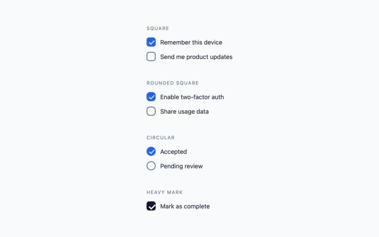
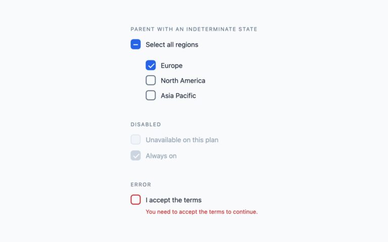
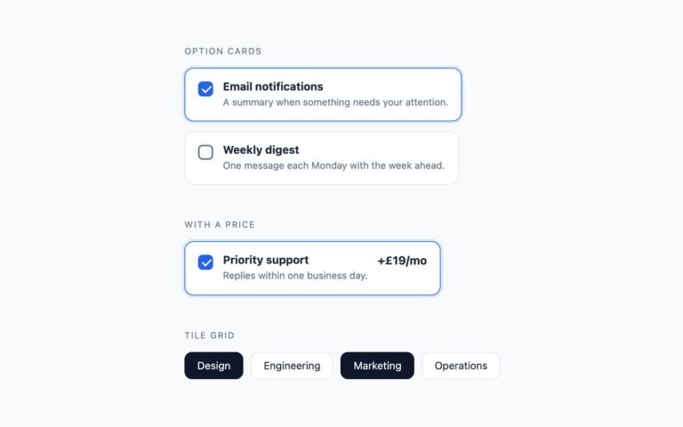
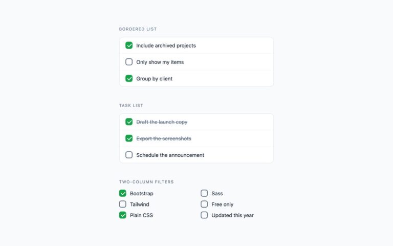
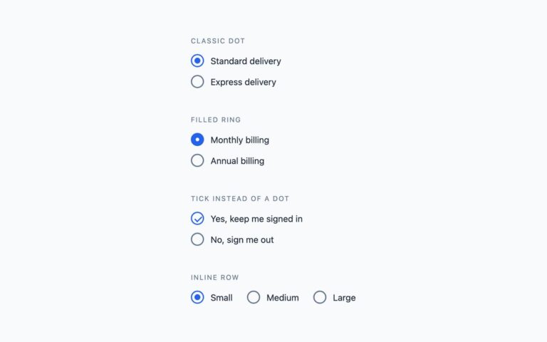
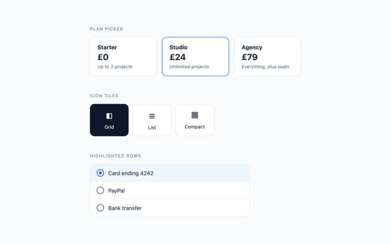
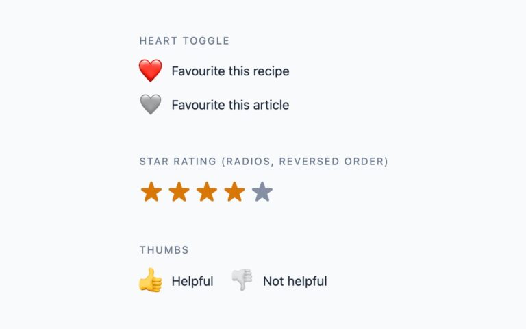
Checkboxes and radio buttons built for dark surfaces, where a light-theme control loses its border and reads as a smudge. The set has a bordered checkbox pair, a radio pair and a selectable card that pairs a checkbox with a title and a description. Every control sits on a slightly raised surface colour with a mid-grey border that stays visible against the near-black page, and the selected state uses a bright cyan accent: the checkbox fills cyan with a dark tick, the radio shows a cyan dot, and the card border turns cyan. Use it for developer tools, dashboards and settings screens in a dark theme. The plain CSS version uses hidden real inputs with drawn sibling boxes, and the card uses :has() for its selected and focused states. The Bootstrap version runs under data-bs-theme=”dark” with .form-check-input controls and a .card, restyled through –bs-form-check-bg, –bs-card-bg and SVG background images. The Tailwind version uses arbitrary colour values with peer-checked and has-[:checked].

What’s included

  • Checkbox pair, radio pair and selectable card
  • Borders tuned to stay visible on near-black
  • Cyan accent with a dark tick for contrast
  • Bootstrap version uses data-bs-theme="dark"
  • No JavaScript

Accessibility

All controls are real inputs labelled by their visible text, and the radio pair has role="radiogroup" with an aria-label. Borders reach 3:1 against both the page and the raised surface, and captions and descriptions reach 4.5:1. Keyboard focus draws a 2px cyan outline around the box, circle or card, and transitions are disabled under prefers-reduced-motion.

Customise it

Plain CSS: change #22d3ee for the accent, #6b7891 for the borders and #161b23 for the control surface. Bootstrap: set --choice-accent, --choice-border and --choice-surface on .choice-dark and edit the SVG fills. Tailwind: swap the [#22d3ee], [#6b7891] and [#161b23] values in the classes.