/* ── Claymorphism UI kit tokens (uiCookies) — identical in every set ──────────────
   Every component is a puffy pastel object floating above --clay-bg: one big soft drop shadow
   below it, an inset highlight top left and an inset shade bottom right. Change a token and
   the whole kit follows; the shadow recipes below are built from these values. */
:root{
  --clay-bg:#f3effa;          /* page, a pale lilac white */
  --clay-surface:#fffcf8;     /* cards, fields and plain objects */
  --clay-peach:#ffd2bd;       /* object fills: ink text on every fill reaches 11:1 */
  --clay-lilac:#dccdff;
  --clay-mint:#bdeed6;
  --clay-sky:#c2e0ff;
  --clay-lemon:#ffe9a3;
  --clay-ink:#241a3d;         /* text, 14.4:1 on --clay-bg */
  --clay-muted:#51476a;       /* secondary text, 5.7:1 or more on every fill */
  --clay-edge:#7a6e96;        /* control boundary, 4.1:1 on --clay-bg, so shadows are never the only edge */
  --clay-line:rgba(36,26,61,.12); /* decorative edge on cards and panels */
  --clay-accent:#6236e8;      /* focus ring and on / selected / current states, 5.8:1 on --clay-bg */
  --clay-on-accent:#ffffff;   /* text and marks on accent fills, 6.5:1 */
  --clay-tint:#e9e1ff;        /* light accent wash behind current items */
  --clay-drop:rgba(86,56,168,.30); /* colour of the outer drop shadow */
  --clay-hi:rgba(255,255,255,.88);  /* inset highlight, top left */
  --clay-lo:rgba(52,30,112,.20);    /* inset shade, bottom right */
  --clay-lift:14px;           /* how high objects float; every shadow scales from it */
  --clay-radius:30px;         /* cards; buttons are pills, fields use .55 of it */
  --clay-bw:1.5px;            /* control border width */
  --clay-success:#17663d;--clay-warning:#8a4b00;--clay-danger:#b3261e;
  --clay-font:ui-rounded,"SF Pro Rounded","Nunito","Quicksand","Varela Round","Arial Rounded MT Bold",system-ui,sans-serif;
}
/* --clay-fill is set by .clay-peach, .clay-mint… on one object and must not leak into its children */
@property --clay-fill{syntax:"*";inherits:false}
/* Dark clay: data-clay="dark" on any wrapper, or a checked .clay-theme-input inside a [data-clay] element.
   :is() is a forgiving list, so browsers without :has() still apply data-clay="dark" */
[data-clay]:is([data-clay="dark"],:has(.clay-theme-input:checked)){
  --clay-bg:#1a1530;--clay-surface:#2a2347;
  --clay-peach:#6e3f33;--clay-lilac:#4a3a8a;--clay-mint:#215a4a;--clay-sky:#26497c;--clay-lemon:#5f5220;
  --clay-ink:#f7f3ff;--clay-muted:#d2c9ea;--clay-edge:#8f83b8;--clay-line:rgba(255,255,255,.1);
  --clay-accent:#bba6ff;--clay-on-accent:#1a1530;--clay-tint:#3a2f66;
  --clay-drop:rgba(4,2,14,.62);--clay-hi:rgba(255,255,255,.2);--clay-lo:rgba(0,0,0,.34);
  --clay-success:#86e3b0;--clay-warning:#ffc76e;--clay-danger:#ffa196;color-scheme:dark}
/* More contrast requested: soft shading stays, but every edge and secondary text turns full ink */
@media (prefers-contrast:more){:root,[data-clay]:is([data-clay],:has(.clay-theme-input:checked)){
  --clay-edge:var(--clay-ink);--clay-line:var(--clay-ink);--clay-muted:var(--clay-ink);--clay-bw:2px}}
:root,[data-clay]{
  --clay-shadow:0 var(--clay-lift) calc(var(--clay-lift)*2.2) calc(var(--clay-lift)*-.3) var(--clay-drop),
    inset calc(var(--clay-lift)*.45) calc(var(--clay-lift)*.5) calc(var(--clay-lift)*.9) var(--clay-hi),
    inset calc(var(--clay-lift)*-.45) calc(var(--clay-lift)*-.6) calc(var(--clay-lift)*.9) var(--clay-lo);
  --clay-shadow-sm:0 calc(var(--clay-lift)*.55) calc(var(--clay-lift)*1.2) calc(var(--clay-lift)*-.15) var(--clay-drop),
    inset calc(var(--clay-lift)*.25) calc(var(--clay-lift)*.3) calc(var(--clay-lift)*.5) var(--clay-hi),
    inset calc(var(--clay-lift)*-.25) calc(var(--clay-lift)*-.35) calc(var(--clay-lift)*.5) var(--clay-lo);
  --clay-press:0 calc(var(--clay-lift)*.12) calc(var(--clay-lift)*.25) 0 var(--clay-drop),
    inset calc(var(--clay-lift)*.2) calc(var(--clay-lift)*.25) calc(var(--clay-lift)*.45) var(--clay-lo),
    inset calc(var(--clay-lift)*-.12) calc(var(--clay-lift)*-.12) calc(var(--clay-lift)*.3) var(--clay-hi);
  --clay-well:inset calc(var(--clay-lift)*.15) calc(var(--clay-lift)*.22) calc(var(--clay-lift)*.45) var(--clay-lo),
    inset calc(var(--clay-lift)*-.12) calc(var(--clay-lift)*-.12) calc(var(--clay-lift)*.3) var(--clay-hi);
}
[data-clay]{background:var(--clay-bg);color:var(--clay-ink)}
/* Components */
:where([class*="clay-"]),:where([class*="clay-"])::before,:where([class*="clay-"])::after{box-sizing:border-box}
.clay-sr{position:absolute;width:1px;height:1px;padding:0;margin:-1px;overflow:hidden;clip:rect(0,0,0,0);white-space:nowrap;border:0}
.clay-ico{width:22px;height:22px;flex:none}
.clay-ico--lg{width:28px;height:28px}
/* Fills: put one on any object; components read --clay-fill */
.clay-peach{--clay-fill:var(--clay-peach)}.clay-lilac{--clay-fill:var(--clay-lilac)}.clay-mint{--clay-fill:var(--clay-mint)}
.clay-sky{--clay-fill:var(--clay-sky)}.clay-lemon{--clay-fill:var(--clay-lemon)}
/* Card: a puffy panel that floats on the big drop shadow */
.clay-card{margin:0;padding:1.6rem;border:var(--clay-bw) solid var(--clay-line);border-radius:var(--clay-radius);
  background:var(--clay-fill,var(--clay-surface));color:var(--clay-ink);box-shadow:var(--clay-shadow)}
/* Layout helpers */
.clay-cluster{display:flex;flex-wrap:wrap;align-items:center;gap:18px}
.clay-tiles{display:grid;grid-template-columns:repeat(auto-fit,minmax(160px,1fr));gap:22px}
.clay-stack{display:grid;gap:1.4rem}
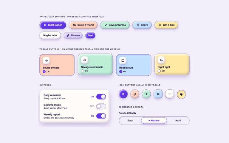
/* Buttons: pastel pills that float; hover lifts them, pressing squashes the shadow flat */
.clay-btn{display:inline-flex;align-items:center;justify-content:center;gap:.55rem;min-height:50px;margin:0;padding:.7rem 1.5rem;
  border:var(--clay-bw) solid var(--clay-edge);border-radius:999px;background:var(--clay-fill,var(--clay-surface));color:var(--clay-ink);
  font-family:inherit;font-size:1rem;font-weight:800;line-height:1.2;text-decoration:none;cursor:pointer;
  box-shadow:var(--clay-shadow-sm);transition:transform .18s,box-shadow .18s}
.clay-btn:hover{transform:translateY(-2px);box-shadow:var(--clay-shadow)}
.clay-btn:active{transform:translateY(2px);box-shadow:var(--clay-press)}
.clay-btn:focus-visible{outline:3px solid var(--clay-accent);outline-offset:4px}
.clay-btn--accent{--clay-fill:var(--clay-accent);border-color:var(--clay-accent);color:var(--clay-on-accent)}
.clay-btn--sm{min-height:40px;padding:.45rem 1.05rem;font-size:.88rem}
.clay-btn--block{width:100%}
/* Icon buttons: round (or squircle) clay pebbles with a chunky icon and an aria-label */
.clay-iconbtn{display:inline-grid;place-items:center;width:58px;height:58px;margin:0;padding:0;border:var(--clay-bw) solid var(--clay-edge);border-radius:50%;
  background:var(--clay-fill,var(--clay-surface));color:var(--clay-ink);cursor:pointer;box-shadow:var(--clay-shadow-sm);transition:transform .18s,box-shadow .18s}
.clay-iconbtn:hover{transform:translateY(-2px);box-shadow:var(--clay-shadow)}
.clay-iconbtn:active{transform:translateY(2px);box-shadow:var(--clay-press)}
.clay-iconbtn:focus-visible{outline:3px solid var(--clay-accent);outline-offset:4px}
.clay-iconbtn--sq{border-radius:20px}
.clay-iconbtn--sm{width:44px;height:44px}
.clay-iconbtn--lg{width:72px;height:72px}
.clay-iconbtn--accent{--clay-fill:var(--clay-accent);border-color:var(--clay-accent);color:var(--clay-on-accent)}
@media (prefers-reduced-motion:reduce){.clay-btn,.clay-iconbtn{transition:none}.clay-btn:hover,.clay-btn:active,.clay-iconbtn:hover,.clay-iconbtn:active{transform:none}}
/* Toggle tiles: a visually hidden checkbox and a puffy face. On = squashed flat (pressed shadow),
   an accent edge, a filled tick badge and the word On — never the shadow alone */
.clay-toggle{position:relative;display:block;cursor:pointer}
.clay-toggle__face{display:flex;flex-direction:column;align-items:flex-start;gap:.35rem;height:100%;padding:1.1rem 1.2rem 1rem;
  border:var(--clay-bw) solid var(--clay-edge);border-radius:calc(var(--clay-radius)*.8);background:var(--clay-fill,var(--clay-surface));color:var(--clay-ink);
  box-shadow:var(--clay-shadow);transition:transform .2s,box-shadow .2s,border-color .2s}
.clay-toggle__icon{display:grid;place-items:center;width:48px;height:48px;margin-bottom:.4rem;border-radius:17px;background:var(--clay-surface);box-shadow:var(--clay-shadow-sm)}
.clay-toggle__name{font-size:1.02rem;font-weight:800;line-height:1.25}
.clay-toggle__state{display:inline-flex;align-items:center;gap:.4rem;font-size:.82rem;font-weight:800;color:var(--clay-muted)}
.clay-toggle__state::after{content:"Off"}
.clay-toggle__mark{display:grid;place-items:center;width:20px;height:20px;border:2px solid var(--clay-edge);border-radius:50%;color:transparent;background:var(--clay-surface)}
.clay-toggle__mark .clay-ico{width:14px;height:14px}
.clay-toggle input:checked+.clay-toggle__face{transform:translateY(4px);border-color:var(--clay-accent);box-shadow:var(--clay-press)}
.clay-toggle input:checked+.clay-toggle__face .clay-toggle__state{color:var(--clay-ink)}
.clay-toggle input:checked+.clay-toggle__face .clay-toggle__state::after{content:"On"}
.clay-toggle input:checked+.clay-toggle__face .clay-toggle__mark{border-color:var(--clay-accent);background:var(--clay-accent);color:var(--clay-on-accent)}
.clay-toggle input:focus-visible+.clay-toggle__face{outline:3px solid var(--clay-accent);outline-offset:4px}
/* Icon toggle: a checkbox behind a round pebble; on = pressed flat, accent and the outline icon becomes a filled one */
.clay-itoggle{position:relative;display:inline-flex}
.clay-itoggle__face{display:grid;place-items:center;width:58px;height:58px;border:var(--clay-bw) solid var(--clay-edge);border-radius:50%;
  background:var(--clay-fill,var(--clay-surface));color:var(--clay-ink);box-shadow:var(--clay-shadow-sm);cursor:pointer;transition:transform .18s,box-shadow .18s}
.clay-itoggle__on{display:none}
.clay-itoggle input:checked+.clay-itoggle__face{transform:translateY(3px);border-color:var(--clay-accent);box-shadow:var(--clay-press)}
.clay-itoggle input:checked+.clay-itoggle__face .clay-itoggle__off{display:none}
.clay-itoggle input:checked+.clay-itoggle__face .clay-itoggle__on{display:block}
.clay-itoggle input:focus-visible+.clay-itoggle__face{outline:3px solid var(--clay-accent);outline-offset:4px}
@media (prefers-reduced-motion:reduce){.clay-toggle__face,.clay-itoggle__face{transition:none}}
/* Switches: a checkbox with role="switch". On = the puffy knob slides right, the track fills with accent and says On */
.clay-switch{position:relative;display:flex;align-items:center;gap:1rem;cursor:pointer}
.clay-switch__text{flex:1;min-width:0;font-weight:800;line-height:1.3}
.clay-switch__hint{display:block;margin-top:.15rem;font-size:.86rem;font-weight:500;color:var(--clay-muted)}
.clay-switch__state{min-width:2.2em;font-size:.75rem;font-weight:800;letter-spacing:.08em;text-align:right;text-transform:uppercase;color:var(--clay-muted)}
.clay-switch__state::after{content:"Off"}
.clay-switch__track{position:relative;flex:none;width:64px;height:36px;border:var(--clay-bw) solid var(--clay-edge);border-radius:999px;
  background:var(--clay-bg);box-shadow:var(--clay-well);transition:background-color .2s,border-color .2s}
.clay-switch__track::before{content:"";position:absolute;top:50%;left:3px;width:27px;height:27px;margin-top:-13.5px;border:var(--clay-bw) solid var(--clay-edge);
  border-radius:50%;background:var(--clay-surface);box-shadow:var(--clay-shadow-sm);transition:transform .2s}
.clay-switch input:checked~.clay-switch__track{background:var(--clay-accent);border-color:var(--clay-accent)}
.clay-switch input:checked~.clay-switch__track::before{transform:translateX(28px);border-color:var(--clay-on-accent)}
.clay-switch input:checked~.clay-switch__state{color:var(--clay-accent)}
.clay-switch input:checked~.clay-switch__state::after{content:"On"}
.clay-switch input:focus-visible~.clay-switch__track{outline:3px solid var(--clay-accent);outline-offset:4px}
@media (prefers-reduced-motion:reduce){.clay-switch__track,.clay-switch__track::before{transition:none}}
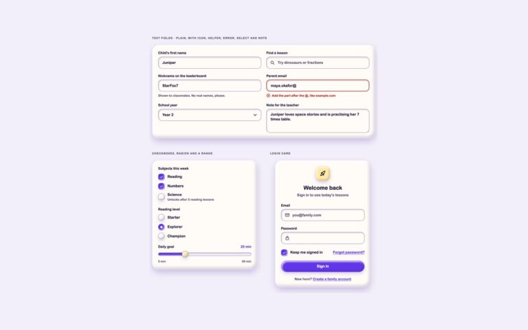
/* Fields: soft white wells with a 4:1 edge and a label above. Focus adds an accent edge and ring */
.clay-field{display:grid;align-content:start;gap:.45rem;min-width:0}
.clay-label{font-size:.92rem;font-weight:800;line-height:1.3}
.clay-control{position:relative;display:flex;align-items:center}
.clay-control>.clay-ico{position:absolute;left:16px;color:var(--clay-muted);pointer-events:none}
.clay-input{display:block;width:100%;min-height:52px;margin:0;padding:.75rem 1.1rem;border:var(--clay-bw) solid var(--clay-edge);border-radius:calc(var(--clay-radius)*.55);
  background:var(--clay-surface);color:var(--clay-ink);font-family:inherit;font-size:1rem;font-weight:600;line-height:1.35;box-shadow:var(--clay-well);
  appearance:none;transition:border-color .18s,box-shadow .18s}
.clay-input::placeholder{color:var(--clay-muted);opacity:1;font-weight:500}
.clay-input:focus{outline:3px solid var(--clay-accent);outline-offset:3px;border-color:var(--clay-accent)}
.clay-input--icon{padding-left:3.05rem}
.clay-input--select{padding-right:3rem;cursor:pointer}
.clay-control>.clay-ico.clay-control__chev{left:auto;right:16px;color:var(--clay-ink)}
.clay-input--area{min-height:104px;resize:vertical}
.clay-input--error{border-color:var(--clay-danger);border-width:2px}
.clay-help{margin:0;font-size:.85rem;color:var(--clay-muted)}
.clay-error{display:flex;align-items:center;gap:.4rem;margin:0;font-size:.85rem;font-weight:700;color:var(--clay-danger)}
.clay-error .clay-ico{width:18px;height:18px}
/* Checkboxes and radios: a hidden input and a puffy box. Checked = squashed flat, accent fill and a tick or dot */
.clay-group{min-width:0;margin:0;padding:0;border:0}
.clay-group__legend{float:none;width:auto;margin:0 0 .75rem;padding:0;font-size:.92rem;font-weight:800;line-height:1.3}
.clay-group__list{display:grid;gap:.8rem}
.clay-check{position:relative;display:flex;align-items:center;gap:.8rem;font-weight:700;cursor:pointer}
.clay-check__box{display:grid;place-items:center;flex:none;width:28px;height:28px;border:var(--clay-bw) solid var(--clay-edge);border-radius:10px;
  background:var(--clay-surface);color:transparent;box-shadow:var(--clay-shadow-sm);transition:transform .18s,box-shadow .18s,background-color .18s}
.clay-check__box .clay-ico{width:18px;height:18px}
.clay-check__box--radio{border-radius:50%}
.clay-check__box--radio::before{content:"";width:10px;height:10px;border-radius:50%;background:transparent}
.clay-check input:checked+.clay-check__box{transform:translateY(2px);border-color:var(--clay-accent);background:var(--clay-accent);color:var(--clay-on-accent);box-shadow:var(--clay-press)}
.clay-check input:checked+.clay-check__box--radio::before{background:var(--clay-on-accent)}
.clay-check input:focus-visible+.clay-check__box{outline:3px solid var(--clay-accent);outline-offset:3px}
.clay-check__hint{display:block;font-size:.84rem;font-weight:500;color:var(--clay-muted)}
/* Login card */
.clay-login{max-width:420px;width:100%;margin:0 auto}
.clay-login__badge{display:grid;place-items:center;width:64px;height:64px;margin:0 auto 1rem;border:var(--clay-bw) solid var(--clay-line);border-radius:22px;
  background:var(--clay-fill,var(--clay-lemon));box-shadow:var(--clay-shadow-sm)}
.clay-login__title{margin:0;font-size:1.5rem;font-weight:800;line-height:1.2;text-align:center}
.clay-login__sub{margin:.35rem 0 1.5rem;color:var(--clay-muted);text-align:center}
.clay-login__row{display:flex;flex-wrap:wrap;align-items:center;justify-content:space-between;gap:.75rem}
.clay-link{color:var(--clay-accent);font-weight:800;text-decoration:underline;text-underline-offset:3px;border-radius:6px}
.clay-link:hover{color:var(--clay-ink)}
.clay-link:focus-visible{outline:3px solid var(--clay-accent);outline-offset:3px}
.clay-login__foot{margin:1.25rem 0 0;font-size:.92rem;color:var(--clay-muted);text-align:center}
.clay-grid2{display:grid;grid-template-columns:repeat(auto-fit,minmax(min(100%,300px),1fr));gap:1.4rem}
@media (prefers-reduced-motion:reduce){.clay-input,.clay-check__box{transition:none}}
/* Range: native input. The track is a well, the thumb a puffy pebble; a few lines of script paint the fill */
.clay-range-head{display:flex;justify-content:space-between;align-items:baseline;gap:1rem}
.clay-range-out{font-size:.92rem;font-weight:800;color:var(--clay-accent)}
.clay-range{--clay-val:50%;display:block;width:100%;height:30px;margin:0;background:transparent;appearance:none;cursor:pointer}
.clay-range::-webkit-slider-runnable-track{height:14px;border:var(--clay-bw) solid var(--clay-edge);border-radius:999px;box-shadow:var(--clay-well);
  background:linear-gradient(90deg,var(--clay-accent) var(--clay-val),var(--clay-bg) var(--clay-val))}
.clay-range::-moz-range-track{height:14px;border:var(--clay-bw) solid var(--clay-edge);border-radius:999px;background:var(--clay-bg);box-shadow:var(--clay-well)}
.clay-range::-moz-range-progress{height:14px;border-radius:999px;background:var(--clay-accent)}
.clay-range::-webkit-slider-thumb{width:28px;height:28px;margin-top:-8.5px;border:var(--clay-bw) solid var(--clay-edge);border-radius:50%;background:var(--clay-lemon);box-shadow:var(--clay-shadow-sm);appearance:none}
.clay-range::-moz-range-thumb{width:28px;height:28px;border:var(--clay-bw) solid var(--clay-edge);border-radius:50%;background:var(--clay-lemon);box-shadow:var(--clay-shadow-sm)}
.clay-range:focus-visible{outline:3px solid var(--clay-accent);outline-offset:4px;border-radius:999px}
.clay-range-scale{display:flex;justify-content:space-between;margin:0;font-size:.8rem;color:var(--clay-muted)}
/* Blob: a small puffy icon tile that sits on any card */
.clay-blob{display:grid;place-items:center;flex:none;width:52px;height:52px;border:var(--clay-bw) solid var(--clay-line);border-radius:18px;
  background:var(--clay-fill,var(--clay-surface));color:var(--clay-ink);box-shadow:var(--clay-shadow-sm)}
.clay-chip{display:inline-flex;align-items:center;gap:.35rem;padding:.3rem .75rem;border:var(--clay-bw) solid var(--clay-line);border-radius:999px;
  background:var(--clay-surface);color:var(--clay-ink);font-size:.8rem;font-weight:800;line-height:1.3}
.clay-chip .clay-ico{width:16px;height:16px}
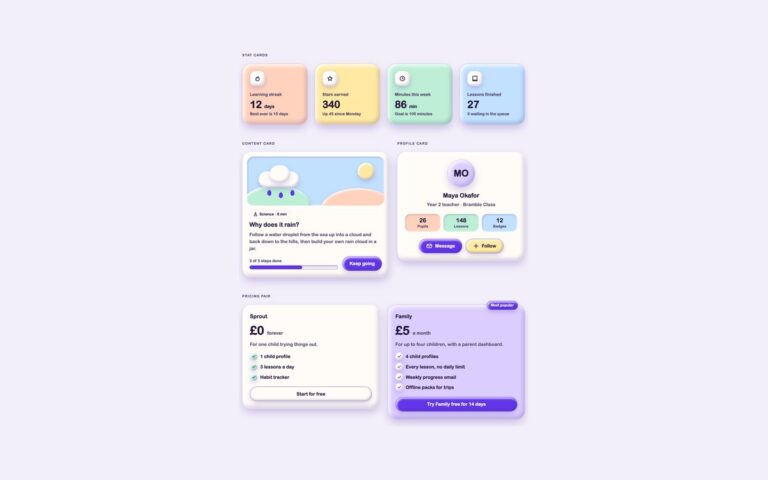
/* Stat cards: coloured clay slabs with a blob icon, a big number and a sentence that explains the change */
.clay-stats{display:grid;grid-template-columns:repeat(auto-fit,minmax(200px,1fr));gap:24px}
.clay-stat{display:grid;gap:.25rem;align-content:start}
.clay-stat__label{margin:.85rem 0 0;font-size:.9rem;font-weight:800;color:var(--clay-muted)}
.clay-stat__value{margin:0;font-size:2.2rem;font-weight:800;line-height:1.1;letter-spacing:-.01em}
.clay-stat__unit{font-size:1rem;font-weight:700}
.clay-stat__note{margin:0;font-size:.86rem;font-weight:600;color:var(--clay-muted)}
/* Content card: an illustration panel made of clay shapes, a chip, a title and a progress line */
.clay-lesson{display:flex;flex-direction:column;gap:1rem;padding:1rem 1rem 1.4rem}
.clay-art{position:relative;height:170px;overflow:hidden;border-radius:calc(var(--clay-radius)*.75);background:var(--clay-sky);box-shadow:var(--clay-well)}
.clay-art__shape{position:absolute;border-radius:50%;box-shadow:var(--clay-shadow-sm)}
.clay-art__shape--sun{top:22px;right:34px;width:58px;height:58px;background:var(--clay-lemon)}
.clay-art__shape--cloud{top:52px;left:40px;width:140px;height:54px;border-radius:999px;background:var(--clay-surface)}
.clay-art__shape--cloud2{top:30px;left:78px;width:70px;height:60px;background:var(--clay-surface)}
.clay-art__shape--hill{bottom:-70px;left:-20px;width:240px;height:140px;background:var(--clay-mint)}
.clay-art__shape--hill2{bottom:-90px;right:-40px;width:260px;height:150px;background:var(--clay-peach)}
.clay-art__shape--drop{top:116px;width:14px;height:20px;border-radius:50% 50% 50% 50%/60% 60% 40% 40%;background:var(--clay-accent);box-shadow:none}
.clay-lesson__body{display:grid;gap:.55rem;padding:0 .5rem}
.clay-lesson__tag{margin:0}
.clay-lesson__title{margin:0;font-size:1.3rem;font-weight:800;line-height:1.25}
.clay-lesson__text{margin:0;color:var(--clay-muted)}
.clay-lesson__foot{display:flex;flex-wrap:wrap;align-items:center;justify-content:space-between;gap:1rem;padding:0 .5rem}
.clay-meter{display:grid;gap:.35rem;flex:1;min-width:140px;font-size:.84rem;font-weight:700;color:var(--clay-muted)}
.clay-meter__bar{height:14px;border:var(--clay-bw) solid var(--clay-edge);border-radius:999px;background:var(--clay-bg);box-shadow:var(--clay-well);overflow:hidden}
.clay-meter__fill{display:block;height:100%;width:var(--clay-pct,50%);border-radius:999px;background:var(--clay-accent)}
/* Profile card */
.clay-profile{display:grid;justify-items:center;gap:.4rem;text-align:center}
.clay-avatar{display:grid;place-items:center;width:96px;height:96px;margin-bottom:.6rem;border:var(--clay-bw) solid var(--clay-line);border-radius:50%;
  background:var(--clay-fill,var(--clay-lilac));font-size:2rem;font-weight:800;box-shadow:var(--clay-shadow)}
.clay-profile__name{margin:0;font-size:1.3rem;font-weight:800;line-height:1.25}
.clay-profile__role{margin:0;color:var(--clay-muted)}
.clay-profile__stats{display:grid;grid-template-columns:repeat(3,1fr);gap:10px;width:100%;margin:.9rem 0 1.1rem;padding:0;list-style:none}
.clay-profile__stat{display:grid;padding:.6rem .3rem;border-radius:18px;background:var(--clay-fill,var(--clay-bg));box-shadow:var(--clay-well)}
.clay-profile__num{font-size:1.25rem;font-weight:800;line-height:1.2}
.clay-profile__key{font-size:.78rem;font-weight:700;color:var(--clay-muted)}
.clay-profile__actions{display:flex;flex-wrap:wrap;justify-content:center;gap:12px}
/* Pricing pair */
.clay-plans{display:grid;grid-template-columns:repeat(auto-fit,minmax(260px,1fr));gap:28px;align-items:start}
.clay-plan{position:relative;display:grid;gap:.9rem}
.clay-plan__badge{position:absolute;top:-14px;right:24px;padding:.3rem .85rem;border:var(--clay-bw) solid var(--clay-accent);border-radius:999px;
  background:var(--clay-accent);color:var(--clay-on-accent);font-size:.78rem;font-weight:800;box-shadow:var(--clay-shadow-sm)}
.clay-plan__name{margin:0;font-size:1.15rem;font-weight:800}
.clay-plan__price{margin:0;font-size:2.6rem;font-weight:800;line-height:1}
.clay-plan__per{font-size:1rem;font-weight:700;color:var(--clay-muted)}
.clay-plan__desc{margin:0;color:var(--clay-muted)}
.clay-plan__list{display:grid;gap:.6rem;margin:.2rem 0 .4rem;padding:0;list-style:none}
.clay-plan__item{display:flex;align-items:center;gap:.6rem;font-weight:600}
.clay-plan__tick{display:grid;place-items:center;flex:none;width:26px;height:26px;border-radius:50%;background:var(--clay-fill,var(--clay-surface));box-shadow:var(--clay-shadow-sm)}
.clay-plan__tick .clay-ico{width:16px;height:16px}
.clay-two{display:grid;grid-template-columns:minmax(0,1.15fr) minmax(0,1fr);gap:28px;align-items:start}
@media (max-width:767px){.clay-two{grid-template-columns:1fr}}
.clay-stats--two{grid-template-columns:repeat(auto-fit,minmax(150px,1fr))}
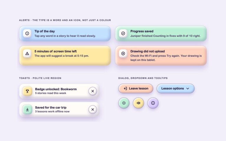
/* Alerts: coloured clay slabs that name their type in a word, an icon and hidden text, not only in colour */
.clay-alerts{display:grid;grid-template-columns:repeat(auto-fit,minmax(min(100%,380px),1fr));gap:22px}
.clay-alert{display:flex;align-items:flex-start;gap:1rem;padding:1.1rem 1.2rem;border:var(--clay-bw) solid var(--clay-line);border-radius:calc(var(--clay-radius)*.8);
  background:var(--clay-fill,var(--clay-surface));color:var(--clay-ink);box-shadow:var(--clay-shadow)}
.clay-alert__icon{display:grid;place-items:center;flex:none;width:44px;height:44px;border-radius:15px;background:var(--clay-surface);box-shadow:var(--clay-shadow-sm)}
.clay-alert__title{margin:0;font-weight:800;line-height:1.3}
.clay-alert__text{margin:.15rem 0 0;font-size:.92rem;color:var(--clay-muted)}
.clay-widgets{display:grid;grid-template-columns:repeat(auto-fit,minmax(min(100%,400px),1fr));gap:28px;align-items:start}
.clay-wtitle{margin:0;font-size:1.1rem;font-weight:800;line-height:1.3}
.clay-wsub{margin:0;font-size:.88rem;color:var(--clay-muted)}
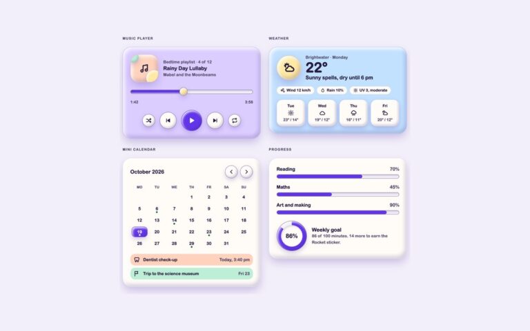
/* Music player: a clay cover, a seek range and round controls; Play swaps to Pause and says so */
.clay-player{display:grid;gap:1.1rem}
.clay-player__top{display:flex;align-items:center;gap:1.1rem}
.clay-cover{position:relative;display:grid;place-items:center;flex:none;width:96px;height:96px;border:var(--clay-bw) solid var(--clay-line);border-radius:28px;
  background:var(--clay-peach);box-shadow:var(--clay-shadow);overflow:hidden}
.clay-cover::before,.clay-cover::after{content:"";position:absolute;border-radius:50%;box-shadow:var(--clay-shadow-sm)}
.clay-cover::before{right:-14px;bottom:-14px;width:54px;height:54px;background:var(--clay-lemon)}
.clay-cover::after{left:-10px;top:-10px;width:38px;height:38px;background:var(--clay-mint)}
.clay-cover .clay-ico{position:relative;z-index:1;width:36px;height:36px}
.clay-player__meta{min-width:0}
.clay-player__times{display:flex;justify-content:space-between;margin:-.4rem 0 0;font-size:.82rem;font-weight:700;color:var(--clay-muted)}
.clay-player__controls{display:flex;align-items:center;justify-content:center;gap:clamp(6px,2vw,16px)}
.clay-play .clay-play__pause,.clay-play[data-playing="true"] .clay-play__play{display:none}
.clay-play[data-playing="true"] .clay-play__pause{display:block}
/* Weather */
.clay-weather{display:grid;gap:1.1rem}
.clay-weather__now{display:flex;align-items:center;gap:1rem}
.clay-weather__icon{display:grid;place-items:center;flex:none;width:84px;height:84px;border:var(--clay-bw) solid var(--clay-line);border-radius:50%;background:var(--clay-lemon);box-shadow:var(--clay-shadow)}
.clay-weather__icon .clay-ico{width:42px;height:42px}
.clay-weather__temp{margin:0;font-size:3rem;font-weight:800;line-height:1}
.clay-weather__facts{display:flex;flex-wrap:wrap;gap:8px;margin:0;padding:0;list-style:none}
.clay-days{display:grid;grid-template-columns:repeat(4,minmax(0,1fr));gap:10px;margin:0;padding:0;list-style:none}
.clay-day{display:grid;justify-items:center;gap:.2rem;padding:.7rem .3rem;border:var(--clay-bw) solid var(--clay-line);border-radius:20px;background:var(--clay-surface);box-shadow:var(--clay-shadow-sm);text-align:center}
.clay-day__name{font-size:.82rem;font-weight:800}
.clay-day__temp{font-size:.82rem;font-weight:700;color:var(--clay-muted)}
/* Mini calendar: a real table; today is an accent pebble with aria-current="date", event days get a dot and hidden text */
.clay-cal{display:grid;gap:.9rem}
.clay-cal__head{display:flex;align-items:center;justify-content:space-between;gap:.5rem}
.clay-cal__nav{display:flex;gap:8px}
.clay-cal__table{width:100%;border-collapse:separate;border-spacing:4px;table-layout:fixed;text-align:center}
.clay-cal__th{padding:.2rem 0;font-size:.74rem;font-weight:800;color:var(--clay-muted);text-transform:uppercase}
.clay-cal__th abbr{text-decoration:none;cursor:help}
.clay-cal__td{padding:0;font-size:.9rem;font-weight:700}
.clay-cal__day{position:relative;display:grid;place-items:center;height:36px;border-radius:13px}
.clay-cal__day--event::after{content:"";position:absolute;bottom:3px;left:50%;width:6px;height:6px;margin-left:-3px;border-radius:50%;background:var(--clay-success)}
.clay-cal__day--today{border:var(--clay-bw) solid var(--clay-accent);background:var(--clay-accent);color:var(--clay-on-accent);font-weight:800;box-shadow:var(--clay-shadow-sm)}
.clay-cal__day--today.clay-cal__day--event::after{background:var(--clay-on-accent)}
.clay-cal__list{display:grid;gap:8px;margin:0;padding:0;list-style:none}
.clay-cal__item{display:flex;align-items:center;gap:.7rem;padding:.55rem .7rem;border-radius:16px;background:var(--clay-fill,var(--clay-bg));font-size:.9rem;font-weight:700}
.clay-cal__when{margin-left:auto;font-weight:600;color:var(--clay-muted)}
/* Progress: bars with role="progressbar" and a conic-gradient ring for the weekly goal */
.clay-progress{display:grid;gap:1.1rem}
.clay-progress__row{display:grid;gap:.4rem}
.clay-progress__label{display:flex;justify-content:space-between;margin:0;font-weight:800}
.clay-progress__pct{color:var(--clay-muted)}
.clay-goal{display:flex;align-items:center;gap:1.1rem;padding-top:.3rem}
.clay-ring{--clay-pct:50;position:relative;display:grid;place-items:center;flex:none;width:104px;height:104px;border-radius:50%;
  background:conic-gradient(var(--clay-accent) calc(var(--clay-pct)*1%),var(--clay-bg) 0);box-shadow:var(--clay-shadow-sm);border:var(--clay-bw) solid var(--clay-edge)}
.clay-ring::before{content:"";position:absolute;inset:14px;border-radius:50%;background:var(--clay-surface);box-shadow:var(--clay-well)}
.clay-ring__value{position:relative;font-size:1.25rem;font-weight:800}
JavaScript
// Music player: Play / Pause swaps its label and icon; the seek range reads "1:42 of 3:58"
document.querySelectorAll('[data-clay-player]').forEach(function (p) {
  var play = p.querySelector('[data-clay-play]'), seek = p.querySelector('[data-clay-seek]'), now = p.querySelector('[data-clay-now]');
  function fmt(s) { s = Math.round(s); return Math.floor(s / 60) + ':' + String(s % 60).padStart(2, '0'); }
  if (play) play.addEventListener('click', function () {
    var on = play.getAttribute("data-playing") !== "true";
    play.setAttribute("data-playing", on); play.setAttribute('aria-label', on ? 'Pause' : 'Play');
  });
  if (seek) {
    var paint = function () {
      var pct = (seek.value - seek.min) / (seek.max - seek.min) * 100;
      seek.style.setProperty('--clay-val', pct + '%');
      if (now) now.textContent = fmt(seek.value);
      seek.setAttribute('aria-valuetext', fmt(seek.value) + ' of ' + fmt(seek.max));
    };
    seek.addEventListener('input', paint); paint();
  }
});
/* ── Claymorphism UI kit tokens (uiCookies) — identical in every set ──────────────
   Every component is a puffy pastel object floating above --clay-bg: one big soft drop shadow
   below it, an inset highlight top left and an inset shade bottom right. Change a token and
   the whole kit follows; the shadow recipes below are built from these values. */
:root{
  --clay-bg:#f3effa;          /* page, a pale lilac white */
  --clay-surface:#fffcf8;     /* cards, fields and plain objects */
  --clay-peach:#ffd2bd;       /* object fills: ink text on every fill reaches 11:1 */
  --clay-lilac:#dccdff;
  --clay-mint:#bdeed6;
  --clay-sky:#c2e0ff;
  --clay-lemon:#ffe9a3;
  --clay-ink:#241a3d;         /* text, 14.4:1 on --clay-bg */
  --clay-muted:#51476a;       /* secondary text, 5.7:1 or more on every fill */
  --clay-edge:#7a6e96;        /* control boundary, 4.1:1 on --clay-bg, so shadows are never the only edge */
  --clay-line:rgba(36,26,61,.12); /* decorative edge on cards and panels */
  --clay-accent:#6236e8;      /* focus ring and on / selected / current states, 5.8:1 on --clay-bg */
  --clay-on-accent:#ffffff;   /* text and marks on accent fills, 6.5:1 */
  --clay-tint:#e9e1ff;        /* light accent wash behind current items */
  --clay-drop:rgba(86,56,168,.30); /* colour of the outer drop shadow */
  --clay-hi:rgba(255,255,255,.88);  /* inset highlight, top left */
  --clay-lo:rgba(52,30,112,.20);    /* inset shade, bottom right */
  --clay-lift:14px;           /* how high objects float; every shadow scales from it */
  --clay-radius:30px;         /* cards; buttons are pills, fields use .55 of it */
  --clay-bw:1.5px;            /* control border width */
  --clay-success:#17663d;--clay-warning:#8a4b00;--clay-danger:#b3261e;
  --clay-font:ui-rounded,"SF Pro Rounded","Nunito","Quicksand","Varela Round","Arial Rounded MT Bold",system-ui,sans-serif;
}
/* --clay-fill is set by .clay-peach, .clay-mint… on one object and must not leak into its children */
@property --clay-fill{syntax:"*";inherits:false}
/* Dark clay: data-clay="dark" on any wrapper, or a checked .clay-theme-input inside a [data-clay] element.
   :is() is a forgiving list, so browsers without :has() still apply data-clay="dark" */
[data-clay]:is([data-clay="dark"],:has(.clay-theme-input:checked)){
  --clay-bg:#1a1530;--clay-surface:#2a2347;
  --clay-peach:#6e3f33;--clay-lilac:#4a3a8a;--clay-mint:#215a4a;--clay-sky:#26497c;--clay-lemon:#5f5220;
  --clay-ink:#f7f3ff;--clay-muted:#d2c9ea;--clay-edge:#8f83b8;--clay-line:rgba(255,255,255,.1);
  --clay-accent:#bba6ff;--clay-on-accent:#1a1530;--clay-tint:#3a2f66;
  --clay-drop:rgba(4,2,14,.62);--clay-hi:rgba(255,255,255,.2);--clay-lo:rgba(0,0,0,.34);
  --clay-success:#86e3b0;--clay-warning:#ffc76e;--clay-danger:#ffa196;color-scheme:dark}
/* More contrast requested: soft shading stays, but every edge and secondary text turns full ink */
@media (prefers-contrast:more){:root,[data-clay]:is([data-clay],:has(.clay-theme-input:checked)){
  --clay-edge:var(--clay-ink);--clay-line:var(--clay-ink);--clay-muted:var(--clay-ink);--clay-bw:2px}}
:root,[data-clay]{
  --clay-shadow:0 var(--clay-lift) calc(var(--clay-lift)*2.2) calc(var(--clay-lift)*-.3) var(--clay-drop),
    inset calc(var(--clay-lift)*.45) calc(var(--clay-lift)*.5) calc(var(--clay-lift)*.9) var(--clay-hi),
    inset calc(var(--clay-lift)*-.45) calc(var(--clay-lift)*-.6) calc(var(--clay-lift)*.9) var(--clay-lo);
  --clay-shadow-sm:0 calc(var(--clay-lift)*.55) calc(var(--clay-lift)*1.2) calc(var(--clay-lift)*-.15) var(--clay-drop),
    inset calc(var(--clay-lift)*.25) calc(var(--clay-lift)*.3) calc(var(--clay-lift)*.5) var(--clay-hi),
    inset calc(var(--clay-lift)*-.25) calc(var(--clay-lift)*-.35) calc(var(--clay-lift)*.5) var(--clay-lo);
  --clay-press:0 calc(var(--clay-lift)*.12) calc(var(--clay-lift)*.25) 0 var(--clay-drop),
    inset calc(var(--clay-lift)*.2) calc(var(--clay-lift)*.25) calc(var(--clay-lift)*.45) var(--clay-lo),
    inset calc(var(--clay-lift)*-.12) calc(var(--clay-lift)*-.12) calc(var(--clay-lift)*.3) var(--clay-hi);
  --clay-well:inset calc(var(--clay-lift)*.15) calc(var(--clay-lift)*.22) calc(var(--clay-lift)*.45) var(--clay-lo),
    inset calc(var(--clay-lift)*-.12) calc(var(--clay-lift)*-.12) calc(var(--clay-lift)*.3) var(--clay-hi);
}
[data-clay]{background:var(--clay-bg);color:var(--clay-ink)}
/* Bootstrap's own variables mapped onto the kit tokens */
:root,[data-clay]{--bs-body-bg:var(--clay-bg);--bs-body-color:var(--clay-ink);--bs-body-font-family:var(--clay-font);
  --bs-emphasis-color:var(--clay-ink);--bs-heading-color:var(--clay-ink);--bs-secondary-color:var(--clay-muted);--bs-tertiary-color:var(--clay-muted);
  --bs-border-color:var(--clay-edge);--bs-border-width:var(--clay-bw);--bs-border-radius:calc(var(--clay-radius)*.55);
  --bs-border-radius-lg:var(--clay-radius);--bs-border-radius-pill:999px;--bs-focus-ring-color:var(--clay-accent);
  --bs-link-color:var(--clay-accent);--bs-link-color-rgb:98,54,232;--bs-link-hover-color:var(--clay-ink);--bs-link-hover-color-rgb:36,26,61}
/* Components */
:where([class*="clay-"]),:where([class*="clay-"])::before,:where([class*="clay-"])::after{box-sizing:border-box}
.clay-sr{position:absolute;width:1px;height:1px;padding:0;margin:-1px;overflow:hidden;clip:rect(0,0,0,0);white-space:nowrap;border:0}
.clay-ico{width:22px;height:22px;flex:none}
.clay-ico--lg{width:28px;height:28px}
/* Fills: put one on any object; components read --clay-fill */
.clay-peach{--clay-fill:var(--clay-peach)}.clay-lilac{--clay-fill:var(--clay-lilac)}.clay-mint{--clay-fill:var(--clay-mint)}
.clay-sky{--clay-fill:var(--clay-sky)}.clay-lemon{--clay-fill:var(--clay-lemon)}
/* Card: a puffy panel that floats on the big drop shadow */
.clay-card{margin:0;padding:1.6rem;border:var(--clay-bw) solid var(--clay-line);border-radius:var(--clay-radius);
  background:var(--clay-fill,var(--clay-surface));color:var(--clay-ink);box-shadow:var(--clay-shadow)}
/* Layout helpers */
.clay-cluster{display:flex;flex-wrap:wrap;align-items:center;gap:18px}
.clay-tiles{display:grid;grid-template-columns:repeat(auto-fit,minmax(160px,1fr));gap:22px}
.clay-stack{display:grid;gap:1.4rem}
/* Cards: Bootstrap .card through its --bs-card-* variables */
.card.clay-card{--bs-card-bg:var(--clay-fill,var(--clay-surface));--bs-card-color:var(--clay-ink);--bs-card-border-color:var(--clay-line);
  --bs-card-border-width:var(--clay-bw);--bs-card-border-radius:var(--clay-radius);--bs-card-inner-border-radius:var(--clay-radius);
  --bs-card-spacer-x:1.6rem;--bs-card-spacer-y:1.6rem;padding:0}
/* Buttons: Bootstrap .btn with a .btn-clay variant set through --bs-btn-* variables.
   Hover lifts the pill, pressing squashes the shadow flat */
.btn-clay{--bs-btn-padding-x:1.5rem;--bs-btn-padding-y:.7rem;--bs-btn-font-family:inherit;--bs-btn-font-size:1rem;--bs-btn-font-weight:800;--bs-btn-line-height:1.2;
  --bs-btn-border-width:var(--clay-bw);--bs-btn-border-radius:999px;
  --bs-btn-bg:var(--clay-fill,var(--clay-surface));--bs-btn-color:var(--clay-ink);--bs-btn-border-color:var(--clay-edge);
  --bs-btn-hover-bg:var(--bs-btn-bg);--bs-btn-hover-color:var(--bs-btn-color);--bs-btn-hover-border-color:var(--bs-btn-border-color);
  --bs-btn-active-bg:var(--bs-btn-bg);--bs-btn-active-color:var(--bs-btn-color);--bs-btn-active-border-color:var(--bs-btn-border-color);
  --clay-btn-shadow:var(--clay-shadow-sm);
  display:inline-flex;align-items:center;justify-content:center;gap:.55rem;min-height:50px;
  box-shadow:var(--clay-btn-shadow);transition:transform .18s,box-shadow .18s}
.btn-clay:hover{--clay-btn-shadow:var(--clay-shadow);transform:translateY(-2px)}
.btn-clay:active,.btn-clay:first-child:active{--clay-btn-shadow:var(--clay-press);transform:translateY(2px)}
.btn-clay:focus-visible,.btn-check:focus-visible+.btn-clay{box-shadow:var(--clay-btn-shadow);outline:3px solid var(--clay-accent);outline-offset:4px}
.btn-clay-accent{--clay-fill:var(--clay-accent);--bs-btn-color:var(--clay-on-accent);--bs-btn-border-color:var(--clay-accent)}
.btn-clay.btn-sm{--bs-btn-padding-x:1.05rem;--bs-btn-padding-y:.45rem;--bs-btn-font-size:.88rem;min-height:40px}
/* Icon buttons: a round or squircle .btn-clay with an aria-label */
.btn-clay-icon{--bs-btn-padding-x:0;--bs-btn-padding-y:0;width:58px;height:58px;min-height:0;border-radius:50%}
.btn-clay-icon.btn-clay-sq{border-radius:20px}
.btn-clay-icon.btn-clay-sm{width:44px;height:44px}
.btn-clay-icon.btn-clay-lg{width:72px;height:72px}
@media (prefers-reduced-motion:reduce){.btn-clay{transition:none}.btn-clay:hover,.btn-clay:active,.btn-clay:first-child:active{transform:none}}
/* Toggle tiles: Bootstrap .btn-check + .btn. On = squashed flat, accent edge, a filled tick badge and the word On */
.btn-clay-tile{--bs-btn-padding-x:1.2rem;--bs-btn-padding-y:1.1rem;--bs-btn-border-radius:calc(var(--clay-radius)*.8);--clay-btn-shadow:var(--clay-shadow);
  flex-direction:column;align-items:flex-start;justify-content:flex-start;gap:.35rem;width:100%;height:100%;padding-bottom:1rem;text-align:left}
.btn-clay-tile:hover{--clay-btn-shadow:var(--clay-shadow);transform:none}
.btn-check:checked+.btn-clay-tile{--clay-btn-shadow:var(--clay-press);--bs-btn-active-border-color:var(--clay-accent);transform:translateY(4px)}
.clay-tile-icon{display:grid;place-items:center;width:48px;height:48px;margin-bottom:.4rem;border-radius:17px;background:var(--clay-surface);box-shadow:var(--clay-shadow-sm)}
.clay-tile-name{font-size:1.02rem;font-weight:800;line-height:1.25}
.clay-tile-state{display:inline-flex;align-items:center;gap:.4rem;font-size:.82rem;font-weight:800;color:var(--clay-muted)}
.clay-tile-state::after{content:"Off"}
.clay-tile-mark{display:grid;place-items:center;width:20px;height:20px;border:2px solid var(--clay-edge);border-radius:50%;color:transparent;background:var(--clay-surface)}
.clay-tile-mark .clay-ico{width:14px;height:14px}
.btn-check:checked+.btn-clay-tile .clay-tile-state{color:var(--clay-ink)}
.btn-check:checked+.btn-clay-tile .clay-tile-state::after{content:"On"}
.btn-check:checked+.btn-clay-tile .clay-tile-mark{border-color:var(--clay-accent);background:var(--clay-accent);color:var(--clay-on-accent)}
/* Icon toggle: .btn-check + a round .btn-clay. Pressed = flat, accent edge, filled icon */
.btn-check+.btn-clay-icon .clay-ico+.clay-ico,.btn-check:checked+.btn-clay-icon .clay-ico:first-of-type{display:none}
.btn-check:checked+.btn-clay-icon .clay-ico+.clay-ico{display:block}
.btn-check:checked+.btn-clay-icon{--clay-btn-shadow:var(--clay-press);--bs-btn-active-border-color:var(--clay-accent);transform:translateY(3px)}
/* Switches: Bootstrap .form-check.form-switch. The knob is a token-coloured radial gradient so it follows light and dark */
.clay-bswitch{display:flex;align-items:center;gap:1rem;min-height:0;margin:0;padding:0}
.clay-bswitch .form-check-label{flex:1;min-width:0;font-weight:800;line-height:1.3;cursor:pointer}
.clay-bswitch .clay-switch-hint{display:block;margin-top:.15rem;font-size:.86rem;font-weight:500;color:var(--clay-muted)}
.clay-bswitch .clay-switch-state{order:2;min-width:2.2em;font-size:.75rem;font-weight:800;letter-spacing:.08em;text-align:right;text-transform:uppercase;color:var(--clay-muted)}
.clay-bswitch .clay-switch-state::after{content:"Off"}
.clay-bswitch.form-switch .form-check-input,.clay-bswitch.form-switch .form-check-input:focus,.clay-bswitch.form-switch .form-check-input:checked,.clay-bswitch.form-switch .form-check-input:not(:checked):not(:focus){
  --bs-form-switch-bg:radial-gradient(circle at 50% 50%,var(--clay-knob) 0 12px,var(--clay-knob-edge) 12.5px 14px,transparent 14.5px)}
.clay-bswitch.form-switch .form-check-input{--clay-knob:var(--clay-surface);--clay-knob-edge:var(--clay-edge);order:3;flex:none;float:none;width:64px;height:36px;margin:0;
  border:var(--clay-bw) solid var(--clay-edge);background-color:var(--clay-bg);background-size:34px 34px;background-position:left center;box-shadow:var(--clay-well);cursor:pointer;
  transition:background-position .2s,background-color .2s,border-color .2s}
.clay-bswitch.form-switch .form-check-input:focus{border-color:var(--clay-edge);box-shadow:var(--clay-well)}
.clay-bswitch.form-switch .form-check-input:checked{--clay-knob-edge:var(--clay-on-accent);background-color:var(--clay-accent);border-color:var(--clay-accent);background-position:right center}
.clay-bswitch.form-switch .form-check-input:focus-visible{outline:3px solid var(--clay-accent);outline-offset:4px}
.clay-bswitch.form-switch .form-check-input:checked~.clay-switch-state{color:var(--clay-accent)}
.clay-bswitch.form-switch .form-check-input:checked~.clay-switch-state::after{content:"On"}
/* Segmented control: .btn-group of .btn-check radios. The chosen option pops up as a lifted pebble with a dot */
.clay-bseg{min-width:0;margin:0;padding:0;border:0}
.clay-bseg legend{float:none;width:auto;margin:0 0 .65rem;padding:0;font-size:.92rem;font-weight:800;line-height:1.4}
.clay-bseg .btn-group{display:flex;flex-wrap:wrap;gap:6px;width:100%;padding:6px;border:var(--clay-bw) solid var(--clay-edge);border-radius:999px;background:var(--clay-bg);box-shadow:var(--clay-well)}
.clay-bseg .btn{--bs-btn-padding-x:1rem;--bs-btn-padding-y:.4rem;--bs-btn-font-size:.92rem;--bs-btn-font-weight:800;--bs-btn-border-width:var(--clay-bw);
  --bs-btn-color:var(--clay-muted);--bs-btn-border-color:transparent;--bs-btn-hover-color:var(--clay-ink);--bs-btn-hover-border-color:transparent;
  --bs-btn-active-bg:var(--clay-surface);--bs-btn-active-color:var(--clay-accent);--bs-btn-active-border-color:var(--clay-accent);
  display:flex;flex:1 1 auto;align-items:center;justify-content:center;gap:.4rem;min-height:42px;border-radius:999px!important;margin:0!important;transition:box-shadow .18s,background-color .18s}
.clay-bseg .btn-check:checked+.btn{box-shadow:var(--clay-shadow-sm)}
.clay-bseg .btn-check:checked+.btn::before{content:"";width:8px;height:8px;border-radius:50%;background:currentColor}
.clay-bseg .btn-check:focus-visible+.btn{outline:3px solid var(--clay-accent);outline-offset:2px;box-shadow:var(--clay-shadow-sm)}
@media (prefers-reduced-motion:reduce){.clay-bswitch.form-switch .form-check-input,.clay-bseg .btn{transition:none}}
/* Forms: Bootstrap .form-control, .form-select, .form-check-input and .form-range inside .clay-bform */
.clay-bform{--bs-form-invalid-color:var(--clay-danger);--bs-form-invalid-border-color:var(--clay-danger)}
.clay-bform .form-label{margin:0 0 .45rem;font-size:.92rem;font-weight:800;line-height:1.3}
.clay-bform .form-control,.clay-bform .form-select{min-height:52px;padding:.75rem 1.1rem;border:var(--clay-bw) solid var(--clay-edge);border-radius:calc(var(--clay-radius)*.55);
  background-color:var(--clay-surface);color:var(--clay-ink);font-size:1rem;font-weight:600;line-height:1.35;box-shadow:var(--clay-well);transition:border-color .18s,box-shadow .18s}
.clay-bform .form-control::placeholder{color:var(--clay-muted);opacity:1;font-weight:500}
.clay-bform .form-control:focus,.clay-bform .form-select:focus{border-color:var(--clay-accent);background-color:var(--clay-surface);color:var(--clay-ink);box-shadow:var(--clay-well);outline:3px solid var(--clay-accent);outline-offset:3px}
.clay-bform .form-select{padding-right:3rem;background-image:none;cursor:pointer}
.clay-bform textarea.form-control{min-height:104px}
.clay-bform .form-control.is-invalid{padding-right:1.1rem;border-width:2px;border-color:var(--clay-danger);background-image:none}
.clay-bform .form-control.is-invalid:focus{border-color:var(--clay-danger);box-shadow:var(--clay-well)}
.clay-bform .invalid-feedback{display:flex;align-items:center;gap:.4rem;margin:.45rem 0 0;font-size:.85rem;font-weight:700;color:var(--clay-danger)}
.clay-bform .invalid-feedback .clay-ico{width:18px;height:18px}
.clay-bform .form-text{margin:.45rem 0 0;font-size:.85rem;color:var(--clay-muted)}
.clay-bform .clay-control{position:relative;display:flex;align-items:center}
.clay-bform .clay-control>.clay-ico{position:absolute;left:16px;z-index:1;color:var(--clay-muted);pointer-events:none}
.clay-bform .clay-control>.clay-ico.clay-control__chev{left:auto;right:16px;color:var(--clay-ink)}
.clay-bform .clay-control .form-control{padding-left:3.05rem}
/* Checkboxes and radios: puffy boxes that squash flat and fill with accent when checked */
.clay-bform .clay-bgroup{min-width:0;margin:0;padding:0;border:0}
.clay-bform .clay-bgroup legend{float:none;width:auto;margin:0 0 .75rem;padding:0;font-size:.92rem;font-weight:800;line-height:1.3}
.clay-bform .form-check{display:flex;align-items:center;gap:.8rem;min-height:0;margin:0 0 .8rem;padding:0}
.clay-bform .form-check:last-child{margin-bottom:0}
.clay-bform .form-check-input{--bs-form-check-bg:var(--clay-surface);flex:none;float:none;width:28px;height:28px;margin:0;border:var(--clay-bw) solid var(--clay-edge);
  background-size:18px;box-shadow:var(--clay-shadow-sm);cursor:pointer;transition:transform .18s,box-shadow .18s,background-color .18s}
.clay-bform .form-check-input[type=checkbox]{border-radius:10px}
.clay-bform .form-check-input[type=radio]{background-size:12px}
.clay-bform .form-check-input:focus{border-color:var(--clay-edge);box-shadow:var(--clay-shadow-sm)}
.clay-bform .form-check-input:checked{transform:translateY(2px);border-color:var(--clay-accent);background-color:var(--clay-accent);box-shadow:var(--clay-press)}
.clay-bform .form-check-input:focus-visible{outline:3px solid var(--clay-accent);outline-offset:3px}
.clay-bform .form-check-label{font-weight:700;cursor:pointer}
.clay-bform .clay-check-hint{display:block;font-size:.84rem;font-weight:500;color:var(--clay-muted)}
/* Range: .form-range with a well track, a puffy thumb and a painted fill */
.clay-bform .clay-range-head{display:flex;justify-content:space-between;align-items:baseline;gap:1rem;margin-bottom:.45rem}
.clay-bform .clay-range-head .form-label{margin:0}
.clay-bform .clay-range-out{font-size:.92rem;font-weight:800;color:var(--clay-accent)}
.clay-bform .form-range{--clay-val:50%;height:30px}
.clay-bform .form-range::-webkit-slider-runnable-track{height:14px;border:var(--clay-bw) solid var(--clay-edge);border-radius:999px;box-shadow:var(--clay-well);
  background:linear-gradient(90deg,var(--clay-accent) var(--clay-val),var(--clay-bg) var(--clay-val))}
.clay-bform .form-range::-moz-range-track{height:14px;border:var(--clay-bw) solid var(--clay-edge);border-radius:999px;background:var(--clay-bg);box-shadow:var(--clay-well)}
.clay-bform .form-range::-moz-range-progress{height:14px;border-radius:999px;background:var(--clay-accent)}
.clay-bform .form-range::-webkit-slider-thumb{width:28px;height:28px;margin-top:-8.5px;border:var(--clay-bw) solid var(--clay-edge);border-radius:50%;background:var(--clay-lemon);box-shadow:var(--clay-shadow-sm)}
.clay-bform .form-range::-moz-range-thumb{width:28px;height:28px;border:var(--clay-bw) solid var(--clay-edge);border-radius:50%;background:var(--clay-lemon);box-shadow:var(--clay-shadow-sm)}
.clay-bform .form-range:focus::-webkit-slider-thumb{box-shadow:var(--clay-shadow-sm)}
.clay-bform .form-range:focus::-moz-range-thumb{box-shadow:var(--clay-shadow-sm)}
.clay-bform .form-range:focus-visible{outline:3px solid var(--clay-accent);outline-offset:4px;border-radius:999px}
.clay-bform .clay-range-scale{display:flex;justify-content:space-between;margin:0;font-size:.8rem;color:var(--clay-muted)}
/* Login card */
.clay-login{max-width:420px;width:100%;margin:0 auto}
.clay-login__badge{display:grid;place-items:center;width:64px;height:64px;margin:0 auto 1rem;border:var(--clay-bw) solid var(--clay-line);border-radius:22px;background:var(--clay-fill,var(--clay-lemon));box-shadow:var(--clay-shadow-sm)}
.clay-login__title{margin:0;font-size:1.5rem;font-weight:800;line-height:1.2;text-align:center}
.clay-login__sub{margin:.35rem 0 1.5rem;color:var(--clay-muted);text-align:center}
.clay-link{color:var(--clay-accent);font-weight:800;text-decoration:underline;text-underline-offset:3px;border-radius:6px}
.clay-link:hover{color:var(--clay-ink)}
.clay-link:focus-visible{outline:3px solid var(--clay-accent);outline-offset:3px}
.clay-login__foot{margin:1.25rem 0 0;font-size:.92rem;color:var(--clay-muted);text-align:center}
@media (prefers-reduced-motion:reduce){.clay-bform .form-control,.clay-bform .form-select,.clay-bform .form-check-input{transition:none}}
/* Blob: a small puffy icon tile that sits on any card */
.clay-blob{display:grid;place-items:center;flex:none;width:52px;height:52px;border:var(--clay-bw) solid var(--clay-line);border-radius:18px;
  background:var(--clay-fill,var(--clay-surface));color:var(--clay-ink);box-shadow:var(--clay-shadow-sm)}
.clay-chip{display:inline-flex;align-items:center;gap:.35rem;padding:.3rem .75rem;border:var(--clay-bw) solid var(--clay-line);border-radius:999px;
  background:var(--clay-surface);color:var(--clay-ink);font-size:.8rem;font-weight:800;line-height:1.3}
.clay-chip .clay-ico{width:16px;height:16px}
/* Stat cards: coloured clay slabs with a blob icon, a big number and a sentence that explains the change */
.clay-stats{display:grid;grid-template-columns:repeat(auto-fit,minmax(200px,1fr));gap:24px}
.clay-stat{display:grid;gap:.25rem;align-content:start}
.clay-stat__label{margin:.85rem 0 0;font-size:.9rem;font-weight:800;color:var(--clay-muted)}
.clay-stat__value{margin:0;font-size:2.2rem;font-weight:800;line-height:1.1;letter-spacing:-.01em}
.clay-stat__unit{font-size:1rem;font-weight:700}
.clay-stat__note{margin:0;font-size:.86rem;font-weight:600;color:var(--clay-muted)}
/* Content card: an illustration panel made of clay shapes, a chip, a title and a progress line */
.clay-lesson{display:flex;flex-direction:column;gap:1rem;padding:1rem 1rem 1.4rem}
.clay-art{position:relative;height:170px;overflow:hidden;border-radius:calc(var(--clay-radius)*.75);background:var(--clay-sky);box-shadow:var(--clay-well)}
.clay-art__shape{position:absolute;border-radius:50%;box-shadow:var(--clay-shadow-sm)}
.clay-art__shape--sun{top:22px;right:34px;width:58px;height:58px;background:var(--clay-lemon)}
.clay-art__shape--cloud{top:52px;left:40px;width:140px;height:54px;border-radius:999px;background:var(--clay-surface)}
.clay-art__shape--cloud2{top:30px;left:78px;width:70px;height:60px;background:var(--clay-surface)}
.clay-art__shape--hill{bottom:-70px;left:-20px;width:240px;height:140px;background:var(--clay-mint)}
.clay-art__shape--hill2{bottom:-90px;right:-40px;width:260px;height:150px;background:var(--clay-peach)}
.clay-art__shape--drop{top:116px;width:14px;height:20px;border-radius:50% 50% 50% 50%/60% 60% 40% 40%;background:var(--clay-accent);box-shadow:none}
.clay-lesson__body{display:grid;gap:.55rem;padding:0 .5rem}
.clay-lesson__tag{margin:0}
.clay-lesson__title{margin:0;font-size:1.3rem;font-weight:800;line-height:1.25}
.clay-lesson__text{margin:0;color:var(--clay-muted)}
.clay-lesson__foot{display:flex;flex-wrap:wrap;align-items:center;justify-content:space-between;gap:1rem;padding:0 .5rem}
.clay-meter{display:grid;gap:.35rem;flex:1;min-width:140px;font-size:.84rem;font-weight:700;color:var(--clay-muted)}
.clay-meter__bar{height:14px;border:var(--clay-bw) solid var(--clay-edge);border-radius:999px;background:var(--clay-bg);box-shadow:var(--clay-well);overflow:hidden}
.clay-meter__fill{display:block;height:100%;width:var(--clay-pct,50%);border-radius:999px;background:var(--clay-accent)}
/* Profile card */
.clay-profile{display:grid;justify-items:center;gap:.4rem;text-align:center}
.clay-avatar{display:grid;place-items:center;width:96px;height:96px;margin-bottom:.6rem;border:var(--clay-bw) solid var(--clay-line);border-radius:50%;
  background:var(--clay-fill,var(--clay-lilac));font-size:2rem;font-weight:800;box-shadow:var(--clay-shadow)}
.clay-profile__name{margin:0;font-size:1.3rem;font-weight:800;line-height:1.25}
.clay-profile__role{margin:0;color:var(--clay-muted)}
.clay-profile__stats{display:grid;grid-template-columns:repeat(3,1fr);gap:10px;width:100%;margin:.9rem 0 1.1rem;padding:0;list-style:none}
.clay-profile__stat{display:grid;padding:.6rem .3rem;border-radius:18px;background:var(--clay-fill,var(--clay-bg));box-shadow:var(--clay-well)}
.clay-profile__num{font-size:1.25rem;font-weight:800;line-height:1.2}
.clay-profile__key{font-size:.78rem;font-weight:700;color:var(--clay-muted)}
.clay-profile__actions{display:flex;flex-wrap:wrap;justify-content:center;gap:12px}
/* Pricing pair */
.clay-plans{display:grid;grid-template-columns:repeat(auto-fit,minmax(260px,1fr));gap:28px;align-items:start}
.clay-plan{position:relative;display:grid;gap:.9rem}
.clay-plan__badge{position:absolute;top:-14px;right:24px;padding:.3rem .85rem;border:var(--clay-bw) solid var(--clay-accent);border-radius:999px;
  background:var(--clay-accent);color:var(--clay-on-accent);font-size:.78rem;font-weight:800;box-shadow:var(--clay-shadow-sm)}
.clay-plan__name{margin:0;font-size:1.15rem;font-weight:800}
.clay-plan__price{margin:0;font-size:2.6rem;font-weight:800;line-height:1}
.clay-plan__per{font-size:1rem;font-weight:700;color:var(--clay-muted)}
.clay-plan__desc{margin:0;color:var(--clay-muted)}
.clay-plan__list{display:grid;gap:.6rem;margin:.2rem 0 .4rem;padding:0;list-style:none}
.clay-plan__item{display:flex;align-items:center;gap:.6rem;font-weight:600}
.clay-plan__tick{display:grid;place-items:center;flex:none;width:26px;height:26px;border-radius:50%;background:var(--clay-fill,var(--clay-surface));box-shadow:var(--clay-shadow-sm)}
.clay-plan__tick .clay-ico{width:16px;height:16px}
.clay-two{display:grid;grid-template-columns:minmax(0,1.15fr) minmax(0,1fr);gap:28px;align-items:start}
@media (max-width:767px){.clay-two{grid-template-columns:1fr}}
.clay-stats--two{grid-template-columns:repeat(auto-fit,minmax(150px,1fr))}
/* Alerts: Bootstrap .alert through --bs-alert-* variables */
.clay-alerts{display:grid;grid-template-columns:repeat(auto-fit,minmax(min(100%,380px),1fr));gap:22px}
.alert.clay-balert{--bs-alert-bg:var(--clay-fill,var(--clay-surface));--bs-alert-color:var(--clay-ink);--bs-alert-border-color:var(--clay-line);--bs-alert-border-radius:calc(var(--clay-radius)*.8);
  --bs-alert-padding-x:1.2rem;--bs-alert-padding-y:1.1rem;--bs-alert-margin-bottom:0;display:flex;align-items:flex-start;gap:1rem;border-width:var(--clay-bw);box-shadow:var(--clay-shadow)}
.clay-alert__icon{display:grid;place-items:center;flex:none;width:44px;height:44px;border-radius:15px;background:var(--clay-surface);box-shadow:var(--clay-shadow-sm)}
.clay-alert__title{margin:0;font-weight:800;line-height:1.3}
.clay-alert__text{margin:.15rem 0 0;font-size:.92rem;color:var(--clay-muted)}
/* Toasts: Bootstrap .toast inside a polite live region; the close button uses data-bs-dismiss="toast" */
.clay-btoasts{display:grid;gap:16px;max-width:420px}
.toast.clay-btoast{--bs-toast-max-width:100%;--bs-toast-bg:var(--clay-surface);--bs-toast-color:var(--clay-ink);--bs-toast-border-color:var(--clay-line);--bs-toast-border-width:var(--clay-bw);
  --bs-toast-border-radius:24px;--bs-toast-box-shadow:var(--clay-shadow);--bs-toast-font-size:1rem;width:100%}
.clay-btoast .toast-body{display:flex;align-items:center;gap:.9rem;padding:.8rem .8rem .8rem 1rem}
.clay-toast__body{flex:1;min-width:0}
.clay-toast__title{margin:0;font-weight:800;line-height:1.3}
.clay-toast__text{margin:0;font-size:.88rem;color:var(--clay-muted)}
/* Tooltips: Bootstrap's tooltip plugin, restyled through --bs-tooltip-* */
.tooltip{--bs-tooltip-bg:var(--clay-ink);--bs-tooltip-color:var(--clay-bg);--bs-tooltip-border-radius:14px;--bs-tooltip-padding-x:.8rem;--bs-tooltip-padding-y:.5rem;
  --bs-tooltip-font-size:.84rem;--bs-tooltip-opacity:1;--bs-tooltip-max-width:220px;--bs-tooltip-arrow-width:14px;--bs-tooltip-arrow-height:7px;font-family:var(--clay-font);font-weight:700}
/* Dropdown: Bootstrap .dropdown-menu as a floating clay menu */
.clay-bdd .dropdown-toggle::after{display:none}
.clay-bdd .clay-dd__chev{transition:transform .18s}
.clay-bdd [aria-expanded="true"] .clay-dd__chev{transform:rotate(180deg)}
.clay-bdd .dropdown-menu{--bs-dropdown-min-width:250px;--bs-dropdown-padding-x:.5rem;--bs-dropdown-padding-y:.5rem;--bs-dropdown-bg:var(--clay-surface);--bs-dropdown-color:var(--clay-ink);
  --bs-dropdown-border-color:var(--clay-line);--bs-dropdown-border-width:var(--clay-bw);--bs-dropdown-border-radius:22px;--bs-dropdown-box-shadow:var(--clay-shadow);--bs-dropdown-spacer:12px;
  --bs-dropdown-link-color:var(--clay-ink);--bs-dropdown-link-hover-color:var(--clay-ink);--bs-dropdown-link-hover-bg:var(--clay-bg);--bs-dropdown-link-active-color:var(--clay-ink);--bs-dropdown-link-active-bg:var(--clay-bg);
  --bs-dropdown-item-padding-x:.7rem;--bs-dropdown-item-padding-y:.45rem;--bs-dropdown-item-border-radius:15px;--bs-dropdown-divider-bg:var(--clay-line);--bs-dropdown-divider-margin-y:.35rem;box-shadow:var(--bs-dropdown-box-shadow)}
.clay-bdd .dropdown-item{display:flex;align-items:center;gap:.7rem;min-height:46px;font-size:.95rem;font-weight:700}
.clay-bdd .dropdown-item:focus-visible{outline:3px solid var(--clay-accent);outline-offset:-3px}
.clay-bdd .dropdown-item.clay-dd__item--danger{color:var(--clay-danger)}
.clay-bdd .dropdown-divider{margin-left:.5rem;margin-right:.5rem;border-top-width:var(--clay-bw);opacity:1}
/* Modal: Bootstrap .modal; focus is kept inside and Escape closes it */
.modal.clay-bmodal{--bs-modal-width:440px;--bs-modal-padding:1.8rem;--bs-modal-bg:var(--clay-surface);--bs-modal-color:var(--clay-ink);--bs-modal-border-color:var(--clay-line);
  --bs-modal-border-width:var(--clay-bw);--bs-modal-border-radius:var(--clay-radius);--bs-modal-box-shadow:var(--clay-shadow);--bs-backdrop-bg:rgb(36,26,61);--bs-backdrop-opacity:.45}
.clay-bmodal .modal-content{box-shadow:var(--bs-modal-box-shadow);text-align:center}
.clay-dialog__icon{display:grid;place-items:center;width:70px;height:70px;margin:0 auto 1rem;border-radius:24px;background:var(--clay-peach);box-shadow:var(--clay-shadow-sm)}
.clay-dialog__title{margin:0;font-size:1.35rem;font-weight:800;line-height:1.25}
.clay-dialog__text{margin:.5rem 0 1.4rem;color:var(--clay-muted)}
.clay-dialog__actions{display:flex;flex-wrap:wrap;justify-content:center;gap:12px;margin:0}
.clay-row{display:flex;flex-wrap:wrap;align-items:flex-start;gap:56px}
.clay-row>section{flex:1 1 280px;min-width:0}
@media (prefers-reduced-motion:reduce){.clay-bdd .clay-dd__chev{transition:none}}
.clay-widgets{display:grid;grid-template-columns:repeat(auto-fit,minmax(min(100%,400px),1fr));gap:28px;align-items:start}
.clay-wtitle{margin:0;font-size:1.1rem;font-weight:800;line-height:1.3}
.clay-wsub{margin:0;font-size:.88rem;color:var(--clay-muted)}
/* Music player: a clay cover, a seek range and round controls; Play swaps to Pause and says so */
.clay-player{display:grid;gap:1.1rem}
.clay-player__top{display:flex;align-items:center;gap:1.1rem}
.clay-cover{position:relative;display:grid;place-items:center;flex:none;width:96px;height:96px;border:var(--clay-bw) solid var(--clay-line);border-radius:28px;
  background:var(--clay-peach);box-shadow:var(--clay-shadow);overflow:hidden}
.clay-cover::before,.clay-cover::after{content:"";position:absolute;border-radius:50%;box-shadow:var(--clay-shadow-sm)}
.clay-cover::before{right:-14px;bottom:-14px;width:54px;height:54px;background:var(--clay-lemon)}
.clay-cover::after{left:-10px;top:-10px;width:38px;height:38px;background:var(--clay-mint)}
.clay-cover .clay-ico{position:relative;z-index:1;width:36px;height:36px}
.clay-player__meta{min-width:0}
.clay-player__times{display:flex;justify-content:space-between;margin:-.4rem 0 0;font-size:.82rem;font-weight:700;color:var(--clay-muted)}
.clay-player__controls{display:flex;align-items:center;justify-content:center;gap:clamp(6px,2vw,16px)}
.clay-play .clay-play__pause,.clay-play[data-playing="true"] .clay-play__play{display:none}
.clay-play[data-playing="true"] .clay-play__pause{display:block}
/* Weather */
.clay-weather{display:grid;gap:1.1rem}
.clay-weather__now{display:flex;align-items:center;gap:1rem}
.clay-weather__icon{display:grid;place-items:center;flex:none;width:84px;height:84px;border:var(--clay-bw) solid var(--clay-line);border-radius:50%;background:var(--clay-lemon);box-shadow:var(--clay-shadow)}
.clay-weather__icon .clay-ico{width:42px;height:42px}
.clay-weather__temp{margin:0;font-size:3rem;font-weight:800;line-height:1}
.clay-weather__facts{display:flex;flex-wrap:wrap;gap:8px;margin:0;padding:0;list-style:none}
.clay-days{display:grid;grid-template-columns:repeat(4,minmax(0,1fr));gap:10px;margin:0;padding:0;list-style:none}
.clay-day{display:grid;justify-items:center;gap:.2rem;padding:.7rem .3rem;border:var(--clay-bw) solid var(--clay-line);border-radius:20px;background:var(--clay-surface);box-shadow:var(--clay-shadow-sm);text-align:center}
.clay-day__name{font-size:.82rem;font-weight:800}
.clay-day__temp{font-size:.82rem;font-weight:700;color:var(--clay-muted)}
/* Mini calendar: a real table; today is an accent pebble with aria-current="date", event days get a dot and hidden text */
.clay-cal{display:grid;gap:.9rem}
.clay-cal__head{display:flex;align-items:center;justify-content:space-between;gap:.5rem}
.clay-cal__nav{display:flex;gap:8px}
.clay-cal__table{width:100%;border-collapse:separate;border-spacing:4px;table-layout:fixed;text-align:center}
.clay-cal__th{padding:.2rem 0;font-size:.74rem;font-weight:800;color:var(--clay-muted);text-transform:uppercase}
.clay-cal__th abbr{text-decoration:none;cursor:help}
.clay-cal__td{padding:0;font-size:.9rem;font-weight:700}
.clay-cal__day{position:relative;display:grid;place-items:center;height:36px;border-radius:13px}
.clay-cal__day--event::after{content:"";position:absolute;bottom:3px;left:50%;width:6px;height:6px;margin-left:-3px;border-radius:50%;background:var(--clay-success)}
.clay-cal__day--today{border:var(--clay-bw) solid var(--clay-accent);background:var(--clay-accent);color:var(--clay-on-accent);font-weight:800;box-shadow:var(--clay-shadow-sm)}
.clay-cal__day--today.clay-cal__day--event::after{background:var(--clay-on-accent)}
.clay-cal__list{display:grid;gap:8px;margin:0;padding:0;list-style:none}
.clay-cal__item{display:flex;align-items:center;gap:.7rem;padding:.55rem .7rem;border-radius:16px;background:var(--clay-fill,var(--clay-bg));font-size:.9rem;font-weight:700}
.clay-cal__when{margin-left:auto;font-weight:600;color:var(--clay-muted)}
/* Progress: bars with role="progressbar" and a conic-gradient ring for the weekly goal */
.clay-progress{display:grid;gap:1.1rem}
.clay-progress__row{display:grid;gap:.4rem}
.clay-progress__label{display:flex;justify-content:space-between;margin:0;font-weight:800}
.clay-progress__pct{color:var(--clay-muted)}
.clay-goal{display:flex;align-items:center;gap:1.1rem;padding-top:.3rem}
.clay-ring{--clay-pct:50;position:relative;display:grid;place-items:center;flex:none;width:104px;height:104px;border-radius:50%;
  background:conic-gradient(var(--clay-accent) calc(var(--clay-pct)*1%),var(--clay-bg) 0);box-shadow:var(--clay-shadow-sm);border:var(--clay-bw) solid var(--clay-edge)}
.clay-ring::before{content:"";position:absolute;inset:14px;border-radius:50%;background:var(--clay-surface);box-shadow:var(--clay-well)}
.clay-ring__value{position:relative;font-size:1.25rem;font-weight:800}
/* Seek bar: Bootstrap .form-range with a well track, a puffy thumb and a painted fill */
.form-range.clay-bseek{--clay-val:50%;height:30px}
.clay-bseek::-webkit-slider-runnable-track{height:14px;border:var(--clay-bw) solid var(--clay-edge);border-radius:999px;box-shadow:var(--clay-well);
  background:linear-gradient(90deg,var(--clay-accent) var(--clay-val),var(--clay-bg) var(--clay-val))}
.clay-bseek::-moz-range-track{height:14px;border:var(--clay-bw) solid var(--clay-edge);border-radius:999px;background:var(--clay-bg);box-shadow:var(--clay-well)}
.clay-bseek::-moz-range-progress{height:14px;border-radius:999px;background:var(--clay-accent)}
.clay-bseek::-webkit-slider-thumb{width:28px;height:28px;margin-top:-8.5px;border:var(--clay-bw) solid var(--clay-edge);border-radius:50%;background:var(--clay-lemon);box-shadow:var(--clay-shadow-sm)}
.clay-bseek::-moz-range-thumb{width:28px;height:28px;border:var(--clay-bw) solid var(--clay-edge);border-radius:50%;background:var(--clay-lemon);box-shadow:var(--clay-shadow-sm)}
.clay-bseek:focus::-webkit-slider-thumb,.clay-bseek:focus::-moz-range-thumb{box-shadow:var(--clay-shadow-sm)}
.clay-bseek:focus-visible{outline:3px solid var(--clay-accent);outline-offset:4px;border-radius:999px}
/* Progress bars: Bootstrap .progress through --bs-progress-* */
.progress.clay-progress-bar{--bs-progress-height:14px;--bs-progress-bg:var(--clay-bg);--bs-progress-border-radius:999px;--bs-progress-bar-bg:var(--clay-accent);
  border:var(--clay-bw) solid var(--clay-edge);box-shadow:var(--clay-well)}
.clay-progress-bar .progress-bar{border-radius:999px}
JavaScript
// Music player: Play / Pause swaps its label and icon; the seek range reads "1:42 of 3:58"
document.querySelectorAll('[data-clay-player]').forEach(function (p) {
  var play = p.querySelector('[data-clay-play]'), seek = p.querySelector('[data-clay-seek]'), now = p.querySelector('[data-clay-now]');
  function fmt(s) { s = Math.round(s); return Math.floor(s / 60) + ':' + String(s % 60).padStart(2, '0'); }
  if (play) play.addEventListener('click', function () {
    var on = play.getAttribute("data-playing") !== "true";
    play.setAttribute("data-playing", on); play.setAttribute('aria-label', on ? 'Pause' : 'Play');
  });
  if (seek) {
    var paint = function () {
      var pct = (seek.value - seek.min) / (seek.max - seek.min) * 100;
      seek.style.setProperty('--clay-val', pct + '%');
      if (now) now.textContent = fmt(seek.value);
      seek.setAttribute('aria-valuetext', fmt(seek.value) + ' of ' + fmt(seek.max));
    };
    seek.addEventListener('input', paint); paint();
  }
});
/* ── Claymorphism UI kit tokens (uiCookies) — identical in every set ──────────────
   Every component is a puffy pastel object floating above --clay-bg: one big soft drop shadow
   below it, an inset highlight top left and an inset shade bottom right. Change a token and
   the whole kit follows; the shadow recipes below are built from these values. */
:root{
  --clay-bg:#f3effa;          /* page, a pale lilac white */
  --clay-surface:#fffcf8;     /* cards, fields and plain objects */
  --clay-peach:#ffd2bd;       /* object fills: ink text on every fill reaches 11:1 */
  --clay-lilac:#dccdff;
  --clay-mint:#bdeed6;
  --clay-sky:#c2e0ff;
  --clay-lemon:#ffe9a3;
  --clay-ink:#241a3d;         /* text, 14.4:1 on --clay-bg */
  --clay-muted:#51476a;       /* secondary text, 5.7:1 or more on every fill */
  --clay-edge:#7a6e96;        /* control boundary, 4.1:1 on --clay-bg, so shadows are never the only edge */
  --clay-line:rgba(36,26,61,.12); /* decorative edge on cards and panels */
  --clay-accent:#6236e8;      /* focus ring and on / selected / current states, 5.8:1 on --clay-bg */
  --clay-on-accent:#ffffff;   /* text and marks on accent fills, 6.5:1 */
  --clay-tint:#e9e1ff;        /* light accent wash behind current items */
  --clay-drop:rgba(86,56,168,.30); /* colour of the outer drop shadow */
  --clay-hi:rgba(255,255,255,.88);  /* inset highlight, top left */
  --clay-lo:rgba(52,30,112,.20);    /* inset shade, bottom right */
  --clay-lift:14px;           /* how high objects float; every shadow scales from it */
  --clay-radius:30px;         /* cards; buttons are pills, fields use .55 of it */
  --clay-bw:1.5px;            /* control border width */
  --clay-success:#17663d;--clay-warning:#8a4b00;--clay-danger:#b3261e;
  --clay-font:ui-rounded,"SF Pro Rounded","Nunito","Quicksand","Varela Round","Arial Rounded MT Bold",system-ui,sans-serif;
}
/* --clay-fill is set by .clay-peach, .clay-mint… on one object and must not leak into its children */
@property --clay-fill{syntax:"*";inherits:false}
/* Dark clay: data-clay="dark" on any wrapper, or a checked .clay-theme-input inside a [data-clay] element.
   :is() is a forgiving list, so browsers without :has() still apply data-clay="dark" */
[data-clay]:is([data-clay="dark"],:has(.clay-theme-input:checked)){
  --clay-bg:#1a1530;--clay-surface:#2a2347;
  --clay-peach:#6e3f33;--clay-lilac:#4a3a8a;--clay-mint:#215a4a;--clay-sky:#26497c;--clay-lemon:#5f5220;
  --clay-ink:#f7f3ff;--clay-muted:#d2c9ea;--clay-edge:#8f83b8;--clay-line:rgba(255,255,255,.1);
  --clay-accent:#bba6ff;--clay-on-accent:#1a1530;--clay-tint:#3a2f66;
  --clay-drop:rgba(4,2,14,.62);--clay-hi:rgba(255,255,255,.2);--clay-lo:rgba(0,0,0,.34);
  --clay-success:#86e3b0;--clay-warning:#ffc76e;--clay-danger:#ffa196;color-scheme:dark}
/* More contrast requested: soft shading stays, but every edge and secondary text turns full ink */
@media (prefers-contrast:more){:root,[data-clay]:is([data-clay],:has(.clay-theme-input:checked)){
  --clay-edge:var(--clay-ink);--clay-line:var(--clay-ink);--clay-muted:var(--clay-ink);--clay-bw:2px}}
:root,[data-clay]{
  --clay-shadow:0 var(--clay-lift) calc(var(--clay-lift)*2.2) calc(var(--clay-lift)*-.3) var(--clay-drop),
    inset calc(var(--clay-lift)*.45) calc(var(--clay-lift)*.5) calc(var(--clay-lift)*.9) var(--clay-hi),
    inset calc(var(--clay-lift)*-.45) calc(var(--clay-lift)*-.6) calc(var(--clay-lift)*.9) var(--clay-lo);
  --clay-shadow-sm:0 calc(var(--clay-lift)*.55) calc(var(--clay-lift)*1.2) calc(var(--clay-lift)*-.15) var(--clay-drop),
    inset calc(var(--clay-lift)*.25) calc(var(--clay-lift)*.3) calc(var(--clay-lift)*.5) var(--clay-hi),
    inset calc(var(--clay-lift)*-.25) calc(var(--clay-lift)*-.35) calc(var(--clay-lift)*.5) var(--clay-lo);
  --clay-press:0 calc(var(--clay-lift)*.12) calc(var(--clay-lift)*.25) 0 var(--clay-drop),
    inset calc(var(--clay-lift)*.2) calc(var(--clay-lift)*.25) calc(var(--clay-lift)*.45) var(--clay-lo),
    inset calc(var(--clay-lift)*-.12) calc(var(--clay-lift)*-.12) calc(var(--clay-lift)*.3) var(--clay-hi);
  --clay-well:inset calc(var(--clay-lift)*.15) calc(var(--clay-lift)*.22) calc(var(--clay-lift)*.45) var(--clay-lo),
    inset calc(var(--clay-lift)*-.12) calc(var(--clay-lift)*-.12) calc(var(--clay-lift)*.3) var(--clay-hi);
}
[data-clay]{background:var(--clay-bg);color:var(--clay-ink)}
/* The tokens above, exposed as Tailwind utilities: bg-clay-peach, text-clay-muted, border-clay-edge,
   shadow-clay, shadow-clay-sm, shadow-clay-press, shadow-clay-well, rounded-clay, rounded-clay-field, font-clay… */
@theme inline {
  --color-clay-bg: var(--clay-bg); --color-clay-surface: var(--clay-surface);
  --color-clay-peach: var(--clay-peach); --color-clay-lilac: var(--clay-lilac); --color-clay-mint: var(--clay-mint);
  --color-clay-sky: var(--clay-sky); --color-clay-lemon: var(--clay-lemon);
  --color-clay-ink: var(--clay-ink); --color-clay-muted: var(--clay-muted); --color-clay-edge: var(--clay-edge); --color-clay-line: var(--clay-line);
  --color-clay-accent: var(--clay-accent); --color-clay-on-accent: var(--clay-on-accent); --color-clay-tint: var(--clay-tint);
  --color-clay-success: var(--clay-success); --color-clay-warning: var(--clay-warning); --color-clay-danger: var(--clay-danger);
  --shadow-clay: var(--clay-shadow); --shadow-clay-sm: var(--clay-shadow-sm); --shadow-clay-press: var(--clay-press); --shadow-clay-well: var(--clay-well);
  --radius-clay: var(--clay-radius); --radius-clay-field: calc(var(--clay-radius) * .55); --radius-clay-sm: calc(var(--clay-radius) * .4);
  --font-clay: var(--clay-font);
}
JavaScript
// Music player: Play / Pause swaps its label and icon; the seek range reads "1:42 of 3:58"
document.querySelectorAll('[data-clay-player]').forEach(function (p) {
  var play = p.querySelector('[data-clay-play]'), seek = p.querySelector('[data-clay-seek]'), now = p.querySelector('[data-clay-now]');
  function fmt(s) { s = Math.round(s); return Math.floor(s / 60) + ':' + String(s % 60).padStart(2, '0'); }
  if (play) play.addEventListener('click', function () {
    var on = play.getAttribute("data-playing") !== "true";
    play.setAttribute("data-playing", on); play.setAttribute('aria-label', on ? 'Pause' : 'Play');
  });
  if (seek) {
    var paint = function () {
      var pct = (seek.value - seek.min) / (seek.max - seek.min) * 100;
      seek.style.setProperty('--clay-val', pct + '%');
      if (now) now.textContent = fmt(seek.value);
      seek.setAttribute('aria-valuetext', fmt(seek.value) + ' of ' + fmt(seek.max));
    };
    seek.addEventListener('input', paint); paint();
  }
});
About this set
The clay kit on a deep indigo night sky. Setting data-clay=”dark” on any wrapper swaps every token at once: the page turns dark, the pastel fills become deep jewel tones of plum, forest, rust, ocean and olive, text turns to a soft white, the accent becomes a light lavender and the shadows deepen while the inset highlight stays faint. The set shows buttons and icon buttons, two toggle tiles for a night light and sleep sounds, switch rows, a search field, two stat cards, a mini music player with a seek bar, a bedtime warning alert and a progress bar. Use it for a bedtime or night mode, a dark product, or as the second theme of a light clay interface. The dark values are checked for contrast: text reaches at least 7:1 on every fill, secondary text stays above 4.8:1 and control edges reach 4:1 against the page. The Bootstrap version pairs data-clay=”dark” with data-bs-theme=”dark” so Bootstrap’s own components follow, and the Tailwind version needs no dark: variants because every utility reads the same tokens.
What’s included
One attribute, data-clay="dark", re-themes every component
Deep jewel-tone fills with light text checked for contrast
Buttons, toggles, switches, field, stat cards, player, alert and progress
Works with Bootstrap data-bs-theme="dark"
Tailwind utilities follow the tokens with no dark: variants
Accessibility
Text reaches 7:1 or more on every dark fill and the accent stays above 8:1 on the page. Focus is a 3px lavender ring, on states keep their tick badge and On word, and controls keep a visible edge. Transitions stop under prefers-reduced-motion and prefers-contrast: more turns edges to full ink.
Customise it
Edit the [data-clay] dark block in the token section: --clay-bg, --clay-surface, the five fill tokens, --clay-ink, --clay-accent and the shadow colours --clay-drop, --clay-hi and --clay-lo.