Open demo

CSS code

HTML
<svg width="0" height="0" style="position:absolute" aria-hidden="true" focusable="false">
  <symbol id="i-chev-right" viewBox="0 0 24 24" fill="none" stroke="currentColor" stroke-width="1.8" stroke-linecap="round" stroke-linejoin="round"><path d="m9 6 6 6-6 6"/></symbol>
  <symbol id="i-pencil" viewBox="0 0 24 24" fill="none" stroke="currentColor" stroke-width="1.8" stroke-linecap="round" stroke-linejoin="round"><path d="M4 20h4L19 9a2.8 2.8 0 0 0-4-4L4 16z"/><path d="m13.5 6.5 4 4"/></symbol>
  <symbol id="i-copy" viewBox="0 0 24 24" fill="none" stroke="currentColor" stroke-width="1.8" stroke-linecap="round" stroke-linejoin="round"><rect x="8.5" y="8.5" width="12" height="12" rx="2"/><path d="M15.5 8.5V5a1.5 1.5 0 0 0-1.5-1.5H5A1.5 1.5 0 0 0 3.5 5v9A1.5 1.5 0 0 0 5 15.5h3.5"/></symbol>
  <symbol id="i-share" viewBox="0 0 24 24" fill="none" stroke="currentColor" stroke-width="1.8" stroke-linecap="round" stroke-linejoin="round"><circle cx="18" cy="5.5" r="2.5"/><circle cx="6" cy="12" r="2.5"/><circle cx="18" cy="18.5" r="2.5"/><path d="m8.2 10.8 7.6-4.1M8.2 13.2l7.6 4.1"/></symbol>
  <symbol id="i-trash" viewBox="0 0 24 24" fill="none" stroke="currentColor" stroke-width="1.8" stroke-linecap="round" stroke-linejoin="round"><path d="M4 7h16M10 11v6M14 11v6M5.5 7l1 12a1.5 1.5 0 0 0 1.5 1.5h8a1.5 1.5 0 0 0 1.5-1.5l1-12M9 7V4.5h6V7"/></symbol>
  <symbol id="i-mail" viewBox="0 0 24 24" fill="none" stroke="currentColor" stroke-width="1.8" stroke-linecap="round" stroke-linejoin="round"><rect x="3.5" y="5.5" width="17" height="13" rx="2"/><path d="m4 7 8 6 8-6"/></symbol>
  <symbol id="i-link" viewBox="0 0 24 24" fill="none" stroke="currentColor" stroke-width="1.8" stroke-linecap="round" stroke-linejoin="round"><path d="M10 14a4 4 0 0 0 5.7 0l3.1-3.1a4 4 0 0 0-5.7-5.7L11.5 6.8"/><path d="M14 10a4 4 0 0 0-5.7 0l-3.1 3.1a4 4 0 0 0 5.7 5.7l1.6-1.6"/></symbol>
  <symbol id="i-download" viewBox="0 0 24 24" fill="none" stroke="currentColor" stroke-width="1.8" stroke-linecap="round" stroke-linejoin="round"><path d="M12 4v11M7 10.5l5 5 5-5M5 19.5h14"/></symbol>
  <symbol id="i-printer" viewBox="0 0 24 24" fill="none" stroke="currentColor" stroke-width="1.8" stroke-linecap="round" stroke-linejoin="round"><path d="M7 8.5V3.5h10v5"/><rect x="3.5" y="8.5" width="17" height="8" rx="2"/><path d="M7 14h10v6.5H7z"/></symbol>
  <symbol id="i-file" viewBox="0 0 24 24" fill="none" stroke="currentColor" stroke-width="1.8" stroke-linecap="round" stroke-linejoin="round"><path d="M6.5 3.5h7l4 4v12a1 1 0 0 1-1 1h-10a1 1 0 0 1-1-1v-15a1 1 0 0 1 1-1z"/><path d="M13.5 3.5v4h4"/></symbol>
  <symbol id="i-users" viewBox="0 0 24 24" fill="none" stroke="currentColor" stroke-width="1.8" stroke-linecap="round" stroke-linejoin="round"><circle cx="9" cy="8.5" r="3.5"/><path d="M2.5 20c.6-3.6 3.2-5.5 6.5-5.5s5.9 1.9 6.5 5.5"/><path d="M16 5.2a3.3 3.3 0 0 1 0 6.6M18 14.8c2 .6 3.2 2.3 3.5 5.2"/></symbol>
  <symbol id="i-dots" viewBox="0 0 24 24" fill="none" stroke="currentColor" stroke-width="1.8" stroke-linecap="round" stroke-linejoin="round"><circle cx="5.5" cy="12" r="1.4" fill="currentColor" stroke="none"/><circle cx="12" cy="12" r="1.4" fill="currentColor" stroke="none"/><circle cx="18.5" cy="12" r="1.4" fill="currentColor" stroke="none"/></symbol>
  <symbol id="i-image" viewBox="0 0 24 24" fill="none" stroke="currentColor" stroke-width="1.8" stroke-linecap="round" stroke-linejoin="round"><rect x="3.5" y="4.5" width="17" height="15" rx="2.5"/><circle cx="9" cy="10" r="1.8"/><path d="m20.5 16-5-5-9 8.5"/></symbol>
  <symbol id="i-code" viewBox="0 0 24 24" fill="none" stroke="currentColor" stroke-width="1.8" stroke-linecap="round" stroke-linejoin="round"><path d="m8.5 8-4 4 4 4M15.5 8l4 4-4 4M13.5 5.5l-3 13"/></symbol>
</svg>
<div><span class="lbl">Popover menu placed with anchor positioning</span>
<div class="stage" style="--stage-h:330px">
<div class="pm-wrap">
<div class="pm" style="--anchor:--pm-share">
<button class="pm-btn" id="pm-a-btn" type="button" popovertarget="pm-share"><svg aria-hidden="true"><use href="#i-share"/></svg>Share</button>
<div class="pm-menu" id="pm-share" popover aria-label="Share options">
<button class="pm-item" type="button" popovertarget="pm-share" popovertargetaction="hide"><svg aria-hidden="true"><use href="#i-link"/></svg><span>Copy link</span><kbd class="pm-kbd" aria-hidden="true">⌘L</kbd></button>
<button class="pm-item" type="button" popovertarget="pm-share" popovertargetaction="hide"><svg aria-hidden="true"><use href="#i-mail"/></svg>Email attendees</button>
<button class="pm-item" type="button" popovertarget="pm-share" popovertargetaction="hide"><svg aria-hidden="true"><use href="#i-code"/></svg>Embed on a page</button>
<div class="pm-sep" role="separator"></div>
<button class="pm-item" type="button" popovertarget="pm-share" popovertargetaction="hide"><svg aria-hidden="true"><use href="#i-users"/></svg>Invite people…</button>
</div>
</div>
<p class="pm-note">Scroll until the button sits near the bottom of the window and the menu flips above it (<code>position-try-fallbacks</code>).</p></div>
</div></div>
<div><span class="lbl">Nested popover with a side fallback</span>
<div class="stage" style="--stage-h:330px">
<div class="pm-wrap pm-card"><span class="pm-thumb b" aria-hidden="true"></span><span><b>Onboarding flow v3</b><small>12 frames · edited today</small></span><div class="pm" style="--anchor:--pm-options">
<button class="pm-btn ghost" id="pm-b-btn" type="button" popovertarget="pm-options" aria-label="Options for Onboarding flow v3"><svg aria-hidden="true"><use href="#i-dots"/></svg></button>
<div class="pm-menu end" id="pm-options" popover aria-label="Options for Onboarding flow v3">
<button class="pm-item" type="button" popovertarget="pm-options" popovertargetaction="hide"><svg aria-hidden="true"><use href="#i-pencil"/></svg>Rename</button>
<button class="pm-item" type="button" popovertarget="pm-options" popovertargetaction="hide"><svg aria-hidden="true"><use href="#i-copy"/></svg>Duplicate</button>
<div class="pm-sub" style="--anchor:--pm-export"><button class="pm-item" id="pm-export-btn" type="button" popovertarget="pm-export"><svg aria-hidden="true"><use href="#i-download"/></svg><span>Export</span><svg class="pm-chev" aria-hidden="true"><use href="#i-chev-right"/></svg></button>
<div class="pm-menu side" id="pm-export" popover aria-label="Export as">
<div class="pm-head" aria-hidden="true">Export as</div>
<button class="pm-item" type="button" popovertarget="pm-export" popovertargetaction="hide"><svg aria-hidden="true"><use href="#i-image"/></svg>PNG image</button>
<button class="pm-item" type="button" popovertarget="pm-export" popovertargetaction="hide"><svg aria-hidden="true"><use href="#i-file"/></svg>SVG vector</button>
<button class="pm-item" type="button" popovertarget="pm-export" popovertargetaction="hide"><svg aria-hidden="true"><use href="#i-printer"/></svg>PDF document</button>
<button class="pm-item" type="button" popovertarget="pm-export" popovertargetaction="hide"><svg aria-hidden="true"><use href="#i-code"/></svg>Copy as CSS</button>
</div></div>
<div class="pm-sep" role="separator"></div>
<button class="pm-item danger" type="button" popovertarget="pm-options" popovertargetaction="hide"><svg aria-hidden="true"><use href="#i-trash"/></svg>Delete</button>
</div>
</div></div>
</div></div>
CSS
/* Dropdowns with no JavaScript: popover opens, closes on Esc or an outside click and returns focus; CSS anchor positioning places
   the menu next to its button and flips it when there is no room; @starting-style animates both ways. */
.pm-btn{display:inline-flex;align-items:center;gap:8px;height:40px;padding:0 14px;border:0;border-radius:10px;background:var(--pm-accent);color:#fff;font:inherit;font-weight:600;
  cursor:pointer;box-shadow:0 8px 18px -8px rgba(162,28,175,.7);transition:background-color .15s}
.pm-btn:hover{background:#86198f}
.pm-btn svg{width:16px;height:16px}
.pm-btn.ghost{width:36px;height:36px;padding:0;justify-content:center;background:none;color:var(--pm-muted);box-shadow:none}
.pm-btn.ghost:hover{background:var(--pm-hover);color:var(--pm-ink)}
.pm-btn:focus-visible{outline:2px solid var(--pm-accent);outline-offset:2px}
.pm-menu{min-width:224px;padding:6px;background:#fff;color:var(--pm-ink);border:1px solid var(--pm-line);border-radius:12px;
  box-shadow:0 2px 6px rgba(34,27,43,.06),0 20px 44px -14px rgba(34,27,43,.3)}
.pm-item{display:flex;align-items:center;gap:10px;width:100%;padding:8px 10px;border:0;border-radius:8px;background:none;color:var(--pm-ink);font:inherit;font-size:.875rem;
  font-weight:500;line-height:1.4;text-align:left;white-space:nowrap;cursor:pointer}
.pm-item>svg{width:16px;height:16px;flex:none;color:var(--pm-muted)}
.pm-item:hover,.pm-item:focus-visible{background:var(--pm-hover)}
.pm-item:focus-visible{outline:2px solid var(--pm-accent);outline-offset:-2px}
.pm-item.danger,.pm-item.danger>svg{color:var(--pm-danger)}
.pm-item.danger:hover{background:var(--pm-danger-bg)}

.pm-wrap{--pm-ink:#221b2b;--pm-muted:#625a6c;--pm-line:#ebe4f0;--pm-hover:#f7f0fa;--pm-accent:#a21caf;--pm-danger:#b42318;--pm-danger-bg:#fef3f2;font-size:.875rem}
.pm-card{display:flex;align-items:center;gap:12px;padding:12px 12px 12px 14px;background:#fff;border:1px solid var(--pm-line);border-radius:14px;box-shadow:0 1px 2px rgba(34,27,43,.05)}
.pm-thumb{flex:none;width:44px;height:44px;border-radius:10px;background:conic-gradient(from 200deg,#a21caf,#db2777,#f59e0b,#a21caf)}
.pm-thumb.b{background:linear-gradient(135deg,#0ea5e9,#6366f1 60%,#a21caf)}
.pm-card b{display:block;color:var(--pm-ink);font-weight:600;line-height:1.35}
.pm-card small{display:block;color:var(--pm-muted);font-size:.8rem}
.pm-card .pm{margin-left:auto}
.pm-note{margin:16px 2px 0;color:var(--pm-muted);font-size:.8rem;line-height:1.5}
.pm-note code{padding:1px 5px;border-radius:5px;background:#f3eef6;color:#6b1d74;font-size:.75rem}
.pm-sep{height:1px;margin:6px -6px;background:var(--pm-line)}
.pm-head{padding:6px 10px 4px;color:var(--pm-muted);font-size:.6875rem;font-weight:700;letter-spacing:.07em;text-transform:uppercase}
.pm-chev{width:14px;height:14px;margin-left:auto}
.pm-kbd{margin-left:auto;padding-left:18px;color:var(--pm-muted);font:500 .75rem ui-monospace,SFMono-Regular,Menlo,Consolas,monospace}

/* Each .pm wrapper sets --anchor to a unique name that links its button to its popover. */
.pm{position:relative;display:inline-block}
.pm>button,.pm-sub>button{anchor-name:var(--anchor)}
.pm-menu{position:fixed;position-anchor:var(--anchor);inset:auto;margin:6px 0 0;position-area:block-end span-inline-end;
  position-try-fallbacks:flip-block,flip-inline,flip-block flip-inline}
.pm-menu.end{position-area:block-end span-inline-start;position-try-fallbacks:flip-block,flip-inline,flip-block flip-inline}
.pm-menu.side{margin:-7px 0 0 4px;position-area:inline-end span-block-end;position-try-fallbacks:flip-inline,block-end span-inline-start,block-start span-inline-start}
/* Open and close animations: @starting-style gives the first frame, allow-discrete keeps it in the top layer while it fades out. */
.pm-menu{opacity:0;translate:0 -4px;transition:opacity .16s,translate .16s,overlay .16s allow-discrete,display .16s allow-discrete}
.pm-menu:popover-open{opacity:1;translate:0 0}
@starting-style{.pm-menu:popover-open{opacity:0;translate:0 -4px}}
/* No anchor positioning: show the menu as a sheet at the bottom of the window instead. */
@supports not (anchor-name:--a){
  .pm-menu,.pm-menu.end,.pm-menu.side{inset:auto 12px 12px;width:auto;max-width:360px;margin:0 auto}
}
@media (prefers-reduced-motion:reduce){.pm-menu{transition:none}}

Bootstrap 5 code

Requires: Bootstrap 5.3.8 CSS

HTML
<svg width="0" height="0" style="position:absolute" aria-hidden="true" focusable="false">
  <symbol id="i-chev-right" viewBox="0 0 24 24" fill="none" stroke="currentColor" stroke-width="1.8" stroke-linecap="round" stroke-linejoin="round"><path d="m9 6 6 6-6 6"/></symbol>
  <symbol id="i-pencil" viewBox="0 0 24 24" fill="none" stroke="currentColor" stroke-width="1.8" stroke-linecap="round" stroke-linejoin="round"><path d="M4 20h4L19 9a2.8 2.8 0 0 0-4-4L4 16z"/><path d="m13.5 6.5 4 4"/></symbol>
  <symbol id="i-copy" viewBox="0 0 24 24" fill="none" stroke="currentColor" stroke-width="1.8" stroke-linecap="round" stroke-linejoin="round"><rect x="8.5" y="8.5" width="12" height="12" rx="2"/><path d="M15.5 8.5V5a1.5 1.5 0 0 0-1.5-1.5H5A1.5 1.5 0 0 0 3.5 5v9A1.5 1.5 0 0 0 5 15.5h3.5"/></symbol>
  <symbol id="i-share" viewBox="0 0 24 24" fill="none" stroke="currentColor" stroke-width="1.8" stroke-linecap="round" stroke-linejoin="round"><circle cx="18" cy="5.5" r="2.5"/><circle cx="6" cy="12" r="2.5"/><circle cx="18" cy="18.5" r="2.5"/><path d="m8.2 10.8 7.6-4.1M8.2 13.2l7.6 4.1"/></symbol>
  <symbol id="i-trash" viewBox="0 0 24 24" fill="none" stroke="currentColor" stroke-width="1.8" stroke-linecap="round" stroke-linejoin="round"><path d="M4 7h16M10 11v6M14 11v6M5.5 7l1 12a1.5 1.5 0 0 0 1.5 1.5h8a1.5 1.5 0 0 0 1.5-1.5l1-12M9 7V4.5h6V7"/></symbol>
  <symbol id="i-mail" viewBox="0 0 24 24" fill="none" stroke="currentColor" stroke-width="1.8" stroke-linecap="round" stroke-linejoin="round"><rect x="3.5" y="5.5" width="17" height="13" rx="2"/><path d="m4 7 8 6 8-6"/></symbol>
  <symbol id="i-link" viewBox="0 0 24 24" fill="none" stroke="currentColor" stroke-width="1.8" stroke-linecap="round" stroke-linejoin="round"><path d="M10 14a4 4 0 0 0 5.7 0l3.1-3.1a4 4 0 0 0-5.7-5.7L11.5 6.8"/><path d="M14 10a4 4 0 0 0-5.7 0l-3.1 3.1a4 4 0 0 0 5.7 5.7l1.6-1.6"/></symbol>
  <symbol id="i-download" viewBox="0 0 24 24" fill="none" stroke="currentColor" stroke-width="1.8" stroke-linecap="round" stroke-linejoin="round"><path d="M12 4v11M7 10.5l5 5 5-5M5 19.5h14"/></symbol>
  <symbol id="i-printer" viewBox="0 0 24 24" fill="none" stroke="currentColor" stroke-width="1.8" stroke-linecap="round" stroke-linejoin="round"><path d="M7 8.5V3.5h10v5"/><rect x="3.5" y="8.5" width="17" height="8" rx="2"/><path d="M7 14h10v6.5H7z"/></symbol>
  <symbol id="i-file" viewBox="0 0 24 24" fill="none" stroke="currentColor" stroke-width="1.8" stroke-linecap="round" stroke-linejoin="round"><path d="M6.5 3.5h7l4 4v12a1 1 0 0 1-1 1h-10a1 1 0 0 1-1-1v-15a1 1 0 0 1 1-1z"/><path d="M13.5 3.5v4h4"/></symbol>
  <symbol id="i-users" viewBox="0 0 24 24" fill="none" stroke="currentColor" stroke-width="1.8" stroke-linecap="round" stroke-linejoin="round"><circle cx="9" cy="8.5" r="3.5"/><path d="M2.5 20c.6-3.6 3.2-5.5 6.5-5.5s5.9 1.9 6.5 5.5"/><path d="M16 5.2a3.3 3.3 0 0 1 0 6.6M18 14.8c2 .6 3.2 2.3 3.5 5.2"/></symbol>
  <symbol id="i-dots" viewBox="0 0 24 24" fill="none" stroke="currentColor" stroke-width="1.8" stroke-linecap="round" stroke-linejoin="round"><circle cx="5.5" cy="12" r="1.4" fill="currentColor" stroke="none"/><circle cx="12" cy="12" r="1.4" fill="currentColor" stroke="none"/><circle cx="18.5" cy="12" r="1.4" fill="currentColor" stroke="none"/></symbol>
  <symbol id="i-image" viewBox="0 0 24 24" fill="none" stroke="currentColor" stroke-width="1.8" stroke-linecap="round" stroke-linejoin="round"><rect x="3.5" y="4.5" width="17" height="15" rx="2.5"/><circle cx="9" cy="10" r="1.8"/><path d="m20.5 16-5-5-9 8.5"/></symbol>
  <symbol id="i-code" viewBox="0 0 24 24" fill="none" stroke="currentColor" stroke-width="1.8" stroke-linecap="round" stroke-linejoin="round"><path d="m8.5 8-4 4 4 4M15.5 8l4 4-4 4M13.5 5.5l-3 13"/></symbol>
</svg>
<div><span class="lbl">Popover menu placed with anchor positioning</span>
<div class="stage" style="--stage-h:330px">
<div class="pm-wrap">
<div class="pm" style="--anchor:--pm-share">
<button class="btn pm-btn" id="pm-a-btn" type="button" popovertarget="pm-share"><svg aria-hidden="true"><use href="#i-share"/></svg>Share</button>
<div class="dropdown-menu pm-menu" id="pm-share" popover aria-label="Share options">
<button class="dropdown-item pm-item" type="button" popovertarget="pm-share" popovertargetaction="hide"><svg aria-hidden="true"><use href="#i-link"/></svg><span>Copy link</span><kbd class="pm-kbd" aria-hidden="true">⌘L</kbd></button>
<button class="dropdown-item pm-item" type="button" popovertarget="pm-share" popovertargetaction="hide"><svg aria-hidden="true"><use href="#i-mail"/></svg>Email attendees</button>
<button class="dropdown-item pm-item" type="button" popovertarget="pm-share" popovertargetaction="hide"><svg aria-hidden="true"><use href="#i-code"/></svg>Embed on a page</button>
<hr class="dropdown-divider">
<button class="dropdown-item pm-item" type="button" popovertarget="pm-share" popovertargetaction="hide"><svg aria-hidden="true"><use href="#i-users"/></svg>Invite people…</button>
</div>
</div>
<p class="pm-note">Scroll until the button sits near the bottom of the window and the menu flips above it (<code>position-try-fallbacks</code>).</p></div>
</div></div>
<div><span class="lbl">Nested popover with a side fallback</span>
<div class="stage" style="--stage-h:330px">
<div class="pm-wrap pm-card"><span class="pm-thumb b" aria-hidden="true"></span><span><b>Onboarding flow v3</b><small>12 frames · edited today</small></span><div class="pm" style="--anchor:--pm-options">
<button class="btn pm-btn ghost" id="pm-b-btn" type="button" popovertarget="pm-options" aria-label="Options for Onboarding flow v3"><svg aria-hidden="true"><use href="#i-dots"/></svg></button>
<div class="dropdown-menu pm-menu end" id="pm-options" popover aria-label="Options for Onboarding flow v3">
<button class="dropdown-item pm-item" type="button" popovertarget="pm-options" popovertargetaction="hide"><svg aria-hidden="true"><use href="#i-pencil"/></svg>Rename</button>
<button class="dropdown-item pm-item" type="button" popovertarget="pm-options" popovertargetaction="hide"><svg aria-hidden="true"><use href="#i-copy"/></svg>Duplicate</button>
<div class="pm-sub" style="--anchor:--pm-export"><button class="dropdown-item pm-item" id="pm-export-btn" type="button" popovertarget="pm-export"><svg aria-hidden="true"><use href="#i-download"/></svg><span>Export</span><svg class="pm-chev" aria-hidden="true"><use href="#i-chev-right"/></svg></button>
<div class="dropdown-menu pm-menu side" id="pm-export" popover aria-label="Export as">
<div class="pm-head" aria-hidden="true">Export as</div>
<button class="dropdown-item pm-item" type="button" popovertarget="pm-export" popovertargetaction="hide"><svg aria-hidden="true"><use href="#i-image"/></svg>PNG image</button>
<button class="dropdown-item pm-item" type="button" popovertarget="pm-export" popovertargetaction="hide"><svg aria-hidden="true"><use href="#i-file"/></svg>SVG vector</button>
<button class="dropdown-item pm-item" type="button" popovertarget="pm-export" popovertargetaction="hide"><svg aria-hidden="true"><use href="#i-printer"/></svg>PDF document</button>
<button class="dropdown-item pm-item" type="button" popovertarget="pm-export" popovertargetaction="hide"><svg aria-hidden="true"><use href="#i-code"/></svg>Copy as CSS</button>
</div></div>
<hr class="dropdown-divider">
<button class="dropdown-item pm-item danger" type="button" popovertarget="pm-options" popovertargetaction="hide"><svg aria-hidden="true"><use href="#i-trash"/></svg>Delete</button>
</div>
</div></div>
</div></div>
CSS
/* Bootstrap's .dropdown-menu and .dropdown-item styles on native popovers: no Bootstrap JavaScript. */
.pm-btn{--bs-btn-padding-x:14px;--bs-btn-padding-y:0;--bs-btn-font-size:.875rem;--bs-btn-font-weight:600;--bs-btn-color:#fff;--bs-btn-bg:var(--pm-accent);
  --bs-btn-border-width:0;--bs-btn-border-radius:10px;--bs-btn-hover-color:#fff;--bs-btn-hover-bg:#86198f;--bs-btn-active-color:#fff;--bs-btn-active-bg:#86198f;
  display:inline-flex;align-items:center;gap:8px;height:40px;box-shadow:0 8px 18px -8px rgba(162,28,175,.7)}
.pm-btn svg{width:16px;height:16px}
.pm-btn.ghost{--bs-btn-padding-x:0;--bs-btn-bg:transparent;--bs-btn-color:var(--pm-muted);--bs-btn-hover-bg:var(--pm-hover);--bs-btn-hover-color:var(--pm-ink);
  --bs-btn-active-bg:var(--pm-hover);--bs-btn-active-color:var(--pm-ink);width:36px;height:36px;justify-content:center;box-shadow:none}
.pm-btn:focus-visible{outline:2px solid var(--pm-accent);outline-offset:2px;box-shadow:none}
.pm-menu{--bs-dropdown-min-width:224px;--bs-dropdown-padding-x:6px;--bs-dropdown-padding-y:6px;--bs-dropdown-font-size:.875rem;--bs-dropdown-color:var(--pm-ink);
  --bs-dropdown-border-color:var(--pm-line);--bs-dropdown-border-radius:12px;--bs-dropdown-divider-bg:var(--pm-line);--bs-dropdown-divider-margin-y:6px;
  --bs-dropdown-link-color:var(--pm-ink);--bs-dropdown-link-hover-color:var(--pm-ink);--bs-dropdown-link-hover-bg:var(--pm-hover);--bs-dropdown-link-active-color:var(--pm-ink);
  --bs-dropdown-link-active-bg:var(--pm-hover);--bs-dropdown-item-padding-x:10px;--bs-dropdown-item-padding-y:8px;--bs-dropdown-item-border-radius:8px;
  box-shadow:0 2px 6px rgba(34,27,43,.06),0 20px 44px -14px rgba(34,27,43,.3)}
.pm-menu:popover-open{display:block}
.pm-menu .dropdown-divider{margin-inline:-6px;opacity:1}
.pm-item{display:flex;align-items:center;gap:10px;font-weight:500;line-height:1.4}
.pm-item>svg{width:16px;height:16px;flex:none;color:var(--pm-muted)}
.pm-item:focus{outline:none}
.pm-item:focus-visible{outline:2px solid var(--pm-accent);outline-offset:-2px}
.pm-item.danger,.pm-item.danger>svg{color:var(--pm-danger)}
.pm-item.danger:hover,.pm-item.danger:focus{background:var(--pm-danger-bg);color:var(--pm-danger)}

.pm-wrap{--pm-ink:#221b2b;--pm-muted:#625a6c;--pm-line:#ebe4f0;--pm-hover:#f7f0fa;--pm-accent:#a21caf;--pm-danger:#b42318;--pm-danger-bg:#fef3f2;font-size:.875rem}
.pm-card{display:flex;align-items:center;gap:12px;padding:12px 12px 12px 14px;background:#fff;border:1px solid var(--pm-line);border-radius:14px;box-shadow:0 1px 2px rgba(34,27,43,.05)}
.pm-thumb{flex:none;width:44px;height:44px;border-radius:10px;background:conic-gradient(from 200deg,#a21caf,#db2777,#f59e0b,#a21caf)}
.pm-thumb.b{background:linear-gradient(135deg,#0ea5e9,#6366f1 60%,#a21caf)}
.pm-card b{display:block;color:var(--pm-ink);font-weight:600;line-height:1.35}
.pm-card small{display:block;color:var(--pm-muted);font-size:.8rem}
.pm-card .pm{margin-left:auto}
.pm-note{margin:16px 2px 0;color:var(--pm-muted);font-size:.8rem;line-height:1.5}
.pm-note code{padding:1px 5px;border-radius:5px;background:#f3eef6;color:#6b1d74;font-size:.75rem}
.pm-sep{height:1px;margin:6px -6px;background:var(--pm-line)}
.pm-head{padding:6px 10px 4px;color:var(--pm-muted);font-size:.6875rem;font-weight:700;letter-spacing:.07em;text-transform:uppercase}
.pm-chev{width:14px;height:14px;margin-left:auto}
.pm-kbd{margin-left:auto;padding-left:18px;color:var(--pm-muted);font:500 .75rem ui-monospace,SFMono-Regular,Menlo,Consolas,monospace}

/* Each .pm wrapper sets --anchor to a unique name that links its button to its popover. */
.pm{position:relative;display:inline-block}
.pm>button,.pm-sub>button{anchor-name:var(--anchor)}
.pm-menu{position:fixed;position-anchor:var(--anchor);inset:auto;margin:6px 0 0;position-area:block-end span-inline-end;
  position-try-fallbacks:flip-block,flip-inline,flip-block flip-inline}
.pm-menu.end{position-area:block-end span-inline-start;position-try-fallbacks:flip-block,flip-inline,flip-block flip-inline}
.pm-menu.side{margin:-7px 0 0 4px;position-area:inline-end span-block-end;position-try-fallbacks:flip-inline,block-end span-inline-start,block-start span-inline-start}
/* Open and close animations: @starting-style gives the first frame, allow-discrete keeps it in the top layer while it fades out. */
.pm-menu{opacity:0;translate:0 -4px;transition:opacity .16s,translate .16s,overlay .16s allow-discrete,display .16s allow-discrete}
.pm-menu:popover-open{opacity:1;translate:0 0}
@starting-style{.pm-menu:popover-open{opacity:0;translate:0 -4px}}
/* No anchor positioning: show the menu as a sheet at the bottom of the window instead. */
@supports not (anchor-name:--a){
  .pm-menu,.pm-menu.end,.pm-menu.side{inset:auto 12px 12px;width:auto;max-width:360px;margin:0 auto}
}
@media (prefers-reduced-motion:reduce){.pm-menu{transition:none}}

Tailwind 4 code

Requires: Tailwind CSS 4

HTML
<svg width="0" height="0" style="position:absolute" aria-hidden="true" focusable="false">
  <symbol id="i-chev-right" viewBox="0 0 24 24" fill="none" stroke="currentColor" stroke-width="1.8" stroke-linecap="round" stroke-linejoin="round"><path d="m9 6 6 6-6 6"/></symbol>
  <symbol id="i-pencil" viewBox="0 0 24 24" fill="none" stroke="currentColor" stroke-width="1.8" stroke-linecap="round" stroke-linejoin="round"><path d="M4 20h4L19 9a2.8 2.8 0 0 0-4-4L4 16z"/><path d="m13.5 6.5 4 4"/></symbol>
  <symbol id="i-copy" viewBox="0 0 24 24" fill="none" stroke="currentColor" stroke-width="1.8" stroke-linecap="round" stroke-linejoin="round"><rect x="8.5" y="8.5" width="12" height="12" rx="2"/><path d="M15.5 8.5V5a1.5 1.5 0 0 0-1.5-1.5H5A1.5 1.5 0 0 0 3.5 5v9A1.5 1.5 0 0 0 5 15.5h3.5"/></symbol>
  <symbol id="i-share" viewBox="0 0 24 24" fill="none" stroke="currentColor" stroke-width="1.8" stroke-linecap="round" stroke-linejoin="round"><circle cx="18" cy="5.5" r="2.5"/><circle cx="6" cy="12" r="2.5"/><circle cx="18" cy="18.5" r="2.5"/><path d="m8.2 10.8 7.6-4.1M8.2 13.2l7.6 4.1"/></symbol>
  <symbol id="i-trash" viewBox="0 0 24 24" fill="none" stroke="currentColor" stroke-width="1.8" stroke-linecap="round" stroke-linejoin="round"><path d="M4 7h16M10 11v6M14 11v6M5.5 7l1 12a1.5 1.5 0 0 0 1.5 1.5h8a1.5 1.5 0 0 0 1.5-1.5l1-12M9 7V4.5h6V7"/></symbol>
  <symbol id="i-mail" viewBox="0 0 24 24" fill="none" stroke="currentColor" stroke-width="1.8" stroke-linecap="round" stroke-linejoin="round"><rect x="3.5" y="5.5" width="17" height="13" rx="2"/><path d="m4 7 8 6 8-6"/></symbol>
  <symbol id="i-link" viewBox="0 0 24 24" fill="none" stroke="currentColor" stroke-width="1.8" stroke-linecap="round" stroke-linejoin="round"><path d="M10 14a4 4 0 0 0 5.7 0l3.1-3.1a4 4 0 0 0-5.7-5.7L11.5 6.8"/><path d="M14 10a4 4 0 0 0-5.7 0l-3.1 3.1a4 4 0 0 0 5.7 5.7l1.6-1.6"/></symbol>
  <symbol id="i-download" viewBox="0 0 24 24" fill="none" stroke="currentColor" stroke-width="1.8" stroke-linecap="round" stroke-linejoin="round"><path d="M12 4v11M7 10.5l5 5 5-5M5 19.5h14"/></symbol>
  <symbol id="i-printer" viewBox="0 0 24 24" fill="none" stroke="currentColor" stroke-width="1.8" stroke-linecap="round" stroke-linejoin="round"><path d="M7 8.5V3.5h10v5"/><rect x="3.5" y="8.5" width="17" height="8" rx="2"/><path d="M7 14h10v6.5H7z"/></symbol>
  <symbol id="i-file" viewBox="0 0 24 24" fill="none" stroke="currentColor" stroke-width="1.8" stroke-linecap="round" stroke-linejoin="round"><path d="M6.5 3.5h7l4 4v12a1 1 0 0 1-1 1h-10a1 1 0 0 1-1-1v-15a1 1 0 0 1 1-1z"/><path d="M13.5 3.5v4h4"/></symbol>
  <symbol id="i-users" viewBox="0 0 24 24" fill="none" stroke="currentColor" stroke-width="1.8" stroke-linecap="round" stroke-linejoin="round"><circle cx="9" cy="8.5" r="3.5"/><path d="M2.5 20c.6-3.6 3.2-5.5 6.5-5.5s5.9 1.9 6.5 5.5"/><path d="M16 5.2a3.3 3.3 0 0 1 0 6.6M18 14.8c2 .6 3.2 2.3 3.5 5.2"/></symbol>
  <symbol id="i-dots" viewBox="0 0 24 24" fill="none" stroke="currentColor" stroke-width="1.8" stroke-linecap="round" stroke-linejoin="round"><circle cx="5.5" cy="12" r="1.4" fill="currentColor" stroke="none"/><circle cx="12" cy="12" r="1.4" fill="currentColor" stroke="none"/><circle cx="18.5" cy="12" r="1.4" fill="currentColor" stroke="none"/></symbol>
  <symbol id="i-image" viewBox="0 0 24 24" fill="none" stroke="currentColor" stroke-width="1.8" stroke-linecap="round" stroke-linejoin="round"><rect x="3.5" y="4.5" width="17" height="15" rx="2.5"/><circle cx="9" cy="10" r="1.8"/><path d="m20.5 16-5-5-9 8.5"/></symbol>
  <symbol id="i-code" viewBox="0 0 24 24" fill="none" stroke="currentColor" stroke-width="1.8" stroke-linecap="round" stroke-linejoin="round"><path d="m8.5 8-4 4 4 4M15.5 8l4 4-4 4M13.5 5.5l-3 13"/></symbol>
</svg>
<div><span class="mb-3.5 block text-[.72rem] tracking-[.12em] text-[#5b6474] uppercase">Popover menu placed with anchor positioning</span>
<div class="relative min-h-[330px] rounded-[18px] border border-[#dfe3eb] bg-[#f8f9fc] bg-[radial-gradient(#d5dae4_1px,transparent_1px)] bg-size-[18px_18px] p-7 max-[600px]:p-5">
<div class="relative inline-block text-[.875rem]" style="--anchor:--pm-share">
<button class="inline-flex h-10 cursor-pointer items-center gap-2 rounded-[10px] border-0 bg-[#a21caf] px-3.5 font-semibold text-white shadow-[0_8px_18px_-8px_rgba(162,28,175,.7)] transition-colors duration-150 hover:bg-[#86198f] focus-visible:outline-2 focus-visible:outline-offset-2 focus-visible:outline-[#a21caf] motion-reduce:transition-none [anchor-name:var(--anchor)]" id="pm-a-btn" type="button" popovertarget="pm-share"><svg class="size-4" aria-hidden="true"><use href="#i-share"/></svg>Share</button>
<div class="fixed inset-auto m-[6px_0_0] [position-anchor:var(--anchor)] min-w-[224px] rounded-xl border border-[#ebe4f0] bg-white p-1.5 text-[.875rem] text-[#221b2b] shadow-[0_2px_6px_rgba(34,27,43,.06),0_20px_44px_-14px_rgba(34,27,43,.3)] opacity-0 -translate-y-1 transition-[opacity,translate,overlay,display] duration-150 transition-discrete open:translate-y-0 open:opacity-100 starting:open:-translate-y-1 starting:open:opacity-0 motion-reduce:transition-none not-supports-[anchor-name:--a]:right-3 not-supports-[anchor-name:--a]:bottom-3 not-supports-[anchor-name:--a]:left-3 not-supports-[anchor-name:--a]:mx-auto not-supports-[anchor-name:--a]:w-auto not-supports-[anchor-name:--a]:max-w-[360px] [position-area:block-end_span-inline-end] [position-try-fallbacks:flip-block,flip-inline,flip-block_flip-inline]" id="pm-share" popover aria-label="Share options">
<button class="flex w-full cursor-pointer items-center gap-2.5 rounded-lg border-0 bg-transparent px-2.5 py-2 text-left text-[.875rem] leading-[1.4] font-medium whitespace-nowrap focus:outline-none focus-visible:bg-[#f7f0fa] focus-visible:outline-2 focus-visible:-outline-offset-2 focus-visible:outline-[#a21caf] text-[#221b2b] hover:bg-[#f7f0fa]" type="button" popovertarget="pm-share" popovertargetaction="hide"><svg class="size-4 flex-none text-[#625a6c]" aria-hidden="true"><use href="#i-link"/></svg><span>Copy link</span><kbd class="ml-auto pl-[18px] font-mono text-[.75rem] font-medium text-[#625a6c]" aria-hidden="true">⌘L</kbd></button>
<button class="flex w-full cursor-pointer items-center gap-2.5 rounded-lg border-0 bg-transparent px-2.5 py-2 text-left text-[.875rem] leading-[1.4] font-medium whitespace-nowrap focus:outline-none focus-visible:bg-[#f7f0fa] focus-visible:outline-2 focus-visible:-outline-offset-2 focus-visible:outline-[#a21caf] text-[#221b2b] hover:bg-[#f7f0fa]" type="button" popovertarget="pm-share" popovertargetaction="hide"><svg class="size-4 flex-none text-[#625a6c]" aria-hidden="true"><use href="#i-mail"/></svg>Email attendees</button>
<button class="flex w-full cursor-pointer items-center gap-2.5 rounded-lg border-0 bg-transparent px-2.5 py-2 text-left text-[.875rem] leading-[1.4] font-medium whitespace-nowrap focus:outline-none focus-visible:bg-[#f7f0fa] focus-visible:outline-2 focus-visible:-outline-offset-2 focus-visible:outline-[#a21caf] text-[#221b2b] hover:bg-[#f7f0fa]" type="button" popovertarget="pm-share" popovertargetaction="hide"><svg class="size-4 flex-none text-[#625a6c]" aria-hidden="true"><use href="#i-code"/></svg>Embed on a page</button>
<div class="-mx-1.5 my-1.5 h-px bg-[#ebe4f0]" role="separator"></div>
<button class="flex w-full cursor-pointer items-center gap-2.5 rounded-lg border-0 bg-transparent px-2.5 py-2 text-left text-[.875rem] leading-[1.4] font-medium whitespace-nowrap focus:outline-none focus-visible:bg-[#f7f0fa] focus-visible:outline-2 focus-visible:-outline-offset-2 focus-visible:outline-[#a21caf] text-[#221b2b] hover:bg-[#f7f0fa]" type="button" popovertarget="pm-share" popovertargetaction="hide"><svg class="size-4 flex-none text-[#625a6c]" aria-hidden="true"><use href="#i-users"/></svg>Invite people…</button>
</div>
</div>
<p class="mx-0.5 mt-4 mb-0 text-[.8rem] leading-[1.5] text-[#625a6c]">Scroll until the button sits near the bottom of the window and the menu flips above it (<code class="rounded-[5px] bg-[#f3eef6] px-[5px] py-px text-[.75rem] text-[#6b1d74]">position-try-fallbacks</code>).</p>
</div></div>
<div><span class="mb-3.5 block text-[.72rem] tracking-[.12em] text-[#5b6474] uppercase">Nested popover with a side fallback</span>
<div class="relative min-h-[330px] rounded-[18px] border border-[#dfe3eb] bg-[#f8f9fc] bg-[radial-gradient(#d5dae4_1px,transparent_1px)] bg-size-[18px_18px] p-7 max-[600px]:p-5">
<div class="flex items-center gap-3 rounded-[14px] border border-[#ebe4f0] bg-white py-3 pr-3 pl-3.5 text-[.875rem] shadow-[0_1px_2px_rgba(34,27,43,.05)]"><span class="size-11 flex-none rounded-[10px] bg-[linear-gradient(135deg,#0ea5e9,#6366f1_60%,#a21caf)]" aria-hidden="true"></span><span><b class="block leading-[1.35] font-semibold text-[#221b2b]">Onboarding flow v3</b><small class="block text-[.8rem] text-[#625a6c]">12 frames · edited today</small></span><div class="relative ml-auto inline-block" style="--anchor:--pm-options">
<button class="grid size-9 cursor-pointer place-items-center rounded-[10px] border-0 bg-transparent p-0 text-[#625a6c] transition-colors duration-150 hover:bg-[#f7f0fa] hover:text-[#221b2b] focus-visible:outline-2 focus-visible:outline-offset-2 focus-visible:outline-[#a21caf] motion-reduce:transition-none [anchor-name:var(--anchor)]" id="pm-b-btn" type="button" popovertarget="pm-options" aria-label="Options for Onboarding flow v3"><svg class="size-[18px]" aria-hidden="true"><use href="#i-dots"/></svg></button>
<div class="fixed inset-auto m-[6px_0_0] [position-anchor:var(--anchor)] min-w-[224px] rounded-xl border border-[#ebe4f0] bg-white p-1.5 text-[.875rem] text-[#221b2b] shadow-[0_2px_6px_rgba(34,27,43,.06),0_20px_44px_-14px_rgba(34,27,43,.3)] opacity-0 -translate-y-1 transition-[opacity,translate,overlay,display] duration-150 transition-discrete open:translate-y-0 open:opacity-100 starting:open:-translate-y-1 starting:open:opacity-0 motion-reduce:transition-none not-supports-[anchor-name:--a]:right-3 not-supports-[anchor-name:--a]:bottom-3 not-supports-[anchor-name:--a]:left-3 not-supports-[anchor-name:--a]:mx-auto not-supports-[anchor-name:--a]:w-auto not-supports-[anchor-name:--a]:max-w-[360px] [position-area:block-end_span-inline-start] [position-try-fallbacks:flip-block,flip-inline,flip-block_flip-inline]" id="pm-options" popover aria-label="Options for Onboarding flow v3">
<button class="flex w-full cursor-pointer items-center gap-2.5 rounded-lg border-0 bg-transparent px-2.5 py-2 text-left text-[.875rem] leading-[1.4] font-medium whitespace-nowrap focus:outline-none focus-visible:bg-[#f7f0fa] focus-visible:outline-2 focus-visible:-outline-offset-2 focus-visible:outline-[#a21caf] text-[#221b2b] hover:bg-[#f7f0fa]" type="button" popovertarget="pm-options" popovertargetaction="hide"><svg class="size-4 flex-none text-[#625a6c]" aria-hidden="true"><use href="#i-pencil"/></svg>Rename</button>
<button class="flex w-full cursor-pointer items-center gap-2.5 rounded-lg border-0 bg-transparent px-2.5 py-2 text-left text-[.875rem] leading-[1.4] font-medium whitespace-nowrap focus:outline-none focus-visible:bg-[#f7f0fa] focus-visible:outline-2 focus-visible:-outline-offset-2 focus-visible:outline-[#a21caf] text-[#221b2b] hover:bg-[#f7f0fa]" type="button" popovertarget="pm-options" popovertargetaction="hide"><svg class="size-4 flex-none text-[#625a6c]" aria-hidden="true"><use href="#i-copy"/></svg>Duplicate</button>
<div class="contents" style="--anchor:--pm-export"><button class="flex w-full cursor-pointer items-center gap-2.5 rounded-lg border-0 bg-transparent px-2.5 py-2 text-left text-[.875rem] leading-[1.4] font-medium whitespace-nowrap focus:outline-none focus-visible:bg-[#f7f0fa] focus-visible:outline-2 focus-visible:-outline-offset-2 focus-visible:outline-[#a21caf] text-[#221b2b] hover:bg-[#f7f0fa] [anchor-name:var(--anchor)]" id="pm-export-btn" type="button" popovertarget="pm-export"><svg class="size-4 flex-none text-[#625a6c]" aria-hidden="true"><use href="#i-download"/></svg><span>Export</span><svg class="ml-auto size-3.5 text-[#625a6c]" aria-hidden="true"><use href="#i-chev-right"/></svg></button>
<div class="fixed inset-auto m-[6px_0_0] [position-anchor:var(--anchor)] min-w-[224px] rounded-xl border border-[#ebe4f0] bg-white p-1.5 text-[.875rem] text-[#221b2b] shadow-[0_2px_6px_rgba(34,27,43,.06),0_20px_44px_-14px_rgba(34,27,43,.3)] opacity-0 -translate-y-1 transition-[opacity,translate,overlay,display] duration-150 transition-discrete open:translate-y-0 open:opacity-100 starting:open:-translate-y-1 starting:open:opacity-0 motion-reduce:transition-none not-supports-[anchor-name:--a]:right-3 not-supports-[anchor-name:--a]:bottom-3 not-supports-[anchor-name:--a]:left-3 not-supports-[anchor-name:--a]:mx-auto not-supports-[anchor-name:--a]:w-auto not-supports-[anchor-name:--a]:max-w-[360px] m-[-7px_0_0_4px]! [position-area:inline-end_span-block-end] [position-try-fallbacks:flip-inline,block-end_span-inline-start,block-start_span-inline-start] not-supports-[anchor-name:--a]:m-[0_auto]!" id="pm-export" popover aria-label="Export as">
<div class="px-2.5 pt-1.5 pb-1 text-[.6875rem] font-bold tracking-[.07em] text-[#625a6c] uppercase" aria-hidden="true">Export as</div>
<button class="flex w-full cursor-pointer items-center gap-2.5 rounded-lg border-0 bg-transparent px-2.5 py-2 text-left text-[.875rem] leading-[1.4] font-medium whitespace-nowrap focus:outline-none focus-visible:bg-[#f7f0fa] focus-visible:outline-2 focus-visible:-outline-offset-2 focus-visible:outline-[#a21caf] text-[#221b2b] hover:bg-[#f7f0fa]" type="button" popovertarget="pm-export" popovertargetaction="hide"><svg class="size-4 flex-none text-[#625a6c]" aria-hidden="true"><use href="#i-image"/></svg>PNG image</button>
<button class="flex w-full cursor-pointer items-center gap-2.5 rounded-lg border-0 bg-transparent px-2.5 py-2 text-left text-[.875rem] leading-[1.4] font-medium whitespace-nowrap focus:outline-none focus-visible:bg-[#f7f0fa] focus-visible:outline-2 focus-visible:-outline-offset-2 focus-visible:outline-[#a21caf] text-[#221b2b] hover:bg-[#f7f0fa]" type="button" popovertarget="pm-export" popovertargetaction="hide"><svg class="size-4 flex-none text-[#625a6c]" aria-hidden="true"><use href="#i-file"/></svg>SVG vector</button>
<button class="flex w-full cursor-pointer items-center gap-2.5 rounded-lg border-0 bg-transparent px-2.5 py-2 text-left text-[.875rem] leading-[1.4] font-medium whitespace-nowrap focus:outline-none focus-visible:bg-[#f7f0fa] focus-visible:outline-2 focus-visible:-outline-offset-2 focus-visible:outline-[#a21caf] text-[#221b2b] hover:bg-[#f7f0fa]" type="button" popovertarget="pm-export" popovertargetaction="hide"><svg class="size-4 flex-none text-[#625a6c]" aria-hidden="true"><use href="#i-printer"/></svg>PDF document</button>
<button class="flex w-full cursor-pointer items-center gap-2.5 rounded-lg border-0 bg-transparent px-2.5 py-2 text-left text-[.875rem] leading-[1.4] font-medium whitespace-nowrap focus:outline-none focus-visible:bg-[#f7f0fa] focus-visible:outline-2 focus-visible:-outline-offset-2 focus-visible:outline-[#a21caf] text-[#221b2b] hover:bg-[#f7f0fa]" type="button" popovertarget="pm-export" popovertargetaction="hide"><svg class="size-4 flex-none text-[#625a6c]" aria-hidden="true"><use href="#i-code"/></svg>Copy as CSS</button>
</div></div>
<div class="-mx-1.5 my-1.5 h-px bg-[#ebe4f0]" role="separator"></div>
<button class="flex w-full cursor-pointer items-center gap-2.5 rounded-lg border-0 bg-transparent px-2.5 py-2 text-left text-[.875rem] leading-[1.4] font-medium whitespace-nowrap focus:outline-none focus-visible:bg-[#f7f0fa] focus-visible:outline-2 focus-visible:-outline-offset-2 focus-visible:outline-[#a21caf] text-[#b42318] hover:bg-[#fef3f2]" type="button" popovertarget="pm-options" popovertargetaction="hide"><svg class="size-4 flex-none" aria-hidden="true"><use href="#i-trash"/></svg>Delete</button>
</div>
</div></div>
</div></div>

About this set

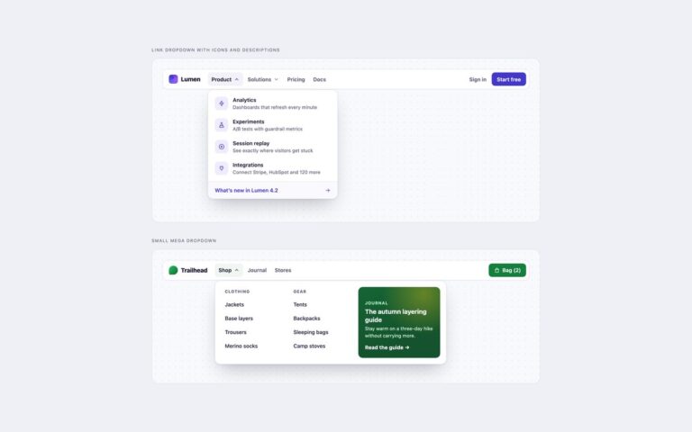
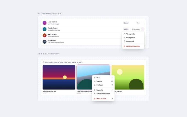
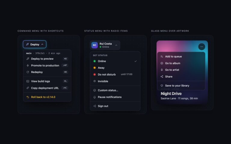
Dropdowns with no JavaScript at all, built on the popover attribute and CSS anchor positioning. Popover menu placed with anchor positioning is a Share button whose menu is anchored under it with position-anchor and position-area; position-try-fallbacks flips it above or to the other side when it would leave the window. Nested popover with a side fallback is a more menu on a design file whose Export item opens a second popover beside it, which flips to the left when there is no room on the right and drops below or above it as a last resort. The browser handles the rest: popovertarget opens and closes each menu, Esc and a click outside close it, focus returns to the button, and a nested popover keeps its parent open. Each item uses popovertargetaction=”hide” so choosing it closes the menu without a script. @starting-style and transition-behavior: allow-discrete fade and slide the menu in and out. In browsers without anchor positioning the menus appear as a sheet at the bottom of the window instead of an unplaced box. These are disclosure-style menus reached with Tab, not ARIA menus with arrow keys.

What’s included

  • popover and popovertarget with no JavaScript
  • Anchored with position-anchor and position-area
  • position-try-fallbacks flip the menu near window edges
  • Nested popover submenu that keeps its parent open
  • Open and close animation with @starting-style
  • Bottom-sheet fallback where anchor positioning is missing

Accessibility

Buttons use popovertarget, so browsers expose their expanded state, and each popover is labelled. Items are ordinary buttons reached with Tab, Esc closes the top popover and returns focus to the button that opened it. Focus outlines are visible on every control and the transitions switch off under prefers-reduced-motion. Because there is no script, there are no arrow-key menu semantics; use the script from set 1 if you need a full ARIA menu.

Customise it

Each .pm wrapper sets --anchor to a unique name that links its button and popover; change position-area to open the menu elsewhere. Colours are the --pm-* custom properties. In Tailwind edit the [position-area:...] and [position-try-fallbacks:...] classes and the hex values.