About this set
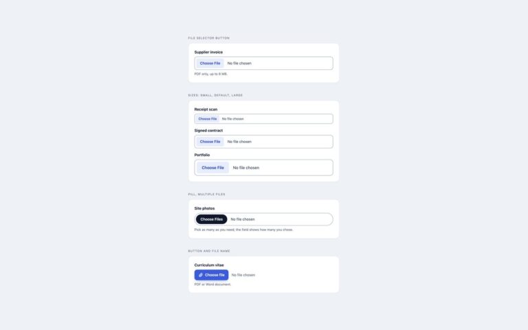
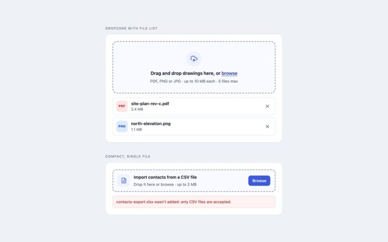
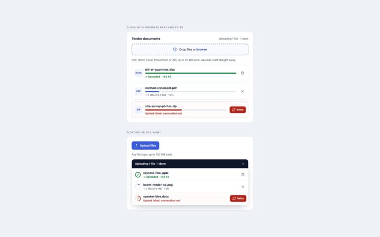
File upload components for dark interfaces such as developer tools, dashboards and media apps. Glowing dropzone with upload progress is a release asset uploader: a dashed zone on a deep blue radial gradient with a gradient icon tile, a soft indigo glow on hover and a stronger violet glow while a file is dragged over it. Accepted builds appear as rows with a type badge, the file name, a thin gradient progress bar and a readout of the bytes sent, then turn green with Uploaded and the size when they finish. The upload is simulated so the states can be seen, and the row list owns the files so the same file can be added twice. Dark file fields restyles two native inputs for dark forms, one with a quiet slate button and one with the indigo to violet gradient, through ::file-selector-button. The palette is tuned for contrast rather than mood alone: muted text reaches 4.5 to 1 on the card colour, the dashed border reaches 3 to 1, and the focus ring uses the bright accent. The Bootstrap version sets data-bs-theme to dark, so Bootstrap’s own fields, alerts and close buttons follow.
What’s included
- Glowing dropzone with hover and dragover states
- Gradient progress bars that turn green when done
- Type and size checks with messages
- Dark native inputs styled through ::file-selector-button
- Muted text and borders checked for contrast on dark
Accessibility
The dropzone input is labelled by its visible text and described by the limits and the error message, with a bright outline on the zone when it has keyboard focus. Remove buttons are named after their file, finished uploads and rejections are announced in a polite live region, and progress is written out as text as well as drawn. Glow, bar and hover transitions switch off under prefers-reduced-motion.
Customise it
Change --dk-accent and --dk-accent-2 for the glow and gradient, --dk-line and --dk-muted for borders and secondary text, on .dk. Bootstrap adds data-bs-theme="dark"; Tailwind reads the dk colours from @theme.