About this set
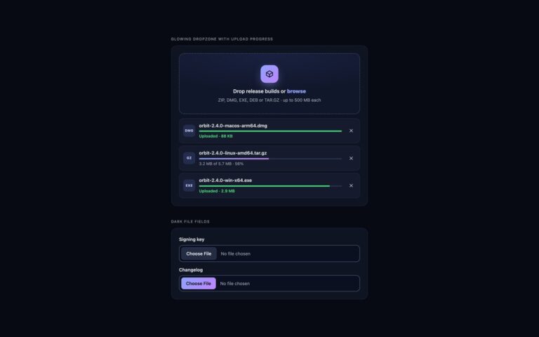
Upload queues that show every file’s progress and what went wrong. Queue with progress bars and retry puts a compact dropzone above a list of rows: each has a type badge, the file name, a progress bar, a live readout such as 2.2 MB of 6.5 MB, 34 percent, and one action that fits the state, Cancel while uploading, Remove when done and Retry when it failed. Finished rows turn green, failed rows turn red with a connection lost message, and the header sums up the queue. Floating upload panel is the corner panel familiar from cloud drives: an Upload files button, then a dark header that collapses the list through a native details element, with ring progress, a tick or an exclamation mark per file. Every row carries a data-status attribute, uploading, done or error, and CSS decides the colours and which button shows. The network is simulated so the states can be tried: every third file fails once and succeeds on retry. Replace the simulate function with XMLHttpRequest and upload.onprogress to send real files. The input is cleared after each pick, so the queue owns the files and the same file can be added again.
What’s included
- Per-file progress with size and percentage
- Uploading, done and error states from one data-status attribute
- Cancel, Remove and Retry actions
- Collapsible floating panel built on details and summary
- Simulated upload that is easy to swap for XMLHttpRequest
Accessibility
Each progress bar is a native progress element or a progressbar role with a name that includes the file, and the status text is written out rather than shown only in colour. Action buttons are named after their file; when a state change hides the focused button, focus moves to the new one. Completed and failed uploads are announced in a polite live region without reading every percentage. Bar and ring animations switch off under prefers-reduced-motion.
Customise it
Set --q-accent, --q-ok and --q-bad on .q for the uploading, done and error colours, and data-max-size or accept on the input. Bootstrap drives .progress-bar width from the same --p value; Tailwind styles the native progress element in the q-bar @utility.