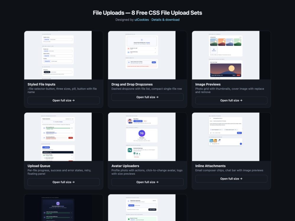
A pack of eight file upload sets, from a styled file input to a drag-and-drop dropzone, image previews, an upload queue with progress, avatar uploaders and composer attachments, designed and maintained in-house by uiCookies. Every set comes three ways: a Bootstrap 5.3.8 version built on .form-control, .progress, .alert and .btn-close, a plain CSS version with no dependencies, and a Tailwind CSS 4 version written in utility classes. All of them run in the browser only, with the upload progress simulated, so you can connect them to whatever backend you use.
A good file upload keeps a real input type="file" underneath, however it looks. That is what gives it a label, keyboard access with Enter and Space, native drag and drop, the system file picker on phones and normal form submission. On top of that it should say what it accepts before anyone picks a file, reject the wrong type or size with a message that names the file and the rule, let people remove what they added, show progress per file rather than one spinner, and tell screen reader users what changed through a live region instead of relying on a list that silently grows.
Free download Browse live demos All snippets
The sets
1. Styled File Inputs
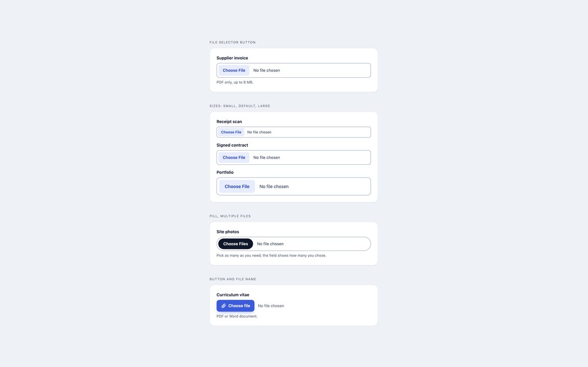
The native file input restyled through ::file-selector-button in three sizes and a pill, plus a visually hidden input behind a button that prints the chosen file name.
Use them when a form needs a file field that matches its design. The browser still handles the picker, the file name and submission.
Live Demo CSS, Bootstrap & Tailwind code
2. Drag and Drop Dropzones
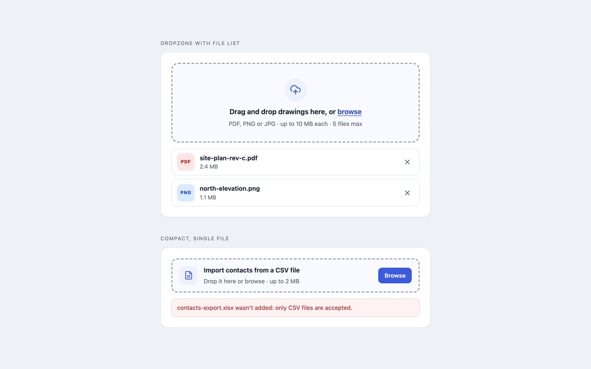
A dashed drag-and-drop zone with the accepted types and limits, a file list with remove buttons, and a compact one-row version for a CSV import.
The file input is stretched over the zone, so clicking, the keyboard and dropped files all reach it natively; a short script adds the checks and the list.
Live Demo CSS, Bootstrap & Tailwind code
3. Image Upload with Previews
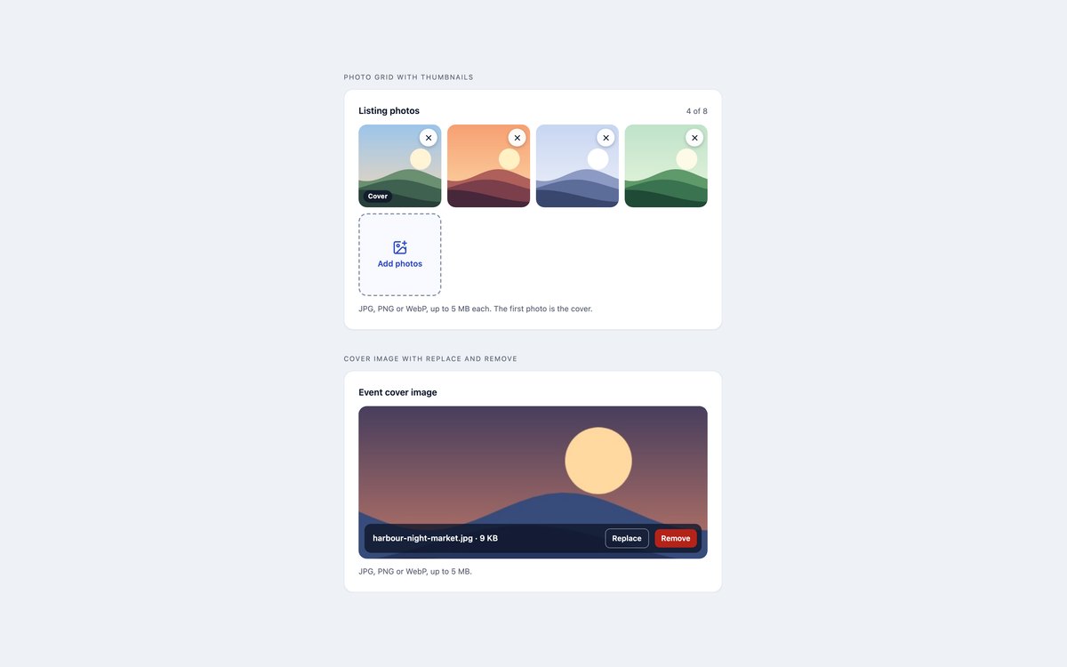
A listing photo grid with instant thumbnails, remove buttons and a cover badge, and a wide cover image zone with Replace and Remove.
Previews come from URL.createObjectURL, so nothing is sent to show them, and the input always holds exactly the images on screen.
Live Demo CSS, Bootstrap & Tailwind code
4. Upload Queue with Progress
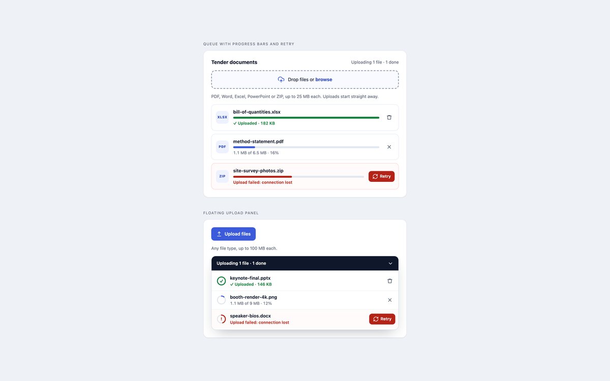
An upload queue with a progress bar per file, success and failure states, Cancel, Remove and Retry, and a collapsible floating panel with ring progress.
One data-status attribute per row drives the colours and buttons. The upload is simulated; swap in XMLHttpRequest and upload.onprogress for real files.
Live Demo CSS, Bootstrap & Tailwind code
5. Avatar Uploaders

A profile photo with Upload and Remove buttons, an avatar you click or drop onto with a Change photo overlay, and a logo previewed at three small sizes.
Photos are checked for type, file size and pixel size before they replace the initials fallback.
Live Demo CSS, Bootstrap & Tailwind code
6. Inline Attachments
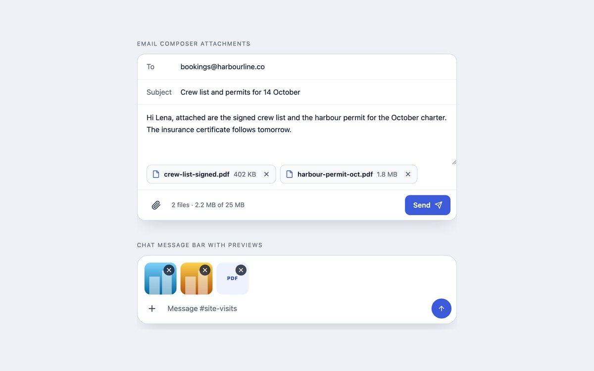
An email composer with attachment chips and a running size total, and a chat bar with image thumbnails above the message field.
The paperclip opens a real file input, and files can also be dropped anywhere on the composer.
Live Demo CSS, Bootstrap & Tailwind code
7. Dark File Uploads
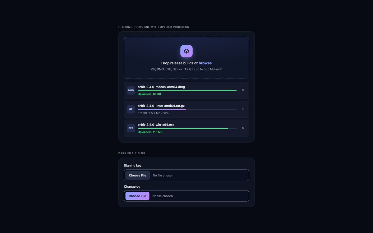
A glowing dark dropzone for release builds with gradient progress bars, and dark file fields styled through ::file-selector-button.
Muted text and borders are tuned for contrast on near-black, and the Bootstrap version uses data-bs-theme="dark".
Live Demo CSS, Bootstrap & Tailwind code
8. CSS-only File Upload States
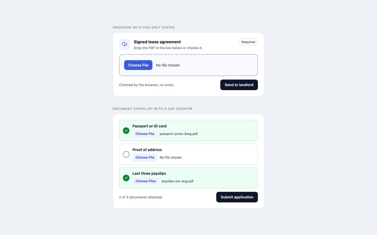
A dropzone whose empty, chosen and missing states come from :valid, :user-invalid and :has(), and a document checklist that counts attached files with a CSS counter.
There is no JavaScript at all. CSS cannot show a drag-over state or check file size, so add a script where you need those.
Live Demo CSS, Bootstrap & Tailwind code
Frequently asked questions
Are these file upload components free to use?
Yes. All eight sets are free for personal and commercial projects, including client work and products you sell. Attribution is optional but always welcome. The full terms are on the uiCookies licence page.
Do the file uploads need JavaScript?
The styled inputs in set 1 and the whole of set 8 work without it. The dropzones, previews, queues, avatars and attachments use a short vanilla script, with no libraries, for validation messages, previews, the file list and the simulated progress. The file input underneath still works if the script fails to load. No set sends files anywhere; connect the form or an XMLHttpRequest to your own endpoint.
Are the upload components accessible?
Each set keeps a real input type="file" with a label, so keyboard and screen reader users get the native control. Focus is drawn on the part people see, remove buttons are named after their file, and added, removed and rejected files are announced through an aria-live region. All sets pass an axe-core WCAG 2.1 AA check, and animations switch off when the reader prefers reduced motion.
Which frameworks are covered?
Every set comes as plain CSS with no dependencies, as Bootstrap 5.3.8 using .form-control, .progress, .alert, .badge, .btn and .btn-close, and as Tailwind CSS 4 utility classes, including the file:, valid: and user-invalid: variants. The three versions of a set look the same and share the same script.
How do I style a Bootstrap file input?
Bootstrap styles input type="file" with .form-control and its ::file-selector-button, so you can restyle the button with a rule such as .form-control::file-selector-button, and resize the field with .form-control-sm or .form-control-lg. To make a whole area a drop target, stretch the input over it with position-absolute, w-100, h-100 and opacity-0, as set 2 does.