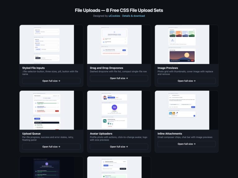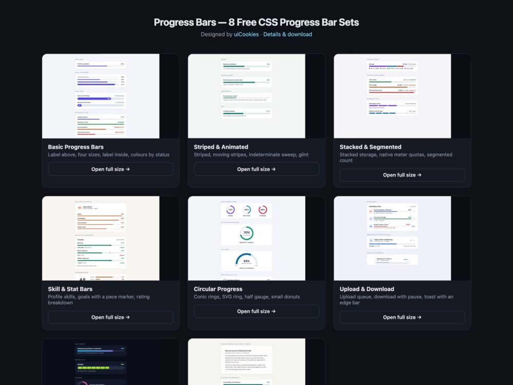
Progress Bars is a pack of eight sets of linear and circular progress indicators, designed and maintained in-house by uiCookies. Every set comes in three versions that look the same: plain HTML and CSS, Bootstrap 5 built on .progress and restyled through its CSS variables, and Tailwind CSS 4 with utility classes. The sets run from everyday labelled bars and striped or indeterminate bars to stacked storage and native meter quotas, skill and goal bars, conic and SVG rings, upload and download rows, a dark set and a set where CSS scroll timelines and @property do what usually takes JavaScript. None of them needs a script.
A good progress bar tells people three things: what is progressing, how far it has got, and whether anything is wrong. It needs a label tied to it, role="progressbar" with aria-valuenow, aria-valuemin and aria-valuemax, and aria-valuetext when a bare percentage is not enough, such as 4.2 MB of 6.8 MB. A quota or usage level is a measurement rather than a task, so it belongs in a meter element. The fill should stand out at 3:1 against its track, failure and warnings need a word as well as a colour, and an indeterminate bar should leave out aria-valuenow instead of pretending to a number. Stripes, sweeps and glows should stop for people who ask for reduced motion.
Free download Browse live demos All snippets
The sets
1. Basic Progress Bars
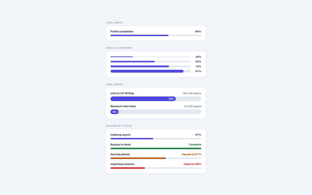
Everyday bars with the label above, four sizes with the value beside, the value inside the fill, and colours for complete, paused and failed.
Use these as the default for dashboards, settings and courses. One –v custom property sets the width, so updating a bar is one style change and one aria-valuenow.
Live Demo CSS, Bootstrap & Tailwind code
2. Animated Progress Bars
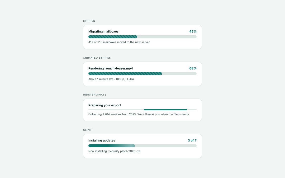
Striped bars, moving stripes, an indeterminate bar with a sweeping segment and a glint that runs over a normal fill.
Use the indeterminate bar until the first real number arrives. Every loop is a CSS keyframe that stops under prefers-reduced-motion.
Live Demo CSS, Bootstrap & Tailwind code
3. Stacked Progress Bars
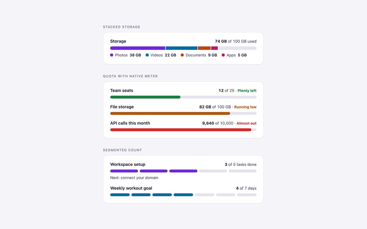
A stacked storage bar with a legend, quotas on a native meter that turns amber and red on its own, and segmented counts for tasks and streaks.
The meter’s low, high and optimum attributes pick the colour band, and the pseudo-elements are styled for Chrome, Safari and Firefox.
Live Demo CSS, Bootstrap & Tailwind code
4. Skill & Stat Progress Bars
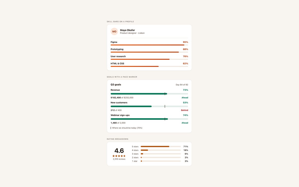
Skill bars under a profile header, quarterly goals with a pace marker and ahead or behind tags, and a star-rating breakdown.
Made for portfolios, resumes and dashboards. The pace marker lines up at the same percentage on every row, and the rating bars stay decorative because the numbers are in the text.
Live Demo CSS, Bootstrap & Tailwind code
5. Circular Progress Bars
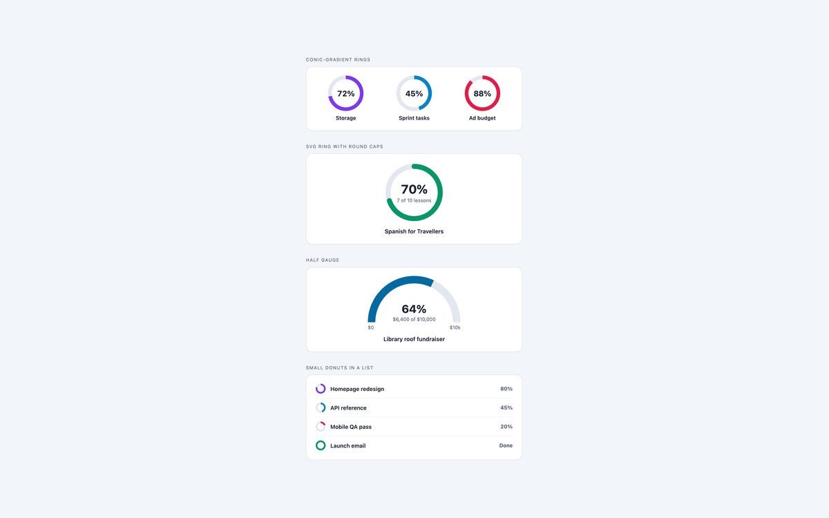
Conic-gradient rings, an SVG ring with round caps, a half gauge and small donuts beside a task list.
The conic rings are one element each, cut with a radial mask; the SVG ring uses pathLength="100" so stroke-dasharray takes the percentage directly.
Live Demo CSS, Bootstrap & Tailwind code
6. Upload Progress Bars
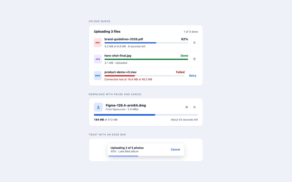
An upload queue with uploading, done and failed rows, a download card with pause and cancel, and a toast with a bar along its bottom edge.
Every bar is labelled by its file name, and every button names the file it acts on, so a screen reader never hears a list of identical Cancel buttons.
Live Demo CSS, Bootstrap & Tailwind code
7. Dark Progress Bars
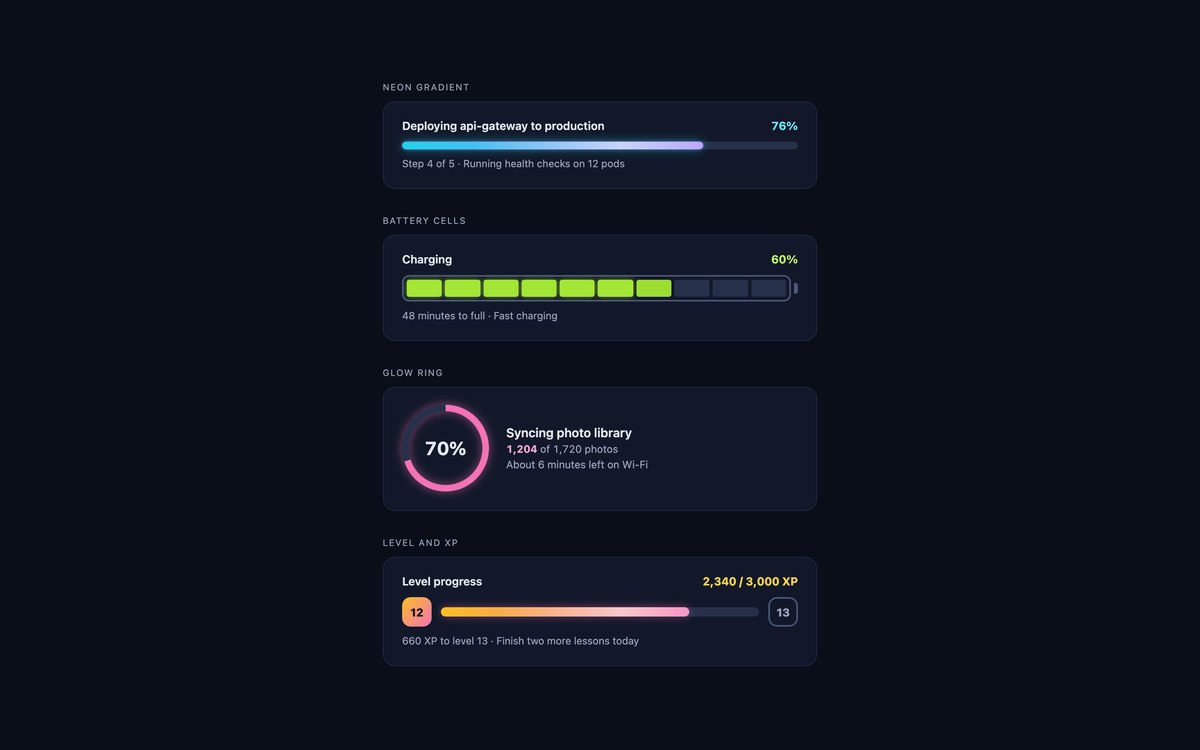
A neon gradient bar with a sheen, a battery with LED cells and a charging pulse, a glow ring and a level bar with XP badges.
Tracks stay visible on the dark card and values use light tints that read at 4.5:1. The glow ring’s halo sits on a wrapper so the mask does not clip it.
Live Demo CSS, Bootstrap & Tailwind code
8. Modern CSS Progress Bars
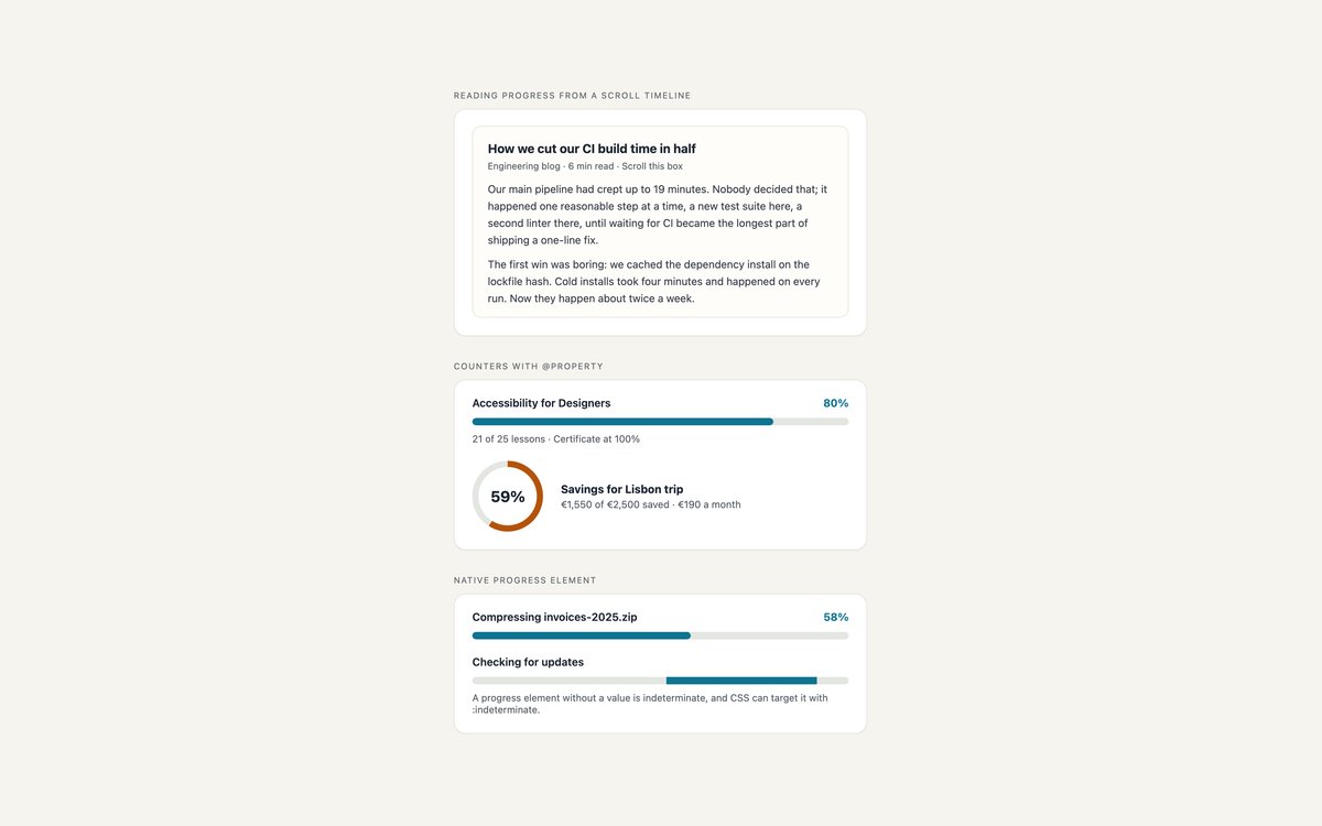
A reading bar driven by a CSS scroll timeline, numbers that count up through a registered @property integer, and a styled native progress element.
No JavaScript anywhere. The reading bar needs animation-timeline, in Chrome, Edge and Safari 26; elsewhere it is not shown and the article reads as normal.
Live Demo CSS, Bootstrap & Tailwind code
Frequently asked questions
Are these progress bars free to use?
Yes. All eight sets are free for personal and commercial projects under the uiCookies licence. Attribution is optional but always welcome.
Do the progress bars need JavaScript?
No. Each bar’s value is a –v custom property or a width in the markup, and the stripes, sweeps, rings and counters are CSS. Your own code only has to update the value and aria-valuenow as work progresses, and the upload buttons are plain buttons for you to wire to your uploader.
Are the progress bars accessible?
Every bar is either role="progressbar" with aria-valuenow, aria-valuemin, aria-valuemax and a visible label, or a native progress or meter element with a label. Context such as 18 of 25 lessons goes into aria-valuetext, indeterminate bars leave out aria-valuenow, status is written as a word as well as a colour, and all motion stops under prefers-reduced-motion. The sets pass axe-core WCAG 2.1 AA checks.
Which frameworks are covered?
Every set comes as plain HTML and CSS, as Bootstrap 5.3 using .progress, .progress-stacked, .progress-bar-striped and .progress-bar-animated restyled through Bootstrap’s CSS variables, and as Tailwind CSS 4 with utility classes. Rings, meters and the native progress element get a small stylesheet in the Bootstrap version because Bootstrap has no classes for them. The three versions look the same.
How do I make a circular progress bar in CSS?
Paint the value with conic-gradient(color calc(var(–v) * 1%), track 0) on a round element and cut the middle out with a radial-gradient mask, which keeps it to one element and one custom property. For round ends on the arc, use an SVG circle with pathLength="100" and stroke-dasharray: var(–v) 100 instead. Either way, give the element role="progressbar" and the aria-value attributes.