Open demo

CSS code

HTML
<div><span class="lbl">Label above</span><div class="card">
<div class="pb">
  <div class="pb-head"><b id="pb-profile">Profile completion</b><span aria-hidden="true">64%</span></div>
  <div class="pb-bar" role="progressbar" aria-labelledby="pb-profile" aria-valuenow="64" aria-valuemin="0" aria-valuemax="100" style="--v:64"><i></i></div>
</div></div></div>

<div><span class="lbl">Sizes, value beside</span><div class="card">
<div class="pb">
  <div class="pb-row"><div class="pb-bar xs" role="progressbar" aria-label="Chapter 2 read" aria-valuenow="28" aria-valuemin="0" aria-valuemax="100" style="--v:28"><i></i></div><span aria-hidden="true">28%</span></div>
  <div class="pb-row"><div class="pb-bar" role="progressbar" aria-label="Chapter 3 read" aria-valuenow="55" aria-valuemin="0" aria-valuemax="100" style="--v:55"><i></i></div><span aria-hidden="true">55%</span></div>
  <div class="pb-row"><div class="pb-bar md" role="progressbar" aria-label="Chapter 4 read" aria-valuenow="73" aria-valuemin="0" aria-valuemax="100" style="--v:73"><i></i></div><span aria-hidden="true">73%</span></div>
  <div class="pb-row"><div class="pb-bar lg" role="progressbar" aria-label="Chapter 5 read" aria-valuenow="91" aria-valuemin="0" aria-valuemax="100" style="--v:91"><i></i></div><span aria-hidden="true">91%</span></div>
</div></div></div>

<div><span class="lbl">Label inside</span><div class="card">
<div class="pb">
  <div class="pb-head"><b id="pb-course">Intro to UX Writing</b><span class="pb-note">18 of 25 lessons</span></div>
  <div class="pb-bar in" role="progressbar" aria-labelledby="pb-course" aria-valuenow="72" aria-valuemin="0" aria-valuemax="100" aria-valuetext="72%, 18 of 25 lessons" style="--v:72"><i>72%</i></div>
</div>
<div class="pb">
  <div class="pb-head"><b id="pb-course2">Research Interviews</b><span class="pb-note">2 of 25 lessons</span></div>
  <div class="pb-bar in" role="progressbar" aria-labelledby="pb-course2" aria-valuenow="8" aria-valuemin="0" aria-valuemax="100" aria-valuetext="8%, 2 of 25 lessons" style="--v:8"><i>8%</i></div>
</div></div></div>

<div><span class="lbl">Colours by status</span><div class="card">
<div class="pb">
  <div class="pb-head"><b id="pb-index">Indexing search</b><span aria-hidden="true">47%</span></div>
  <div class="pb-bar" role="progressbar" aria-labelledby="pb-index" aria-valuenow="47" aria-valuemin="0" aria-valuemax="100" style="--v:47"><i></i></div>
</div>
<div class="pb ok">
  <div class="pb-head"><b id="pb-backup">Backup to cloud</b><span aria-hidden="true">Complete</span></div>
  <div class="pb-bar" role="progressbar" aria-labelledby="pb-backup" aria-valuenow="100" aria-valuemin="0" aria-valuemax="100" aria-valuetext="100%, complete" style="--v:100"><i></i></div>
</div>
<div class="pb warn">
  <div class="pb-head"><b id="pb-sync">Syncing photos</b><span aria-hidden="true">Paused at 61%</span></div>
  <div class="pb-bar" role="progressbar" aria-labelledby="pb-sync" aria-valuenow="61" aria-valuemin="0" aria-valuemax="100" aria-valuetext="61%, paused" style="--v:61"><i></i></div>
</div>
<div class="pb bad">
  <div class="pb-head"><b id="pb-import">Importing contacts</b><span aria-hidden="true">Failed at 38%</span></div>
  <div class="pb-bar" role="progressbar" aria-labelledby="pb-import" aria-valuenow="38" aria-valuemin="0" aria-valuemax="100" aria-valuetext="38%, failed" style="--v:38"><i></i></div>
</div></div></div>
CSS
/* Basic progress bars. Each bar is a div with role="progressbar" and aria-value* attributes.
   --v (0 to 100) on the bar sets the width of the fill, so no script is needed: update --v and aria-valuenow together. */
.pb{--pb-accent:#4f46e5;--pb-track:#e2e8f0;--pb-h:8px;display:grid;gap:10px}
.pb+.pb{margin-top:20px}
.pb-head{display:flex;justify-content:space-between;align-items:baseline;gap:12px;font-size:.92rem}
.pb-head b{font-weight:600;color:#1e293b}
.pb-head span{font-weight:700;color:#334155;font-variant-numeric:tabular-nums}
.pb-bar{--v:0;height:var(--pb-h);border-radius:999px;background:var(--pb-track);overflow:hidden}
.pb-bar>i{display:block;height:100%;width:calc(var(--v) * 1%);border-radius:inherit;background:var(--pb-accent);transition:width .5s ease}
/* sizes, with the value beside the bar */
.pb-row{display:flex;align-items:center;gap:14px}
.pb-row .pb-bar{flex:1}
.pb-row span{min-width:3.2em;text-align:right;font-size:.88rem;font-weight:700;color:#334155;font-variant-numeric:tabular-nums}
.pb-bar.xs{--pb-h:4px}
.pb-bar.md{--pb-h:10px}
.pb-bar.lg{--pb-h:16px}
/* label inside the fill: white text on the accent, never narrower than the label */
.pb-bar.in{--pb-h:26px}
.pb-bar.in>i{display:flex;align-items:center;justify-content:flex-end;min-width:max-content;padding:0 12px;
  font-size:.8rem;font-style:normal;font-weight:700;color:#fff;font-variant-numeric:tabular-nums}
.pb-head .pb-note{font-size:.85rem;font-weight:400;color:#475569}
/* status colours: fills stay 3:1 or more against the track */
.pb.ok{--pb-accent:#15803d}
.pb.warn{--pb-accent:#b45309}
.pb.bad{--pb-accent:#dc2626}
.pb.ok .pb-head span,.pb.warn .pb-head span,.pb.bad .pb-head span{color:var(--pb-accent)}
@media (prefers-reduced-motion:reduce){.pb-bar>i{transition:none}}

Bootstrap 5 code

Requires: Bootstrap 5.3.8 CSS

HTML
<div><span class="lbl">Label above</span><div class="card demo-card"><div class="card-body p-4">
<div class="pb">
  <div class="d-flex justify-content-between align-items-baseline gap-3"><span class="fw-semibold" id="pb-profile">Profile completion</span><span class="fw-bold pb-val" aria-hidden="true">64%</span></div>
  <div class="progress" role="progressbar" aria-labelledby="pb-profile" aria-valuenow="64" aria-valuemin="0" aria-valuemax="100"><div class="progress-bar" style="width:64%"></div></div>
</div></div></div></div>

<div><span class="lbl">Sizes, value beside</span><div class="card demo-card"><div class="card-body p-4">
<div class="pb">
  <div class="d-flex align-items-center gap-3 pb-row"><div class="progress xs flex-grow-1" role="progressbar" aria-label="Chapter 2 read" aria-valuenow="28" aria-valuemin="0" aria-valuemax="100"><div class="progress-bar" style="width:28%"></div></div><span class="fw-bold text-end pb-val" aria-hidden="true">28%</span></div>
  <div class="d-flex align-items-center gap-3 pb-row"><div class="progress flex-grow-1" role="progressbar" aria-label="Chapter 3 read" aria-valuenow="55" aria-valuemin="0" aria-valuemax="100"><div class="progress-bar" style="width:55%"></div></div><span class="fw-bold text-end pb-val" aria-hidden="true">55%</span></div>
  <div class="d-flex align-items-center gap-3 pb-row"><div class="progress md flex-grow-1" role="progressbar" aria-label="Chapter 4 read" aria-valuenow="73" aria-valuemin="0" aria-valuemax="100"><div class="progress-bar" style="width:73%"></div></div><span class="fw-bold text-end pb-val" aria-hidden="true">73%</span></div>
  <div class="d-flex align-items-center gap-3 pb-row"><div class="progress lg flex-grow-1" role="progressbar" aria-label="Chapter 5 read" aria-valuenow="91" aria-valuemin="0" aria-valuemax="100"><div class="progress-bar" style="width:91%"></div></div><span class="fw-bold text-end pb-val" aria-hidden="true">91%</span></div>
</div></div></div></div>

<div><span class="lbl">Label inside</span><div class="card demo-card"><div class="card-body p-4">
<div class="pb">
  <div class="d-flex justify-content-between align-items-baseline gap-3"><span class="fw-semibold" id="pb-course">Intro to UX Writing</span><span class="pb-note">18 of 25 lessons</span></div>
  <div class="progress in" role="progressbar" aria-labelledby="pb-course" aria-valuenow="72" aria-valuemin="0" aria-valuemax="100" aria-valuetext="72%, 18 of 25 lessons"><div class="progress-bar text-end px-3" style="width:72%">72%</div></div>
</div>
<div class="pb">
  <div class="d-flex justify-content-between align-items-baseline gap-3"><span class="fw-semibold" id="pb-course2">Research Interviews</span><span class="pb-note">2 of 25 lessons</span></div>
  <div class="progress in" role="progressbar" aria-labelledby="pb-course2" aria-valuenow="8" aria-valuemin="0" aria-valuemax="100" aria-valuetext="8%, 2 of 25 lessons"><div class="progress-bar text-end px-3" style="width:8%">8%</div></div>
</div></div></div></div>

<div><span class="lbl">Colours by status</span><div class="card demo-card"><div class="card-body p-4">
<div class="pb">
  <div class="d-flex justify-content-between align-items-baseline gap-3"><span class="fw-semibold" id="pb-index">Indexing search</span><span class="fw-bold pb-val" aria-hidden="true">47%</span></div>
  <div class="progress" role="progressbar" aria-labelledby="pb-index" aria-valuenow="47" aria-valuemin="0" aria-valuemax="100"><div class="progress-bar" style="width:47%"></div></div>
</div>
<div class="pb">
  <div class="d-flex justify-content-between align-items-baseline gap-3"><span class="fw-semibold" id="pb-backup">Backup to cloud</span><span class="fw-bold text-success" aria-hidden="true">Complete</span></div>
  <div class="progress" role="progressbar" aria-labelledby="pb-backup" aria-valuenow="100" aria-valuemin="0" aria-valuemax="100" aria-valuetext="100%, complete"><div class="progress-bar bg-success" style="width:100%"></div></div>
</div>
<div class="pb">
  <div class="d-flex justify-content-between align-items-baseline gap-3"><span class="fw-semibold" id="pb-sync">Syncing photos</span><span class="fw-bold text-warning" aria-hidden="true">Paused at 61%</span></div>
  <div class="progress" role="progressbar" aria-labelledby="pb-sync" aria-valuenow="61" aria-valuemin="0" aria-valuemax="100" aria-valuetext="61%, paused"><div class="progress-bar bg-warning" style="width:61%"></div></div>
</div>
<div class="pb">
  <div class="d-flex justify-content-between align-items-baseline gap-3"><span class="fw-semibold" id="pb-import">Importing contacts</span><span class="fw-bold text-danger" aria-hidden="true">Failed at 38%</span></div>
  <div class="progress" role="progressbar" aria-labelledby="pb-import" aria-valuenow="38" aria-valuemin="0" aria-valuemax="100" aria-valuetext="38%, failed"><div class="progress-bar bg-danger" style="width:38%"></div></div>
</div></div></div></div>
CSS
/* Bootstrap .progress restyled through its CSS variables. role="progressbar" and the aria-value* attributes sit on
   .progress (the Bootstrap 5.3 pattern); the inline width on .progress-bar is the value. */
.pb{--bs-success-rgb:21,128,61;--bs-warning-rgb:180,83,9;--bs-danger-rgb:220,38,38;display:grid;gap:10px;font-size:.92rem}
.pb .progress{--bs-progress-height:8px;--bs-progress-bg:#e2e8f0;--bs-progress-bar-bg:#4f46e5;--bs-progress-border-radius:999px;
  --bs-progress-font-size:.8rem}
.pb+.pb{margin-top:20px}
.pb .progress-bar{border-radius:inherit;transition:width .5s ease}
.pb .pb-val{color:#334155;font-variant-numeric:tabular-nums}
.pb .pb-row .pb-val{min-width:3.2em;font-size:.88rem}
.pb .progress.xs{--bs-progress-height:4px}
.pb .progress.md{--bs-progress-height:10px}
.pb .progress.lg{--bs-progress-height:16px}
/* label inside the fill: never narrower than the label */
.pb .progress.in{--bs-progress-height:26px}
.pb .progress.in .progress-bar{min-width:max-content;font-weight:700;font-variant-numeric:tabular-nums}
.pb .pb-note{font-size:.85rem;color:#475569}
@media (prefers-reduced-motion:reduce){.pb .progress-bar{transition:none}}

Tailwind 4 code

Requires: Tailwind CSS 4

HTML
<div><span class="mb-3 block text-[.72rem] tracking-[.12em] text-[#5b6b82] uppercase">Label above</span><div class="rounded-2xl border border-[#e2e8f0] bg-white px-6 pt-[22px] pb-6 shadow-[0_1px_2px_rgba(15,23,42,.04)]">
<div class="grid gap-2.5 text-[.92rem]">
  <div class="flex items-baseline justify-between gap-3"><span class="font-semibold" id="pb-profile">Profile completion</span><span class="font-bold text-[#334155] tabular-nums" aria-hidden="true">64%</span></div>
  <div class="h-2 overflow-hidden rounded-full bg-pb-track" role="progressbar" aria-labelledby="pb-profile" aria-valuenow="64" aria-valuemin="0" aria-valuemax="100"><div class="h-full w-[64%] rounded-full bg-pb-accent transition-[width] duration-500 motion-reduce:transition-none"></div></div>
</div></div></div>

<div><span class="mb-3 block text-[.72rem] tracking-[.12em] text-[#5b6b82] uppercase">Sizes, value beside</span><div class="rounded-2xl border border-[#e2e8f0] bg-white px-6 pt-[22px] pb-6 shadow-[0_1px_2px_rgba(15,23,42,.04)]">
<div class="grid gap-2.5 text-[.88rem]">
  <div class="flex items-center gap-3.5"><div class="h-1 flex-1 overflow-hidden rounded-full bg-pb-track" role="progressbar" aria-label="Chapter 2 read" aria-valuenow="28" aria-valuemin="0" aria-valuemax="100"><div class="h-full w-[28%] rounded-full bg-pb-accent"></div></div><span class="min-w-[3.2em] text-right font-bold text-[#334155] tabular-nums" aria-hidden="true">28%</span></div>
  <div class="flex items-center gap-3.5"><div class="h-2 flex-1 overflow-hidden rounded-full bg-pb-track" role="progressbar" aria-label="Chapter 3 read" aria-valuenow="55" aria-valuemin="0" aria-valuemax="100"><div class="h-full w-[55%] rounded-full bg-pb-accent"></div></div><span class="min-w-[3.2em] text-right font-bold text-[#334155] tabular-nums" aria-hidden="true">55%</span></div>
  <div class="flex items-center gap-3.5"><div class="h-2.5 flex-1 overflow-hidden rounded-full bg-pb-track" role="progressbar" aria-label="Chapter 4 read" aria-valuenow="73" aria-valuemin="0" aria-valuemax="100"><div class="h-full w-[73%] rounded-full bg-pb-accent"></div></div><span class="min-w-[3.2em] text-right font-bold text-[#334155] tabular-nums" aria-hidden="true">73%</span></div>
  <div class="flex items-center gap-3.5"><div class="h-4 flex-1 overflow-hidden rounded-full bg-pb-track" role="progressbar" aria-label="Chapter 5 read" aria-valuenow="91" aria-valuemin="0" aria-valuemax="100"><div class="h-full w-[91%] rounded-full bg-pb-accent"></div></div><span class="min-w-[3.2em] text-right font-bold text-[#334155] tabular-nums" aria-hidden="true">91%</span></div>
</div></div></div>

<div><span class="mb-3 block text-[.72rem] tracking-[.12em] text-[#5b6b82] uppercase">Label inside</span><div class="rounded-2xl border border-[#e2e8f0] bg-white px-6 pt-[22px] pb-6 shadow-[0_1px_2px_rgba(15,23,42,.04)]">
<div class="grid gap-2.5 text-[.92rem]">
  <div class="flex items-baseline justify-between gap-3"><span class="font-semibold" id="pb-course">Intro to UX Writing</span><span class="text-[.85rem] text-[#475569]">18 of 25 lessons</span></div>
  <div class="h-[26px] overflow-hidden rounded-full bg-pb-track" role="progressbar" aria-labelledby="pb-course" aria-valuenow="72" aria-valuemin="0" aria-valuemax="100" aria-valuetext="72%, 18 of 25 lessons"><div class="flex h-full w-[72%] min-w-max items-center justify-end rounded-full bg-pb-accent px-3 text-[.8rem] font-bold text-white tabular-nums">72%</div></div>
</div>
<div class="mt-5 grid gap-2.5 text-[.92rem]">
  <div class="flex items-baseline justify-between gap-3"><span class="font-semibold" id="pb-course2">Research Interviews</span><span class="text-[.85rem] text-[#475569]">2 of 25 lessons</span></div>
  <div class="h-[26px] overflow-hidden rounded-full bg-pb-track" role="progressbar" aria-labelledby="pb-course2" aria-valuenow="8" aria-valuemin="0" aria-valuemax="100" aria-valuetext="8%, 2 of 25 lessons"><div class="flex h-full w-[8%] min-w-max items-center justify-end rounded-full bg-pb-accent px-3 text-[.8rem] font-bold text-white tabular-nums">8%</div></div>
</div></div></div>

<div><span class="mb-3 block text-[.72rem] tracking-[.12em] text-[#5b6b82] uppercase">Colours by status</span><div class="rounded-2xl border border-[#e2e8f0] bg-white px-6 pt-[22px] pb-6 shadow-[0_1px_2px_rgba(15,23,42,.04)]">
<div class="grid gap-2.5 text-[.92rem]">
  <div class="flex items-baseline justify-between gap-3"><span class="font-semibold" id="pb-index">Indexing search</span><span class="font-bold text-[#334155] tabular-nums" aria-hidden="true">47%</span></div>
  <div class="h-2 overflow-hidden rounded-full bg-pb-track" role="progressbar" aria-labelledby="pb-index" aria-valuenow="47" aria-valuemin="0" aria-valuemax="100"><div class="h-full w-[47%] rounded-full bg-pb-accent"></div></div>
</div>
<div class="mt-5 grid gap-2.5 text-[.92rem]">
  <div class="flex items-baseline justify-between gap-3"><span class="font-semibold" id="pb-backup">Backup to cloud</span><span class="font-bold text-pb-ok" aria-hidden="true">Complete</span></div>
  <div class="h-2 overflow-hidden rounded-full bg-pb-track" role="progressbar" aria-labelledby="pb-backup" aria-valuenow="100" aria-valuemin="0" aria-valuemax="100" aria-valuetext="100%, complete"><div class="h-full w-full rounded-full bg-pb-ok"></div></div>
</div>
<div class="mt-5 grid gap-2.5 text-[.92rem]">
  <div class="flex items-baseline justify-between gap-3"><span class="font-semibold" id="pb-sync">Syncing photos</span><span class="font-bold text-pb-warn" aria-hidden="true">Paused at 61%</span></div>
  <div class="h-2 overflow-hidden rounded-full bg-pb-track" role="progressbar" aria-labelledby="pb-sync" aria-valuenow="61" aria-valuemin="0" aria-valuemax="100" aria-valuetext="61%, paused"><div class="h-full w-[61%] rounded-full bg-pb-warn"></div></div>
</div>
<div class="mt-5 grid gap-2.5 text-[.92rem]">
  <div class="flex items-baseline justify-between gap-3"><span class="font-semibold" id="pb-import">Importing contacts</span><span class="font-bold text-pb-bad" aria-hidden="true">Failed at 38%</span></div>
  <div class="h-2 overflow-hidden rounded-full bg-pb-track" role="progressbar" aria-labelledby="pb-import" aria-valuenow="38" aria-valuemin="0" aria-valuemax="100" aria-valuetext="38%, failed"><div class="h-full w-[38%] rounded-full bg-pb-bad"></div></div>
</div></div></div>
CSS
@theme {
  --color-pb-accent: #4f46e5;
  --color-pb-track: #e2e8f0;
  --color-pb-ok: #15803d;
  --color-pb-warn: #b45309;
  --color-pb-bad: #dc2626;
}

About this set

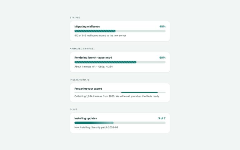
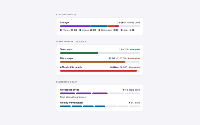
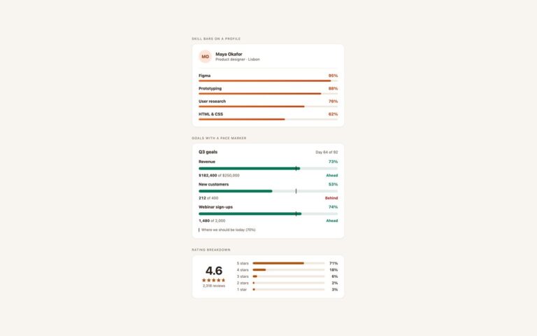
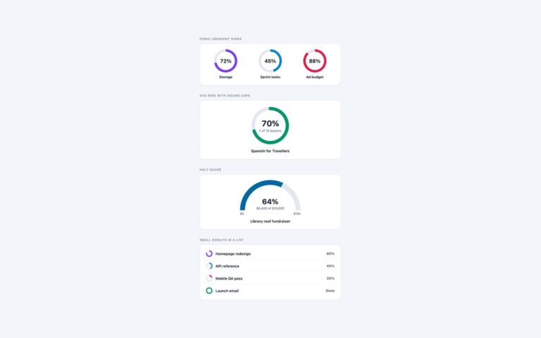
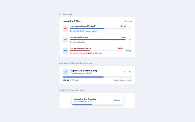
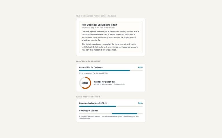
Four everyday progress bar layouts that cover most settings pages, course dashboards and task lists. Label above puts the name on the left and the percentage on the right over a thin 8 pixel bar, as in a profile completion prompt. Sizes, value beside shows 4, 8, 10 and 16 pixel bars with the number right-aligned in a fixed-width column, so a stack of bars lines up. Label inside prints the value in white inside a 26 pixel fill that never gets narrower than its own text, which keeps a value like 8% readable. Colours by status gives the fill and the status word one colour each for in progress, complete, paused and failed, with the status also written out in words so colour is not the only signal. Every bar is a div with role=”progressbar”, aria-valuenow, aria-valuemin, aria-valuemax and a visible label tied to it with aria-labelledby. The width comes from one custom property, –v, set from 0 to 100 in the style attribute, so there is no script: change –v and aria-valuenow together and the bar follows.

What’s included

  • Label above, value beside, label inside and status variants
  • Four heights from 4 to 16 pixels
  • Width from one --v custom property, no JavaScript
  • role="progressbar" with aria-valuenow, aria-valuetext and a visible label
  • Status shown in words as well as colour
  • Plain CSS, Bootstrap .progress and Tailwind versions of the same design

Accessibility

Each bar has role="progressbar" with aria-valuenow, aria-valuemin and aria-valuemax, and is named by its visible label through aria-labelledby or by an aria-label. Bars with extra context, such as 18 of 25 lessons or paused, carry it in aria-valuetext, and the duplicate visible percentages are hidden from screen readers so the value is not read twice. Fills are at least 3:1 against the track and all text meets 4.5:1. The only motion is a width transition, which is switched off under prefers-reduced-motion.

Customise it

Change --pb-accent, --pb-track and --pb-h on .pb in the plain CSS version. In Bootstrap set --bs-progress-height, --bs-progress-bg and --bs-progress-bar-bg on .progress, and --bs-success-rgb, --bs-warning-rgb and --bs-danger-rgb for the status colours. In Tailwind edit the pb- theme colours and the h- and w- utilities.