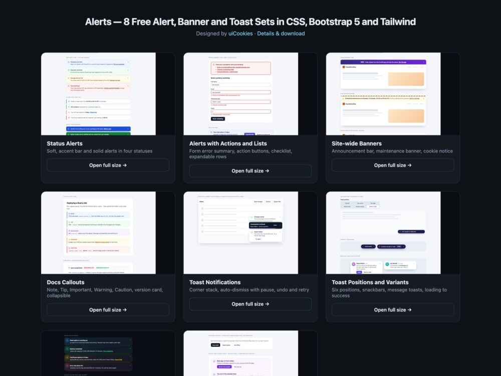
A pack of eight sets of alerts, banners, callouts and toast notifications, designed and maintained in-house by uiCookies. Every set comes three ways: a Bootstrap 5.3.8 version built on Bootstrap’s own .alert, .toast, .card and .btn-close with the Alert and Toast plugins where they fit, a plain CSS version with no dependencies, and a Tailwind CSS 4 version written in utility classes. The three look the same, so pick the one that matches your stack and copy the marked snippet.
A good alert says what happened and what to do next in words, not only in colour, and it interrupts only when it has to. That means keeping role="alert" for urgent messages and using a polite live region for toasts, naming every dismiss button, and linking an error summary to the fields it describes. Toasts should pause while the pointer or keyboard focus is on them, errors and toasts with an Undo button should stay long enough to be used, and closing one should not drop keyboard users back at the top of the page. Animation should stop when the reader prefers reduced motion.
Free download Browse live demos All snippets
The sets
1. Status Alerts
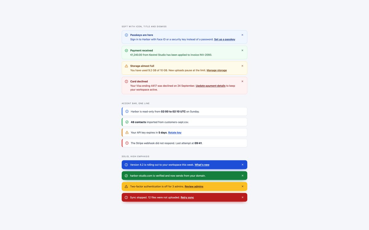
Twelve alerts in three weights, soft, accent bar and solid, each in info, success, warning and danger, with icons, titles, links and dismiss buttons.
Use them for page-level messages. Colours come from five custom properties per status, and the status is always named in text as well as colour.
Live Demo CSS, Bootstrap & Tailwind code
2. Alerts with Actions and Lists
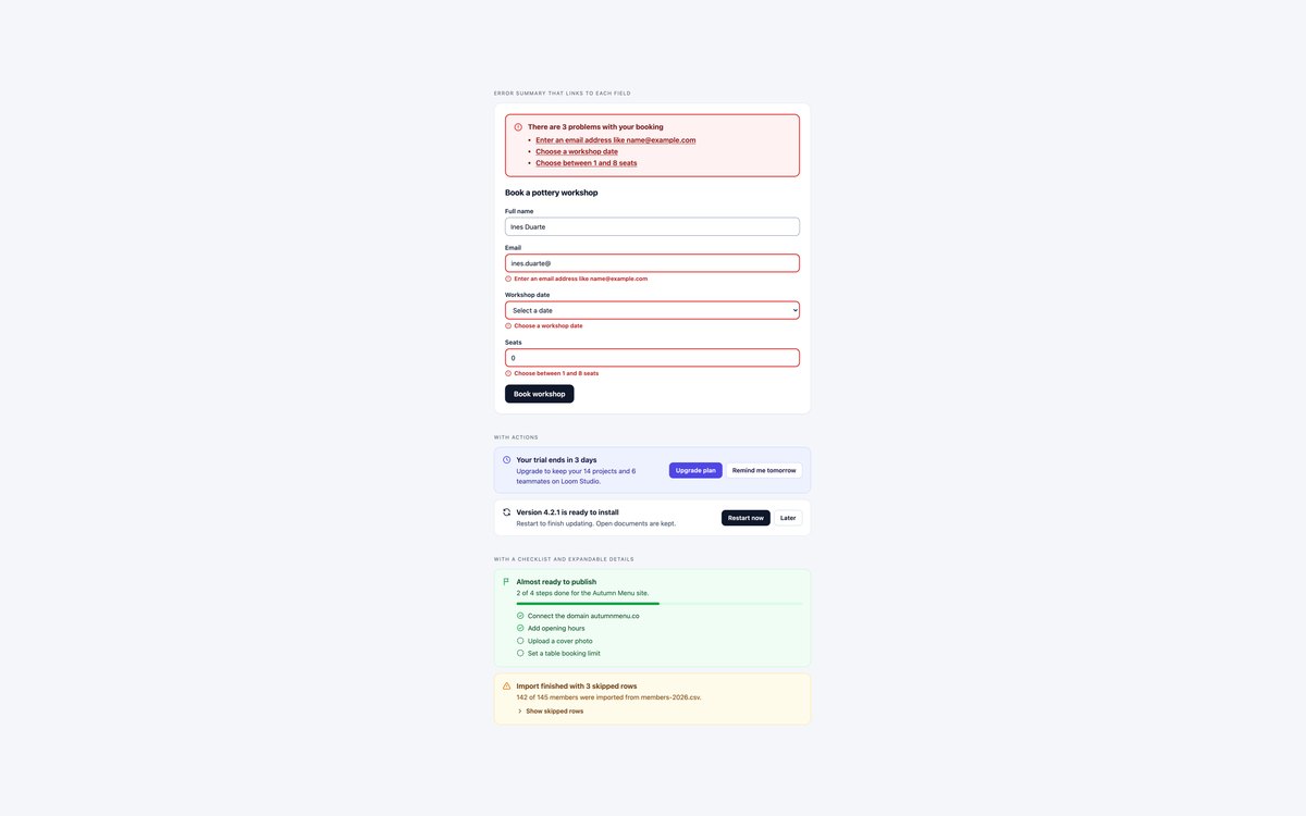
A form error summary that links to each invalid field, alerts with Upgrade and Restart buttons, a checklist alert with progress, and an import warning with expandable rows.
Reach for these when the reader has to act. A short script focuses the summary after a failed submit and takes each link straight into its field.
Live Demo CSS, Bootstrap & Tailwind code
3. Site-wide Banners
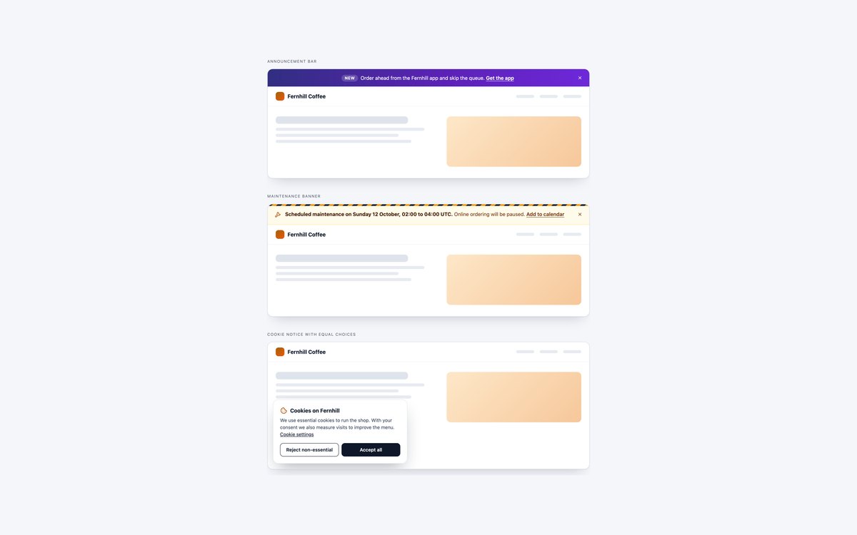
An announcement bar, a striped maintenance banner and a cookie notice with equal Reject and Accept buttons, each shown on a small website.
They are labelled regions rather than alerts, and closing one moves focus to the next element on the page instead of losing it.
Live Demo CSS, Bootstrap & Tailwind code
4. Docs Callouts
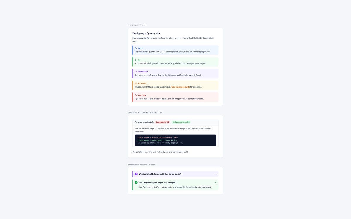
Note, Tip, Important, Warning and Caution callouts for documentation, a card callout with version badges and code, and collapsible question callouts.
They need no JavaScript. Each is a role="note" box with a visible label, and the collapsible ones use native details and summary.
Live Demo CSS, Bootstrap & Tailwind code
5. Toast Notifications
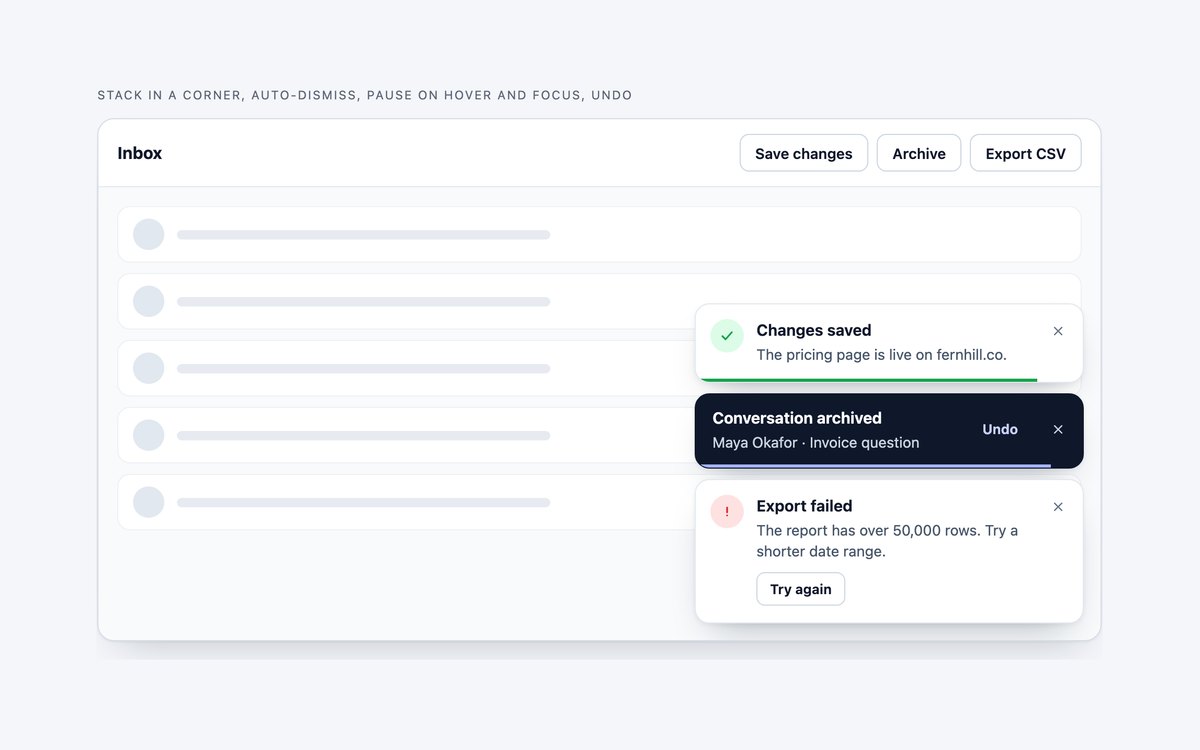
A toast stack in a corner with success, undo and error toasts, a time line along the bottom and actions that work.
The line’s CSS animation is the timer, so hovering or focusing the stack pauses it; errors stay until closed and Esc closes the focused toast.
Live Demo CSS, Bootstrap & Tailwind code
6. Toast Positions and Variants
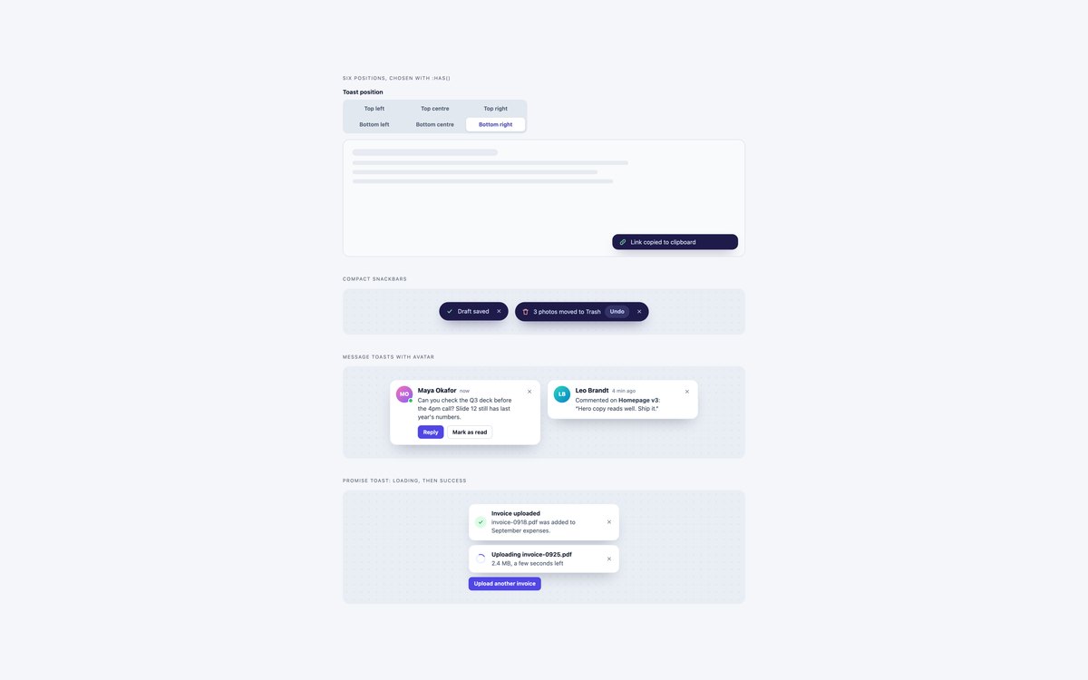
A six-position picker built on radios and :has(), compact snackbars, message toasts with avatars, and a promise toast that goes from loading to success.
Use the picker to choose a corner, then take the variant you need. The promise toast updates in place inside a polite live region.
Live Demo CSS, Bootstrap & Tailwind code
7. Dark Alerts and Toasts
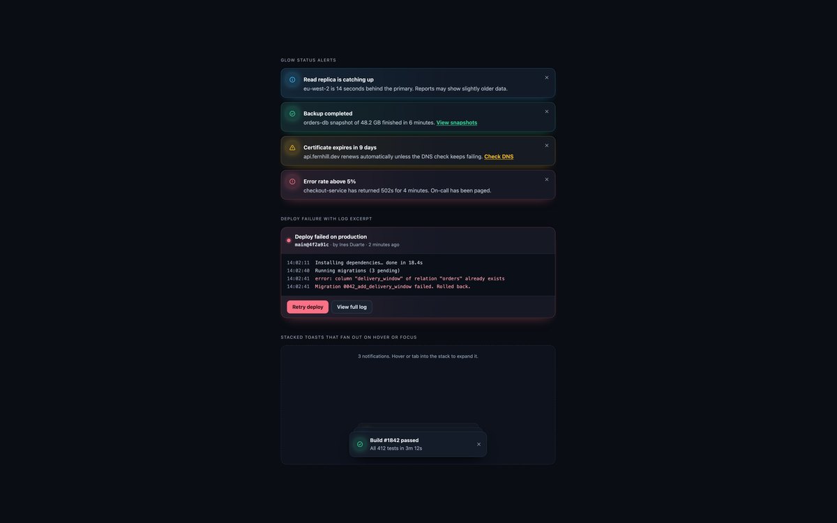
Glow status alerts for dark dashboards, a deploy failure card with a log excerpt, and a pile of toasts that fans out on hover or focus.
Text is tuned to 4.5:1 on near-black, and the stacked pile is pure CSS with nth-child and :focus-within, so keyboard users can open it too.
Live Demo CSS, Bootstrap & Tailwind code
8. Modern CSS Alerts and Toasts
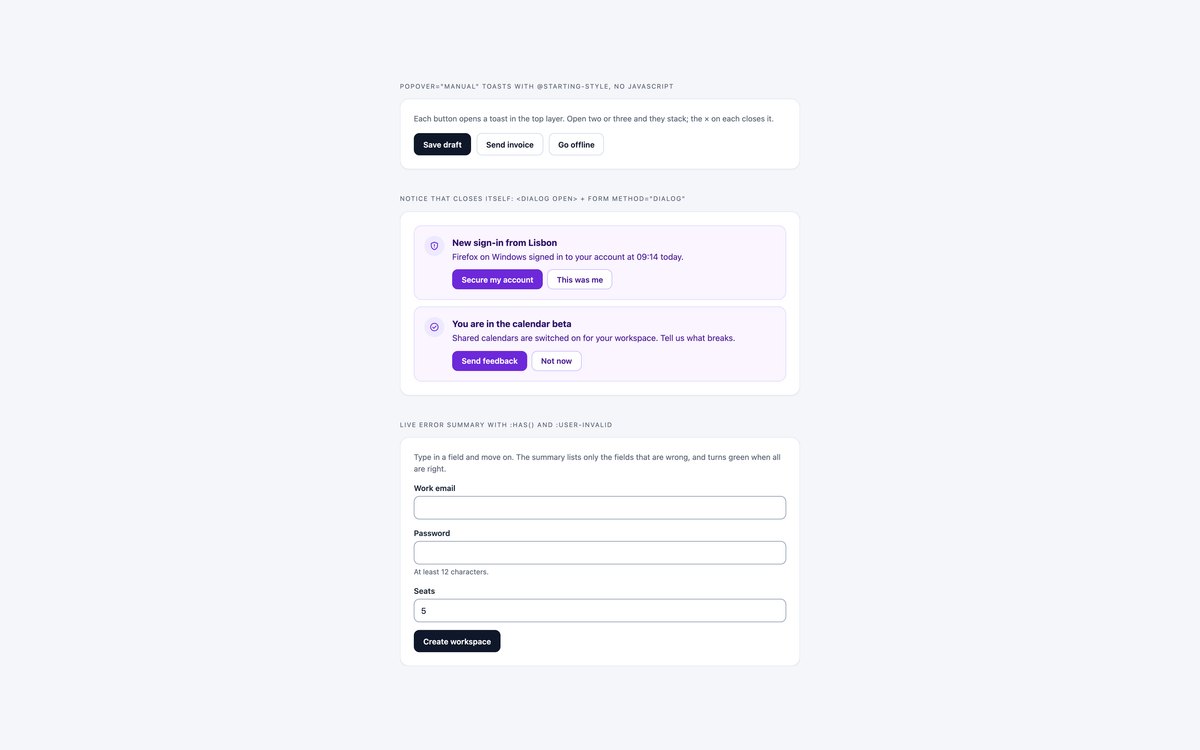
Toasts built on popover="manual" with @starting-style animation, notices closed by form method="dialog", and a live error summary from :has() and :user-invalid.
All three work without JavaScript in current Chrome, Safari and Firefox. The popover toasts do not close on a timer, which still needs a script.
Live Demo CSS, Bootstrap & Tailwind code
Frequently asked questions
Are these alerts and toasts free to use?
Yes. All eight sets are free for personal and commercial projects, including client work and products you sell. Attribution is optional but always welcome. The full terms are on the uiCookies licence page.
Do the alerts need JavaScript?
The callouts, the position picker, the dark toast pile and the whole modern set are HTML and CSS only. Dismiss buttons, the error summary, the toast stack and the promise toast use a few lines of vanilla JavaScript, and the Bootstrap versions of those sets load the Bootstrap bundle for the Alert and Toast plugins.
Are the alerts accessible?
Urgent messages use role="alert" and toasts sit in a polite live region, every dismiss button has a name, and status is written out rather than shown only by colour. Timed toasts pause on hover and keyboard focus, closing an item moves focus to a sensible place, and motion stops under prefers-reduced-motion. Every page passes an axe-core WCAG 2.1 AA check.
Which frameworks are covered?
Each set comes as plain CSS with no dependencies, as Bootstrap 5.3.8 using .alert, .toast, .card, .badge, .btn-close, .spinner-border and the Alert and Toast plugins, and as Tailwind CSS 4 utility classes. The three versions of a set look the same, so you can switch stacks without redesigning.
How do I make a Bootstrap toast pause on hover?
Bootstrap’s Toast plugin clears its timer on hover or focus and starts the full delay again afterwards. Set 5 instead turns autohide off and hides the toast with bootstrap.Toast.getOrCreateInstance(el).hide() when a CSS progress-line animation ends; pausing that animation on :hover and :focus-within pauses the countdown, which then resumes where it stopped.