// Dismiss: a button with data-dismiss removes its [data-alert]. Focus moves to the next item's
// button so keyboard users keep their place (and the toast deck stays expanded).
document.addEventListener('click', function (e) {
  var btn = e.target.closest('[data-dismiss]');
  if (!btn) return;
  var item = btn.closest('[data-alert]');
  if (!item) return;
  var sibling = item.nextElementSibling || item.previousElementSibling;
  var next = sibling && sibling.querySelector('[data-dismiss], a[href], button');
  var done = function () { item.remove(); if (next) next.focus(); };
  if (!item.animate || matchMedia('(prefers-reduced-motion: reduce)').matches) return done();
  item.animate([{ opacity: 1 }, { opacity: 0 }], { duration: 160, easing: 'ease-in' }).onfinish = done;
});
// After Bootstrap closes an alert or hides a toast, remove it and move focus to the next item's
// close button so keyboard users keep their place (and the toast deck stays expanded).
var dkNext = null;
function dkRemember(e) {
  var item = e.target;
  var sibling = item.nextElementSibling || item.previousElementSibling;
  dkNext = item.contains(document.activeElement) && sibling ? sibling.querySelector('.btn-close, a[href], button') : null;
}
function dkFocus(e) {
  if (e.type === 'hidden.bs.toast') e.target.remove();
  if (dkNext) dkNext.focus();
  dkNext = null;
}
document.addEventListener('close.bs.alert', dkRemember);
document.addEventListener('hide.bs.toast', dkRemember);
document.addEventListener('closed.bs.alert', dkFocus);
document.addEventListener('hidden.bs.toast', dkFocus);
// Dismiss: a button with data-dismiss removes its [data-alert]. Focus moves to the next item's
// button so keyboard users keep their place (and the toast deck stays expanded).
document.addEventListener('click', function (e) {
  var btn = e.target.closest('[data-dismiss]');
  if (!btn) return;
  var item = btn.closest('[data-alert]');
  if (!item) return;
  var sibling = item.nextElementSibling || item.previousElementSibling;
  var next = sibling && sibling.querySelector('[data-dismiss], a[href], button');
  var done = function () { item.remove(); if (next) next.focus(); };
  if (!item.animate || matchMedia('(prefers-reduced-motion: reduce)').matches) return done();
  item.animate([{ opacity: 1 }, { opacity: 0 }], { duration: 160, easing: 'ease-in' }).onfinish = done;
});
About this set
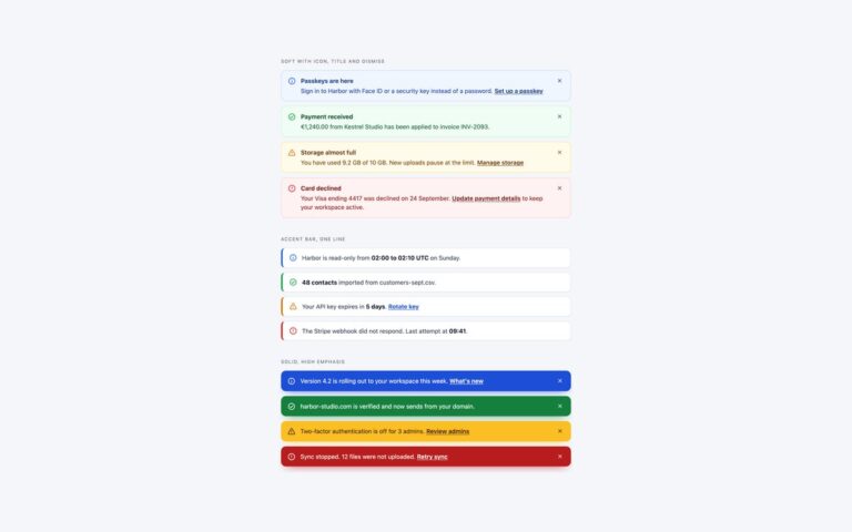
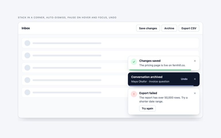
Alerts and toasts for dark dashboards and developer tools, where light-theme alerts turn into glaring blocks. The glow alerts are near-black cards with a hairline border tinted by the status, a faint gradient from the left and an icon chip with a soft glow, in sky, emerald, amber and rose; body text is tuned to pass 4.5:1 on the dark ground. The deploy failure card shows a failed production deploy with the commit, author and time, a monospace log excerpt with the error lines in red, and Retry deploy and View full log buttons. The stacked toasts collapse into a pile, like the notification stacks in modern apps, with the newest toast in front and two peeking behind it; hovering the pile or tabbing into it fans the toasts out so each can be read and closed, all in CSS with nth-child, :hover and :focus-within. Dismissing removes the item and moves focus to the next close button, so the fanned-out stack stays open for keyboard users. The Bootstrap version wraps each group in data-bs-theme=”dark” and uses .alert, .card, .toast and the Alert and Toast plugins.
What’s included
Four glow status alerts tuned for 4.5:1 on near-black
Deploy failure card with a wrapped log excerpt
Stacked toast pile that fans out on hover or focus
Fan-out done in CSS with nth-child and :focus-within
Bootstrap version uses data-bs-theme="dark"
Accessibility
Text colours were chosen to reach 4.5:1 on the dark cards and focus outlines use each status colour so they stay visible. Close buttons are named after their alert, only the error-rate alert is role="alert", and the toast pile expands on keyboard focus as well as hover, so nothing is hidden from keyboard users. The fan-out, fade and hover transitions switch off under prefers-reduced-motion.
Customise it
Each status sets --dk-accent and --dk-rgb (the same colour as comma-separated RGB for the glows) on .dk-info, .dk-success, .dk-warning and .dk-danger. The pile depth is the translate, scale and brightness values on .dk-deck>li:nth-child(2) and (3). In Bootstrap the same classes sit on .alert and .toast; in Tailwind edit the rgba values in the utilities.