About this set
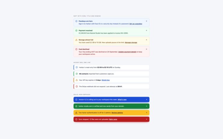
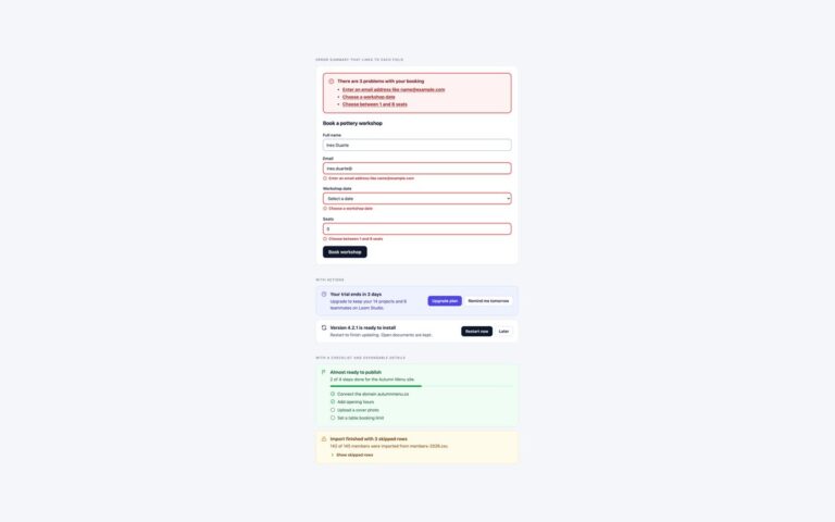
Three patterns that usually need JavaScript, done with current HTML and CSS instead. The popover toasts are elements with popover=”manual” opened and closed by buttons with popovertarget, so they sit in the top layer above everything, with no z-index battles and no script. They fade and slide in and out with @starting-style and transition-behavior: allow-discrete, and they stack upwards because the general sibling combinator moves each toast up when an earlier one is open. They do not close themselves, since that still needs a timer. The self-closing notices are non-modal dialog elements that start open; their buttons sit in a form with method=”dialog”, which closes the dialog natively, and a display transition animates the exit. The live error summary uses :has() with :user-invalid: the red summary appears only after someone has edited a field, lists only the fields that are wrong, and a green message replaces it when nothing is invalid. The browser’s own validation still runs on submit. The Bootstrap version applies the same techniques to .toast, .alert and .form-control markup without Bootstrap’s JavaScript.
What’s included
- popover="manual" toasts with no JavaScript
- Enter and exit animation with @starting-style and allow-discrete
- Toasts stack with the ~ sibling combinator
- Notices closed by form method="dialog"
- Error summary from :has() and :user-invalid
Accessibility
Toast and notice buttons are real buttons, browsers expose each opener's expanded state from popovertarget, and each toast has role="status"; screen reader announcement of a newly shown popover varies by browser, so use the scripted stack in set 5 for background events. Dialog notices are labelled by their headings. The error summary is a visual aid in an aria-live region, and native validation messages still fire on submit. All motion is removed under prefers-reduced-motion.
Customise it
The toast corner is the inset on .mc-toast and the stacking step is the 84px in its bottom calc. Notice colours are on .mc-notice, and the summary rules pair each field id with a data-for list item, so add a field by adding one selector and one li. In Bootstrap the same rules sit on .mc-toast, .mc-notice and .mc-alert; in Tailwind edit the open:, starting: and arbitrary [form:has(...)_&] variants.