/* ── Dark UI kit tokens (uiCookies) — identical in every set ──────────────────────────────
   Dark first. Elevation is a lighter surface, not a shadow: surface-0 is the page, 1 cards and
   panels, 2 controls, menus and dialogs, 3 hover, selected rows and tooltips.
   Every colour is a light-dark() pair, so flipping color-scheme turns the whole kit light:
   data-theme="dark" | "light" | "system" on any wrapper (system follows prefers-color-scheme),
   or a checked .theme-pick radio inside a [data-theme] element (:has()).
   Contrast, dark | light, on the worst surface (surface-3): text-1 12.2 | 15.0, text-2 6.6 | 7.3,
   text-3 4.8 | 5.4, accent 5.4 | 5.1, success 7.7 | 5.0, warning 8.4 | 5.2, danger 6.8 | 5.0;
   edge (control boundaries) 3.3 | 3.1 and focus 7.9 | 5.9 against every surface. */
:root{color-scheme:dark}
[data-theme="dark"]{color-scheme:dark}
[data-theme="light"]{color-scheme:light}
[data-theme="system"]{color-scheme:light dark}
[data-theme]:has(.theme-pick[value="dark"]:checked){color-scheme:dark}
[data-theme]:has(.theme-pick[value="light"]:checked){color-scheme:light}
[data-theme]:has(.theme-pick[value="system"]:checked){color-scheme:light dark}
:root{
  --surface-0:light-dark(#eef1f5,#0b0d12);   /* page */
  --surface-1:light-dark(#ffffff,#151821);   /* cards, panels, navbar, sidebar */
  --surface-2:light-dark(#f6f7f9,#1d212c);   /* controls, menus, dialogs, toasts */
  --surface-3:light-dark(#e6e9ef,#262b38);   /* hover, selected rows, tooltips */
  --text-1:light-dark(#12151c,#eceef3);      /* primary text */
  --text-2:light-dark(#434a5a,#aab1bf);      /* secondary text */
  --text-3:light-dark(#555d6e,#8f96a8);      /* captions, placeholders, axis labels */
  --border:light-dark(#dde1e8,#2a2f3c);      /* decorative 1px dividers and card edges */
  --edge:light-dark(#7c8496,#737b90);        /* control boundaries: fields, boxes, tracks */
  --accent:light-dark(#4452d0,#8b97ff);      /* the one vivid colour: links, selected, primary */
  --accent-soft:light-dark(#e6e8ff,#232a4d); /* selected backgrounds; accent text keeps 5.2 | 5.3 on it */
  --on-accent:light-dark(#ffffff,#0b0d12);   /* text on accent fills, 6.2 | 7.4 */
  --success:light-dark(#11713f,#5fd4a0);     /* desaturated for dark, so they do not vibrate */
  --warning:light-dark(#875500,#f0c060);
  --danger:light-dark(#bb2532,#ff9790);
  --focus:light-dark(#3b48c4,#b5bdff);       /* 2px focus ring */
  --highlight:light-dark(rgb(255 255 255 / 0),rgb(255 255 255 / .045)); /* 1px top light on dark surfaces */
  --shadow-color:light-dark(rgb(16 24 40 / .16),rgb(0 0 0 / .55));     /* overlays only */
  --radius:12px;--radius-sm:8px;
  --mono:ui-monospace,"SF Mono","Cascadia Code",Menlo,Consolas,monospace;
}
/* No light-dark() (Chrome < 123, Safari < 17.5, Firefox < 120): the same values, chosen by attribute */
@supports not (color:light-dark(#fff,#000)){
  :root,[data-theme="dark"]{--surface-0:#0b0d12;--surface-1:#151821;--surface-2:#1d212c;--surface-3:#262b38;--text-1:#eceef3;--text-2:#aab1bf;--text-3:#8f96a8;--border:#2a2f3c;--edge:#737b90;--accent:#8b97ff;--accent-soft:#232a4d;--on-accent:#0b0d12;--success:#5fd4a0;--warning:#f0c060;--danger:#ff9790;--focus:#b5bdff;--highlight:rgb(255 255 255 / .045);--shadow-color:rgb(0 0 0 / .55)}
  [data-theme="light"]{--surface-0:#eef1f5;--surface-1:#ffffff;--surface-2:#f6f7f9;--surface-3:#e6e9ef;--text-1:#12151c;--text-2:#434a5a;--text-3:#555d6e;--border:#dde1e8;--edge:#7c8496;--accent:#4452d0;--accent-soft:#e6e8ff;--on-accent:#ffffff;--success:#11713f;--warning:#875500;--danger:#bb2532;--focus:#3b48c4;--highlight:rgb(255 255 255 / 0);--shadow-color:rgb(16 24 40 / .16)}
  @media (prefers-color-scheme:light){[data-theme="system"]{--surface-0:#eef1f5;--surface-1:#ffffff;--surface-2:#f6f7f9;--surface-3:#e6e9ef;--text-1:#12151c;--text-2:#434a5a;--text-3:#555d6e;--border:#dde1e8;--edge:#7c8496;--accent:#4452d0;--accent-soft:#e6e8ff;--on-accent:#ffffff;--success:#11713f;--warning:#875500;--danger:#bb2532;--focus:#3b48c4;--highlight:rgb(255 255 255 / 0);--shadow-color:rgb(16 24 40 / .16)}}
}
@media (prefers-contrast:more){:root{--border:var(--edge);--text-3:var(--text-2)}}
[data-theme]{background:var(--surface-0);color:var(--text-1)}
/* The tokens above as Tailwind utilities: bg-surface-0…3, text-ink-1…3, border-line, border-edge,
   bg-accent, bg-accent-soft, text-on-accent, text-success|warning|danger, outline-focus, rounded-ui… */
@theme inline {
  --color-surface-0: var(--surface-0); --color-surface-1: var(--surface-1);
  --color-surface-2: var(--surface-2); --color-surface-3: var(--surface-3);
  --color-ink-1: var(--text-1); --color-ink-2: var(--text-2); --color-ink-3: var(--text-3);
  --color-line: var(--border); --color-edge: var(--edge);
  --color-accent: var(--accent); --color-accent-soft: var(--accent-soft); --color-on-accent: var(--on-accent);
  --color-success: var(--success); --color-warning: var(--warning); --color-danger: var(--danger);
  --color-focus: var(--focus); --color-highlight: var(--highlight);
  --radius-ui: var(--radius); --radius-ui-sm: var(--radius-sm);
  --font-mono: var(--mono);
  --shadow-overlay: 0 18px 48px -12px var(--shadow-color);
  --inset-shadow-hl: inset 0 1px 0 var(--highlight);
}
About this set
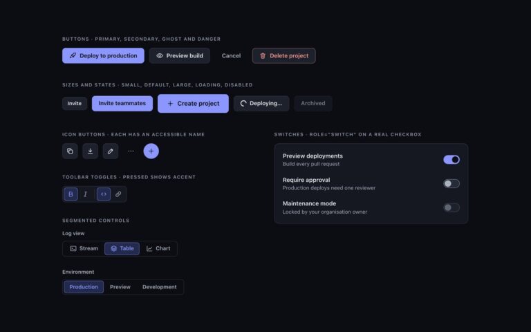
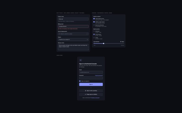
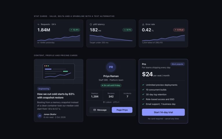
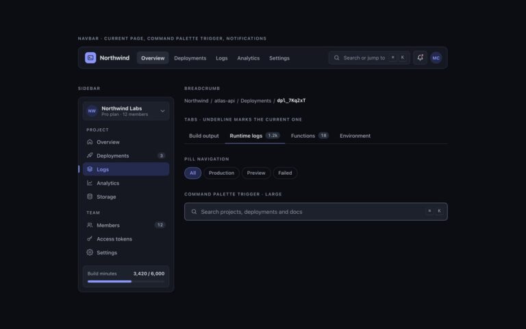
The set that proves the system: the same components rendered twice, side by side, once under data-theme=”dark” and once under data-theme=”light”, plus a third panel under data-theme=”system” that follows the operating system. Each panel holds primary, secondary, ghost and danger buttons, a field, a segmented control, a switch, a checkbox, a stat card with a sparkline, underline tabs, a warning alert and a toast, with identical markup and classes. Nothing is overridden per theme. Every colour token is a light-dark() pair, and the data-theme attribute only sets color-scheme on its element, so each token resolves to its light or dark value wherever it is used. The dark values use a slightly desaturated accent and pastel semantic colours so they do not vibrate on near-black, the light values use deeper versions of the same hues, and both sets were measured for 4.5:1 text and 3:1 control edges on every surface level. Browsers without light-dark() get a fallback block that sets the same values by attribute. In Bootstrap the panels also carry data-bs-theme so Bootstrap’s own defaults follow along.
What’s included
Identical markup under data-theme="dark", "light" and "system"
Every colour token is a light-dark() pair
Fallback values for browsers without light-dark()
Bootstrap data-bs-theme kept in step
Contrast measured on every surface in both themes
Accessibility
Both themes were checked for 4.5:1 text and 3:1 control edges on all four surface levels, and focus uses a separate --focus colour tuned for each theme. Controls keep their native semantics in both panels, the segmented control and checkbox are real inputs with labels, and transitions stop under prefers-reduced-motion.
Customise it
Edit the light-dark(light, dark) pairs in the token block to change either theme, and set data-theme="dark", "light" or "system" on any wrapper. In Bootstrap also set data-bs-theme on the same element; in Tailwind the bg-surface-*, text-ink-* and bg-accent utilities follow automatically.