/* ── Dark UI kit tokens (uiCookies) — identical in every set ──────────────────────────────
   Dark first. Elevation is a lighter surface, not a shadow: surface-0 is the page, 1 cards and
   panels, 2 controls, menus and dialogs, 3 hover, selected rows and tooltips.
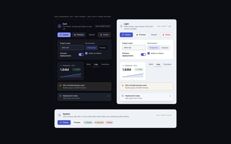
   Every colour is a light-dark() pair, so flipping color-scheme turns the whole kit light:
   data-theme="dark" | "light" | "system" on any wrapper (system follows prefers-color-scheme),
   or a checked .theme-pick radio inside a [data-theme] element (:has()).
   Contrast, dark | light, on the worst surface (surface-3): text-1 12.2 | 15.0, text-2 6.6 | 7.3,
   text-3 4.8 | 5.4, accent 5.4 | 5.1, success 7.7 | 5.0, warning 8.4 | 5.2, danger 6.8 | 5.0;
   edge (control boundaries) 3.3 | 3.1 and focus 7.9 | 5.9 against every surface. */
:root{color-scheme:dark}
[data-theme="dark"]{color-scheme:dark}
[data-theme="light"]{color-scheme:light}
[data-theme="system"]{color-scheme:light dark}
[data-theme]:has(.theme-pick[value="dark"]:checked){color-scheme:dark}
[data-theme]:has(.theme-pick[value="light"]:checked){color-scheme:light}
[data-theme]:has(.theme-pick[value="system"]:checked){color-scheme:light dark}
:root{
  --surface-0:light-dark(#eef1f5,#0b0d12);   /* page */
  --surface-1:light-dark(#ffffff,#151821);   /* cards, panels, navbar, sidebar */
  --surface-2:light-dark(#f6f7f9,#1d212c);   /* controls, menus, dialogs, toasts */
  --surface-3:light-dark(#e6e9ef,#262b38);   /* hover, selected rows, tooltips */
  --text-1:light-dark(#12151c,#eceef3);      /* primary text */
  --text-2:light-dark(#434a5a,#aab1bf);      /* secondary text */
  --text-3:light-dark(#555d6e,#8f96a8);      /* captions, placeholders, axis labels */
  --border:light-dark(#dde1e8,#2a2f3c);      /* decorative 1px dividers and card edges */
  --edge:light-dark(#7c8496,#737b90);        /* control boundaries: fields, boxes, tracks */
  --accent:light-dark(#4452d0,#8b97ff);      /* the one vivid colour: links, selected, primary */
  --accent-soft:light-dark(#e6e8ff,#232a4d); /* selected backgrounds; accent text keeps 5.2 | 5.3 on it */
  --on-accent:light-dark(#ffffff,#0b0d12);   /* text on accent fills, 6.2 | 7.4 */
  --success:light-dark(#11713f,#5fd4a0);     /* desaturated for dark, so they do not vibrate */
  --warning:light-dark(#875500,#f0c060);
  --danger:light-dark(#bb2532,#ff9790);
  --focus:light-dark(#3b48c4,#b5bdff);       /* 2px focus ring */
  --highlight:light-dark(rgb(255 255 255 / 0),rgb(255 255 255 / .045)); /* 1px top light on dark surfaces */
  --shadow-color:light-dark(rgb(16 24 40 / .16),rgb(0 0 0 / .55));     /* overlays only */
  --radius:12px;--radius-sm:8px;
  --mono:ui-monospace,"SF Mono","Cascadia Code",Menlo,Consolas,monospace;
}
/* No light-dark() (Chrome < 123, Safari < 17.5, Firefox < 120): the same values, chosen by attribute */
@supports not (color:light-dark(#fff,#000)){
  :root,[data-theme="dark"]{--surface-0:#0b0d12;--surface-1:#151821;--surface-2:#1d212c;--surface-3:#262b38;--text-1:#eceef3;--text-2:#aab1bf;--text-3:#8f96a8;--border:#2a2f3c;--edge:#737b90;--accent:#8b97ff;--accent-soft:#232a4d;--on-accent:#0b0d12;--success:#5fd4a0;--warning:#f0c060;--danger:#ff9790;--focus:#b5bdff;--highlight:rgb(255 255 255 / .045);--shadow-color:rgb(0 0 0 / .55)}
  [data-theme="light"]{--surface-0:#eef1f5;--surface-1:#ffffff;--surface-2:#f6f7f9;--surface-3:#e6e9ef;--text-1:#12151c;--text-2:#434a5a;--text-3:#555d6e;--border:#dde1e8;--edge:#7c8496;--accent:#4452d0;--accent-soft:#e6e8ff;--on-accent:#ffffff;--success:#11713f;--warning:#875500;--danger:#bb2532;--focus:#3b48c4;--highlight:rgb(255 255 255 / 0);--shadow-color:rgb(16 24 40 / .16)}
  @media (prefers-color-scheme:light){[data-theme="system"]{--surface-0:#eef1f5;--surface-1:#ffffff;--surface-2:#f6f7f9;--surface-3:#e6e9ef;--text-1:#12151c;--text-2:#434a5a;--text-3:#555d6e;--border:#dde1e8;--edge:#7c8496;--accent:#4452d0;--accent-soft:#e6e8ff;--on-accent:#ffffff;--success:#11713f;--warning:#875500;--danger:#bb2532;--focus:#3b48c4;--highlight:rgb(255 255 255 / 0);--shadow-color:rgb(16 24 40 / .16)}}
}
@media (prefers-contrast:more){:root{--border:var(--edge);--text-3:var(--text-2)}}
[data-theme]{background:var(--surface-0);color:var(--text-1)}
/* The tokens above as Tailwind utilities: bg-surface-0…3, text-ink-1…3, border-line, border-edge,
   bg-accent, bg-accent-soft, text-on-accent, text-success|warning|danger, outline-focus, rounded-ui… */
@theme inline {
  --color-surface-0: var(--surface-0); --color-surface-1: var(--surface-1);
  --color-surface-2: var(--surface-2); --color-surface-3: var(--surface-3);
  --color-ink-1: var(--text-1); --color-ink-2: var(--text-2); --color-ink-3: var(--text-3);
  --color-line: var(--border); --color-edge: var(--edge);
  --color-accent: var(--accent); --color-accent-soft: var(--accent-soft); --color-on-accent: var(--on-accent);
  --color-success: var(--success); --color-warning: var(--warning); --color-danger: var(--danger);
  --color-focus: var(--focus); --color-highlight: var(--highlight);
  --radius-ui: var(--radius); --radius-ui-sm: var(--radius-sm);
  --font-mono: var(--mono);
  --shadow-overlay: 0 18px 48px -12px var(--shadow-color);
  --inset-shadow-hl: inset 0 1px 0 var(--highlight);
}
About this set
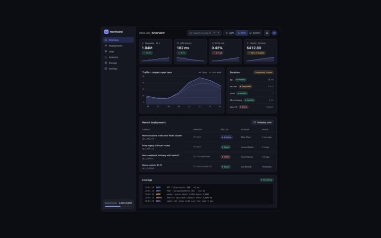
Cards from the uiCookies dark UI kit, built to show how elevation works without shadows. Three stat cards show requests, p95 latency and error rate, each with a large tabular figure, a delta badge whose direction is also given as visually hidden text, an SVG sparkline and a comparison line. Below them sit a content card with an illustrated cover drawn in the theme tokens, a category badge, a linked headline, an excerpt and an author line; a profile card with an initials avatar, an on-call badge, three counts in a description list, a location and two actions; and a featured pricing card with a most popular label, a large price, a ticked feature list and a trial button. Every card is surface-1 with a one-pixel border and a faint top highlight, and anything inside that needs to stand out moves up to surface-2 or surface-3. Badges are tinted with color-mix from their own semantic colour, which keeps the text above 4.5:1 on its fill in both themes, and the cover art and sparklines read their colours from the tokens, so they follow the light theme too.
What’s included
Stat cards with delta badges and SVG sparklines
Content card with token-coloured cover art
Profile card with counts in a description list
Featured pricing card with a text label
Badges tinted with color-mix so text keeps its contrast
Accessibility
Each card is an article with a heading, the headline is a real link with a visible focus ring, and decorative art, icons and sparklines are hidden from assistive technology, with the trend repeated as visually hidden text. Delta direction is spoken as up or down rather than shown by colour alone, counts use a description list, and all text was measured at 4.5:1 or more on its surface.
Customise it
Change --surface-1, --border and --radius for every card, and --accent, --success or --danger for badges and sparklines. In Bootstrap the tokens feed --bs-card-* and the .dk-badge variants; in Tailwind use bg-surface-1, border-line and rounded-ui.