About this set
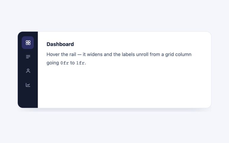
A settings card with a 200 pixel side rail of tabs, Profile, Notifications, Security and Billing, each with a small emoji icon, and the selected section’s heading and text in the panel on the right. The selected tab turns white with a teal spine on its left edge and a soft shadow, so it reads as lifted out of the grey rail. Use it for account settings, admin preferences and documentation sections where the labels read like a menu and the panels hold longer content. Below 560 pixels the grid collapses to one column and the rail becomes a horizontal row that scrolls sideways, so it stays usable on phones. The script handles selection, the roving tabindex and the hidden panels, and it also switches aria-orientation between vertical and horizontal as the layout changes, so assistive technology is told the truth. The Bootstrap version uses vertical .nav-pills with the Tab plugin, and the Tailwind version builds the rail and its states from grid, border-l and aria-selected utilities.
What’s included
- Side rail with icons and a coloured spine on the selected tab
- Collapses to a scrolling horizontal row under 560px
- aria-orientation follows the layout
- Emoji icons hidden from screen readers
- Panels hold any markup, headings included
Accessibility
The rail is a labelled tablist whose tabs control panels labelled by those tabs, and the decorative emoji are aria-hidden so each tab is announced by its word. Only the selected tab is in the Tab order; Left and Right (or Up and Down) move between tabs and select them, and Home and End jump to the first and last tab. Focus shows a 2px teal outline on the tab or panel, and transitions are removed under prefers-reduced-motion.
Customise it
Set --vt-accent, --vt-muted and --vt-text on .vtabs (plain CSS and Bootstrap) and change grid-template-columns for a wider rail; Bootstrap also takes --bs-nav-pills-link-active-bg and the --bs-nav-link-* variables. In Tailwind edit the --color-vt-* theme colours and the grid-cols-[200px_1fr] utility.