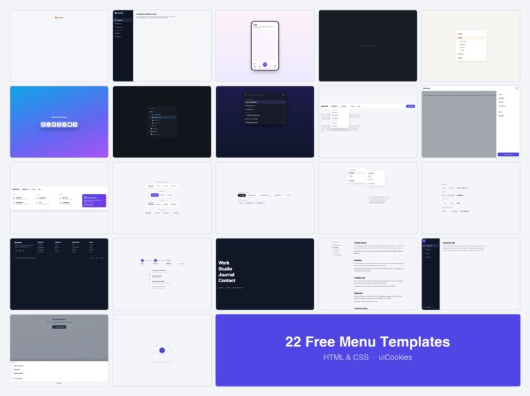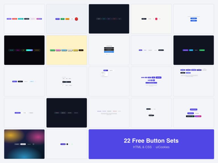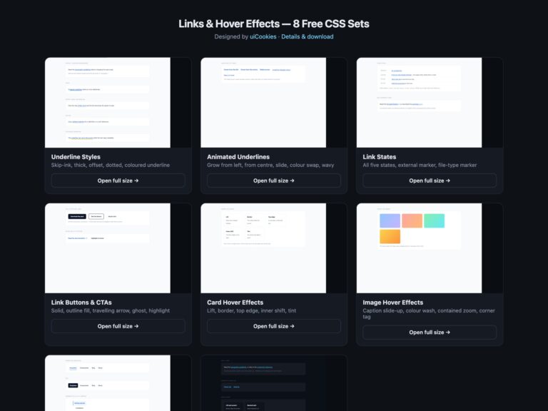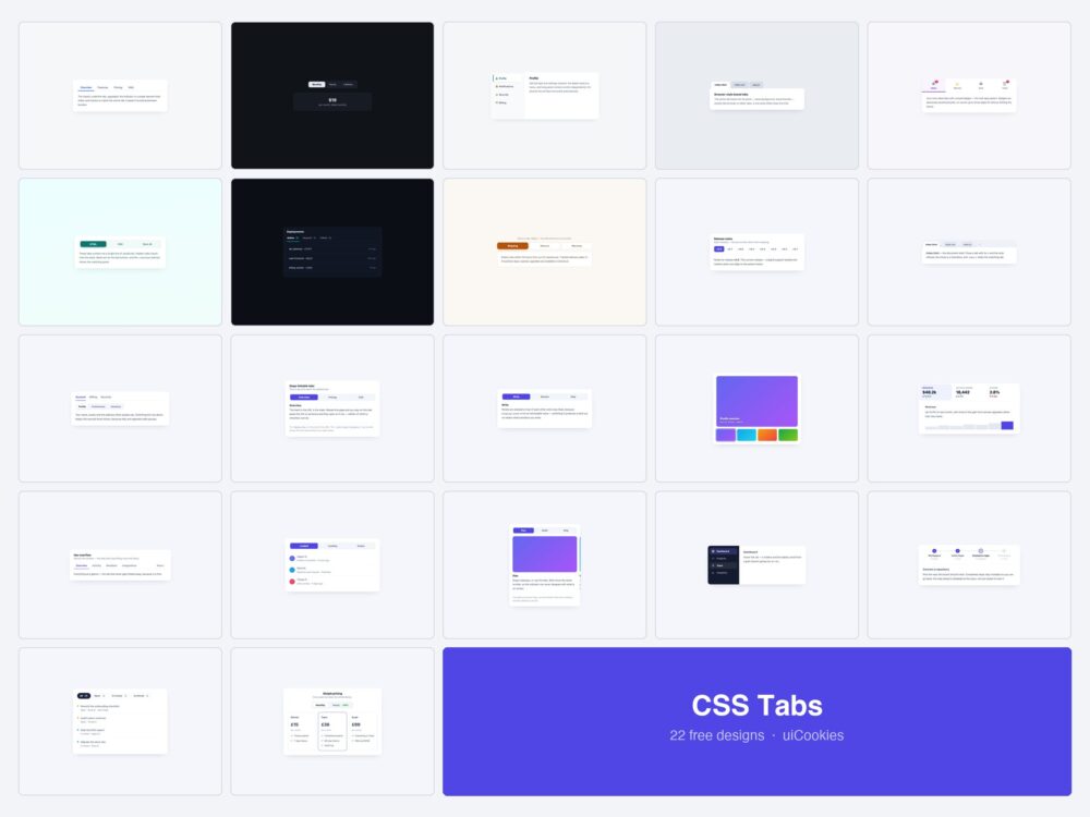
Twenty-two tab components, all designed and coded in-house by uiCookies. Each is a single self-contained HTML file with the CSS inline — and 14 of the 22 need no JavaScript at all.
That number is the point. “Can you build tabs with only CSS” usually gets a grudging yes and one radio-input example; the honest answer now stretches to closable browser tabs, two-level navigation, deep-linkable panels and a wizard. Only one design here genuinely needs script, and the page says exactly which and why.
Download all 22 (free) Browse live demos
Which tab design do you need?
| What you are building | Start with |
|---|---|
| A plain content switcher | Sliding Underline (1) or Pill Segments (2) |
| No JavaScript at all | CSS-Only (6) — and 13 more of these |
| A tab someone can link to | Deep-Linkable (12) |
| More tabs than fit | Scrollable Bar (9) or More Menu (16) |
| A settings screen | Vertical Tabs (3) or Two-Level (11) |
| An app sidebar | Icon Rail (19) |
| An editor or browser UI | Boxed Tabs (4) or Closable (10) |
| Filtering a list | Filter Tabs with Counts (21) |
| A dashboard | Metric Tabs (15) |
| An image or product gallery | Media Thumbnails (14) |
| A multi-step form | Tabs as a Wizard (20) |
| Pricing plans | Comparison Tabs (22) |
| Tabs on a phone | Swipeable Panels (18) or Tabs → Accordion (8) |
The original eight
The designs the pack started with — the common shapes, plus the CSS-only variant that started the rest.
1. Sliding Underline Tabs
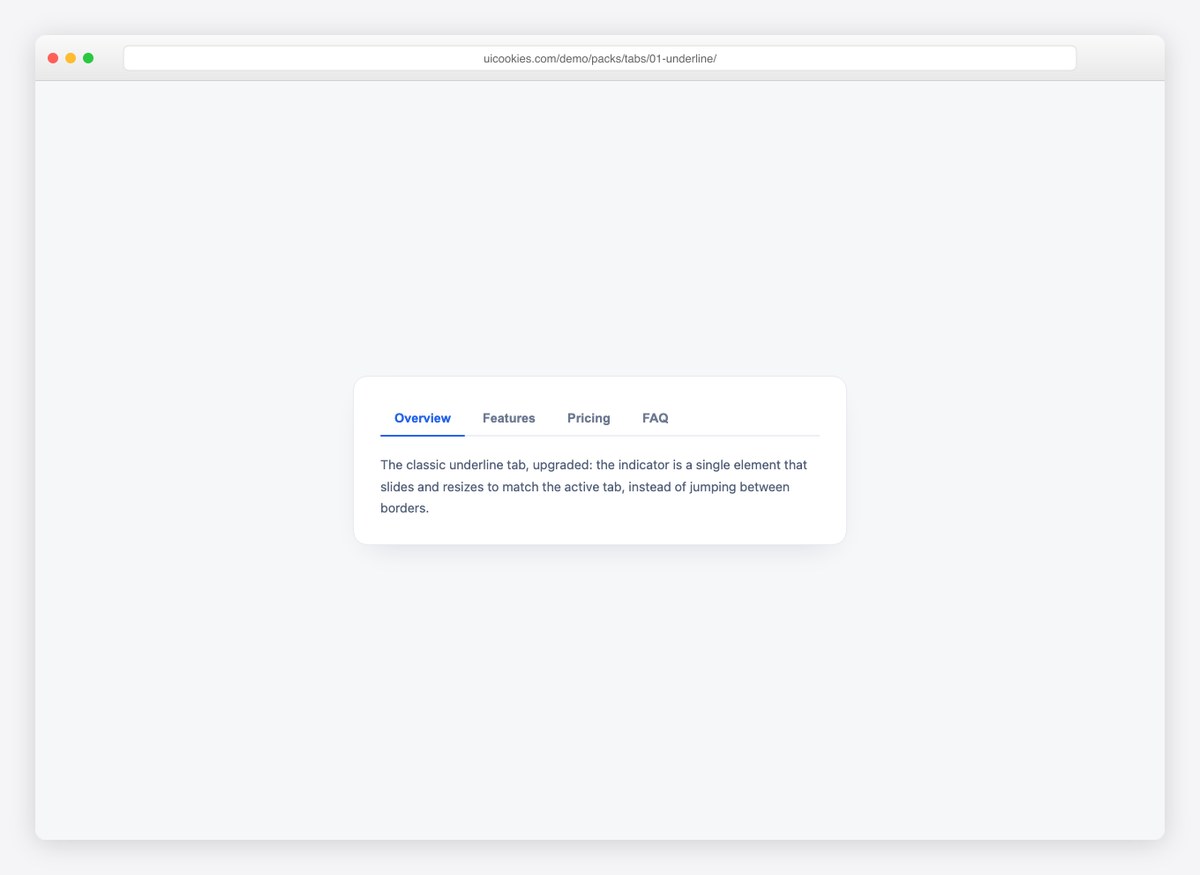
The ink-bar pattern: a single indicator element that slides and resizes to match the active tab, instead of borders jumping between buttons. Twenty lines of JavaScript, fully keyboard-accessible.
Live Demo CSS, Bootstrap & Tailwind code
2. Pill Segmented Control
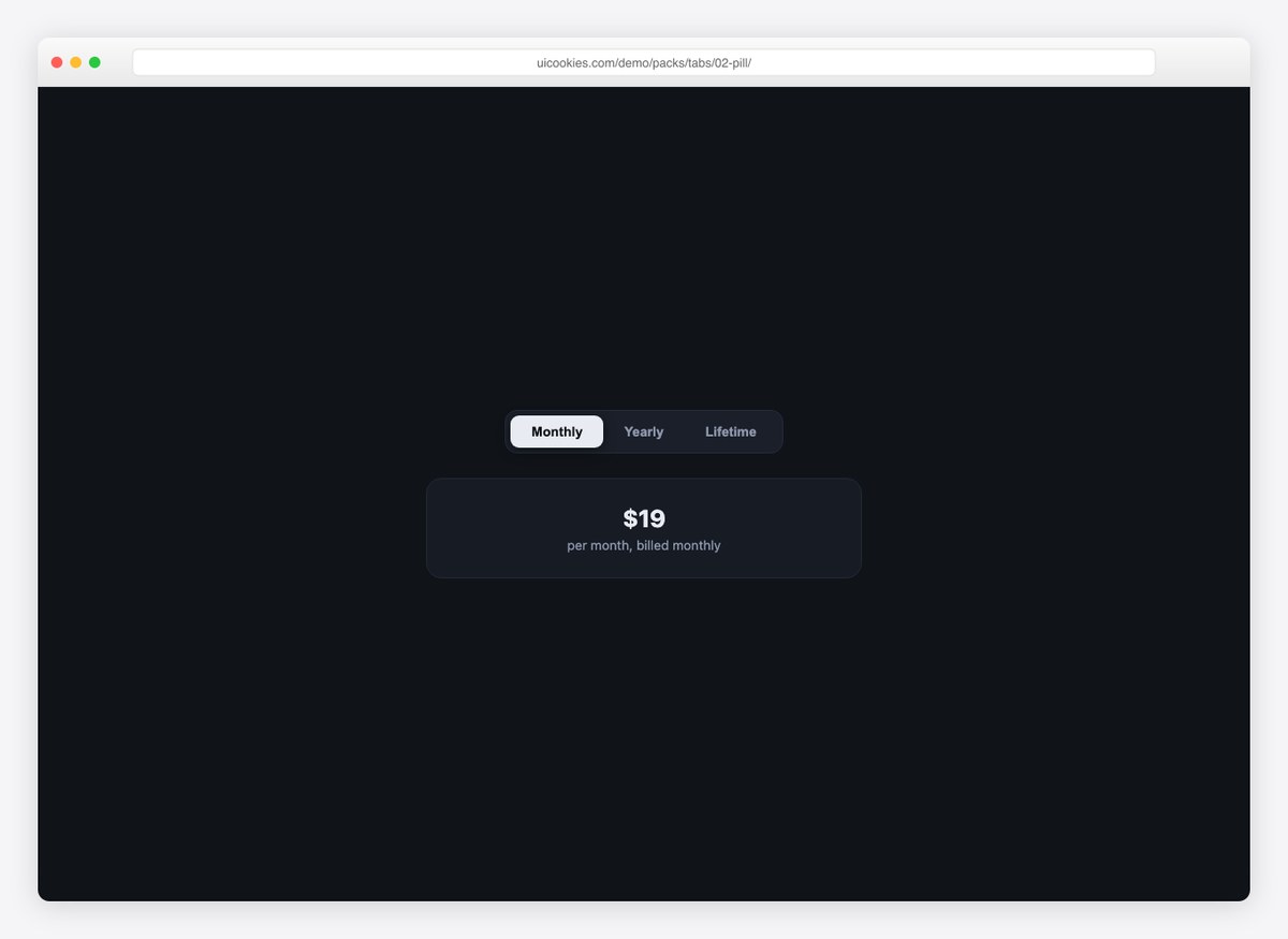
An iOS-style segmented control with a sliding thumb, wired to a live pricing card so you can see tabs driving content. Works for any either/or choice.
Live Demo CSS, Bootstrap & Tailwind code
3. Vertical Settings Tabs
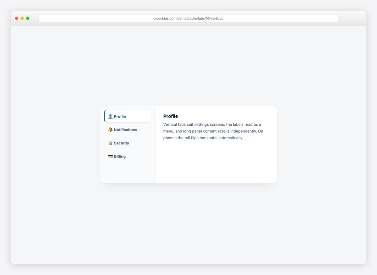
A settings-screen rail with icons and a colored spine on the active item. Below 560px the rail flips horizontal and scrolls — no separate mobile component needed.
Live Demo CSS, Bootstrap & Tailwind code
4. Boxed Browser Tabs
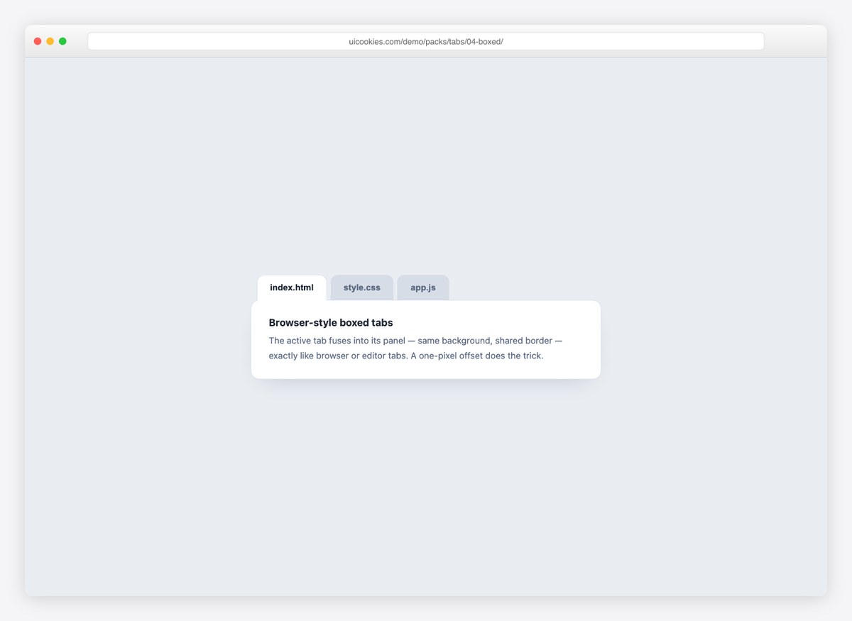
Editor-style tabs where the active tab fuses into its panel — same background, shared border, one-pixel offset. The most literal “tabs” there are.
Live Demo CSS, Bootstrap & Tailwind code
5. Icon Tabs with Badges
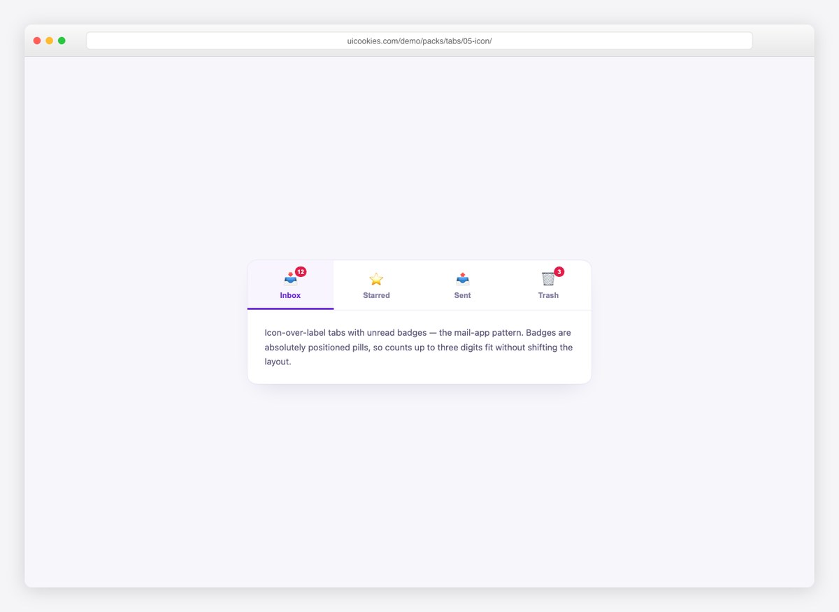
Mail-app tabs: icon over label with unread-count badges that don’t shift the layout. Active state uses color, bar, and background together.
Live Demo CSS, Bootstrap & Tailwind code
6. Pure CSS Tabs
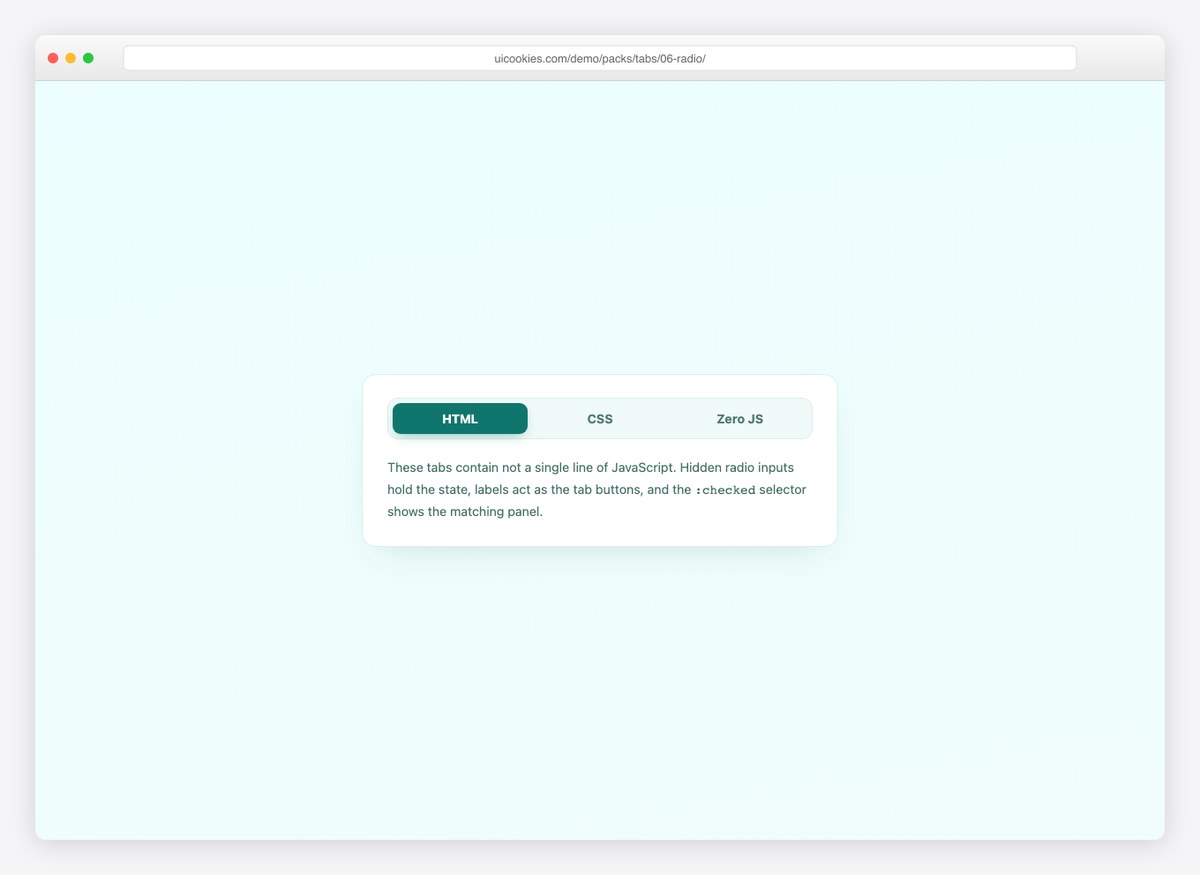
Not a single line of JavaScript — hidden radio inputs hold the state and :checked shows the panel. For docs sites and no-script baselines.
Live Demo CSS, Bootstrap & Tailwind code
7. Dark App Tabs
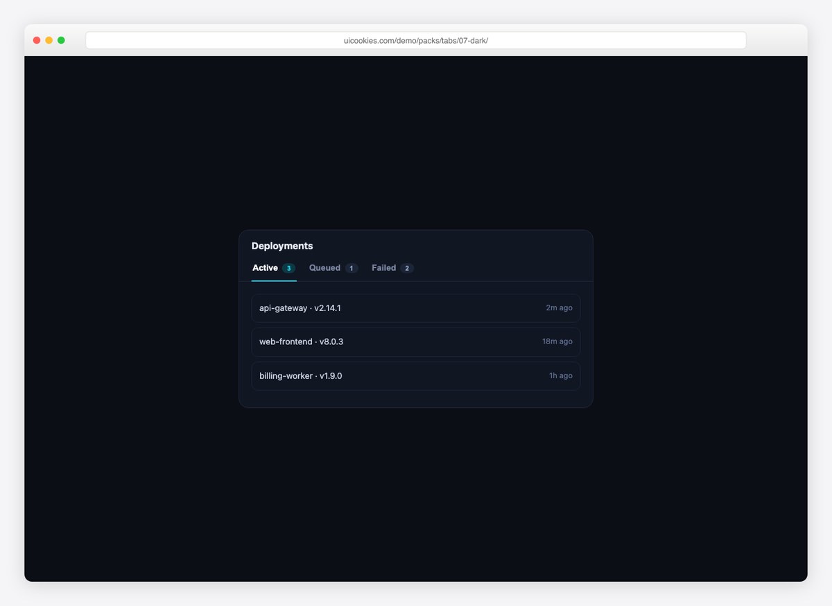
Dashboard tabs with count chips, styled for dark UIs and wired to a deployments list. The chips recolor with the active state.
Live Demo CSS, Bootstrap & Tailwind code
8. Responsive Tabs-to-Accordion
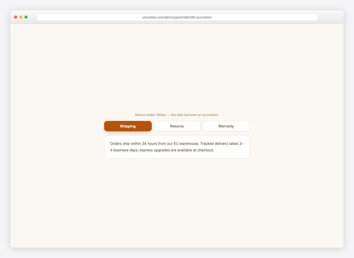
The honest answer to tabs on mobile: below 560px the tab row hides and per-panel accordion headers take over, sharing one state and one script.
Live Demo CSS, Bootstrap & Tailwind code
Fourteen more
Scrolling, closing, nesting, deep-linking, swiping and folding — thirteen of these fourteen are pure CSS.
9. Scrollable Tab Bar
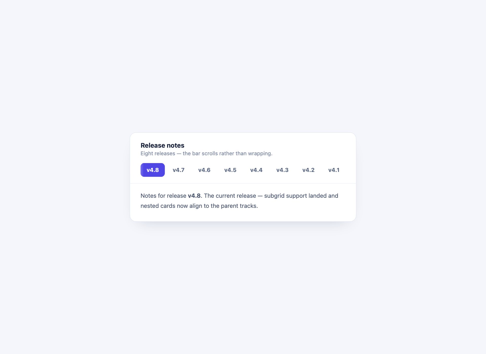
What to do when there are more tabs than width: scroll them, with a fade at each edge so it is obvious more exist. The scrollbar is hidden but the scrolling is not, and the fades are pseudo-elements — nothing has to be measured.
Live Demo CSS, Bootstrap & Tailwind code
10. Closable Browser Tabs
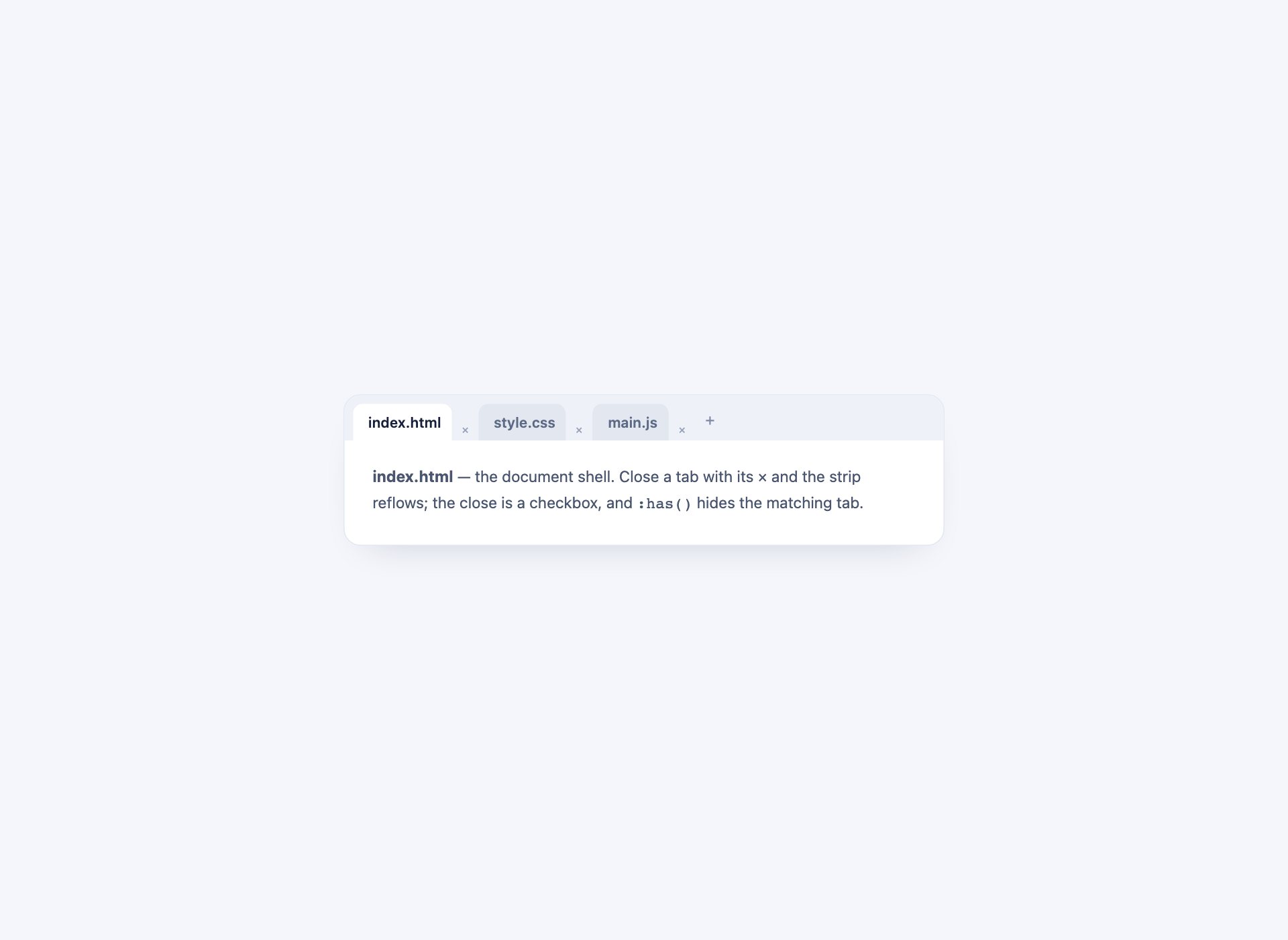
Browser-style tabs with a close control on each. Closing is a checkbox and a :has() rule, so a tab removes itself from the strip with no script — the sort of thing that used to mean reaching for a framework.
Live Demo CSS, Bootstrap & Tailwind code
11. Two-Level Tabs
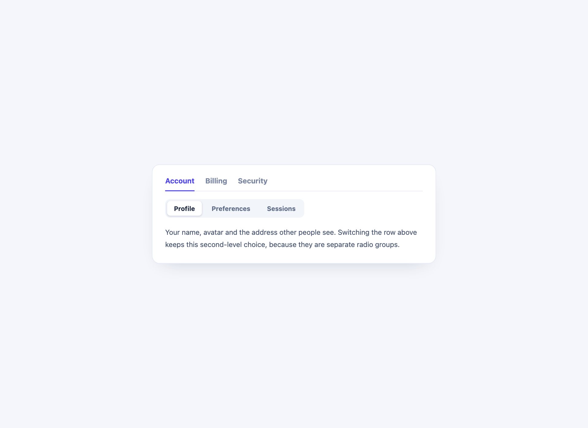
A primary tab row with its own secondary row underneath, which is where settings screens and documentation both end up. Two independent radio groups, so switching the top level does not reset the one below it.
Live Demo CSS, Bootstrap & Tailwind code
12. Deep-Linkable Tabs
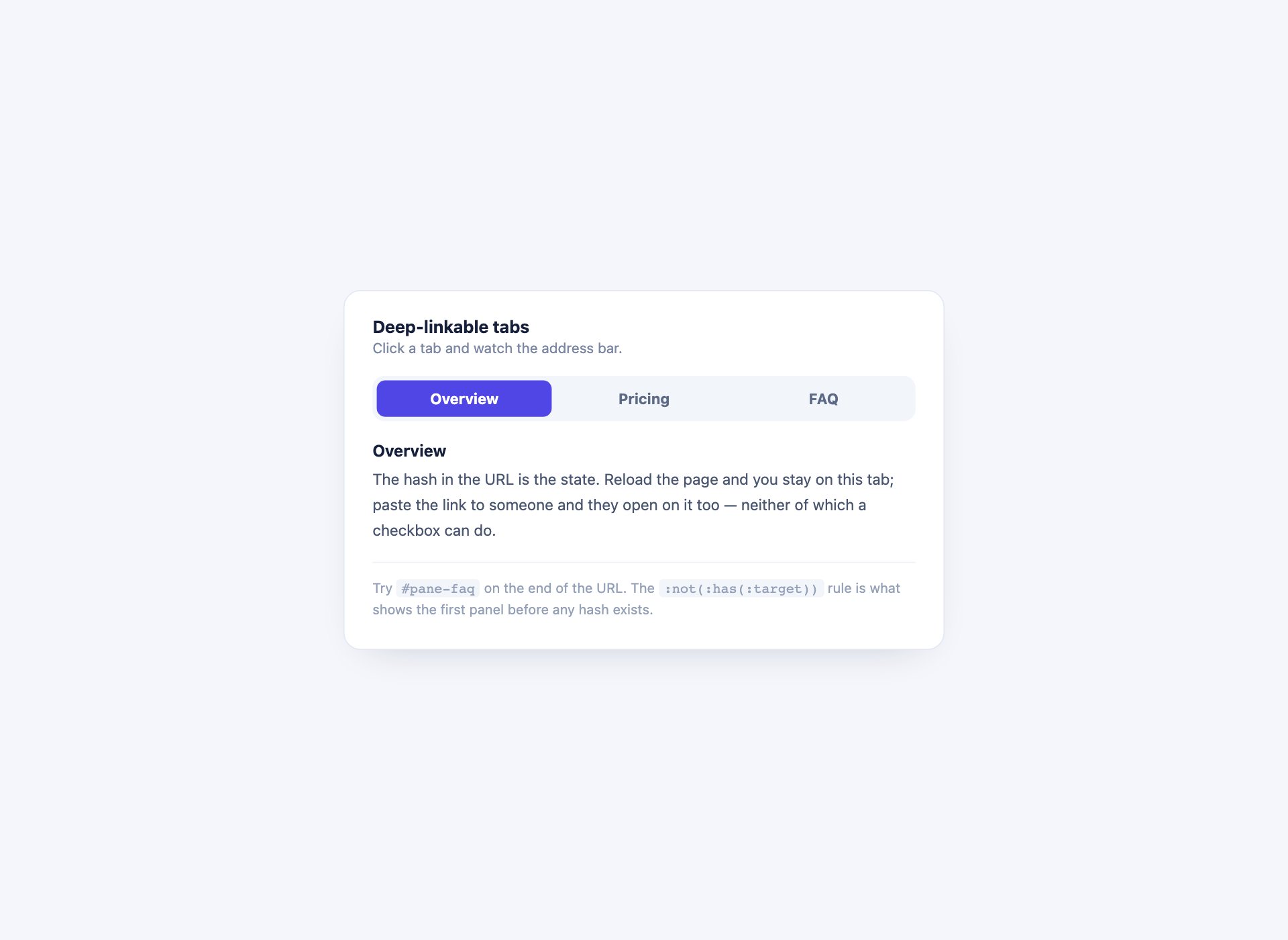
Tabs driven by the URL hash, so a panel can be linked to directly — send someone /page#pricing and they land on that tab. This is the one thing :target gives you that a checkbox never can, with a :not(:has(:target)) rule opening the first panel before any hash exists.
Live Demo CSS, Bootstrap & Tailwind code
13. Animated Panel Transitions
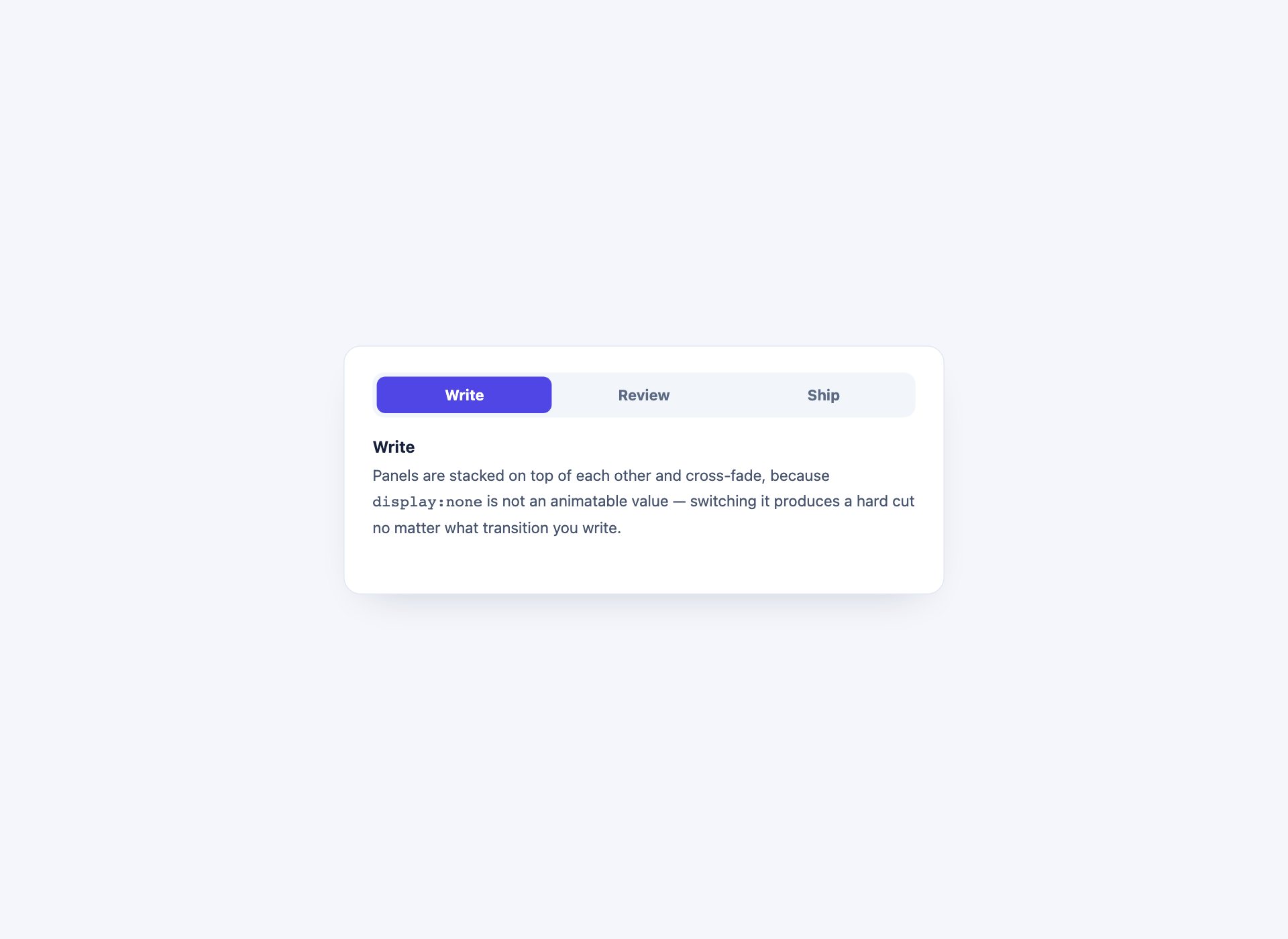
Panels that fade and lift into place rather than appearing instantly. The catch is that display:none cannot be transitioned at all, so the panels are stacked and cross-faded with opacity and visibility instead.
Live Demo CSS, Bootstrap & Tailwind code
14. Media Tabs with Thumbnails
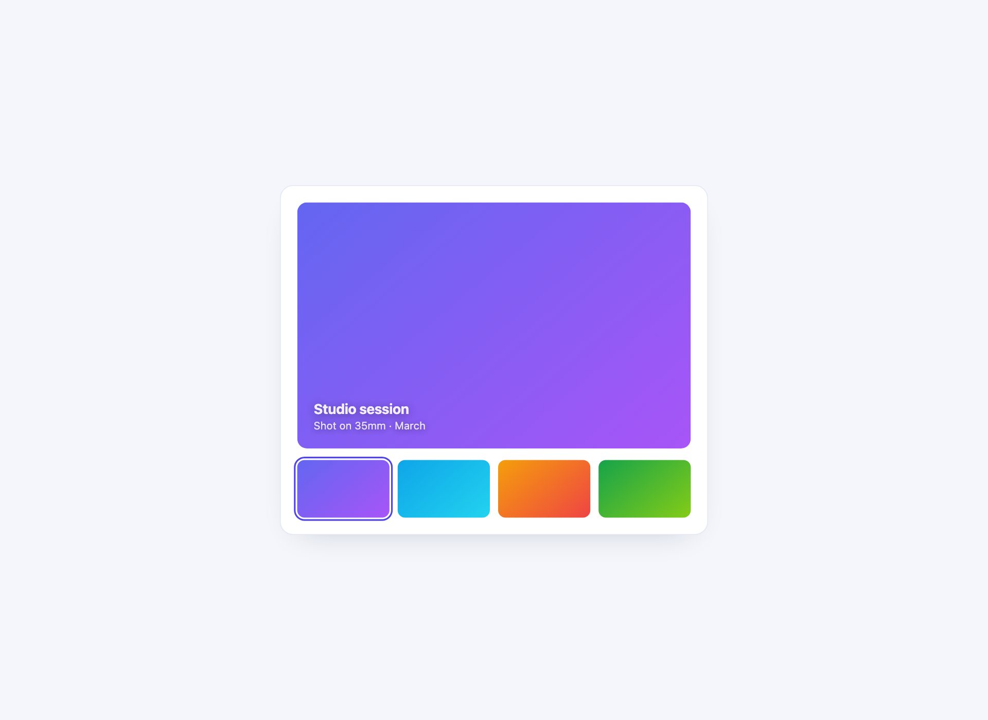
Tabs that show what they contain — a thumbnail strip for a product gallery or a case study. The previews are CSS gradients rather than images, so there is nothing to load.
Live Demo CSS, Bootstrap & Tailwind code
15. Tabs Carrying Their Own Metric
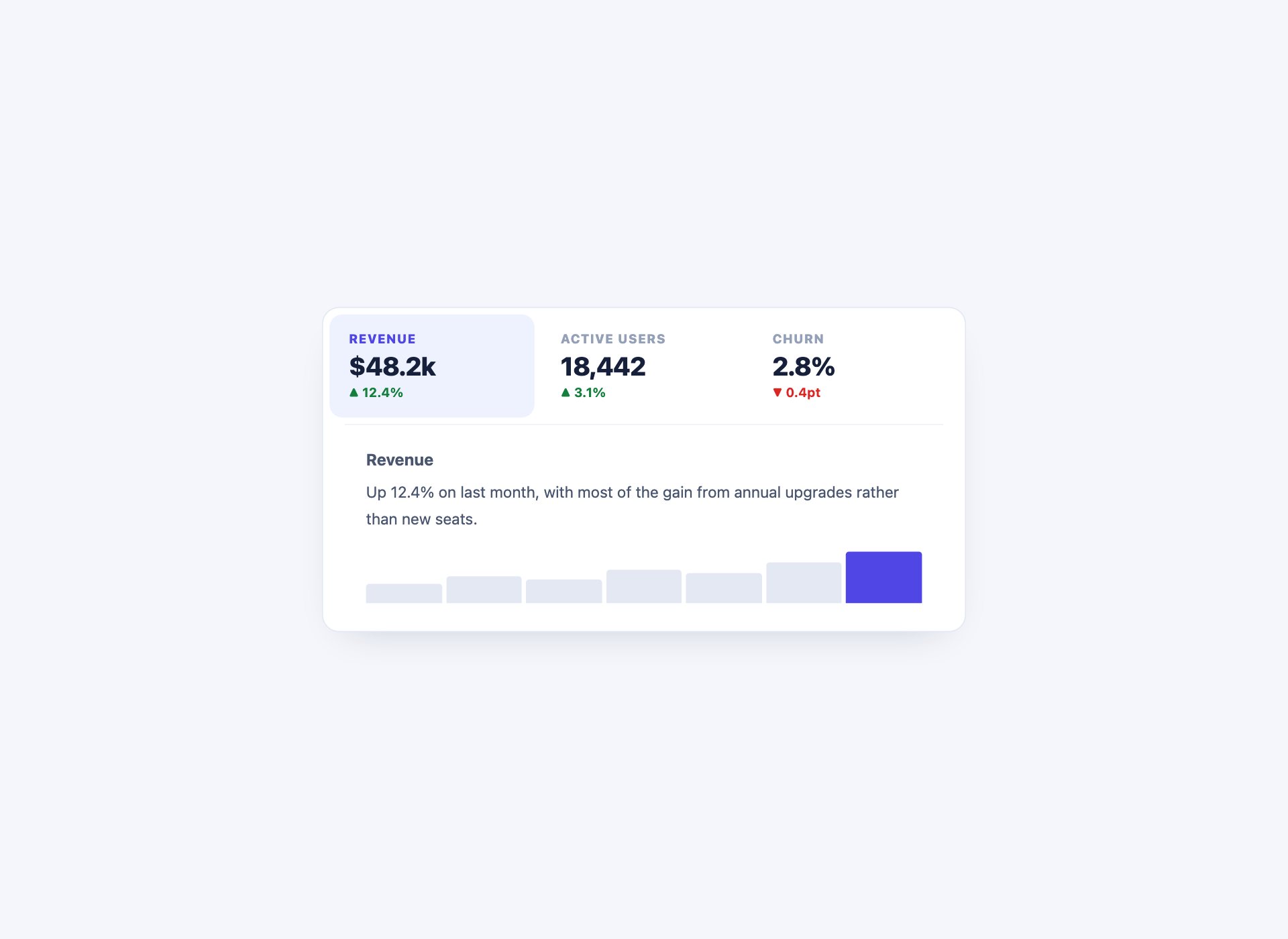
Dashboard tabs where each one shows its headline number, so the comparison is visible before anything is clicked. Selecting a tab swaps the detail and a CSS sparkline underneath.
Live Demo CSS, Bootstrap & Tailwind code
16. Tabs with a More Menu
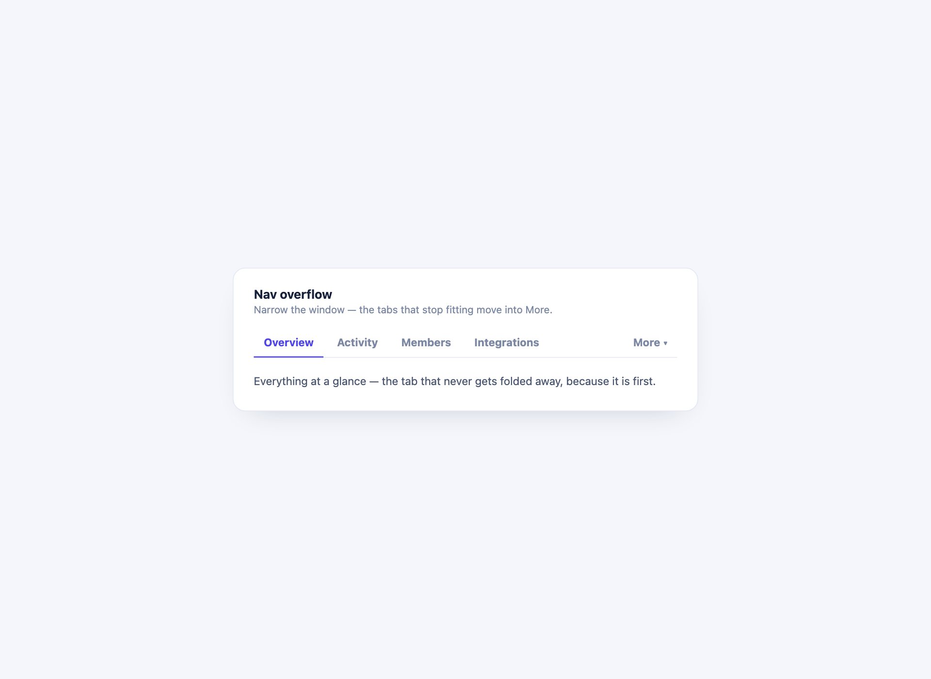
Tabs that measure themselves and fold whatever does not fit into a More menu, then put them back when the window grows. This is the one tab pattern CSS genuinely cannot express, because it depends on measured widths — a ResizeObserver and about twenty lines.
Live Demo CSS, Bootstrap & Tailwind code
17. Tab Panel States
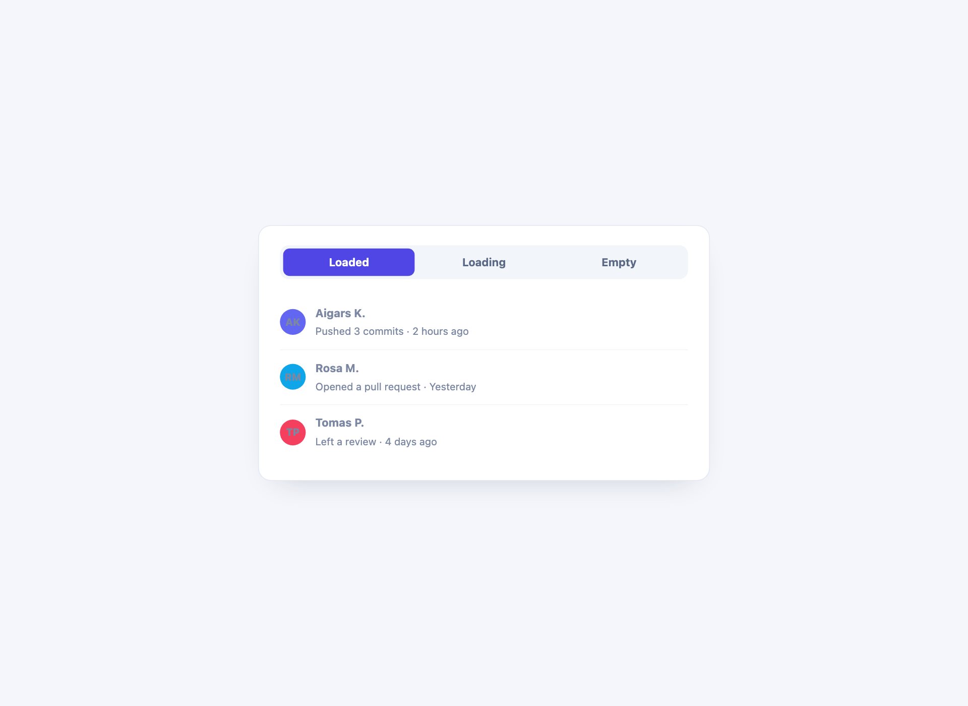
The states a tab panel is actually in: loaded, still loading, and empty. Most tab components ship only the first, which is why the second one anybody builds always looks unfinished.
Live Demo CSS, Bootstrap & Tailwind code
18. Swipeable Panels
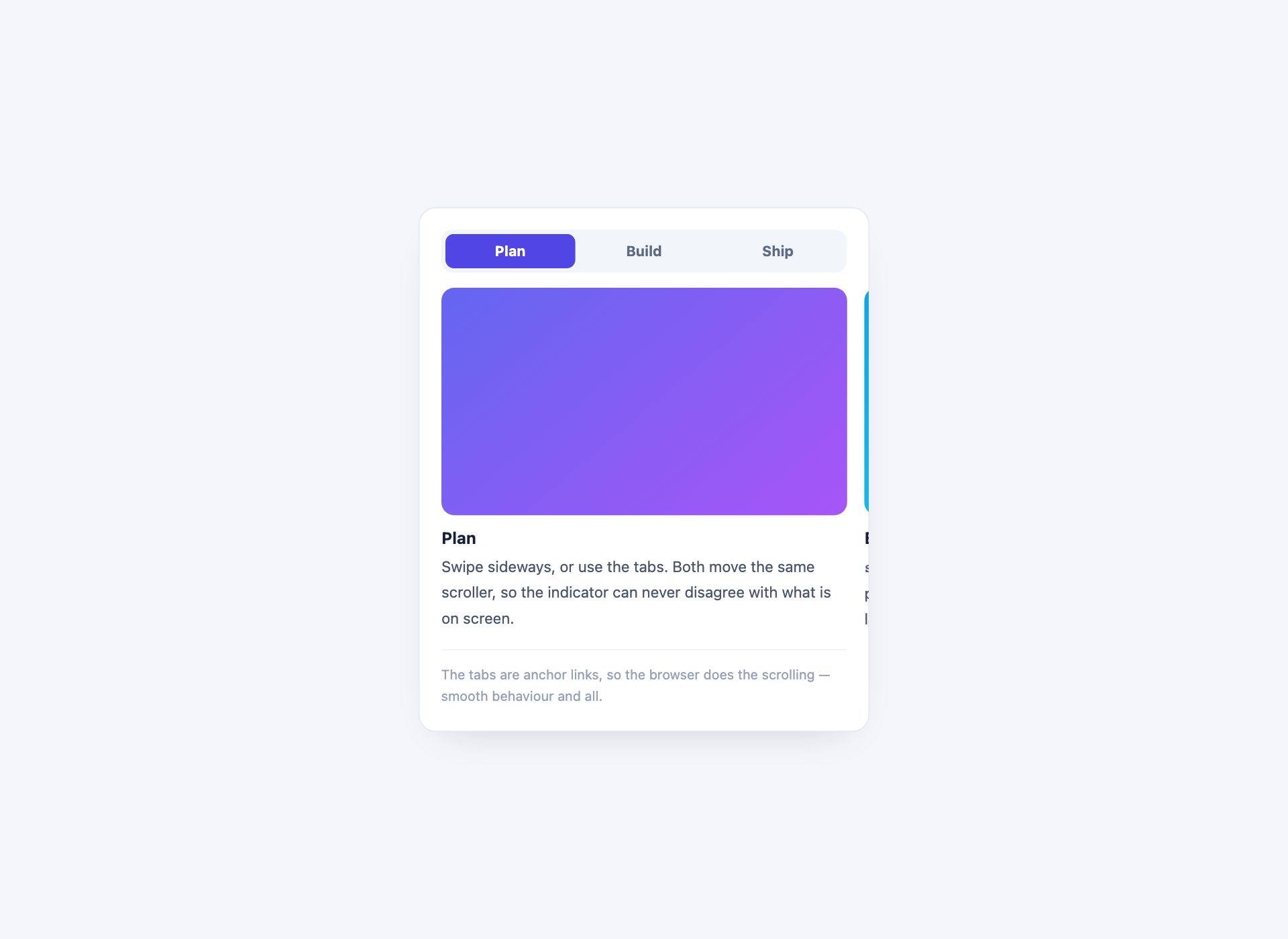
Panels laid out in a row you swipe through, with scroll-snap holding each in place and the tab strip doubling as the indicator. Scrolling and tapping drive the same scroller, so the two can never disagree about which panel is showing.
Live Demo CSS, Bootstrap & Tailwind code
19. Vertical Icon Rail Tabs
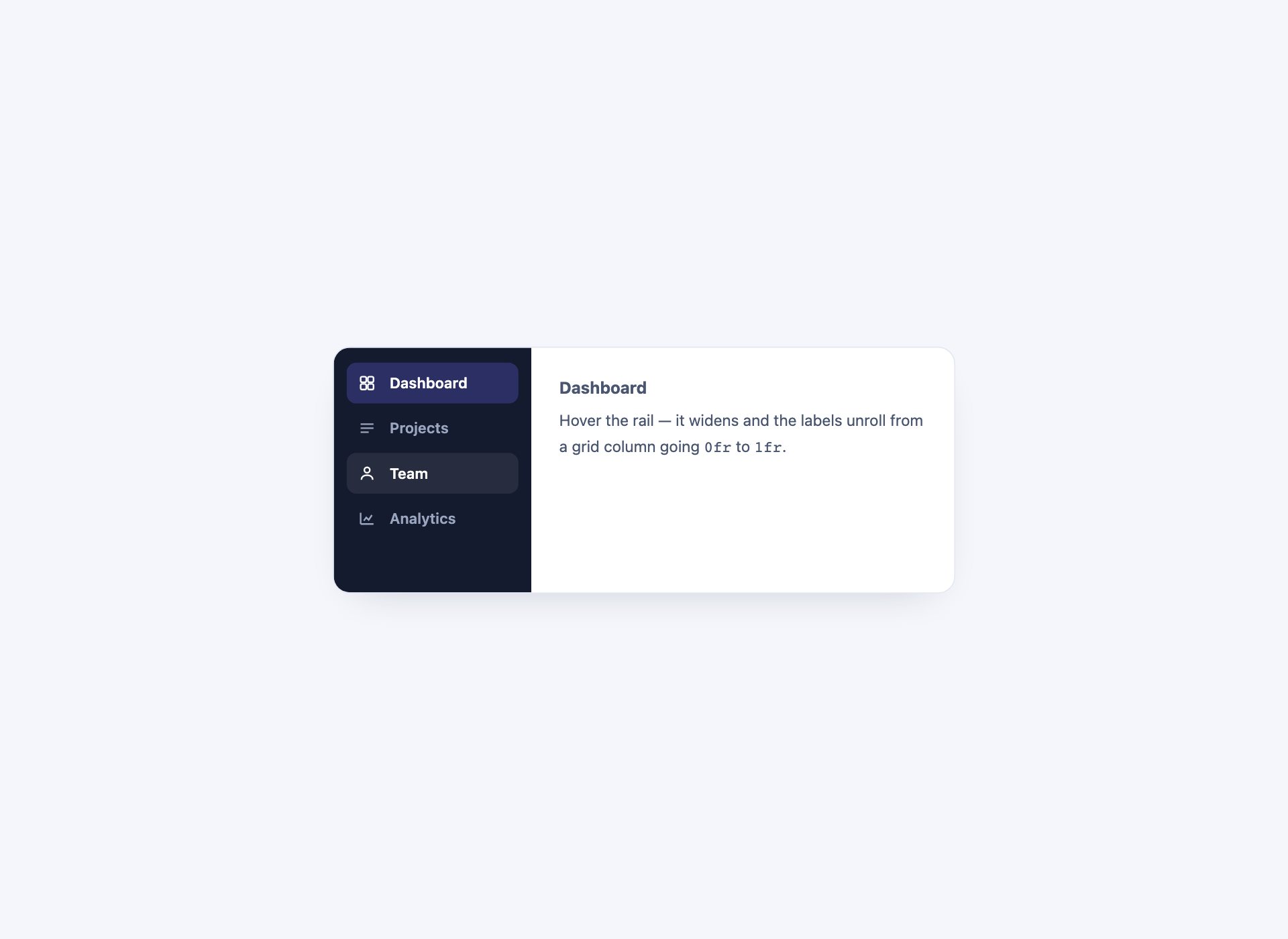
A narrow rail of icons that expands its labels on hover and focus. The labels stay in the DOM, so every tab keeps its accessible name whether or not anyone hovers.
Live Demo CSS, Bootstrap & Tailwind code
20. Tabs as a Wizard
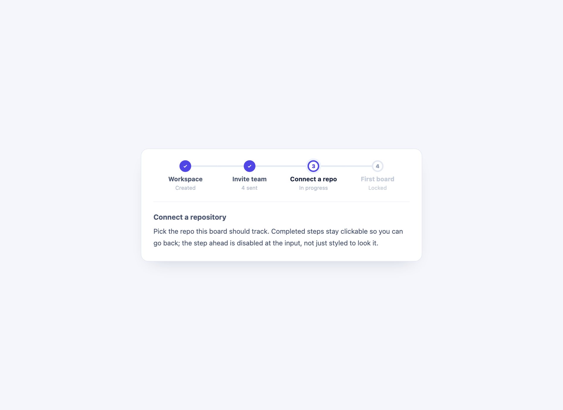
Tabs that carry progress — completed steps marked, the current one highlighted, and steps ahead disabled at the input rather than merely styled to look it. A wizard is a tab set with an order, and pretending otherwise is how people reach step four with nothing filled in.
Live Demo CSS, Bootstrap & Tailwind code
21. Filter Tabs with Counts
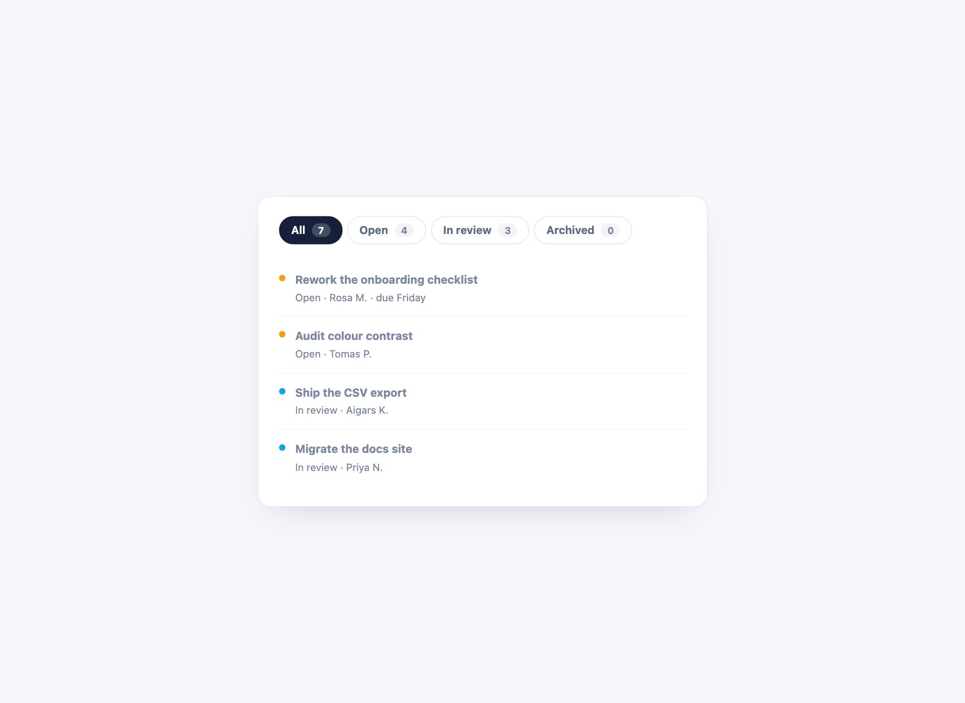
Tabs used as filters, each carrying how many items it holds — so an empty tab announces itself before anyone opens it.
Live Demo CSS, Bootstrap & Tailwind code
22. Pricing Comparison Tabs
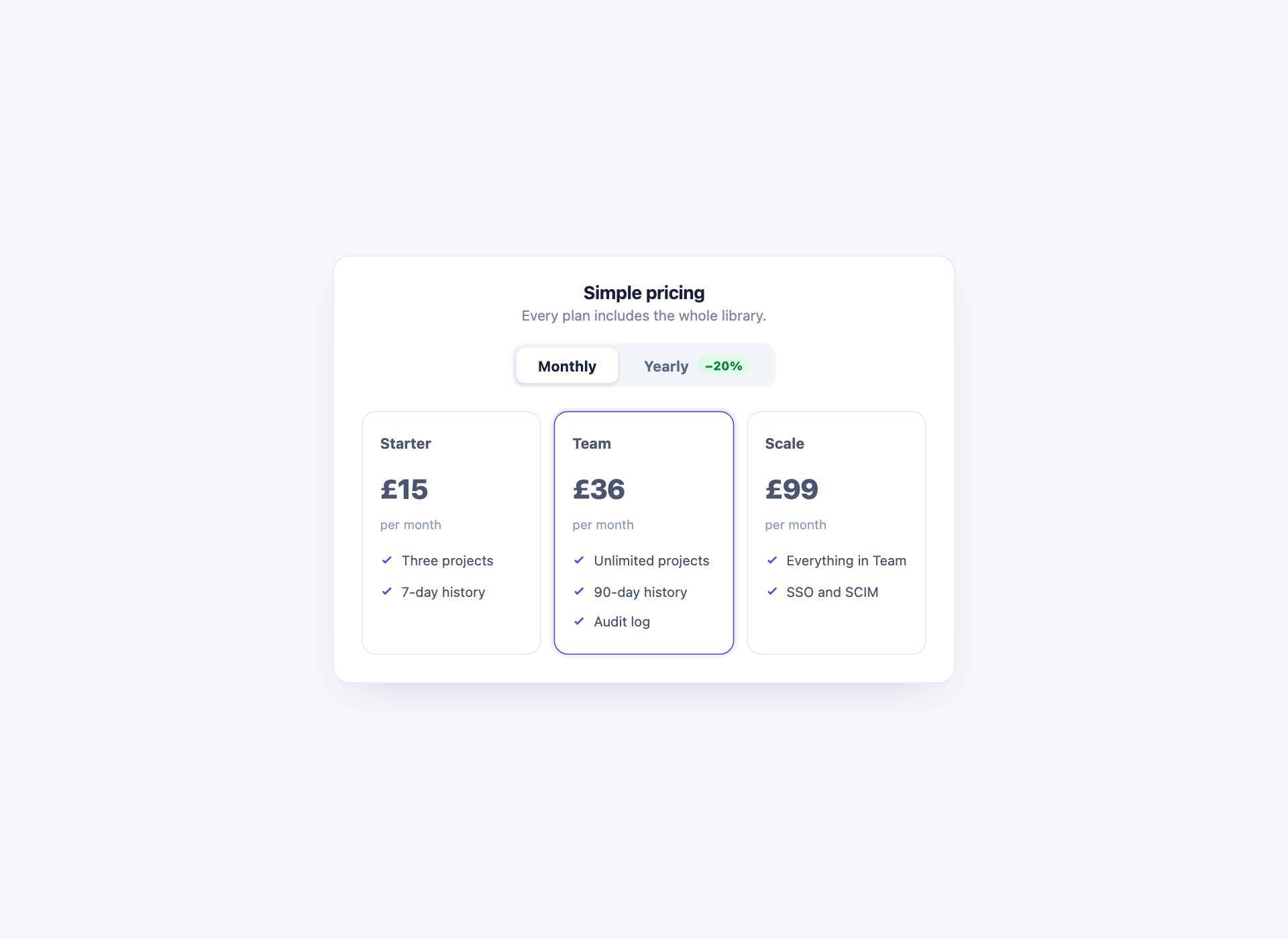
Tabs switching a whole pricing table between monthly and yearly, with the saving shown on the tab itself. Every figure swaps at once, which is the only way the comparison reads honestly.
Live Demo CSS, Bootstrap & Tailwind code
Tabs with CSS only: three techniques
There are exactly three ways to hold tab state without JavaScript, and they are not interchangeable.
Hidden radio inputs. The workhorse. A radio per tab, labels styled as the tabs, and :checked reveals the matching panel:
#t2:checked ~ .tabs label[for="t2"] { background: #4f46e5; color: #fff; }
#t2:checked ~ .panels .panel-2      { display: block; }
Native radios bring arrow-key navigation and correct screen-reader announcement with them, which is why this is worth more than the JavaScript it replaces. The limit is that the state vanishes on reload and cannot be linked to.
:target and the URL hash. Solves exactly that limit — the tab becomes part of the address, so it survives a reload and can be shared. The cost is that every tab click adds a history entry, so the back button walks through tabs rather than leaving the page. Design 12.
:has(). The newest of the three, and it changes what is reachable. Because a parent can now be styled from the state of a descendant, a tab can hide itself — which is how the closable tabs in design 10 work with no script.
Getting the accessibility right
This is where tab components most often go wrong, and the correct answer depends on which technique you used.
- JavaScript tabs want the full ARIA pattern:
role="tablist",role="tab"witharia-selected,role="tabpanel",aria-controlslinking them, arrow-key navigation, and a rovingtabindexso the tab strip is one stop rather than five. - CSS-only radio tabs should not use those roles. They are already a radio group — the browser gives you arrow keys and “2 of 4” announcement for nothing. Bolting
role="tab"onto a radio input tells assistive technology it is something it is not, and takes the working behaviour away. Wrap them in a labelledrole="radiogroup"and stop there. - Never hide a panel from the accessibility tree while it is visible, and never leave a hidden panel focusable.
display:nonehandles both; the cross-fade in design 13 needsvisibilityalongside opacity for the same reason. - Disabled means disabled. The wizard’s locked step sets the input’s
disabledattribute, not just a grey colour — otherwise it is reachable by keyboard and does nothing.
Using the tabs in your project
Download the pack, open the folder for the design you want, and copy its markup with the rules from the <style> block. Each design is self-contained — nothing depends on the other 21. For the radio-based ones, the only thing to change is the shared name on the inputs so two tab sets on one page do not fight.
Frequently asked questions
Are these tab components free?
Yes. All 22 are free for personal and commercial projects, including client work. No attribution required.
Can I make tabs with CSS only, without JavaScript?
Yes — 14 of the 22 here do. The state lives in a hidden radio input and the labels act as the tabs, so :checked shows the matching panel; or it lives in the URL hash and :target does the same job. Modern CSS goes further than most people expect: the closable tabs remove themselves with :has(), and the two-level design keeps two independent selections without a line of script.
When do tabs actually need JavaScript?
Three cases. When the choice must survive a reload or be linkable — though :target covers the linkable half. When panels load their content on demand. And when the layout depends on measurement, like folding overflowing tabs into a More menu, which is design 16 and the only one here that needs script for a reason CSS cannot argue with.
What ARIA do tabs need?
A JavaScript tab set wants role="tablist" on the container, role="tab" with aria-selected on each tab, role="tabpanel" on each panel, and aria-controls tying them together — plus arrow-key navigation and a roving tabindex. A CSS-only tab set built from radio inputs should not use those roles: it is already a radio group, and native radios give you arrow keys and correct announcement for free. Using both fights itself.
How should tabs behave on mobile?
Three honest options, and all three are here. Scroll the bar horizontally (design 9), fold the overflow into a menu (16), or stop being tabs at all and become an accordion (8). What does not work is shrinking the labels until they fit — they become unreadable and untappable at the same time.
Do they work with Bootstrap?
Yes. They use their own class names, so nothing collides with Bootstrap’s .nav-tabs or its tab JavaScript. If you want Bootstrap’s behaviour with one of these looks, keep its markup and copy the styling across.
Can I use these in a template I sell?
Yes, in client work and in products you sell. What you cannot do is repackage the pack itself for redistribution.
Download all 22 tab templates (free) Browse live demos