About this set
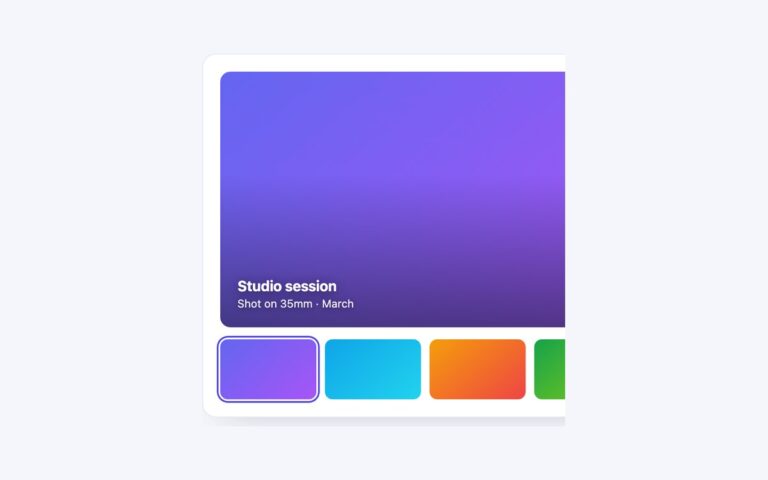
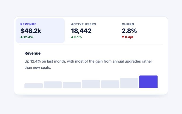
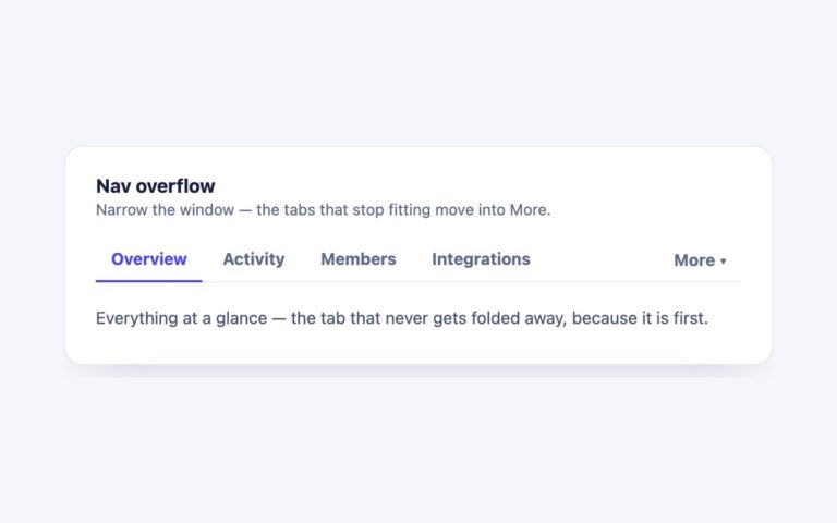
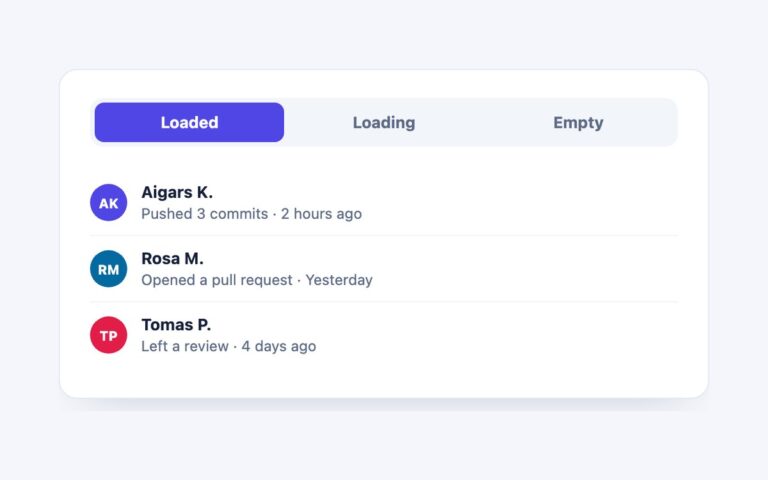
Tabs over a horizontal scroll-snap track, so on a phone you can swipe between panels as well as tap the tab strip. The three panels, Plan, Build and Ship, each have a gradient banner, a heading and a paragraph. Use it for mobile-first onboarding, feature tours or card sets where swiping is the natural gesture. The browser does the hard part: scroll-snap-type x mandatory holds each panel in place and scroll-behavior smooth animates the move, so no script decides where a swipe lands. A few lines of script watch for the scroller to come to rest and then move the highlight to the tab of the panel in view, which keeps the strip in step after a swipe. In the plain CSS version the tabs are anchor links that scroll the track and the highlight is aria-current. The Bootstrap version keeps every .tab-pane rendered inside the track and ties the Tab plugin to the scroll position; the Tailwind version does the same with a small WAI-ARIA tabs script.
What’s included
- Swipe or tap to change panels
- Scroll snap, not script, decides where a swipe lands
- The tab highlight follows the panel in view after a swipe
- Track is focusable and labelled for keyboard scrolling
- Smooth scrolling switches off under prefers-reduced-motion
Accessibility
In the plain CSS version the tabs are a nav of anchor links with aria-current on the one in view, not ARIA tabs. In the Bootstrap and Tailwind versions they follow the WAI-ARIA tabs pattern with role tablist, tab and tabpanel, aria-selected, aria-controls, a roving tabindex, arrow keys plus Home and End. In every version the track is a labelled region with tabindex="0" so it can be scrolled with the arrow keys, and focus shows a 2px indigo outline. Smooth scrolling is turned off under prefers-reduced-motion.
Customise it
Change the panel width and gap in .slide and .track (plain CSS and Bootstrap) or basis-full and gap-4 (Tailwind). The active colour is #4f46e5 in .tabs a[aria-current], --bs-nav-pills-link-active-bg, or --color-tab-accent.