About this set
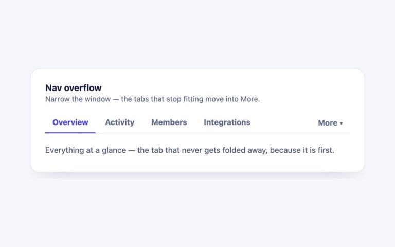
A white card with four text tabs, Overview, Features, Pricing and FAQ, over a thin grey baseline. The selected tab turns blue and a single blue ink bar slides and resizes to sit exactly under it, instead of the underline jumping from one border to the next. Use it for product pages, documentation and settings where the tabs are short words and the page around them is quiet. The markup is a tablist of buttons, one tabpanel per tab and an empty span for the ink. A short script sets aria-selected, the roving tabindex and the hidden attribute on the panels, then measures the selected tab’s offsetLeft and offsetWidth to place the ink; a ResizeObserver repositions it when fonts load or the layout changes, so long and short labels both line up. The tab row scrolls sideways rather than overflowing if the card gets narrow. The Bootstrap version is a .nav run by the Tab plugin with the same ink moved on show.bs.tab, and the Tailwind version styles the states with aria-selected utilities.
What’s included
- One ink bar that slides and resizes to the selected tab
- Full WAI-ARIA tabs pattern with arrow keys, Home and End
- Ink position recalculated with a ResizeObserver
- Tab row scrolls instead of overflowing on narrow screens
- Muted tab text darkened to meet 4.5:1
Accessibility
Buttons with role="tab" sit in a labelled tablist, each controls a tabpanel that is labelled by its tab, and aria-selected tracks the choice. Only the selected tab is in the Tab order; Left and Right (or Up and Down) move between tabs and select them, and Home and End jump to the first and last tab. Tabs and panels show a 2px blue outline on keyboard focus, and the ink and colour transitions are switched off under prefers-reduced-motion.
Customise it
Change --ut-accent, --ut-muted, --ut-text and --ut-line on .utabs in the plain CSS and Bootstrap versions (Bootstrap also reads the --bs-nav-link-* variables on .nav). In Tailwind edit the --color-ut-* theme colours and the px- and py- utilities on the tabs.