About this set
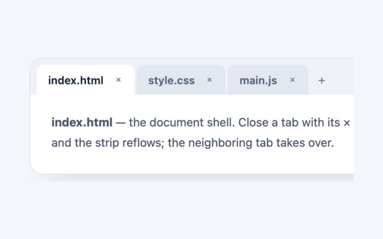
Folder-style tabs, labelled index.html, style.css and app.js, that sit on top of a white panel the way browser and code editor tabs do. Inactive tabs are a darker grey and lighten on hover, while the selected tab turns white, takes the panel’s border on three sides and overlaps the panel’s top edge by one pixel, so the two fuse into a single shape. Use it for code samples, file viewers, dashboards and any interface where the tabs should feel like physical dividers rather than links. The panel is a normal block and each tabpanel inside it can hold any content. The script sets aria-selected, the roving tabindex and hidden panels, and nothing about the look depends on it. The Bootstrap version is stock .nav-tabs recoloured through the –bs-nav-tabs-* variables, where the active link’s white bottom border does the fusing, and the Tailwind version uses a relative top-px offset with aria-selected utilities for the same effect.
What’s included
- Selected tab fuses into the panel with a 1px overlap
- Two greys for inactive and hovered tabs
- Bootstrap version is stock .nav-tabs restyled by variables
- Inactive tab text darkened to reach 4.5:1 on grey
- Narrower tab padding on small screens
Accessibility
The file names are tabs in a tablist labelled Files, each controlling a panel labelled by its tab. Only the selected tab is in the Tab order; Left and Right (or Up and Down) move between tabs and select them, and Home and End jump to the first and last tab. Keyboard focus draws a 2px blue outline inside the tab and around the panel, and the background transition is removed under prefers-reduced-motion.
Customise it
Change --bt-tab, --bt-tab-hover, --bt-muted, --bt-text and --bt-border on .btabs in plain CSS and Bootstrap; in Bootstrap the corner radius and active colours come from --bs-nav-tabs-border-radius and --bs-nav-tabs-link-active-*. In Tailwind edit the --color-bt-* theme colours.