About this set
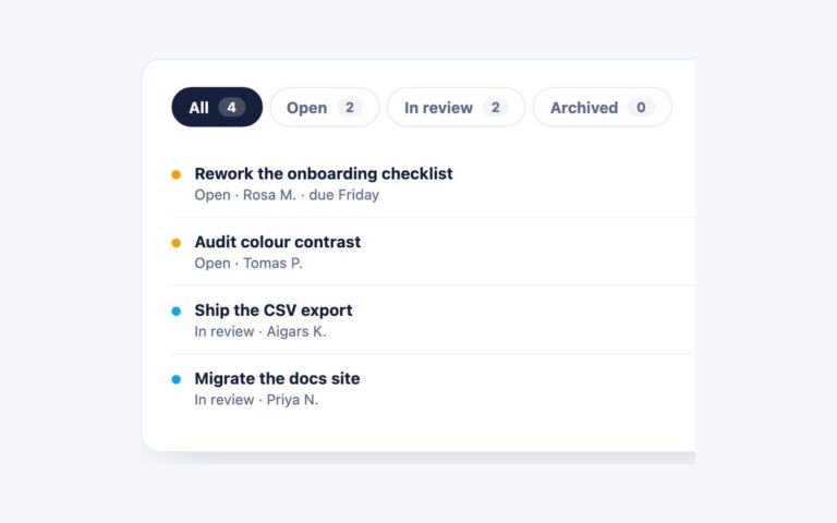
A dark card titled Deployments with three underline tabs, Active, Queued and Failed, each followed by a small count pill, and a list of deployment rows under the selected tab. The selected tab turns white with a cyan underline, and its count pill switches from slate to cyan on a deep teal background, so the numbers stay readable in both states. Use it for dashboards, admin consoles, CI and deploy tools, and anywhere a dark interface needs to split one list by status. Each row shows a service name and version on the left and a timestamp or failure reason on the right, and the rows wrap cleanly on narrow screens. The script handles aria-selected, the roving tabindex and hidden panels. The Bootstrap version is .nav-underline with the Tab plugin, recoloured through the –bs-nav-underline-* variables, with .badge pills for the counts; the Tailwind version uses aria-selected utilities, and group-aria-selected utilities for the pills.
What’s included
- Underline tabs with count pills that change with the selection
- Built for dark dashboards and consoles
- Bootstrap version uses .nav-underline and .badge
- Row timestamps lightened to meet 4.5:1 on the dark card
- Heading marked up as a real h2
Accessibility
The tabs are buttons in a tablist labelled Deployment status, so each is announced with its count, for example Active 3, and controls a panel labelled by the tab. Only the selected tab is in the Tab order; Left and Right (or Up and Down) move between tabs and select them, and Home and End jump to the first and last tab. Focus draws a 2px cyan outline around the tab or inside the panel, and colour transitions are removed under prefers-reduced-motion.
Customise it
Change --dt-accent, --dt-muted, --dt-line and --dt-pill on .dtabs in plain CSS and Bootstrap, where the tab gap and underline width come from --bs-nav-underline-gap and --bs-nav-underline-border-width. In Tailwind edit the --color-dt-* theme colours.