Open demo

CSS code

HTML
<div class="w">
  <div class="tabs" role="radiogroup" aria-label="Release stage">
    <input type="radio" name="f" id="f1" checked><label for="f1">Write</label>
    <input type="radio" name="f" id="f2"><label for="f2">Review</label>
    <input type="radio" name="f" id="f3"><label for="f3">Ship</label>
  </div>
  <div class="stage">
    <div class="pane n1"><h3>Write</h3><p>Panels are stacked on top of each other and cross-fade, because <code>display:none</code> is not an animatable value — switching it produces a hard cut no matter what transition you write.</p></div>
    <div class="pane n2"><h3>Review</h3><p><code>visibility</code> is transitioned alongside opacity so the hidden panels stop receiving clicks once they have faded out.</p></div>
    <div class="pane n3"><h3>Ship</h3><p>Under <code>prefers-reduced-motion</code> the movement is removed and the panels simply swap — the content is never withheld, only the animation.</p></div>
  </div>
</div>
CSS
/* Cross-fading tabs, CSS only: a radio group styled as a tab strip. :has() shows the pane that matches the
   checked radio. Panes share one grid cell and fade, because display:none cannot be transitioned. */
.w{width:100%;max-width:560px;padding:24px 26px 26px;background:#fff;border:1px solid #e3e8f2;border-radius:16px;
  box-shadow:0 16px 38px -24px rgba(16,24,48,.24)}
.tabs{display:flex;gap:4px;background:#f2f5fa;border-radius:11px;padding:4px;margin-bottom:18px;position:relative}
.tabs input{position:absolute;opacity:0;width:1px;height:1px;margin:0;pointer-events:none}
.tabs label{flex:1;text-align:center;padding:9px;border-radius:8px;font-size:.86rem;font-weight:700;
  color:#5d6a86;cursor:pointer;transition:background-color .18s,color .18s}
.tabs label:hover{color:#16203a}
.tabs input:checked+label{background:#4f46e5;color:#fff}
.tabs input:focus-visible+label{outline:2px solid #4f46e5;outline-offset:2px}
.stage{display:grid}
.pane{grid-area:1/1;opacity:0;visibility:hidden;transform:translateY(8px);
  transition:opacity .28s ease,transform .28s cubic-bezier(.4,0,.2,1),visibility .28s}
.pane h3{font-size:.94rem;margin:0 0 6px}
.pane p{font-size:.89rem;line-height:1.7;color:#4a5670;margin:0}
.w:has(#f1:checked) .n1,.w:has(#f2:checked) .n2,.w:has(#f3:checked) .n3{opacity:1;visibility:visible;transform:none}
@media (prefers-reduced-motion:reduce){.tabs label,.pane{transition:none}.pane{transform:none}}

Bootstrap 5 code

Requires: Bootstrap 5.3.8 CSS, Bootstrap 5.3.8 JS bundle

HTML
<div class="w">
  <div class="nav nav-pills tabs" role="tablist" aria-label="Release stage">
    <button class="nav-link active" id="stage-write-tab" data-bs-toggle="pill" data-bs-target="#stage-write" type="button" role="tab" aria-controls="stage-write" aria-selected="true">Write</button>
    <button class="nav-link" id="stage-review-tab" data-bs-toggle="pill" data-bs-target="#stage-review" type="button" role="tab" aria-controls="stage-review" aria-selected="false" tabindex="-1">Review</button>
    <button class="nav-link" id="stage-ship-tab" data-bs-toggle="pill" data-bs-target="#stage-ship" type="button" role="tab" aria-controls="stage-ship" aria-selected="false" tabindex="-1">Ship</button>
  </div>
  <div class="tab-content stage">
    <div class="tab-pane active" id="stage-write" role="tabpanel" aria-labelledby="stage-write-tab" tabindex="0"><h3>Write</h3><p>Panels are stacked on top of each other and cross-fade, because <code>display:none</code> is not an animatable value — switching it produces a hard cut no matter what transition you write.</p></div>
    <div class="tab-pane" id="stage-review" role="tabpanel" aria-labelledby="stage-review-tab" tabindex="0"><h3>Review</h3><p><code>visibility</code> is transitioned alongside opacity so the hidden panels stop receiving clicks once they have faded out.</p></div>
    <div class="tab-pane" id="stage-ship" role="tabpanel" aria-labelledby="stage-ship-tab" tabindex="0"><h3>Ship</h3><p>Under <code>prefers-reduced-motion</code> the movement is removed and the panels simply swap — the content is never withheld, only the animation.</p></div>
  </div>
</div>
CSS
/* Cross-fading tabs: Bootstrap .nav-pills and the Tab plugin. The panes share one grid cell and fade on .active,
   instead of Bootstrap's display:none swap, which cannot be transitioned. */
.w{width:100%;max-width:560px;padding:24px 26px 26px;background:#fff;border:1px solid #e3e8f2;border-radius:16px;
  box-shadow:0 16px 38px -24px rgba(16,24,48,.24)}
.tabs{--bs-nav-link-padding-x:9px;--bs-nav-link-padding-y:9px;--bs-nav-link-font-size:.86rem;--bs-nav-link-font-weight:700;
  --bs-nav-link-color:#5d6a86;--bs-nav-link-hover-color:#16203a;--bs-nav-pills-border-radius:8px;
  --bs-nav-pills-link-active-bg:#4f46e5;--bs-nav-pills-link-active-color:#fff;
  flex-wrap:nowrap;gap:4px;background:#f2f5fa;border-radius:11px;padding:4px;margin-bottom:18px}
.tabs .nav-link{flex:1;text-align:center;transition:background-color .18s,color .18s}
.tabs .nav-link:focus-visible{box-shadow:none;outline:2px solid #4f46e5;outline-offset:2px}
.stage{display:grid}
.stage>.tab-pane{display:block;grid-area:1/1;opacity:0;visibility:hidden;transform:translateY(8px);
  transition:opacity .28s ease,transform .28s cubic-bezier(.4,0,.2,1),visibility .28s}
.stage>.tab-pane.active{opacity:1;visibility:visible;transform:none}
.stage>.tab-pane:focus-visible{outline:2px solid #4f46e5;outline-offset:4px;border-radius:4px}
.stage h3{font-size:.94rem;font-weight:700;line-height:normal;margin:0 0 6px}
.stage p{font-size:.89rem;line-height:1.7;color:#4a5670;margin:0}
.stage code{color:inherit;font-size:.9em}
@media (prefers-reduced-motion:reduce){.tabs .nav-link,.stage>.tab-pane{transition:none}.stage>.tab-pane{transform:none}}

Tailwind 4 code

Requires: Tailwind CSS 4

HTML
<div class="w-full max-w-[560px] rounded-2xl border border-tab-line bg-white px-[26px] pt-6 pb-[26px] shadow-[0_16px_38px_-24px_rgba(16,24,48,.24)]">
  <div class="mb-[18px] flex gap-1 rounded-[11px] bg-tab-soft p-1" role="tablist" aria-label="Release stage">
    <button type="button" role="tab" id="stage-write-tab" aria-controls="stage-write" aria-selected="true" class="flex-1 cursor-pointer rounded-lg p-[9px] text-[.86rem] font-bold text-tab-muted transition-[color,background-color] duration-[180ms] hover:text-tab-ink focus-visible:outline-2 focus-visible:outline-offset-2 focus-visible:outline-tab-accent aria-selected:bg-tab-accent aria-selected:text-white motion-reduce:transition-none">Write</button>
    <button type="button" role="tab" id="stage-review-tab" aria-controls="stage-review" aria-selected="false" tabindex="-1" class="flex-1 cursor-pointer rounded-lg p-[9px] text-[.86rem] font-bold text-tab-muted transition-[color,background-color] duration-[180ms] hover:text-tab-ink focus-visible:outline-2 focus-visible:outline-offset-2 focus-visible:outline-tab-accent aria-selected:bg-tab-accent aria-selected:text-white motion-reduce:transition-none">Review</button>
    <button type="button" role="tab" id="stage-ship-tab" aria-controls="stage-ship" aria-selected="false" tabindex="-1" class="flex-1 cursor-pointer rounded-lg p-[9px] text-[.86rem] font-bold text-tab-muted transition-[color,background-color] duration-[180ms] hover:text-tab-ink focus-visible:outline-2 focus-visible:outline-offset-2 focus-visible:outline-tab-accent aria-selected:bg-tab-accent aria-selected:text-white motion-reduce:transition-none">Ship</button>
  </div>
  <div class="grid">
    <div id="stage-write" role="tabpanel" aria-labelledby="stage-write-tab" tabindex="0" data-active class="invisible col-start-1 row-start-1 translate-y-2 rounded opacity-0 transition-[opacity,translate,visibility] duration-[280ms] ease-[cubic-bezier(.4,0,.2,1)] focus-visible:outline-2 focus-visible:outline-offset-4 focus-visible:outline-tab-accent data-active:visible data-active:translate-y-0 data-active:opacity-100 motion-reduce:translate-y-0 motion-reduce:transition-none"><h3 class="mb-1.5 text-[.94rem] font-bold">Write</h3><p class="text-[.89rem] leading-[1.7] text-tab-body">Panels are stacked on top of each other and cross-fade, because <code>display:none</code> is not an animatable value — switching it produces a hard cut no matter what transition you write.</p></div>
    <div id="stage-review" role="tabpanel" aria-labelledby="stage-review-tab" tabindex="0" class="invisible col-start-1 row-start-1 translate-y-2 rounded opacity-0 transition-[opacity,translate,visibility] duration-[280ms] ease-[cubic-bezier(.4,0,.2,1)] focus-visible:outline-2 focus-visible:outline-offset-4 focus-visible:outline-tab-accent data-active:visible data-active:translate-y-0 data-active:opacity-100 motion-reduce:translate-y-0 motion-reduce:transition-none"><h3 class="mb-1.5 text-[.94rem] font-bold">Review</h3><p class="text-[.89rem] leading-[1.7] text-tab-body"><code>visibility</code> is transitioned alongside opacity so the hidden panels stop receiving clicks once they have faded out.</p></div>
    <div id="stage-ship" role="tabpanel" aria-labelledby="stage-ship-tab" tabindex="0" class="invisible col-start-1 row-start-1 translate-y-2 rounded opacity-0 transition-[opacity,translate,visibility] duration-[280ms] ease-[cubic-bezier(.4,0,.2,1)] focus-visible:outline-2 focus-visible:outline-offset-4 focus-visible:outline-tab-accent data-active:visible data-active:translate-y-0 data-active:opacity-100 motion-reduce:translate-y-0 motion-reduce:transition-none"><h3 class="mb-1.5 text-[.94rem] font-bold">Ship</h3><p class="text-[.89rem] leading-[1.7] text-tab-body">Under <code>prefers-reduced-motion</code> the movement is removed and the panels simply swap — the content is never withheld, only the animation.</p></div>
  </div>
</div>
CSS
@theme {
  --color-tab-ink: #16203a;
  --color-tab-body: #4a5670;
  --color-tab-muted: #5d6a86;
  --color-tab-line: #e3e8f2;
  --color-tab-soft: #f2f5fa;
  --color-tab-accent: #4f46e5;
}
JavaScript
// WAI-ARIA tabs: click or arrow keys select a tab, Home/End jump to the ends, only the selected tab is in the Tab order.
// Panels stay rendered in one grid cell; data-active fades the selected one in.
for (const list of document.querySelectorAll('[role=tablist]')) {
  const tabs = [...list.querySelectorAll('[role=tab]')];
  const select = tab => tabs.forEach(t => {
    const on = t === tab;
    t.setAttribute('aria-selected', on);
    t.tabIndex = on ? 0 : -1;
    document.getElementById(t.getAttribute('aria-controls')).toggleAttribute('data-active', on);
  });
  list.addEventListener('click', e => { const t = e.target.closest('[role=tab]'); if (t) select(t); });
  list.addEventListener('keydown', e => {
    const i = tabs.indexOf(e.target);
    const n = { ArrowLeft: i - 1, ArrowUp: i - 1, ArrowRight: i + 1, ArrowDown: i + 1, Home: 0, End: tabs.length - 1 }[e.key];
    if (n === undefined || i < 0) return;
    e.preventDefault();
    const t = tabs[(n + tabs.length) % tabs.length];
    t.focus();
    select(t);
  });
}

About this set

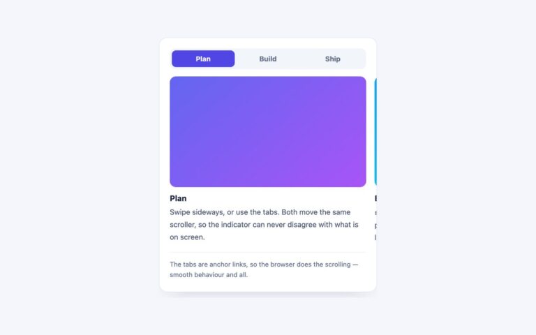
A segmented tab strip whose panels cross-fade and rise 8 pixels instead of cutting, with three steps named Write, Review and Ship. Use it where a softer change between panels helps, such as onboarding cards or feature explainers, and where the panels are short. The trick is that display:none cannot be animated, so every panel stays rendered: all three share one grid cell, which also makes the card as tall as the tallest panel, and the hidden ones sit at opacity 0 with visibility:hidden. Transitioning visibility together with opacity means a faded-out panel stops receiving clicks and leaves the accessibility tree once it has gone. The plain CSS version is a radio group and uses :has() to pick the visible panel. The Bootstrap version keeps the .nav-pills strip and Tab plugin but overrides the .tab-pane rules so the .active pane fades in rather than switching display. The Tailwind version toggles a data-active attribute from a small WAI-ARIA tabs script.

What’s included

  • Panels cross-fade and rise instead of cutting
  • Panels share one grid cell, so the card never jumps in height
  • visibility is transitioned with opacity, so hidden panels take no clicks
  • Movement and fades switch off under prefers-reduced-motion
  • Bootstrap Tab plugin with the .tab-pane display rule overridden

Accessibility

In the plain CSS version the tabs are a radio group, not ARIA tabs: the radios sit inside an element with role="radiogroup" and an aria-label, each takes its name from its visible label, Tab enters the group and the arrow keys move the selection (radios have no Home or End). In the Bootstrap and Tailwind versions they follow the WAI-ARIA tabs pattern: role tablist, tab and tabpanel, aria-selected, aria-controls, a roving tabindex, arrow keys plus Home and End. Focus shows a 2px indigo outline, and under prefers-reduced-motion the panels swap without fading or moving.

Customise it

Change the timing in the .pane transition (plain CSS), the .stage > .tab-pane rule (Bootstrap) or the duration- and translate-y- utilities (Tailwind). Colours are #4f46e5 and #f2f5fa in plain CSS, --bs-nav-pills-* on .tabs in Bootstrap and --color-tab-* in Tailwind.