Open demo

CSS code

HTML
<div class="w">
  <div class="tabs" role="radiogroup" aria-label="Panel state">
    <input type="radio" name="h" id="h1" checked><label for="h1">Loaded</label>
    <input type="radio" name="h" id="h2"><label for="h2">Loading</label>
    <input type="radio" name="h" id="h3"><label for="h3">Empty</label>
  </div>
  <div class="body">
    <div class="p p1">
      <div class="row"><span class="av" style="background:#4f46e5" aria-hidden="true">AK</span><span><b>Aigars K.</b><small>Pushed 3 commits · 2 hours ago</small></span></div>
      <div class="row"><span class="av" style="background:#0369a1" aria-hidden="true">RM</span><span><b>Rosa M.</b><small>Opened a pull request · Yesterday</small></span></div>
      <div class="row"><span class="av" style="background:#e11d48" aria-hidden="true">TP</span><span><b>Tomas P.</b><small>Left a review · 4 days ago</small></span></div>
    </div>
    <div class="p p2" aria-busy="true">
      <span class="sr-only">Loading activity…</span>
      <div class="row" aria-hidden="true"><span class="sk av"></span><span class="sk-lines"><span class="sk" style="width:38%"></span><span class="sk" style="width:62%;margin-top:7px;height:9px"></span></span></div>
      <div class="row" aria-hidden="true"><span class="sk av"></span><span class="sk-lines"><span class="sk" style="width:30%"></span><span class="sk" style="width:54%;margin-top:7px;height:9px"></span></span></div>
      <div class="row" aria-hidden="true"><span class="sk av"></span><span class="sk-lines"><span class="sk" style="width:44%"></span><span class="sk" style="width:48%;margin-top:7px;height:9px"></span></span></div>
    </div>
    <div class="p p3">
      <div class="empty">
        <span class="ic" aria-hidden="true"><svg viewBox="0 0 24 24"><path d="M4 7h16M4 12h16M4 17h10"/><circle cx="12" cy="12" r="10"/></svg></span>
        <h3>No activity yet</h3>
        <p>Once someone pushes a commit or opens a pull request, it will show up here.</p>
      </div>
    </div>
  </div>
</div>
CSS
/* Panel states, CSS only: a radio group styled as tabs switches between the three states a real panel has —
   loaded, loading (shimmering skeleton rows) and empty. :has() shows the panel for the checked radio. */
.w{width:100%;max-width:560px;padding:24px 26px 26px;background:#fff;border:1px solid #e3e8f2;border-radius:16px;
  box-shadow:0 16px 38px -24px rgba(16,24,48,.24)}
.tabs{display:flex;gap:4px;background:#f2f5fa;border-radius:11px;padding:4px;margin-bottom:20px;position:relative}
.tabs input{position:absolute;opacity:0;width:1px;height:1px;margin:0;pointer-events:none}
.tabs label{flex:1;text-align:center;padding:9px;border-radius:8px;font-size:.86rem;font-weight:700;color:#5d6a86;cursor:pointer}
.tabs label:hover{color:#16203a}
.tabs input:checked+label{background:#4f46e5;color:#fff}
.tabs input:focus-visible+label{outline:2px solid #4f46e5;outline-offset:2px}
.body .p{display:none}
.w:has(#h1:checked) .p1,.w:has(#h2:checked) .p2,.w:has(#h3:checked) .p3{display:block}
.row{display:flex;gap:12px;align-items:center;padding:11px 0;border-bottom:1px solid #f2f4f9}
.row:last-child{border-bottom:0}
.av{width:32px;height:32px;border-radius:50%;flex-shrink:0;display:grid;place-items:center;
  color:#fff;font-size:.72rem;font-weight:800}
.row b{display:block;font-size:.87rem}
.row small{font-size:.79rem;color:#5d6a86}
.sk{background:#eceff5;border-radius:6px;position:relative;overflow:hidden;display:block;height:11px}
.sk::after{content:"";position:absolute;inset:0;transform:translateX(-100%);
  background:linear-gradient(90deg,transparent,rgba(255,255,255,.9),transparent);animation:sk-shine 1.4s infinite}
@keyframes sk-shine{100%{transform:translateX(100%)}}
.sk.av{border-radius:50%;height:32px}
.sk-lines{flex:1}
.empty{text-align:center;padding:34px 10px}
.empty .ic{width:48px;height:48px;border-radius:14px;background:#f2f5fa;display:grid;place-items:center;margin:0 auto 14px}
.empty .ic svg{width:22px;height:22px;stroke:#93a0b8;fill:none;stroke-width:2}
.empty h3{font-size:.94rem;margin:0 0 5px}
.empty p{font-size:.85rem;color:#5d6a86;line-height:1.6;max-width:34ch;margin:0 auto}
.sr-only{position:absolute;width:1px;height:1px;padding:0;margin:-1px;overflow:hidden;clip:rect(0,0,0,0);white-space:nowrap;border:0}
@media (prefers-reduced-motion:reduce){.sk::after{animation:none;display:none}}

Bootstrap 5 code

Requires: Bootstrap 5.3.8 CSS, Bootstrap 5.3.8 JS bundle

HTML
<div class="w">
  <div class="nav nav-pills tabs" role="tablist" aria-label="Panel state">
    <button class="nav-link active" id="state-loaded-tab" data-bs-toggle="pill" data-bs-target="#state-loaded" type="button" role="tab" aria-controls="state-loaded" aria-selected="true">Loaded</button>
    <button class="nav-link" id="state-loading-tab" data-bs-toggle="pill" data-bs-target="#state-loading" type="button" role="tab" aria-controls="state-loading" aria-selected="false" tabindex="-1">Loading</button>
    <button class="nav-link" id="state-empty-tab" data-bs-toggle="pill" data-bs-target="#state-empty" type="button" role="tab" aria-controls="state-empty" aria-selected="false" tabindex="-1">Empty</button>
  </div>
  <div class="tab-content">
    <div class="tab-pane active" id="state-loaded" role="tabpanel" aria-labelledby="state-loaded-tab" tabindex="0">
      <div class="row-item"><span class="av" style="background:#4f46e5" aria-hidden="true">AK</span><span><b>Aigars K.</b><small>Pushed 3 commits · 2 hours ago</small></span></div>
      <div class="row-item"><span class="av" style="background:#0369a1" aria-hidden="true">RM</span><span><b>Rosa M.</b><small>Opened a pull request · Yesterday</small></span></div>
      <div class="row-item"><span class="av" style="background:#e11d48" aria-hidden="true">TP</span><span><b>Tomas P.</b><small>Left a review · 4 days ago</small></span></div>
    </div>
    <div class="tab-pane sk" id="state-loading" role="tabpanel" aria-labelledby="state-loading-tab" tabindex="0" aria-busy="true">
      <span class="visually-hidden">Loading activity…</span>
      <div class="row-item placeholder-wave" aria-hidden="true"><span class="placeholder av"></span><span class="flex-grow-1"><span class="placeholder" style="width:38%"></span><span class="placeholder" style="width:62%;margin-top:7px;height:9px"></span></span></div>
      <div class="row-item placeholder-wave" aria-hidden="true"><span class="placeholder av"></span><span class="flex-grow-1"><span class="placeholder" style="width:30%"></span><span class="placeholder" style="width:54%;margin-top:7px;height:9px"></span></span></div>
      <div class="row-item placeholder-wave" aria-hidden="true"><span class="placeholder av"></span><span class="flex-grow-1"><span class="placeholder" style="width:44%"></span><span class="placeholder" style="width:48%;margin-top:7px;height:9px"></span></span></div>
    </div>
    <div class="tab-pane" id="state-empty" role="tabpanel" aria-labelledby="state-empty-tab" tabindex="0">
      <div class="empty">
        <span class="ic" aria-hidden="true"><svg viewBox="0 0 24 24"><path d="M4 7h16M4 12h16M4 17h10"/><circle cx="12" cy="12" r="10"/></svg></span>
        <h3>No activity yet</h3>
        <p>Once someone pushes a commit or opens a pull request, it will show up here.</p>
      </div>
    </div>
  </div>
</div>
CSS
/* Panel states: Bootstrap .nav-pills and the Tab plugin switch between loaded, loading and empty.
   The loading panel uses Bootstrap placeholders with .placeholder-wave, recoloured to soft grey. */
.w{width:100%;max-width:560px;padding:24px 26px 26px;background:#fff;border:1px solid #e3e8f2;border-radius:16px;
  box-shadow:0 16px 38px -24px rgba(16,24,48,.24)}
.tabs{--bs-nav-link-padding-x:9px;--bs-nav-link-padding-y:9px;--bs-nav-link-font-size:.86rem;--bs-nav-link-font-weight:700;
  --bs-nav-link-color:#5d6a86;--bs-nav-link-hover-color:#16203a;--bs-nav-pills-border-radius:8px;
  --bs-nav-pills-link-active-bg:#4f46e5;--bs-nav-pills-link-active-color:#fff;
  flex-wrap:nowrap;gap:4px;background:#f2f5fa;border-radius:11px;padding:4px;margin-bottom:20px}
.tabs .nav-link{flex:1;text-align:center;transition:none}
.tabs .nav-link:focus-visible{box-shadow:none;outline:2px solid #4f46e5;outline-offset:2px}
.w .tab-pane:focus-visible{outline:2px solid #4f46e5;outline-offset:4px;border-radius:4px}
.row-item{display:flex;gap:12px;align-items:center;padding:11px 0;border-bottom:1px solid #f2f4f9}
.row-item:last-child{border-bottom:0}
.av{width:32px;height:32px;border-radius:50%;flex-shrink:0;display:grid;place-items:center;color:#fff;font-size:.72rem;font-weight:800}
.row-item b{display:block;font-size:.87rem}
.row-item small{font-size:.79rem;color:#5d6a86}
.sk .placeholder{display:block;background:#eceff5;opacity:1;min-height:0;height:11px;border-radius:6px}
.sk .placeholder.av{height:32px;border-radius:50%}
.sk .placeholder-wave{-webkit-mask-image:linear-gradient(130deg,#000 55%,rgba(0,0,0,.35) 75%,#000 95%);
  mask-image:linear-gradient(130deg,#000 55%,rgba(0,0,0,.35) 75%,#000 95%)}
.empty{text-align:center;padding:34px 10px}
.empty .ic{width:48px;height:48px;border-radius:14px;background:#f2f5fa;display:grid;place-items:center;margin:0 auto 14px}
.empty .ic svg{width:22px;height:22px;stroke:#93a0b8;fill:none;stroke-width:2}
.empty h3{font-size:.94rem;font-weight:700;line-height:normal;margin:0 0 5px}
.empty p{font-size:.85rem;color:#5d6a86;line-height:1.6;max-width:34ch;margin:0 auto}
@media (prefers-reduced-motion:reduce){.sk .placeholder-wave{animation:none;-webkit-mask-image:none;mask-image:none}}

Tailwind 4 code

Requires: Tailwind CSS 4

HTML
<div class="w-full max-w-[560px] rounded-2xl border border-tab-line bg-white px-[26px] pt-6 pb-[26px] shadow-[0_16px_38px_-24px_rgba(16,24,48,.24)]">
  <div class="mb-5 flex gap-1 rounded-[11px] bg-tab-soft p-1" role="tablist" aria-label="Panel state">
    <button type="button" role="tab" id="state-loaded-tab" aria-controls="state-loaded" aria-selected="true" class="flex-1 cursor-pointer rounded-lg p-[9px] text-[.86rem] font-bold text-tab-muted hover:text-tab-ink focus-visible:outline-2 focus-visible:outline-offset-2 focus-visible:outline-tab-accent aria-selected:bg-tab-accent aria-selected:text-white">Loaded</button>
    <button type="button" role="tab" id="state-loading-tab" aria-controls="state-loading" aria-selected="false" tabindex="-1" class="flex-1 cursor-pointer rounded-lg p-[9px] text-[.86rem] font-bold text-tab-muted hover:text-tab-ink focus-visible:outline-2 focus-visible:outline-offset-2 focus-visible:outline-tab-accent aria-selected:bg-tab-accent aria-selected:text-white">Loading</button>
    <button type="button" role="tab" id="state-empty-tab" aria-controls="state-empty" aria-selected="false" tabindex="-1" class="flex-1 cursor-pointer rounded-lg p-[9px] text-[.86rem] font-bold text-tab-muted hover:text-tab-ink focus-visible:outline-2 focus-visible:outline-offset-2 focus-visible:outline-tab-accent aria-selected:bg-tab-accent aria-selected:text-white">Empty</button>
  </div>
  <div id="state-loaded" role="tabpanel" aria-labelledby="state-loaded-tab" tabindex="0" class="rounded focus-visible:outline-2 focus-visible:outline-offset-4 focus-visible:outline-tab-accent">
    <div class="flex items-center gap-3 border-b border-tab-rule py-[11px] last:border-b-0"><span class="grid size-8 shrink-0 place-items-center rounded-full bg-[#4f46e5] text-[.72rem] font-extrabold text-white" aria-hidden="true">AK</span><span><b class="block text-[.87rem]">Aigars K.</b><small class="text-[.79rem] text-tab-muted">Pushed 3 commits · 2 hours ago</small></span></div>
    <div class="flex items-center gap-3 border-b border-tab-rule py-[11px] last:border-b-0"><span class="grid size-8 shrink-0 place-items-center rounded-full bg-[#0369a1] text-[.72rem] font-extrabold text-white" aria-hidden="true">RM</span><span><b class="block text-[.87rem]">Rosa M.</b><small class="text-[.79rem] text-tab-muted">Opened a pull request · Yesterday</small></span></div>
    <div class="flex items-center gap-3 border-b border-tab-rule py-[11px] last:border-b-0"><span class="grid size-8 shrink-0 place-items-center rounded-full bg-[#e11d48] text-[.72rem] font-extrabold text-white" aria-hidden="true">TP</span><span><b class="block text-[.87rem]">Tomas P.</b><small class="text-[.79rem] text-tab-muted">Left a review · 4 days ago</small></span></div>
  </div>
  <div id="state-loading" role="tabpanel" aria-labelledby="state-loading-tab" tabindex="0" aria-busy="true" hidden class="rounded focus-visible:outline-2 focus-visible:outline-offset-4 focus-visible:outline-tab-accent">
    <span class="sr-only">Loading activity…</span>
    <div class="flex items-center gap-3 border-b border-tab-rule py-[11px] last:border-b-0" aria-hidden="true"><span class="relative block overflow-hidden bg-tab-skeleton after:absolute after:inset-0 after:animate-shine after:bg-linear-to-r after:from-transparent after:via-white/90 after:to-transparent motion-reduce:after:hidden size-8 shrink-0 rounded-full"></span><span class="flex-1"><span class="relative block overflow-hidden bg-tab-skeleton after:absolute after:inset-0 after:animate-shine after:bg-linear-to-r after:from-transparent after:via-white/90 after:to-transparent motion-reduce:after:hidden h-[11px] w-[38%] rounded-md"></span><span class="relative block overflow-hidden bg-tab-skeleton after:absolute after:inset-0 after:animate-shine after:bg-linear-to-r after:from-transparent after:via-white/90 after:to-transparent motion-reduce:after:hidden mt-[7px] h-[9px] w-[62%] rounded-md"></span></span></div>
    <div class="flex items-center gap-3 border-b border-tab-rule py-[11px] last:border-b-0" aria-hidden="true"><span class="relative block overflow-hidden bg-tab-skeleton after:absolute after:inset-0 after:animate-shine after:bg-linear-to-r after:from-transparent after:via-white/90 after:to-transparent motion-reduce:after:hidden size-8 shrink-0 rounded-full"></span><span class="flex-1"><span class="relative block overflow-hidden bg-tab-skeleton after:absolute after:inset-0 after:animate-shine after:bg-linear-to-r after:from-transparent after:via-white/90 after:to-transparent motion-reduce:after:hidden h-[11px] w-[30%] rounded-md"></span><span class="relative block overflow-hidden bg-tab-skeleton after:absolute after:inset-0 after:animate-shine after:bg-linear-to-r after:from-transparent after:via-white/90 after:to-transparent motion-reduce:after:hidden mt-[7px] h-[9px] w-[54%] rounded-md"></span></span></div>
    <div class="flex items-center gap-3 border-b border-tab-rule py-[11px] last:border-b-0" aria-hidden="true"><span class="relative block overflow-hidden bg-tab-skeleton after:absolute after:inset-0 after:animate-shine after:bg-linear-to-r after:from-transparent after:via-white/90 after:to-transparent motion-reduce:after:hidden size-8 shrink-0 rounded-full"></span><span class="flex-1"><span class="relative block overflow-hidden bg-tab-skeleton after:absolute after:inset-0 after:animate-shine after:bg-linear-to-r after:from-transparent after:via-white/90 after:to-transparent motion-reduce:after:hidden h-[11px] w-[44%] rounded-md"></span><span class="relative block overflow-hidden bg-tab-skeleton after:absolute after:inset-0 after:animate-shine after:bg-linear-to-r after:from-transparent after:via-white/90 after:to-transparent motion-reduce:after:hidden mt-[7px] h-[9px] w-[48%] rounded-md"></span></span></div>
  </div>
  <div id="state-empty" role="tabpanel" aria-labelledby="state-empty-tab" tabindex="0" hidden class="rounded focus-visible:outline-2 focus-visible:outline-offset-4 focus-visible:outline-tab-accent">
    <div class="px-2.5 py-[34px] text-center">
      <span class="mx-auto mb-3.5 grid size-12 place-items-center rounded-[14px] bg-tab-soft" aria-hidden="true"><svg class="size-[22px] fill-none stroke-[#93a0b8] stroke-2" viewBox="0 0 24 24"><path d="M4 7h16M4 12h16M4 17h10"/><circle cx="12" cy="12" r="10"/></svg></span>
      <h3 class="mb-[5px] text-[.94rem] font-bold">No activity yet</h3>
      <p class="mx-auto max-w-[34ch] text-[.85rem] leading-[1.6] text-tab-muted">Once someone pushes a commit or opens a pull request, it will show up here.</p>
    </div>
  </div>
</div>
CSS
@theme {
  --color-tab-ink: #16203a;
  --color-tab-muted: #5d6a86;
  --color-tab-line: #e3e8f2;
  --color-tab-soft: #f2f5fa;
  --color-tab-rule: #f2f4f9;
  --color-tab-skeleton: #eceff5;
  --color-tab-accent: #4f46e5;
  --animate-shine: shine 1.4s infinite;
  @keyframes shine { from { translate: -100% 0; } to { translate: 100% 0; } }
}
JavaScript
// WAI-ARIA tabs: click or arrow keys select a tab, Home/End jump to the ends, only the selected tab is in the Tab order.
for (const list of document.querySelectorAll('[role=tablist]')) {
  const tabs = [...list.querySelectorAll('[role=tab]')];
  const select = tab => tabs.forEach(t => {
    const on = t === tab;
    t.setAttribute('aria-selected', on);
    t.tabIndex = on ? 0 : -1;
    document.getElementById(t.getAttribute('aria-controls')).hidden = !on;
  });
  list.addEventListener('click', e => { const t = e.target.closest('[role=tab]'); if (t && !t.disabled) select(t); });
  list.addEventListener('keydown', e => {
    const live = tabs.filter(t => !t.disabled), i = live.indexOf(e.target);
    const n = { ArrowLeft: i - 1, ArrowUp: i - 1, ArrowRight: i + 1, ArrowDown: i + 1, Home: 0, End: live.length - 1 }[e.key];
    if (n === undefined || i < 0) return;
    e.preventDefault();
    const t = live[(n + live.length) % live.length];
    t.focus();
    select(t);
  });
}

About this set

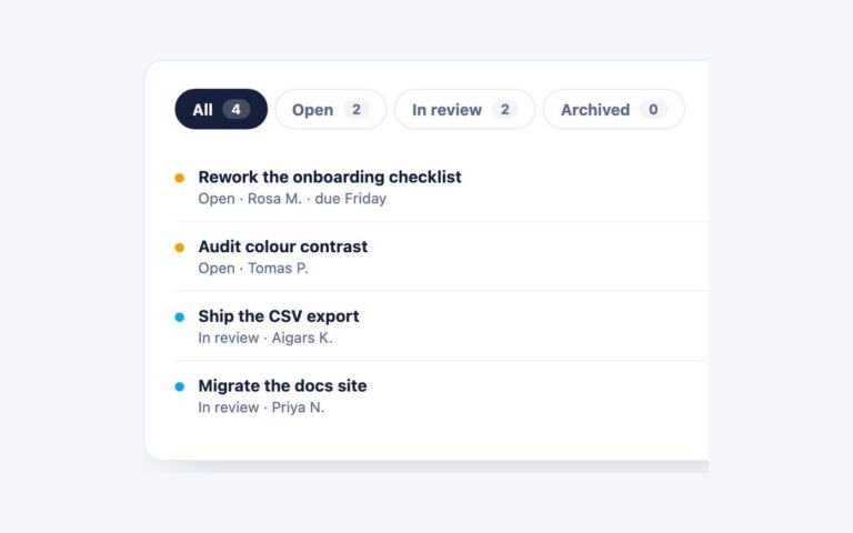
One activity panel shown in the three states a real tab panel goes through: Loaded, with three rows of avatars, names and recent actions; Loading, with skeleton rows that shimmer; and Empty, with an icon, a heading and a line of guidance. The tabs here switch between the states so you can design and review all three side by side, and each panel is ready to copy into an app that fetches tab content. The loading panel carries aria-busy and a visually hidden Loading activity message, and its skeleton rows are hidden from screen readers so they are not read out as empty content. The plain CSS version is a radio group with :has() choosing the panel and a gradient shimmer on each skeleton bar. The Bootstrap version uses .nav-pills with the Tab plugin and Bootstrap’s own placeholders with .placeholder-wave, recoloured to soft grey. The Tailwind version draws the skeleton with after: utilities and a custom shine animation, and uses a small WAI-ARIA tabs script.

What’s included

  • Loaded, loading and empty versions of the same panel
  • Skeleton rows are aria-hidden, with a hidden loading message
  • Bootstrap version uses .placeholder and .placeholder-wave
  • Shimmer stops under prefers-reduced-motion
  • Avatar colours darkened so the white initials pass 4.5:1

Accessibility

In the plain CSS version the tabs are a radio group, not ARIA tabs: the radios sit inside an element with role="radiogroup" and an aria-label, each takes its name from its visible label, Tab enters the group and the arrow keys move the selection (radios have no Home or End). In the Bootstrap and Tailwind versions they follow the WAI-ARIA tabs pattern: role tablist, tab and tabpanel, aria-selected, aria-controls, a roving tabindex, arrow keys plus Home and End. Focus shows a 2px indigo outline. The loading panel has aria-busy and hidden text, and the shimmer animation is switched off under prefers-reduced-motion.

Customise it

Change the skeleton colour #eceff5 and the shimmer timing in .sk (plain CSS), the .sk .placeholder rule (Bootstrap) or --color-tab-skeleton and --animate-shine (Tailwind). The selected tab colour is #4f46e5, --bs-nav-pills-link-active-bg or --color-tab-accent.