Open demo

CSS code

HTML
<fieldset class="rtabs">
  <legend>Topic</legend>
  <input type="radio" name="rt" id="t1" checked><input type="radio" name="rt" id="t2"><input type="radio" name="rt" id="t3">
  <div class="tabs"><label for="t1">HTML</label><label for="t2">CSS</label><label for="t3">Zero JS</label></div>
  <p class="p p1">These tabs contain not a single line of JavaScript. Hidden radio inputs hold the state, labels act as the tab buttons, and the <code>:checked</code> selector shows the matching panel.</p>
  <p class="p p2">The active style rides the same selector: <code>#t2:checked ~ .tabs label[for=t2]</code>. General sibling combinators do all the wiring.</p>
  <p class="p p3">Use this variant where scripts are unwelcome — emails aside (no radios there), it's perfect for docs, AMP-ish pages, and progressive enhancement baselines.</p>
</fieldset>
CSS
/* CSS-only tabs: hidden radio inputs hold the state, labels are the tabs, and :checked + ~ show the matching panel. No JavaScript. */
.rtabs{--rt-accent:#0f766e;--rt-muted:#4e7a72;--rt-text:#134e4a;--rt-soft:#f0faf8;--rt-line:#d8f0ec;
  position:relative;box-sizing:border-box;width:100%;max-width:540px;min-width:0;margin:0;background:#fff;border:1px solid var(--rt-line);
  border-radius:16px;padding:26px 28px;box-shadow:0 16px 38px -22px rgba(10,80,70,.22);color:var(--rt-text)}
.rtabs legend{position:absolute;width:1px;height:1px;padding:0;margin:-1px;overflow:hidden;clip:rect(0,0,0,0);white-space:nowrap;border:0}
.rtabs input[type=radio]{position:absolute;opacity:0;pointer-events:none;margin:0}
.rtabs .tabs{display:flex;gap:6px;background:var(--rt-soft);border:1px solid var(--rt-line);border-radius:12px;padding:5px;margin-bottom:20px}
.rtabs label{flex:1;text-align:center;padding:9px;border-radius:9px;font-size:.88rem;font-weight:700;color:var(--rt-muted);cursor:pointer;
  transition:background-color .15s,color .15s,box-shadow .15s}
.rtabs label:hover{color:var(--rt-text)}
.rtabs .p{display:none;margin:0;font-size:.9rem;line-height:1.7;color:#3f6d64}
#t1:checked~.tabs label[for=t1],#t2:checked~.tabs label[for=t2],#t3:checked~.tabs label[for=t3]{background:var(--rt-accent);color:#fff;box-shadow:0 6px 14px -6px rgba(15,118,110,.5)}
.rtabs code{font-family:ui-monospace,SFMono-Regular,Menlo,Consolas,monospace;font-size:.85em;color:inherit}
#t1:checked~.p1,#t2:checked~.p2,#t3:checked~.p3{display:block}
#t1:focus-visible~.tabs label[for=t1],#t2:focus-visible~.tabs label[for=t2],#t3:focus-visible~.tabs label[for=t3]{outline:2px solid var(--rt-accent);outline-offset:2px}
@media (prefers-reduced-motion:reduce){.rtabs label{transition:none}}

Bootstrap 5 code

Requires: Bootstrap 5.3.8 CSS

HTML
<fieldset class="rtabs">
  <legend class="visually-hidden">Topic</legend>
  <input type="radio" class="btn-check" name="rt" id="t1" checked><input type="radio" class="btn-check" name="rt" id="t2"><input type="radio" class="btn-check" name="rt" id="t3">
  <div class="tabs"><label class="btn" for="t1">HTML</label><label class="btn" for="t2">CSS</label><label class="btn" for="t3">Zero JS</label></div>
  <p class="p p1">These tabs contain not a single line of JavaScript. Hidden radio inputs hold the state, labels act as the tab buttons, and the <code>:checked</code> selector shows the matching panel.</p>
  <p class="p p2">The active style rides the same selector: <code>#t2:checked ~ .tabs label[for=t2]</code>. General sibling combinators do all the wiring.</p>
  <p class="p p3">Use this variant where scripts are unwelcome — emails aside (no radios there), it's perfect for docs, AMP-ish pages, and progressive enhancement baselines.</p>
</fieldset>
CSS
/* CSS-only tabs with Bootstrap: .btn-check radios hold the state, .btn labels are the tabs (restyled via --bs-btn-*), :checked + ~ show the panel. No JavaScript. */
.rtabs{--rt-accent:#0f766e;--rt-muted:#4e7a72;--rt-text:#134e4a;--rt-soft:#f0faf8;--rt-line:#d8f0ec;
  position:relative;width:100%;max-width:540px;min-width:0;margin:0;background:#fff;border:1px solid var(--rt-line);
  border-radius:16px;padding:26px 28px;box-shadow:0 16px 38px -22px rgba(10,80,70,.22);color:var(--rt-text)}
.rtabs .tabs{display:flex;gap:6px;background:var(--rt-soft);border:1px solid var(--rt-line);border-radius:12px;padding:5px;margin-bottom:20px}
.rtabs .btn{--bs-btn-padding-x:9px;--bs-btn-padding-y:9px;--bs-btn-font-size:.88rem;--bs-btn-font-weight:700;--bs-btn-line-height:normal;
  --bs-btn-color:var(--rt-muted);--bs-btn-hover-color:var(--rt-text);--bs-btn-hover-bg:transparent;--bs-btn-border-width:0;--bs-btn-border-radius:9px;
  --bs-btn-active-color:var(--rt-text);--bs-btn-active-bg:transparent;--bs-btn-active-border-color:transparent;
  flex:1;transition:background-color .15s,color .15s,box-shadow .15s}
.rtabs .p{display:none;margin:0;font-size:.9rem;line-height:1.7;color:#3f6d64}
#t1:checked~.tabs label[for=t1],#t2:checked~.tabs label[for=t2],#t3:checked~.tabs label[for=t3]{background:var(--rt-accent);color:#fff;box-shadow:0 6px 14px -6px rgba(15,118,110,.5)}
.rtabs code{font-family:ui-monospace,SFMono-Regular,Menlo,Consolas,monospace;font-size:.85em;color:inherit}
#t1:checked~.p1,#t2:checked~.p2,#t3:checked~.p3{display:block}
#t1:focus-visible~.tabs label[for=t1],#t2:focus-visible~.tabs label[for=t2],#t3:focus-visible~.tabs label[for=t3]{outline:2px solid var(--rt-accent);outline-offset:2px}
@media (prefers-reduced-motion:reduce){.rtabs .btn{transition:none}}

Tailwind 4 code

Requires: Tailwind CSS 4

HTML
<fieldset class="group relative w-full max-w-[540px] min-w-0 rounded-2xl border border-rt-line bg-white px-7 py-[26px] text-rt-text shadow-[0_16px_38px_-22px_rgba(10,80,70,.22)]">
  <legend class="sr-only">Topic</legend>
  <input type="radio" name="rt" id="t1" class="peer/t1 sr-only" checked><input type="radio" name="rt" id="t2" class="peer/t2 sr-only"><input type="radio" name="rt" id="t3" class="peer/t3 sr-only">
  <div class="mb-5 flex gap-1.5 rounded-xl border border-rt-line bg-rt-soft p-[5px]">
    <label for="t1" class="flex-1 cursor-pointer rounded-[9px] p-[9px] text-center text-[.88rem] font-bold text-rt-muted transition-[background-color,color,box-shadow] duration-150 hover:text-rt-text group-has-[#t1:checked]:bg-rt-accent group-has-[#t1:checked]:text-white group-has-[#t1:checked]:shadow-[0_6px_14px_-6px_rgba(15,118,110,.5)] group-has-[#t1:focus-visible]:outline-2 group-has-[#t1:focus-visible]:outline-offset-2 group-has-[#t1:focus-visible]:outline-rt-accent motion-reduce:transition-none">HTML</label>
    <label for="t2" class="flex-1 cursor-pointer rounded-[9px] p-[9px] text-center text-[.88rem] font-bold text-rt-muted transition-[background-color,color,box-shadow] duration-150 hover:text-rt-text group-has-[#t2:checked]:bg-rt-accent group-has-[#t2:checked]:text-white group-has-[#t2:checked]:shadow-[0_6px_14px_-6px_rgba(15,118,110,.5)] group-has-[#t2:focus-visible]:outline-2 group-has-[#t2:focus-visible]:outline-offset-2 group-has-[#t2:focus-visible]:outline-rt-accent motion-reduce:transition-none">CSS</label>
    <label for="t3" class="flex-1 cursor-pointer rounded-[9px] p-[9px] text-center text-[.88rem] font-bold text-rt-muted transition-[background-color,color,box-shadow] duration-150 hover:text-rt-text group-has-[#t3:checked]:bg-rt-accent group-has-[#t3:checked]:text-white group-has-[#t3:checked]:shadow-[0_6px_14px_-6px_rgba(15,118,110,.5)] group-has-[#t3:focus-visible]:outline-2 group-has-[#t3:focus-visible]:outline-offset-2 group-has-[#t3:focus-visible]:outline-rt-accent motion-reduce:transition-none">Zero JS</label>
  </div>
  <p class="hidden text-[.9rem] leading-[1.7] text-[#3f6d64] peer-checked/t1:block">These tabs contain not a single line of JavaScript. Hidden radio inputs hold the state, labels act as the tab buttons, and the <code class="font-[ui-monospace,SFMono-Regular,Menlo,Consolas,monospace] text-[.85em]">:checked</code> selector shows the matching panel.</p>
  <p class="hidden text-[.9rem] leading-[1.7] text-[#3f6d64] peer-checked/t2:block">The active style rides the same selector: <code class="font-[ui-monospace,SFMono-Regular,Menlo,Consolas,monospace] text-[.85em]">#t2:checked ~ .tabs label[for=t2]</code>. General sibling combinators do all the wiring.</p>
  <p class="hidden text-[.9rem] leading-[1.7] text-[#3f6d64] peer-checked/t3:block">Use this variant where scripts are unwelcome — emails aside (no radios there), it's perfect for docs, AMP-ish pages, and progressive enhancement baselines.</p>
</fieldset>
CSS
@theme {
  --color-rt-accent: #0f766e;
  --color-rt-muted: #4e7a72;
  --color-rt-text: #134e4a;
  --color-rt-soft: #f0faf8;
  --color-rt-line: #d8f0ec;
}

About this set

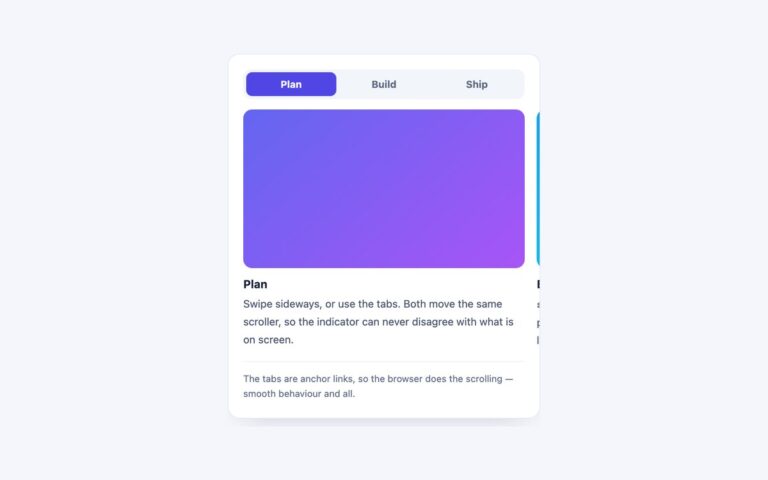
Three tabs, HTML, CSS and Zero JS, in a pale teal segmented bar above a text panel, built without any JavaScript. Hidden radio inputs hold the state, a label for each radio acts as the tab, and general sibling selectors such as #t2:checked ~ .tabs label[for=t2] style the selected label and #t2:checked ~ .p2 show the matching panel. The selected label fills with dark teal and a soft shadow. Use it where scripts are unwelcome or unavailable: documentation, static site generators, content management systems that strip scripts, and progressive enhancement baselines. Because these are real radio buttons rather than ARIA tabs, a screen reader announces them as a group of three radio buttons called Topic, and the panels follow in reading order. Tab moves to the checked radio, the arrow keys move between radios and select them, and focus is drawn on the visible label. The Bootstrap version uses .btn-check radios and .btn labels restyled through –bs-btn-* variables, and the Tailwind version uses named peers for the panels and group-has for the labels.

What’s included

  • No JavaScript: radio inputs hold the state
  • Grouped in a fieldset with a visually hidden legend
  • Focus ring drawn on the visible label
  • Bootstrap version uses .btn-check and .btn
  • Tailwind version uses peer-checked and group-has variants

Accessibility

This set uses radio buttons rather than the ARIA tabs pattern: the radios are grouped in a fieldset whose visually hidden legend reads Topic, and each is named by its label. Tab reaches the checked radio and the arrow keys move and select, as radios always do, but Home and End are not supported. The focused radio's label gets a 2px teal outline, and the label transition is removed under prefers-reduced-motion.

Customise it

Change --rt-accent, --rt-muted, --rt-text, --rt-soft and --rt-line on .rtabs (plain CSS and Bootstrap); Bootstrap label sizing comes from --bs-btn-padding-x, --bs-btn-padding-y and --bs-btn-font-size. In Tailwind edit the --color-rt-* theme colours. Add a tab by adding a radio, a label and a panel, plus one selector for each.