About this set
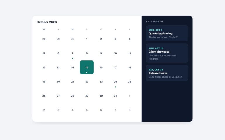
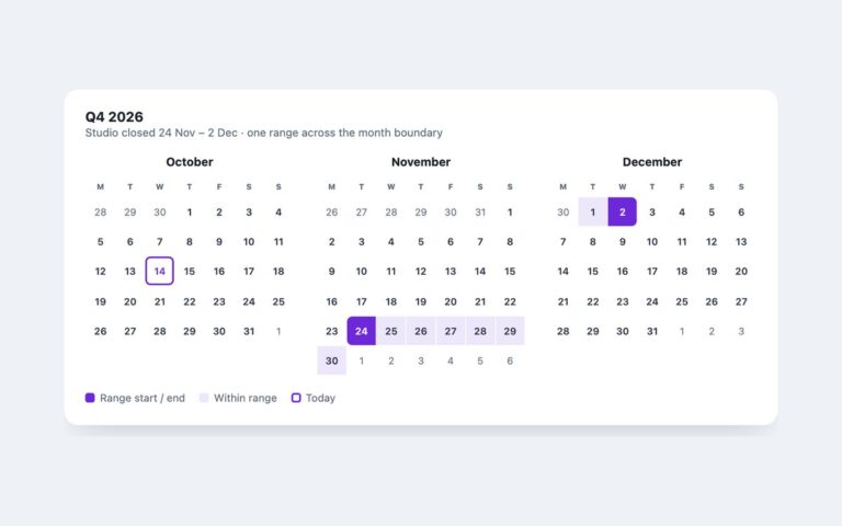
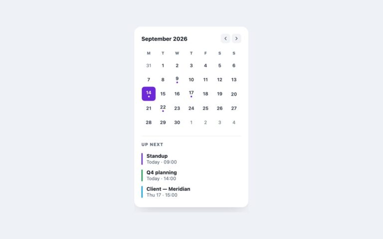
A month grid for September 2026 next to a detail panel. Three days have events and are outlined as selectable; choosing one swaps the panel to that day, with a heading, an event count and each event with its time and room. There is no JavaScript. The days with events are radio inputs inside their table cells, and a :has() rule on the wrapper shows the pane whose data-pane value matches the checked input, so it works as soon as the HTML is parsed. Use it for event listings, class timetables or a booking page where most days are empty and a few need detail. The grid is a table with a caption and full weekday headers. Each selectable day has an accessible name such as Monday 14 September, 3 events, and the panel is a polite live region so the change is announced. Selectable days carry a thin outline as well as a dot, so they stand out without relying on colour. Below 680 pixels the panel moves under the grid. The Bootstrap version uses .table and .list-group, and the Tailwind version uses has-checked and an arbitrary :has() variant on each pane.
What’s included
- Day selection with radio inputs, no JavaScript
- :has() on the wrapper swaps the detail pane
- Accessible names such as "Monday 14 September, 3 events"
- Detail panel is a polite live region
- Panel moves under the grid below 680px
Accessibility
The month is a table with a caption and full weekday headers. Selectable days are native radio inputs with descriptive aria-labels; Tab reaches the group and the arrow keys move between event days. Focus draws a 2px violet outline around the day, the panel is aria-live="polite", and the hover transition is removed under prefers-reduced-motion.
Customise it
Change --dc-accent, --dc-muted and --dc-line on .dcal in plain CSS and Bootstrap, or the --color-dc-* theme colours in Tailwind. To add a day, give its input an id and add a matching :has() rule and data-pane.