/* Arrow keys move a day or a week, Home/End jump to the start/end of the week, Page Up/Page Down change month,
   Enter or Space selects. Each day button is named with its full date; today has aria-current="date". */
(() => {
  const root = document.querySelector('[data-mini]'); if (!root) return;
  const title = root.querySelector('#mini-title'), body = root.querySelector('tbody'), out = root.querySelector('p b');
  const BASE = 'flex aspect-square w-full items-center justify-center rounded-[9px] text-[.8rem]';
  const CLS = {
    day: `${BASE} cursor-pointer font-semibold text-[#2c3546] transition-colors duration-[120ms] hover:bg-[#eef2f8] focus-visible:outline-2 focus-visible:outline-offset-2 focus-visible:outline-mini-accent motion-reduce:transition-none aria-[current=date]:text-mini-accent aria-[current=date]:shadow-[inset_0_0_0_2px_var(--color-mini-accent)] aria-pressed:bg-mini-accent aria-pressed:text-white aria-pressed:hover:bg-mini-accent`,
    dim: `${BASE} font-medium text-[#6b7280]` };
  const full = d => d.toLocaleDateString('en-GB', { weekday: 'long', day: 'numeric', month: 'long', year: 'numeric' });
  const same = (a, b) => !!a && !!b && a.toDateString() === b.toDateString();
  const addMonths = (d, n) => { const t = new Date(d.getFullYear(), d.getMonth() + n, 1);
    t.setDate(Math.min(d.getDate(), new Date(t.getFullYear(), t.getMonth() + 1, 0).getDate())); return t; };
  let view = new Date(); view.setDate(1);
  let focus = new Date(), sel = null;
  function render(moveFocus) {
    const y = view.getFullYear(), m = view.getMonth(), today = new Date();
    if (focus.getMonth() !== m || focus.getFullYear() !== y) focus = new Date(y, m, 1);
    title.textContent = view.toLocaleDateString('en-US', { month: 'long', year: 'numeric' });
    const start = new Date(y, m, 1 - (new Date(y, m, 1).getDay() + 6) % 7);
    let h = '';
    for (let i = 0; i < 42; i++) {
      const d = new Date(start.getFullYear(), start.getMonth(), start.getDate() + i);
      if (i % 7 === 0) h += '<tr>';
      h += d.getMonth() !== m
        ? `<td><span class="${CLS.dim}" aria-hidden="true">${d.getDate()}</span></td>`
        : `<td><button type="button" class="${CLS.day}" data-day="${d.getDate()}" tabindex="${same(d, focus) ? 0 : -1}" ` +
          `aria-label="${full(d)}" aria-pressed="${same(d, sel)}"${same(d, today) ? ' aria-current="date"' : ''}>${d.getDate()}</button></td>`;
      if (i % 7 === 6) h += '</tr>';
    }
    body.innerHTML = h;
    if (moveFocus) body.querySelector('[tabindex="0"]').focus();
  }
  function go(d) { focus = d; view = new Date(d.getFullYear(), d.getMonth(), 1); render(true); }
  body.addEventListener('keydown', e => {
    if (!e.target.matches('button[data-day]')) return;
    const f = focus, wd = (f.getDay() + 6) % 7, at = n => new Date(f.getFullYear(), f.getMonth(), f.getDate() + n);
    const d = { ArrowLeft: () => at(-1), ArrowRight: () => at(1), ArrowUp: () => at(-7), ArrowDown: () => at(7),
      Home: () => at(-wd), End: () => at(6 - wd), PageUp: () => addMonths(f, -1), PageDown: () => addMonths(f, 1) }[e.key];
    if (!d) return;
    e.preventDefault(); go(d());
  });
  body.addEventListener('click', e => {
    const b = e.target.closest('button[data-day]'); if (!b) return;
    sel = focus = new Date(view.getFullYear(), view.getMonth(), Number(b.dataset.day));
    out.textContent = sel.toLocaleDateString('en-US', { weekday: 'short', month: 'short', day: 'numeric' });
    render(true);
  });
  root.querySelectorAll('[data-move]').forEach(b => b.addEventListener('click', () => {
    view.setMonth(view.getMonth() + Number(b.dataset.move)); render(false);
  }));
  render(false);
})();
About this set
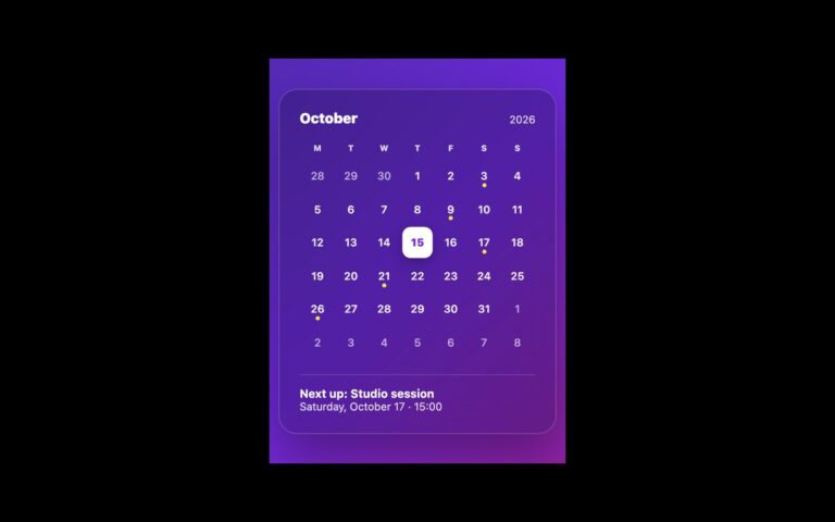
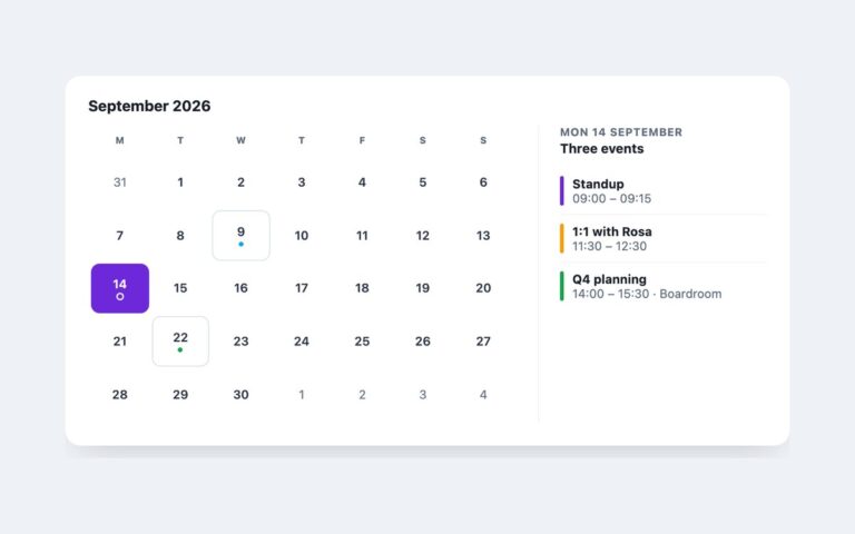
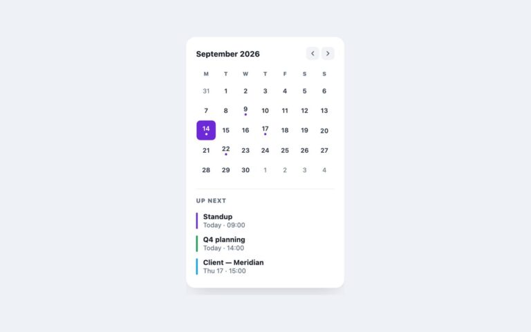
A compact 300 pixel calendar card for sidebars, booking widgets and settings pages where someone needs to pick one date. The header has round-cornered previous and next buttons around the month name, the grid uses single-letter weekday headers, and a footer line reports the current choice, for example “Selected: Fri, Oct 23″. Days of the shown month are buttons; the leading and trailing days from the neighbouring months are shown in grey for orientation but are not interactive. Today gets a violet ring and the selected day a solid violet fill. Under the hood the grid is a table with role=”grid” and one roving tab stop: Tab lands on a single day, then the arrow keys move by day or week, Home and End jump within the week, and Page Up and Page Down change month, rendering the new month as focus crosses its edge. Enter or Space selects. The script is about fifty lines with no dependencies. Use it inline on a page; for a picker that opens from a form field, see the date picker input in the same pack. The Bootstrap version uses .card, .btn and a borderless .table, and the Tailwind version styles state with aria-pressed and aria-current variants.
What’s included
Single-date picker in a 300px card
role="grid" with roving tabindex and arrow-key navigation
Page Up and Page Down move by month
Today ringed, selection filled, both driven by ARIA attributes
Footer line announces the chosen date
Accessibility
Each day is a button named with its full date ("Friday, 23 October 2026") and aria-pressed for the selected day; today has aria-current="date". Only one day is in the Tab order and the arrow, Home, End and Page keys move focus through the grid. The month title and the selection line are polite live regions, the month buttons have aria-labels, and all buttons show a 2px violet focus outline. Hover transitions are removed under prefers-reduced-motion.
Customise it
Set --mini-accent and --mini-muted on .mini for colour, and the card width on .mini. In Bootstrap the same variables sit on the .card and the day buttons are restyled through --bs-btn-* variables; in Tailwind change --color-mini-accent and --color-mini-muted in the @theme block.