About this set
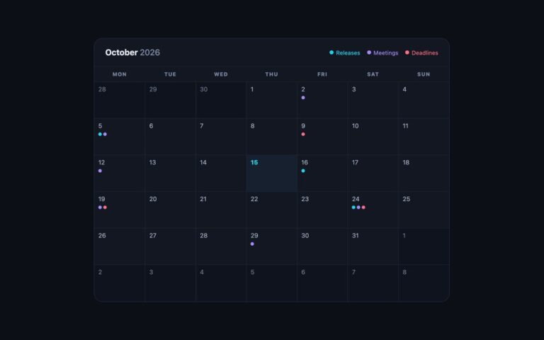
A dark, full-year planner that shows all twelve months at once, useful for holiday planning, content calendars, academic years and annual reports. A heading reads “Plan the whole” followed by the year in amber, and below it twelve small month cards flow into a responsive grid: four across on a wide screen, fewer on tablets and a single column on phones, using repeat(auto-fill, minmax(210px, 1fr)) so no media queries are needed. Each card has the month name in amber and a seven-column table with single-letter weekday headers, Monday first. Today is picked out with an amber fill in its month. A short script builds the whole year for the current date, so the page never goes stale; change one line to render a different year. The output is plain tables, so you can extend the script to mark holidays, school terms or booked weeks by adding a class or a data attribute to particular cells. The Bootstrap version runs in Bootstrap’s dark colour mode and places each month in a .card with a borderless .table, and the Tailwind version uses an arbitrary grid template with the same auto-fill rule.
What’s included
- Twelve month tables generated for the current year
- Responsive auto-fill grid without media queries
- Today filled in amber with aria-current="date"
- Weekday headers with full names for screen readers
- Dark theme with labels lifted to 4.5:1
Accessibility
Each month is a table labelled by its month heading, with full weekday names as hidden header text and the full date of every day as hidden cell text, so a screen reader reads "Thursday, 15 October 2026" rather than a bare number. Today has aria-current="date". The weekday letters were lightened to pass 4.5:1 on the dark cards. There are no interactive controls.
Customise it
Change --yr-accent and --yr-muted on .yr, and the 210px minimum card width in .yr-grid. In Bootstrap the cards are restyled through --bs-card-* variables and the tables through --bs-table-*; in Tailwind edit --color-yr-accent and --color-yr-muted.