Open demo

CSS code

HTML
<div><span class="lbl">One card, three containers (container queries)</span>
<div class="cq-demo">
  <div><span class="cq-note">Narrow column</span>
  <div class="mc-wrap"><article class="mc">
    <div class="mc-media"><img src="https://images.unsplash.com/photo-1617897903246-719242758050?auto=format&fit=crop&w=600&q=70" alt="Glass dropper bottle of golden oil on a round wooden board with eucalyptus" width="600" height="600" loading="lazy"></div>
    <div class="mc-body">
      <p class="mc-cat">Skincare · 30 ml</p>
      <h3 class="mc-title"><a href="#">Rosehip Face Oil</a></h3>
      <p class="mc-rating"><span class="mc-stars" aria-hidden="true">★★★★★</span><span class="sr-only">Rated 4.6 out of 5, 391 reviews</span><span aria-hidden="true">4.6 (391)</span></p>
      <p class="mc-desc">Cold-pressed rosehip and jojoba for dry skin. Absorbs in a minute, no fragrance.</p>
      <ul class="mc-feats"><li>Vegan</li><li>Refillable glass</li><li>Made in small batches</li></ul>
      <div class="mc-buy"><p class="mc-price">$26</p><button type="button" class="mc-add">Add<span class="sr-only"> Rosehip Face Oil</span> to cart</button></div>
    </div>
  </article></div></div>
  <div><span class="cq-note">Medium column</span>
  <div class="mc-wrap"><article class="mc">
    <div class="mc-media"><img src="https://images.unsplash.com/photo-1617897903246-719242758050?auto=format&fit=crop&w=600&q=70" alt="Glass dropper bottle of golden oil on a round wooden board with eucalyptus" width="600" height="600" loading="lazy"></div>
    <div class="mc-body">
      <p class="mc-cat">Skincare · 30 ml</p>
      <h3 class="mc-title"><a href="#">Rosehip Face Oil</a></h3>
      <p class="mc-rating"><span class="mc-stars" aria-hidden="true">★★★★★</span><span class="sr-only">Rated 4.6 out of 5, 391 reviews</span><span aria-hidden="true">4.6 (391)</span></p>
      <p class="mc-desc">Cold-pressed rosehip and jojoba for dry skin. Absorbs in a minute, no fragrance.</p>
      <ul class="mc-feats"><li>Vegan</li><li>Refillable glass</li><li>Made in small batches</li></ul>
      <div class="mc-buy"><p class="mc-price">$26</p><button type="button" class="mc-add">Add<span class="sr-only"> Rosehip Face Oil</span> to cart</button></div>
    </div>
  </article></div></div>
  <div><span class="cq-note">Full width</span>
  <div class="mc-wrap"><article class="mc">
    <div class="mc-media"><img src="https://images.unsplash.com/photo-1617897903246-719242758050?auto=format&fit=crop&w=600&q=70" alt="Glass dropper bottle of golden oil on a round wooden board with eucalyptus" width="600" height="600" loading="lazy"></div>
    <div class="mc-body">
      <p class="mc-cat">Skincare · 30 ml</p>
      <h3 class="mc-title"><a href="#">Rosehip Face Oil</a></h3>
      <p class="mc-rating"><span class="mc-stars" aria-hidden="true">★★★★★</span><span class="sr-only">Rated 4.6 out of 5, 391 reviews</span><span aria-hidden="true">4.6 (391)</span></p>
      <p class="mc-desc">Cold-pressed rosehip and jojoba for dry skin. Absorbs in a minute, no fragrance.</p>
      <ul class="mc-feats"><li>Vegan</li><li>Refillable glass</li><li>Made in small batches</li></ul>
      <div class="mc-buy"><p class="mc-price">$26</p><button type="button" class="mc-add">Add<span class="sr-only"> Rosehip Face Oil</span> to cart</button></div>
    </div>
  </article></div></div>
</div></div>

<div><span class="lbl">Variant picker with :has() and a popover size guide</span>
<div class="mb-wrap"><article class="mb">
  <div class="mb-media"><img src="https://images.unsplash.com/photo-1602143407151-7111542de6e8?auto=format&fit=crop&w=700&q=70" alt="Matte insulated steel water bottle standing on a pale surface" width="700" height="700" loading="lazy"></div>
  <div class="mb-body">
    <p class="mc-cat">Everyday carry</p>
    <h3 class="mc-title"><a href="#">Insulated Steel Bottle</a></h3>
    <p class="mc-rating"><span class="mc-stars" aria-hidden="true">★★★★★</span><span class="sr-only">Rated 4.6 out of 5, 1,284 reviews</span><span aria-hidden="true">4.6 (1,284)</span></p>
    <fieldset class="mb-group"><legend>Colour: <span class="mb-chosen"><span data-colour="sage">Sage</span><span data-colour="clay">Clay</span><span data-colour="ocean">Ocean</span><span data-colour="charcoal">Charcoal</span></span></legend>
      <div class="mb-opts">
        <label><input type="radio" name="mb-colour" value="sage" checked><i class="mb-dot" style="--c:#5f7f6a"></i><span class="sr-only">Sage</span></label>
        <label><input type="radio" name="mb-colour" value="clay"><i class="mb-dot" style="--c:#b4532a"></i><span class="sr-only">Clay</span></label>
        <label><input type="radio" name="mb-colour" value="ocean"><i class="mb-dot" style="--c:#1d5f8a"></i><span class="sr-only">Ocean</span></label>
        <label><input type="radio" name="mb-colour" value="charcoal"><i class="mb-dot" style="--c:#3f3f46"></i><span class="sr-only">Charcoal</span></label>
      </div>
    </fieldset>
    <fieldset class="mb-group"><legend>Size</legend>
      <div class="mb-opts">
        <label><input type="radio" name="mb-size" value="500"><span class="mb-size">500 ml</span></label>
        <label><input type="radio" name="mb-size" value="750" checked><span class="mb-size">750 ml</span></label>
        <label><input type="radio" name="mb-size" value="1000"><span class="mb-size">1 litre</span></label>
      </div>
    </fieldset>
    <div class="mb-row">
      <p class="mc-price mb-price"><span data-size="500">$29</span><span data-size="750">$34</span><span data-size="1000">$39</span></p>
      <button type="button" class="mb-link" popovertarget="mb-guide">Size guide</button>
    </div>
    <button type="button" class="mc-add">Add<span class="sr-only"> Insulated Steel Bottle</span> to cart</button>
  </div>
</article></div>
<div class="mb-guide" id="mb-guide" popover role="dialog" aria-labelledby="mb-guide-title">
  <h4 id="mb-guide-title">Which size?</h4>
  <table>
    <thead><tr><th scope="col">Size</th><th scope="col">Good for</th><th scope="col">Cold / hot</th></tr></thead>
    <tbody>
      <tr><th scope="row">500 ml</th><td>Commute, school bag</td><td>24 h / 12 h</td></tr>
      <tr><th scope="row">750 ml</th><td>Desk, gym, cycling</td><td>24 h / 12 h</td></tr>
      <tr><th scope="row">1 litre</th><td>Hikes, long days out</td><td>36 h / 18 h</td></tr>
    </tbody>
  </table>
  <button type="button" class="mb-close" popovertarget="mb-guide" popovertargetaction="hide" aria-label="Close size guide"><svg viewBox="0 0 24 24" aria-hidden="true"><path d="M6 6l12 12M18 6L6 18"/></svg></button>
</div></div>
CSS
/* Modern CSS product cards, no JavaScript.
   1. Container queries: .mc sits in a container (container-type: inline-size), so one card lays itself out
      by the space it is given, not by the viewport. Chrome 105, Safari 16, Firefox 110.
   2. :has() reads the checked colour and size radios to tint the photo, recolour the card, show the colour
      name and switch the price. Chrome 105, Safari 15.4, Firefox 121.
   3. The size guide is a native popover (light dismiss, Esc) that fades in with @starting-style.
      Popover: Chrome 114, Safari 17, Firefox 125. @starting-style: Chrome 117, Safari 17.5, Firefox 129.
   aspect-ratio keeps every photo box stable while it loads. */
.mc-wrap{container-type:inline-size}
.mc,.mb,.mb-guide{--mc-ink:#1f1d1a;--mc-muted:#5c574f;--mc-line:#e6e1d8;--mc-media:#ece8e1;--mc-accent:#3f6b4f;--mc-star:#b45309;--mc-star-off:#d6d3d1;--mc-focus:#2563eb}
.mc{display:grid;grid-template-columns:1fr;background:#fff;border:1px solid var(--mc-line);border-radius:18px;overflow:hidden}
.mc-media{aspect-ratio:1;background:var(--mc-media);overflow:hidden}
.mc-media img{display:block;width:100%;height:100%;object-fit:cover}
.mc-body{display:flex;flex-direction:column;gap:6px;padding:16px}
.mc-cat{margin:0;font-size:.7rem;font-weight:700;letter-spacing:.12em;text-transform:uppercase;color:var(--mc-accent)}
.mc-title{margin:0;font-size:1rem;font-weight:700;line-height:1.3}
.mc-title a{color:var(--mc-ink);text-decoration:none}
.mc-title a:hover{text-decoration:underline;text-underline-offset:3px}
.mc-rating{display:flex;align-items:center;gap:6px;margin:0;font-size:.8rem;color:var(--mc-muted)}
.mc-stars{font-size:.9rem;letter-spacing:1px;line-height:1;color:transparent;
  background:linear-gradient(90deg,var(--mc-star) 92%,var(--mc-star-off) 0);-webkit-background-clip:text;background-clip:text}
.mc-desc,.mc-feats{display:none}
.mc-buy{display:flex;flex-wrap:wrap;align-items:center;justify-content:space-between;gap:10px;margin-top:6px}
.mc-price{margin:0;font-size:1.15rem;font-weight:800}
.mc-add{flex:1 1 auto;padding:10px 16px;border:0;border-radius:10px;background:var(--mc-ink);color:#fff;font:inherit;font-size:.88rem;font-weight:700;cursor:pointer;transition:background-color .15s}
.mc-add:hover{background:var(--mc-accent)}
@container (min-width:360px){
  .mc{grid-template-columns:140px 1fr}
  .mc-media{position:relative;aspect-ratio:auto;min-height:160px}
  .mc-media img{position:absolute;inset:0}
  .mc-desc{display:block;margin:0;font-size:.85rem;color:var(--mc-muted)}
  .mc-add{flex:0 0 auto}
}
@container (min-width:620px){
  .mc{grid-template-columns:260px 1fr}
  .mc-body{gap:8px;padding:24px 26px}
  .mc-title{font-size:1.3rem}
  .mc-feats{display:flex;flex-wrap:wrap;gap:6px;margin:4px 0 0;padding:0;list-style:none}
  .mc-feats li{padding:3px 10px;border-radius:999px;background:var(--mc-media);font-size:.75rem;font-weight:600;color:var(--mc-ink)}
  .mc-price{font-size:1.4rem}
  .mc-add{padding:12px 22px}
}
/* :has() variant picker */
.mb-wrap{container-type:inline-size}
.mb{--mb-accent:#3f6b4f;display:grid;grid-template-columns:1fr;background:#fff;border:2px solid var(--mb-accent);border-radius:22px;overflow:hidden;transition:border-color .3s}
.mb:has([value="clay"]:checked){--mb-accent:#b4532a;--mb-tint:hue-rotate(240deg) saturate(1.4)}
.mb:has([value="ocean"]:checked){--mb-accent:#1d5f8a;--mb-tint:hue-rotate(60deg)}
.mb:has([value="charcoal"]:checked){--mb-accent:#3f3f46;--mb-tint:saturate(0) brightness(.6)}
.mb-media{aspect-ratio:1;background:var(--mc-media);overflow:hidden}
.mb-media img{display:block;width:100%;height:100%;object-fit:cover;filter:var(--mb-tint,none);transition:filter .4s}
.mb-body{display:flex;flex-direction:column;gap:12px;padding:22px}
.mb .mc-cat{color:var(--mb-accent);transition:color .3s}
.mb .mc-title{font-size:1.35rem}
.mb-group{min-width:0;margin:0;padding:0;border:0}
.mb-group legend{display:flex;gap:6px;margin-bottom:8px;padding:0;font-size:.75rem;font-weight:700;letter-spacing:.08em;text-transform:uppercase;color:var(--mc-muted)}
.mb-chosen{color:var(--mc-ink)}
.mb-chosen span{display:none;opacity:1;transition:opacity .3s}
@starting-style{.mb-chosen span{opacity:0}}
.mb:has([value="sage"]:checked) [data-colour="sage"],.mb:has([value="clay"]:checked) [data-colour="clay"],
.mb:has([value="ocean"]:checked) [data-colour="ocean"],.mb:has([value="charcoal"]:checked) [data-colour="charcoal"]{display:inline}
.mb-opts{display:flex;flex-wrap:wrap;gap:8px}
.mb-opts label{position:relative;cursor:pointer}
.mb-opts input{position:absolute;opacity:0;width:1px;height:1px;margin:0}
.mb-dot{display:block;width:30px;height:30px;border-radius:50%;background:var(--c);box-shadow:inset 0 0 0 1px rgba(0,0,0,.25)}
.mb-opts label:has(:checked) .mb-dot{box-shadow:inset 0 0 0 1px rgba(0,0,0,.25),0 0 0 2px #fff,0 0 0 4px var(--mb-accent)}
.mb-size{display:block;padding:8px 14px;border:1.5px solid #9c958a;border-radius:10px;font-size:.85rem;font-weight:700;color:var(--mc-ink);transition:background-color .2s,border-color .2s,color .2s}
.mb-opts label:has(:checked) .mb-size{border-color:var(--mb-accent);background:var(--mb-accent);color:#fff}
.mb-opts label:has(:focus-visible) :is(.mb-dot,.mb-size){outline:3px solid var(--mc-focus);outline-offset:3px}
.mb-price span{display:none}
.mb:has([value="500"]:checked) [data-size="500"],.mb:has([value="750"]:checked) [data-size="750"],.mb:has([value="1000"]:checked) [data-size="1000"]{display:inline}
.mb-row{display:flex;flex-wrap:wrap;align-items:center;gap:10px 14px}
.mb-row .mc-price{font-size:1.5rem}
.mb .mc-add{background:var(--mb-accent);transition:background-color .3s}
.mb .mc-add:hover{background:var(--mc-ink)}
.mb-link{padding:0;border:0;background:none;color:var(--mc-ink);font:inherit;font-size:.85rem;font-weight:600;text-decoration:underline;text-underline-offset:3px;cursor:pointer}
@container (min-width:560px){.mb{grid-template-columns:minmax(0,1fr) minmax(0,1.1fr)}.mb-media{position:relative;aspect-ratio:auto;min-height:380px}.mb-media img{position:absolute;inset:0}.mb-body{padding:28px 30px}}
/* Popover size guide with @starting-style entry */
.mb-guide{width:min(360px,calc(100% - 32px));margin:auto;padding:22px;border:0;border-radius:18px;background:#fff;color:var(--mc-ink);box-shadow:0 30px 70px -20px rgba(31,29,26,.45);
  opacity:0;transform:translateY(8px) scale(.97);transition:opacity .22s,transform .22s,overlay .22s allow-discrete,display .22s allow-discrete}
.mb-guide:popover-open{opacity:1;transform:none}
@starting-style{.mb-guide:popover-open{opacity:0;transform:translateY(8px) scale(.97)}}
.mb-guide::backdrop{background:rgba(31,29,26,.35)}
.mb-guide h4{margin:0 0 12px;font-size:1.05rem}
.mb-guide table{width:100%;border-collapse:collapse;font-size:.85rem}
.mb-guide :is(th,td){padding:8px 4px;border-bottom:1px solid var(--mc-line);text-align:left}
.mb-guide th{font-weight:700}
.mb-guide td{color:var(--mc-muted)}
.mb-close{position:absolute;top:14px;right:14px;display:grid;place-items:center;width:32px;height:32px;padding:0;border:0;border-radius:50%;background:var(--mc-media);color:var(--mc-ink);cursor:pointer}
.mb-close svg{width:16px;height:16px;fill:none;stroke:currentColor;stroke-width:2.2;stroke-linecap:round}
:is(.mc,.mb,.mb-guide) :is(a,button):focus-visible{outline:3px solid var(--mc-focus);outline-offset:2px}
.sr-only{position:absolute;width:1px;height:1px;padding:0;margin:-1px;overflow:hidden;clip:rect(0,0,0,0);white-space:nowrap;border:0}
@media (prefers-reduced-motion:reduce){.mc-add,.mb,.mb-media img,.mb .mc-cat,.mb .mc-add,.mb-chosen span,.mb-size,.mb-guide{transition:none}}

Bootstrap 5 code

Requires: Bootstrap 5.3.8 CSS

HTML
<div><span class="lbl">One card, three containers (container queries)</span>
<div class="cq-demo">
  <div><span class="cq-note">Narrow column</span>
  <div class="mc-wrap"><article class="mc card">
    <div class="mc-media"><img src="https://images.unsplash.com/photo-1617897903246-719242758050?auto=format&fit=crop&w=600&q=70" alt="Glass dropper bottle of golden oil on a round wooden board with eucalyptus" width="600" height="600" loading="lazy"></div>
    <div class="mc-body">
      <p class="mb-0 mc-cat">Skincare · 30 ml</p>
      <h3 class="mc-title"><a href="#" class="text-decoration-none">Rosehip Face Oil</a></h3>
      <p class="mb-0 mc-rating"><span class="mc-stars" aria-hidden="true">★★★★★</span><span class="visually-hidden">Rated 4.6 out of 5, 391 reviews</span><span aria-hidden="true">4.6 (391)</span></p>
      <p class="mb-0 mc-desc">Cold-pressed rosehip and jojoba for dry skin. Absorbs in a minute, no fragrance.</p>
      <ul class="mc-feats"><li>Vegan</li><li>Refillable glass</li><li>Made in small batches</li></ul>
      <div class="mc-buy"><p class="mb-0 mc-price">$26</p><button type="button" class="btn mc-add">Add<span class="visually-hidden"> Rosehip Face Oil</span> to cart</button></div>
    </div>
  </article></div></div>
  <div><span class="cq-note">Medium column</span>
  <div class="mc-wrap"><article class="mc card">
    <div class="mc-media"><img src="https://images.unsplash.com/photo-1617897903246-719242758050?auto=format&fit=crop&w=600&q=70" alt="Glass dropper bottle of golden oil on a round wooden board with eucalyptus" width="600" height="600" loading="lazy"></div>
    <div class="mc-body">
      <p class="mb-0 mc-cat">Skincare · 30 ml</p>
      <h3 class="mc-title"><a href="#" class="text-decoration-none">Rosehip Face Oil</a></h3>
      <p class="mb-0 mc-rating"><span class="mc-stars" aria-hidden="true">★★★★★</span><span class="visually-hidden">Rated 4.6 out of 5, 391 reviews</span><span aria-hidden="true">4.6 (391)</span></p>
      <p class="mb-0 mc-desc">Cold-pressed rosehip and jojoba for dry skin. Absorbs in a minute, no fragrance.</p>
      <ul class="mc-feats"><li>Vegan</li><li>Refillable glass</li><li>Made in small batches</li></ul>
      <div class="mc-buy"><p class="mb-0 mc-price">$26</p><button type="button" class="btn mc-add">Add<span class="visually-hidden"> Rosehip Face Oil</span> to cart</button></div>
    </div>
  </article></div></div>
  <div><span class="cq-note">Full width</span>
  <div class="mc-wrap"><article class="mc card">
    <div class="mc-media"><img src="https://images.unsplash.com/photo-1617897903246-719242758050?auto=format&fit=crop&w=600&q=70" alt="Glass dropper bottle of golden oil on a round wooden board with eucalyptus" width="600" height="600" loading="lazy"></div>
    <div class="mc-body">
      <p class="mb-0 mc-cat">Skincare · 30 ml</p>
      <h3 class="mc-title"><a href="#" class="text-decoration-none">Rosehip Face Oil</a></h3>
      <p class="mb-0 mc-rating"><span class="mc-stars" aria-hidden="true">★★★★★</span><span class="visually-hidden">Rated 4.6 out of 5, 391 reviews</span><span aria-hidden="true">4.6 (391)</span></p>
      <p class="mb-0 mc-desc">Cold-pressed rosehip and jojoba for dry skin. Absorbs in a minute, no fragrance.</p>
      <ul class="mc-feats"><li>Vegan</li><li>Refillable glass</li><li>Made in small batches</li></ul>
      <div class="mc-buy"><p class="mb-0 mc-price">$26</p><button type="button" class="btn mc-add">Add<span class="visually-hidden"> Rosehip Face Oil</span> to cart</button></div>
    </div>
  </article></div></div>
</div></div>

<div><span class="lbl">Variant picker with :has() and a popover size guide</span>
<div class="mb-wrap"><article class="mb card">
  <div class="mb-media"><img src="https://images.unsplash.com/photo-1602143407151-7111542de6e8?auto=format&fit=crop&w=700&q=70" alt="Matte insulated steel water bottle standing on a pale surface" width="700" height="700" loading="lazy"></div>
  <div class="mb-body">
    <p class="mb-0 mc-cat">Everyday carry</p>
    <h3 class="mc-title"><a href="#" class="text-decoration-none">Insulated Steel Bottle</a></h3>
    <p class="mb-0 mc-rating"><span class="mc-stars" aria-hidden="true">★★★★★</span><span class="visually-hidden">Rated 4.6 out of 5, 1,284 reviews</span><span aria-hidden="true">4.6 (1,284)</span></p>
    <fieldset class="mb-group"><legend>Colour: <span class="mb-chosen"><span data-colour="sage">Sage</span><span data-colour="clay">Clay</span><span data-colour="ocean">Ocean</span><span data-colour="charcoal">Charcoal</span></span></legend>
      <div class="mb-opts">
        <input type="radio" class="btn-check" name="mb-colour" id="mb-c1" value="sage" checked><label class="mb-dot" for="mb-c1" style="--c:#5f7f6a"><span class="visually-hidden">Sage</span></label>
        <input type="radio" class="btn-check" name="mb-colour" id="mb-c2" value="clay"><label class="mb-dot" for="mb-c2" style="--c:#b4532a"><span class="visually-hidden">Clay</span></label>
        <input type="radio" class="btn-check" name="mb-colour" id="mb-c3" value="ocean"><label class="mb-dot" for="mb-c3" style="--c:#1d5f8a"><span class="visually-hidden">Ocean</span></label>
        <input type="radio" class="btn-check" name="mb-colour" id="mb-c4" value="charcoal"><label class="mb-dot" for="mb-c4" style="--c:#3f3f46"><span class="visually-hidden">Charcoal</span></label>
      </div>
    </fieldset>
    <fieldset class="mb-group"><legend>Size</legend>
      <div class="mb-opts">
        <input type="radio" class="btn-check" name="mb-size" id="mb-s5" value="500"><label class="btn mb-size" for="mb-s5">500 ml</label>
        <input type="radio" class="btn-check" name="mb-size" id="mb-s6" value="750" checked><label class="btn mb-size" for="mb-s6">750 ml</label>
        <input type="radio" class="btn-check" name="mb-size" id="mb-s7" value="1000"><label class="btn mb-size" for="mb-s7">1 litre</label>
      </div>
    </fieldset>
    <div class="mb-row">
      <p class="mb-0 mc-price mb-price"><span data-size="500">$29</span><span data-size="750">$34</span><span data-size="1000">$39</span></p>
      <button type="button" class="btn mb-link" popovertarget="mb-guide">Size guide</button>
    </div>
    <button type="button" class="btn mc-add">Add<span class="visually-hidden"> Insulated Steel Bottle</span> to cart</button>
  </div>
</article></div>
<div class="mb-guide" id="mb-guide" popover role="dialog" aria-labelledby="mb-guide-title">
  <h4 id="mb-guide-title">Which size?</h4>
  <table class="table">
    <thead><tr><th scope="col">Size</th><th scope="col">Good for</th><th scope="col">Cold / hot</th></tr></thead>
    <tbody>
      <tr><th scope="row">500 ml</th><td>Commute, school bag</td><td>24 h / 12 h</td></tr>
      <tr><th scope="row">750 ml</th><td>Desk, gym, cycling</td><td>24 h / 12 h</td></tr>
      <tr><th scope="row">1 litre</th><td>Hikes, long days out</td><td>36 h / 18 h</td></tr>
    </tbody>
  </table>
  <button type="button" class="btn-close mb-close" popovertarget="mb-guide" popovertargetaction="hide" aria-label="Close size guide"></button>
</div></div>
CSS
/* Modern CSS product cards on Bootstrap, no JavaScript (and no Bootstrap JS either).
   1. Container queries: .mc sits in a container (container-type: inline-size), so one card lays itself out
      by the space it is given, not by the viewport. Chrome 105, Safari 16, Firefox 110.
   2. :has() reads the checked .btn-check colour and size radios to tint the photo, recolour the card, show the colour
      name and switch the price. Chrome 105, Safari 15.4, Firefox 121.
   3. The size guide is a native popover (light dismiss, Esc) that fades in with @starting-style.
      Popover: Chrome 114, Safari 17, Firefox 125. @starting-style: Chrome 117, Safari 17.5, Firefox 129.
   aspect-ratio keeps every photo box stable while it loads. */
.mc-wrap{container-type:inline-size}
.mc,.mb,.mb-guide{--mc-ink:#1f1d1a;--mc-muted:#5c574f;--mc-line:#e6e1d8;--mc-media:#ece8e1;--mc-accent:#3f6b4f;--mc-star:#b45309;--mc-star-off:#d6d3d1;--mc-focus:#2563eb}
.mc.card{--bs-card-border-color:var(--mc-line);--bs-card-border-radius:18px;--bs-card-inner-border-radius:17px;display:grid;grid-template-columns:1fr;overflow:hidden}
.mc-media{aspect-ratio:1;background:var(--mc-media);overflow:hidden}
.mc-media img{display:block;width:100%;height:100%;object-fit:cover}
.mc-body{display:flex;flex-direction:column;gap:6px;padding:16px}
.mc-cat{margin:0;font-size:.7rem;font-weight:700;letter-spacing:.12em;text-transform:uppercase;color:var(--mc-accent)}
.mc-title{margin:0;font-size:1rem;font-weight:700;line-height:1.3}
.mc-title a{color:var(--mc-ink);text-decoration:none}
.mc-title a:hover{text-decoration:underline;text-underline-offset:3px}
.mc-rating{display:flex;align-items:center;gap:6px;margin:0;font-size:.8rem;color:var(--mc-muted)}
.mc-stars{font-size:.9rem;letter-spacing:1px;line-height:1;color:transparent;
  background:linear-gradient(90deg,var(--mc-star) 92%,var(--mc-star-off) 0);-webkit-background-clip:text;background-clip:text}
.mc-desc,.mc-feats{display:none}
.mc-buy{display:flex;flex-wrap:wrap;align-items:center;justify-content:space-between;gap:10px;margin-top:6px}
.mc-price{margin:0;font-size:1.15rem;font-weight:800}
.mc-add{--bs-btn-padding-x:16px;--bs-btn-padding-y:10px;--bs-btn-font-size:.88rem;--bs-btn-font-weight:700;--bs-btn-border-width:0;--bs-btn-border-radius:10px;--bs-btn-color:#fff;--bs-btn-bg:var(--mc-ink);
  --bs-btn-hover-color:#fff;--bs-btn-hover-bg:var(--mc-accent);--bs-btn-active-color:#fff;--bs-btn-active-bg:var(--mc-accent);flex:1 1 auto}
@container (min-width:360px){
  .mc.card{grid-template-columns:140px 1fr}
  .mc-media{position:relative;aspect-ratio:auto;min-height:160px}
  .mc-media img{position:absolute;inset:0}
  .mc-desc{display:block;margin:0;font-size:.85rem;color:var(--mc-muted)}
  .mc-add{flex:0 0 auto}
}
@container (min-width:620px){
  .mc.card{grid-template-columns:260px 1fr}
  .mc-body{gap:8px;padding:24px 26px}
  .mc-title{font-size:1.3rem}
  .mc-feats{display:flex;flex-wrap:wrap;gap:6px;margin:4px 0 0;padding:0;list-style:none}
  .mc-feats li{padding:3px 10px;border-radius:999px;background:var(--mc-media);font-size:.75rem;font-weight:600;color:var(--mc-ink)}
  .mc-price{font-size:1.4rem}
  .mc-add{--bs-btn-padding-x:22px;--bs-btn-padding-y:12px}
}
/* :has() variant picker */
.mb-wrap{container-type:inline-size}
.mb.card{--mb-accent:#3f6b4f;--bs-card-border-width:2px;--bs-card-border-color:var(--mb-accent);--bs-card-border-radius:22px;--bs-card-inner-border-radius:20px;display:grid;grid-template-columns:1fr;overflow:hidden;transition:border-color .3s}
.mb:has([value="clay"]:checked){--mb-accent:#b4532a;--mb-tint:hue-rotate(240deg) saturate(1.4)}
.mb:has([value="ocean"]:checked){--mb-accent:#1d5f8a;--mb-tint:hue-rotate(60deg)}
.mb:has([value="charcoal"]:checked){--mb-accent:#3f3f46;--mb-tint:saturate(0) brightness(.6)}
.mb-media{aspect-ratio:1;background:var(--mc-media);overflow:hidden}
.mb-media img{display:block;width:100%;height:100%;object-fit:cover;filter:var(--mb-tint,none);transition:filter .4s}
.mb-body{display:flex;flex-direction:column;gap:12px;padding:22px}
.mb .mc-cat{color:var(--mb-accent);transition:color .3s}
.mb .mc-title{font-size:1.35rem}
.mb-group{min-width:0;margin:0;padding:0;border:0}
.mb-group legend{display:flex;gap:6px;margin-bottom:8px;padding:0;font-size:.75rem;font-weight:700;letter-spacing:.08em;text-transform:uppercase;color:var(--mc-muted)}
.mb-chosen{color:var(--mc-ink)}
.mb-chosen span{display:none;opacity:1;transition:opacity .3s}
@starting-style{.mb-chosen span{opacity:0}}
.mb:has([value="sage"]:checked) [data-colour="sage"],.mb:has([value="clay"]:checked) [data-colour="clay"],
.mb:has([value="ocean"]:checked) [data-colour="ocean"],.mb:has([value="charcoal"]:checked) [data-colour="charcoal"]{display:inline}
.mb-opts{display:flex;flex-wrap:wrap;gap:8px}
.mb-dot{display:block;cursor:pointer;width:30px;height:30px;border-radius:50%;background:var(--c);box-shadow:inset 0 0 0 1px rgba(0,0,0,.25)}
.btn-check:checked+.mb-dot{box-shadow:inset 0 0 0 1px rgba(0,0,0,.25),0 0 0 2px #fff,0 0 0 4px var(--mb-accent)}
.mb-size{--bs-btn-padding-x:14px;--bs-btn-padding-y:8px;--bs-btn-font-size:.85rem;--bs-btn-font-weight:700;--bs-btn-line-height:1.5;--bs-btn-border-width:1.5px;--bs-btn-border-radius:10px;
  --bs-btn-color:var(--mc-ink);--bs-btn-border-color:#9c958a;--bs-btn-hover-color:var(--mc-ink);--bs-btn-hover-border-color:var(--mb-accent);
  --bs-btn-active-color:#fff;--bs-btn-active-bg:var(--mb-accent);--bs-btn-active-border-color:var(--mb-accent)}
.btn-check:focus-visible+:is(.mb-dot,.mb-size){outline:3px solid var(--mc-focus);outline-offset:3px;box-shadow:none}
.mb-price span{display:none}
.mb:has([value="500"]:checked) [data-size="500"],.mb:has([value="750"]:checked) [data-size="750"],.mb:has([value="1000"]:checked) [data-size="1000"]{display:inline}
.mb-row{display:flex;flex-wrap:wrap;align-items:center;gap:10px 14px}
.mb-row .mc-price{font-size:1.5rem}
.mb .mc-add{--bs-btn-bg:var(--mb-accent);--bs-btn-hover-bg:var(--mc-ink);--bs-btn-active-bg:var(--mc-ink)}
.mb-link{--bs-btn-padding-x:0;--bs-btn-padding-y:0;--bs-btn-font-size:.85rem;--bs-btn-font-weight:600;--bs-btn-color:var(--mc-ink);--bs-btn-hover-color:var(--mc-ink);--bs-btn-active-color:var(--mc-ink);--bs-btn-border-width:0;text-decoration:underline;text-underline-offset:3px}
@container (min-width:560px){.mb.card{grid-template-columns:minmax(0,1fr) minmax(0,1.1fr)}.mb-media{position:relative;aspect-ratio:auto;min-height:380px}.mb-media img{position:absolute;inset:0}.mb-body{padding:28px 30px}}
/* Popover size guide with @starting-style entry */
.mb-guide{width:min(360px,calc(100% - 32px));margin:auto;padding:22px;border:0;border-radius:18px;background:#fff;color:var(--mc-ink);box-shadow:0 30px 70px -20px rgba(31,29,26,.45);
  opacity:0;transform:translateY(8px) scale(.97);transition:opacity .22s,transform .22s,overlay .22s allow-discrete,display .22s allow-discrete}
.mb-guide:popover-open{opacity:1;transform:none}
@starting-style{.mb-guide:popover-open{opacity:0;transform:translateY(8px) scale(.97)}}
.mb-guide::backdrop{background:rgba(31,29,26,.35)}
.mb-guide h4{margin:0 0 12px;font-size:1.05rem;font-weight:700}
.mb-guide .table{--bs-table-border-color:var(--mc-line);margin:0;font-size:.85rem}
.mb-guide :is(th,td){padding:8px 4px}
.mb-guide th{font-weight:700}
.mb-guide td{--bs-table-color:var(--mc-muted);color:var(--mc-muted)}
.mb-close{--bs-btn-close-opacity:1;--bs-btn-close-hover-opacity:1;--bs-btn-close-focus-shadow:none;position:absolute;top:14px;right:14px;width:32px;height:32px;padding:0;border-radius:50%;background-color:var(--mc-media);background-size:11px}
:is(.mc,.mb,.mb-guide) :is(a,.btn,.btn-close):focus-visible{outline:3px solid var(--mc-focus);outline-offset:2px;box-shadow:none}
@media (prefers-reduced-motion:reduce){.mc .btn,.mb,.mb-media img,.mb .mc-cat,.mb .btn,.mb-chosen span,.mb-guide{transition:none}}

Tailwind 4 code

Requires: Tailwind CSS 4

HTML
<div><span class="mb-4 block text-[.72rem] tracking-[.12em] text-[#5c574f] uppercase">One card, three containers (container queries)</span>
<div class="grid grid-cols-[220px_minmax(0,460px)_1fr] items-start gap-5 max-sm:grid-cols-1">
  <div><span class="mb-2 block text-[.72rem] font-semibold text-[#5c574f]">Narrow column</span>
  <div class="@container"><article class="grid grid-cols-1 overflow-hidden rounded-[18px] border border-[#e6e1d8] bg-white @min-[360px]:grid-cols-[140px_1fr] @min-[620px]:grid-cols-[260px_1fr]">
    <div class="relative aspect-square overflow-hidden bg-[#ece8e1] @min-[360px]:aspect-auto @min-[360px]:min-h-[160px]"><img class="block size-full object-cover @min-[360px]:absolute @min-[360px]:inset-0" src="https://images.unsplash.com/photo-1617897903246-719242758050?auto=format&fit=crop&w=600&q=70" alt="Glass dropper bottle of golden oil on a round wooden board with eucalyptus" width="600" height="600" loading="lazy"></div>
    <div class="flex flex-col gap-1.5 p-4 @min-[620px]:gap-2 @min-[620px]:px-[26px] @min-[620px]:py-6">
      <p class="text-[.7rem] font-bold tracking-[.12em] text-[#3f6b4f] uppercase">Skincare · 30 ml</p>
      <h3 class="text-base leading-[1.3] font-bold @min-[620px]:text-[1.3rem]"><a href="#" class="underline-offset-3 hover:underline focus-visible:outline-3 focus-visible:outline-offset-2 focus-visible:outline-[#2563eb]">Rosehip Face Oil</a></h3>
      <p class="flex items-center gap-1.5 text-[.8rem] text-[#5c574f]"><span class="bg-[linear-gradient(90deg,#b45309_92%,#d6d3d1_0)] bg-clip-text text-[.9rem] leading-none tracking-[1px] text-transparent" aria-hidden="true">★★★★★</span><span class="sr-only">Rated 4.6 out of 5, 391 reviews</span><span aria-hidden="true">4.6 (391)</span></p>
      <p class="hidden text-[.85rem] text-[#5c574f] @min-[360px]:block">Cold-pressed rosehip and jojoba for dry skin. Absorbs in a minute, no fragrance.</p>
      <ul class="mt-1 hidden flex-wrap gap-1.5 @min-[620px]:flex"><li class="rounded-full bg-[#ece8e1] px-2.5 py-[3px] text-xs font-semibold">Vegan</li><li class="rounded-full bg-[#ece8e1] px-2.5 py-[3px] text-xs font-semibold">Refillable glass</li><li class="rounded-full bg-[#ece8e1] px-2.5 py-[3px] text-xs font-semibold">Made in small batches</li></ul>
      <div class="mt-1.5 flex flex-wrap items-center justify-between gap-2.5"><p class="text-[1.15rem] font-extrabold @min-[620px]:text-[1.4rem]">$26</p><button type="button" class="flex-auto cursor-pointer rounded-[10px] bg-[#1f1d1a] px-4 py-2.5 text-[.88rem] font-bold text-white transition-colors duration-150 hover:bg-[#3f6b4f] focus-visible:outline-3 focus-visible:outline-offset-2 focus-visible:outline-[#2563eb] @min-[360px]:flex-none @min-[620px]:px-[22px] @min-[620px]:py-3 motion-reduce:transition-none">Add<span class="sr-only"> Rosehip Face Oil</span> to cart</button></div>
    </div>
  </article></div></div>
  <div><span class="mb-2 block text-[.72rem] font-semibold text-[#5c574f]">Medium column</span>
  <div class="@container"><article class="grid grid-cols-1 overflow-hidden rounded-[18px] border border-[#e6e1d8] bg-white @min-[360px]:grid-cols-[140px_1fr] @min-[620px]:grid-cols-[260px_1fr]">
    <div class="relative aspect-square overflow-hidden bg-[#ece8e1] @min-[360px]:aspect-auto @min-[360px]:min-h-[160px]"><img class="block size-full object-cover @min-[360px]:absolute @min-[360px]:inset-0" src="https://images.unsplash.com/photo-1617897903246-719242758050?auto=format&fit=crop&w=600&q=70" alt="Glass dropper bottle of golden oil on a round wooden board with eucalyptus" width="600" height="600" loading="lazy"></div>
    <div class="flex flex-col gap-1.5 p-4 @min-[620px]:gap-2 @min-[620px]:px-[26px] @min-[620px]:py-6">
      <p class="text-[.7rem] font-bold tracking-[.12em] text-[#3f6b4f] uppercase">Skincare · 30 ml</p>
      <h3 class="text-base leading-[1.3] font-bold @min-[620px]:text-[1.3rem]"><a href="#" class="underline-offset-3 hover:underline focus-visible:outline-3 focus-visible:outline-offset-2 focus-visible:outline-[#2563eb]">Rosehip Face Oil</a></h3>
      <p class="flex items-center gap-1.5 text-[.8rem] text-[#5c574f]"><span class="bg-[linear-gradient(90deg,#b45309_92%,#d6d3d1_0)] bg-clip-text text-[.9rem] leading-none tracking-[1px] text-transparent" aria-hidden="true">★★★★★</span><span class="sr-only">Rated 4.6 out of 5, 391 reviews</span><span aria-hidden="true">4.6 (391)</span></p>
      <p class="hidden text-[.85rem] text-[#5c574f] @min-[360px]:block">Cold-pressed rosehip and jojoba for dry skin. Absorbs in a minute, no fragrance.</p>
      <ul class="mt-1 hidden flex-wrap gap-1.5 @min-[620px]:flex"><li class="rounded-full bg-[#ece8e1] px-2.5 py-[3px] text-xs font-semibold">Vegan</li><li class="rounded-full bg-[#ece8e1] px-2.5 py-[3px] text-xs font-semibold">Refillable glass</li><li class="rounded-full bg-[#ece8e1] px-2.5 py-[3px] text-xs font-semibold">Made in small batches</li></ul>
      <div class="mt-1.5 flex flex-wrap items-center justify-between gap-2.5"><p class="text-[1.15rem] font-extrabold @min-[620px]:text-[1.4rem]">$26</p><button type="button" class="flex-auto cursor-pointer rounded-[10px] bg-[#1f1d1a] px-4 py-2.5 text-[.88rem] font-bold text-white transition-colors duration-150 hover:bg-[#3f6b4f] focus-visible:outline-3 focus-visible:outline-offset-2 focus-visible:outline-[#2563eb] @min-[360px]:flex-none @min-[620px]:px-[22px] @min-[620px]:py-3 motion-reduce:transition-none">Add<span class="sr-only"> Rosehip Face Oil</span> to cart</button></div>
    </div>
  </article></div></div>
  <div class="col-span-full"><span class="mb-2 block text-[.72rem] font-semibold text-[#5c574f]">Full width</span>
  <div class="@container"><article class="grid grid-cols-1 overflow-hidden rounded-[18px] border border-[#e6e1d8] bg-white @min-[360px]:grid-cols-[140px_1fr] @min-[620px]:grid-cols-[260px_1fr]">
    <div class="relative aspect-square overflow-hidden bg-[#ece8e1] @min-[360px]:aspect-auto @min-[360px]:min-h-[160px]"><img class="block size-full object-cover @min-[360px]:absolute @min-[360px]:inset-0" src="https://images.unsplash.com/photo-1617897903246-719242758050?auto=format&fit=crop&w=600&q=70" alt="Glass dropper bottle of golden oil on a round wooden board with eucalyptus" width="600" height="600" loading="lazy"></div>
    <div class="flex flex-col gap-1.5 p-4 @min-[620px]:gap-2 @min-[620px]:px-[26px] @min-[620px]:py-6">
      <p class="text-[.7rem] font-bold tracking-[.12em] text-[#3f6b4f] uppercase">Skincare · 30 ml</p>
      <h3 class="text-base leading-[1.3] font-bold @min-[620px]:text-[1.3rem]"><a href="#" class="underline-offset-3 hover:underline focus-visible:outline-3 focus-visible:outline-offset-2 focus-visible:outline-[#2563eb]">Rosehip Face Oil</a></h3>
      <p class="flex items-center gap-1.5 text-[.8rem] text-[#5c574f]"><span class="bg-[linear-gradient(90deg,#b45309_92%,#d6d3d1_0)] bg-clip-text text-[.9rem] leading-none tracking-[1px] text-transparent" aria-hidden="true">★★★★★</span><span class="sr-only">Rated 4.6 out of 5, 391 reviews</span><span aria-hidden="true">4.6 (391)</span></p>
      <p class="hidden text-[.85rem] text-[#5c574f] @min-[360px]:block">Cold-pressed rosehip and jojoba for dry skin. Absorbs in a minute, no fragrance.</p>
      <ul class="mt-1 hidden flex-wrap gap-1.5 @min-[620px]:flex"><li class="rounded-full bg-[#ece8e1] px-2.5 py-[3px] text-xs font-semibold">Vegan</li><li class="rounded-full bg-[#ece8e1] px-2.5 py-[3px] text-xs font-semibold">Refillable glass</li><li class="rounded-full bg-[#ece8e1] px-2.5 py-[3px] text-xs font-semibold">Made in small batches</li></ul>
      <div class="mt-1.5 flex flex-wrap items-center justify-between gap-2.5"><p class="text-[1.15rem] font-extrabold @min-[620px]:text-[1.4rem]">$26</p><button type="button" class="flex-auto cursor-pointer rounded-[10px] bg-[#1f1d1a] px-4 py-2.5 text-[.88rem] font-bold text-white transition-colors duration-150 hover:bg-[#3f6b4f] focus-visible:outline-3 focus-visible:outline-offset-2 focus-visible:outline-[#2563eb] @min-[360px]:flex-none @min-[620px]:px-[22px] @min-[620px]:py-3 motion-reduce:transition-none">Add<span class="sr-only"> Rosehip Face Oil</span> to cart</button></div>
    </div>
  </article></div></div>
</div></div>

<div><span class="mb-4 block text-[.72rem] tracking-[.12em] text-[#5c574f] uppercase">Variant picker with :has() and a popover size guide</span>
<div class="@container"><article class="group/mb grid grid-cols-1 overflow-hidden rounded-[22px] border-2 border-(--mb-accent) bg-white transition-colors duration-300 [--mb-accent:#3f6b4f] has-[input[value=clay]:checked]:[--mb-accent:#b4532a] has-[input[value=clay]:checked]:[--mb-tint:hue-rotate(240deg)_saturate(1.4)] has-[input[value=ocean]:checked]:[--mb-accent:#1d5f8a] has-[input[value=ocean]:checked]:[--mb-tint:hue-rotate(60deg)] has-[input[value=charcoal]:checked]:[--mb-accent:#3f3f46] has-[input[value=charcoal]:checked]:[--mb-tint:saturate(0)_brightness(.6)] motion-reduce:transition-none @min-[560px]:grid-cols-[minmax(0,1fr)_minmax(0,1.1fr)]">
  <div class="relative aspect-square overflow-hidden bg-[#ece8e1] @min-[560px]:aspect-auto @min-[560px]:min-h-[380px]"><img class="block size-full object-cover [filter:var(--mb-tint,none)] transition-[filter] duration-400 motion-reduce:transition-none @min-[560px]:absolute @min-[560px]:inset-0" src="https://images.unsplash.com/photo-1602143407151-7111542de6e8?auto=format&fit=crop&w=700&q=70" alt="Matte insulated steel water bottle standing on a pale surface" width="700" height="700" loading="lazy"></div>
  <div class="flex flex-col gap-3 p-[22px] @min-[560px]:px-[30px] @min-[560px]:py-7">
    <p class="text-[.7rem] font-bold tracking-[.12em] text-(--mb-accent) uppercase transition-colors duration-300 motion-reduce:transition-none">Everyday carry</p>
    <h3 class="text-[1.35rem] leading-[1.3] font-bold"><a href="#" class="underline-offset-3 hover:underline focus-visible:outline-3 focus-visible:outline-offset-2 focus-visible:outline-[#2563eb]">Insulated Steel Bottle</a></h3>
    <p class="flex items-center gap-1.5 text-[.8rem] text-[#5c574f]"><span class="bg-[linear-gradient(90deg,#b45309_92%,#d6d3d1_0)] bg-clip-text text-[.9rem] leading-none tracking-[1px] text-transparent" aria-hidden="true">★★★★★</span><span class="sr-only">Rated 4.6 out of 5, 1,284 reviews</span><span aria-hidden="true">4.6 (1,284)</span></p>
    <fieldset class="min-w-0"><legend class="mb-2 flex gap-1.5 text-xs font-bold tracking-[.08em] text-[#5c574f] uppercase">Colour: <span class="text-[#1f1d1a]"><span data-colour="sage" class="hidden opacity-100 transition-opacity duration-300 group-has-[input[value=sage]:checked]/mb:inline starting:opacity-0 motion-reduce:transition-none">Sage</span><span data-colour="clay" class="hidden opacity-100 transition-opacity duration-300 group-has-[input[value=clay]:checked]/mb:inline starting:opacity-0 motion-reduce:transition-none">Clay</span><span data-colour="ocean" class="hidden opacity-100 transition-opacity duration-300 group-has-[input[value=ocean]:checked]/mb:inline starting:opacity-0 motion-reduce:transition-none">Ocean</span><span data-colour="charcoal" class="hidden opacity-100 transition-opacity duration-300 group-has-[input[value=charcoal]:checked]/mb:inline starting:opacity-0 motion-reduce:transition-none">Charcoal</span></span></legend>
      <div class="flex flex-wrap gap-2">
        <label class="group/o cursor-pointer"><input class="sr-only" type="radio" name="mb-colour" value="sage" checked><i class="block size-[30px] rounded-full bg-[#5f7f6a] shadow-[inset_0_0_0_1px_rgba(0,0,0,.25)] group-has-checked/o:shadow-[inset_0_0_0_1px_rgba(0,0,0,.25),0_0_0_2px_#fff,0_0_0_4px_var(--mb-accent)] group-has-focus-visible/o:outline-3 group-has-focus-visible/o:outline-offset-3 group-has-focus-visible/o:outline-[#2563eb]"></i><span class="sr-only">Sage</span></label>
        <label class="group/o cursor-pointer"><input class="sr-only" type="radio" name="mb-colour" value="clay"><i class="block size-[30px] rounded-full bg-[#b4532a] shadow-[inset_0_0_0_1px_rgba(0,0,0,.25)] group-has-checked/o:shadow-[inset_0_0_0_1px_rgba(0,0,0,.25),0_0_0_2px_#fff,0_0_0_4px_var(--mb-accent)] group-has-focus-visible/o:outline-3 group-has-focus-visible/o:outline-offset-3 group-has-focus-visible/o:outline-[#2563eb]"></i><span class="sr-only">Clay</span></label>
        <label class="group/o cursor-pointer"><input class="sr-only" type="radio" name="mb-colour" value="ocean"><i class="block size-[30px] rounded-full bg-[#1d5f8a] shadow-[inset_0_0_0_1px_rgba(0,0,0,.25)] group-has-checked/o:shadow-[inset_0_0_0_1px_rgba(0,0,0,.25),0_0_0_2px_#fff,0_0_0_4px_var(--mb-accent)] group-has-focus-visible/o:outline-3 group-has-focus-visible/o:outline-offset-3 group-has-focus-visible/o:outline-[#2563eb]"></i><span class="sr-only">Ocean</span></label>
        <label class="group/o cursor-pointer"><input class="sr-only" type="radio" name="mb-colour" value="charcoal"><i class="block size-[30px] rounded-full bg-[#3f3f46] shadow-[inset_0_0_0_1px_rgba(0,0,0,.25)] group-has-checked/o:shadow-[inset_0_0_0_1px_rgba(0,0,0,.25),0_0_0_2px_#fff,0_0_0_4px_var(--mb-accent)] group-has-focus-visible/o:outline-3 group-has-focus-visible/o:outline-offset-3 group-has-focus-visible/o:outline-[#2563eb]"></i><span class="sr-only">Charcoal</span></label>
      </div>
    </fieldset>
    <fieldset class="min-w-0"><legend class="mb-2 flex gap-1.5 text-xs font-bold tracking-[.08em] text-[#5c574f] uppercase">Size</legend>
      <div class="flex flex-wrap gap-2">
        <label class="group/o cursor-pointer"><input class="sr-only" type="radio" name="mb-size" value="500"><span class="block rounded-[10px] border-[1.5px] border-[#9c958a] px-3.5 py-2 text-[.85rem] font-bold transition-colors duration-200 group-has-checked/o:border-(--mb-accent) group-has-checked/o:bg-(--mb-accent) group-has-checked/o:text-white group-has-focus-visible/o:outline-3 group-has-focus-visible/o:outline-offset-3 group-has-focus-visible/o:outline-[#2563eb] motion-reduce:transition-none">500 ml</span></label>
        <label class="group/o cursor-pointer"><input class="sr-only" type="radio" name="mb-size" value="750" checked><span class="block rounded-[10px] border-[1.5px] border-[#9c958a] px-3.5 py-2 text-[.85rem] font-bold transition-colors duration-200 group-has-checked/o:border-(--mb-accent) group-has-checked/o:bg-(--mb-accent) group-has-checked/o:text-white group-has-focus-visible/o:outline-3 group-has-focus-visible/o:outline-offset-3 group-has-focus-visible/o:outline-[#2563eb] motion-reduce:transition-none">750 ml</span></label>
        <label class="group/o cursor-pointer"><input class="sr-only" type="radio" name="mb-size" value="1000"><span class="block rounded-[10px] border-[1.5px] border-[#9c958a] px-3.5 py-2 text-[.85rem] font-bold transition-colors duration-200 group-has-checked/o:border-(--mb-accent) group-has-checked/o:bg-(--mb-accent) group-has-checked/o:text-white group-has-focus-visible/o:outline-3 group-has-focus-visible/o:outline-offset-3 group-has-focus-visible/o:outline-[#2563eb] motion-reduce:transition-none">1 litre</span></label>
      </div>
    </fieldset>
    <div class="flex flex-wrap items-center gap-x-3.5 gap-y-2.5">
      <p class="text-[1.5rem] font-extrabold"><span data-size="500" class="hidden group-has-[input[value='500']:checked]/mb:inline">$29</span><span data-size="750" class="hidden group-has-[input[value='750']:checked]/mb:inline">$34</span><span data-size="1000" class="hidden group-has-[input[value='1000']:checked]/mb:inline">$39</span></p>
      <button type="button" class="cursor-pointer text-[.85rem] font-semibold underline underline-offset-3 focus-visible:outline-3 focus-visible:outline-offset-2 focus-visible:outline-[#2563eb]" popovertarget="mb-guide">Size guide</button>
    </div>
    <button type="button" class="cursor-pointer rounded-[10px] bg-(--mb-accent) px-4 py-2.5 text-[.88rem] font-bold text-white transition-colors duration-300 hover:bg-[#1f1d1a] focus-visible:outline-3 focus-visible:outline-offset-2 focus-visible:outline-[#2563eb] motion-reduce:transition-none">Add<span class="sr-only"> Insulated Steel Bottle</span> to cart</button>
  </div>
</article></div>
<div class="m-auto w-[min(360px,calc(100%-32px))] translate-y-2 scale-97 rounded-[18px] bg-white p-[22px] text-[#1f1d1a] opacity-0 shadow-[0_30px_70px_-20px_rgba(31,29,26,.45)] transition-[opacity,translate,scale,overlay,display] transition-discrete duration-[220ms] backdrop:bg-[rgba(31,29,26,.35)] open:translate-y-0 open:scale-100 open:opacity-100 starting:open:translate-y-2 starting:open:scale-97 starting:open:opacity-0 motion-reduce:transition-none" id="mb-guide" popover role="dialog" aria-labelledby="mb-guide-title">
  <h4 id="mb-guide-title" class="mb-3 text-[1.05rem] font-bold">Which size?</h4>
  <table class="w-full border-collapse text-[.85rem]">
    <thead><tr><th scope="col" class="border-b border-[#e6e1d8] px-1 py-2 text-left font-bold">Size</th><th scope="col" class="border-b border-[#e6e1d8] px-1 py-2 text-left font-bold">Good for</th><th scope="col" class="border-b border-[#e6e1d8] px-1 py-2 text-left font-bold">Cold / hot</th></tr></thead>
    <tbody>
      <tr><th scope="row" class="border-b border-[#e6e1d8] px-1 py-2 text-left font-bold">500 ml</th><td class="border-b border-[#e6e1d8] px-1 py-2 text-[#5c574f]">Commute, school bag</td><td class="border-b border-[#e6e1d8] px-1 py-2 text-[#5c574f]">24 h / 12 h</td></tr>
      <tr><th scope="row" class="border-b border-[#e6e1d8] px-1 py-2 text-left font-bold">750 ml</th><td class="border-b border-[#e6e1d8] px-1 py-2 text-[#5c574f]">Desk, gym, cycling</td><td class="border-b border-[#e6e1d8] px-1 py-2 text-[#5c574f]">24 h / 12 h</td></tr>
      <tr><th scope="row" class="border-b border-[#e6e1d8] px-1 py-2 text-left font-bold">1 litre</th><td class="border-b border-[#e6e1d8] px-1 py-2 text-[#5c574f]">Hikes, long days out</td><td class="border-b border-[#e6e1d8] px-1 py-2 text-[#5c574f]">36 h / 18 h</td></tr>
    </tbody>
  </table>
  <button type="button" class="absolute top-3.5 right-3.5 grid size-8 cursor-pointer place-items-center rounded-full bg-[#ece8e1] focus-visible:outline-3 focus-visible:outline-offset-2 focus-visible:outline-[#2563eb]" popovertarget="mb-guide" popovertargetaction="hide" aria-label="Close size guide"><svg class="size-4 fill-none stroke-current stroke-[2.2] [stroke-linecap:round]" viewBox="0 0 24 24" aria-hidden="true"><path d="M6 6l12 12M18 6L6 18"/></svg></button>
</div></div>

About this set

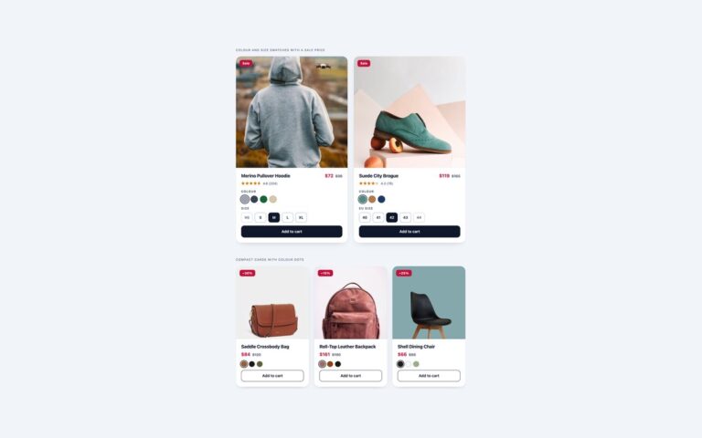
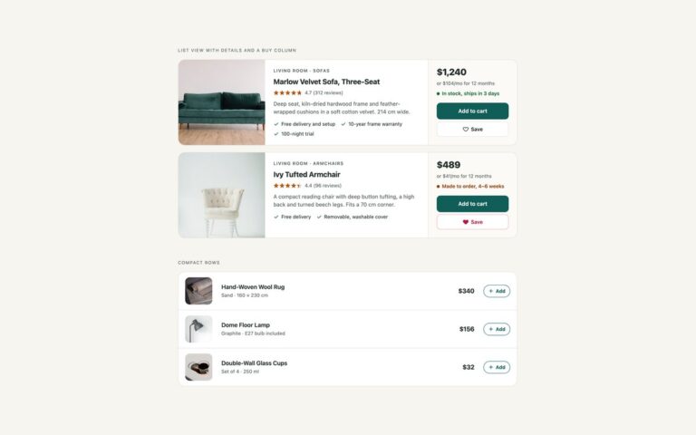
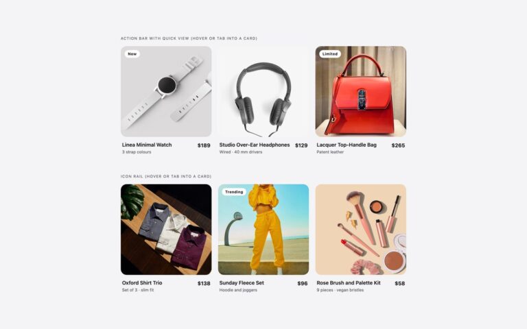
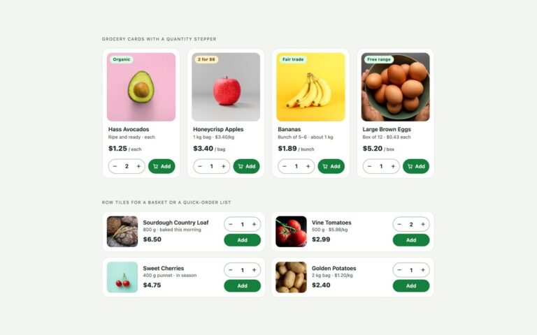
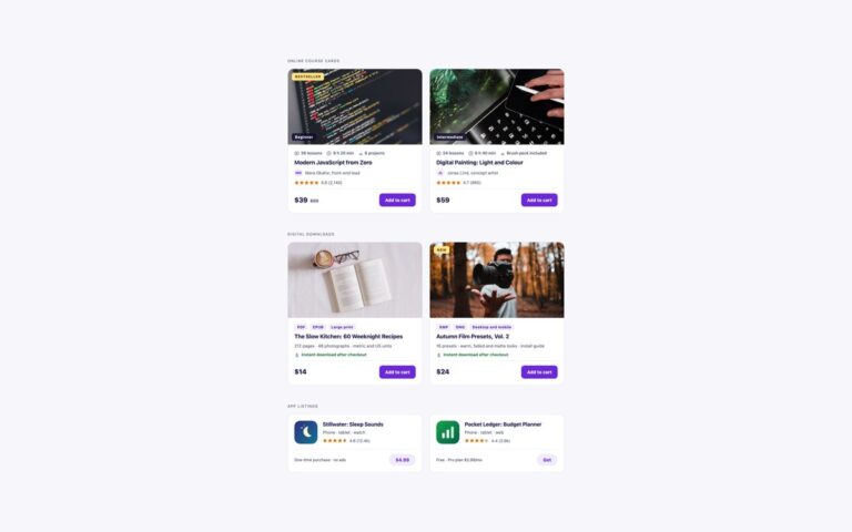
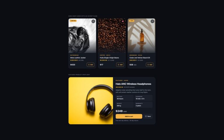
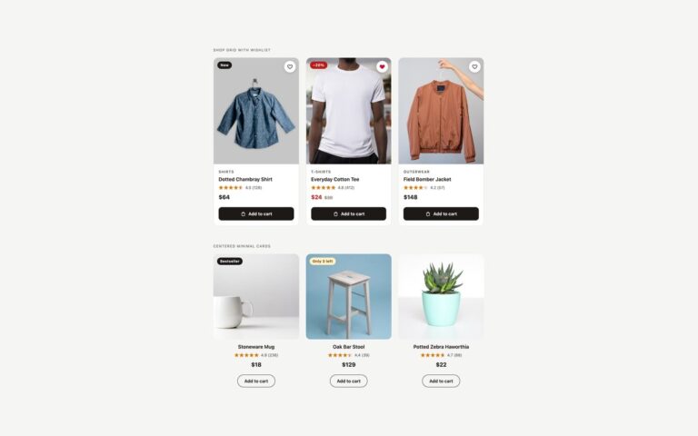
Product cards that do with CSS what is usually done with JavaScript. One card, three containers shows the same face oil card in a narrow column, a medium column and at full width. Each card sits in a container with container-type: inline-size, and container queries switch its layout by the space it actually gets: stacked with a square photo when narrow, photo beside text with a description from 360px, and a wider photo with feature chips and a larger price from 620px. Drop the same markup into a sidebar, a two-column grid or a full-width row and it adapts without a breakpoint for each place. Variant picker with :has() is a water bottle card where the chosen colour radio tints the photo, recolours the border, label and button, and writes the colour name into the legend, and the chosen size switches the price between three values, all through :has() on the card. The selected swatch and size are styled with label:has(:checked). The size guide is a native popover, so it closes with Esc or a click outside, and it fades in with @starting-style. There is no JavaScript in any of the three versions.

What’s included

  • Container queries: one card, three layouts by available width
  • :has() tints the photo, recolours the card and switches the price
  • Selected swatch and size styled with label:has(:checked)
  • Native popover size guide that fades in with @starting-style
  • aspect-ratio keeps photo boxes stable while images load

Accessibility

Colour and size are radio groups in fieldsets with legends, the colour radios have names such as Clay, and the legend shows the chosen colour as text. Only the price for the chosen size is displayed, so screen readers read one price. The size guide button opens a popover labelled Which size? with a real data table and a Close size guide button, and Esc closes it and returns focus to the button. Focus outlines are 3px and every transition stops under prefers-reduced-motion.

Customise it

Change the container breakpoints in the @container rules, --mc-accent for the container cards and --mb-accent and --mb-tint per colour in the :has() rules. In Tailwind edit the @min-[360px]: and @min-[620px]: variants and the has-[input[value=…]:checked]: values.