About this set
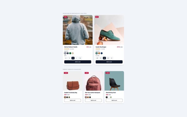
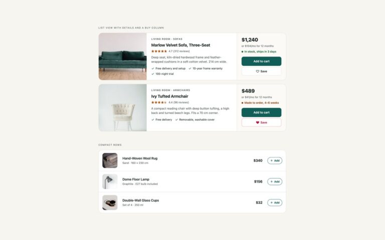
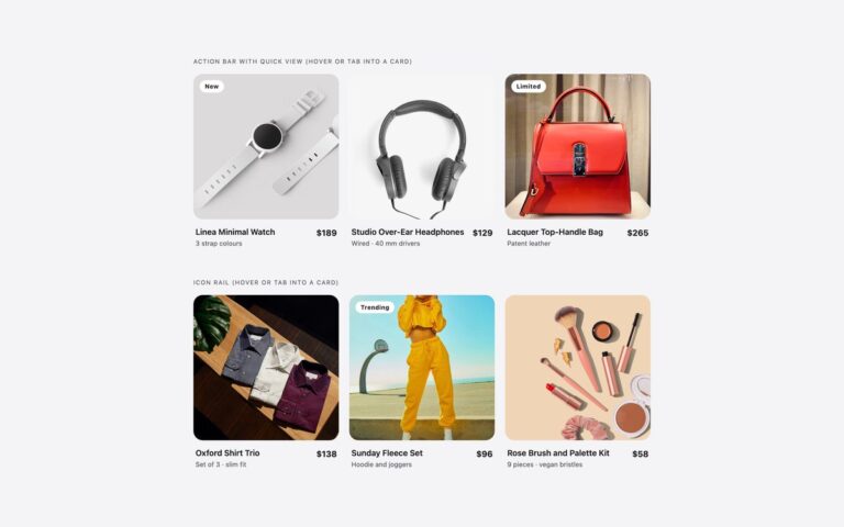
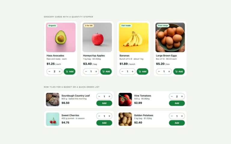
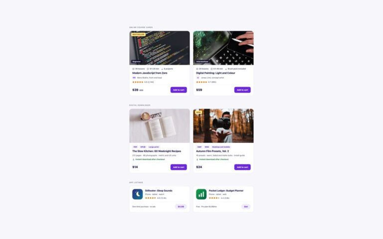
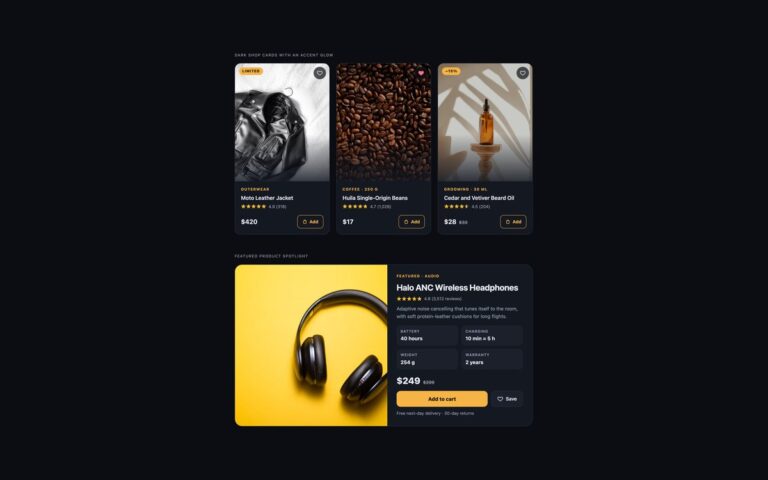
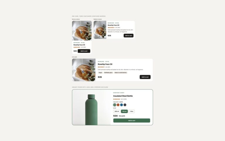
The two product card layouts most online shops start with. Shop grid with wishlist is a bordered card with a 4:5 photo, a New or sale badge, a round wishlist heart in the corner, the category, the product name as a link, a star rating with its review count, the price and a full-width Add to cart button with a bag icon; the sale card shows the reduced price in red beside the struck-through original. Centered minimal cards drop the border for a square photo on a warm ground, centred text and an outline pill button, with Bestseller and Only 3 left badges, which suits homeware and gift shops where the photo carries the card. Both grids are CSS Grid with auto-fill columns, so they go from one card on a phone to three or four on a desktop without media queries. The stars are a row of characters filled to the exact rating with a gradient clipped to the text, so 4.5 shows four and a half stars from one custom property. A few lines of JavaScript flip the wishlist buttons between pressed and not pressed. The Bootstrap version uses .card, .ratio, .badge and Bootstrap’s own data-bs-toggle=”button” for the wishlist.
What’s included
- Two layouts: bordered shop card and centered minimal card
- Badges for new, sale, bestseller and low stock
- Partial star ratings from one --r custom property
- Wishlist hearts that are real toggle buttons with aria-pressed
- Auto-fill grid from one to four columns, no media queries
Accessibility
Each Add to cart button is named for its product, for example Add Field Bomber Jacket to cart, through visually hidden text, and the wishlist heart is a button named Save Field Bomber Jacket to wishlist whose aria-pressed state screen readers announce. Star graphics are hidden from assistive technology and replaced with text such as Rated 4.2 out of 5, 57 reviews, and sale prices are read as Sale price $24, was $30. Links and buttons show a 3px blue focus outline, and the hover lift is switched off under prefers-reduced-motion.
Customise it
Change --pc-ink, --pc-sale, --pc-heart, --pc-star and --pc-focus on .pc for colour, and the minmax(230px, 1fr) value for card width. In Bootstrap the button colours are --bs-btn-* variables on .pc-add; in Tailwind edit the bg-[#1c1917] and aspect-[4/5] utilities.