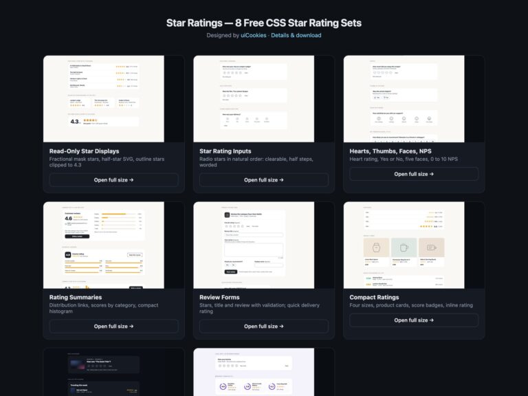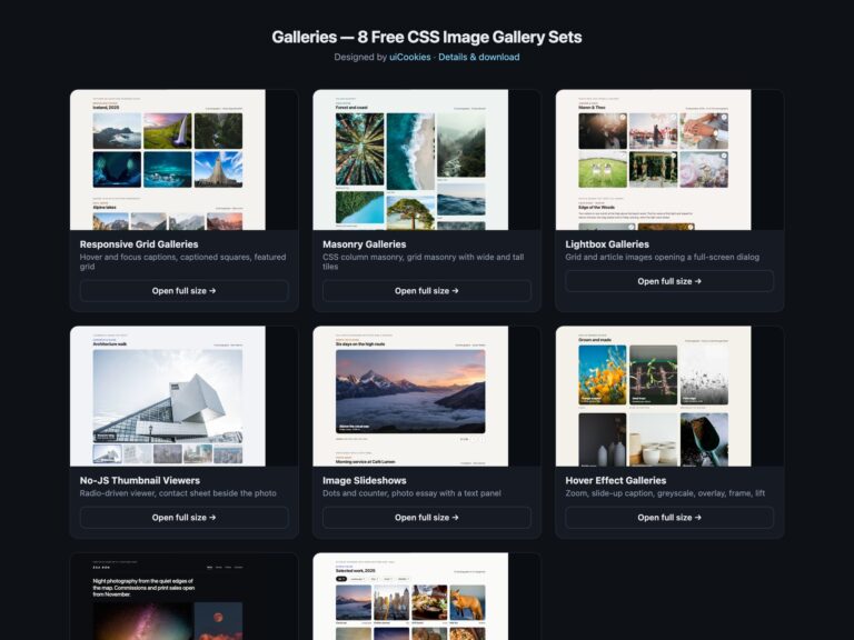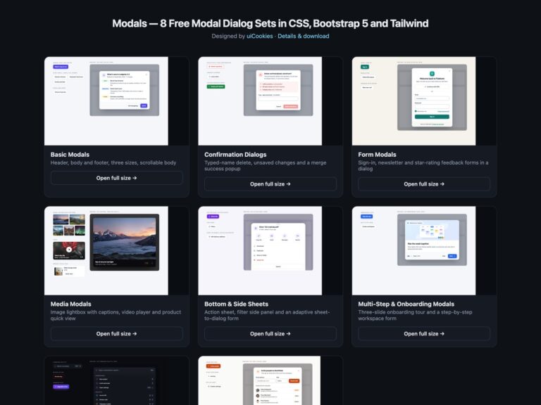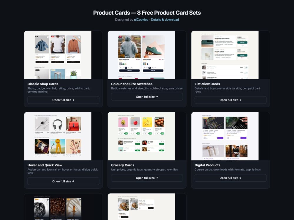
Product Cards is a pack of eight sets of ecommerce product cards, designed and maintained in-house by uiCookies. Every set comes in three versions that look the same: plain HTML and CSS, Bootstrap 5 using .card, .ratio, .badge, .btn-check, .input-group and .modal where they fit, and Tailwind CSS 4. The sets cover classic shop cards, colour and size swatches, horizontal list-view cards, hover cards with a quick view, grocery cards with a quantity stepper, cards for courses, downloads and apps, a dark storefront, and a modern-CSS set built on container queries, :has() and the Popover API.
A good product card answers the shopper’s questions without making them open the product page: what it is, what it costs, whether it is on sale, how well it is rated and whether it is in stock. It also has to work for people who cannot see the stars or use a mouse. The rating should be text a screen reader can read, such as Rated 4.5 out of 5, 128 reviews, not five unlabelled icons. Every Add to cart button should name its product, because a page of twelve identical Add to cart buttons is useless when read as a list. A wishlist heart is a toggle and should say whether it is pressed. Colour and size choices should be real radio buttons, and any action that appears on hover must also appear on keyboard focus and stay visible on touch screens.
Free download Browse live demos All snippets
The sets
1. Classic Shop Product Cards
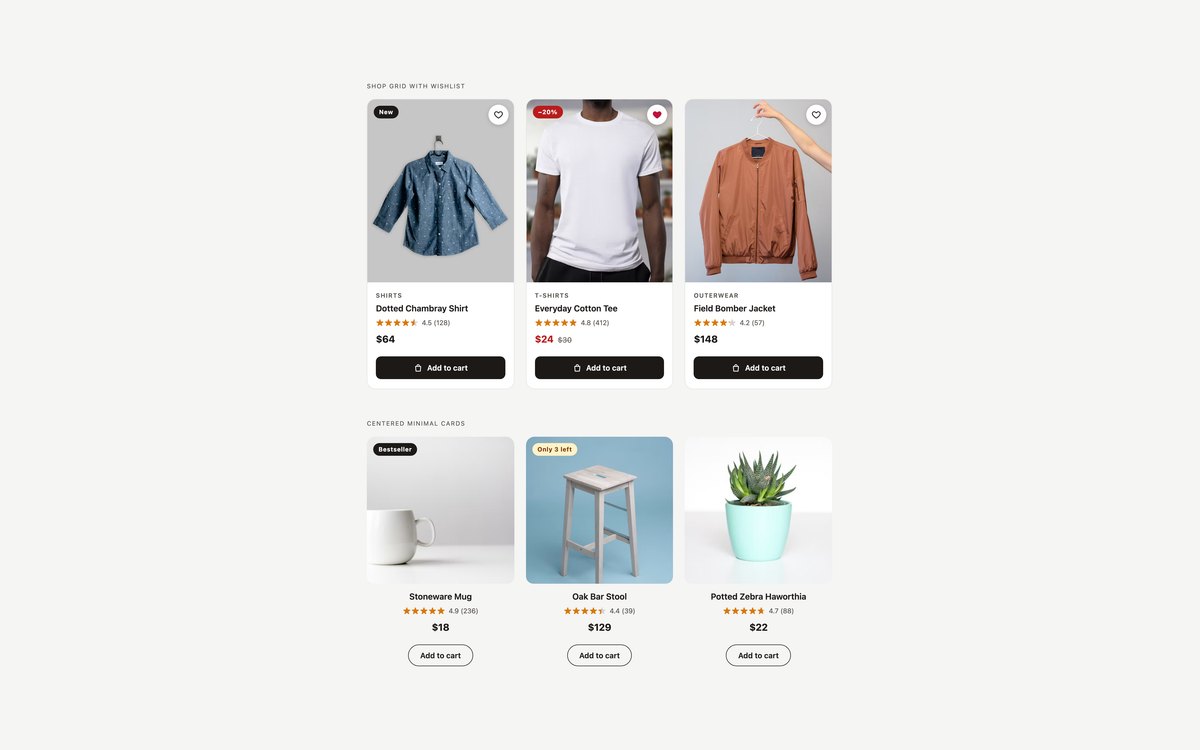
A bordered shop card with a photo, New or sale badge, wishlist heart, category, star rating, price and a full-width Add to cart button, and a centred minimal card with an outline pill button.
Use them for any product grid. The grid fills one to four columns on its own, and a partial star rating comes from a single –r custom property.
Live Demo CSS, Bootstrap & Tailwind code
2. Colour and Size Swatch Cards
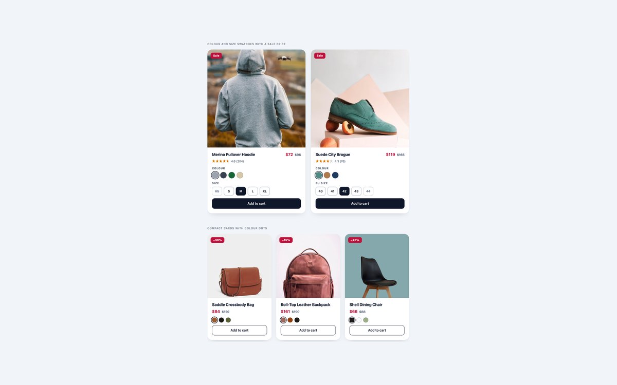
Cards with round colour swatches, size pills with one sold out, and a sale price with the original struck through, plus a compact three-up version with colour dots.
Every picker is a radio group in a fieldset, so it needs no JavaScript and the arrow keys move between options; Bootstrap builds the pills from .btn-check.
Live Demo CSS, Bootstrap & Tailwind code
3. List-View Product Cards
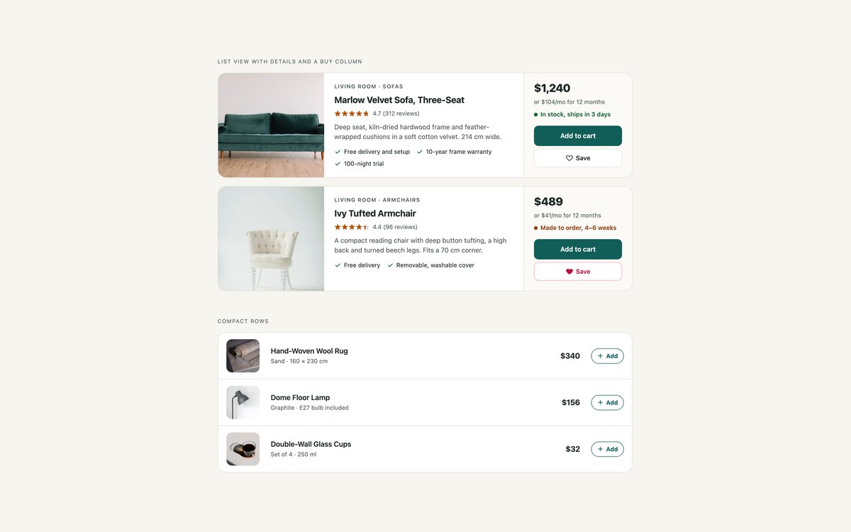
Horizontal cards with the photo, details and a buy column side by side, showing selling points, a monthly payment line and stock status, and compact rows with a thumbnail, price and Add button.
Use the first for a category page’s list view and the rows for a mini cart, recently viewed items or a quick-order page. Both stack cleanly on phones.
Live Demo CSS, Bootstrap & Tailwind code
4. Quick View Product Cards
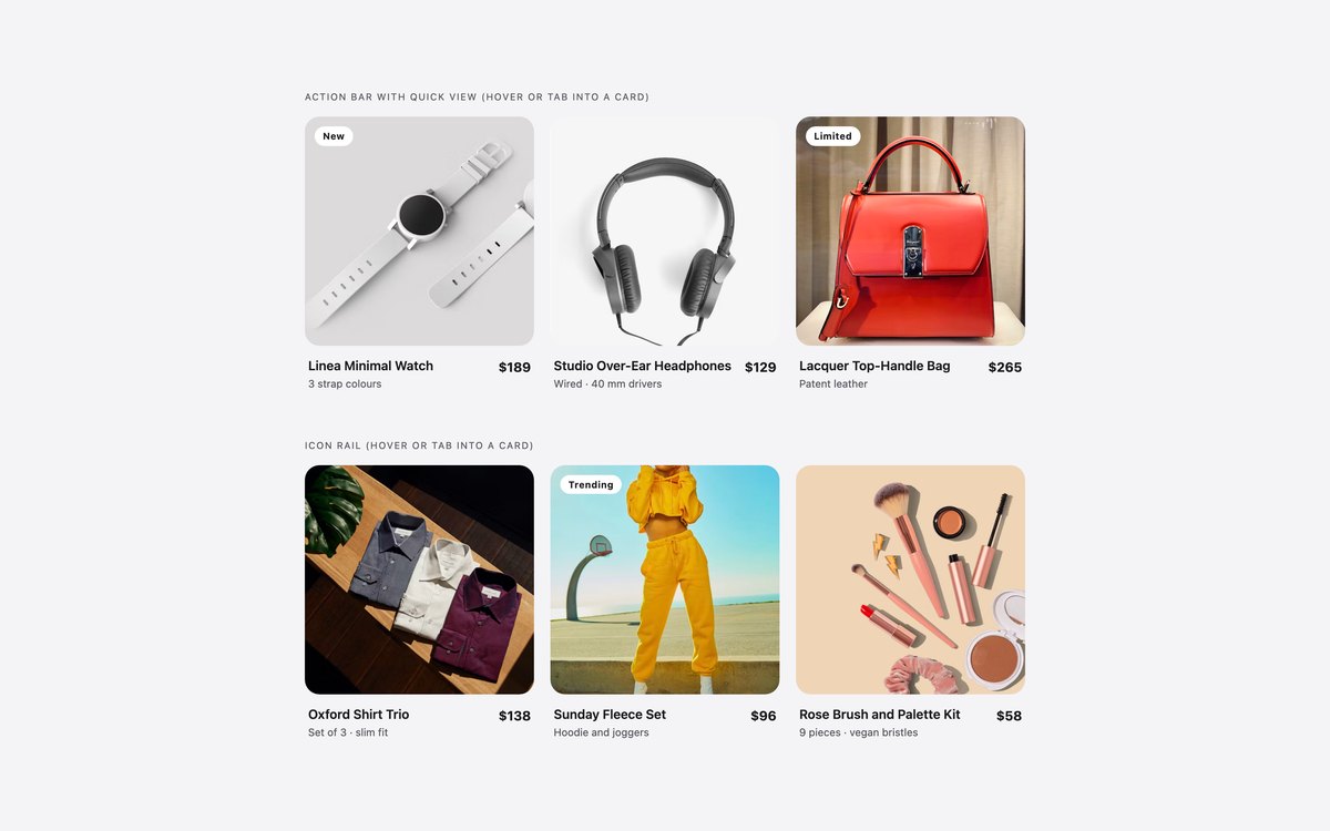
Cards whose action bar or icon rail slides in over the photo, with quick view, add to cart, wishlist and compare buttons.
The actions show on hover and on keyboard focus and stay visible on touch screens. Quick view is a native dialog, or Bootstrap’s .modal, that traps focus and closes with Esc.
Live Demo CSS, Bootstrap & Tailwind code
5. Grocery Product Cards
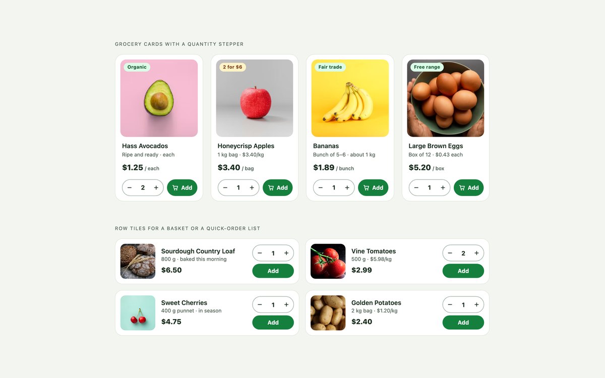
Grocery cards with organic and deal tags, unit prices per kilo or item, and a quantity stepper beside the Add button, plus row tiles for a basket.
The stepper is a labelled number input that works on its own; a few lines of script make the minus and plus buttons step it within its min and max.
Live Demo CSS, Bootstrap & Tailwind code
6. Digital Product Cards

Course cards with lessons, running time, level and instructor, download cards with file-format chips and an instant-download note, and app listings with SVG icons.
Use them for course platforms, digital shops and app marketplaces, where the details have to sell what a product photo cannot.
Live Demo CSS, Bootstrap & Tailwind code
7. Dark Product Cards
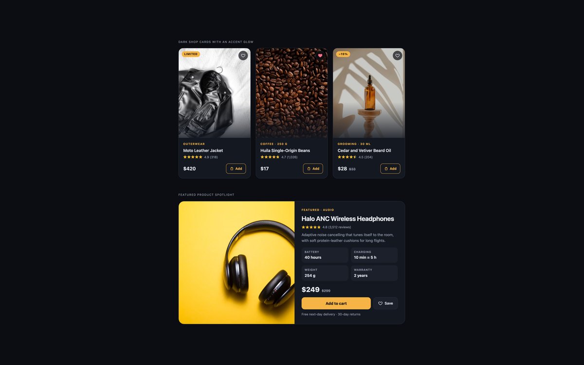
Raised dark cards with photos that fade into the card and an amber glow on hover and focus, and a featured product spotlight with specification tiles.
Every text and accent colour is checked for 4.5:1 contrast on the dark ground; the Bootstrap version is scoped with data-bs-theme="dark".
Live Demo CSS, Bootstrap & Tailwind code
8. Modern CSS Product Cards
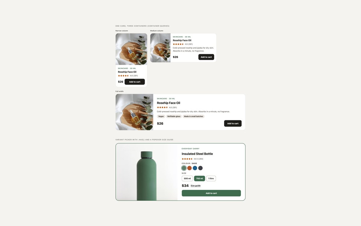
One card that changes its layout to fit a narrow column, a medium column or a full-width row, and a bottle card whose colour and size radios tint the photo and switch the price.
No JavaScript: container queries, :has(), a native popover size guide and @starting-style. It needs Chrome 117, Safari 17.5 or Firefox 129 for every effect.
Live Demo CSS, Bootstrap & Tailwind code
Frequently asked questions
Are these product cards free for commercial projects?
Yes. Every set is free for personal and commercial projects, including client shops and themes you sell. Attribution is optional but always welcome. The licence is at uicookies.com/license/.
Do these product cards need JavaScript?
Most of the card is HTML and CSS. A few lines of vanilla JavaScript flip the wishlist hearts between pressed and not pressed, open the quick view dialog and make the quantity stepper’s minus and plus buttons work; the Bootstrap versions use Bootstrap’s own toggle buttons and .modal for the first two. The swatch cards, digital product cards and the modern-CSS set need no JavaScript at all.
Are the product cards accessible?
Star ratings are hidden from screen readers and replaced with text such as Rated 4.5 out of 5, 128 reviews, and sale prices are read as sale price and was. Every Add to cart button includes the product name, wishlist toggles use aria-pressed, and colour and size choices are radio groups with legends. Actions that appear on hover also appear on keyboard focus, every control has a visible focus outline, motion stops under prefers-reduced-motion, and every set passes an automated axe-core WCAG 2.1 AA check.
Which frameworks are included?
Every set has three files that look the same: plain HTML and CSS, Bootstrap 5.3.8 and Tailwind CSS 4. The Bootstrap files use .card, .ratio, .badge, .btn, .btn-check, .input-group, .list-group, .modal and the row-cols grid where they fit, with a small style block for the rest. The Tailwind files use utility classes in the markup, including peer-checked:, group-focus-within:, has-[…]: and container query variants.
How do I make a product card with HTML and CSS?
Start with set 01: an article holding a photo in a box with a fixed aspect-ratio, the product name as a heading with a link, the rating as text, the price and a button whose accessible name includes the product. Lay the cards out with CSS Grid and repeat(auto-fill, minmax(230px, 1fr)) so the column count follows the screen. For colour or size options use radio buttons as in set 02, and for cards that must fit different column widths use the container queries in set 08.