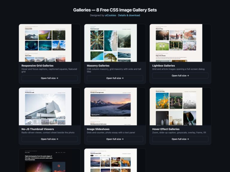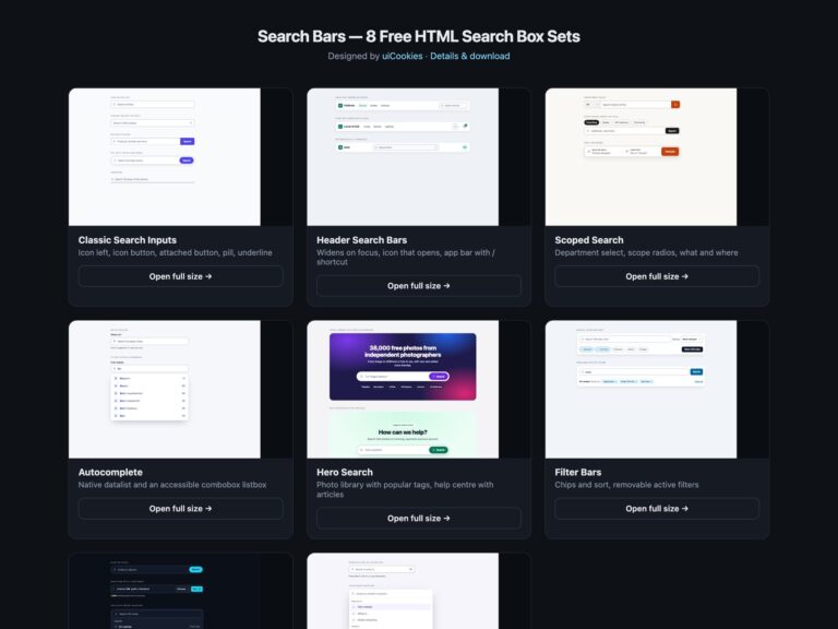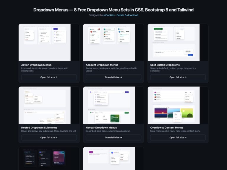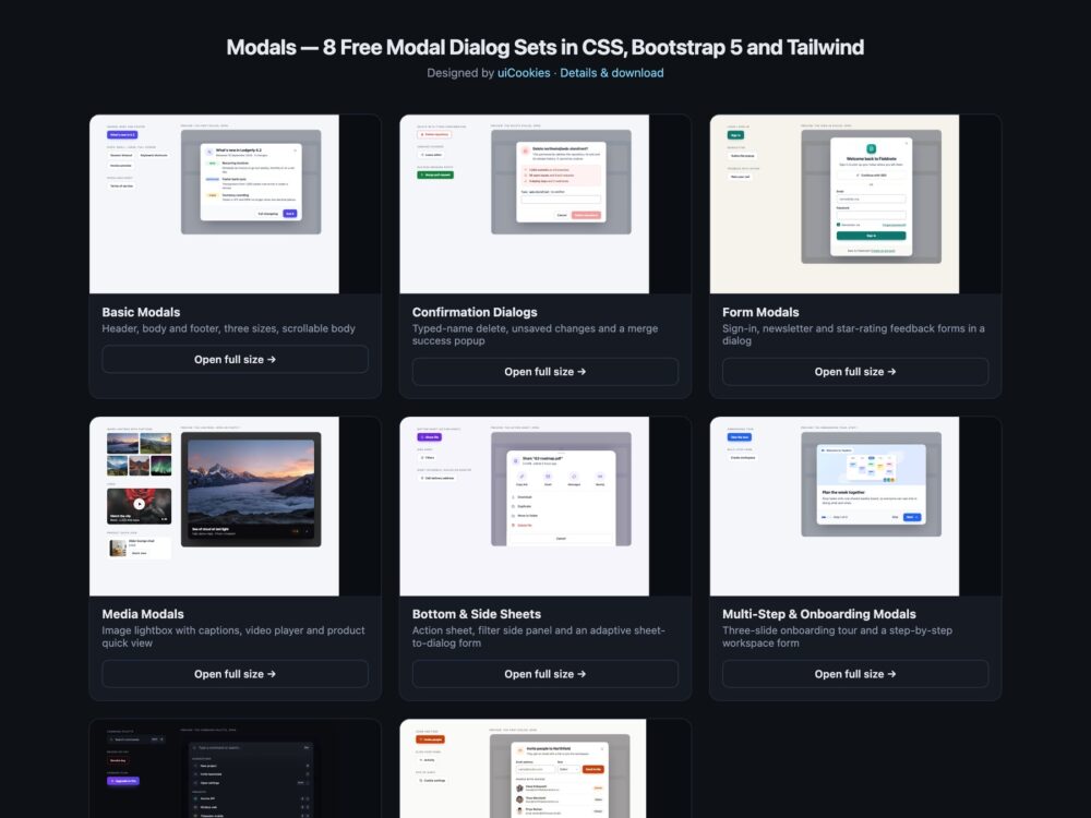
A pack of eight modal dialog sets, designed and maintained in-house by uiCookies: everyday header, body and footer modals in three sizes, confirmation and success popups, login, newsletter and feedback forms, a lightbox and video player, bottom and side sheets, onboarding steps, a dark command palette and a set built only on current HTML and CSS. Every set comes three ways: a Bootstrap 5.3.8 version that uses Bootstrap’s own Modal plugin, a plain CSS version built on the native dialog element, and a Tailwind CSS 4 version written in utility classes. Pick the one that matches your stack and copy the marked snippet.
A good modal is one the reader can always get out of. It needs a visible heading that names it, Esc and a labelled close button that work every time, and keyboard focus that moves into the dialog when it opens, cannot wander onto the page behind, and goes back to the button that opened it when it closes. It should stop the page scrolling underneath, fit a 375px phone without sideways scrolling, and keep its footer buttons in reach when the body is long. A destructive action deserves a confirmation that says exactly what will be lost, and a prompt the reader did not ask for, such as a newsletter popup, should be easy to dismiss and never block the page before it has been read.
Free download Browse live demos All snippets
The sets
1. Basic Modals
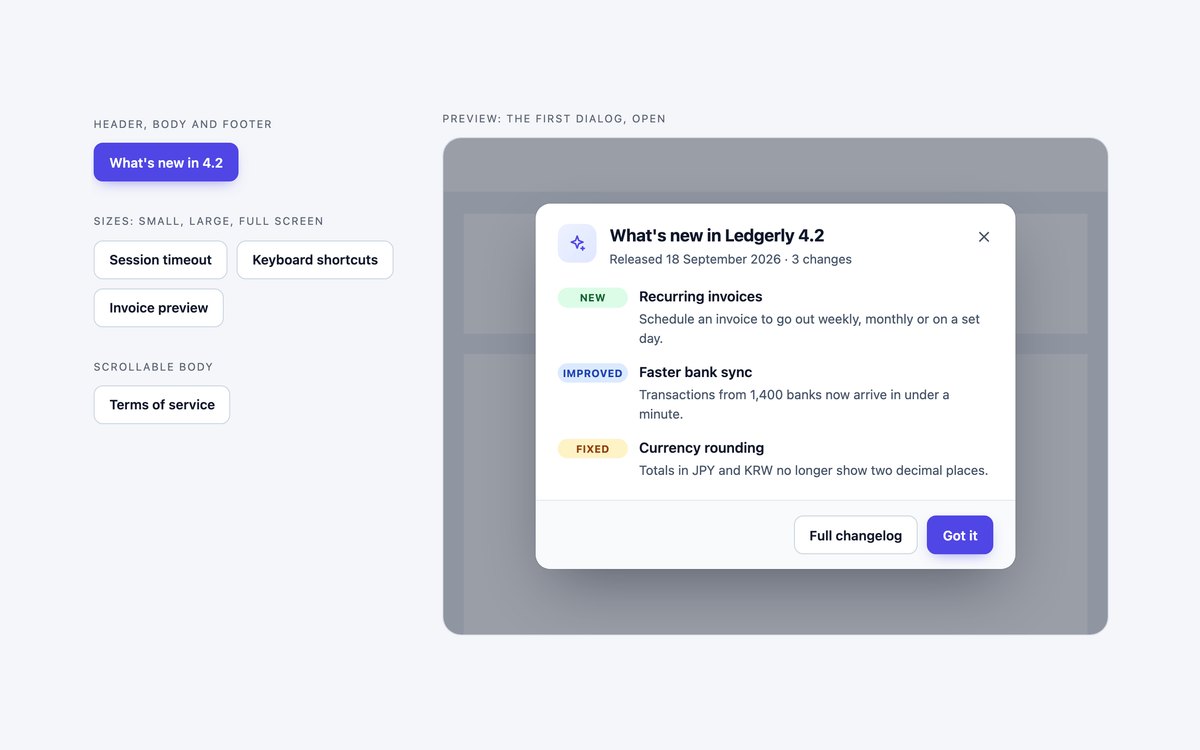
Five everyday modals: release notes with a header, body and footer, a small session-timeout prompt, a large keyboard-shortcuts sheet, a full-screen invoice preview and terms of service in a scrollable body.
Start here for most messages. The plain and Tailwind versions use the native dialog and showModal(), and the Bootstrap version uses .modal-sm, .modal-lg, .modal-fullscreen and .modal-dialog-scrollable.
Live Demo CSS, Bootstrap & Tailwind code
2. Confirmation Dialogs
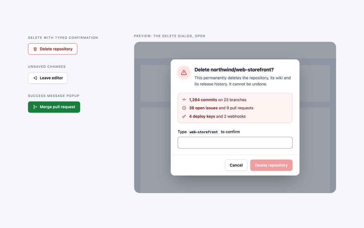
Three confirmation modals from a code-hosting app: a repository delete that unlocks only when the name is typed, an unsaved-changes prompt with three actions, and a merge success popup with a check mark that draws itself.
Use them for destructive, interrupting or completed actions. A few lines of JavaScript compare the typed name, and required and pattern on the input block a wrong value even without it.
Live Demo CSS, Bootstrap & Tailwind code
3. Form Modals
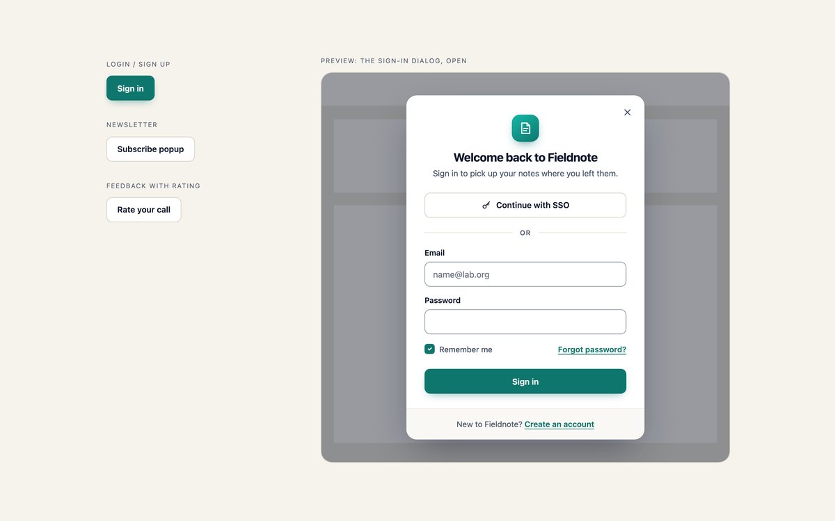
Three form dialogs for a note-taking app: a sign-in card with SSO, a two-column newsletter popup with a photo, and a feedback form with a star rating, chips and a comment box.
Use them wherever a modal has to collect input. The browser’s own validation keeps each dialog open until the form is valid, and the star rating is radio inputs filled with CSS, not script.
Live Demo CSS, Bootstrap & Tailwind code
4. Media Modals
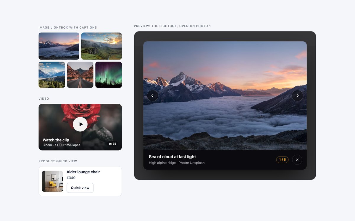
An image lightbox with captions, a counter and previous and next buttons, a video player in a 16:9 frame, and a product quick view with a photo, colour swatches and an add to basket button.
Use them for galleries, product tours and shop listings. One lightbox dialog serves every thumbnail and answers the arrow keys, and the video pauses when its dialog closes.
Live Demo CSS, Bootstrap & Tailwind code
5. Bottom & Side Sheets
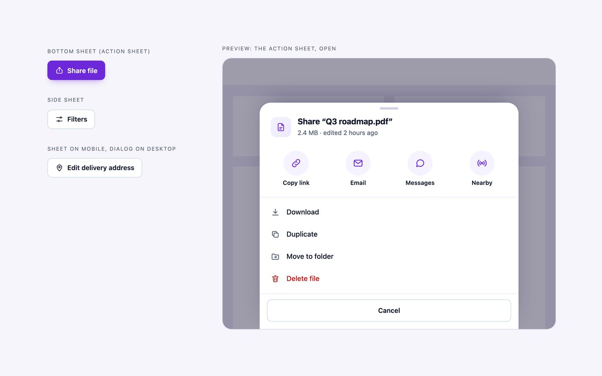
Three modal sheets anchored to a screen edge: a bottom action sheet for sharing a file, a full-height filter panel from the right, and an address form that is a bottom sheet on phones and a centred dialog on desktop.
Use them on mobile-first screens or when a panel should sit beside the content. They are still modal dialogs, native or Bootstrap’s Modal plugin, so focus handling, Esc and the scroll lock keep working.
Live Demo CSS, Bootstrap & Tailwind code
6. Multi-Step & Onboarding Modals
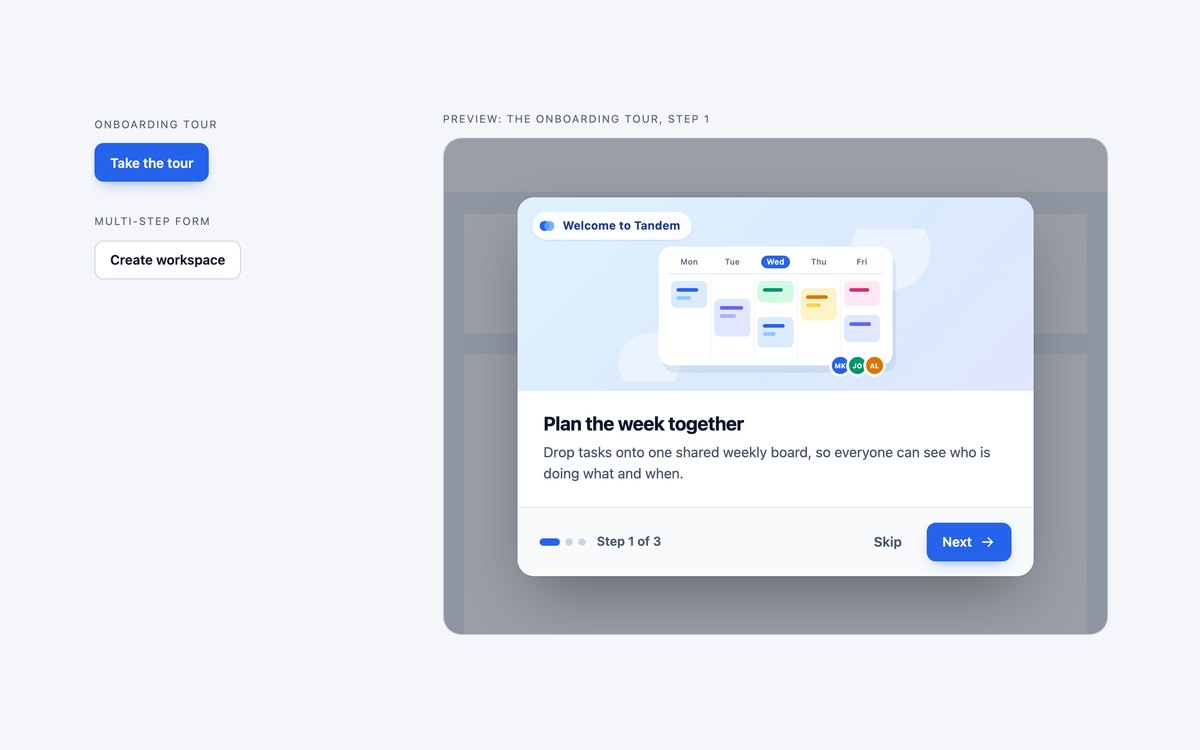
A three-slide onboarding tour with illustrations and progress dots, and a three-step form that creates a workspace with a numbered stepper and radio-card plan choice.
Use the tour once after sign-up and the steps wherever one long form would put people off. A small data-attribute script moves between steps, validates each one and announces the change.
Live Demo CSS, Bootstrap & Tailwind code
7. Dark Modals
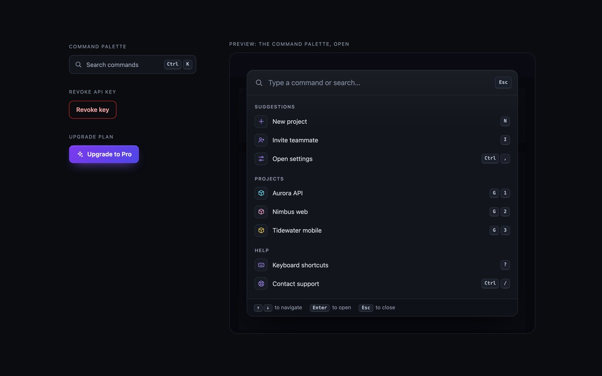
A command palette, a destructive API-key confirmation and a gradient-bordered upgrade card, all on near-black panels with hairline borders and a cyan and violet accent.
Use them in developer tools and dark dashboards. The palette opens with Ctrl+K and filters as you type with a few lines of script, and the pricing toggle switches with :has() and no JavaScript.
Live Demo CSS, Bootstrap & Tailwind code
8. Modern CSS Modals
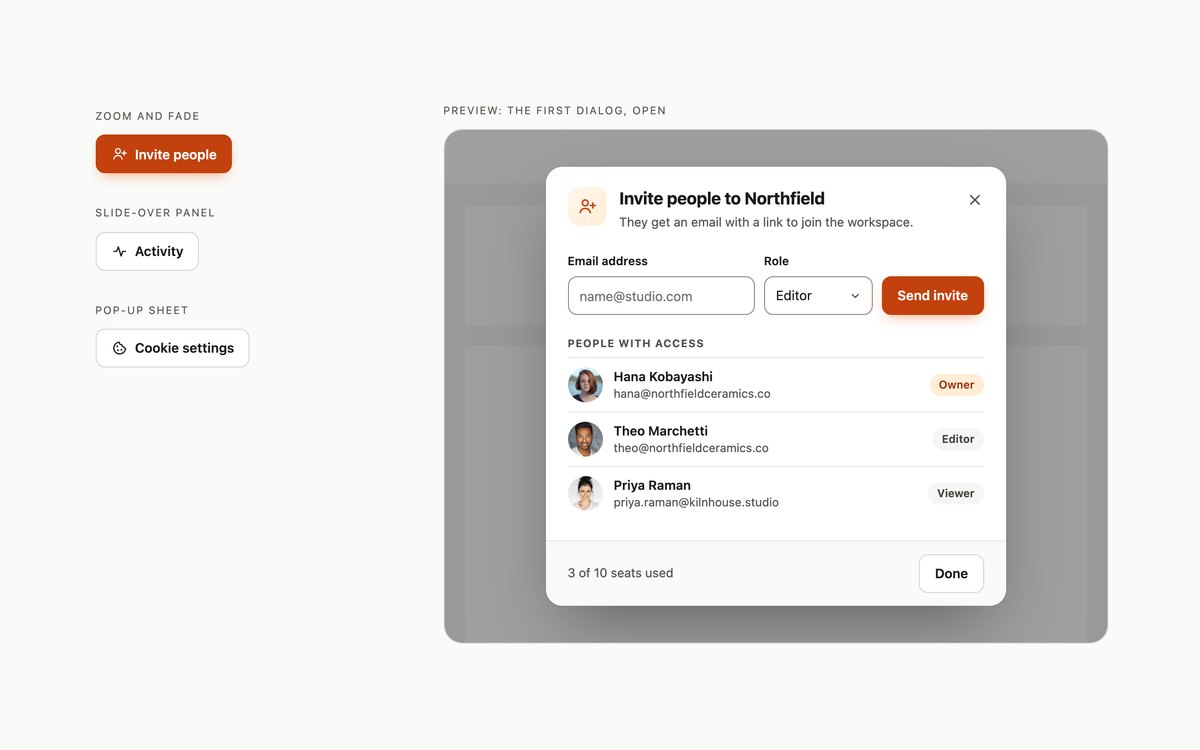
An invite dialog that zooms and fades, an activity panel that slides over from the right, and a cookie settings sheet that rises from the bottom, all opening and closing with HTML and CSS.
Buttons open them with invoker commands, closedby decides whether a backdrop click closes them, and @starting-style animates them in and out. A short script covers browsers without invoker commands or closedby.
Live Demo CSS, Bootstrap & Tailwind code
Frequently asked questions
Are these modals free to use?
Yes. All eight sets are free for personal and commercial projects, including client work and products you sell. Attribution is optional but always welcome. The full terms are on the uiCookies licence page.
Do the modals need JavaScript?
A modal has to be opened by something. In sets 1 to 7 the plain CSS and Tailwind versions use a short script that calls showModal() on the native dialog element, and the Bootstrap versions load the Bootstrap bundle for its Modal plugin. The lightbox, command palette and step dialogs add a few lines of their own. Set 8 opens and closes its dialogs with invoker commands and closedby, and only uses a small fallback script in browsers that lack them.
Are the modals accessible?
Every dialog is labelled by its visible heading, confirmations are alert dialogs with a description, and icon-only buttons have accessible names. Focus moves into the dialog when it opens, the page behind cannot be reached, Esc closes it and focus returns to the button that opened it. Every set passes an axe-core WCAG 2.1 AA check with its dialogs closed and open, and animations switch off when the reader prefers reduced motion.
Which frameworks are covered?
Every set comes as plain CSS on the native dialog element with no dependencies, as Bootstrap 5.3.8 using Bootstrap’s Modal plugin and its button, form, badge and list group components, and as Tailwind CSS 4 utility classes. The three versions of a set look the same, so you can switch stacks without redesigning. In set 8 the Bootstrap file keeps the native dialog, because the Modal plugin cannot be opened by invoker commands.
How do I open a Bootstrap modal with JavaScript?
Get the instance with bootstrap.Modal.getOrCreateInstance(document.getElementById(‘my-modal’)) and call show() or hide() on it. To focus a field when it opens, listen for the shown.bs.modal event on the modal element, because Bootstrap focuses the modal itself rather than the autofocus field. Set 7 opens its command palette this way from a Ctrl+K shortcut.