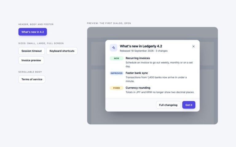
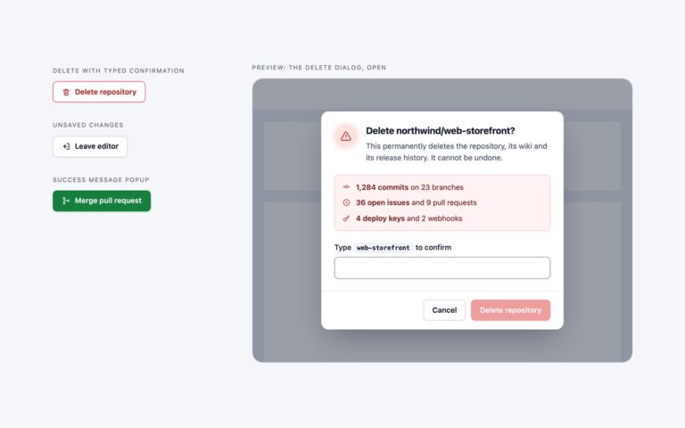
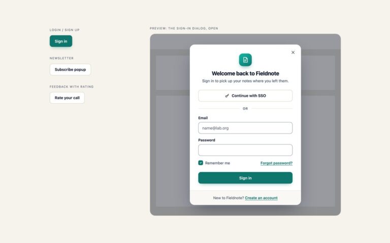
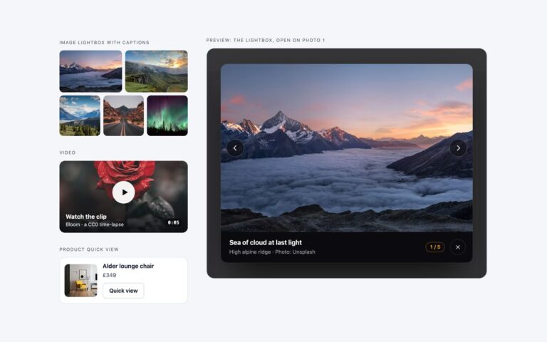
// Open a dialog from any button with data-open="dialog-id". showModal() traps focus, closes on Esc
// and makes the page behind inert. Buttons inside <form method="dialog"> close it with no script.
document.querySelectorAll('[data-open]').forEach(function (btn) {
  var dialog = document.getElementById(btn.getAttribute('data-open'));
  if (!dialog) return;
  btn.addEventListener('click', function () {
    dialog.showModal();
    dialog.addEventListener('close', function () { btn.focus(); }, { once: true }); // focus back to the trigger
  });
  // A click on the backdrop lands on the <dialog> itself (its form fills the box), so close it
  dialog.addEventListener('click', function (e) { if (e.target === dialog) dialog.close(); });
});

// Step-by-step dialogs. Inside any element with data-steps:
//   [data-step]          one panel per step, hidden with the hidden attribute
//   [data-marker]        progress dots / stepper items: get data-state="done|current|todo" and aria-current="step"
//   [data-done]          visually hidden "completed" text inside a marker, shown once that step is done
//   [data-step-status]   polite live region that reads "Step 2 of 3"
//   [data-back] [data-next] [data-skip]   buttons that move between steps; [data-finish] shows on the last step only
document.querySelectorAll('[data-steps]').forEach(function (root) {
  var panels = root.querySelectorAll('[data-step]'), last = panels.length - 1, step = 0;
  var form = panels[0].closest('form');
  function show(sel, on) { root.querySelectorAll(sel).forEach(function (el) { el.hidden = !on; }); }

  function go(n, moveFocus) {
    root.style.setProperty('--st-dir', n < step ? -1 : 1); // slide direction for the CSS animation
    step = n;
    panels.forEach(function (p, i) { p.hidden = i !== n; });
    root.querySelectorAll('[data-marker]').forEach(function (m, i) {
      m.setAttribute('data-state', i < n ? 'done' : i === n ? 'current' : 'todo');
      if (i === n) m.setAttribute('aria-current', 'step'); else m.removeAttribute('aria-current');
      var done = m.querySelector('[data-done]'); if (done) done.hidden = i >= n;
    });
    show('[data-back]', n > 0); show('[data-next]', n < last); show('[data-finish]', n === last);
    var status = root.querySelector('[data-step-status]');
    if (status) status.textContent = 'Step ' + (n + 1) + ' of ' + panels.length;
    if (moveFocus) panels[n].querySelector('[tabindex="-1"]').focus(); // land on the new step's heading
  }

  function next(skip) {
    var fields = panels[step].querySelectorAll('input, select, textarea');
    if (skip) panels[step].querySelectorAll('input').forEach(function (f) { f.value = f.defaultValue; }); // "Skip for now" empties the step
    else if (![].every.call(fields, function (f) { return f.reportValidity(); })) return; // browser message on the first invalid field
    go(step + 1, true);
  }

  root.addEventListener('click', function (e) {
    var b = e.target.closest('[data-next], [data-back], [data-skip]');
    if (b) b.hasAttribute('data-back') ? go(step - 1, true) : next(b.hasAttribute('data-skip'));
  });
  if (form) form.addEventListener('submit', function (e) {
    if (e.submitter && e.submitter.formNoValidate) return; // Skip: <form method="dialog"> closes the dialog
    if (step < last) { e.preventDefault(); next(); }       // Enter in a field goes to the next step, not out
  });
  root.addEventListener('close', function () {
    if (root.returnValue === 'done' && form) form.reset(); // finished: clear the fields for next time
    root.returnValue = ''; step = 0; go(0);                // always reopen on step 1
  });
  go(0);
});
/* Bootstrap's Modal component, restyled through its --bs-modal-* and --bs-btn-* variables.
   Each step is a panel hidden with the hidden attribute; the script after the bundle moves between them. */
.st-btn{--bs-btn-padding-x:16px;--bs-btn-padding-y:9px;--bs-btn-font-size:.9rem;--bs-btn-font-weight:600;--bs-btn-line-height:1.2;--bs-btn-border-radius:10px;
  --bs-btn-bg:#fff;--bs-btn-color:#0f172a;--bs-btn-border-color:#cbd5e1;--bs-btn-hover-bg:#f1f5f9;--bs-btn-hover-color:#0f172a;--bs-btn-hover-border-color:#94a3b8;
  --bs-btn-active-bg:#e2e8f0;--bs-btn-active-color:#0f172a;--bs-btn-active-border-color:#94a3b8;
  display:inline-flex;align-items:center;justify-content:center;gap:8px;min-height:42px}
.st-btn.btn-primary{--bs-btn-bg:#2563eb;--bs-btn-color:#fff;--bs-btn-border-color:#2563eb;--bs-btn-hover-bg:#1d4ed8;--bs-btn-hover-color:#fff;--bs-btn-hover-border-color:#1d4ed8;
  --bs-btn-active-bg:#1e40af;--bs-btn-active-color:#fff;--bs-btn-active-border-color:#1e40af;box-shadow:0 6px 16px -8px rgba(37,99,235,.7)}
.st-btn.st-btn-text{--bs-btn-bg:transparent;--bs-btn-border-color:transparent;--bs-btn-color:#475569;--bs-btn-hover-bg:#f1f5f9;--bs-btn-hover-border-color:transparent;--bs-btn-hover-color:#0f172a;
  --bs-btn-active-bg:#e2e8f0;--bs-btn-active-border-color:transparent;--bs-btn-active-color:#0f172a}
.st-btn:focus-visible{outline:2px solid #2563eb;outline-offset:2px;box-shadow:none}
.st-btn svg{width:18px;height:18px;flex:none}

.st{--bs-modal-width:560px;--bs-modal-margin:1rem;--bs-modal-color:#0f172a;--bs-modal-bg:#fff;--bs-modal-border-width:0;--bs-modal-border-radius:18px;--bs-modal-inner-border-radius:18px;
  --bs-modal-header-padding:22px 24px 0;--bs-modal-header-border-color:#e2e8f0;--bs-modal-title-line-height:1.35;--bs-modal-footer-bg:#f8fafc;--bs-modal-footer-border-color:#e2e8f0;
  font-size:.95rem;line-height:1.55}
@media (min-width:576px){.st{--bs-modal-margin:1.75rem}}
.st.st-create{--bs-modal-width:600px}
.st .modal-content{overflow:hidden;box-shadow:0 0 0 1px rgba(15,23,42,.06),0 28px 64px -18px rgba(15,23,42,.45)}
.st .modal-footer{flex-wrap:wrap;align-items:center;gap:10px;padding:16px 24px}
.st .modal-footer>*{margin:0}
.st-status{margin:0 auto 0 0!important;color:#475569;font-size:.85rem;font-weight:600}
/* Same entrance as the plain version: a short rise and scale instead of Bootstrap's 50px drop */
.st.fade .modal-dialog{transform:translateY(10px) scale(.97);transition:transform .22s cubic-bezier(.2,.8,.2,1)}
.st.show .modal-dialog{transform:none}
.modal-backdrop{--bs-backdrop-bg:#0f172a;--bs-backdrop-opacity:.55;backdrop-filter:blur(2px)}
/* --st-dir is 1 going forward and -1 going back (set by the script) */
@keyframes st-slide{from{opacity:0;transform:translateX(calc(var(--st-dir,1) * 18px))}}

/* Onboarding tour */
.st-chip{position:absolute;top:16px;left:16px;z-index:1;display:inline-flex;align-items:center;gap:7px;margin:0;padding:5px 12px 5px 6px;border-radius:999px;
  background:rgba(255,255,255,.9);color:#1e3a8a;font-size:.78rem;font-weight:700;letter-spacing:.01em;line-height:1.4;box-shadow:0 1px 2px rgba(15,23,42,.08)}
.st-chip svg{width:20px;height:20px}
.st-slide,.st-pane{animation:st-slide .32s cubic-bezier(.2,.8,.2,1)}
.st-art{display:grid;place-items:center;height:210px;padding:34px 20px 10px}
.st-art svg{width:100%;height:100%;max-width:340px}
.st-art.is-sky{background:linear-gradient(135deg,#e0f2fe,#dbeafe 55%,#e0e7ff)}
.st-art.is-indigo{background:linear-gradient(135deg,#e0e7ff,#ede9fe 60%,#fae8ff)}
.st-art.is-mint{background:linear-gradient(135deg,#d1fae5,#ccfbf1 55%,#e0f2fe)}
.st-copy{padding:22px 28px 24px}
.st-copy h3{margin:0;border-radius:4px;color:#0f172a;font-size:1.3rem;font-weight:700;letter-spacing:-.015em;line-height:1.3}
.st-copy p{margin:6px 0 0;color:#475569}
.st-copy h3:focus-visible,.st-pane h3:focus-visible{outline:2px solid #2563eb;outline-offset:4px}
.st-progress{display:flex;align-items:center;gap:12px;margin-right:auto!important}
.st-progress .st-status{margin:0!important}
.st-dots{display:flex;gap:6px}
.st-dots span{width:8px;height:8px;border-radius:999px;background:#cbd5e1;transition:width .25s,background-color .25s}
.st-dots [data-state=done]{background:#93c5fd}
.st-dots [data-state=current]{width:22px;background:#2563eb}

/* Multi-step form: header with a stepper */
.st-create .modal-header{flex-wrap:wrap;align-items:flex-start;gap:0 14px}
.st-create .modal-header>.flex-grow-1{flex-basis:0;min-width:0}
.st .modal-title{font-size:1.15rem;font-weight:700;letter-spacing:-.01em}
.st-sub{margin:3px 0 0;color:#475569;font-size:.85rem}
.st .modal-header .btn-close{flex:none;width:36px;height:36px;margin:-4px -8px 0 auto;padding:0;border-radius:10px;background-size:13px;opacity:.75}
.st .btn-close:hover{background-color:#f1f5f9;opacity:1}
.st .btn-close:focus-visible{outline:2px solid #2563eb;outline-offset:1px;box-shadow:none;opacity:1}
.st-stepper{display:flex;flex:0 0 100%;align-items:center;margin:18px 0 0;padding:0 0 18px;list-style:none}
.st-stepper li{display:flex;flex:1;align-items:center;gap:10px;min-width:0;color:#475569;font-size:.875rem;font-weight:600}
.st-stepper li:last-child{flex:none}
.st-stepper li:not(:last-child)::after{content:"";flex:1;min-width:12px;height:2px;margin-right:10px;border-radius:2px;background:#e2e8f0}
.st-num{display:grid;place-items:center;flex:none;width:28px;height:28px;border:2px solid #cbd5e1;border-radius:50%;background:#fff;color:#475569;font-size:.8rem;font-weight:700}
.st-num svg{display:none;width:16px;height:16px}
.st-stepper [data-state=current],.st-stepper [data-state=done]{color:#0f172a}
.st-stepper [data-state=current] .st-num{border-color:#2563eb;background:#2563eb;color:#fff;box-shadow:0 0 0 4px #dbeafe}
.st-stepper [data-state=done] .st-num{border-color:#dbeafe;background:#dbeafe;color:#1d4ed8}
.st-stepper [data-state=done] .st-num b{display:none}
.st-stepper [data-state=done] .st-num svg{display:block}
.st-stepper li[data-state=done]::after{background:#2563eb}

/* Step panels and fields: Bootstrap's form controls with the set's border, radius and focus ring */
.st-main{display:flex;flex:1 1 auto;flex-direction:column;min-height:0}
.st-create .modal-body{padding:22px 24px 24px;overscroll-behavior:contain}
.st-pane h3{margin:0;border-radius:4px;color:#0f172a;font-size:1.05rem;font-weight:700;line-height:1.4}
.st-pane-sub{margin:3px 0 18px;color:#475569;font-size:.9rem}
.st .form-label{margin-bottom:6px;padding:0;color:#0f172a;font-size:.875rem;font-weight:600;line-height:1.4}
.st legend.form-label{float:none;width:auto}
.st .form-control,.st .form-select,.st .input-group-text{min-height:44px;border-color:#7c8aa0;border-radius:10px;font-size:.95rem;line-height:1.4}
.st .form-control,.st .form-select{padding:10px 12px;color:#0f172a;transition:border-color .15s}
.st .form-select{padding-right:38px;background-position:right 12px center;background-size:16px;cursor:pointer}
.st .form-control::placeholder{color:#64748b}
.st .form-control:hover,.st .form-select:hover{border-color:#64748b}
.st .form-control:focus,.st .form-select:focus{border-color:#2563eb;box-shadow:none;outline:2px solid #2563eb;outline-offset:1px}
.st .input-group-text{padding:0 12px;background:#f1f5f9;color:#475569;font-size:.9rem}
.st .form-text{margin-top:6px;color:#475569;font-size:.8rem}
.st-skip{display:flex;flex-wrap:wrap;align-items:center;gap:4px 8px;margin:18px 0 0;padding-top:16px;border-top:1px dashed #e2e8f0;color:#475569;font-size:.85rem}
.st-skip .btn-link{--bs-btn-padding-x:6px;--bs-btn-padding-y:4px;--bs-btn-font-size:.85rem;--bs-btn-font-weight:600;--bs-btn-border-radius:6px;--bs-btn-color:#1d4ed8;--bs-btn-hover-color:#1e40af;--bs-btn-active-color:#1e40af;
  margin-left:-6px;border:0;text-underline-offset:3px}
.st-skip .btn-link:focus-visible{outline:2px solid #2563eb;outline-offset:1px;box-shadow:none}

/* Plan choice: radio cards built on .form-check-input */
.st-plans{display:grid;grid-template-columns:repeat(3,minmax(0,1fr));gap:10px;min-width:0;margin:0;padding:0;border:0}
.st-plan{position:relative;display:flex;flex-direction:column;gap:2px;margin:0;padding:14px;border:1px solid #cbd5e1;border-radius:14px;background:#fff;cursor:pointer;
  transition:border-color .15s,background-color .15s,box-shadow .15s}
.st-plan:hover{border-color:#94a3b8}
.st-plan:has(:checked){border-color:#2563eb;background:#eff6ff;box-shadow:inset 0 0 0 1px #2563eb}
.st-plan .form-check-input{position:absolute;top:14px;right:14px;width:18px;height:18px;margin:0;border:1.5px solid #7c8aa0;cursor:pointer}
.st-plan .form-check-input:checked{border-color:#2563eb;background-color:#2563eb}
.st-plan .form-check-input:focus{box-shadow:none}
.st-plan .form-check-input:focus-visible{outline:2px solid #2563eb;outline-offset:2px}
.st-plan-name{display:flex;align-items:center;gap:6px;color:#0f172a;font-size:.95rem;font-weight:700}
.st-badge{padding:2px 7px;background:#dbeafe;color:#1e40af;font-size:.68rem;letter-spacing:.04em;text-transform:uppercase}
.st-price{margin-top:6px;color:#475569;font-size:.8rem}
.st-price b{display:block;color:#0f172a;font-size:1.5rem;font-weight:700;letter-spacing:-.02em;line-height:1.2}
.st-plan-note{margin-top:8px;padding-top:8px;border-top:1px solid #e2e8f0;color:#475569;font-size:.8rem}

@media (max-width:600px){
  .st{--bs-modal-header-padding:22px 18px 0}
  .st-copy{padding-left:18px;padding-right:18px}
  .st .modal-footer,.st-create .modal-body{padding-left:18px;padding-right:18px}
  .st .modal-footer .st-btn{flex:1 1 auto}
  .st .modal-footer>.st-status,.st-progress{flex-basis:100%}
  .st-plans{grid-template-columns:1fr}
  .st-plan{display:grid;grid-template-columns:1fr auto;gap:2px 12px;padding-right:44px}
  .st-plan .form-check-input{top:50%;translate:0 -50%}
  .st-price{grid-column:2;grid-row:1 / 3;align-self:center;margin:0;text-align:right}
  .st-plan-note{margin:0;padding:0;border:0}
}
@media (prefers-reduced-motion:reduce){
  .st.fade .modal-dialog,.st-btn,.st .form-control,.st .form-select,.st-plan,.st-dots span{transition:none}
  .st-slide,.st-pane{animation:none}
}
JavaScript
// Step-by-step dialogs. Inside any element with data-steps:
//   [data-step]          one panel per step, hidden with the hidden attribute
//   [data-marker]        progress dots / stepper items: get data-state="done|current|todo" and aria-current="step"
//   [data-done]          visually hidden "completed" text inside a marker, shown once that step is done
//   [data-step-status]   polite live region that reads "Step 2 of 3"
//   [data-back] [data-next] [data-skip]   buttons that move between steps; [data-finish] shows on the last step only
document.querySelectorAll('[data-steps]').forEach(function (root) {
  var panels = root.querySelectorAll('[data-step]'), last = panels.length - 1, step = 0;
  var form = panels[0].closest('form');
  function show(sel, on) { root.querySelectorAll(sel).forEach(function (el) { el.hidden = !on; }); }

  function go(n, moveFocus) {
    root.style.setProperty('--st-dir', n < step ? -1 : 1); // slide direction for the CSS animation
    step = n;
    panels.forEach(function (p, i) { p.hidden = i !== n; });
    root.querySelectorAll('[data-marker]').forEach(function (m, i) {
      m.setAttribute('data-state', i < n ? 'done' : i === n ? 'current' : 'todo');
      if (i === n) m.setAttribute('aria-current', 'step'); else m.removeAttribute('aria-current');
      var done = m.querySelector('[data-done]'); if (done) done.hidden = i >= n;
    });
    show('[data-back]', n > 0); show('[data-next]', n < last); show('[data-finish]', n === last);
    var status = root.querySelector('[data-step-status]');
    if (status) status.textContent = 'Step ' + (n + 1) + ' of ' + panels.length;
    if (moveFocus) panels[n].querySelector('[tabindex="-1"]').focus(); // land on the new step's heading
  }

  function next(skip) {
    var fields = panels[step].querySelectorAll('input, select, textarea');
    if (skip) panels[step].querySelectorAll('input').forEach(function (f) { f.value = f.defaultValue; }); // "Skip for now" empties the step
    else if (![].every.call(fields, function (f) { return f.reportValidity(); })) return; // browser message on the first invalid field
    go(step + 1, true);
  }

  root.addEventListener('click', function (e) {
    var b = e.target.closest('[data-next], [data-back], [data-skip]');
    if (b) b.hasAttribute('data-back') ? go(step - 1, true) : next(b.hasAttribute('data-skip'));
  });
  if (form) form.addEventListener('submit', function (e) {
    e.preventDefault();
    if (step < last) return next();                        // Enter in a field goes to the next step
    root.addEventListener('hidden.bs.modal', function () { form.reset(); }, { once: true }); // clear once it has faded out
    bootstrap.Modal.getOrCreateInstance(root).hide();      // the last step's submit button closes the modal
  });
  root.addEventListener('show.bs.modal', function () { step = 0; go(0); }); // always open on step 1
  root.addEventListener('shown.bs.modal', function () { var f = root.querySelector('[autofocus]'); if (f) f.focus(); }); // Bootstrap ignores autofocus
  go(0);
});
/* Entrance keyframes for the dialog and its backdrop (used through motion-safe:open:animate-[…]) */
@keyframes st-in { from { opacity: 0; transform: translateY(10px) scale(.97); } }
@keyframes st-fade { from { opacity: 0; } }
/* Step change: --st-dir is 1 going forward and -1 going back (set by the script) */
@keyframes st-slide { from { opacity: 0; transform: translateX(calc(var(--st-dir, 1) * 18px)); } }
/* Stop the page scrolling behind an open modal */
html:has(dialog:modal) { overflow: hidden; }
JavaScript
// Open a dialog from any button with data-open="dialog-id". showModal() traps focus, closes on Esc
// and makes the page behind inert. Buttons inside <form method="dialog"> close it with no script.
document.querySelectorAll('[data-open]').forEach(function (btn) {
  var dialog = document.getElementById(btn.getAttribute('data-open'));
  if (!dialog) return;
  btn.addEventListener('click', function () {
    dialog.showModal();
    dialog.addEventListener('close', function () { btn.focus(); }, { once: true }); // focus back to the trigger
  });
  // A click on the backdrop lands on the <dialog> itself (its form fills the box), so close it
  dialog.addEventListener('click', function (e) { if (e.target === dialog) dialog.close(); });
});

// Step-by-step dialogs. Inside any element with data-steps:
//   [data-step]          one panel per step, hidden with the hidden attribute
//   [data-marker]        progress dots / stepper items: get data-state="done|current|todo" and aria-current="step"
//   [data-done]          visually hidden "completed" text inside a marker, shown once that step is done
//   [data-step-status]   polite live region that reads "Step 2 of 3"
//   [data-back] [data-next] [data-skip]   buttons that move between steps; [data-finish] shows on the last step only
document.querySelectorAll('[data-steps]').forEach(function (root) {
  var panels = root.querySelectorAll('[data-step]'), last = panels.length - 1, step = 0;
  var form = panels[0].closest('form');
  function show(sel, on) { root.querySelectorAll(sel).forEach(function (el) { el.hidden = !on; }); }

  function go(n, moveFocus) {
    root.style.setProperty('--st-dir', n < step ? -1 : 1); // slide direction for the CSS animation
    step = n;
    panels.forEach(function (p, i) { p.hidden = i !== n; });
    root.querySelectorAll('[data-marker]').forEach(function (m, i) {
      m.setAttribute('data-state', i < n ? 'done' : i === n ? 'current' : 'todo');
      if (i === n) m.setAttribute('aria-current', 'step'); else m.removeAttribute('aria-current');
      var done = m.querySelector('[data-done]'); if (done) done.hidden = i >= n;
    });
    show('[data-back]', n > 0); show('[data-next]', n < last); show('[data-finish]', n === last);
    var status = root.querySelector('[data-step-status]');
    if (status) status.textContent = 'Step ' + (n + 1) + ' of ' + panels.length;
    if (moveFocus) panels[n].querySelector('[tabindex="-1"]').focus(); // land on the new step's heading
  }

  function next(skip) {
    var fields = panels[step].querySelectorAll('input, select, textarea');
    if (skip) panels[step].querySelectorAll('input').forEach(function (f) { f.value = f.defaultValue; }); // "Skip for now" empties the step
    else if (![].every.call(fields, function (f) { return f.reportValidity(); })) return; // browser message on the first invalid field
    go(step + 1, true);
  }

  root.addEventListener('click', function (e) {
    var b = e.target.closest('[data-next], [data-back], [data-skip]');
    if (b) b.hasAttribute('data-back') ? go(step - 1, true) : next(b.hasAttribute('data-skip'));
  });
  if (form) form.addEventListener('submit', function (e) {
    if (e.submitter && e.submitter.formNoValidate) return; // Skip: <form method="dialog"> closes the dialog
    if (step < last) { e.preventDefault(); next(); }       // Enter in a field goes to the next step, not out
  });
  root.addEventListener('close', function () {
    if (root.returnValue === 'done' && form) form.reset(); // finished: clear the fields for next time
    root.returnValue = ''; step = 0; go(0);                // always reopen on step 1
  });
  go(0);
});
About this set
Two modals that walk the reader through more than one screen, for a team planning app called Tandem. Onboarding tour is a three-slide welcome: an illustrated panel drawn in inline SVG, a heading and one sentence per slide (Plan the week together, Assign work in one drag, Stay in sync without meetings), progress dots, a Step 1 of 3 line, and Skip, Back and Next buttons, with Next turning into Get started on the last slide. Multi-step form creates a workspace in three steps shown in a numbered stepper: a name and URL, up to three teammate emails with a role, and a plan chosen from radio cards. Use the tour once, after sign-up, and the form wherever one long form would put people off. A short generic script drives both from data attributes: panels are hidden with the hidden attribute, the current step gets aria-current=”step”, a polite live region announces the step, focus moves to the new step’s heading, and each step’s fields are checked with reportValidity() before moving on. Both reopen on step 1. The plain and Tailwind versions use the native dialog element; the Bootstrap version uses the Modal plugin with the same step script.
What’s included
Three-slide onboarding tour with inline SVG illustrations and progress dots
Three-step workspace form with a numbered stepper and radio-card plan choice
Each step validated with reportValidity() before Continue
Step changes announced in a polite live region, focus moved to the new heading
One small data-attribute script shared by both dialogs and all three versions
Accessibility
Both dialogs are labelled by their headings. The stepper is an ordered list with aria-current="step" on the current item and visually hidden completed text on finished ones, a polite live region reads Step 2 of 3 after each move, and focus lands on the new step's heading so screen reader and keyboard users start at the top. Every field has a label, plan cards are real radio inputs, every control shows a focus outline, and the slide transitions stop under prefers-reduced-motion.
Customise it
In plain CSS change the --st-* custom properties on .st (accent, ink, muted, line, soft, field, radius and --st-w for the width) and the gradients in the illustration panels. In Bootstrap edit --bs-modal-width and the --bs-btn-* variables; in Tailwind replace the #2563eb and slate hex utilities and the w-[min(…)] width.