Open demo

CSS code

HTML
<div class="faq-centre"><span class="lbl">Centred column</span>
<h2>Frequently asked questions</h2>
<p class="sub">Everything people usually ask before downloading.</p>
<div class="acc">
<details open>
<summary>What is included in the download?<span class="chev" aria-hidden="true"></span></summary>
<div class="body">Each set comes as plain CSS, Bootstrap 5 and Tailwind CSS versions of the same design, one HTML file each. There is no build step and nothing to compile.</div>
</details>
<details>
<summary>Can I use these commercially?<span class="chev" aria-hidden="true"></span></summary>
<div class="body">Yes — free for personal and commercial projects, including client work.</div>
</details>
<details>
<summary>Do they work on mobile?<span class="chev" aria-hidden="true"></span></summary>
<div class="body">Yes. The header row is a flex layout, and the tap target is the full width of the row rather than just the label text.</div>
</details>
</div>
</div>
<div><span class="lbl">Two columns</span>
<div class="faq-cols">
<div class="acc">
<details open>
<summary>What is included in the download?<span class="chev" aria-hidden="true"></span></summary>
<div class="body">Each set comes as plain CSS, Bootstrap 5 and Tailwind CSS versions of the same design, one HTML file each. There is no build step and nothing to compile.</div>
</details>
<details>
<summary>Can I use these commercially?<span class="chev" aria-hidden="true"></span></summary>
<div class="body">Yes — free for personal and commercial projects, including client work.</div>
</details>
<details>
<summary>Do they work on mobile?<span class="chev" aria-hidden="true"></span></summary>
<div class="body">Yes. The header row is a flex layout, and the tap target is the full width of the row rather than just the label text.</div>
</details>
</div>
<div class="acc">
<details>
<summary>Do I have to credit uiCookies?<span class="chev" aria-hidden="true"></span></summary>
<div class="body">No. Attribution is optional but welcome.</div>
</details>
<details>
<summary>Which browsers are supported?<span class="chev" aria-hidden="true"></span></summary>
<div class="body">Current versions of Chrome, Edge, Firefox and Safari, on desktop and mobile.</div>
</details>
<details>
<summary>Can I change the colours?<span class="chev" aria-hidden="true"></span></summary>
<div class="body">Yes. Every colour is a plain value you can swap for your own palette.</div>
</details>
</div>
</div>
</div>
<div class="faq-group"><span class="lbl">Grouped by category</span>
<h3>Licensing</h3>
<div class="acc">
<details>
<summary>Can I use these commercially?<span class="chev" aria-hidden="true"></span></summary>
<div class="body">Yes — free for personal and commercial projects, including client work.</div>
</details>
<details>
<summary>Do I have to credit uiCookies?<span class="chev" aria-hidden="true"></span></summary>
<div class="body">No. Attribution is optional but welcome.</div>
</details>
</div>
<h3>Technical</h3>
<div class="acc">
<details>
<summary>What is included in the download?<span class="chev" aria-hidden="true"></span></summary>
<div class="body">Each set comes as plain CSS, Bootstrap 5 and Tailwind CSS versions of the same design, one HTML file each. There is no build step and nothing to compile.</div>
</details>
<details>
<summary>Do they work on mobile?<span class="chev" aria-hidden="true"></span></summary>
<div class="body">Yes. The header row is a flex layout, and the tap target is the full width of the row rather than just the label text.</div>
</details>
<details>
<summary>Which browsers are supported?<span class="chev" aria-hidden="true"></span></summary>
<div class="body">Current versions of Chrome, Edge, Firefox and Safari, on desktop and mobile.</div>
</details>
</div>
</div>
CSS
/* FAQ layouts built from native <details>/<summary>. */
.acc{--acc-bg:#fff;--acc-border:#e2e8f0;--acc-text:#1e293b;--acc-muted:#475569;
  --acc-hover:#f8fafc;--acc-icon:#64748b;--acc-focus:#2563eb;max-width:560px}
.acc details{background:var(--acc-bg);border:1px solid var(--acc-border);border-radius:11px;margin:0 0 9px;overflow:hidden}
.acc summary{display:flex;align-items:center;justify-content:space-between;gap:14px;padding:15px 18px;cursor:pointer;
  list-style:none;font-size:.94rem;font-weight:600;color:var(--acc-text);transition:background-color .15s}
.acc summary::-webkit-details-marker{display:none}
.acc summary:hover{background:var(--acc-hover)}
.acc summary:focus-visible{outline:2px solid var(--acc-focus);outline-offset:-2px}
.acc .body{padding:0 18px 17px;font-size:.89rem;line-height:1.66;color:var(--acc-muted)}
/* chevron: two borders of a small square, rotated to point down, then up when open */
.acc .chev{flex:none;width:9px;height:9px;margin-top:-3px;border-right:2px solid var(--acc-icon);
  border-bottom:2px solid var(--acc-icon);transform:rotate(45deg);transition:transform .2s}
.acc details[open]>summary .chev{margin-top:3px;transform:rotate(-135deg)}
/* centred column with a heading */
.faq-centre{max-width:600px;margin:0 auto}
.faq-centre h2{margin:0 0 8px;font-size:1.35rem;text-align:center}
.faq-centre .sub{margin:0 0 22px;font-size:.87rem;color:#64748b;text-align:center}
.faq-centre .acc,.faq-cols .acc{max-width:none}
/* two columns that stack on narrow screens */
.faq-cols{display:grid;grid-template-columns:repeat(auto-fit,minmax(270px,1fr));gap:20px}
/* grouped under category headings */
.faq-group h3{margin:22px 0 10px;font-size:.75rem;letter-spacing:.1em;text-transform:uppercase;color:#64748b}
@media (prefers-reduced-motion:reduce){.acc summary,.acc .chev{transition:none}}

Bootstrap 5 code

Requires: Bootstrap 5.3.8 CSS, Bootstrap 5.3.8 JS bundle

HTML
<div class="faq-centre"><span class="lbl">Centred column</span>
<h2>Frequently asked questions</h2>
<p class="sub">Everything people usually ask before downloading.</p>
<div class="accordion acc">
<div class="accordion-item">
<h3 class="accordion-header"><button class="accordion-button" type="button" data-bs-toggle="collapse" data-bs-target="#b3-1" aria-expanded="true" aria-controls="b3-1">What is included in the download?</button></h3>
<div id="b3-1" class="accordion-collapse collapse show">
<div class="accordion-body">Each set comes as plain CSS, Bootstrap 5 and Tailwind CSS versions of the same design, one HTML file each. There is no build step and nothing to compile.</div>
</div>
</div>
<div class="accordion-item">
<h3 class="accordion-header"><button class="accordion-button collapsed" type="button" data-bs-toggle="collapse" data-bs-target="#b3-2" aria-expanded="false" aria-controls="b3-2">Can I use these commercially?</button></h3>
<div id="b3-2" class="accordion-collapse collapse">
<div class="accordion-body">Yes — free for personal and commercial projects, including client work.</div>
</div>
</div>
<div class="accordion-item">
<h3 class="accordion-header"><button class="accordion-button collapsed" type="button" data-bs-toggle="collapse" data-bs-target="#b3-3" aria-expanded="false" aria-controls="b3-3">Do they work on mobile?</button></h3>
<div id="b3-3" class="accordion-collapse collapse">
<div class="accordion-body">Yes. The header row is a flex layout, and the tap target is the full width of the row rather than just the label text.</div>
</div>
</div>
</div>
</div>
<div><span class="lbl">Two columns</span>
<div class="faq-cols">
<div class="accordion acc">
<div class="accordion-item">
<h3 class="accordion-header"><button class="accordion-button" type="button" data-bs-toggle="collapse" data-bs-target="#b3-4" aria-expanded="true" aria-controls="b3-4">What is included in the download?</button></h3>
<div id="b3-4" class="accordion-collapse collapse show">
<div class="accordion-body">Each set comes as plain CSS, Bootstrap 5 and Tailwind CSS versions of the same design, one HTML file each. There is no build step and nothing to compile.</div>
</div>
</div>
<div class="accordion-item">
<h3 class="accordion-header"><button class="accordion-button collapsed" type="button" data-bs-toggle="collapse" data-bs-target="#b3-5" aria-expanded="false" aria-controls="b3-5">Can I use these commercially?</button></h3>
<div id="b3-5" class="accordion-collapse collapse">
<div class="accordion-body">Yes — free for personal and commercial projects, including client work.</div>
</div>
</div>
<div class="accordion-item">
<h3 class="accordion-header"><button class="accordion-button collapsed" type="button" data-bs-toggle="collapse" data-bs-target="#b3-6" aria-expanded="false" aria-controls="b3-6">Do they work on mobile?</button></h3>
<div id="b3-6" class="accordion-collapse collapse">
<div class="accordion-body">Yes. The header row is a flex layout, and the tap target is the full width of the row rather than just the label text.</div>
</div>
</div>
</div>
<div class="accordion acc">
<div class="accordion-item">
<h3 class="accordion-header"><button class="accordion-button collapsed" type="button" data-bs-toggle="collapse" data-bs-target="#b3-7" aria-expanded="false" aria-controls="b3-7">Do I have to credit uiCookies?</button></h3>
<div id="b3-7" class="accordion-collapse collapse">
<div class="accordion-body">No. Attribution is optional but welcome.</div>
</div>
</div>
<div class="accordion-item">
<h3 class="accordion-header"><button class="accordion-button collapsed" type="button" data-bs-toggle="collapse" data-bs-target="#b3-8" aria-expanded="false" aria-controls="b3-8">Which browsers are supported?</button></h3>
<div id="b3-8" class="accordion-collapse collapse">
<div class="accordion-body">Current versions of Chrome, Edge, Firefox and Safari, on desktop and mobile.</div>
</div>
</div>
<div class="accordion-item">
<h3 class="accordion-header"><button class="accordion-button collapsed" type="button" data-bs-toggle="collapse" data-bs-target="#b3-9" aria-expanded="false" aria-controls="b3-9">Can I change the colours?</button></h3>
<div id="b3-9" class="accordion-collapse collapse">
<div class="accordion-body">Yes. Every colour is a plain value you can swap for your own palette.</div>
</div>
</div>
</div>
</div>
</div>
<div class="faq-group"><span class="lbl">Grouped by category</span>
<h3>Licensing</h3>
<div class="accordion acc">
<div class="accordion-item">
<h4 class="accordion-header"><button class="accordion-button collapsed" type="button" data-bs-toggle="collapse" data-bs-target="#b3-10" aria-expanded="false" aria-controls="b3-10">Can I use these commercially?</button></h4>
<div id="b3-10" class="accordion-collapse collapse">
<div class="accordion-body">Yes — free for personal and commercial projects, including client work.</div>
</div>
</div>
<div class="accordion-item">
<h4 class="accordion-header"><button class="accordion-button collapsed" type="button" data-bs-toggle="collapse" data-bs-target="#b3-11" aria-expanded="false" aria-controls="b3-11">Do I have to credit uiCookies?</button></h4>
<div id="b3-11" class="accordion-collapse collapse">
<div class="accordion-body">No. Attribution is optional but welcome.</div>
</div>
</div>
</div>
<h3>Technical</h3>
<div class="accordion acc">
<div class="accordion-item">
<h4 class="accordion-header"><button class="accordion-button collapsed" type="button" data-bs-toggle="collapse" data-bs-target="#b3-12" aria-expanded="false" aria-controls="b3-12">What is included in the download?</button></h4>
<div id="b3-12" class="accordion-collapse collapse">
<div class="accordion-body">Each set comes as plain CSS, Bootstrap 5 and Tailwind CSS versions of the same design, one HTML file each. There is no build step and nothing to compile.</div>
</div>
</div>
<div class="accordion-item">
<h4 class="accordion-header"><button class="accordion-button collapsed" type="button" data-bs-toggle="collapse" data-bs-target="#b3-13" aria-expanded="false" aria-controls="b3-13">Do they work on mobile?</button></h4>
<div id="b3-13" class="accordion-collapse collapse">
<div class="accordion-body">Yes. The header row is a flex layout, and the tap target is the full width of the row rather than just the label text.</div>
</div>
</div>
<div class="accordion-item">
<h4 class="accordion-header"><button class="accordion-button collapsed" type="button" data-bs-toggle="collapse" data-bs-target="#b3-14" aria-expanded="false" aria-controls="b3-14">Which browsers are supported?</button></h4>
<div id="b3-14" class="accordion-collapse collapse">
<div class="accordion-body">Current versions of Chrome, Edge, Firefox and Safari, on desktop and mobile.</div>
</div>
</div>
</div>
</div>
CSS
/* Bootstrap .accordion + Collapse plugin, restyled through the --bs-accordion-* variables. */
.acc{--bs-accordion-color:#475569;--bs-accordion-bg:#fff;--bs-accordion-border-color:#e2e8f0;
  --bs-accordion-border-radius:11px;--bs-accordion-inner-border-radius:10px;
  --bs-accordion-btn-padding-x:18px;--bs-accordion-btn-padding-y:15px;--bs-accordion-btn-color:#1e293b;
  --bs-accordion-btn-bg:transparent;--bs-accordion-active-color:#1e293b;--bs-accordion-active-bg:transparent;
  --bs-accordion-btn-focus-box-shadow:none;--bs-accordion-btn-icon-width:16px;--bs-accordion-btn-icon-transition:transform .2s;
  --bs-accordion-btn-icon:url("data:image/svg+xml,%3csvg xmlns='http://www.w3.org/2000/svg' viewBox='0 0 16 16'%3e%3cpath fill='none' stroke='%2364748b' stroke-width='2' d='M2.5 5 8 10.5 13.5 5'/%3e%3c/svg%3e");
  --bs-accordion-btn-active-icon:var(--bs-accordion-btn-icon);
  --bs-accordion-body-padding-x:18px;--bs-accordion-body-padding-y:17px;
  --acc-hover:#f8fafc;--acc-focus:#2563eb;max-width:560px}
/* separate cards instead of one joined block */
.acc .accordion-item{margin-bottom:9px;border-top:var(--bs-accordion-border-width) solid var(--bs-accordion-border-color);
  border-radius:var(--bs-accordion-border-radius);overflow:hidden}
.acc .accordion-button{justify-content:space-between;gap:14px;font-size:.94rem;font-weight:600;line-height:normal;
  box-shadow:none;transition:background-color .15s}
.acc .accordion-button::after{margin-left:0}
.acc .accordion-button:hover{background-color:var(--acc-hover)}
.acc .accordion-button:focus-visible{outline:2px solid var(--acc-focus);outline-offset:-2px}
.acc .accordion-body{padding-top:0;font-size:.89rem;line-height:1.66}
/* centred column with a heading */
.faq-centre{max-width:600px;margin:0 auto}
.faq-centre h2{margin:0 0 8px;font-size:1.35rem;font-weight:700;line-height:normal;text-align:center}
.faq-centre .sub{margin:0 0 22px;font-size:.87rem;color:#64748b;text-align:center}
.faq-centre .acc,.faq-cols .acc{max-width:none}
/* two columns that stack on narrow screens */
.faq-cols{display:grid;grid-template-columns:repeat(auto-fit,minmax(270px,1fr));gap:20px}
/* grouped under category headings */
.faq-group h3{margin:22px 0 10px;font-size:.75rem;font-weight:700;line-height:normal;letter-spacing:.1em;
  text-transform:uppercase;color:#64748b}
@media (prefers-reduced-motion:reduce){.acc .accordion-button,.acc .accordion-button::after,.acc .collapsing{transition:none}}

Tailwind 4 code

Requires: Tailwind CSS 4

HTML
<div class="mx-auto w-full max-w-[600px]"><span class="mb-4 block text-[.72rem] tracking-[.12em] text-[#64748b] uppercase">Centred column</span>
<h2 class="mb-2 text-center text-[1.35rem] font-bold">Frequently asked questions</h2>
<p class="mb-[22px] text-center text-[.87rem] text-[#64748b]">Everything people usually ask before downloading.</p>
<div>
<details class="group mb-[9px] overflow-hidden rounded-[11px] border border-[#e2e8f0] bg-white" open>
<summary class="flex cursor-pointer list-none items-center justify-between gap-[14px] px-[18px] py-[15px] text-[.94rem] font-semibold transition-[background-color] duration-150 hover:bg-[#f8fafc] focus-visible:outline-2 focus-visible:-outline-offset-2 focus-visible:outline-[#2563eb] motion-reduce:transition-none [&::-webkit-details-marker]:hidden">What is included in the download?<span class="-mt-[3px] size-[9px] flex-none rotate-45 border-r-2 border-b-2 border-[#64748b] transition-transform duration-200 group-open:mt-[3px] group-open:-rotate-[135deg] motion-reduce:transition-none" aria-hidden="true"></span></summary>
<div class="px-[18px] pb-[17px] text-[.89rem] leading-[1.66] text-[#475569]">Each set comes as plain CSS, Bootstrap 5 and Tailwind CSS versions of the same design, one HTML file each. There is no build step and nothing to compile.</div>
</details>
<details class="group mb-[9px] overflow-hidden rounded-[11px] border border-[#e2e8f0] bg-white">
<summary class="flex cursor-pointer list-none items-center justify-between gap-[14px] px-[18px] py-[15px] text-[.94rem] font-semibold transition-[background-color] duration-150 hover:bg-[#f8fafc] focus-visible:outline-2 focus-visible:-outline-offset-2 focus-visible:outline-[#2563eb] motion-reduce:transition-none [&::-webkit-details-marker]:hidden">Can I use these commercially?<span class="-mt-[3px] size-[9px] flex-none rotate-45 border-r-2 border-b-2 border-[#64748b] transition-transform duration-200 group-open:mt-[3px] group-open:-rotate-[135deg] motion-reduce:transition-none" aria-hidden="true"></span></summary>
<div class="px-[18px] pb-[17px] text-[.89rem] leading-[1.66] text-[#475569]">Yes — free for personal and commercial projects, including client work.</div>
</details>
<details class="group mb-[9px] overflow-hidden rounded-[11px] border border-[#e2e8f0] bg-white">
<summary class="flex cursor-pointer list-none items-center justify-between gap-[14px] px-[18px] py-[15px] text-[.94rem] font-semibold transition-[background-color] duration-150 hover:bg-[#f8fafc] focus-visible:outline-2 focus-visible:-outline-offset-2 focus-visible:outline-[#2563eb] motion-reduce:transition-none [&::-webkit-details-marker]:hidden">Do they work on mobile?<span class="-mt-[3px] size-[9px] flex-none rotate-45 border-r-2 border-b-2 border-[#64748b] transition-transform duration-200 group-open:mt-[3px] group-open:-rotate-[135deg] motion-reduce:transition-none" aria-hidden="true"></span></summary>
<div class="px-[18px] pb-[17px] text-[.89rem] leading-[1.66] text-[#475569]">Yes. The header row is a flex layout, and the tap target is the full width of the row rather than just the label text.</div>
</details>
</div>
</div>
<div><span class="mb-4 block text-[.72rem] tracking-[.12em] text-[#64748b] uppercase">Two columns</span>
<div class="grid grid-cols-[repeat(auto-fit,minmax(270px,1fr))] gap-5">
<div>
<details class="group mb-[9px] overflow-hidden rounded-[11px] border border-[#e2e8f0] bg-white" open>
<summary class="flex cursor-pointer list-none items-center justify-between gap-[14px] px-[18px] py-[15px] text-[.94rem] font-semibold transition-[background-color] duration-150 hover:bg-[#f8fafc] focus-visible:outline-2 focus-visible:-outline-offset-2 focus-visible:outline-[#2563eb] motion-reduce:transition-none [&::-webkit-details-marker]:hidden">What is included in the download?<span class="-mt-[3px] size-[9px] flex-none rotate-45 border-r-2 border-b-2 border-[#64748b] transition-transform duration-200 group-open:mt-[3px] group-open:-rotate-[135deg] motion-reduce:transition-none" aria-hidden="true"></span></summary>
<div class="px-[18px] pb-[17px] text-[.89rem] leading-[1.66] text-[#475569]">Each set comes as plain CSS, Bootstrap 5 and Tailwind CSS versions of the same design, one HTML file each. There is no build step and nothing to compile.</div>
</details>
<details class="group mb-[9px] overflow-hidden rounded-[11px] border border-[#e2e8f0] bg-white">
<summary class="flex cursor-pointer list-none items-center justify-between gap-[14px] px-[18px] py-[15px] text-[.94rem] font-semibold transition-[background-color] duration-150 hover:bg-[#f8fafc] focus-visible:outline-2 focus-visible:-outline-offset-2 focus-visible:outline-[#2563eb] motion-reduce:transition-none [&::-webkit-details-marker]:hidden">Can I use these commercially?<span class="-mt-[3px] size-[9px] flex-none rotate-45 border-r-2 border-b-2 border-[#64748b] transition-transform duration-200 group-open:mt-[3px] group-open:-rotate-[135deg] motion-reduce:transition-none" aria-hidden="true"></span></summary>
<div class="px-[18px] pb-[17px] text-[.89rem] leading-[1.66] text-[#475569]">Yes — free for personal and commercial projects, including client work.</div>
</details>
<details class="group mb-[9px] overflow-hidden rounded-[11px] border border-[#e2e8f0] bg-white">
<summary class="flex cursor-pointer list-none items-center justify-between gap-[14px] px-[18px] py-[15px] text-[.94rem] font-semibold transition-[background-color] duration-150 hover:bg-[#f8fafc] focus-visible:outline-2 focus-visible:-outline-offset-2 focus-visible:outline-[#2563eb] motion-reduce:transition-none [&::-webkit-details-marker]:hidden">Do they work on mobile?<span class="-mt-[3px] size-[9px] flex-none rotate-45 border-r-2 border-b-2 border-[#64748b] transition-transform duration-200 group-open:mt-[3px] group-open:-rotate-[135deg] motion-reduce:transition-none" aria-hidden="true"></span></summary>
<div class="px-[18px] pb-[17px] text-[.89rem] leading-[1.66] text-[#475569]">Yes. The header row is a flex layout, and the tap target is the full width of the row rather than just the label text.</div>
</details>
</div>
<div>
<details class="group mb-[9px] overflow-hidden rounded-[11px] border border-[#e2e8f0] bg-white">
<summary class="flex cursor-pointer list-none items-center justify-between gap-[14px] px-[18px] py-[15px] text-[.94rem] font-semibold transition-[background-color] duration-150 hover:bg-[#f8fafc] focus-visible:outline-2 focus-visible:-outline-offset-2 focus-visible:outline-[#2563eb] motion-reduce:transition-none [&::-webkit-details-marker]:hidden">Do I have to credit uiCookies?<span class="-mt-[3px] size-[9px] flex-none rotate-45 border-r-2 border-b-2 border-[#64748b] transition-transform duration-200 group-open:mt-[3px] group-open:-rotate-[135deg] motion-reduce:transition-none" aria-hidden="true"></span></summary>
<div class="px-[18px] pb-[17px] text-[.89rem] leading-[1.66] text-[#475569]">No. Attribution is optional but welcome.</div>
</details>
<details class="group mb-[9px] overflow-hidden rounded-[11px] border border-[#e2e8f0] bg-white">
<summary class="flex cursor-pointer list-none items-center justify-between gap-[14px] px-[18px] py-[15px] text-[.94rem] font-semibold transition-[background-color] duration-150 hover:bg-[#f8fafc] focus-visible:outline-2 focus-visible:-outline-offset-2 focus-visible:outline-[#2563eb] motion-reduce:transition-none [&::-webkit-details-marker]:hidden">Which browsers are supported?<span class="-mt-[3px] size-[9px] flex-none rotate-45 border-r-2 border-b-2 border-[#64748b] transition-transform duration-200 group-open:mt-[3px] group-open:-rotate-[135deg] motion-reduce:transition-none" aria-hidden="true"></span></summary>
<div class="px-[18px] pb-[17px] text-[.89rem] leading-[1.66] text-[#475569]">Current versions of Chrome, Edge, Firefox and Safari, on desktop and mobile.</div>
</details>
<details class="group mb-[9px] overflow-hidden rounded-[11px] border border-[#e2e8f0] bg-white">
<summary class="flex cursor-pointer list-none items-center justify-between gap-[14px] px-[18px] py-[15px] text-[.94rem] font-semibold transition-[background-color] duration-150 hover:bg-[#f8fafc] focus-visible:outline-2 focus-visible:-outline-offset-2 focus-visible:outline-[#2563eb] motion-reduce:transition-none [&::-webkit-details-marker]:hidden">Can I change the colours?<span class="-mt-[3px] size-[9px] flex-none rotate-45 border-r-2 border-b-2 border-[#64748b] transition-transform duration-200 group-open:mt-[3px] group-open:-rotate-[135deg] motion-reduce:transition-none" aria-hidden="true"></span></summary>
<div class="px-[18px] pb-[17px] text-[.89rem] leading-[1.66] text-[#475569]">Yes. Every colour is a plain value you can swap for your own palette.</div>
</details>
</div>
</div>
</div>
<div><span class="mb-4 block text-[.72rem] tracking-[.12em] text-[#64748b] uppercase">Grouped by category</span>
<h3 class="mt-[22px] mb-[10px] text-[.75rem] font-bold tracking-[.1em] text-[#64748b] uppercase">Licensing</h3>
<div class="max-w-[560px]">
<details class="group mb-[9px] overflow-hidden rounded-[11px] border border-[#e2e8f0] bg-white">
<summary class="flex cursor-pointer list-none items-center justify-between gap-[14px] px-[18px] py-[15px] text-[.94rem] font-semibold transition-[background-color] duration-150 hover:bg-[#f8fafc] focus-visible:outline-2 focus-visible:-outline-offset-2 focus-visible:outline-[#2563eb] motion-reduce:transition-none [&::-webkit-details-marker]:hidden">Can I use these commercially?<span class="-mt-[3px] size-[9px] flex-none rotate-45 border-r-2 border-b-2 border-[#64748b] transition-transform duration-200 group-open:mt-[3px] group-open:-rotate-[135deg] motion-reduce:transition-none" aria-hidden="true"></span></summary>
<div class="px-[18px] pb-[17px] text-[.89rem] leading-[1.66] text-[#475569]">Yes — free for personal and commercial projects, including client work.</div>
</details>
<details class="group mb-[9px] overflow-hidden rounded-[11px] border border-[#e2e8f0] bg-white">
<summary class="flex cursor-pointer list-none items-center justify-between gap-[14px] px-[18px] py-[15px] text-[.94rem] font-semibold transition-[background-color] duration-150 hover:bg-[#f8fafc] focus-visible:outline-2 focus-visible:-outline-offset-2 focus-visible:outline-[#2563eb] motion-reduce:transition-none [&::-webkit-details-marker]:hidden">Do I have to credit uiCookies?<span class="-mt-[3px] size-[9px] flex-none rotate-45 border-r-2 border-b-2 border-[#64748b] transition-transform duration-200 group-open:mt-[3px] group-open:-rotate-[135deg] motion-reduce:transition-none" aria-hidden="true"></span></summary>
<div class="px-[18px] pb-[17px] text-[.89rem] leading-[1.66] text-[#475569]">No. Attribution is optional but welcome.</div>
</details>
</div>
<h3 class="mt-[22px] mb-[10px] text-[.75rem] font-bold tracking-[.1em] text-[#64748b] uppercase">Technical</h3>
<div class="max-w-[560px]">
<details class="group mb-[9px] overflow-hidden rounded-[11px] border border-[#e2e8f0] bg-white">
<summary class="flex cursor-pointer list-none items-center justify-between gap-[14px] px-[18px] py-[15px] text-[.94rem] font-semibold transition-[background-color] duration-150 hover:bg-[#f8fafc] focus-visible:outline-2 focus-visible:-outline-offset-2 focus-visible:outline-[#2563eb] motion-reduce:transition-none [&::-webkit-details-marker]:hidden">What is included in the download?<span class="-mt-[3px] size-[9px] flex-none rotate-45 border-r-2 border-b-2 border-[#64748b] transition-transform duration-200 group-open:mt-[3px] group-open:-rotate-[135deg] motion-reduce:transition-none" aria-hidden="true"></span></summary>
<div class="px-[18px] pb-[17px] text-[.89rem] leading-[1.66] text-[#475569]">Each set comes as plain CSS, Bootstrap 5 and Tailwind CSS versions of the same design, one HTML file each. There is no build step and nothing to compile.</div>
</details>
<details class="group mb-[9px] overflow-hidden rounded-[11px] border border-[#e2e8f0] bg-white">
<summary class="flex cursor-pointer list-none items-center justify-between gap-[14px] px-[18px] py-[15px] text-[.94rem] font-semibold transition-[background-color] duration-150 hover:bg-[#f8fafc] focus-visible:outline-2 focus-visible:-outline-offset-2 focus-visible:outline-[#2563eb] motion-reduce:transition-none [&::-webkit-details-marker]:hidden">Do they work on mobile?<span class="-mt-[3px] size-[9px] flex-none rotate-45 border-r-2 border-b-2 border-[#64748b] transition-transform duration-200 group-open:mt-[3px] group-open:-rotate-[135deg] motion-reduce:transition-none" aria-hidden="true"></span></summary>
<div class="px-[18px] pb-[17px] text-[.89rem] leading-[1.66] text-[#475569]">Yes. The header row is a flex layout, and the tap target is the full width of the row rather than just the label text.</div>
</details>
<details class="group mb-[9px] overflow-hidden rounded-[11px] border border-[#e2e8f0] bg-white">
<summary class="flex cursor-pointer list-none items-center justify-between gap-[14px] px-[18px] py-[15px] text-[.94rem] font-semibold transition-[background-color] duration-150 hover:bg-[#f8fafc] focus-visible:outline-2 focus-visible:-outline-offset-2 focus-visible:outline-[#2563eb] motion-reduce:transition-none [&::-webkit-details-marker]:hidden">Which browsers are supported?<span class="-mt-[3px] size-[9px] flex-none rotate-45 border-r-2 border-b-2 border-[#64748b] transition-transform duration-200 group-open:mt-[3px] group-open:-rotate-[135deg] motion-reduce:transition-none" aria-hidden="true"></span></summary>
<div class="px-[18px] pb-[17px] text-[.89rem] leading-[1.66] text-[#475569]">Current versions of Chrome, Edge, Firefox and Safari, on desktop and mobile.</div>
</details>
</div>
</div>

About this set

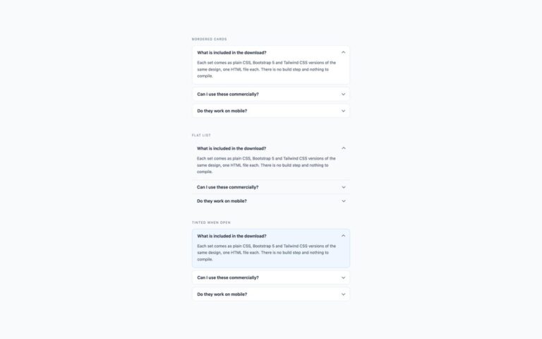
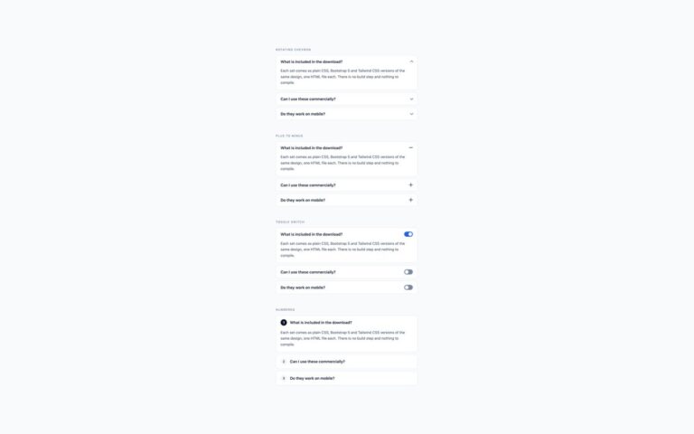
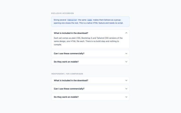
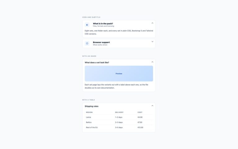
Three page layouts for a frequently asked questions section, each built from the same bordered accordion cards. The centred column puts a heading and a one-line introduction above a single 600px column, the usual choice for a landing page or pricing page. Two columns splits the questions into a pair of accordions on a CSS grid with auto-fit and a 270px minimum, so they sit side by side on wide screens and stack into one column on phones without a media query. Grouped by category adds small uppercase headings such as Licensing and Technical above separate accordions, for support pages with many questions. The plain CSS and Tailwind versions use native details and summary elements, which in Chromium browsers also lets find-in-page open a closed answer that contains a match. The Bootstrap version uses .accordion with the Collapse plugin; each question is a button inside a heading element, which gives screen reader users a list of questions to jump between. Panels open independently, so readers can compare two answers.

What’s included

  • Three layouts: centred column with heading, two columns, grouped by category
  • Two-column grid stacks on narrow screens without a media query
  • Category headings and introduction text darkened to meet 4.5:1
  • Native details and summary in plain CSS and Tailwind; Bootstrap .accordion with headings
  • Panels open independently

Accessibility

Questions are summary elements, or buttons with aria-expanded and aria-controls inside h3 and h4 headings in the Bootstrap version. The section heading is a real h2 and the category titles are h3 elements. Tab reaches each question, Enter or Space opens it, focus shows a 2px blue outline, and the chevron transition is removed under prefers-reduced-motion.

Customise it

Change the --acc-* properties on .acc for colours, and the max-width on .faq-centre or the 270px minimum in .faq-cols for layout. Bootstrap uses the --bs-accordion-* variables on .acc; in Tailwind edit the colour classes and the grid-cols-[repeat(auto-fit,minmax(270px,1fr))] class.