About this set
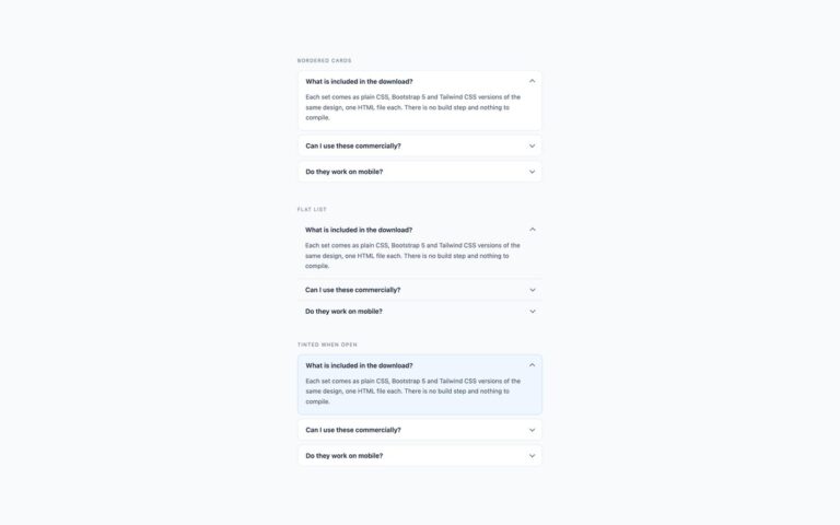
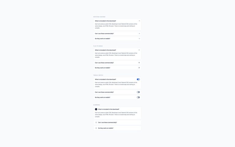
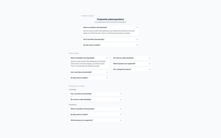
An accordion where opening one panel closes the others, shown next to an independent accordion so the difference is easy to try. In the plain CSS and Tailwind versions the grouping is done by HTML alone: every details element in the group carries the same name attribute, and the browser keeps at most one of them open. There is no script, no radio-button workaround and no state to manage, and the panels still work with the keyboard. In browsers that do not yet support the name attribute on details, the panels simply open independently, so nothing breaks. The Bootstrap version gets the same behaviour from the Collapse plugin by giving each panel data-bs-parent pointing at the accordion’s id; leave the attribute out and the panels open independently, as in the second example. Use an exclusive accordion when answers are long and only one needs to be on screen at a time, such as a pricing FAQ or a mobile menu, and an independent one when readers may want to compare answers.
What’s included
- Exclusive group through the native name attribute on details, no JavaScript
- Bootstrap version uses data-bs-parent with the Collapse plugin
- Independent accordion alongside for comparison
- Falls back to independent panels in older browsers
- Chevron transition switches off under reduced motion
Accessibility
Headers are summary elements, or buttons with aria-expanded and aria-controls in the Bootstrap version, so each panel's state is announced when it changes. Tab moves between headers and Enter or Space toggles them; closing the other panels happens automatically. Focus shows a 2px blue outline, and the chevron transition is removed under prefers-reduced-motion.
Customise it
Change the name value to create separate groups on one page, and the --acc-* properties on .acc for colours. In Bootstrap change the id and matching data-bs-parent values and the --bs-accordion-* variables; in Tailwind edit the colour classes on details and summary.