About this set
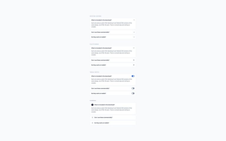
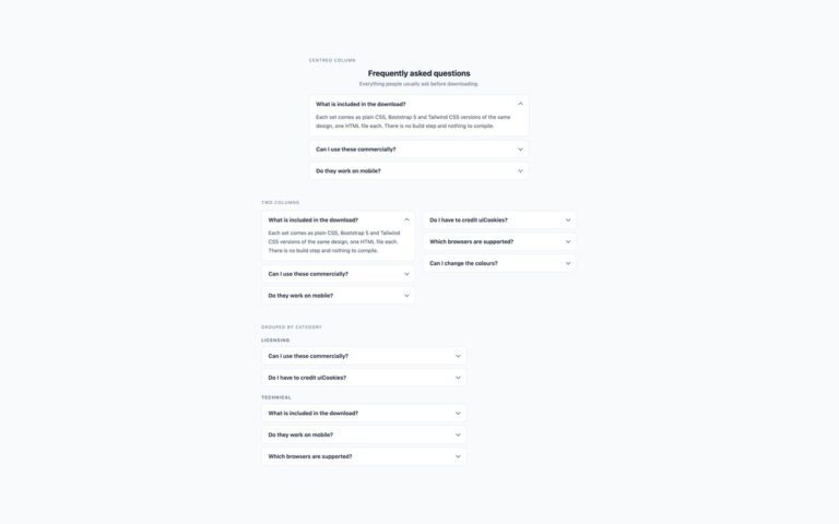
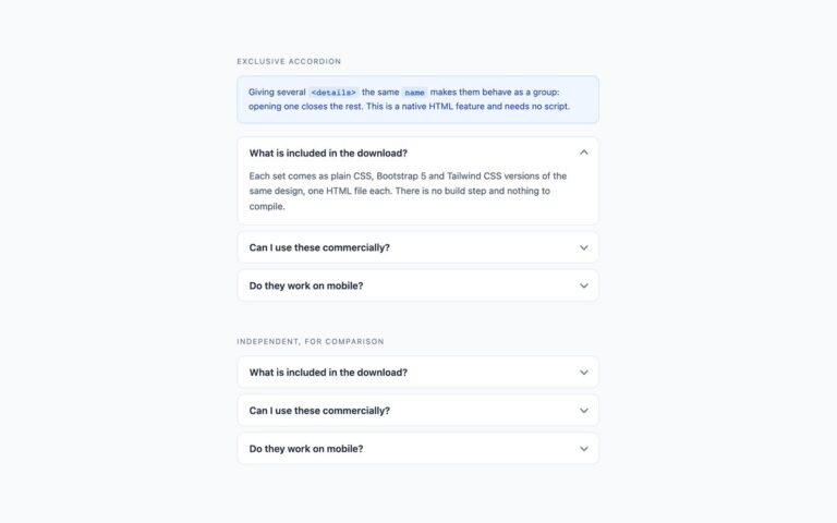
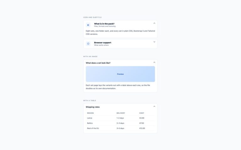
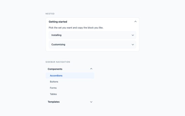
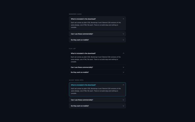
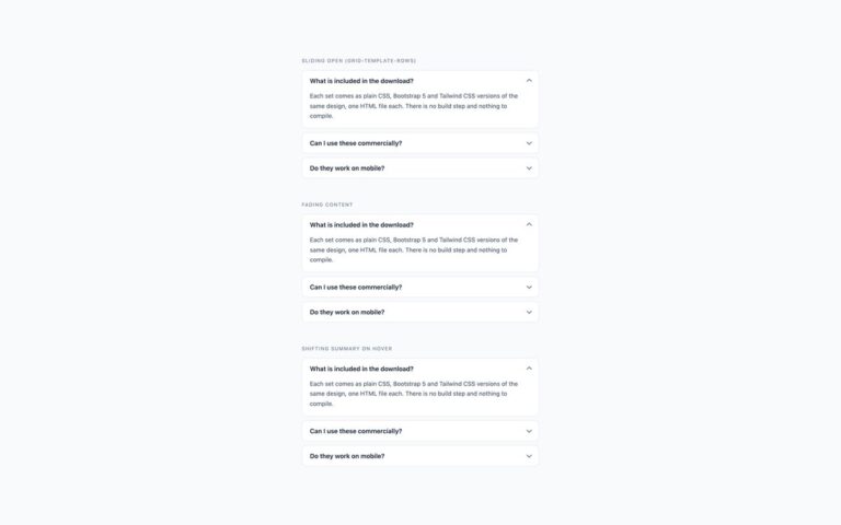
Three plain accordion treatments that fit most pages. Bordered cards give each question its own white card with an 11px radius and a small gap between them, which reads well on a tinted page background. The flat list drops the cards and divides the rows with hairlines, for use inside a card, a sidebar or any surface that already has its own frame; hovering a row turns its title blue. Tinted when open keeps the cards but gives the open panel a light blue fill and border, so the expanded answer stands out in a long list. All three share one chevron that points down when a panel is closed and up when it is open. The plain CSS and Tailwind versions are built on the native details and summary elements, so the browser handles opening, closing and keyboard use without any script. The Bootstrap version is the stock .accordion with the Collapse plugin from the bundle, split into separate cards and restyled through the –bs-accordion-* variables, and the flat list uses .accordion-flush.
What’s included
- Three treatments: bordered cards, flat list, tinted when open
- Native details and summary in the plain CSS and Tailwind versions, no JavaScript
- Bootstrap version uses .accordion, .accordion-flush and the Collapse plugin
- Chevron darkened to meet 3:1 against the card
- Chevron rotation and hover fill switch off under reduced motion
Accessibility
Each header is a summary element (a button in the Bootstrap version, with aria-expanded and aria-controls), so screen readers announce it as expandable with its open or closed state. Tab reaches every header and Enter or Space toggles it. Keyboard focus draws a 2px blue outline inside the header, and transitions are removed when prefers-reduced-motion is set.
Customise it
In plain CSS change the --acc-bg, --acc-border, --acc-text, --acc-muted, --acc-icon and --acc-focus properties on .acc. In Bootstrap set the --bs-accordion-* variables on .acc; in Tailwind edit the bg-, border- and text- colour classes on the details and summary.