Open demo

CSS code

HTML
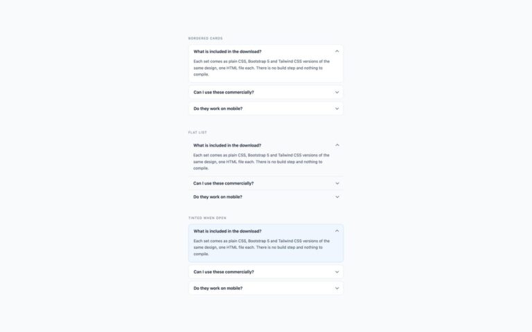
<div><span class="lbl">Bordered cards</span>
<div class="acc">
<details open>
<summary>What is included in the download?<span class="chev" aria-hidden="true"></span></summary>
<div class="body">Each set comes as plain CSS, Bootstrap 5 and Tailwind CSS versions of the same design, one HTML file each. There is no build step and nothing to compile.</div>
</details>
<details>
<summary>Can I use these commercially?<span class="chev" aria-hidden="true"></span></summary>
<div class="body">Yes — free for personal and commercial projects, including client work.</div>
</details>
<details>
<summary>Do they work on mobile?<span class="chev" aria-hidden="true"></span></summary>
<div class="body">Yes. The header row is a flex layout, and the tap target is the full width of the row rather than just the label text.</div>
</details>
</div>
</div>
<div><span class="lbl">Flat list</span>
<div class="acc acc-flat">
<details open>
<summary>What is included in the download?<span class="chev" aria-hidden="true"></span></summary>
<div class="body">Each set comes as plain CSS, Bootstrap 5 and Tailwind CSS versions of the same design, one HTML file each. There is no build step and nothing to compile.</div>
</details>
<details>
<summary>Can I use these commercially?<span class="chev" aria-hidden="true"></span></summary>
<div class="body">Yes — free for personal and commercial projects, including client work.</div>
</details>
<details>
<summary>Do they work on mobile?<span class="chev" aria-hidden="true"></span></summary>
<div class="body">Yes. The header row is a flex layout, and the tap target is the full width of the row rather than just the label text.</div>
</details>
</div>
</div>
<div><span class="lbl">Accent when open</span>
<div class="acc acc-accent">
<details open>
<summary>What is included in the download?<span class="chev" aria-hidden="true"></span></summary>
<div class="body">Each set comes as plain CSS, Bootstrap 5 and Tailwind CSS versions of the same design, one HTML file each. There is no build step and nothing to compile.</div>
</details>
<details>
<summary>Can I use these commercially?<span class="chev" aria-hidden="true"></span></summary>
<div class="body">Yes — free for personal and commercial projects, including client work.</div>
</details>
<details>
<summary>Do they work on mobile?<span class="chev" aria-hidden="true"></span></summary>
<div class="body">Yes. The header row is a flex layout, and the tap target is the full width of the row rather than just the label text.</div>
</details>
</div>
</div>
CSS
/* Native <details>/<summary> for dark interfaces; colours live in the --acc-* properties. */
.acc{--acc-bg:#161b23;--acc-border:#232a36;--acc-text:#e6e9ef;--acc-muted:#a8b0c0;
  --acc-hover:#1d2530;--acc-icon:#7d879a;--acc-focus:#22d3ee;max-width:560px}
.acc details{background:var(--acc-bg);border:1px solid var(--acc-border);border-radius:11px;margin:0 0 9px;overflow:hidden}
.acc summary{display:flex;align-items:center;justify-content:space-between;gap:14px;padding:15px 18px;cursor:pointer;
  list-style:none;font-size:.94rem;font-weight:600;color:var(--acc-text);transition:background-color .15s}
.acc summary::-webkit-details-marker{display:none}
.acc summary:hover{background:var(--acc-hover)}
.acc summary:focus-visible{outline:2px solid var(--acc-focus);outline-offset:-2px}
.acc .body{padding:0 18px 17px;font-size:.89rem;line-height:1.66;color:var(--acc-muted)}
/* chevron: two borders of a small square, rotated to point down, then up when open */
.acc .chev{flex:none;width:9px;height:9px;margin-top:-3px;border-right:2px solid var(--acc-icon);
  border-bottom:2px solid var(--acc-icon);transform:rotate(45deg);transition:transform .2s}
.acc details[open]>summary .chev{margin-top:3px;transform:rotate(-135deg)}
/* flat list */
.acc-flat details{border-width:0 0 1px;border-radius:0;margin:0;background:transparent}
.acc-flat summary:hover{background:transparent;color:#22d3ee}
/* accent border and title on the open panel */
.acc-accent details[open]{border-color:#22d3ee}
.acc-accent details[open]>summary{color:#22d3ee}
@media (prefers-reduced-motion:reduce){.acc summary,.acc .chev{transition:none}}

Bootstrap 5 code

Requires: Bootstrap 5.3.8 CSS, Bootstrap 5.3.8 JS bundle

HTML
<div><span class="lbl">Bordered cards</span>
<div class="accordion acc">
<div class="accordion-item">
<h3 class="accordion-header"><button class="accordion-button" type="button" data-bs-toggle="collapse" data-bs-target="#b7-1" aria-expanded="true" aria-controls="b7-1">What is included in the download?</button></h3>
<div id="b7-1" class="accordion-collapse collapse show">
<div class="accordion-body">Each set comes as plain CSS, Bootstrap 5 and Tailwind CSS versions of the same design, one HTML file each. There is no build step and nothing to compile.</div>
</div>
</div>
<div class="accordion-item">
<h3 class="accordion-header"><button class="accordion-button collapsed" type="button" data-bs-toggle="collapse" data-bs-target="#b7-2" aria-expanded="false" aria-controls="b7-2">Can I use these commercially?</button></h3>
<div id="b7-2" class="accordion-collapse collapse">
<div class="accordion-body">Yes — free for personal and commercial projects, including client work.</div>
</div>
</div>
<div class="accordion-item">
<h3 class="accordion-header"><button class="accordion-button collapsed" type="button" data-bs-toggle="collapse" data-bs-target="#b7-3" aria-expanded="false" aria-controls="b7-3">Do they work on mobile?</button></h3>
<div id="b7-3" class="accordion-collapse collapse">
<div class="accordion-body">Yes. The header row is a flex layout, and the tap target is the full width of the row rather than just the label text.</div>
</div>
</div>
</div>
</div>
<div><span class="lbl">Flat list</span>
<div class="accordion accordion-flush acc acc-flat">
<div class="accordion-item">
<h3 class="accordion-header"><button class="accordion-button" type="button" data-bs-toggle="collapse" data-bs-target="#b7-4" aria-expanded="true" aria-controls="b7-4">What is included in the download?</button></h3>
<div id="b7-4" class="accordion-collapse collapse show">
<div class="accordion-body">Each set comes as plain CSS, Bootstrap 5 and Tailwind CSS versions of the same design, one HTML file each. There is no build step and nothing to compile.</div>
</div>
</div>
<div class="accordion-item">
<h3 class="accordion-header"><button class="accordion-button collapsed" type="button" data-bs-toggle="collapse" data-bs-target="#b7-5" aria-expanded="false" aria-controls="b7-5">Can I use these commercially?</button></h3>
<div id="b7-5" class="accordion-collapse collapse">
<div class="accordion-body">Yes — free for personal and commercial projects, including client work.</div>
</div>
</div>
<div class="accordion-item">
<h3 class="accordion-header"><button class="accordion-button collapsed" type="button" data-bs-toggle="collapse" data-bs-target="#b7-6" aria-expanded="false" aria-controls="b7-6">Do they work on mobile?</button></h3>
<div id="b7-6" class="accordion-collapse collapse">
<div class="accordion-body">Yes. The header row is a flex layout, and the tap target is the full width of the row rather than just the label text.</div>
</div>
</div>
</div>
</div>
<div><span class="lbl">Accent when open</span>
<div class="accordion acc acc-accent">
<div class="accordion-item">
<h3 class="accordion-header"><button class="accordion-button" type="button" data-bs-toggle="collapse" data-bs-target="#b7-7" aria-expanded="true" aria-controls="b7-7">What is included in the download?</button></h3>
<div id="b7-7" class="accordion-collapse collapse show">
<div class="accordion-body">Each set comes as plain CSS, Bootstrap 5 and Tailwind CSS versions of the same design, one HTML file each. There is no build step and nothing to compile.</div>
</div>
</div>
<div class="accordion-item">
<h3 class="accordion-header"><button class="accordion-button collapsed" type="button" data-bs-toggle="collapse" data-bs-target="#b7-8" aria-expanded="false" aria-controls="b7-8">Can I use these commercially?</button></h3>
<div id="b7-8" class="accordion-collapse collapse">
<div class="accordion-body">Yes — free for personal and commercial projects, including client work.</div>
</div>
</div>
<div class="accordion-item">
<h3 class="accordion-header"><button class="accordion-button collapsed" type="button" data-bs-toggle="collapse" data-bs-target="#b7-9" aria-expanded="false" aria-controls="b7-9">Do they work on mobile?</button></h3>
<div id="b7-9" class="accordion-collapse collapse">
<div class="accordion-body">Yes. The header row is a flex layout, and the tap target is the full width of the row rather than just the label text.</div>
</div>
</div>
</div>
</div>
CSS
/* Bootstrap .accordion + Collapse plugin, restyled through the --bs-accordion-* variables. */
.acc{--bs-accordion-color:#a8b0c0;--bs-accordion-bg:#161b23;--bs-accordion-border-color:#232a36;
  --bs-accordion-border-radius:11px;--bs-accordion-inner-border-radius:10px;
  --bs-accordion-btn-padding-x:18px;--bs-accordion-btn-padding-y:15px;--bs-accordion-btn-color:#e6e9ef;
  --bs-accordion-btn-bg:transparent;--bs-accordion-active-color:#e6e9ef;--bs-accordion-active-bg:transparent;
  --bs-accordion-btn-focus-box-shadow:none;--bs-accordion-btn-icon-width:16px;--bs-accordion-btn-icon-transition:transform .2s;
  --bs-accordion-btn-icon:url("data:image/svg+xml,%3csvg xmlns='http://www.w3.org/2000/svg' viewBox='0 0 16 16'%3e%3cpath fill='none' stroke='%237d879a' stroke-width='2' d='M2.5 5 8 10.5 13.5 5'/%3e%3c/svg%3e");
  --bs-accordion-btn-active-icon:var(--bs-accordion-btn-icon);
  --bs-accordion-body-padding-x:18px;--bs-accordion-body-padding-y:17px;
  --acc-hover:#1d2530;--acc-focus:#22d3ee;max-width:560px}
/* separate cards instead of one joined block */
.acc .accordion-item{margin-bottom:9px;border-top:var(--bs-accordion-border-width) solid var(--bs-accordion-border-color);
  border-radius:var(--bs-accordion-border-radius);overflow:hidden}
.acc .accordion-button{justify-content:space-between;gap:14px;font-size:.94rem;font-weight:600;line-height:normal;
  box-shadow:none;transition:background-color .15s}
.acc .accordion-button::after{margin-left:0}
.acc .accordion-button:hover{background-color:var(--acc-hover)}
.acc .accordion-button:focus-visible{outline:2px solid var(--acc-focus);outline-offset:-2px}
.acc .accordion-body{padding-top:0;font-size:.89rem;line-height:1.66}
/* flat list */
.acc-flat .accordion-item{margin:0;border-width:0 0 1px;border-radius:0;background:transparent}
.acc-flat .accordion-item:last-child{border-bottom-width:1px}
.acc-flat .accordion-button:hover{background-color:transparent;color:#22d3ee}
/* accent border and title on the open panel */
.acc-accent{--bs-accordion-active-color:#22d3ee}
.acc-accent .accordion-item:has(>.accordion-header>.accordion-button:not(.collapsed)){border-color:#22d3ee}
@media (prefers-reduced-motion:reduce){.acc .accordion-button,.acc .accordion-button::after,.acc .collapsing{transition:none}}

Tailwind 4 code

Requires: Tailwind CSS 4

HTML
<div><span class="mb-4 block text-[.72rem] tracking-[.12em] text-[#7d879a] uppercase">Bordered cards</span>
<div class="max-w-[560px]">
<details class="group mb-[9px] overflow-hidden rounded-[11px] border border-[#232a36] bg-[#161b23]" open>
<summary class="flex cursor-pointer list-none items-center justify-between gap-[14px] px-[18px] py-[15px] text-[.94rem] font-semibold text-[#e6e9ef] transition-[background-color] duration-150 hover:bg-[#1d2530] focus-visible:outline-2 focus-visible:-outline-offset-2 focus-visible:outline-[#22d3ee] motion-reduce:transition-none [&::-webkit-details-marker]:hidden">What is included in the download?<span class="-mt-[3px] size-[9px] flex-none rotate-45 border-r-2 border-b-2 border-[#7d879a] transition-transform duration-200 group-open:mt-[3px] group-open:-rotate-[135deg] motion-reduce:transition-none" aria-hidden="true"></span></summary>
<div class="px-[18px] pb-[17px] text-[.89rem] leading-[1.66] text-[#a8b0c0]">Each set comes as plain CSS, Bootstrap 5 and Tailwind CSS versions of the same design, one HTML file each. There is no build step and nothing to compile.</div>
</details>
<details class="group mb-[9px] overflow-hidden rounded-[11px] border border-[#232a36] bg-[#161b23]">
<summary class="flex cursor-pointer list-none items-center justify-between gap-[14px] px-[18px] py-[15px] text-[.94rem] font-semibold text-[#e6e9ef] transition-[background-color] duration-150 hover:bg-[#1d2530] focus-visible:outline-2 focus-visible:-outline-offset-2 focus-visible:outline-[#22d3ee] motion-reduce:transition-none [&::-webkit-details-marker]:hidden">Can I use these commercially?<span class="-mt-[3px] size-[9px] flex-none rotate-45 border-r-2 border-b-2 border-[#7d879a] transition-transform duration-200 group-open:mt-[3px] group-open:-rotate-[135deg] motion-reduce:transition-none" aria-hidden="true"></span></summary>
<div class="px-[18px] pb-[17px] text-[.89rem] leading-[1.66] text-[#a8b0c0]">Yes — free for personal and commercial projects, including client work.</div>
</details>
<details class="group mb-[9px] overflow-hidden rounded-[11px] border border-[#232a36] bg-[#161b23]">
<summary class="flex cursor-pointer list-none items-center justify-between gap-[14px] px-[18px] py-[15px] text-[.94rem] font-semibold text-[#e6e9ef] transition-[background-color] duration-150 hover:bg-[#1d2530] focus-visible:outline-2 focus-visible:-outline-offset-2 focus-visible:outline-[#22d3ee] motion-reduce:transition-none [&::-webkit-details-marker]:hidden">Do they work on mobile?<span class="-mt-[3px] size-[9px] flex-none rotate-45 border-r-2 border-b-2 border-[#7d879a] transition-transform duration-200 group-open:mt-[3px] group-open:-rotate-[135deg] motion-reduce:transition-none" aria-hidden="true"></span></summary>
<div class="px-[18px] pb-[17px] text-[.89rem] leading-[1.66] text-[#a8b0c0]">Yes. The header row is a flex layout, and the tap target is the full width of the row rather than just the label text.</div>
</details>
</div>
</div>
<div><span class="mb-4 block text-[.72rem] tracking-[.12em] text-[#7d879a] uppercase">Flat list</span>
<div class="max-w-[560px]">
<details class="group border-b border-[#232a36]" open>
<summary class="flex cursor-pointer list-none items-center justify-between gap-[14px] px-[18px] py-[15px] text-[.94rem] font-semibold text-[#e6e9ef] transition-[background-color] duration-150 hover:text-[#22d3ee] focus-visible:outline-2 focus-visible:-outline-offset-2 focus-visible:outline-[#22d3ee] motion-reduce:transition-none [&::-webkit-details-marker]:hidden">What is included in the download?<span class="-mt-[3px] size-[9px] flex-none rotate-45 border-r-2 border-b-2 border-[#7d879a] transition-transform duration-200 group-open:mt-[3px] group-open:-rotate-[135deg] motion-reduce:transition-none" aria-hidden="true"></span></summary>
<div class="px-[18px] pb-[17px] text-[.89rem] leading-[1.66] text-[#a8b0c0]">Each set comes as plain CSS, Bootstrap 5 and Tailwind CSS versions of the same design, one HTML file each. There is no build step and nothing to compile.</div>
</details>
<details class="group border-b border-[#232a36]">
<summary class="flex cursor-pointer list-none items-center justify-between gap-[14px] px-[18px] py-[15px] text-[.94rem] font-semibold text-[#e6e9ef] transition-[background-color] duration-150 hover:text-[#22d3ee] focus-visible:outline-2 focus-visible:-outline-offset-2 focus-visible:outline-[#22d3ee] motion-reduce:transition-none [&::-webkit-details-marker]:hidden">Can I use these commercially?<span class="-mt-[3px] size-[9px] flex-none rotate-45 border-r-2 border-b-2 border-[#7d879a] transition-transform duration-200 group-open:mt-[3px] group-open:-rotate-[135deg] motion-reduce:transition-none" aria-hidden="true"></span></summary>
<div class="px-[18px] pb-[17px] text-[.89rem] leading-[1.66] text-[#a8b0c0]">Yes — free for personal and commercial projects, including client work.</div>
</details>
<details class="group border-b border-[#232a36]">
<summary class="flex cursor-pointer list-none items-center justify-between gap-[14px] px-[18px] py-[15px] text-[.94rem] font-semibold text-[#e6e9ef] transition-[background-color] duration-150 hover:text-[#22d3ee] focus-visible:outline-2 focus-visible:-outline-offset-2 focus-visible:outline-[#22d3ee] motion-reduce:transition-none [&::-webkit-details-marker]:hidden">Do they work on mobile?<span class="-mt-[3px] size-[9px] flex-none rotate-45 border-r-2 border-b-2 border-[#7d879a] transition-transform duration-200 group-open:mt-[3px] group-open:-rotate-[135deg] motion-reduce:transition-none" aria-hidden="true"></span></summary>
<div class="px-[18px] pb-[17px] text-[.89rem] leading-[1.66] text-[#a8b0c0]">Yes. The header row is a flex layout, and the tap target is the full width of the row rather than just the label text.</div>
</details>
</div>
</div>
<div><span class="mb-4 block text-[.72rem] tracking-[.12em] text-[#7d879a] uppercase">Accent when open</span>
<div class="max-w-[560px]">
<details class="group mb-[9px] overflow-hidden rounded-[11px] border border-[#232a36] bg-[#161b23] open:border-[#22d3ee]" open>
<summary class="flex cursor-pointer list-none items-center justify-between gap-[14px] px-[18px] py-[15px] text-[.94rem] font-semibold text-[#e6e9ef] transition-[background-color] duration-150 hover:bg-[#1d2530] focus-visible:outline-2 focus-visible:-outline-offset-2 focus-visible:outline-[#22d3ee] motion-reduce:transition-none [&::-webkit-details-marker]:hidden group-open:text-[#22d3ee]">What is included in the download?<span class="-mt-[3px] size-[9px] flex-none rotate-45 border-r-2 border-b-2 border-[#7d879a] transition-transform duration-200 group-open:mt-[3px] group-open:-rotate-[135deg] motion-reduce:transition-none" aria-hidden="true"></span></summary>
<div class="px-[18px] pb-[17px] text-[.89rem] leading-[1.66] text-[#a8b0c0]">Each set comes as plain CSS, Bootstrap 5 and Tailwind CSS versions of the same design, one HTML file each. There is no build step and nothing to compile.</div>
</details>
<details class="group mb-[9px] overflow-hidden rounded-[11px] border border-[#232a36] bg-[#161b23] open:border-[#22d3ee]">
<summary class="flex cursor-pointer list-none items-center justify-between gap-[14px] px-[18px] py-[15px] text-[.94rem] font-semibold text-[#e6e9ef] transition-[background-color] duration-150 hover:bg-[#1d2530] focus-visible:outline-2 focus-visible:-outline-offset-2 focus-visible:outline-[#22d3ee] motion-reduce:transition-none [&::-webkit-details-marker]:hidden group-open:text-[#22d3ee]">Can I use these commercially?<span class="-mt-[3px] size-[9px] flex-none rotate-45 border-r-2 border-b-2 border-[#7d879a] transition-transform duration-200 group-open:mt-[3px] group-open:-rotate-[135deg] motion-reduce:transition-none" aria-hidden="true"></span></summary>
<div class="px-[18px] pb-[17px] text-[.89rem] leading-[1.66] text-[#a8b0c0]">Yes — free for personal and commercial projects, including client work.</div>
</details>
<details class="group mb-[9px] overflow-hidden rounded-[11px] border border-[#232a36] bg-[#161b23] open:border-[#22d3ee]">
<summary class="flex cursor-pointer list-none items-center justify-between gap-[14px] px-[18px] py-[15px] text-[.94rem] font-semibold text-[#e6e9ef] transition-[background-color] duration-150 hover:bg-[#1d2530] focus-visible:outline-2 focus-visible:-outline-offset-2 focus-visible:outline-[#22d3ee] motion-reduce:transition-none [&::-webkit-details-marker]:hidden group-open:text-[#22d3ee]">Do they work on mobile?<span class="-mt-[3px] size-[9px] flex-none rotate-45 border-r-2 border-b-2 border-[#7d879a] transition-transform duration-200 group-open:mt-[3px] group-open:-rotate-[135deg] motion-reduce:transition-none" aria-hidden="true"></span></summary>
<div class="px-[18px] pb-[17px] text-[.89rem] leading-[1.66] text-[#a8b0c0]">Yes. The header row is a flex layout, and the tap target is the full width of the row rather than just the label text.</div>
</details>
</div>
</div>

About this set

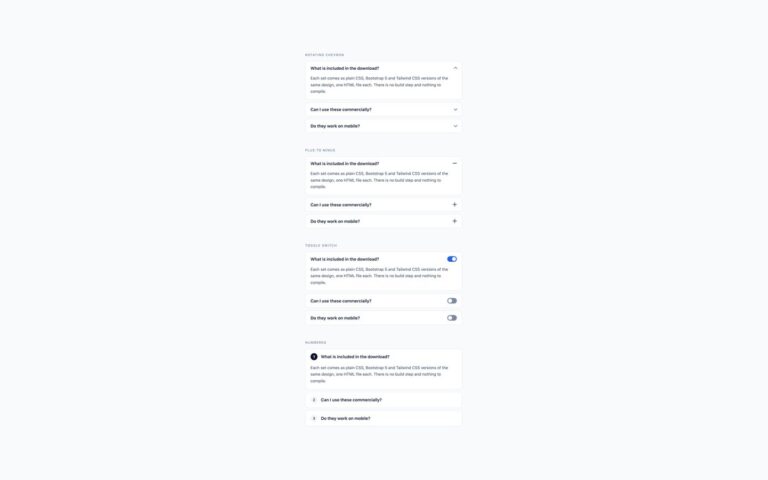
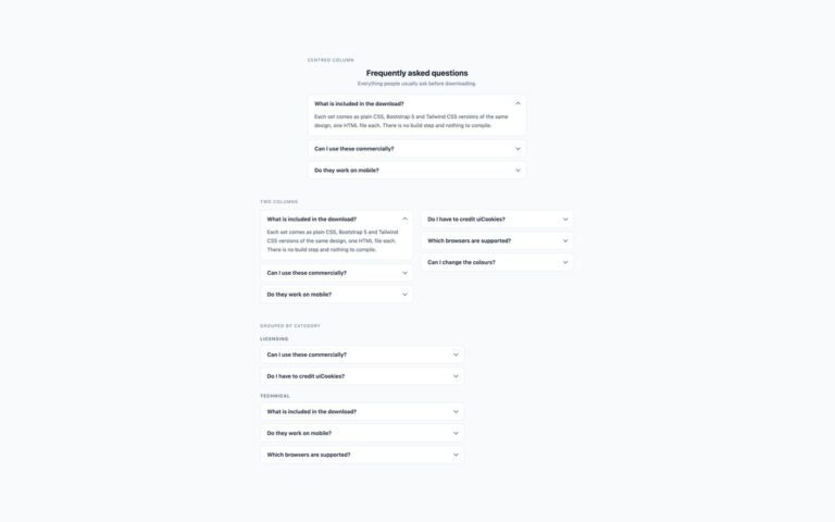
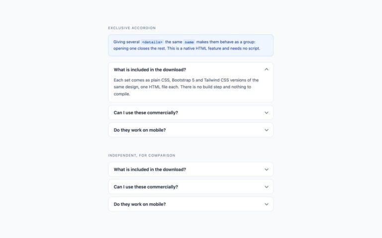
Three accordion treatments for dark interfaces such as dashboards, developer tools and dark-mode sites, with a cyan accent. Bordered cards sit on a slightly raised surface with a subtle border and a lighter fill on hover. The flat list removes the cards and separates the rows with dark hairlines; hovering a title turns it cyan. Accent when open gives the open panel a cyan border and a cyan title, so the expanded answer is easy to find in a long list. The muted grey used for captions and the chevron was lightened to reach the required contrast on the near-black background, and the answer text stays at a soft grey that is comfortable for longer reading. In plain CSS all colours live in a handful of custom properties on the .acc container, so switching this set to your own dark palette is a matter of changing seven values. The plain CSS and Tailwind versions use native details and summary; the Bootstrap version uses .accordion with the Collapse plugin and the same colours set through the –bs-accordion-* variables.

What’s included

  • Three dark treatments: bordered cards, flat list, accent when open
  • Cyan focus outline and accent on a near-black background
  • Captions and chevrons lightened to meet contrast on dark
  • All colours in --acc-* custom properties in the plain CSS version
  • Transitions switch off under reduced motion

Accessibility

Headers are summary elements, or buttons with aria-expanded and aria-controls in the Bootstrap version, so the open state is announced. Tab reaches each header and Enter or Space toggles it. Focus draws a 2px cyan outline that stands out against the dark cards, and transitions are removed when prefers-reduced-motion is set.

Customise it

In plain CSS change the seven --acc-* properties on .acc and the #22d3ee accent in the .acc-flat and .acc-accent rules. In Bootstrap set the --bs-accordion-* variables on .acc; in Tailwind edit the bg-[#161b23], border-[#232a36] and #22d3ee classes.