Open demo

CSS code

HTML
<div><span class="lbl">Fill and readout without JavaScript</span><div class="card">
<div class="cs" style="--unit:' Mbps'">
  <div class="cs-head"><label for="cs-limit">Download limit</label><output for="cs-limit"></output></div>
  <input type="range" id="cs-limit" min="0" max="100" value="40">
  <div class="cs-scale" aria-hidden="true"><span>0 Mbps</span><span>100 Mbps</span></div>
</div></div></div>

<div><span class="lbl">Bubble that follows the thumb</span><div class="card">
<div class="cs" style="--max:30;--unit:'%'">
  <div class="cs-head"><label for="cs-tip">Tip for the driver</label></div>
  <div class="cs-track">
    <output for="cs-tip"></output>
    <input type="range" id="cs-tip" min="0" max="30" value="18">
  </div>
</div></div></div>

<div><span class="lbl">Colour that follows the value</span><div class="card">
<div class="cs heat" style="--unit:'%'">
  <div class="cs-head"><label for="cs-cpu">CPU limit per container</label><output for="cs-cpu"></output></div>
  <input type="range" id="cs-cpu" min="0" max="100" step="5" value="65">
  <div class="cs-scale" aria-hidden="true"><span>Idle</span><span>Full load</span></div>
</div></div></div>
CSS
/* CSS-driven range sliders. The thumb gets a view timeline (view-timeline on ::-webkit-slider-thumb) and the input
   clips it (overflow:hidden), so the thumb's position inside the input becomes an animation timeline. A registered
   integer --val is animated along it from --max to --min, which hands CSS the live value: it paints the fill,
   prints the number through a counter, places the bubble and picks the colour. In Chrome and Edge that needs no
   script. Safari and Firefox do not run view timelines on the thumb yet: Firefox fills the track with
   ::-moz-range-progress, and in both the small script below sets --val instead. */
@property --val{syntax:"<integer>";inherits:true;initial-value:0}
.cs{--cs-accent:#047857;--cs-track:#8a9a93;--cs-thumb:22px;--cs-h:6px;--min:0;--max:100;
  --pos:calc(var(--cs-thumb) / 2 + (100% - var(--cs-thumb)) * (var(--val) - var(--min)) / (var(--max) - var(--min)));
  timeline-scope:--cs-thumb;display:grid;gap:14px}
@supports (animation-timeline:view()){
  .cs{animation:cs-value linear both;animation-timeline:--cs-thumb;animation-range:contain}
}
@keyframes cs-value{from{--val:var(--max)}to{--val:var(--min)}}
.cs-head{display:flex;justify-content:space-between;align-items:baseline;gap:12px}
.cs-head label{font-size:.95rem;font-weight:600;color:#132a20}
.cs-head output{font-size:.95rem;font-weight:700;color:var(--cs-accent);font-variant-numeric:tabular-nums}
.cs output::after{counter-reset:cs var(--val);content:counter(cs) var(--unit,"")}
.cs input[type="range"]{-webkit-appearance:none;appearance:none;display:block;width:100%;height:var(--cs-thumb);margin:0;
  background:none;overflow:hidden;cursor:pointer}
.cs input[type="range"]:focus-visible{outline:2px solid var(--cs-accent);outline-offset:4px;border-radius:999px}
.cs input[type="range"]::-webkit-slider-runnable-track{height:var(--cs-h);border-radius:999px;
  background:linear-gradient(to right,var(--cs-accent) 0 var(--pos),var(--cs-track) 0)}
.cs input[type="range"]::-moz-range-track{height:var(--cs-h);border-radius:999px;background:var(--cs-track)}
.cs input[type="range"]::-moz-range-progress{height:var(--cs-h);border-radius:999px;background:var(--cs-accent)}
.cs input[type="range"]::-webkit-slider-thumb{-webkit-appearance:none;appearance:none;box-sizing:border-box;view-timeline:--cs-thumb inline;
  width:var(--cs-thumb);height:var(--cs-thumb);margin-top:calc((var(--cs-h) - var(--cs-thumb)) / 2);
  border:3px solid var(--cs-accent);border-radius:50%;background:#fff}
.cs input[type="range"]::-moz-range-thumb{box-sizing:border-box;width:var(--cs-thumb);height:var(--cs-thumb);
  border:3px solid var(--cs-accent);border-radius:50%;background:#fff}
/* pressed thumb: a tint, faded in unless reduced motion is requested */
.cs input[type="range"]::-webkit-slider-thumb{transition:background-color .15s}
.cs input[type="range"]::-moz-range-thumb{transition:background-color .15s}
.cs input[type="range"]:active::-webkit-slider-thumb{background:color-mix(in srgb,var(--cs-accent) 18%,#fff)}
.cs input[type="range"]:active::-moz-range-thumb{background:color-mix(in srgb,var(--cs-accent) 18%,#fff)}
@media (prefers-reduced-motion:reduce){.cs input[type="range"]::-webkit-slider-thumb,.cs input[type="range"]::-moz-range-thumb{transition:none}}
/* bubble: rides on the same --val */
.cs-track{position:relative;padding-top:44px}
.cs-track output{position:absolute;top:0;left:var(--pos);transform:translateX(-50%);padding:5px 10px;border-radius:8px;
  background:var(--cs-accent);color:#fff;font-size:.85rem;font-weight:700;font-variant-numeric:tabular-nums;white-space:nowrap}
.cs-track output::before{content:"";position:absolute;left:50%;bottom:-5px;width:10px;height:10px;margin-left:-5px;
  background:inherit;border-radius:0 0 2px 0;transform:rotate(45deg)}
/* colour ramp: the accent turns from green to red as the value rises */
.cs.heat{--cs-accent:oklch(.52 .16 calc(150 - 125 * (var(--val) - var(--min)) / (var(--max) - var(--min))))}
.cs-scale{display:flex;justify-content:space-between;margin-top:-4px;font-size:.8rem;color:#4f6159}
JavaScript
// Fallback for browsers that cannot drive --val from the thumb (Safari, Firefox): checks once whether CSS shows the
// real value and, if not, switches the animation off and sets --val on every input. Chrome and Edge never need it.
document.querySelectorAll('.cs input[type="range"]').forEach(function (range) {
  var field = range.closest('.cs');
  var mode = CSS.supports('animation-timeline: view()') ? 'test' : 'js';
  function sync() { field.style.setProperty('--val', range.value); }
  function test() {
    requestAnimationFrame(function () { requestAnimationFrame(function () {
      if (mode !== 'test') return;
      var shown = Math.round(parseFloat(getComputedStyle(field).getPropertyValue('--val')));
      if (shown !== Number(range.value)) { mode = 'js'; field.style.animation = 'none'; sync(); }
      else if (range.value !== range.min) mode = 'css'; // at the minimum both paths agree, so test again later
    }); });
  }
  range.addEventListener('input', function () { if (mode === 'js') sync(); });
  range.addEventListener('change', test);
  if (mode === 'js') sync(); else test();
});

Bootstrap 5 code

Requires: Bootstrap 5.3.8 CSS

HTML
<div><span class="lbl">Fill and readout without JavaScript</span><div class="card demo-card"><div class="card-body p-4">
<div class="cs" style="--unit:' Mbps'">
  <div class="d-flex justify-content-between align-items-baseline gap-3"><label class="form-label fw-semibold mb-0" for="cs-limit">Download limit</label><output class="cs-value fw-bold" for="cs-limit"></output></div>
  <input type="range" class="form-range" id="cs-limit" min="0" max="100" value="40">
  <div class="cs-scale d-flex justify-content-between" aria-hidden="true"><span>0 Mbps</span><span>100 Mbps</span></div>
</div></div></div></div>

<div><span class="lbl">Bubble that follows the thumb</span><div class="card demo-card"><div class="card-body p-4">
<div class="cs" style="--max:30;--unit:'%'">
  <label class="form-label fw-semibold mb-0" for="cs-tip">Tip for the driver</label>
  <div class="cs-track">
    <output class="badge cs-bubble" for="cs-tip"></output>
    <input type="range" class="form-range" id="cs-tip" min="0" max="30" value="18">
  </div>
</div></div></div></div>

<div><span class="lbl">Colour that follows the value</span><div class="card demo-card"><div class="card-body p-4">
<div class="cs heat" style="--unit:'%'">
  <div class="d-flex justify-content-between align-items-baseline gap-3"><label class="form-label fw-semibold mb-0" for="cs-cpu">CPU limit per container</label><output class="cs-value fw-bold" for="cs-cpu"></output></div>
  <input type="range" class="form-range" id="cs-cpu" min="0" max="100" step="5" value="65">
  <div class="cs-scale d-flex justify-content-between" aria-hidden="true"><span>Idle</span><span>Full load</span></div>
</div></div></div></div>
CSS
/* CSS-driven range sliders on Bootstrap .form-range. The thumb gets a view timeline (view-timeline on ::-webkit-slider-thumb) and the input
   clips it (overflow:hidden), so the thumb's position inside the input becomes an animation timeline. A registered
   integer --val is animated along it from --max to --min, which hands CSS the live value: it paints the fill,
   prints the number through a counter, places the bubble and picks the colour. In Chrome and Edge that needs no
   script. Safari and Firefox do not run view timelines on the thumb yet: Firefox fills the track with
   ::-moz-range-progress, and in both the small script below sets --val instead. */
@property --val{syntax:"<integer>";inherits:true;initial-value:0}
.cs{--cs-accent:#047857;--cs-track:#8a9a93;--cs-thumb:22px;--cs-h:6px;--min:0;--max:100;
  --pos:calc(var(--cs-thumb) / 2 + (100% - var(--cs-thumb)) * (var(--val) - var(--min)) / (var(--max) - var(--min)));
  timeline-scope:--cs-thumb;display:grid;gap:14px}
@supports (animation-timeline:view()){
  .cs{animation:cs-value linear both;animation-timeline:--cs-thumb;animation-range:contain}
}
@keyframes cs-value{from{--val:var(--max)}to{--val:var(--min)}}
.cs .form-label{font-size:.95rem;color:#132a20}
.cs .cs-value{font-size:.95rem;color:var(--cs-accent);font-variant-numeric:tabular-nums}
.cs output::after{counter-reset:cs var(--val);content:counter(cs) var(--unit,"")}
.cs .form-range{height:var(--cs-thumb);overflow:hidden}
.cs .form-range:focus-visible{outline:2px solid var(--cs-accent);outline-offset:4px;border-radius:999px}
.cs .form-range::-webkit-slider-runnable-track{height:var(--cs-h);border-radius:999px;
  background:linear-gradient(to right,var(--cs-accent) 0 var(--pos),var(--cs-track) 0)}
.cs .form-range::-moz-range-track{height:var(--cs-h);border-radius:999px;background:var(--cs-track)}
.cs .form-range::-moz-range-progress{height:var(--cs-h);border-radius:999px;background:var(--cs-accent)}
.cs .form-range::-webkit-slider-thumb{box-sizing:border-box;view-timeline:--cs-thumb inline;
  width:var(--cs-thumb);height:var(--cs-thumb);margin-top:calc((var(--cs-h) - var(--cs-thumb)) / 2);
  border:3px solid var(--cs-accent);border-radius:50%;background:#fff;box-shadow:none}
.cs .form-range::-moz-range-thumb{box-sizing:border-box;width:var(--cs-thumb);height:var(--cs-thumb);
  border:3px solid var(--cs-accent);border-radius:50%;background:#fff;box-shadow:none}
/* pressed thumb: a tint, faded in unless reduced motion is requested */
.cs .form-range::-webkit-slider-thumb{transition:background-color .15s}
.cs .form-range::-moz-range-thumb{transition:background-color .15s}
.cs .form-range:active::-webkit-slider-thumb{background:color-mix(in srgb,var(--cs-accent) 18%,#fff)}
.cs .form-range:active::-moz-range-thumb{background:color-mix(in srgb,var(--cs-accent) 18%,#fff)}
@media (prefers-reduced-motion:reduce){.cs .form-range::-webkit-slider-thumb,.cs .form-range::-moz-range-thumb{transition:none}}
/* bubble: rides on the same --val */
.cs-track{position:relative;padding-top:44px}
.cs .cs-bubble{display:inline-block;position:absolute;top:0;left:var(--pos);transform:translateX(-50%);--bs-badge-padding-x:10px;--bs-badge-padding-y:5px;
  --bs-badge-font-size:.85rem;--bs-badge-border-radius:8px;background:var(--cs-accent);color:#fff;font-variant-numeric:tabular-nums}
.cs .cs-bubble::before{content:"";position:absolute;left:50%;bottom:-5px;width:10px;height:10px;margin-left:-5px;
  background:inherit;border-radius:0 0 2px 0;transform:rotate(45deg)}
/* colour ramp: the accent turns from green to red as the value rises */
.cs.heat{--cs-accent:oklch(.52 .16 calc(150 - 125 * (var(--val) - var(--min)) / (var(--max) - var(--min))))}
.cs-scale{margin-top:-4px;font-size:.8rem;color:#4f6159}
JavaScript
// Fallback for browsers that cannot drive --val from the thumb (Safari, Firefox): checks once whether CSS shows the
// real value and, if not, switches the animation off and sets --val on every input. Chrome and Edge never need it.
document.querySelectorAll('.cs .form-range').forEach(function (range) {
  var field = range.closest('.cs');
  var mode = CSS.supports('animation-timeline: view()') ? 'test' : 'js';
  function sync() { field.style.setProperty('--val', range.value); }
  function test() {
    requestAnimationFrame(function () { requestAnimationFrame(function () {
      if (mode !== 'test') return;
      var shown = Math.round(parseFloat(getComputedStyle(field).getPropertyValue('--val')));
      if (shown !== Number(range.value)) { mode = 'js'; field.style.animation = 'none'; sync(); }
      else if (range.value !== range.min) mode = 'css'; // at the minimum both paths agree, so test again later
    }); });
  }
  range.addEventListener('input', function () { if (mode === 'js') sync(); });
  range.addEventListener('change', test);
  if (mode === 'js') sync(); else test();
});

Tailwind 4 code

Requires: Tailwind CSS 4

HTML
<div><span class="mb-3 block text-[.72rem] tracking-[.12em] text-[#4f6159] uppercase">Fill and readout without JavaScript</span><div class="rounded-2xl border border-[#dfe9e4] bg-white px-6 pt-[22px] pb-6 shadow-[0_1px_2px_rgba(19,42,32,.04)]">
<div class="cs grid gap-3.5 [--min:0] [--max:100] [--unit:'_Mbps'] [--cs-accent:#047857] [--pos:calc(11px_+_(100%_-_22px)_*_(var(--val)_-_var(--min))_/_(var(--max)_-_var(--min)))] [timeline-scope:--cs-thumb] supports-[animation-timeline:view()]:[animation-name:cs-value] supports-[animation-timeline:view()]:[animation-timing-function:linear] supports-[animation-timeline:view()]:[animation-fill-mode:both] supports-[animation-timeline:view()]:[animation-timeline:--cs-thumb] supports-[animation-timeline:view()]:[animation-range:contain]">
  <div class="flex items-baseline justify-between gap-3"><label for="cs-limit" class="text-[.95rem] font-semibold">Download limit</label><output for="cs-limit" class="text-[.95rem] font-bold text-(--cs-accent) tabular-nums after:[counter-reset:cs_var(--val)] after:content-[counter(cs)_var(--unit,'')]"></output></div>
  <input type="range" id="cs-limit" min="0" max="100" value="40" class="block h-[22px] w-full cursor-pointer appearance-none overflow-hidden bg-transparent focus-visible:rounded-full focus-visible:outline-2 focus-visible:outline-offset-4 focus-visible:outline-(--cs-accent) [&::-webkit-slider-runnable-track]:h-1.5 [&::-webkit-slider-runnable-track]:rounded-full [&::-webkit-slider-runnable-track]:bg-[linear-gradient(to_right,var(--cs-accent)_0_var(--pos),var(--color-cs-track)_0)] [&::-moz-range-track]:h-1.5 [&::-moz-range-track]:rounded-full [&::-moz-range-track]:bg-cs-track [&::-moz-range-progress]:h-1.5 [&::-moz-range-progress]:rounded-full [&::-moz-range-progress]:bg-(--cs-accent) [&::-webkit-slider-thumb]:appearance-none [&::-webkit-slider-thumb]:-mt-2 [&::-webkit-slider-thumb]:[view-timeline:--cs-thumb_inline] [&::-webkit-slider-thumb]:box-border [&::-webkit-slider-thumb]:size-[22px] [&::-webkit-slider-thumb]:rounded-full [&::-webkit-slider-thumb]:border-3 [&::-webkit-slider-thumb]:border-(--cs-accent) [&::-webkit-slider-thumb]:bg-white [&::-moz-range-thumb]:box-border [&::-moz-range-thumb]:size-[22px] [&::-moz-range-thumb]:rounded-full [&::-moz-range-thumb]:border-3 [&::-moz-range-thumb]:border-(--cs-accent) [&::-moz-range-thumb]:bg-white [&::-webkit-slider-thumb]:transition-colors [&::-webkit-slider-thumb]:duration-150 [&::-moz-range-thumb]:transition-colors [&::-moz-range-thumb]:duration-150 motion-reduce:[&::-webkit-slider-thumb]:transition-none motion-reduce:[&::-moz-range-thumb]:transition-none active:[&::-webkit-slider-thumb]:bg-[color-mix(in_srgb,var(--cs-accent)_18%,#fff)] active:[&::-moz-range-thumb]:bg-[color-mix(in_srgb,var(--cs-accent)_18%,#fff)]">
  <div class="-mt-1 flex justify-between text-[.8rem] text-[#4f6159]" aria-hidden="true"><span>0 Mbps</span><span>100 Mbps</span></div>
</div></div></div>

<div><span class="mb-3 block text-[.72rem] tracking-[.12em] text-[#4f6159] uppercase">Bubble that follows the thumb</span><div class="rounded-2xl border border-[#dfe9e4] bg-white px-6 pt-[22px] pb-6 shadow-[0_1px_2px_rgba(19,42,32,.04)]">
<div class="cs grid gap-3.5 [--min:0] [--max:30] [--unit:'%'] [--cs-accent:#047857] [--pos:calc(11px_+_(100%_-_22px)_*_(var(--val)_-_var(--min))_/_(var(--max)_-_var(--min)))] [timeline-scope:--cs-thumb] supports-[animation-timeline:view()]:[animation-name:cs-value] supports-[animation-timeline:view()]:[animation-timing-function:linear] supports-[animation-timeline:view()]:[animation-fill-mode:both] supports-[animation-timeline:view()]:[animation-timeline:--cs-thumb] supports-[animation-timeline:view()]:[animation-range:contain]">
  <div class="flex items-baseline justify-between gap-3"><label for="cs-tip" class="text-[.95rem] font-semibold">Tip for the driver</label></div>
  <div class="relative pt-11">
    <output for="cs-tip" class="absolute top-0 left-(--pos) -translate-x-1/2 rounded-lg bg-(--cs-accent) px-2.5 py-[5px] text-[.85rem] font-bold whitespace-nowrap text-white tabular-nums before:absolute before:-bottom-[5px] before:left-1/2 before:-ml-[5px] before:size-2.5 before:rotate-45 before:rounded-br-[2px] before:bg-inherit before:content-[''] after:[counter-reset:cs_var(--val)] after:content-[counter(cs)_var(--unit,'')]"></output>
    <input type="range" id="cs-tip" min="0" max="30" value="18" class="block h-[22px] w-full cursor-pointer appearance-none overflow-hidden bg-transparent focus-visible:rounded-full focus-visible:outline-2 focus-visible:outline-offset-4 focus-visible:outline-(--cs-accent) [&::-webkit-slider-runnable-track]:h-1.5 [&::-webkit-slider-runnable-track]:rounded-full [&::-webkit-slider-runnable-track]:bg-[linear-gradient(to_right,var(--cs-accent)_0_var(--pos),var(--color-cs-track)_0)] [&::-moz-range-track]:h-1.5 [&::-moz-range-track]:rounded-full [&::-moz-range-track]:bg-cs-track [&::-moz-range-progress]:h-1.5 [&::-moz-range-progress]:rounded-full [&::-moz-range-progress]:bg-(--cs-accent) [&::-webkit-slider-thumb]:appearance-none [&::-webkit-slider-thumb]:-mt-2 [&::-webkit-slider-thumb]:[view-timeline:--cs-thumb_inline] [&::-webkit-slider-thumb]:box-border [&::-webkit-slider-thumb]:size-[22px] [&::-webkit-slider-thumb]:rounded-full [&::-webkit-slider-thumb]:border-3 [&::-webkit-slider-thumb]:border-(--cs-accent) [&::-webkit-slider-thumb]:bg-white [&::-moz-range-thumb]:box-border [&::-moz-range-thumb]:size-[22px] [&::-moz-range-thumb]:rounded-full [&::-moz-range-thumb]:border-3 [&::-moz-range-thumb]:border-(--cs-accent) [&::-moz-range-thumb]:bg-white [&::-webkit-slider-thumb]:transition-colors [&::-webkit-slider-thumb]:duration-150 [&::-moz-range-thumb]:transition-colors [&::-moz-range-thumb]:duration-150 motion-reduce:[&::-webkit-slider-thumb]:transition-none motion-reduce:[&::-moz-range-thumb]:transition-none active:[&::-webkit-slider-thumb]:bg-[color-mix(in_srgb,var(--cs-accent)_18%,#fff)] active:[&::-moz-range-thumb]:bg-[color-mix(in_srgb,var(--cs-accent)_18%,#fff)]">
  </div>
</div></div></div>

<div><span class="mb-3 block text-[.72rem] tracking-[.12em] text-[#4f6159] uppercase">Colour that follows the value</span><div class="rounded-2xl border border-[#dfe9e4] bg-white px-6 pt-[22px] pb-6 shadow-[0_1px_2px_rgba(19,42,32,.04)]">
<div class="cs grid gap-3.5 [--min:0] [--max:100] [--unit:'%'] [--cs-accent:oklch(.52_.16_calc(150_-_125_*_(var(--val)_-_var(--min))_/_(var(--max)_-_var(--min))))] [--pos:calc(11px_+_(100%_-_22px)_*_(var(--val)_-_var(--min))_/_(var(--max)_-_var(--min)))] [timeline-scope:--cs-thumb] supports-[animation-timeline:view()]:[animation-name:cs-value] supports-[animation-timeline:view()]:[animation-timing-function:linear] supports-[animation-timeline:view()]:[animation-fill-mode:both] supports-[animation-timeline:view()]:[animation-timeline:--cs-thumb] supports-[animation-timeline:view()]:[animation-range:contain]">
  <div class="flex items-baseline justify-between gap-3"><label for="cs-cpu" class="text-[.95rem] font-semibold">CPU limit per container</label><output for="cs-cpu" class="text-[.95rem] font-bold text-(--cs-accent) tabular-nums after:[counter-reset:cs_var(--val)] after:content-[counter(cs)_var(--unit,'')]"></output></div>
  <input type="range" id="cs-cpu" min="0" max="100" step="5" value="65" class="block h-[22px] w-full cursor-pointer appearance-none overflow-hidden bg-transparent focus-visible:rounded-full focus-visible:outline-2 focus-visible:outline-offset-4 focus-visible:outline-(--cs-accent) [&::-webkit-slider-runnable-track]:h-1.5 [&::-webkit-slider-runnable-track]:rounded-full [&::-webkit-slider-runnable-track]:bg-[linear-gradient(to_right,var(--cs-accent)_0_var(--pos),var(--color-cs-track)_0)] [&::-moz-range-track]:h-1.5 [&::-moz-range-track]:rounded-full [&::-moz-range-track]:bg-cs-track [&::-moz-range-progress]:h-1.5 [&::-moz-range-progress]:rounded-full [&::-moz-range-progress]:bg-(--cs-accent) [&::-webkit-slider-thumb]:appearance-none [&::-webkit-slider-thumb]:-mt-2 [&::-webkit-slider-thumb]:[view-timeline:--cs-thumb_inline] [&::-webkit-slider-thumb]:box-border [&::-webkit-slider-thumb]:size-[22px] [&::-webkit-slider-thumb]:rounded-full [&::-webkit-slider-thumb]:border-3 [&::-webkit-slider-thumb]:border-(--cs-accent) [&::-webkit-slider-thumb]:bg-white [&::-moz-range-thumb]:box-border [&::-moz-range-thumb]:size-[22px] [&::-moz-range-thumb]:rounded-full [&::-moz-range-thumb]:border-3 [&::-moz-range-thumb]:border-(--cs-accent) [&::-moz-range-thumb]:bg-white [&::-webkit-slider-thumb]:transition-colors [&::-webkit-slider-thumb]:duration-150 [&::-moz-range-thumb]:transition-colors [&::-moz-range-thumb]:duration-150 motion-reduce:[&::-webkit-slider-thumb]:transition-none motion-reduce:[&::-moz-range-thumb]:transition-none active:[&::-webkit-slider-thumb]:bg-[color-mix(in_srgb,var(--cs-accent)_18%,#fff)] active:[&::-moz-range-thumb]:bg-[color-mix(in_srgb,var(--cs-accent)_18%,#fff)]">
  <div class="-mt-1 flex justify-between text-[.8rem] text-[#4f6159]" aria-hidden="true"><span>Idle</span><span>Full load</span></div>
</div></div></div>
CSS
/* The thumb's view timeline animates the registered integer --val from --max to --min: CSS gets the live value.
   Chrome and Edge need no script; Safari and Firefox use the fallback script at the bottom. */
@theme {
  --color-cs-track: #8a9a93;
}
@property --val { syntax: "<integer>"; inherits: true; initial-value: 0; }
@keyframes cs-value { from { --val: var(--max); } to { --val: var(--min); } }
JavaScript
// Fallback for browsers that cannot drive --val from the thumb (Safari, Firefox): checks once whether CSS shows the
// real value and, if not, switches the animation off and sets --val on every input. Chrome and Edge never need it.
document.querySelectorAll('.cs input[type="range"]').forEach(function (range) {
  var field = range.closest('.cs');
  var mode = CSS.supports('animation-timeline: view()') ? 'test' : 'js';
  function sync() { field.style.setProperty('--val', range.value); }
  function test() {
    requestAnimationFrame(function () { requestAnimationFrame(function () {
      if (mode !== 'test') return;
      var shown = Math.round(parseFloat(getComputedStyle(field).getPropertyValue('--val')));
      if (shown !== Number(range.value)) { mode = 'js'; field.style.animation = 'none'; sync(); }
      else if (range.value !== range.min) mode = 'css'; // at the minimum both paths agree, so test again later
    }); });
  }
  range.addEventListener('input', function () { if (mode === 'js') sync(); });
  range.addEventListener('change', test);
  if (mode === 'js') sync(); else test();
});

About this set

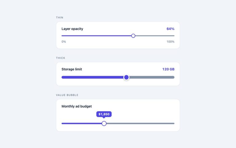
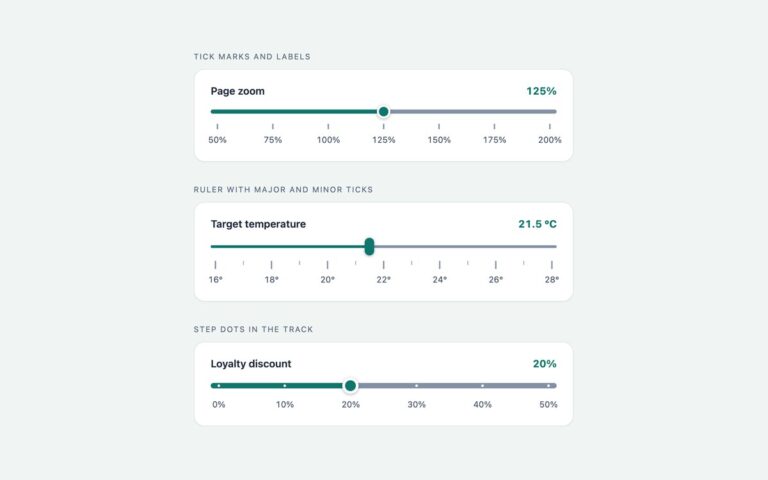
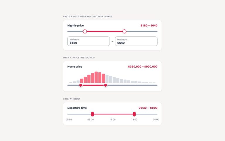
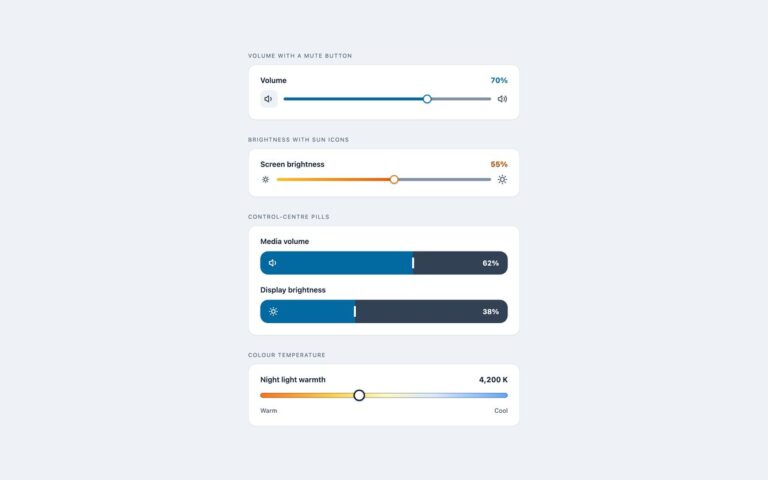
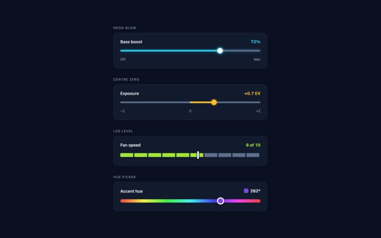
Range sliders whose fill, number, bubble and colour come from CSS rather than JavaScript. Fill and readout without JavaScript shows a download limit in Mbps. Bubble that follows the thumb moves a tip percentage above the thumb. Colour that follows the value turns a CPU limit from green through amber to red as it rises, using oklch(). The technique uses scroll-driven animations: the thumb gets a view timeline with view-timeline on ::-webkit-slider-thumb, the input clips it with overflow: hidden, and a registered integer –val is animated along that timeline from the maximum to the minimum. The live value then drives the gradient fill, a CSS counter that prints the number, the left position of the bubble and the hue. In Chrome and Edge that works with no script at all. Safari and Firefox do not run view timelines on the slider thumb yet, so the set ships a small fallback script: it checks once whether CSS is showing the real value and, if not, switches the animation off and sets –val itself. Firefox also fills the track natively through ::-moz-range-progress. Use it where Chromium matters most and you want the script as a safety net.

What’s included

  • Live value, fill, bubble and colour driven by CSS in Chromium
  • Registered --val animated by the thumb's view timeline
  • Numbers printed with a CSS counter
  • Colour ramp from green to red with oklch()
  • Fallback script that only acts where the CSS path is missing

Accessibility

Each slider has a visible label, and the input itself exposes its value to assistive technology, so the CSS-printed readout is a visual extra. Arrow keys, Page Up, Page Down, Home and End work as on any range input. Because the input clips its thumb, keyboard focus is an outline around the whole slider rather than a ring on the thumb. The pressed thumb takes a tint that fades in over 150 ms, instantly under prefers-reduced-motion.

Customise it

Set --cs-accent, --cs-track, --cs-thumb and --cs-h on .cs, and keep --min and --max equal to the input's min and max; --unit is the text printed after the number. The Tailwind version puts the same variables in arbitrary properties and --color-cs-track in @theme.