/* Comic and thought bubbles on Bootstrap: .row/.col lay out the strip and utilities place the parts; this block draws the shapes. Dialogue uses a comic face with system fallbacks; the shout uses a condensed display face.
   Swap in a self-hosted Comic Neue or Bangers by putting it first in --cb-talk / --cb-shout. */
.cb-strip{--cb-ink:#14120f;--cb-paper:#fff;--cb-skin:#f2c49b;--cb-pop:#ffdf3d;--cb-line:3px;
  --cb-talk:"Comic Neue","Comic Sans MS","Chalkboard SE","Comic Sans",cursive;
  --cb-shout:Bangers,Impact,Haettenschweiler,"Arial Narrow Bold","Franklin Gothic Bold",sans-serif;
  }

/* A panel with a halftone ground, a narration box and a character drawn in CSS */
.cb-panel{gap:14px;min-height:340px;padding:52px 20px 92px;
  border:var(--cb-line) solid var(--cb-ink);background:#fbf2df radial-gradient(#e8d5b5 1.4px,transparent 1.8px) 0 0/11px 11px;overflow:hidden}
.cb-panel.shake{background-color:#ffe9e4;background-image:radial-gradient(#f6c3b6 1.4px,transparent 1.8px)}
.cb-note{position:absolute;top:0;left:0;margin:0;padding:6px 12px;border:solid var(--cb-ink);border-width:0 var(--cb-line) var(--cb-line) 0;background:var(--cb-pop);
  font:700 .8rem/1.3 var(--cb-talk);text-transform:uppercase;letter-spacing:.02em}
.cb-face{position:absolute;left:22px;bottom:-14px;width:78px;height:86px;border:var(--cb-line) solid var(--cb-ink);border-radius:46% 46% 40% 40%;
  background:radial-gradient(circle 4px at 34% 42%,var(--cb-ink) 98%,#0000),radial-gradient(circle 4px at 66% 42%,var(--cb-ink) 98%,#0000),var(--cb-skin)}
.cb-face::after{content:"";position:absolute;left:30%;top:60%;width:40%;height:12%;border-bottom:var(--cb-line) solid var(--cb-ink);border-radius:0 0 50% 50%}
.cb-face.oh::after{left:40%;top:58%;width:20%;height:20%;border:var(--cb-line) solid var(--cb-ink);border-radius:50%;background:#7a2e1d}

/* 1. Comic speech bubble: the ellipse and the tail are two background layers on one pseudo-element
   (a radial-gradient and a conic-gradient wedge), outlined together by four hard drop-shadows,
   so the outline runs round the tail without a seam. */
.cb-say{position:relative;isolation:isolate;max-width:240px;margin:0 0 0 auto;padding:26px 30px;
  font:700 1rem/1.35 var(--cb-talk);text-align:center;text-transform:uppercase;letter-spacing:.02em}
.cb-say::before{content:"";position:absolute;z-index:-1;inset:0 0 -46px;
  background:radial-gradient(closest-side,var(--cb-paper) calc(100% - 1px),#0000) 0 0/100% calc(100% - 46px) no-repeat,
    conic-gradient(from 6deg at 3px calc(100% - 2px),var(--cb-paper) 30deg,#0000 0) 24% 100%/42px 60px no-repeat}

/* 2. Thought cloud: overlapping ellipses on one pseudo-element, outlined the same way. The trailing circles are a second pseudo-element with the same outline. */
.cb-think{position:relative;isolation:isolate;max-width:250px;margin:0 0 0 auto;padding:36px 38px 38px;
  font:700 .98rem/1.35 var(--cb-talk);text-align:center;text-transform:uppercase;letter-spacing:.02em;font-style:italic}
.cb-say::before,.cb-think::before,.cb-think::after{content:"";position:absolute;z-index:-1;
  filter:drop-shadow(var(--cb-line) 0 0 var(--cb-ink)) drop-shadow(calc(var(--cb-line) * -1) 0 0 var(--cb-ink)) drop-shadow(0 var(--cb-line) 0 var(--cb-ink)) drop-shadow(0 calc(var(--cb-line) * -1) 0 var(--cb-ink)) drop-shadow(1px 1px 0 var(--cb-ink)) drop-shadow(-1px -1px 0 var(--cb-ink))}
.cb-think::before{inset:4px;--g:radial-gradient(closest-side,var(--cb-paper) calc(100% - 1px),#0000);
  background:var(--g) 50% 50%/80% 72%,var(--g) 0 58%/36% 54%,var(--g) 24% 2%/40% 52%,var(--g) 62% 0/42% 50%,var(--g) 100% 30%/36% 54%,
    var(--g) 96% 92%/38% 50%,var(--g) 58% 100%/40% 46%,var(--g) 16% 96%/36% 48%;background-repeat:no-repeat}
.cb-think::after{top:calc(100% - 4px);left:24%;width:46px;height:52px;
  background:radial-gradient(circle at 72% 26%,var(--cb-paper) 10px,#0000 10.5px),radial-gradient(circle at 22% 82%,var(--cb-paper) 6px,#0000 6.5px)}

/* 3. Shout bubble: a jagged polygon cut with clip-path twice, ink behind and colour inset on top. One spike is the tail. */
.cb-shout{position:relative;isolation:isolate;max-width:270px;margin:-10px -6px 0 auto;padding:44px 50px 84px 58px;
  font:400 2.1rem/1 var(--cb-shout);text-align:center;text-transform:uppercase;letter-spacing:.03em;color:var(--cb-ink)}
.cb-shout::before,.cb-shout::after{content:"";position:absolute;z-index:-1;
  clip-path:polygon(50% 0,57% 12%,68% 2%,71% 16%,86% 8%,83% 24%,99% 24%,89% 38%,100% 50%,88% 58%,97% 72%,80% 70%,80% 86%,66% 76%,58% 88%,48% 76%,36% 82%,30% 74%,3% 100%,20% 66%,6% 66%,13% 54%,0 44%,12% 36%,2% 22%,18% 22%,14% 6%,30% 13%,36% 0,42% 12%)}
.cb-shout::before{inset:0;background:var(--cb-ink)}
.cb-shout::after{inset:7px;background:var(--cb-pop)}
.cb-shout small{display:block;margin-top:6px;font:700 .8rem/1.2 var(--cb-talk);letter-spacing:.02em}
@theme {
  --color-cb-ink:#14120f; --color-cb-pop:#ffdf3d;
  --font-talk:"Comic Neue","Comic Sans MS","Chalkboard SE","Comic Sans",cursive;
  --font-shout:Bangers,Impact,Haettenschweiler,"Arial Narrow Bold","Franklin Gothic Bold",sans-serif;
}
/* Utilities lay out the panels and set the type (font-talk, font-shout). The bubble shapes are pseudo-elements
   with layered gradients, clip-paths and outline filters, so they live here. */
:root{--cb-ink:var(--color-cb-ink);--cb-paper:#fff;--cb-skin:#f2c49b;--cb-pop:var(--color-cb-pop);--cb-line:3px}
.cb-face{background:radial-gradient(circle 4px at 34% 42%,var(--cb-ink) 98%,#0000),radial-gradient(circle 4px at 66% 42%,var(--cb-ink) 98%,#0000),var(--cb-skin)}
.cb-face::after{content:"";position:absolute;left:30%;top:60%;width:40%;height:12%;border-bottom:var(--cb-line) solid var(--cb-ink);border-radius:0 0 50% 50%}
.cb-face.cb-oh::after{left:40%;top:58%;width:20%;height:20%;border:var(--cb-line) solid var(--cb-ink);border-radius:50%;background:#7a2e1d}

/* Comic speech bubble: the ellipse and the tail are two background layers on one pseudo-element
   (a radial-gradient and a conic-gradient wedge), outlined together by four hard drop-shadows,
   so the outline runs round the tail without a seam. */
.cb-say::before{content:"";position:absolute;z-index:-1;inset:0 0 -46px;
  background:radial-gradient(closest-side,var(--cb-paper) calc(100% - 1px),#0000) 0 0/100% calc(100% - 46px) no-repeat,
    conic-gradient(from 6deg at 3px calc(100% - 2px),var(--cb-paper) 30deg,#0000 0) 24% 100%/42px 60px no-repeat}

/* Thought cloud: overlapping ellipses on one pseudo-element, outlined the same way. The trailing circles are a second pseudo-element with the same outline. */
.cb-say::before,.cb-think::before,.cb-think::after{content:"";position:absolute;z-index:-1;
  filter:drop-shadow(var(--cb-line) 0 0 var(--cb-ink)) drop-shadow(calc(var(--cb-line) * -1) 0 0 var(--cb-ink)) drop-shadow(0 var(--cb-line) 0 var(--cb-ink)) drop-shadow(0 calc(var(--cb-line) * -1) 0 var(--cb-ink)) drop-shadow(1px 1px 0 var(--cb-ink)) drop-shadow(-1px -1px 0 var(--cb-ink))}
.cb-think::before{inset:4px;--g:radial-gradient(closest-side,var(--cb-paper) calc(100% - 1px),#0000);
  background:var(--g) 50% 50%/80% 72%,var(--g) 0 58%/36% 54%,var(--g) 24% 2%/40% 52%,var(--g) 62% 0/42% 50%,var(--g) 100% 30%/36% 54%,
    var(--g) 96% 92%/38% 50%,var(--g) 58% 100%/40% 46%,var(--g) 16% 96%/36% 48%;background-repeat:no-repeat}
.cb-think::after{top:calc(100% - 4px);left:24%;width:46px;height:52px;
  background:radial-gradient(circle at 72% 26%,var(--cb-paper) 10px,#0000 10.5px),radial-gradient(circle at 22% 82%,var(--cb-paper) 6px,#0000 6.5px)}

/* Shout bubble: a jagged polygon cut with clip-path twice, ink behind and colour inset on top. One spike is the tail. */
.cb-shout::before,.cb-shout::after{content:"";position:absolute;z-index:-1;
  clip-path:polygon(50% 0,57% 12%,68% 2%,71% 16%,86% 8%,83% 24%,99% 24%,89% 38%,100% 50%,88% 58%,97% 72%,80% 70%,80% 86%,66% 76%,58% 88%,48% 76%,36% 82%,30% 74%,3% 100%,20% 66%,6% 66%,13% 54%,0 44%,12% 36%,2% 22%,18% 22%,14% 6%,30% 13%,36% 0,42% 12%)}
.cb-shout::before{inset:0;background:var(--cb-ink)}
.cb-shout::after{inset:7px;background:var(--cb-pop)}
About this set
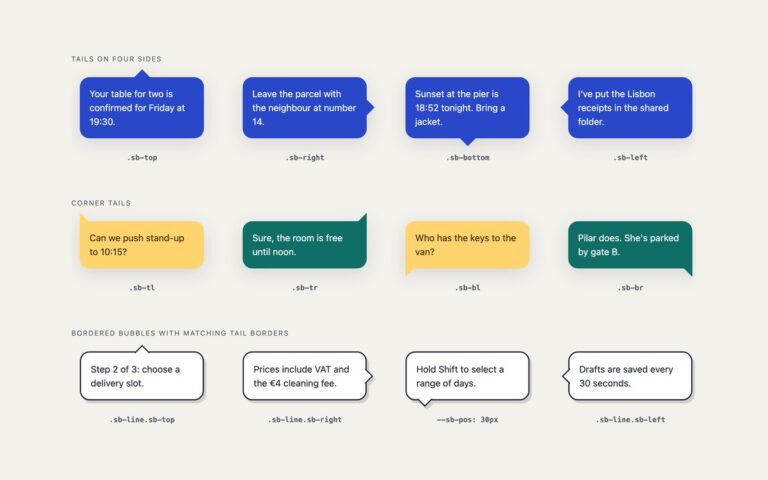
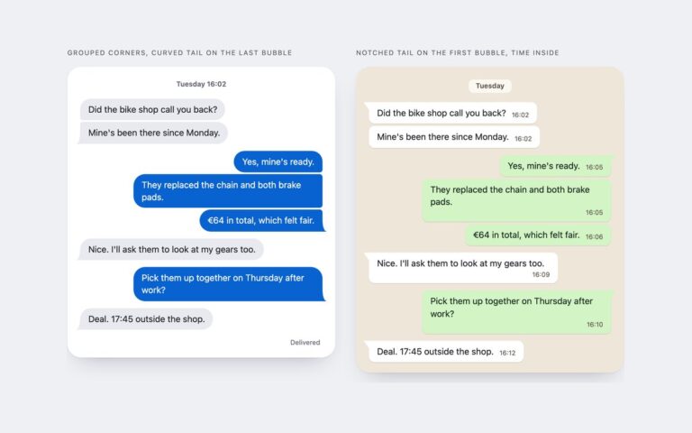
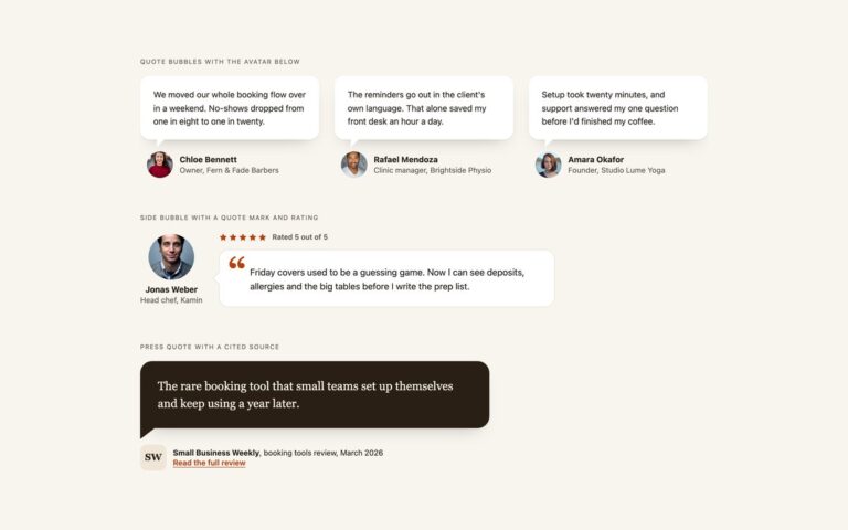
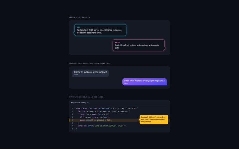
A three-panel comic strip about a baker and a temperamental oven, with the three balloon types comics use. Comic speech bubble is an outlined ellipse with a pointed tail aimed at the speaker. The ellipse and the tail are two background layers, a radial-gradient and a conic-gradient wedge, on one pseudo-element, and four hard drop-shadows outline the merged shape, so the ink line runs round the tail without a seam. Thought bubble with trailing circles builds a cloud from eight overlapping ellipses on one pseudo-element and outlines it the same way, with two shrinking circles leading down to the character. Shout bubble cut with clip-path is a jagged burst: the same 30-point polygon is clipped twice, ink behind and yellow inset on top, and one long spike is the tail. Each panel has a halftone dot background, a narration box and a character drawn in CSS. Dialogue is set in a comic face with system fallbacks, Comic Sans MS and Chalkboard SE, and the shout uses Impact or another condensed display face; put a self-hosted Comic Neue or Bangers first in the font variables if you want the same lettering everywhere.
What’s included
Outlined speech balloon whose outline follows the tail
Cloud thought bubble with trailing circles
Jagged shout bubble cut with clip-path: polygon()
Comic font pairing with system fallbacks, no web font download
Halftone panels, narration boxes and CSS characters
Accessibility
The strip is an ordered list named Comic strip: The 7 o'clock rush, so the panels are read in order. Each balloon starts with visually hidden text such as Baker thinks: or Baker shouts:, so the type of balloon is not conveyed by shape alone. The CSS characters are aria-hidden, and all lettering reaches at least 4.5:1 on its balloon.
Customise it
Change --cb-ink, --cb-paper, --cb-pop and --cb-line on .cb-strip for colours and outline width, and --cb-talk / --cb-shout for the fonts. Edit the clip-path polygon to reshape the burst. In Tailwind the fonts are the font-talk and font-shout theme utilities; Bootstrap uses the same variables with .row and .col-lg-4.