Open demo

CSS code

HTML
<div><span class="lbl">Pill</span><div class="row">
<label class="sw"><input type="checkbox" role="switch" aria-label="Wi-Fi" checked><i></i></label>
<label class="sw"><input type="checkbox" role="switch" aria-label="Bluetooth"><i></i></label></div></div>
<div><span class="lbl">Square</span><div class="row">
<label class="sw sq"><input type="checkbox" role="switch" aria-label="Autosave" checked><i></i></label>
<label class="sw sq"><input type="checkbox" role="switch" aria-label="Offline mode"><i></i></label></div></div>
<div><span class="lbl">Compact</span><div class="row">
<label class="sw sm"><input type="checkbox" role="switch" aria-label="Show hints" checked><i></i></label>
<label class="sw sm"><input type="checkbox" role="switch" aria-label="Compact view"><i></i></label></div></div>
<div><span class="lbl">Knob with a tick</span><div class="row">
<label class="sw tick"><input type="checkbox" role="switch" aria-label="Sync contacts" checked><i></i></label>
<label class="sw tick"><input type="checkbox" role="switch" aria-label="Sync calendar"><i></i></label></div></div>
<div><span class="lbl">Long travel</span><div class="row">
<label class="sw wide"><input type="checkbox" role="switch" aria-label="Public profile" checked><i></i></label>
<label class="sw wide"><input type="checkbox" role="switch" aria-label="Show online status"><i></i></label></div></div>
CSS
/* Classic switches: a visually hidden checkbox (role="switch") followed by an <i> that draws the track and knob. */
.sw{--sw-off:#7c8aa0;--sw-on:#2563eb;--sw-knob:#fff;--sw-focus:#2563eb;
  position:relative;display:inline-block;width:52px;height:30px;cursor:pointer}
.sw input{position:absolute;opacity:0;width:0;height:0;margin:0}
.sw i{position:absolute;inset:0;background:var(--sw-off);border-radius:999px;transition:background .22s}
.sw i::before{content:"";position:absolute;top:3px;left:3px;width:24px;height:24px;background:var(--sw-knob);
  border-radius:50%;box-shadow:0 1px 3px rgba(15,23,42,.28);transition:transform .22s}
.sw input:checked+i{background:var(--sw-on)}
.sw input:checked+i::before{transform:translateX(22px)}
.sw input:focus-visible+i{outline:2px solid var(--sw-focus);outline-offset:3px}
/* square */
.sw.sq i,.sw.sq i::before{border-radius:6px}
/* compact */
.sw.sm{width:38px;height:22px}
.sw.sm i::before{width:16px;height:16px;top:3px;left:3px}
.sw.sm input:checked+i::before{transform:translateX(16px)}
/* knob with a tick */
.sw.tick i::after{content:"";position:absolute;top:10px;left:11px;width:9px;height:5px;
  border-left:2px solid var(--sw-on);border-bottom:2px solid var(--sw-on);transform:rotate(-45deg) scale(0);
  transition:transform .2s .06s}
.sw.tick input:checked+i::after{transform:rotate(-45deg) scale(1);left:33px}
/* long travel */
.sw.wide{width:74px}
.sw.wide input:checked+i::before{transform:translateX(44px)}
@media (prefers-reduced-motion:reduce){.sw i,.sw i::before,.sw i::after{transition:none}}

Bootstrap 5 code

Requires: Bootstrap 5.3.8 CSS

HTML
<div><span class="lbl">Pill</span><div class="demo-row">
<div class="form-check form-switch sw"><input class="form-check-input" type="checkbox" role="switch" aria-label="Wi-Fi" checked></div>
<div class="form-check form-switch sw"><input class="form-check-input" type="checkbox" role="switch" aria-label="Bluetooth"></div></div></div>
<div><span class="lbl">Square</span><div class="demo-row">
<div class="form-check form-switch sw sq"><input class="form-check-input" type="checkbox" role="switch" aria-label="Autosave" checked></div>
<div class="form-check form-switch sw sq"><input class="form-check-input" type="checkbox" role="switch" aria-label="Offline mode"></div></div></div>
<div><span class="lbl">Compact</span><div class="demo-row">
<div class="form-check form-switch sw sm"><input class="form-check-input" type="checkbox" role="switch" aria-label="Show hints" checked></div>
<div class="form-check form-switch sw sm"><input class="form-check-input" type="checkbox" role="switch" aria-label="Compact view"></div></div></div>
<div><span class="lbl">Knob with a tick</span><div class="demo-row">
<div class="form-check form-switch sw tick"><input class="form-check-input" type="checkbox" role="switch" aria-label="Sync contacts" checked></div>
<div class="form-check form-switch sw tick"><input class="form-check-input" type="checkbox" role="switch" aria-label="Sync calendar"></div></div></div>
<div><span class="lbl">Long travel</span><div class="demo-row">
<div class="form-check form-switch sw wide"><input class="form-check-input" type="checkbox" role="switch" aria-label="Public profile" checked></div>
<div class="form-check form-switch sw wide"><input class="form-check-input" type="checkbox" role="switch" aria-label="Show online status"></div></div></div>
CSS
/* Bootstrap .form-switch, resized and recoloured. The knob is Bootstrap's --bs-form-switch-bg image. */
.sw{--sw-off:#7c8aa0;--sw-on:#2563eb;--sw-focus:#2563eb;
  --sw-knob:url("data:image/svg+xml,<svg xmlns='http://www.w3.org/2000/svg' viewBox='-15 -15 30 30'><filter id='s' x='-50%25' y='-50%25' width='200%25' height='200%25'><feDropShadow dy='1' stdDeviation='1.5' flood-color='%230f172a' flood-opacity='.28'/></filter><circle r='12' fill='%23fff' filter='url(%23s)'/></svg>");
  display:inline-block;min-height:0;margin:0;padding:0;line-height:0}
.sw .form-check-input{width:52px;height:30px;margin:0;float:none;border:0;border-radius:999px;cursor:pointer;
  background-color:var(--sw-off);transition:background-position .22s,background-color .22s}
.sw .form-check-input,.sw .form-check-input:focus,.sw .form-check-input:checked{--bs-form-switch-bg:var(--sw-knob)}
.sw .form-check-input:checked{background-color:var(--sw-on)}
.sw .form-check-input:focus{box-shadow:none}
.sw .form-check-input:focus-visible{outline:2px solid var(--sw-focus);outline-offset:3px}
/* square */
.sw.sq{--sw-knob:url("data:image/svg+xml,<svg xmlns='http://www.w3.org/2000/svg' viewBox='-15 -15 30 30'><filter id='s' x='-50%25' y='-50%25' width='200%25' height='200%25'><feDropShadow dy='1' stdDeviation='1.5' flood-color='%230f172a' flood-opacity='.28'/></filter><rect x='-12' y='-12' width='24' height='24' rx='6' fill='%23fff' filter='url(%23s)'/></svg>")}
.sw.sq .form-check-input{border-radius:6px}
/* compact */
.sw.sm{--sw-knob:url("data:image/svg+xml,<svg xmlns='http://www.w3.org/2000/svg' viewBox='-11 -11 22 22'><filter id='s' x='-50%25' y='-50%25' width='200%25' height='200%25'><feDropShadow dy='1' stdDeviation='1.5' flood-color='%230f172a' flood-opacity='.28'/></filter><circle r='8' fill='%23fff' filter='url(%23s)'/></svg>")}
.sw.sm .form-check-input{width:38px;height:22px}
/* knob with a tick (shown when on) */
.sw.tick .form-check-input:checked{--bs-form-switch-bg:url("data:image/svg+xml,<svg xmlns='http://www.w3.org/2000/svg' viewBox='-15 -15 30 30'><filter id='s' x='-50%25' y='-50%25' width='200%25' height='200%25'><feDropShadow dy='1' stdDeviation='1.5' flood-color='%230f172a' flood-opacity='.28'/></filter><circle r='12' fill='%23fff' filter='url(%23s)'/><path d='M-4.2-.4l2.8 2.8 5.6-5.6' fill='none' stroke='%232563eb' stroke-width='2'/></svg>")}
/* long travel */
.sw.wide .form-check-input{width:74px}
@media (prefers-reduced-motion:reduce){.sw .form-check-input{transition:none}}

Tailwind 4 code

Requires: Tailwind CSS 4

HTML
<div><span class="mb-4 block text-[.72rem] tracking-[.12em] text-[#64748b] uppercase">Pill</span><div class="flex flex-wrap items-center gap-[18px]">
<label class="relative inline-block h-[30px] w-[52px] cursor-pointer"><input type="checkbox" role="switch" aria-label="Wi-Fi" class="peer sr-only" checked><span class="absolute inset-0 rounded-full bg-sw-off transition-[background-color,border-color,color] duration-[220ms] peer-checked:bg-sw-on peer-focus-visible:outline-2 peer-focus-visible:outline-offset-3 peer-focus-visible:outline-sw-on motion-reduce:transition-none"></span><span class="pointer-events-none absolute top-[3px] left-[3px] size-6 rounded-full bg-white shadow-[0_1px_3px_rgba(15,23,42,.28)] transition-transform duration-[220ms] peer-checked:translate-x-[22px] motion-reduce:transition-none"></span></label>
<label class="relative inline-block h-[30px] w-[52px] cursor-pointer"><input type="checkbox" role="switch" aria-label="Bluetooth" class="peer sr-only"><span class="absolute inset-0 rounded-full bg-sw-off transition-[background-color,border-color,color] duration-[220ms] peer-checked:bg-sw-on peer-focus-visible:outline-2 peer-focus-visible:outline-offset-3 peer-focus-visible:outline-sw-on motion-reduce:transition-none"></span><span class="pointer-events-none absolute top-[3px] left-[3px] size-6 rounded-full bg-white shadow-[0_1px_3px_rgba(15,23,42,.28)] transition-transform duration-[220ms] peer-checked:translate-x-[22px] motion-reduce:transition-none"></span></label></div></div>
<div><span class="mb-4 block text-[.72rem] tracking-[.12em] text-[#64748b] uppercase">Square</span><div class="flex flex-wrap items-center gap-[18px]">
<label class="relative inline-block h-[30px] w-[52px] cursor-pointer"><input type="checkbox" role="switch" aria-label="Autosave" class="peer sr-only" checked><span class="absolute inset-0 rounded-md bg-sw-off transition-[background-color,border-color,color] duration-[220ms] peer-checked:bg-sw-on peer-focus-visible:outline-2 peer-focus-visible:outline-offset-3 peer-focus-visible:outline-sw-on motion-reduce:transition-none"></span><span class="pointer-events-none absolute top-[3px] left-[3px] size-6 rounded-md bg-white shadow-[0_1px_3px_rgba(15,23,42,.28)] transition-transform duration-[220ms] peer-checked:translate-x-[22px] motion-reduce:transition-none"></span></label>
<label class="relative inline-block h-[30px] w-[52px] cursor-pointer"><input type="checkbox" role="switch" aria-label="Offline mode" class="peer sr-only"><span class="absolute inset-0 rounded-md bg-sw-off transition-[background-color,border-color,color] duration-[220ms] peer-checked:bg-sw-on peer-focus-visible:outline-2 peer-focus-visible:outline-offset-3 peer-focus-visible:outline-sw-on motion-reduce:transition-none"></span><span class="pointer-events-none absolute top-[3px] left-[3px] size-6 rounded-md bg-white shadow-[0_1px_3px_rgba(15,23,42,.28)] transition-transform duration-[220ms] peer-checked:translate-x-[22px] motion-reduce:transition-none"></span></label></div></div>
<div><span class="mb-4 block text-[.72rem] tracking-[.12em] text-[#64748b] uppercase">Compact</span><div class="flex flex-wrap items-center gap-[18px]">
<label class="relative inline-block h-[22px] w-[38px] cursor-pointer"><input type="checkbox" role="switch" aria-label="Show hints" class="peer sr-only" checked><span class="absolute inset-0 rounded-full bg-sw-off transition-[background-color,border-color,color] duration-[220ms] peer-checked:bg-sw-on peer-focus-visible:outline-2 peer-focus-visible:outline-offset-3 peer-focus-visible:outline-sw-on motion-reduce:transition-none"></span><span class="pointer-events-none absolute top-[3px] left-[3px] size-4 rounded-full bg-white shadow-[0_1px_3px_rgba(15,23,42,.28)] transition-transform duration-[220ms] peer-checked:translate-x-4 motion-reduce:transition-none"></span></label>
<label class="relative inline-block h-[22px] w-[38px] cursor-pointer"><input type="checkbox" role="switch" aria-label="Compact view" class="peer sr-only"><span class="absolute inset-0 rounded-full bg-sw-off transition-[background-color,border-color,color] duration-[220ms] peer-checked:bg-sw-on peer-focus-visible:outline-2 peer-focus-visible:outline-offset-3 peer-focus-visible:outline-sw-on motion-reduce:transition-none"></span><span class="pointer-events-none absolute top-[3px] left-[3px] size-4 rounded-full bg-white shadow-[0_1px_3px_rgba(15,23,42,.28)] transition-transform duration-[220ms] peer-checked:translate-x-4 motion-reduce:transition-none"></span></label></div></div>
<div><span class="mb-4 block text-[.72rem] tracking-[.12em] text-[#64748b] uppercase">Knob with a tick</span><div class="flex flex-wrap items-center gap-[18px]">
<label class="relative inline-block h-[30px] w-[52px] cursor-pointer"><input type="checkbox" role="switch" aria-label="Sync contacts" class="peer sr-only" checked><span class="absolute inset-0 rounded-full bg-sw-off transition-[background-color,border-color,color] duration-[220ms] peer-checked:bg-sw-on peer-focus-visible:outline-2 peer-focus-visible:outline-offset-3 peer-focus-visible:outline-sw-on motion-reduce:transition-none"></span><span class="pointer-events-none absolute top-[3px] left-[3px] size-6 rounded-full bg-white shadow-[0_1px_3px_rgba(15,23,42,.28)] transition-transform duration-[220ms] peer-checked:translate-x-[22px] motion-reduce:transition-none"></span><span class="pointer-events-none absolute top-[10px] left-[33px] h-[7px] w-[11px] -rotate-45 scale-0 border-b-2 border-l-2 border-sw-on transition-transform delay-[60ms] duration-200 peer-checked:scale-100 motion-reduce:transition-none"></span></label>
<label class="relative inline-block h-[30px] w-[52px] cursor-pointer"><input type="checkbox" role="switch" aria-label="Sync calendar" class="peer sr-only"><span class="absolute inset-0 rounded-full bg-sw-off transition-[background-color,border-color,color] duration-[220ms] peer-checked:bg-sw-on peer-focus-visible:outline-2 peer-focus-visible:outline-offset-3 peer-focus-visible:outline-sw-on motion-reduce:transition-none"></span><span class="pointer-events-none absolute top-[3px] left-[3px] size-6 rounded-full bg-white shadow-[0_1px_3px_rgba(15,23,42,.28)] transition-transform duration-[220ms] peer-checked:translate-x-[22px] motion-reduce:transition-none"></span><span class="pointer-events-none absolute top-[10px] left-[33px] h-[7px] w-[11px] -rotate-45 scale-0 border-b-2 border-l-2 border-sw-on transition-transform delay-[60ms] duration-200 peer-checked:scale-100 motion-reduce:transition-none"></span></label></div></div>
<div><span class="mb-4 block text-[.72rem] tracking-[.12em] text-[#64748b] uppercase">Long travel</span><div class="flex flex-wrap items-center gap-[18px]">
<label class="relative inline-block h-[30px] w-[74px] cursor-pointer"><input type="checkbox" role="switch" aria-label="Public profile" class="peer sr-only" checked><span class="absolute inset-0 rounded-full bg-sw-off transition-[background-color,border-color,color] duration-[220ms] peer-checked:bg-sw-on peer-focus-visible:outline-2 peer-focus-visible:outline-offset-3 peer-focus-visible:outline-sw-on motion-reduce:transition-none"></span><span class="pointer-events-none absolute top-[3px] left-[3px] size-6 rounded-full bg-white shadow-[0_1px_3px_rgba(15,23,42,.28)] transition-transform duration-[220ms] peer-checked:translate-x-[44px] motion-reduce:transition-none"></span></label>
<label class="relative inline-block h-[30px] w-[74px] cursor-pointer"><input type="checkbox" role="switch" aria-label="Show online status" class="peer sr-only"><span class="absolute inset-0 rounded-full bg-sw-off transition-[background-color,border-color,color] duration-[220ms] peer-checked:bg-sw-on peer-focus-visible:outline-2 peer-focus-visible:outline-offset-3 peer-focus-visible:outline-sw-on motion-reduce:transition-none"></span><span class="pointer-events-none absolute top-[3px] left-[3px] size-6 rounded-full bg-white shadow-[0_1px_3px_rgba(15,23,42,.28)] transition-transform duration-[220ms] peer-checked:translate-x-[44px] motion-reduce:transition-none"></span></label></div></div>
CSS
@theme {
  --color-sw-off: #7c8aa0;
  --color-sw-on: #2563eb;
}

About this set

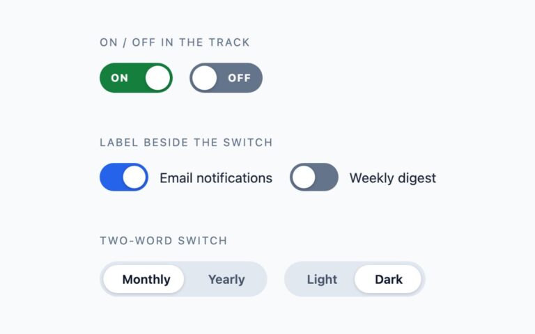
Five switch shapes that cover most settings screens: a rounded pill, a square switch with 6px corners, a compact 38 by 22 pixel switch for dense tables and toolbars, a pill whose knob shows a blue tick when it is on, and a long-travel switch with a 74 pixel track for touch layouts where a bigger target helps. Each one is shown on and off. Use the pill as the default, the square one where the rest of the interface has square corners, the compact one where vertical space is tight, and the tick variant when colour alone should not carry the state. Each switch is a real checkbox with role=”switch”, visually hidden inside a label, followed by an empty element that draws the track and the knob. The browser handles clicking, keyboard toggling and form submission, and the CSS only reacts to :checked. The Bootstrap version is the stock .form-switch with the knob redrawn through –bs-form-switch-bg, and the Tailwind version builds the same parts with peer-checked utilities.

What’s included

  • Five shapes: pill, square, compact, knob with a tick, long travel
  • Native checkbox with role="switch", so it submits with a form
  • Off track darkened to meet 3:1 against the page
  • Knob slides with a 220 ms transition that switches off under reduced motion
  • Plain CSS, Bootstrap .form-switch and Tailwind versions of the same design

Accessibility

Each input has role="switch" and an aria-label, so screen readers announce a named switch with its on or off state. Tab reaches every switch and Space toggles it. Keyboard focus draws a 2px blue outline around the visible track, and all transitions are removed when prefers-reduced-motion is set.

Customise it

In plain CSS change --sw-on, --sw-off and --sw-knob on .sw, and the width, height and translateX values for size. In Bootstrap the same --sw-* variables sit on the .form-switch wrapper; in Tailwind edit the --color-sw-on and --color-sw-off theme colours and the w-, h- and translate-x- utilities.