About this set
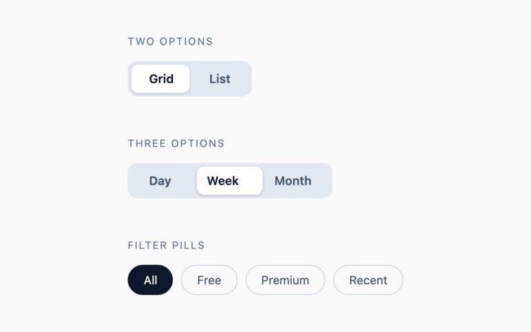
Switches that say what state they are in, for places where a coloured track alone is not clear enough. The set has three variants. ON and OFF in the track prints the current state inside a 78 pixel track, fading the words as the knob passes. Label beside the switch pairs a standard switch with a text label such as Email notifications, and the whole label is the click target. The two-word switch shows both choices, for example Monthly and Yearly or Light and Dark, with a white pill that slides under the active word. Use the ON and OFF track in admin panels and forms, the side label in settings lists, and the two-word switch for a binary choice where both options deserve a name. Every variant is one checkbox, visually hidden, followed by spans that CSS shows, hides or moves with the :checked selector. No JavaScript is involved and the state submits with a form like any checkbox.
What’s included
- ON and OFF text inside the track, faded in and out
- Side label that makes the whole row clickable
- Two-word switch with a sliding pill for binary choices
- Darker green and slate tracks so the white ON and OFF text reaches 4.5:1
- Transitions removed under prefers-reduced-motion
Accessibility
The side-label switches take their name from their visible text; the others carry an aria-label, and the ON and OFF words are aria-hidden so the state is announced once rather than read out as text. All controls use role="switch", are reachable with Tab and toggle with Space. Focus shows a 2px blue outline on the track or on the sliding pill, and motion is disabled under prefers-reduced-motion.
Customise it
Change the track colours in .tr and .t input:checked+.tr (plain CSS), the --sw-on and --sw-off variables on .sw (Bootstrap) or the --color-sw-* theme colours (Tailwind). The two-word switch uses --seg-muted and --seg-active in Bootstrap and seg- colours in Tailwind.