About this set
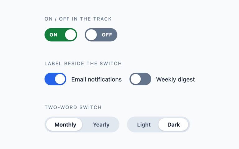
Multi-option switches for when there are more than two states. The two-up control switches between two views, such as Grid and List. The three-up control picks one of three ranges, such as Day, Week and Month, with a white indicator that slides under the chosen option. Filter pills are a wrapping row of rounded buttons, such as All, Free, Premium and Recent, where the chosen pill fills dark. Use the segmented controls for view and range pickers in toolbars and dashboards, and the pills for filters above a list or grid. All three are groups of radio inputs sharing one name, so only one option can be chosen and the value submits with a form. The inputs are visually hidden and their labels are the visible buttons; the sliding indicator is an element positioned with sibling selectors that follow the checked radio. In Bootstrap they are .btn-check radios in a .btn-group, and in Tailwind they use named peer variants.
What’s included
- Two-option and three-option segmented controls
- Sliding white indicator under the chosen option
- Filter pills that wrap onto new lines on narrow screens
- Built on radio inputs, so arrow keys move the choice
- Label text darkened to #475569 so it reaches 4.5:1 on the grey track
Accessibility
Each group has role="radiogroup" and an aria-label, and every option is a radio input named by its label. Tab enters the group on the chosen option and the arrow keys move the selection, as with any native radio group. Focus shows a 2px blue outline on the indicator or the pill, and the slide and colour transitions are removed under prefers-reduced-motion.
Customise it
Change the track, text and indicator colours in .sg, .sg label and .sg em, and the pill colours in .pills label (plain CSS), the --bs-btn-* variables on .sg .btn and .pills .btn (Bootstrap) or the --color-seg-* theme colours (Tailwind). For a different number of options, set the indicator width to that fraction and add a matching translateX rule.