About this set
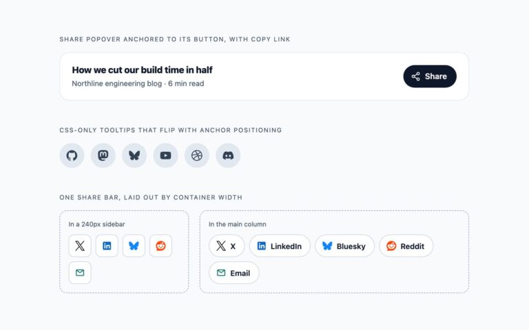
Three share bars for articles and posts, wired to real share URLs. The horizontal bar sits under an article with a Share this article label and outlined pills for X, LinkedIn, Facebook, Bluesky, Reddit and Email. The floating vertical side bar is fixed to the left edge and centred vertically, with round brand-coloured buttons that grow slightly on hover. The mobile bottom bar is fixed to the bottom of the screen with five equal buttons, an icon over a short name, and padding from env(safe-area-inset-bottom) so it clears the home indicator on phones. Every link uses the network’s public share pattern with an encoded https://example.com address and title: x.com/intent/post, facebook.com/sharer, linkedin.com/sharing/share-offsite, bsky.app/intent/compose, threads.net/intent/post, reddit.com/submit, wa.me, t.me/share and a mailto: link with subject and body. Replace the encoded URL and title with your page’s. Mastodon is left out because it has no single share address; each server has its own. In the demo the fixed bars sit inside a frame with a transform, so they stay inside the preview. The Bootstrap version uses .btn, position utilities, .fixed-bottom and .nav-fill. No JavaScript.
What’s included
- Horizontal, floating side and mobile bottom share bars
- Real share URLs for X, Facebook, LinkedIn, Bluesky, Threads, Reddit, WhatsApp, Telegram and email
- Bottom bar respects the iPhone safe area
- Icon-only buttons are named Share on X and so on
- Bootstrap version uses .fixed-bottom and .nav-fill
Accessibility
Every share link is named Share on X, Share on LinkedIn or Share by email, from visible text plus hidden words or from aria-label on the icon-only side bar. Each bar is a labelled group or list, icons are aria-hidden, every link shows a 3px focus outline, and the scale and colour transitions stop under prefers-reduced-motion.
Customise it
Swap the encoded URL and title in each href, change the pill and tab colours in .sh and .sh-tab, and the brand fills through the .sh-network classes. Move the side bar with left and top on .sh-side, and hide either fixed bar with a media query to show the side bar on wide screens and the bottom bar on phones.