About this set
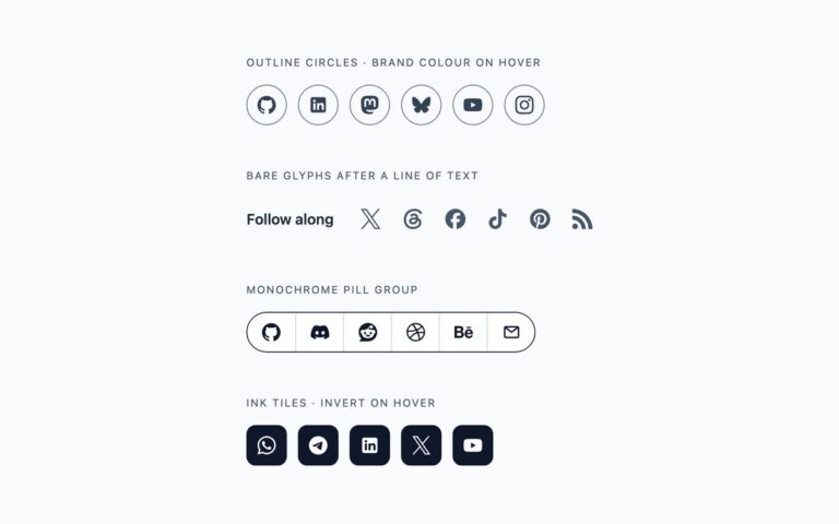
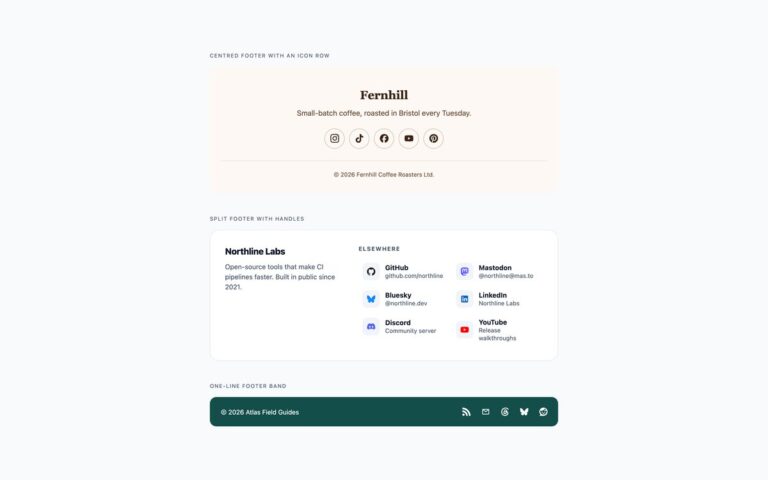
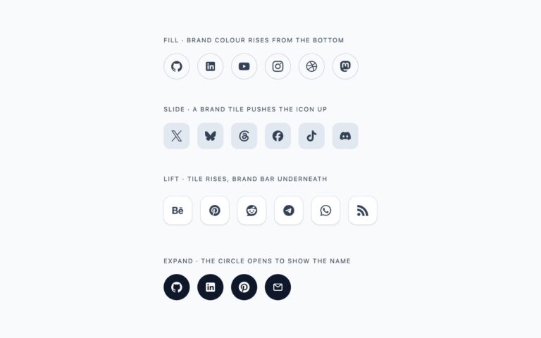
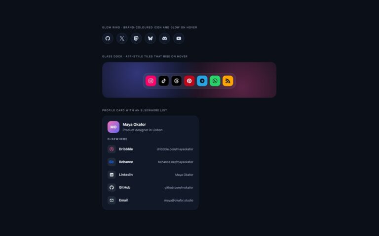
The four social icon rows most websites need, each a list of links with inline SVG logos. Circle shows neutral grey circles that fill with the network’s own colour on hover and keyboard focus, which suits headers and author boxes where the icons should stay quiet until used. Square is a row of solid brand-coloured tiles for contact pages and link-in-bio layouts where the networks should be recognised at a glance. Rounded is a white tile with a thin border and a brand-coloured glyph that fills in on hover, a middle ground for cards and sidebars. Small is a 36 pixel circle row for bylines and team cards. Every brand colour lives in a .si-network class as three custom properties: the fill, the icon colour on that fill, and the glyph colour on white. The icon colour switches to near-black on WhatsApp green, Telegram blue and the RSS orange, where a white icon would fall below 3:1, and the glyph colour falls back to slate where the brand colour is too light on white. The Bootstrap version uses .btn with its –bs-btn-* variables and .rounded-circle, and the Tailwind version reads the same colours from arbitrary properties. No JavaScript.
What’s included
- Circle, square, rounded and small icon rows
- Brand colour on hover and keyboard focus, not on hover alone
- Icon colours checked for 3:1 against every fill, with a dark icon where white fails
- Logos are inline SVG with no icon font or external request
- Bootstrap version built on .btn and its --bs-btn-* variables
Accessibility
Each link has an aria-label such as uiCookies on GitHub, and the SVG inside it is aria-hidden, so screen readers announce one named link per network. The rows are lists, so the number of networks is announced. Keyboard focus shows a 3px dark outline and the same brand fill as hover, and the colour and lift transitions are removed under prefers-reduced-motion.
Customise it
Change --si-size and --si-icon on .si-row for size, and the --si-brand, --si-on and --si-ink values in each .si-network class for colour. In Bootstrap the same classes feed --bs-btn-bg and --bs-btn-hover-bg; in Tailwind edit the [--b] and [--on] arbitrary properties and the size-11 and size-5 utilities.