/* ── Retro UI kit tokens (uiCookies) — identical in every set ─────────────
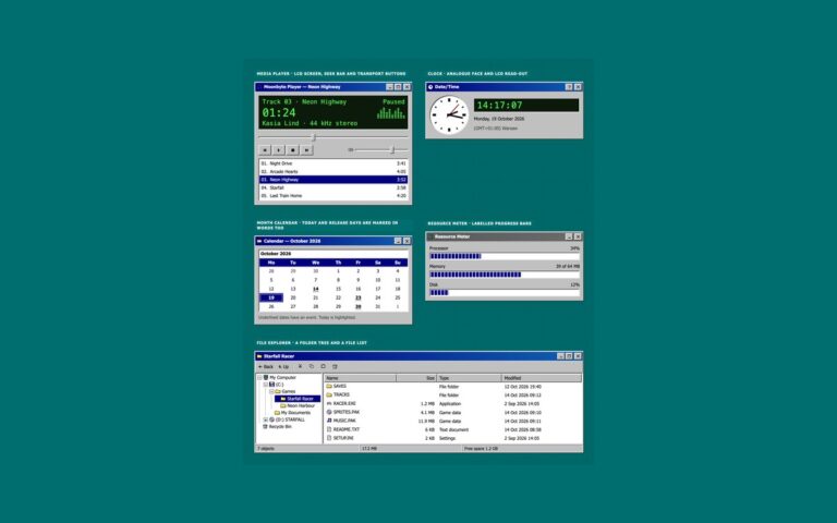
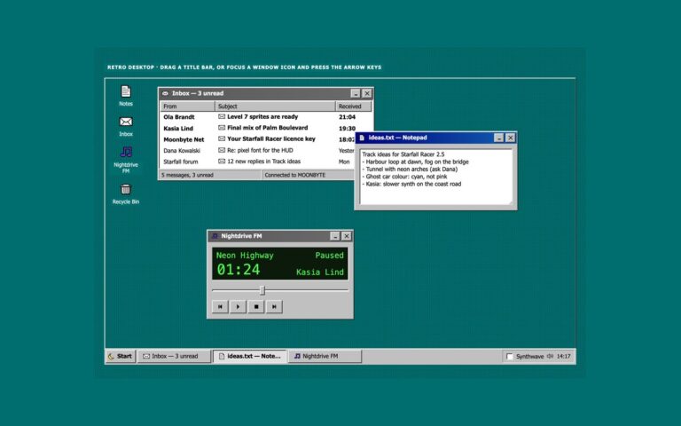
   A classic desktop OS look: grey bevelled faces, navy title bars, sunken white fields on a dithered teal desktop.
   Bevels are four 1px inset shadows built from --retro-hilite, --retro-light, --retro-shadow and --retro-dark,
   so one change to a token re-colours every button, field and window in the kit. */
:root{
  --retro-desk:#006e6e;        /* desktop behind the windows */
  --retro-desk-text:#ffffff;   /* captions and icon labels on the desktop, 6.1:1 */
  --retro-desk-dither:rgba(0,0,0,.22);
  --retro-face:#c0c0c0;        /* window, button and bar faces */
  --retro-hilite:#ffffff;      /* bevel: outer light edge */
  --retro-light:#dfdfdf;       /* bevel: inner light edge */
  --retro-shadow:#808080;      /* bevel: inner dark edge */
  --retro-dark:#0a0a0a;        /* bevel: outer dark edge */
  --retro-text:#000000;        /* text on faces, 11.5:1 */
  --retro-muted:#3d3d3d;       /* secondary text on faces, 6:1 */
  --retro-field:#ffffff;       /* inputs, lists and document areas */
  --retro-field-text:#000000;
  --retro-title:#000080;       /* active title bar gradient, white text 6.3:1 or more */
  --retro-title-2:#1060b0;
  --retro-title-text:#ffffff;
  --retro-idle:#5a5a5a;        /* inactive title bar gradient, white text 5.3:1 or more */
  --retro-idle-2:#6b6b6b;
  --retro-idle-text:#ffffff;
  --retro-select:#000080;      /* highlighted menu items, rows and dates */
  --retro-select-text:#ffffff;
  --retro-link:#0000cc;        /* 6.2:1 on faces */
  --retro-danger:#8a0000;      /* error text, 5.5:1 on faces */
  --retro-tip:#ffffe1;         /* tooltips and balloons */
  --retro-tip-text:#000000;
  --retro-tip-line:#000000;
  --retro-lcd:#0b1a0b;         /* LCD read-outs */
  --retro-lcd-text:#4dff4d;
  --retro-accent:#000080;      /* progress chunks */
  --retro-disabled:#808080;    /* disabled text, embossed */
  --retro-emboss:#ffffff;
  --retro-dither-a:#ffffff;    /* checkerboard behind a latched toggle */
  --retro-dither-b:#c0c0c0;
  --retro-focus:#000000;       /* dotted focus rectangle */
  --retro-glow:0 0 #0000;      /* the synthwave theme adds a neon glow to windows */
  --retro-neon-pink:#ff3fa4;--retro-neon-cyan:#00e5ff;--retro-sun-1:#ffd23f;--retro-sun-2:#ff3fa4;
  --retro-font:Tahoma,"Microsoft Sans Serif","MS Sans Serif",Geneva,Verdana,"Segoe UI",sans-serif;
  --retro-mono:"VT323","Fixedsys","Lucida Console",Consolas,Menlo,"Courier New",ui-monospace,monospace;
}
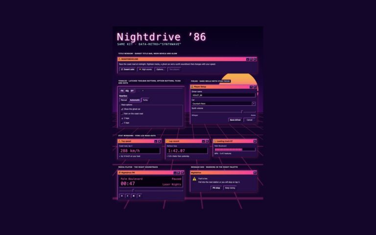
/* Synthwave 80s night theme: data-retro="synthwave" on any wrapper, or a checked .retro-theme-input inside a
   [data-retro] element. :is() is a forgiving list, so browsers without :has() still apply the attribute. */
[data-retro]:is([data-retro="synthwave"],:has(.retro-theme-input:checked)){
  --retro-desk:#14062b;--retro-desk-text:#fff1fb;--retro-desk-dither:rgba(255,63,164,.16);
  --retro-face:#261047;--retro-hilite:#ff6ec7;--retro-light:#a05cff;--retro-shadow:#0d0420;--retro-dark:#000000;
  --retro-text:#fff1fb;--retro-muted:#dcc6ff;--retro-field:#0e0322;--retro-field-text:#fff1fb;
  --retro-title:#ff8a3d;--retro-title-2:#ff3fa4;--retro-title-text:#1b0030;
  --retro-idle:#4a2d6e;--retro-idle-2:#5c3a85;--retro-idle-text:#f3e8ff;
  --retro-select:#00e5ff;--retro-select-text:#14062b;--retro-link:#7cf3ff;--retro-danger:#ff8fa3;
  --retro-tip:#2b1352;--retro-tip-text:#fff1fb;--retro-tip-line:#ff6ec7;
  --retro-lcd:#07010f;--retro-lcd-text:#ff5fd2;--retro-accent:#ff3fa4;
  --retro-disabled:#8a72b0;--retro-emboss:transparent;--retro-dither-a:#3d1a6e;--retro-dither-b:#261047;
  --retro-focus:#5ff4ff;--retro-glow:0 0 0 1px rgba(255,63,164,.45),0 0 22px rgba(255,63,164,.35);color-scheme:dark}
/* More contrast requested: secondary text turns full strength and the glow goes */
@media (prefers-contrast:more){:root,[data-retro],[data-retro]:is([data-retro="synthwave"],:has(.retro-theme-input:checked)){--retro-muted:var(--retro-text);--retro-glow:0 0 #0000}}
:root,[data-retro]{
  --retro-out:inset -1px -1px var(--retro-dark),inset 1px 1px var(--retro-hilite),inset -2px -2px var(--retro-shadow),inset 2px 2px var(--retro-light);
  --retro-in:inset -1px -1px var(--retro-hilite),inset 1px 1px var(--retro-dark),inset -2px -2px var(--retro-light),inset 2px 2px var(--retro-shadow);
  --retro-out-default:inset 0 0 0 1px var(--retro-dark),inset -2px -2px var(--retro-dark),inset 2px 2px var(--retro-hilite),inset -3px -3px var(--retro-shadow),inset 3px 3px var(--retro-light);
  --retro-in-default:inset 0 0 0 1px var(--retro-dark),inset 2px 2px var(--retro-shadow),inset -2px -2px var(--retro-shadow);
  --retro-sunken:inset -1px -1px var(--retro-hilite),inset 1px 1px var(--retro-shadow),inset -2px -2px var(--retro-light),inset 2px 2px var(--retro-dark);
  --retro-frame:inset -1px -1px var(--retro-dark),inset 1px 1px var(--retro-light),inset -2px -2px var(--retro-shadow),inset 2px 2px var(--retro-hilite);
  --retro-window:var(--retro-frame),var(--retro-glow);
  --retro-thin-in:inset -1px -1px var(--retro-hilite),inset 1px 1px var(--retro-shadow);
  --retro-thin-out:inset -1px -1px var(--retro-shadow),inset 1px 1px var(--retro-hilite);
  --retro-title-bg:linear-gradient(90deg,var(--retro-title),var(--retro-title-2));
  --retro-idle-bg:linear-gradient(90deg,var(--retro-idle),var(--retro-idle-2));
  --retro-dither:repeating-conic-gradient(var(--retro-dither-a) 0 25%,var(--retro-dither-b) 0 50%) 0 0/2px 2px;
  --retro-wallpaper:radial-gradient(var(--retro-desk-dither) 1px,transparent 1.5px) 0 0/4px 4px,var(--retro-desk);
  --retro-check-mask:url("data:image/svg+xml,%3Csvg%20xmlns='http://www.w3.org/2000/svg'%20viewBox='0%200%207%207'%20shape-rendering='crispEdges'%3E%3Crect%20x='6'%20y='0'%20width='1'%20height='1'%20fill='%23000'/%3E%3Crect%20x='5'%20y='1'%20width='2'%20height='1'%20fill='%23000'/%3E%3Crect%20x='0'%20y='2'%20width='1'%20height='1'%20fill='%23000'/%3E%3Crect%20x='4'%20y='2'%20width='3'%20height='1'%20fill='%23000'/%3E%3Crect%20x='0'%20y='3'%20width='2'%20height='1'%20fill='%23000'/%3E%3Crect%20x='3'%20y='3'%20width='3'%20height='1'%20fill='%23000'/%3E%3Crect%20x='0'%20y='4'%20width='5'%20height='1'%20fill='%23000'/%3E%3Crect%20x='1'%20y='5'%20width='3'%20height='1'%20fill='%23000'/%3E%3Crect%20x='2'%20y='6'%20width='1'%20height='1'%20fill='%23000'/%3E%3C/svg%3E");
  --retro-arrow-mask:url("data:image/svg+xml,%3Csvg%20xmlns='http://www.w3.org/2000/svg'%20viewBox='0%200%207%204'%20shape-rendering='crispEdges'%3E%3Crect%20x='0'%20y='0'%20width='7'%20height='1'%20fill='%23000'/%3E%3Crect%20x='1'%20y='1'%20width='5'%20height='1'%20fill='%23000'/%3E%3Crect%20x='2'%20y='2'%20width='3'%20height='1'%20fill='%23000'/%3E%3Crect%20x='3'%20y='3'%20width='1'%20height='1'%20fill='%23000'/%3E%3C/svg%3E");
}
[data-retro]{color:var(--retro-text);font-family:var(--retro-font)}
/* The tokens above, exposed as Tailwind utilities: bg-retro-face, text-retro-text, shadow-retro-out,
   shadow-retro-in, shadow-retro-sunken, shadow-retro-window, outline-retro-focus, font-retro, font-retro-mono… */
@theme inline {
  --color-retro-desk: var(--retro-desk); --color-retro-desk-text: var(--retro-desk-text); --color-retro-face: var(--retro-face);
  --color-retro-hilite: var(--retro-hilite); --color-retro-light: var(--retro-light); --color-retro-shadow: var(--retro-shadow); --color-retro-dark: var(--retro-dark);
  --color-retro-text: var(--retro-text); --color-retro-muted: var(--retro-muted); --color-retro-field: var(--retro-field); --color-retro-field-text: var(--retro-field-text);
  --color-retro-title-text: var(--retro-title-text); --color-retro-idle-text: var(--retro-idle-text);
  --color-retro-select: var(--retro-select); --color-retro-select-text: var(--retro-select-text); --color-retro-link: var(--retro-link); --color-retro-danger: var(--retro-danger);
  --color-retro-tip: var(--retro-tip); --color-retro-tip-text: var(--retro-tip-text); --color-retro-tip-line: var(--retro-tip-line);
  --color-retro-lcd: var(--retro-lcd); --color-retro-lcd-text: var(--retro-lcd-text); --color-retro-accent: var(--retro-accent);
  --color-retro-disabled: var(--retro-disabled); --color-retro-focus: var(--retro-focus);
  --color-retro-neon-pink: var(--retro-neon-pink); --color-retro-neon-cyan: var(--retro-neon-cyan);
  --shadow-retro-out: var(--retro-out); --shadow-retro-in: var(--retro-in); --shadow-retro-default: var(--retro-out-default); --shadow-retro-default-in: var(--retro-in-default);
  --shadow-retro-sunken: var(--retro-sunken); --shadow-retro-frame: var(--retro-frame); --shadow-retro-window: var(--retro-window);
  --shadow-retro-thin-in: var(--retro-thin-in); --shadow-retro-thin-out: var(--retro-thin-out);
  --font-retro: var(--retro-font); --font-retro-mono: var(--retro-mono);
}
About this set
Form controls in the classic desktop style and a log-on dialog that uses them. A registration window lays out text fields as sunken white wells with labels above: a name, an email address with a hint, a serial number in an error state, a number field for seats, a disabled licence field and a country select. The error adds a dark red frame, a pixel error icon and a message that starts with hidden Error text and is tied to the field with aria-describedby and aria-invalid. A Sound Settings window shows a native select with a drawn drop-down button, a list box built on a select with a size attribute and a navy highlight, a trackbar made from a range input with a raised rectangular thumb in a sunken groove, a text area and an Output group of radios and a checkbox. The log-on dialog puts the labels to the left of the fields, with autocomplete hints for the user name and password, a domain select, a remember-me checkbox and OK, Cancel and Shut Down buttons. Under 480 pixels the labels move above their fields.
What’s included
Sunken fields with hints and an error that is more than a colour
Native select with a drawn drop-down button and a list box with a navy highlight
Trackbar from a range input with a raised thumb
Log-on dialog with labels beside the fields and autocomplete hints
Bootstrap version on .form-control, .form-select, .form-check and .form-range
Accessibility
Every field has a visible label, the error is announced through aria-invalid and aria-describedby, and hints are linked to their fields. Fields, the list box and the trackbar show a 2px dotted focus outline outside the well; checkboxes and radios draw it round the label text. Text reaches 5.5:1 or more on the grey face and 10:1 in fields. Nothing animates.
Customise it
Recolour the wells with --retro-field and --retro-field-text, the error with --retro-danger and the list highlight with --retro-select. Bootstrap maps them onto .form-control.retro-input and .form-select.retro-input, and Tailwind uses bg-retro-field, shadow-retro-sunken and outline-retro-focus.