/* ── Retro UI kit tokens (uiCookies) — identical in every set ─────────────
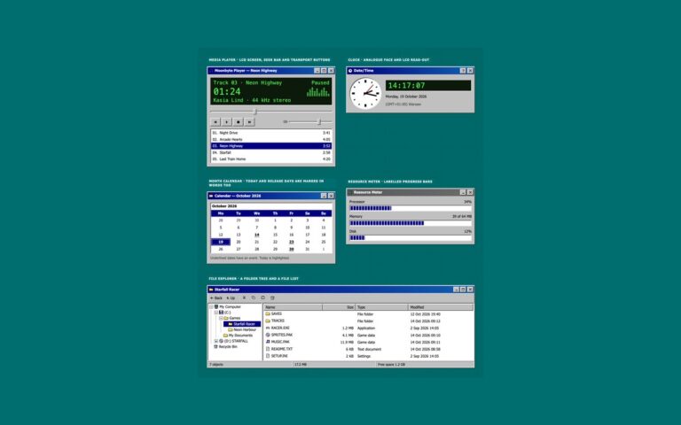
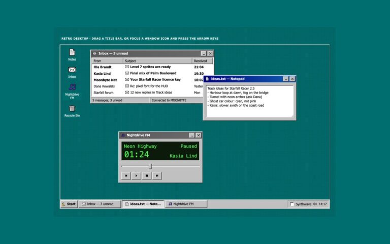
   A classic desktop OS look: grey bevelled faces, navy title bars, sunken white fields on a dithered teal desktop.
   Bevels are four 1px inset shadows built from --retro-hilite, --retro-light, --retro-shadow and --retro-dark,
   so one change to a token re-colours every button, field and window in the kit. */
:root{
  --retro-desk:#006e6e;        /* desktop behind the windows */
  --retro-desk-text:#ffffff;   /* captions and icon labels on the desktop, 6.1:1 */
  --retro-desk-dither:rgba(0,0,0,.22);
  --retro-face:#c0c0c0;        /* window, button and bar faces */
  --retro-hilite:#ffffff;      /* bevel: outer light edge */
  --retro-light:#dfdfdf;       /* bevel: inner light edge */
  --retro-shadow:#808080;      /* bevel: inner dark edge */
  --retro-dark:#0a0a0a;        /* bevel: outer dark edge */
  --retro-text:#000000;        /* text on faces, 11.5:1 */
  --retro-muted:#3d3d3d;       /* secondary text on faces, 6:1 */
  --retro-field:#ffffff;       /* inputs, lists and document areas */
  --retro-field-text:#000000;
  --retro-title:#000080;       /* active title bar gradient, white text 6.3:1 or more */
  --retro-title-2:#1060b0;
  --retro-title-text:#ffffff;
  --retro-idle:#5a5a5a;        /* inactive title bar gradient, white text 5.3:1 or more */
  --retro-idle-2:#6b6b6b;
  --retro-idle-text:#ffffff;
  --retro-select:#000080;      /* highlighted menu items, rows and dates */
  --retro-select-text:#ffffff;
  --retro-link:#0000cc;        /* 6.2:1 on faces */
  --retro-danger:#8a0000;      /* error text, 5.5:1 on faces */
  --retro-tip:#ffffe1;         /* tooltips and balloons */
  --retro-tip-text:#000000;
  --retro-tip-line:#000000;
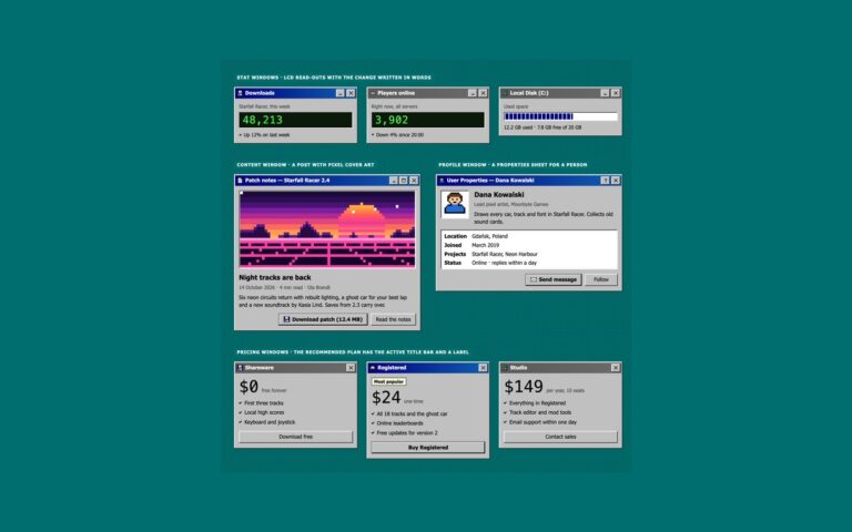
  --retro-lcd:#0b1a0b;         /* LCD read-outs */
  --retro-lcd-text:#4dff4d;
  --retro-accent:#000080;      /* progress chunks */
  --retro-disabled:#808080;    /* disabled text, embossed */
  --retro-emboss:#ffffff;
  --retro-dither-a:#ffffff;    /* checkerboard behind a latched toggle */
  --retro-dither-b:#c0c0c0;
  --retro-focus:#000000;       /* dotted focus rectangle */
  --retro-glow:0 0 #0000;      /* the synthwave theme adds a neon glow to windows */
  --retro-neon-pink:#ff3fa4;--retro-neon-cyan:#00e5ff;--retro-sun-1:#ffd23f;--retro-sun-2:#ff3fa4;
  --retro-font:Tahoma,"Microsoft Sans Serif","MS Sans Serif",Geneva,Verdana,"Segoe UI",sans-serif;
  --retro-mono:"VT323","Fixedsys","Lucida Console",Consolas,Menlo,"Courier New",ui-monospace,monospace;
}
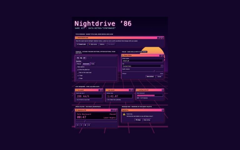
/* Synthwave 80s night theme: data-retro="synthwave" on any wrapper, or a checked .retro-theme-input inside a
   [data-retro] element. :is() is a forgiving list, so browsers without :has() still apply the attribute. */
[data-retro]:is([data-retro="synthwave"],:has(.retro-theme-input:checked)){
  --retro-desk:#14062b;--retro-desk-text:#fff1fb;--retro-desk-dither:rgba(255,63,164,.16);
  --retro-face:#261047;--retro-hilite:#ff6ec7;--retro-light:#a05cff;--retro-shadow:#0d0420;--retro-dark:#000000;
  --retro-text:#fff1fb;--retro-muted:#dcc6ff;--retro-field:#0e0322;--retro-field-text:#fff1fb;
  --retro-title:#ff8a3d;--retro-title-2:#ff3fa4;--retro-title-text:#1b0030;
  --retro-idle:#4a2d6e;--retro-idle-2:#5c3a85;--retro-idle-text:#f3e8ff;
  --retro-select:#00e5ff;--retro-select-text:#14062b;--retro-link:#7cf3ff;--retro-danger:#ff8fa3;
  --retro-tip:#2b1352;--retro-tip-text:#fff1fb;--retro-tip-line:#ff6ec7;
  --retro-lcd:#07010f;--retro-lcd-text:#ff5fd2;--retro-accent:#ff3fa4;
  --retro-disabled:#8a72b0;--retro-emboss:transparent;--retro-dither-a:#3d1a6e;--retro-dither-b:#261047;
  --retro-focus:#5ff4ff;--retro-glow:0 0 0 1px rgba(255,63,164,.45),0 0 22px rgba(255,63,164,.35);color-scheme:dark}
/* More contrast requested: secondary text turns full strength and the glow goes */
@media (prefers-contrast:more){:root,[data-retro],[data-retro]:is([data-retro="synthwave"],:has(.retro-theme-input:checked)){--retro-muted:var(--retro-text);--retro-glow:0 0 #0000}}
:root,[data-retro]{
  --retro-out:inset -1px -1px var(--retro-dark),inset 1px 1px var(--retro-hilite),inset -2px -2px var(--retro-shadow),inset 2px 2px var(--retro-light);
  --retro-in:inset -1px -1px var(--retro-hilite),inset 1px 1px var(--retro-dark),inset -2px -2px var(--retro-light),inset 2px 2px var(--retro-shadow);
  --retro-out-default:inset 0 0 0 1px var(--retro-dark),inset -2px -2px var(--retro-dark),inset 2px 2px var(--retro-hilite),inset -3px -3px var(--retro-shadow),inset 3px 3px var(--retro-light);
  --retro-in-default:inset 0 0 0 1px var(--retro-dark),inset 2px 2px var(--retro-shadow),inset -2px -2px var(--retro-shadow);
  --retro-sunken:inset -1px -1px var(--retro-hilite),inset 1px 1px var(--retro-shadow),inset -2px -2px var(--retro-light),inset 2px 2px var(--retro-dark);
  --retro-frame:inset -1px -1px var(--retro-dark),inset 1px 1px var(--retro-light),inset -2px -2px var(--retro-shadow),inset 2px 2px var(--retro-hilite);
  --retro-window:var(--retro-frame),var(--retro-glow);
  --retro-thin-in:inset -1px -1px var(--retro-hilite),inset 1px 1px var(--retro-shadow);
  --retro-thin-out:inset -1px -1px var(--retro-shadow),inset 1px 1px var(--retro-hilite);
  --retro-title-bg:linear-gradient(90deg,var(--retro-title),var(--retro-title-2));
  --retro-idle-bg:linear-gradient(90deg,var(--retro-idle),var(--retro-idle-2));
  --retro-dither:repeating-conic-gradient(var(--retro-dither-a) 0 25%,var(--retro-dither-b) 0 50%) 0 0/2px 2px;
  --retro-wallpaper:radial-gradient(var(--retro-desk-dither) 1px,transparent 1.5px) 0 0/4px 4px,var(--retro-desk);
  --retro-check-mask:url("data:image/svg+xml,%3Csvg%20xmlns='http://www.w3.org/2000/svg'%20viewBox='0%200%207%207'%20shape-rendering='crispEdges'%3E%3Crect%20x='6'%20y='0'%20width='1'%20height='1'%20fill='%23000'/%3E%3Crect%20x='5'%20y='1'%20width='2'%20height='1'%20fill='%23000'/%3E%3Crect%20x='0'%20y='2'%20width='1'%20height='1'%20fill='%23000'/%3E%3Crect%20x='4'%20y='2'%20width='3'%20height='1'%20fill='%23000'/%3E%3Crect%20x='0'%20y='3'%20width='2'%20height='1'%20fill='%23000'/%3E%3Crect%20x='3'%20y='3'%20width='3'%20height='1'%20fill='%23000'/%3E%3Crect%20x='0'%20y='4'%20width='5'%20height='1'%20fill='%23000'/%3E%3Crect%20x='1'%20y='5'%20width='3'%20height='1'%20fill='%23000'/%3E%3Crect%20x='2'%20y='6'%20width='1'%20height='1'%20fill='%23000'/%3E%3C/svg%3E");
  --retro-arrow-mask:url("data:image/svg+xml,%3Csvg%20xmlns='http://www.w3.org/2000/svg'%20viewBox='0%200%207%204'%20shape-rendering='crispEdges'%3E%3Crect%20x='0'%20y='0'%20width='7'%20height='1'%20fill='%23000'/%3E%3Crect%20x='1'%20y='1'%20width='5'%20height='1'%20fill='%23000'/%3E%3Crect%20x='2'%20y='2'%20width='3'%20height='1'%20fill='%23000'/%3E%3Crect%20x='3'%20y='3'%20width='1'%20height='1'%20fill='%23000'/%3E%3C/svg%3E");
}
[data-retro]{color:var(--retro-text);font-family:var(--retro-font)}
/* Components */
:where([class*="retro-"]),:where([class*="retro-"])::before,:where([class*="retro-"])::after{box-sizing:border-box}
.retro-sr{position:absolute;width:1px;height:1px;padding:0;margin:-1px;overflow:hidden;clip:rect(0,0,0,0);white-space:nowrap;border:0}
.retro-ico{display:block;flex:none;width:16px;height:16px;shape-rendering:crispEdges}
.retro-ico--md{width:24px;height:24px}
.retro-ico--lg{width:32px;height:32px}
.retro-glyph{display:block;flex:none;shape-rendering:crispEdges}
.retro-link{color:var(--retro-link);text-decoration:underline;text-underline-offset:2px}
.retro-link:hover{color:var(--retro-link);text-decoration-thickness:2px}
.retro-link:focus-visible{outline:2px dotted var(--retro-focus);outline-offset:2px}
.retro-muted{color:var(--retro-muted)}
.retro-cluster{display:flex;flex-wrap:wrap;align-items:center;gap:10px}
.retro-grid{display:grid;grid-template-columns:repeat(auto-fit,minmax(min(100%,250px),1fr));gap:24px;align-items:start}
.retro-stack{display:grid;gap:10px}
/* Push buttons: raised bevel; pressing swaps it for the sunken one. The default button gets an extra dark frame */
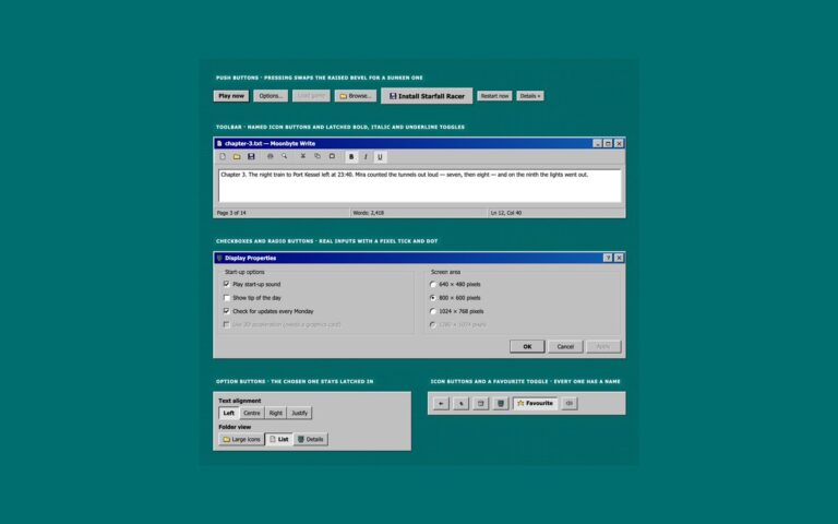
.retro-btn{display:inline-flex;align-items:center;justify-content:center;gap:6px;min-width:88px;min-height:32px;margin:0;padding:5px 14px;border:0;border-radius:0;
  background:var(--retro-face);color:var(--retro-text);box-shadow:var(--retro-out);font:400 .875rem/1.2 var(--retro-font);text-align:center;text-decoration:none;cursor:pointer}
.retro-btn:hover{color:var(--retro-text)}
.retro-btn:active:not(:disabled){box-shadow:var(--retro-in)}
.retro-btn:focus-visible{outline:2px dotted var(--retro-focus);outline-offset:-6px}
.retro-btn--default{box-shadow:var(--retro-out-default);font-weight:700}
.retro-btn--default:active:not(:disabled){box-shadow:var(--retro-in-default)}
.retro-btn--sm{min-width:0;min-height:26px;padding:3px 10px;font-size:.8125rem}
.retro-btn--lg{min-height:42px;padding:8px 22px;font-size:1rem;font-weight:700}
.retro-btn--block{width:100%}
.retro-btn:disabled{color:var(--retro-disabled);text-shadow:1px 1px 0 var(--retro-emboss);cursor:default}
.retro-btn:disabled .retro-ico{opacity:.5}
/* Checkboxes and radio buttons: real inputs with appearance:none, a sunken white well and a pixel tick or dot.
   Focus draws the classic dotted rectangle round the label text */
.retro-check{display:inline-flex;align-items:center;gap:8px;min-height:24px;margin:0;color:var(--retro-text);font:400 .875rem/1.3 var(--retro-font);cursor:pointer}
.retro-check__box{appearance:none;display:grid;place-content:center;flex:none;width:16px;height:16px;margin:0;border:0;border-radius:0;
  background:var(--retro-field);box-shadow:var(--retro-sunken);cursor:pointer}
.retro-check__box::before{content:"";width:10px;height:10px;background:var(--retro-field-text);
  -webkit-mask:var(--retro-check-mask) center/contain no-repeat;mask:var(--retro-check-mask) center/contain no-repeat;scale:0}
.retro-check__box[type="radio"]{border-radius:50%}
.retro-check__box[type="radio"]::before{width:6px;height:6px;border-radius:50%;-webkit-mask:none;mask:none}
.retro-check__box:checked::before{scale:1}
.retro-check__box:focus-visible{outline:0}
.retro-check__box:focus-visible+span{outline:2px dotted var(--retro-focus);outline-offset:1px}
.retro-check__box:disabled{background:var(--retro-face);cursor:default}
.retro-check__box:disabled::before{background:var(--retro-disabled)}
.retro-check__box:disabled+span{color:var(--retro-disabled);text-shadow:1px 1px 0 var(--retro-emboss)}
/* Group box: an etched frame with the legend sitting in the line */
.retro-group{min-width:0;margin:0;padding:10px 12px 12px;border:1px solid var(--retro-shadow);border-radius:0;box-shadow:inset 1px 1px var(--retro-hilite),1px 1px var(--retro-hilite)}
.retro-group__legend{float:none;width:auto;margin:0;padding:0 4px;color:var(--retro-text);font:400 .875rem/1.3 var(--retro-font)}
/* Window: a bevelled frame, a gradient title bar with labelled controls, a body and an optional status bar */
.retro-window{display:flex;flex-direction:column;min-width:0;padding:3px;background:var(--retro-face);color:var(--retro-text);box-shadow:var(--retro-window);font:400 .875rem/1.4 var(--retro-font)}
.retro-window :where(h2,h3,h4,p,ul,ol,dl,dd,figure){margin:0}
.retro-titlebar{display:flex;align-items:center;gap:6px;min-height:28px;padding:2px 3px 2px 5px;background:var(--retro-title-bg);color:var(--retro-title-text)}
.retro-titlebar--idle{background:var(--retro-idle-bg);color:var(--retro-idle-text)}
.retro-titlebar__title{display:flex;align-items:center;gap:6px;flex:1;min-width:0;margin:0;color:inherit;font:700 .875rem/1.2 var(--retro-font)}
.retro-titlebar__title span{min-width:0;overflow:hidden;text-overflow:ellipsis;white-space:nowrap}
.retro-titlebar__controls{display:flex;flex:none;gap:2px}
.retro-ctl{display:grid;place-items:center;width:24px;height:22px;margin:0;padding:0;border:0;border-radius:0;background:var(--retro-face);color:var(--retro-text);box-shadow:var(--retro-out);cursor:pointer}
.retro-ctl:active{box-shadow:var(--retro-in)}
.retro-ctl:focus-visible{outline:2px dotted var(--retro-focus);outline-offset:-5px}
.retro-ctl--close{margin-left:2px}
.retro-window__body{padding:12px 10px}
.retro-statusbar{display:flex;flex-wrap:wrap;gap:2px;margin-top:2px}
.retro-statusbar>*{flex:1 1 auto;padding:3px 7px;box-shadow:var(--retro-thin-in);font-size:.8125rem}
/* Panel: a window face without a title bar, for grouping controls */
.retro-panel{min-width:0;padding:14px;background:var(--retro-face);color:var(--retro-text);box-shadow:var(--retro-window);font:400 .875rem/1.4 var(--retro-font)}
.retro-panel :where(h2,h3,p,ul,ol){margin:0}
.retro-actions{display:flex;flex-wrap:wrap;justify-content:flex-end;gap:8px}
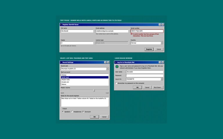
.retro-formrow{display:grid;grid-template-columns:minmax(96px,auto) minmax(0,1fr);align-items:center;gap:6px 10px}
.retro-formrow .retro-label{margin:0}
@media (max-width:480px){.retro-formrow{grid-template-columns:minmax(0,1fr)}}
/* Toolbar: flat icon buttons that show a thin bevel on hover and sink when pressed or latched */
.retro-toolbar{display:flex;flex-wrap:wrap;align-items:center;gap:2px;padding:3px 4px;background:var(--retro-face);box-shadow:var(--retro-thin-out)}
.retro-tool{display:inline-flex;align-items:center;justify-content:center;gap:6px;min-width:34px;height:32px;margin:0;padding:0 7px;border:0;border-radius:0;
  background:transparent;color:var(--retro-text);font:400 .875rem/1 var(--retro-font);cursor:pointer}
.retro-tool:hover{box-shadow:var(--retro-thin-out)}
.retro-tool:active{box-shadow:var(--retro-thin-in)}
.retro-tool:focus-visible{outline:2px dotted var(--retro-focus);outline-offset:-4px}
.retro-tooltog{position:relative;display:inline-flex}
.retro-tooltog .retro-tool{font-size:1rem}
.retro-tooltog input:checked+.retro-tool{box-shadow:var(--retro-thin-in);background:var(--retro-dither)}
.retro-tooltog input:focus-visible+.retro-tool{outline:2px dotted var(--retro-focus);outline-offset:-4px}
.retro-sep{align-self:stretch;width:2px;margin:3px 4px;box-shadow:inset 1px 0 var(--retro-shadow),inset -1px 0 var(--retro-hilite)}
/* Progress: chunked blocks in a sunken well. The marquee variant is for unknown durations */
.retro-progress{position:relative;height:24px;padding:4px;overflow:hidden;background:var(--retro-field);box-shadow:var(--retro-sunken)}
.retro-progress__bar{width:var(--retro-value,0%);height:100%;background:repeating-linear-gradient(90deg,var(--retro-accent) 0 9px,transparent 9px 11px)}
.retro-progress--marquee .retro-progress__bar{width:30%;animation:retro-marquee 2.6s steps(26) infinite}
@keyframes retro-marquee{from{translate:-100% 0}to{translate:340% 0}}
/* Message boxes: an icon, the message and centred buttons */
.retro-msg{display:flex;align-items:flex-start;gap:14px;padding:16px 14px 8px}
.retro-msg__text{display:grid;gap:6px;padding-top:4px}
.retro-actions--center{justify-content:center;padding:10px 12px 12px}
/* Native <dialog>: focus moves in, Tab stays inside and Escape closes it */
.retro-dialog{width:min(430px,calc(100vw - 32px));max-width:none;margin:auto;padding:0;border:0;background:transparent;color:var(--retro-text);overflow:visible}
.retro-dialog::backdrop{background:rgba(0,0,0,.45)}
.retro-dialog[open]{animation:retro-open .2s steps(4)}
@keyframes retro-open{from{clip-path:inset(0 100% 100% 0)}to{clip-path:inset(0)}}
/* Balloon toasts from the system tray, in a polite live region */
.retro-toasts{display:grid;gap:24px;justify-items:end}
.retro-balloon{position:relative;display:flex;gap:10px;width:min(100%,380px);padding:10px 40px 12px 12px;border:1px solid var(--retro-tip-line);border-radius:8px;background:var(--retro-tip);color:var(--retro-tip-text);
  box-shadow:2px 2px 0 rgba(0,0,0,.35);font:400 .875rem/1.4 var(--retro-font)}
.retro-balloon[hidden]{display:none}
.retro-balloon::before,.retro-balloon::after{content:"";position:absolute;right:42px;clip-path:polygon(0 0,100% 0,100% 100%)}
.retro-balloon::before{bottom:-14px;width:18px;height:14px;margin-right:-1px;background:var(--retro-tip-line)}
.retro-balloon::after{bottom:-12px;width:16px;height:13px;background:var(--retro-tip)}
.retro-balloon p{margin:0}
.retro-balloon__title{font-weight:700}
.retro-balloon .retro-ctl{position:absolute;top:6px;right:6px;width:22px;height:20px}
.retro-balloon[data-new]{animation:retro-pop .24s steps(3)}
@keyframes retro-pop{from{opacity:0;translate:0 8px}to{opacity:1;translate:0}}
/* Tooltips: shown on hover and keyboard focus, hidden again with Escape */
.retro-tipwrap{position:relative;display:inline-flex}
.retro-tooltip{position:absolute;top:calc(100% + 6px);left:50%;z-index:10;width:max-content;max-width:220px;padding:3px 7px;border:1px solid var(--retro-tip-line);background:var(--retro-tip);color:var(--retro-tip-text);
  box-shadow:2px 2px 0 rgba(0,0,0,.35);font:400 .8125rem/1.3 var(--retro-font);translate:-50% 0;pointer-events:none;opacity:0;visibility:hidden;transition:opacity .12s,visibility .12s}
.retro-tipwrap:hover .retro-tooltip,.retro-tipwrap:focus-within .retro-tooltip{opacity:1;visibility:visible}
.retro-tipwrap.is-dismissed .retro-tooltip{opacity:0;visibility:hidden}
.retro-tooltip--static{position:static;display:inline-block;translate:none;opacity:1;visibility:visible}
.retro-mt{margin-top:24px}
.retro-grid--wide{grid-template-columns:repeat(auto-fit,minmax(min(100%,400px),1fr))}
.retro-mb{margin:0 0 12px}
.retro-tipnote{display:flex;flex-wrap:wrap;align-items:center;gap:10px;margin:44px 0 0;color:var(--retro-muted)}
.retro-copyrow{display:flex;align-items:center;gap:12px;margin-bottom:12px}
.retro-copyfoot{display:flex;flex-wrap:wrap;align-items:center;justify-content:space-between;gap:10px;margin-top:12px}
@media (prefers-reduced-motion:reduce){[class*="retro-"],[class*="retro-"]::before,[class*="retro-"]::after{transition:none!important;animation:none!important}}
JavaScript
// Dialog: open with showModal(); the title bar close button closes it, OK and Cancel close it through method="dialog"
document.querySelectorAll('[data-retro-open]').forEach(function (btn) {
  var dlg = document.getElementById(btn.dataset.retroOpen);
  btn.addEventListener('click', function () { dlg.showModal(); });
  dlg.querySelectorAll('[data-retro-close]').forEach(function (x) { x.addEventListener('click', function () { dlg.close(); }); });
});
// Balloons: the close button hides one and moves focus to the Show button; Show reveals the hidden one
document.querySelectorAll('[data-retro-dismiss]').forEach(function (x) {
  x.addEventListener('click', function () {
    x.parentElement.hidden = true;
    var show = document.querySelector('[data-retro-show]'); if (show) show.focus();
  });
});
document.querySelectorAll('[data-retro-show]').forEach(function (btn) {
  btn.addEventListener('click', function () {
    var b = document.getElementById(btn.dataset.retroShow);
    b.hidden = false; b.setAttribute('data-new', '');
  });
});
// Tooltips: Escape hides the one being shown until the pointer or focus leaves it
document.addEventListener('keydown', function (e) {
  if (e.key !== 'Escape') return;
  document.querySelectorAll('[role="tooltip"]').forEach(function (t) {
    var wrap = t.parentElement;
    if (wrap.matches(':hover, :focus-within')) wrap.classList.add('is-dismissed');
  });
});
document.querySelectorAll('[role="tooltip"]').forEach(function (t) {
  var wrap = t.parentElement;
  ['mouseleave', 'focusout'].forEach(function (ev) { wrap.addEventListener(ev, function () { wrap.classList.remove('is-dismissed'); }); });
});
/* ── Retro UI kit tokens (uiCookies) — identical in every set ─────────────
   A classic desktop OS look: grey bevelled faces, navy title bars, sunken white fields on a dithered teal desktop.
   Bevels are four 1px inset shadows built from --retro-hilite, --retro-light, --retro-shadow and --retro-dark,
   so one change to a token re-colours every button, field and window in the kit. */
:root{
  --retro-desk:#006e6e;        /* desktop behind the windows */
  --retro-desk-text:#ffffff;   /* captions and icon labels on the desktop, 6.1:1 */
  --retro-desk-dither:rgba(0,0,0,.22);
  --retro-face:#c0c0c0;        /* window, button and bar faces */
  --retro-hilite:#ffffff;      /* bevel: outer light edge */
  --retro-light:#dfdfdf;       /* bevel: inner light edge */
  --retro-shadow:#808080;      /* bevel: inner dark edge */
  --retro-dark:#0a0a0a;        /* bevel: outer dark edge */
  --retro-text:#000000;        /* text on faces, 11.5:1 */
  --retro-muted:#3d3d3d;       /* secondary text on faces, 6:1 */
  --retro-field:#ffffff;       /* inputs, lists and document areas */
  --retro-field-text:#000000;
  --retro-title:#000080;       /* active title bar gradient, white text 6.3:1 or more */
  --retro-title-2:#1060b0;
  --retro-title-text:#ffffff;
  --retro-idle:#5a5a5a;        /* inactive title bar gradient, white text 5.3:1 or more */
  --retro-idle-2:#6b6b6b;
  --retro-idle-text:#ffffff;
  --retro-select:#000080;      /* highlighted menu items, rows and dates */
  --retro-select-text:#ffffff;
  --retro-link:#0000cc;        /* 6.2:1 on faces */
  --retro-danger:#8a0000;      /* error text, 5.5:1 on faces */
  --retro-tip:#ffffe1;         /* tooltips and balloons */
  --retro-tip-text:#000000;
  --retro-tip-line:#000000;
  --retro-lcd:#0b1a0b;         /* LCD read-outs */
  --retro-lcd-text:#4dff4d;
  --retro-accent:#000080;      /* progress chunks */
  --retro-disabled:#808080;    /* disabled text, embossed */
  --retro-emboss:#ffffff;
  --retro-dither-a:#ffffff;    /* checkerboard behind a latched toggle */
  --retro-dither-b:#c0c0c0;
  --retro-focus:#000000;       /* dotted focus rectangle */
  --retro-glow:0 0 #0000;      /* the synthwave theme adds a neon glow to windows */
  --retro-neon-pink:#ff3fa4;--retro-neon-cyan:#00e5ff;--retro-sun-1:#ffd23f;--retro-sun-2:#ff3fa4;
  --retro-font:Tahoma,"Microsoft Sans Serif","MS Sans Serif",Geneva,Verdana,"Segoe UI",sans-serif;
  --retro-mono:"VT323","Fixedsys","Lucida Console",Consolas,Menlo,"Courier New",ui-monospace,monospace;
}
/* Synthwave 80s night theme: data-retro="synthwave" on any wrapper, or a checked .retro-theme-input inside a
   [data-retro] element. :is() is a forgiving list, so browsers without :has() still apply the attribute. */
[data-retro]:is([data-retro="synthwave"],:has(.retro-theme-input:checked)){
  --retro-desk:#14062b;--retro-desk-text:#fff1fb;--retro-desk-dither:rgba(255,63,164,.16);
  --retro-face:#261047;--retro-hilite:#ff6ec7;--retro-light:#a05cff;--retro-shadow:#0d0420;--retro-dark:#000000;
  --retro-text:#fff1fb;--retro-muted:#dcc6ff;--retro-field:#0e0322;--retro-field-text:#fff1fb;
  --retro-title:#ff8a3d;--retro-title-2:#ff3fa4;--retro-title-text:#1b0030;
  --retro-idle:#4a2d6e;--retro-idle-2:#5c3a85;--retro-idle-text:#f3e8ff;
  --retro-select:#00e5ff;--retro-select-text:#14062b;--retro-link:#7cf3ff;--retro-danger:#ff8fa3;
  --retro-tip:#2b1352;--retro-tip-text:#fff1fb;--retro-tip-line:#ff6ec7;
  --retro-lcd:#07010f;--retro-lcd-text:#ff5fd2;--retro-accent:#ff3fa4;
  --retro-disabled:#8a72b0;--retro-emboss:transparent;--retro-dither-a:#3d1a6e;--retro-dither-b:#261047;
  --retro-focus:#5ff4ff;--retro-glow:0 0 0 1px rgba(255,63,164,.45),0 0 22px rgba(255,63,164,.35);color-scheme:dark}
/* More contrast requested: secondary text turns full strength and the glow goes */
@media (prefers-contrast:more){:root,[data-retro],[data-retro]:is([data-retro="synthwave"],:has(.retro-theme-input:checked)){--retro-muted:var(--retro-text);--retro-glow:0 0 #0000}}
:root,[data-retro]{
  --retro-out:inset -1px -1px var(--retro-dark),inset 1px 1px var(--retro-hilite),inset -2px -2px var(--retro-shadow),inset 2px 2px var(--retro-light);
  --retro-in:inset -1px -1px var(--retro-hilite),inset 1px 1px var(--retro-dark),inset -2px -2px var(--retro-light),inset 2px 2px var(--retro-shadow);
  --retro-out-default:inset 0 0 0 1px var(--retro-dark),inset -2px -2px var(--retro-dark),inset 2px 2px var(--retro-hilite),inset -3px -3px var(--retro-shadow),inset 3px 3px var(--retro-light);
  --retro-in-default:inset 0 0 0 1px var(--retro-dark),inset 2px 2px var(--retro-shadow),inset -2px -2px var(--retro-shadow);
  --retro-sunken:inset -1px -1px var(--retro-hilite),inset 1px 1px var(--retro-shadow),inset -2px -2px var(--retro-light),inset 2px 2px var(--retro-dark);
  --retro-frame:inset -1px -1px var(--retro-dark),inset 1px 1px var(--retro-light),inset -2px -2px var(--retro-shadow),inset 2px 2px var(--retro-hilite);
  --retro-window:var(--retro-frame),var(--retro-glow);
  --retro-thin-in:inset -1px -1px var(--retro-hilite),inset 1px 1px var(--retro-shadow);
  --retro-thin-out:inset -1px -1px var(--retro-shadow),inset 1px 1px var(--retro-hilite);
  --retro-title-bg:linear-gradient(90deg,var(--retro-title),var(--retro-title-2));
  --retro-idle-bg:linear-gradient(90deg,var(--retro-idle),var(--retro-idle-2));
  --retro-dither:repeating-conic-gradient(var(--retro-dither-a) 0 25%,var(--retro-dither-b) 0 50%) 0 0/2px 2px;
  --retro-wallpaper:radial-gradient(var(--retro-desk-dither) 1px,transparent 1.5px) 0 0/4px 4px,var(--retro-desk);
  --retro-check-mask:url("data:image/svg+xml,%3Csvg%20xmlns='http://www.w3.org/2000/svg'%20viewBox='0%200%207%207'%20shape-rendering='crispEdges'%3E%3Crect%20x='6'%20y='0'%20width='1'%20height='1'%20fill='%23000'/%3E%3Crect%20x='5'%20y='1'%20width='2'%20height='1'%20fill='%23000'/%3E%3Crect%20x='0'%20y='2'%20width='1'%20height='1'%20fill='%23000'/%3E%3Crect%20x='4'%20y='2'%20width='3'%20height='1'%20fill='%23000'/%3E%3Crect%20x='0'%20y='3'%20width='2'%20height='1'%20fill='%23000'/%3E%3Crect%20x='3'%20y='3'%20width='3'%20height='1'%20fill='%23000'/%3E%3Crect%20x='0'%20y='4'%20width='5'%20height='1'%20fill='%23000'/%3E%3Crect%20x='1'%20y='5'%20width='3'%20height='1'%20fill='%23000'/%3E%3Crect%20x='2'%20y='6'%20width='1'%20height='1'%20fill='%23000'/%3E%3C/svg%3E");
  --retro-arrow-mask:url("data:image/svg+xml,%3Csvg%20xmlns='http://www.w3.org/2000/svg'%20viewBox='0%200%207%204'%20shape-rendering='crispEdges'%3E%3Crect%20x='0'%20y='0'%20width='7'%20height='1'%20fill='%23000'/%3E%3Crect%20x='1'%20y='1'%20width='5'%20height='1'%20fill='%23000'/%3E%3Crect%20x='2'%20y='2'%20width='3'%20height='1'%20fill='%23000'/%3E%3Crect%20x='3'%20y='3'%20width='1'%20height='1'%20fill='%23000'/%3E%3C/svg%3E");
}
[data-retro]{color:var(--retro-text);font-family:var(--retro-font)}
/* Bootstrap's own variables mapped onto the kit tokens */
:root,[data-retro]{--bs-body-bg:var(--retro-desk);--bs-body-color:var(--retro-text);--bs-body-font-family:var(--retro-font);--bs-emphasis-color:var(--retro-text);
  --bs-secondary-color:var(--retro-muted);--bs-border-color:var(--retro-shadow);--bs-border-radius:0;--bs-border-radius-sm:0;--bs-border-radius-lg:0;
  --bs-link-color:var(--retro-link);--bs-link-hover-color:var(--retro-link);--bs-focus-ring-color:var(--retro-focus)}
/* Components */
:where([class*="retro-"]),:where([class*="retro-"])::before,:where([class*="retro-"])::after{box-sizing:border-box}
.retro-sr{position:absolute;width:1px;height:1px;padding:0;margin:-1px;overflow:hidden;clip:rect(0,0,0,0);white-space:nowrap;border:0}
.retro-ico{display:block;flex:none;width:16px;height:16px;shape-rendering:crispEdges}
.retro-ico--md{width:24px;height:24px}
.retro-ico--lg{width:32px;height:32px}
.retro-glyph{display:block;flex:none;shape-rendering:crispEdges}
.retro-link{color:var(--retro-link);text-decoration:underline;text-underline-offset:2px}
.retro-link:hover{color:var(--retro-link);text-decoration-thickness:2px}
.retro-link:focus-visible{outline:2px dotted var(--retro-focus);outline-offset:2px}
.retro-muted{color:var(--retro-muted)}
.retro-cluster{display:flex;flex-wrap:wrap;align-items:center;gap:10px}
.retro-grid{display:grid;grid-template-columns:repeat(auto-fit,minmax(min(100%,250px),1fr));gap:24px;align-items:start}
.retro-stack{display:grid;gap:10px}
/* Buttons: Bootstrap .btn with a .btn-retro variant set through --bs-btn-* variables */
.btn-retro{--bs-btn-padding-x:14px;--bs-btn-padding-y:5px;--bs-btn-font-family:var(--retro-font);--bs-btn-font-size:.875rem;--bs-btn-font-weight:400;--bs-btn-line-height:1.2;
  --bs-btn-border-width:0;--bs-btn-border-radius:0;--bs-btn-bg:var(--retro-face);--bs-btn-color:var(--retro-text);--bs-btn-hover-bg:var(--retro-face);--bs-btn-hover-color:var(--retro-text);
  --bs-btn-active-bg:var(--retro-face);--bs-btn-active-color:var(--retro-text);--bs-btn-disabled-bg:var(--retro-face);--bs-btn-disabled-color:var(--retro-disabled);--bs-btn-disabled-opacity:1;
  display:inline-flex;align-items:center;justify-content:center;gap:6px;min-width:88px;min-height:32px;box-shadow:var(--retro-out)}
.btn-retro:active,.btn-retro.active,.btn-retro.show,.btn-check:checked+.btn-retro{box-shadow:var(--retro-in)}
.btn-retro:focus-visible,.btn-check:focus-visible+.btn-retro{box-shadow:var(--retro-out);outline:2px dotted var(--retro-focus);outline-offset:-6px}
.btn-check:checked:focus-visible+.btn-retro{box-shadow:var(--retro-in)}
.btn-retro:disabled{text-shadow:1px 1px 0 var(--retro-emboss)}
.btn-retro:disabled .retro-ico{opacity:.5}
.btn-retro-default{--bs-btn-font-weight:700;box-shadow:var(--retro-out-default)}
.btn-retro-default:focus-visible{box-shadow:var(--retro-out-default)}
.btn-retro-default:active{box-shadow:var(--retro-in-default)}
.btn-retro.btn-sm{--bs-btn-padding-x:10px;--bs-btn-padding-y:3px;--bs-btn-font-size:.8125rem;min-width:0;min-height:26px}
.btn-retro.btn-lg{--bs-btn-padding-x:22px;--bs-btn-padding-y:8px;--bs-btn-font-size:1rem;--bs-btn-font-weight:700;min-height:42px}
/* Checkboxes and radios: Bootstrap .form-check, with the input redrawn as a sunken well and a pixel tick */
.form-check.retro-fc{display:flex;align-items:center;gap:8px;min-height:24px;margin:0;padding:0;color:var(--retro-text);font:400 .875rem/1.3 var(--retro-font)}
.retro-fc .form-check-input{display:grid;place-content:center;flex:none;float:none;width:16px;height:16px;margin:0;border:0;border-radius:0;background:var(--retro-field);box-shadow:var(--retro-sunken);cursor:pointer}
.retro-fc .form-check-input:checked{background:var(--retro-field);background-image:none}
.retro-fc .form-check-input::before{content:"";width:10px;height:10px;background:var(--retro-field-text);
  -webkit-mask:var(--retro-check-mask) center/contain no-repeat;mask:var(--retro-check-mask) center/contain no-repeat;scale:0}
.retro-fc .form-check-input[type="radio"]{border-radius:50%}
.retro-fc .form-check-input[type="radio"]::before{width:6px;height:6px;border-radius:50%;-webkit-mask:none;mask:none}
.retro-fc .form-check-input:checked::before{scale:1}
.retro-fc .form-check-input:focus{box-shadow:var(--retro-sunken);outline:0}
.retro-fc .form-check-input:focus-visible+.form-check-label{outline:2px dotted var(--retro-focus);outline-offset:1px}
.retro-fc .form-check-label{cursor:pointer}
.retro-fc .form-check-input:disabled{background:var(--retro-face);opacity:1}
.retro-fc .form-check-input:disabled::before{background:var(--retro-disabled)}
.retro-fc .form-check-input:disabled~.form-check-label{color:var(--retro-disabled);text-shadow:1px 1px 0 var(--retro-emboss);opacity:1}
/* Group box: an etched frame with the legend sitting in the line */
.retro-group{min-width:0;margin:0;padding:10px 12px 12px;border:1px solid var(--retro-shadow);border-radius:0;box-shadow:inset 1px 1px var(--retro-hilite),1px 1px var(--retro-hilite)}
.retro-group__legend{float:none;width:auto;margin:0;padding:0 4px;color:var(--retro-text);font:400 .875rem/1.3 var(--retro-font)}
/* Window: a bevelled frame, a gradient title bar with labelled controls, a body and an optional status bar */
.retro-window{display:flex;flex-direction:column;min-width:0;padding:3px;background:var(--retro-face);color:var(--retro-text);box-shadow:var(--retro-window);font:400 .875rem/1.4 var(--retro-font)}
.retro-window :where(h2,h3,h4,p,ul,ol,dl,dd,figure){margin:0}
.retro-titlebar{display:flex;align-items:center;gap:6px;min-height:28px;padding:2px 3px 2px 5px;background:var(--retro-title-bg);color:var(--retro-title-text)}
.retro-titlebar--idle{background:var(--retro-idle-bg);color:var(--retro-idle-text)}
.retro-titlebar__title{display:flex;align-items:center;gap:6px;flex:1;min-width:0;margin:0;color:inherit;font:700 .875rem/1.2 var(--retro-font)}
.retro-titlebar__title span{min-width:0;overflow:hidden;text-overflow:ellipsis;white-space:nowrap}
.retro-titlebar__controls{display:flex;flex:none;gap:2px}
.retro-ctl{display:grid;place-items:center;width:24px;height:22px;margin:0;padding:0;border:0;border-radius:0;background:var(--retro-face);color:var(--retro-text);box-shadow:var(--retro-out);cursor:pointer}
.retro-ctl:active{box-shadow:var(--retro-in)}
.retro-ctl:focus-visible{outline:2px dotted var(--retro-focus);outline-offset:-5px}
.retro-ctl--close{margin-left:2px}
.retro-window__body{padding:12px 10px}
.retro-statusbar{display:flex;flex-wrap:wrap;gap:2px;margin-top:2px}
.retro-statusbar>*{flex:1 1 auto;padding:3px 7px;box-shadow:var(--retro-thin-in);font-size:.8125rem}
/* Windows: Bootstrap .card with the header as a title bar */
.card.retro-window{--bs-card-bg:var(--retro-face);--bs-card-color:var(--retro-text);--bs-card-border-width:0;--bs-card-border-radius:0;--bs-card-inner-border-radius:0;
  --bs-card-spacer-y:12px;--bs-card-spacer-x:10px;--bs-card-cap-padding-y:2px;--bs-card-cap-padding-x:5px;--bs-card-cap-bg:transparent;--bs-card-cap-color:var(--retro-title-text)}
.card-header.retro-titlebar{border-bottom:0;padding:2px 3px 2px 5px}
.card-header.retro-titlebar:first-child{border-radius:0}
.card-footer.retro-statusbar{padding:0;border-top:0;background:transparent}
.card-footer.retro-statusbar:last-child{border-radius:0}
.card-footer.retro-statusbar{color:var(--retro-text)}
/* Panel: a window face without a title bar, for grouping controls */
.retro-panel{min-width:0;padding:14px;background:var(--retro-face);color:var(--retro-text);box-shadow:var(--retro-window);font:400 .875rem/1.4 var(--retro-font)}
.retro-panel :where(h2,h3,p,ul,ol){margin:0}
.retro-actions{display:flex;flex-wrap:wrap;justify-content:flex-end;gap:8px}
.retro-formrow{display:grid;grid-template-columns:minmax(96px,auto) minmax(0,1fr);align-items:center;gap:6px 10px}
.retro-formrow .retro-label{margin:0}
@media (max-width:480px){.retro-formrow{grid-template-columns:minmax(0,1fr)}}
/* Toolbar: Bootstrap .btn-toolbar with flat .btn tools; latched toggles are .btn-check checkboxes */
.retro-toolbar{display:flex;flex-wrap:wrap;align-items:center;gap:2px;padding:3px 4px;background:var(--retro-face);box-shadow:var(--retro-thin-out)}
.btn.retro-tool{--bs-btn-padding-x:7px;--bs-btn-padding-y:0;--bs-btn-border-width:0;--bs-btn-border-radius:0;--bs-btn-font-family:var(--retro-font);--bs-btn-font-size:.875rem;--bs-btn-line-height:1;
  --bs-btn-color:var(--retro-text);--bs-btn-bg:transparent;--bs-btn-hover-color:var(--retro-text);--bs-btn-hover-bg:transparent;--bs-btn-active-color:var(--retro-text);--bs-btn-active-bg:transparent;
  display:inline-flex;align-items:center;justify-content:center;gap:6px;min-width:34px;height:32px}
.btn.retro-tool:hover{box-shadow:var(--retro-thin-out)}
.btn.retro-tool:active{box-shadow:var(--retro-thin-in)}
.btn.retro-tool:focus-visible,.btn-check:focus-visible+.retro-tool{box-shadow:none;outline:2px dotted var(--retro-focus);outline-offset:-4px}
label.retro-tool{font-size:1rem}
.btn-check:checked+.retro-tool,.btn-check:checked:focus-visible+.retro-tool{box-shadow:var(--retro-thin-in);background:var(--retro-dither)}
.retro-sep{align-self:stretch;width:2px;margin:3px 4px;box-shadow:inset 1px 0 var(--retro-shadow),inset -1px 0 var(--retro-hilite)}
/* Progress: Bootstrap .progress with a chunked bar */
.progress.retro-progress{--bs-progress-height:24px;--bs-progress-bg:var(--retro-field);--bs-progress-border-radius:0;--bs-progress-bar-bg:transparent;--bs-progress-bar-transition:none}
.progress.retro-progress{padding:4px;box-shadow:var(--retro-sunken)}
.retro-progress .progress-bar{background:repeating-linear-gradient(90deg,var(--retro-accent) 0 9px,transparent 9px 11px)}
.retro-progress--marquee .progress-bar{animation:retro-marquee 2.6s steps(26) infinite}
@keyframes retro-marquee{from{translate:-100% 0}to{translate:340% 0}}
/* Message boxes: an icon, the message and centred buttons */
.retro-msg{display:flex;align-items:flex-start;gap:14px;padding:16px 14px 8px}
.retro-msg__text{display:grid;gap:6px;padding-top:4px}
.retro-actions--center{justify-content:center;padding:10px 12px 12px}
/* Native <dialog>: focus moves in, Tab stays inside and Escape closes it */
.retro-dialog{width:min(430px,calc(100vw - 32px));max-width:none;margin:auto;padding:0;border:0;background:transparent;color:var(--retro-text);overflow:visible}
.retro-dialog::backdrop{background:rgba(0,0,0,.45)}
.retro-dialog[open]{animation:retro-open .2s steps(4)}
@keyframes retro-open{from{clip-path:inset(0 100% 100% 0)}to{clip-path:inset(0)}}
/* Dialog: Bootstrap .modal with the content drawn as a window */
.retro-modal{--bs-modal-width:430px;--bs-modal-bg:var(--retro-face);--bs-modal-color:var(--retro-text);--bs-modal-border-width:0;--bs-modal-border-radius:0;--bs-modal-inner-border-radius:0;--bs-backdrop-opacity:.45}
.retro-modal .modal-content.retro-window{box-shadow:var(--retro-window)}
.retro-modal .modal-header.retro-titlebar{padding:2px 3px 2px 5px;border:0}
.retro-modal.show .modal-content{animation:retro-open .2s steps(4)}
@keyframes retro-open{from{clip-path:inset(0 100% 100% 0)}to{clip-path:inset(0)}}
/* Balloon toasts: Bootstrap .toast restyled through --bs-toast-* variables */
.toast.retro-balloon{--bs-toast-bg:var(--retro-tip);--bs-toast-color:var(--retro-tip-text);--bs-toast-border-color:var(--retro-tip-line);--bs-toast-border-width:1px;--bs-toast-border-radius:8px;
  --bs-toast-max-width:380px;--bs-toast-font-size:.875rem;--bs-toast-box-shadow:2px 2px 0 rgba(0,0,0,.35);--bs-toast-padding-x:12px;--bs-toast-padding-y:10px;
  position:relative;display:flex;gap:10px;width:min(100%,380px);padding:10px 40px 12px 12px;font-family:var(--retro-font);line-height:1.4}
.toast.retro-balloon:not(.show){display:none}
.toast.retro-balloon::before,.toast.retro-balloon::after{content:"";position:absolute;right:42px;clip-path:polygon(0 0,100% 0,100% 100%)}
.toast.retro-balloon::before{bottom:-14px;width:18px;height:14px;margin-right:-1px;background:var(--retro-tip-line)}
.toast.retro-balloon::after{bottom:-12px;width:16px;height:13px;background:var(--retro-tip)}
.retro-balloon p{margin:0}
.retro-balloon__title{font-weight:700}
.retro-balloon .retro-ctl{position:absolute;top:6px;right:6px;width:22px;height:20px}
.retro-toasts{display:grid;gap:24px;justify-items:end}
/* Tooltips: Bootstrap's tooltip plugin with a .retro-tip custom class */
.tooltip.retro-tip{--bs-tooltip-bg:var(--retro-tip);--bs-tooltip-color:var(--retro-tip-text);--bs-tooltip-border-radius:0;--bs-tooltip-opacity:1;--bs-tooltip-font-size:.8125rem;--bs-tooltip-padding-x:7px;--bs-tooltip-padding-y:3px;font-family:var(--retro-font)}
.tooltip.retro-tip .tooltip-inner{border:1px solid var(--retro-tip-line);box-shadow:2px 2px 0 rgba(0,0,0,.35)}
.tooltip.retro-tip .tooltip-arrow{display:none}
.retro-tooltip--static{display:inline-block;padding:3px 7px;border:1px solid var(--retro-tip-line);background:var(--retro-tip);color:var(--retro-tip-text);box-shadow:2px 2px 0 rgba(0,0,0,.35);font:400 .8125rem/1.3 var(--retro-font)}
.retro-mt{margin-top:24px}
.retro-grid--wide{grid-template-columns:repeat(auto-fit,minmax(min(100%,400px),1fr))}
.retro-mb{margin:0 0 12px}
.retro-tipnote{display:flex;flex-wrap:wrap;align-items:center;gap:10px;margin:44px 0 0;color:var(--retro-muted)}
.retro-copyrow{display:flex;align-items:center;gap:12px;margin-bottom:12px}
.retro-copyfoot{display:flex;flex-wrap:wrap;align-items:center;justify-content:space-between;gap:10px;margin-top:12px}
.retro-copyfoot p{margin:0}
.retro-panel .retro-mb{margin:0 0 12px}
@media (prefers-reduced-motion:reduce){[class*="retro-"],[class*="retro-"]::before,[class*="retro-"]::after{transition:none!important;animation:none!important}}
JavaScript
// Tooltips use Bootstrap's plugin; the reminder toast is shown with the Toast plugin
document.querySelectorAll('[data-bs-toggle="tooltip"]').forEach(function (el) { new bootstrap.Tooltip(el); });
document.querySelectorAll('[data-retro-toast]').forEach(function (btn) {
  btn.addEventListener('click', function () { bootstrap.Toast.getOrCreateInstance(document.getElementById(btn.dataset.retroToast)).show(); });
});
/* ── Retro UI kit tokens (uiCookies) — identical in every set ─────────────
   A classic desktop OS look: grey bevelled faces, navy title bars, sunken white fields on a dithered teal desktop.
   Bevels are four 1px inset shadows built from --retro-hilite, --retro-light, --retro-shadow and --retro-dark,
   so one change to a token re-colours every button, field and window in the kit. */
:root{
  --retro-desk:#006e6e;        /* desktop behind the windows */
  --retro-desk-text:#ffffff;   /* captions and icon labels on the desktop, 6.1:1 */
  --retro-desk-dither:rgba(0,0,0,.22);
  --retro-face:#c0c0c0;        /* window, button and bar faces */
  --retro-hilite:#ffffff;      /* bevel: outer light edge */
  --retro-light:#dfdfdf;       /* bevel: inner light edge */
  --retro-shadow:#808080;      /* bevel: inner dark edge */
  --retro-dark:#0a0a0a;        /* bevel: outer dark edge */
  --retro-text:#000000;        /* text on faces, 11.5:1 */
  --retro-muted:#3d3d3d;       /* secondary text on faces, 6:1 */
  --retro-field:#ffffff;       /* inputs, lists and document areas */
  --retro-field-text:#000000;
  --retro-title:#000080;       /* active title bar gradient, white text 6.3:1 or more */
  --retro-title-2:#1060b0;
  --retro-title-text:#ffffff;
  --retro-idle:#5a5a5a;        /* inactive title bar gradient, white text 5.3:1 or more */
  --retro-idle-2:#6b6b6b;
  --retro-idle-text:#ffffff;
  --retro-select:#000080;      /* highlighted menu items, rows and dates */
  --retro-select-text:#ffffff;
  --retro-link:#0000cc;        /* 6.2:1 on faces */
  --retro-danger:#8a0000;      /* error text, 5.5:1 on faces */
  --retro-tip:#ffffe1;         /* tooltips and balloons */
  --retro-tip-text:#000000;
  --retro-tip-line:#000000;
  --retro-lcd:#0b1a0b;         /* LCD read-outs */
  --retro-lcd-text:#4dff4d;
  --retro-accent:#000080;      /* progress chunks */
  --retro-disabled:#808080;    /* disabled text, embossed */
  --retro-emboss:#ffffff;
  --retro-dither-a:#ffffff;    /* checkerboard behind a latched toggle */
  --retro-dither-b:#c0c0c0;
  --retro-focus:#000000;       /* dotted focus rectangle */
  --retro-glow:0 0 #0000;      /* the synthwave theme adds a neon glow to windows */
  --retro-neon-pink:#ff3fa4;--retro-neon-cyan:#00e5ff;--retro-sun-1:#ffd23f;--retro-sun-2:#ff3fa4;
  --retro-font:Tahoma,"Microsoft Sans Serif","MS Sans Serif",Geneva,Verdana,"Segoe UI",sans-serif;
  --retro-mono:"VT323","Fixedsys","Lucida Console",Consolas,Menlo,"Courier New",ui-monospace,monospace;
}
/* Synthwave 80s night theme: data-retro="synthwave" on any wrapper, or a checked .retro-theme-input inside a
   [data-retro] element. :is() is a forgiving list, so browsers without :has() still apply the attribute. */
[data-retro]:is([data-retro="synthwave"],:has(.retro-theme-input:checked)){
  --retro-desk:#14062b;--retro-desk-text:#fff1fb;--retro-desk-dither:rgba(255,63,164,.16);
  --retro-face:#261047;--retro-hilite:#ff6ec7;--retro-light:#a05cff;--retro-shadow:#0d0420;--retro-dark:#000000;
  --retro-text:#fff1fb;--retro-muted:#dcc6ff;--retro-field:#0e0322;--retro-field-text:#fff1fb;
  --retro-title:#ff8a3d;--retro-title-2:#ff3fa4;--retro-title-text:#1b0030;
  --retro-idle:#4a2d6e;--retro-idle-2:#5c3a85;--retro-idle-text:#f3e8ff;
  --retro-select:#00e5ff;--retro-select-text:#14062b;--retro-link:#7cf3ff;--retro-danger:#ff8fa3;
  --retro-tip:#2b1352;--retro-tip-text:#fff1fb;--retro-tip-line:#ff6ec7;
  --retro-lcd:#07010f;--retro-lcd-text:#ff5fd2;--retro-accent:#ff3fa4;
  --retro-disabled:#8a72b0;--retro-emboss:transparent;--retro-dither-a:#3d1a6e;--retro-dither-b:#261047;
  --retro-focus:#5ff4ff;--retro-glow:0 0 0 1px rgba(255,63,164,.45),0 0 22px rgba(255,63,164,.35);color-scheme:dark}
/* More contrast requested: secondary text turns full strength and the glow goes */
@media (prefers-contrast:more){:root,[data-retro],[data-retro]:is([data-retro="synthwave"],:has(.retro-theme-input:checked)){--retro-muted:var(--retro-text);--retro-glow:0 0 #0000}}
:root,[data-retro]{
  --retro-out:inset -1px -1px var(--retro-dark),inset 1px 1px var(--retro-hilite),inset -2px -2px var(--retro-shadow),inset 2px 2px var(--retro-light);
  --retro-in:inset -1px -1px var(--retro-hilite),inset 1px 1px var(--retro-dark),inset -2px -2px var(--retro-light),inset 2px 2px var(--retro-shadow);
  --retro-out-default:inset 0 0 0 1px var(--retro-dark),inset -2px -2px var(--retro-dark),inset 2px 2px var(--retro-hilite),inset -3px -3px var(--retro-shadow),inset 3px 3px var(--retro-light);
  --retro-in-default:inset 0 0 0 1px var(--retro-dark),inset 2px 2px var(--retro-shadow),inset -2px -2px var(--retro-shadow);
  --retro-sunken:inset -1px -1px var(--retro-hilite),inset 1px 1px var(--retro-shadow),inset -2px -2px var(--retro-light),inset 2px 2px var(--retro-dark);
  --retro-frame:inset -1px -1px var(--retro-dark),inset 1px 1px var(--retro-light),inset -2px -2px var(--retro-shadow),inset 2px 2px var(--retro-hilite);
  --retro-window:var(--retro-frame),var(--retro-glow);
  --retro-thin-in:inset -1px -1px var(--retro-hilite),inset 1px 1px var(--retro-shadow);
  --retro-thin-out:inset -1px -1px var(--retro-shadow),inset 1px 1px var(--retro-hilite);
  --retro-title-bg:linear-gradient(90deg,var(--retro-title),var(--retro-title-2));
  --retro-idle-bg:linear-gradient(90deg,var(--retro-idle),var(--retro-idle-2));
  --retro-dither:repeating-conic-gradient(var(--retro-dither-a) 0 25%,var(--retro-dither-b) 0 50%) 0 0/2px 2px;
  --retro-wallpaper:radial-gradient(var(--retro-desk-dither) 1px,transparent 1.5px) 0 0/4px 4px,var(--retro-desk);
  --retro-check-mask:url("data:image/svg+xml,%3Csvg%20xmlns='http://www.w3.org/2000/svg'%20viewBox='0%200%207%207'%20shape-rendering='crispEdges'%3E%3Crect%20x='6'%20y='0'%20width='1'%20height='1'%20fill='%23000'/%3E%3Crect%20x='5'%20y='1'%20width='2'%20height='1'%20fill='%23000'/%3E%3Crect%20x='0'%20y='2'%20width='1'%20height='1'%20fill='%23000'/%3E%3Crect%20x='4'%20y='2'%20width='3'%20height='1'%20fill='%23000'/%3E%3Crect%20x='0'%20y='3'%20width='2'%20height='1'%20fill='%23000'/%3E%3Crect%20x='3'%20y='3'%20width='3'%20height='1'%20fill='%23000'/%3E%3Crect%20x='0'%20y='4'%20width='5'%20height='1'%20fill='%23000'/%3E%3Crect%20x='1'%20y='5'%20width='3'%20height='1'%20fill='%23000'/%3E%3Crect%20x='2'%20y='6'%20width='1'%20height='1'%20fill='%23000'/%3E%3C/svg%3E");
  --retro-arrow-mask:url("data:image/svg+xml,%3Csvg%20xmlns='http://www.w3.org/2000/svg'%20viewBox='0%200%207%204'%20shape-rendering='crispEdges'%3E%3Crect%20x='0'%20y='0'%20width='7'%20height='1'%20fill='%23000'/%3E%3Crect%20x='1'%20y='1'%20width='5'%20height='1'%20fill='%23000'/%3E%3Crect%20x='2'%20y='2'%20width='3'%20height='1'%20fill='%23000'/%3E%3Crect%20x='3'%20y='3'%20width='1'%20height='1'%20fill='%23000'/%3E%3C/svg%3E");
}
[data-retro]{color:var(--retro-text);font-family:var(--retro-font)}
/* The tokens above, exposed as Tailwind utilities: bg-retro-face, text-retro-text, shadow-retro-out,
   shadow-retro-in, shadow-retro-sunken, shadow-retro-window, outline-retro-focus, font-retro, font-retro-mono… */
@theme inline {
  --color-retro-desk: var(--retro-desk); --color-retro-desk-text: var(--retro-desk-text); --color-retro-face: var(--retro-face);
  --color-retro-hilite: var(--retro-hilite); --color-retro-light: var(--retro-light); --color-retro-shadow: var(--retro-shadow); --color-retro-dark: var(--retro-dark);
  --color-retro-text: var(--retro-text); --color-retro-muted: var(--retro-muted); --color-retro-field: var(--retro-field); --color-retro-field-text: var(--retro-field-text);
  --color-retro-title-text: var(--retro-title-text); --color-retro-idle-text: var(--retro-idle-text);
  --color-retro-select: var(--retro-select); --color-retro-select-text: var(--retro-select-text); --color-retro-link: var(--retro-link); --color-retro-danger: var(--retro-danger);
  --color-retro-tip: var(--retro-tip); --color-retro-tip-text: var(--retro-tip-text); --color-retro-tip-line: var(--retro-tip-line);
  --color-retro-lcd: var(--retro-lcd); --color-retro-lcd-text: var(--retro-lcd-text); --color-retro-accent: var(--retro-accent);
  --color-retro-disabled: var(--retro-disabled); --color-retro-focus: var(--retro-focus);
  --color-retro-neon-pink: var(--retro-neon-pink); --color-retro-neon-cyan: var(--retro-neon-cyan);
  --shadow-retro-out: var(--retro-out); --shadow-retro-in: var(--retro-in); --shadow-retro-default: var(--retro-out-default); --shadow-retro-default-in: var(--retro-in-default);
  --shadow-retro-sunken: var(--retro-sunken); --shadow-retro-frame: var(--retro-frame); --shadow-retro-window: var(--retro-window);
  --shadow-retro-thin-in: var(--retro-thin-in); --shadow-retro-thin-out: var(--retro-thin-out);
  --font-retro: var(--retro-font); --font-retro-mono: var(--retro-mono);
}
@keyframes retro-open{from{clip-path:inset(0 100% 100% 0)}to{clip-path:inset(0)}}
@keyframes retro-pop{from{opacity:0;translate:0 8px}to{opacity:1;translate:0}}
@keyframes retro-marquee{from{translate:-100% 0}to{translate:340% 0}}
JavaScript
// Dialog: open with showModal(); the title bar close button closes it, OK and Cancel close it through method="dialog"
document.querySelectorAll('[data-retro-open]').forEach(function (btn) {
  var dlg = document.getElementById(btn.dataset.retroOpen);
  btn.addEventListener('click', function () { dlg.showModal(); });
  dlg.querySelectorAll('[data-retro-close]').forEach(function (x) { x.addEventListener('click', function () { dlg.close(); }); });
});
// Balloons: the close button hides one and moves focus to the Show button; Show reveals the hidden one
document.querySelectorAll('[data-retro-dismiss]').forEach(function (x) {
  x.addEventListener('click', function () {
    x.parentElement.hidden = true;
    var show = document.querySelector('[data-retro-show]'); if (show) show.focus();
  });
});
document.querySelectorAll('[data-retro-show]').forEach(function (btn) {
  btn.addEventListener('click', function () {
    var b = document.getElementById(btn.dataset.retroShow);
    b.hidden = false; b.setAttribute('data-new', '');
  });
});
// Tooltips: Escape hides the one being shown until the pointer or focus leaves it
document.addEventListener('keydown', function (e) {
  if (e.key !== 'Escape') return;
  document.querySelectorAll('[role="tooltip"]').forEach(function (t) {
    var wrap = t.parentElement;
    if (wrap.matches(':hover, :focus-within')) wrap.classList.add('is-dismissed');
  });
});
document.querySelectorAll('[role="tooltip"]').forEach(function (t) {
  var wrap = t.parentElement;
  ['mouseleave', 'focusout'].forEach(function (ev) { wrap.addEventListener(ev, function () { wrap.classList.remove('is-dismissed'); }); });
});
About this set
Feedback the way classic desktops gave it. Four message boxes cover an error about a missing file, a warning about unsaved changes, an information note about a finished backup and a question before emptying the Recycle Bin; each has a pixel icon, hidden text that names its type, the message in plain words and centred buttons with a default action. A Shut Down button opens a modal built on the native dialog element, so focus moves in, Tab stays inside, Escape closes it and focus returns to the button; it offers Stand by, Shut down and Restart as radios. Tooltips appear under toolbar buttons on hover and keyboard focus, are linked with aria-describedby, and Escape hides them. Balloon toasts in the classic pale yellow sit in a polite live region with a close button, and a Show reminder button reveals a second one. Two progress dialogs finish the set: a copy window with a chunked bar that reports its value, and a hardware search with a moving marquee for an unknown duration. The marquee and the opening effects stop under reduced motion.
What’s included
Error, warning, information and question message boxes with named types
Modal dialog on the native dialog element
Tooltips on hover and focus that Escape dismisses
Balloon toasts in a polite live region
Chunked progress bar and a marquee for unknown durations
Accessibility
Message types are named in hidden text, the dialog is labelled by its title and returns focus when it closes, tooltips are role tooltip and linked with aria-describedby, toasts sit in a role status live region, and both progress bars are labelled progressbars, the copy bar with aria-valuetext. Focus is a 2px dotted rectangle. The dialog opening, the toast entry and the marquee stop under prefers-reduced-motion.
Customise it
Change --retro-tip, --retro-tip-text and --retro-tip-line for tooltips and balloons, and --retro-accent for the progress chunks. Bootstrap uses .modal, .toast, the tooltip plugin with a retro-tip custom class and .progress, and Tailwind uses group-hover:, group-focus-within:, open: and motion-reduce: variants.