Open demo

CSS code

HTML
<nav class="acm" aria-label="Account">
  <button class="acm-trigger" type="button" aria-expanded="false" aria-controls="acm-list"><span class="acm-av" aria-hidden="true">AS</span> Account <span aria-hidden="true">▾</span></button>
  <div class="acm-drop" id="acm-list">
    <ul>
      <li><a href="#" aria-current="page"><span aria-hidden="true">👤</span> View profile <kbd aria-hidden="true">⇧P</kbd></a></li>
      <li><a href="#"><span aria-hidden="true">⚙️</span> Settings <kbd aria-hidden="true">⌘,</kbd></a></li>
      <li><a href="#"><span aria-hidden="true">👥</span> Switch team</a></li>
    </ul>
    <ul>
      <li><a href="#"><span aria-hidden="true">📄</span> Documentation</a></li>
      <li><a href="#"><span aria-hidden="true">💬</span> Support</a></li>
    </ul>
    <ul>
      <li><a class="acm-danger" href="#"><span aria-hidden="true">↩</span> Sign out</a></li>
    </ul>
  </div>
</nav>
CSS
/* Account menu as a disclosure: a button with aria-expanded shows the list of links that follows it. */
.acm{position:relative}
.acm ul{list-style:none;margin:0;padding:0}
.acm-trigger{display:flex;align-items:center;gap:9px;border:1px solid #d9dfe9;background:#fff;padding:11px 18px;border-radius:11px;font:inherit;font-size:.9rem;font-weight:700;line-height:normal;color:#1a2233;cursor:pointer;box-shadow:0 2px 6px rgba(20,30,55,.06);transition:border-color .15s}
.acm-trigger:hover{border-color:#b9c3d4}
.acm-av{width:26px;height:26px;border-radius:50%;background:linear-gradient(135deg,#b45309,#be123c);color:#fff;font-size:.7rem;font-weight:800;display:flex;align-items:center;justify-content:center}
.acm-drop{position:absolute;top:calc(100% + 8px);right:0;width:240px;max-width:calc(100vw - 32px);background:#fff;border:1px solid #e5eaf2;border-radius:14px;box-shadow:0 24px 50px -20px rgba(18,28,50,.3);padding:7px;opacity:0;visibility:hidden;transform:translateY(6px) scale(.98);transition:opacity .16s ease,transform .16s ease,visibility .16s;z-index:5}
.acm-trigger[aria-expanded="true"]+.acm-drop{opacity:1;visibility:visible;transform:none}
.acm-drop ul+ul::before{content:"";display:block;height:1px;background:#eef1f6;margin:6px 4px}
.acm-drop a{display:flex;align-items:center;gap:11px;padding:10px 12px;border-radius:9px;font-size:.87rem;font-weight:600;line-height:normal;color:#3d4a63;text-decoration:none;transition:background-color .12s}
.acm-drop a:hover,.acm-drop a[aria-current="page"]{background:#f2f5fa;color:#1a2233}
.acm-drop kbd{margin-left:auto;font-family:inherit;font-size:.68rem;color:#5b6679;background:#f2f5fa;border-radius:5px;padding:2px 6px}
.acm-drop a:hover kbd,.acm-drop a[aria-current="page"] kbd{background:#fff}
.acm-drop a.acm-danger{color:#c22f45}
.acm-drop a.acm-danger:hover{background:#fdf1f3}
.acm-trigger:focus-visible{outline:2px solid #2563eb;outline-offset:2px}
.acm-drop a:focus-visible{outline:2px solid #2563eb;outline-offset:-2px}
@media (prefers-reduced-motion:reduce){.acm-trigger,.acm-drop,.acm-drop a{transition:none}}
JavaScript
/* Disclosure menu: the button flips aria-expanded and CSS shows the list after it.
   Esc closes and returns focus to the button; a click outside or tabbing out of the nav closes it. */
document.querySelectorAll('.acm').forEach(nav => {
  const btn = nav.querySelector('.acm-trigger');
  const isOpen = () => btn.getAttribute('aria-expanded') === 'true';
  const set = open => btn.setAttribute('aria-expanded', open);
  btn.addEventListener('click', () => set(!isOpen()));
  nav.addEventListener('keydown', e => { if (e.key === 'Escape' && isOpen()) { set(false); btn.focus(); } });
  nav.addEventListener('focusout', e => { if (e.relatedTarget && !nav.contains(e.relatedTarget)) set(false); });
  document.addEventListener('click', e => { if (!nav.contains(e.target)) set(false); });
});

Bootstrap 5 code

Requires: Bootstrap 5.3.8 CSS, Bootstrap 5.3.8 JS bundle

HTML
<nav class="acm dropdown" aria-label="Account">
  <button class="btn acm-trigger" type="button" data-bs-toggle="dropdown" data-bs-offset="0,8" aria-expanded="false"><span class="acm-av" aria-hidden="true">AS</span> Account <span aria-hidden="true">▾</span></button>
  <ul class="dropdown-menu dropdown-menu-end">
    <li><a class="dropdown-item" href="#" aria-current="page"><span aria-hidden="true">👤</span> View profile <kbd aria-hidden="true">⇧P</kbd></a></li>
    <li><a class="dropdown-item" href="#"><span aria-hidden="true">⚙️</span> Settings <kbd aria-hidden="true">⌘,</kbd></a></li>
    <li><a class="dropdown-item" href="#"><span aria-hidden="true">👥</span> Switch team</a></li>
    <li><hr class="dropdown-divider"></li>
    <li><a class="dropdown-item" href="#"><span aria-hidden="true">📄</span> Documentation</a></li>
    <li><a class="dropdown-item" href="#"><span aria-hidden="true">💬</span> Support</a></li>
    <li><hr class="dropdown-divider"></li>
    <li><a class="dropdown-item text-danger" href="#"><span aria-hidden="true">↩</span> Sign out</a></li>
  </ul>
</nav>
CSS
/* Bootstrap .dropdown restyled through its CSS variables. The Dropdown plugin sets aria-expanded, closes on Esc
   (focus goes back to the button) or a click outside, and moves through the links with the arrow keys. */
.acm .acm-trigger{--bs-btn-padding-x:18px;--bs-btn-padding-y:11px;--bs-btn-font-size:.9rem;--bs-btn-font-weight:700;--bs-btn-line-height:normal;--bs-btn-border-radius:11px;
  --bs-btn-color:#1a2233;--bs-btn-bg:#fff;--bs-btn-border-color:#d9dfe9;--bs-btn-hover-color:#1a2233;--bs-btn-hover-bg:#fff;--bs-btn-hover-border-color:#b9c3d4;
  --bs-btn-active-color:#1a2233;--bs-btn-active-bg:#fff;--bs-btn-active-border-color:#b9c3d4;
  display:flex;align-items:center;gap:9px;box-shadow:0 2px 6px rgba(20,30,55,.06);transition:border-color .15s}
.acm-av{width:26px;height:26px;border-radius:50%;background:linear-gradient(135deg,#b45309,#be123c);color:#fff;font-size:.7rem;font-weight:800;display:flex;align-items:center;justify-content:center}
.acm .dropdown-menu{--bs-dropdown-min-width:240px;--bs-dropdown-padding-x:7px;--bs-dropdown-padding-y:7px;--bs-dropdown-border-color:#e5eaf2;--bs-dropdown-border-radius:14px;
  --bs-dropdown-font-size:.87rem;--bs-dropdown-link-color:#3d4a63;--bs-dropdown-link-hover-color:#1a2233;--bs-dropdown-link-hover-bg:#f2f5fa;
  --bs-dropdown-link-active-color:#1a2233;--bs-dropdown-link-active-bg:#f2f5fa;--bs-dropdown-item-padding-x:12px;--bs-dropdown-item-padding-y:10px;
  --bs-dropdown-item-border-radius:9px;--bs-dropdown-divider-bg:#eef1f6;--bs-dropdown-divider-margin-y:6px;
  width:240px;max-width:calc(100vw - 32px);box-shadow:0 24px 50px -20px rgba(18,28,50,.3)}
.acm .dropdown-menu.show{animation:acm-in .16s ease}
@keyframes acm-in{from{opacity:0;translate:0 6px;scale:.98}}
.acm .dropdown-item{display:flex;align-items:center;gap:11px;font-weight:600;line-height:normal;transition:background-color .12s}
.acm .dropdown-item[aria-current="page"]{background:#f2f5fa;color:#1a2233}
.acm .dropdown-divider{margin-left:4px;margin-right:4px;opacity:1}
.acm kbd{margin-left:auto;font-family:inherit;font-size:.68rem;color:#5b6679;background:#f2f5fa;border-radius:5px;padding:2px 6px;box-shadow:none}
.acm .dropdown-item:hover kbd,.acm .dropdown-item[aria-current="page"] kbd{background:#fff}
.acm .dropdown-item.text-danger{color:#c22f45!important}
.acm .dropdown-item.text-danger:hover{background:#fdf1f3}
.acm .acm-trigger:focus-visible{outline:2px solid #2563eb;outline-offset:2px;box-shadow:0 2px 6px rgba(20,30,55,.06)}
.acm .dropdown-item:focus-visible{outline:2px solid #2563eb;outline-offset:-2px}
@media (prefers-reduced-motion:reduce){.acm .dropdown-menu.show{animation:none}.acm .acm-trigger,.acm .dropdown-item{transition:none}}

Tailwind 4 code

Requires: Tailwind CSS 4

HTML
<nav class="acm relative" aria-label="Account">
  <button class="acm-trigger peer flex cursor-pointer items-center gap-[9px] rounded-[11px] border border-[#d9dfe9] bg-white px-[18px] py-[11px] text-[.9rem] font-bold text-[#1a2233] shadow-[0_2px_6px_rgba(20,30,55,.06)] transition-colors duration-150 hover:border-[#b9c3d4] focus-visible:outline-2 focus-visible:outline-offset-2 focus-visible:outline-[#2563eb] motion-reduce:transition-none" type="button" aria-expanded="false" aria-controls="acm-list"><span class="flex size-[26px] items-center justify-center rounded-full bg-linear-135/srgb from-[#b45309] to-[#be123c] text-[.7rem] font-extrabold text-white" aria-hidden="true">AS</span> Account <span aria-hidden="true">▾</span></button>
  <div class="invisible absolute top-[calc(100%+8px)] right-0 z-5 w-60 max-w-[calc(100vw-32px)] translate-y-1.5 scale-[.98] rounded-[14px] border border-[#e5eaf2] bg-white p-[7px] opacity-0 shadow-[0_24px_50px_-20px_rgba(18,28,50,.3)] transition-[opacity,translate,scale,visibility] duration-[160ms] peer-aria-expanded:visible peer-aria-expanded:translate-y-0 peer-aria-expanded:scale-100 peer-aria-expanded:opacity-100 motion-reduce:transition-none" id="acm-list">
    <ul>
      <li><a class="group flex items-center gap-[11px] rounded-[9px] bg-[#f2f5fa] px-3 py-2.5 text-[.87rem] font-semibold text-[#1a2233] focus-visible:outline-2 focus-visible:-outline-offset-2 focus-visible:outline-[#2563eb]" href="#" aria-current="page"><span aria-hidden="true">👤</span> View profile <kbd class="ml-auto rounded-[5px] bg-white px-1.5 py-0.5 font-[inherit] text-[.68rem] text-[#5b6679]" aria-hidden="true">⇧P</kbd></a></li>
      <li><a class="group flex items-center gap-[11px] rounded-[9px] px-3 py-2.5 text-[.87rem] font-semibold text-[#3d4a63] transition-colors duration-[120ms] hover:bg-[#f2f5fa] hover:text-[#1a2233] focus-visible:outline-2 focus-visible:-outline-offset-2 focus-visible:outline-[#2563eb] motion-reduce:transition-none" href="#"><span aria-hidden="true">⚙️</span> Settings <kbd class="ml-auto rounded-[5px] bg-[#f2f5fa] px-1.5 py-0.5 font-[inherit] text-[.68rem] text-[#5b6679] group-hover:bg-white" aria-hidden="true">⌘,</kbd></a></li>
      <li><a class="flex items-center gap-[11px] rounded-[9px] px-3 py-2.5 text-[.87rem] font-semibold text-[#3d4a63] transition-colors duration-[120ms] hover:bg-[#f2f5fa] hover:text-[#1a2233] focus-visible:outline-2 focus-visible:-outline-offset-2 focus-visible:outline-[#2563eb] motion-reduce:transition-none" href="#"><span aria-hidden="true">👥</span> Switch team</a></li>
    </ul>
    <ul class="before:mx-1 before:my-1.5 before:block before:h-px before:bg-[#eef1f6] before:content-['']">
      <li><a class="flex items-center gap-[11px] rounded-[9px] px-3 py-2.5 text-[.87rem] font-semibold text-[#3d4a63] transition-colors duration-[120ms] hover:bg-[#f2f5fa] hover:text-[#1a2233] focus-visible:outline-2 focus-visible:-outline-offset-2 focus-visible:outline-[#2563eb] motion-reduce:transition-none" href="#"><span aria-hidden="true">📄</span> Documentation</a></li>
      <li><a class="flex items-center gap-[11px] rounded-[9px] px-3 py-2.5 text-[.87rem] font-semibold text-[#3d4a63] transition-colors duration-[120ms] hover:bg-[#f2f5fa] hover:text-[#1a2233] focus-visible:outline-2 focus-visible:-outline-offset-2 focus-visible:outline-[#2563eb] motion-reduce:transition-none" href="#"><span aria-hidden="true">💬</span> Support</a></li>
    </ul>
    <ul class="before:mx-1 before:my-1.5 before:block before:h-px before:bg-[#eef1f6] before:content-['']">
      <li><a class="flex items-center gap-[11px] rounded-[9px] px-3 py-2.5 text-[.87rem] font-semibold text-[#c22f45] transition-colors duration-[120ms] hover:bg-[#fdf1f3] focus-visible:outline-2 focus-visible:-outline-offset-2 focus-visible:outline-[#2563eb] motion-reduce:transition-none" href="#"><span aria-hidden="true">↩</span> Sign out</a></li>
    </ul>
  </div>
</nav>
JavaScript
/* Disclosure menu: the button flips aria-expanded and peer-aria-expanded: utilities show the list after it.
   Esc closes and returns focus to the button; a click outside or tabbing out of the nav closes it. */
document.querySelectorAll('.acm').forEach(nav => {
  const btn = nav.querySelector('.acm-trigger');
  const isOpen = () => btn.getAttribute('aria-expanded') === 'true';
  const set = open => btn.setAttribute('aria-expanded', open);
  btn.addEventListener('click', () => set(!isOpen()));
  nav.addEventListener('keydown', e => { if (e.key === 'Escape' && isOpen()) { set(false); btn.focus(); } });
  nav.addEventListener('focusout', e => { if (e.relatedTarget && !nav.contains(e.relatedTarget)) set(false); });
  document.addEventListener('click', e => { if (!nav.contains(e.target)) set(false); });
});

About this set

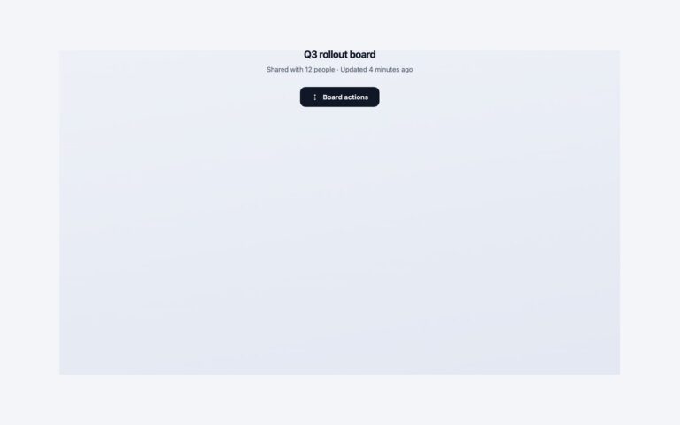
An account menu for the top right corner of an app: a trigger button with initials in a gradient avatar, and a 240 pixel panel of links in three groups. The first group holds View profile, Settings and Switch team, with keyboard shortcut hints on the right. The second holds Documentation and Support. The last is a red Sign out link. Thin rules separate the groups and the current page is shaded. Use it wherever an app needs a place for the signed-in user’s pages without crowding the main navigation. Because every entry is a link to a page, the menu is built as site navigation rather than an application menu: a labelled nav holding a button with aria-expanded and plain lists of links. The button toggles aria-expanded and CSS shows the panel that follows it, with a short fade and lift. In the Bootstrap version the same markup runs on the stock .dropdown with the Dropdown plugin, restyled through –bs-dropdown-* variables. The Tailwind version drives the panel with peer-aria-expanded utilities. The shortcut hints are labels only, so bind the keys in your own app.

What’s included

  • Avatar trigger with the account name and a caret
  • Three link groups separated by rules, with a red Sign out
  • Current page shaded and marked with aria-current
  • Esc, a click outside or tabbing away closes the panel
  • Panel narrows to fit the screen on phones

Accessibility

The panel sits in a nav labelled Account and opens from a button that reports its state with aria-expanded, so screen readers announce it as collapsed or expanded. Tab reaches the button and each link, Enter or Space toggles the panel, and Esc closes it and puts focus back on the button; the Bootstrap version also moves through the links with the arrow keys. Focus draws a 2px blue outline, and the fade is removed under prefers-reduced-motion.

Customise it

Change the colours in the .acm-trigger, .acm-drop and .acm-av rules (plain CSS) or the --bs-dropdown-* and --bs-btn-* variables on .acm (Bootstrap). In Tailwind edit the bg-, text- and border- colour utilities and the w-60 panel width.