About this set
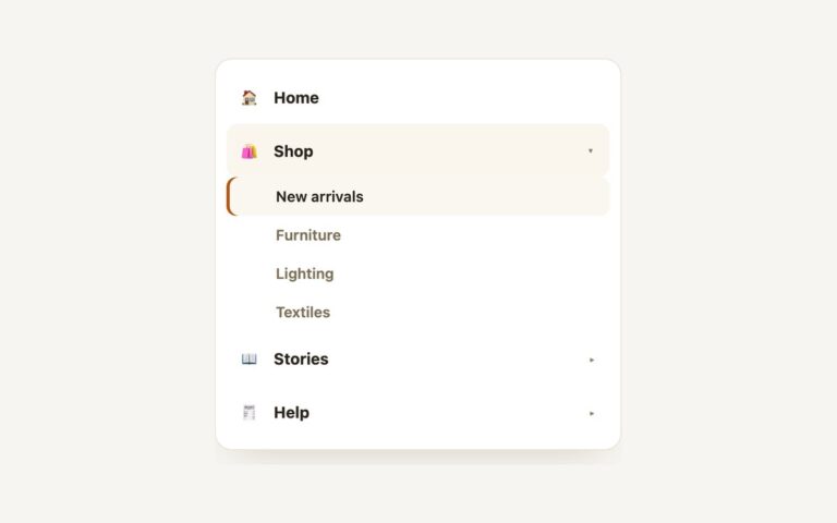
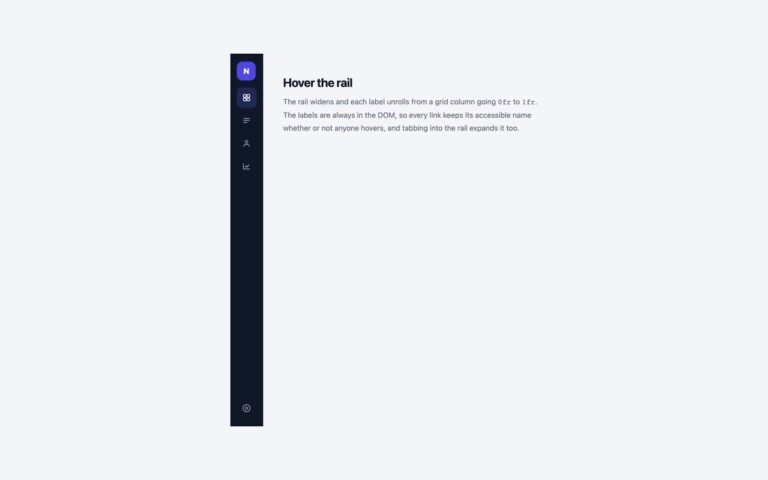
A dark 250 pixel sidebar for dashboards and admin panels. It has a logo row, two labelled groups (Main and Workspace), an active Dashboard item marked by a cyan spine and a lighter background, and a Resources item that expands in place to show Databases, Storage and Functions. Use it as the permanent left column of an app where the section list is short enough to stay visible. Each group is a list labelled by its small uppercase heading, and the active link carries aria-current=”page”. The Resources entry is a disclosure button: it flips aria-expanded, CSS rotates its chevron and expands the list below it by animating max-height, and the collapsed list is hidden from the tab order so keyboard users never land on invisible links. Below 640 pixels the sidebar stops being a column and stacks above the page content at full width. The Bootstrap version uses .nav.flex-column with the Collapse plugin for the submenu, and the Tailwind version drives the same states with peer-aria-expanded utilities.
What’s included
- Grouped links under Main and Workspace headings
- Active item with a cyan accent spine and aria-current
- Submenu that expands in place from a disclosure button
- Collapsed links leave the tab order
- Stacks above the content below 640px
Accessibility
The sidebar links sit in a nav labelled Console, and each group list is named by its visible heading. The Resources button reports its state with aria-expanded, opens with Enter or Space, and Esc inside the open submenu closes it and returns focus to the button. Every link and button shows a 2px cyan outline on keyboard focus, and the expand animation is removed under prefers-reduced-motion.
Customise it
Change the sidebar background, link colour and accent in .sbm, .sbm-item and the inset box-shadow (plain CSS), the --bs-nav-link-* variables on .sbm .nav (Bootstrap) or the --color-sbm-* theme colours (Tailwind). The width is the 250px on .sbm or w-[250px].