Open demo

CSS code

HTML
<nav class="mm" aria-label="Main">
  <a href="#" class="mm-logo">Northwind</a>
  <ul class="mm-links">
    <li class="mm-item">
      <button class="mm-top" type="button" aria-expanded="false" aria-controls="mm-platform">Platform <svg viewBox="0 0 24 24" aria-hidden="true"><path d="M6 9l6 6 6-6"/></svg></button>
      <div class="mm-panel" id="mm-platform">
        <div class="mm-col"><p class="mm-h" id="mm-h-build">Build</p>
          <ul aria-labelledby="mm-h-build">
            <li><a href="#"><span class="mm-ic" aria-hidden="true"><svg viewBox="0 0 24 24"><rect x="4" y="4" width="16" height="16" rx="3"/><path d="M9 9h6v6H9z"/></svg></span><span><strong>Dashboard</strong><span class="mm-desc">Everything in one view</span></span></a></li>
            <li><a href="#"><span class="mm-ic" aria-hidden="true"><svg viewBox="0 0 24 24"><path d="M13 3l-8 10h6l-2 8 8-10h-6z"/></svg></span><span><strong>Automations</strong><span class="mm-desc">Rules that run themselves</span></span></a></li>
          </ul>
        </div>
        <div class="mm-col"><p class="mm-h" id="mm-h-connect">Connect</p>
          <ul aria-labelledby="mm-h-connect">
            <li><a href="#"><span class="mm-ic" aria-hidden="true"><svg viewBox="0 0 24 24"><path d="M10 14a4 4 0 006 0l3-3a4 4 0 00-6-6l-1 1"/><path d="M14 10a4 4 0 00-6 0l-3 3a4 4 0 006 6l1-1"/></svg></span><span><strong>Integrations</strong><span class="mm-desc">120+ tools</span></span></a></li>
            <li><a href="#"><span class="mm-ic" aria-hidden="true"><svg viewBox="0 0 24 24"><path d="M4 7h16M4 12h16M4 17h10"/></svg></span><span><strong>API</strong><span class="mm-desc">REST and webhooks</span></span></a></li>
          </ul>
        </div>
        <div class="mm-col"><p class="mm-h" id="mm-h-govern">Govern</p>
          <ul aria-labelledby="mm-h-govern">
            <li><a href="#"><span class="mm-ic" aria-hidden="true"><svg viewBox="0 0 24 24"><path d="M12 3l7 3v5c0 4.5-3 8.3-7 10-4-1.7-7-5.5-7-10V6z"/></svg></span><span><strong>Security</strong><span class="mm-desc">SSO, SCIM, audit log</span></span></a></li>
            <li><a href="#"><span class="mm-ic" aria-hidden="true"><svg viewBox="0 0 24 24"><circle cx="12" cy="12" r="9"/><path d="M12 7v5l3 2"/></svg></span><span><strong>Compliance</strong><span class="mm-desc">SOC 2 and GDPR</span></span></a></li>
          </ul>
        </div>
        <div class="mm-promo">
          <p class="mm-promo-tag">New</p>
          <p class="mm-promo-title">Release 4.0 is here</p>
          <p class="mm-promo-text">Boards, reviews and release notes finally in one place.</p>
          <a href="#">Read the notes <span aria-hidden="true">→</span></a>
        </div>
      </div>
    </li>
    <li><a class="mm-top" href="#" aria-current="page">Pricing</a></li>
    <li><a class="mm-top" href="#">Docs</a></li>
  </ul>
</nav>
CSS
/* Mega menu: a disclosure button (aria-expanded + aria-controls) opens a full-width panel of grouped links.
   Click, tap, Enter or Space opens it, Esc closes it; with a mouse it also opens on hover. */
:where(.mm) a{text-decoration:none;color:inherit}
:where(.mm) ul{list-style:none;margin:0;padding:0}
:where(.mm) svg{display:block}
.mm{position:relative;width:100%;background:#fff;border-bottom:1px solid #e7e9f0;display:flex;align-items:center;gap:4px;padding:0 30px;height:64px}
.mm-logo{font-weight:800;font-size:1.05rem;letter-spacing:-.02em;margin-right:20px}
.mm-links{display:flex;align-items:center;gap:4px}
.mm-top{display:flex;align-items:center;gap:6px;padding:10px 14px;border:0;border-radius:9px;background:none;font:inherit;font-size:.9rem;font-weight:600;line-height:normal;color:#475467;cursor:pointer}
.mm-top:hover,.mm-top[aria-expanded="true"],.mm-top[aria-current="page"]{background:#f2f4f8;color:#101828}
.mm-top svg{width:13px;height:13px;stroke:currentColor;fill:none;stroke-width:2.4;transition:transform .2s}
.mm-top[aria-expanded="true"] svg{transform:rotate(180deg)}
.mm-panel{position:absolute;top:100%;left:0;right:0;background:#fff;border-bottom:1px solid #e7e9f0;padding:28px 30px 30px;display:grid;grid-template-columns:repeat(3,1fr) 290px;gap:30px;
  opacity:0;visibility:hidden;transform:translateY(-8px);transition:opacity .18s,transform .18s,visibility .18s;box-shadow:0 22px 40px -26px rgba(16,24,40,.3);z-index:10}
.mm-panel::before{content:"";position:absolute;left:0;right:0;bottom:100%;height:14px} /* bridges the gap so the pointer can reach the panel */
.mm-top[aria-expanded="true"]+.mm-panel{opacity:1;visibility:visible;transform:none}
@media (hover:hover){
  .mm-item:hover:not([data-hover-off])>.mm-panel{opacity:1;visibility:visible;transform:none}
  .mm-item:hover:not([data-hover-off])>.mm-top{background:#f2f4f8;color:#101828}
  .mm-item:hover:not([data-hover-off])>.mm-top svg{transform:rotate(180deg)}
}
.mm-h{margin:0 0 12px;font-size:.71rem;font-weight:700;letter-spacing:.09em;text-transform:uppercase;color:#667085}
.mm-col a{display:flex;gap:11px;padding:9px 10px;border-radius:10px;margin:0 -10px}
.mm-col a:hover{background:#f5f6fa}
.mm-ic{width:32px;height:32px;border-radius:9px;background:#eef2ff;color:#4f46e5;display:grid;place-items:center;flex-shrink:0}
.mm-ic svg{width:16px;height:16px;stroke:currentColor;fill:none;stroke-width:2}
.mm-col strong{display:block;font-size:.88rem;color:#101828}
.mm-desc{font-size:.79rem;color:#667085;line-height:1.5}
.mm-promo{background:linear-gradient(150deg,#4f46e5,#7c3aed);border-radius:14px;padding:22px;color:#fff;display:flex;flex-direction:column;justify-content:space-between}
.mm-promo-tag{margin:0;font-size:.71rem;font-weight:700;letter-spacing:.09em;text-transform:uppercase;opacity:.85}
.mm-promo-title{margin:auto 0 0;font-size:1.08rem;font-weight:700;line-height:1.3}
.mm-promo p.mm-promo-text{margin:8px 0 0;font-size:.83rem;opacity:.9;line-height:1.55}
.mm-promo a{margin-top:16px;font-size:.85rem;font-weight:700;display:inline-flex;align-items:center;gap:7px;align-self:flex-start;border-radius:6px}
.mm-promo a:hover{text-decoration:underline}
.mm :focus-visible{outline:2px solid #4f46e5;outline-offset:2px}
.mm-col a:focus-visible{outline-offset:-2px}
.mm-promo a:focus-visible{outline-color:#fff}
@media (max-width:900px){.mm-panel{grid-template-columns:1fr 1fr;gap:22px}.mm-promo{grid-column:1/-1}}
@media (max-width:780px){.mm{flex-wrap:wrap;height:auto;padding:10px 16px;row-gap:4px}.mm-logo{margin-right:8px}.mm-links{flex-wrap:wrap}.mm-panel{padding:22px 16px 24px}.mm-panel::before{height:24px}}
@media (max-width:560px){.mm-panel{grid-template-columns:1fr}}
@media (prefers-reduced-motion:reduce){.mm-top svg,.mm-panel{transition:none}}
JavaScript
/* Disclosure navigation (WAI-ARIA pattern). The button toggles aria-expanded. Esc closes the open panel (focus returns
   to its button) or dismisses a hover-opened one; a click outside or tabbing away also closes it.
   data-hover-off keeps a dismissed panel shut until the pointer leaves. */
document.querySelectorAll('.mm').forEach(nav => {
  const btns = [...nav.querySelectorAll('button[aria-controls]')];
  const isOpen = b => b.getAttribute('aria-expanded') === 'true';
  const set = (b, open) => {
    b.setAttribute('aria-expanded', open);
    b.parentElement.toggleAttribute('data-hover-off', !open && b.parentElement.matches(':hover'));
  };
  btns.forEach(b => {
    const li = b.parentElement;
    b.addEventListener('click', () => { const open = !isOpen(b); btns.forEach(x => { if (x !== b && isOpen(x)) set(x, false); }); set(b, open); });
    li.addEventListener('focusout', e => { if (e.relatedTarget && !li.contains(e.relatedTarget) && isOpen(b)) set(b, false); });
    li.addEventListener('pointerleave', () => li.removeAttribute('data-hover-off'));
  });
  document.addEventListener('click', e => btns.forEach(b => { if (isOpen(b) && !b.parentElement.contains(e.target)) set(b, false); }));
  document.addEventListener('keydown', e => {
    if (e.key !== 'Escape') return;
    btns.forEach(b => {
      const li = b.parentElement;
      if (isOpen(b)) { const inside = li.contains(document.activeElement); set(b, false); if (inside) b.focus(); }
      else if (li.matches(':hover')) li.setAttribute('data-hover-off', '');
    });
  });
});

Bootstrap 5 code

Requires: Bootstrap 5.3.8 CSS, Bootstrap 5.3.8 JS bundle

HTML
<nav class="mm navbar navbar-expand" aria-label="Main">
  <a class="navbar-brand" href="#">Northwind</a>
  <ul class="navbar-nav">
    <li class="nav-item dropdown position-static">
      <button class="nav-link" type="button" data-bs-toggle="dropdown" aria-expanded="false">Platform <svg viewBox="0 0 24 24" aria-hidden="true"><path d="M6 9l6 6 6-6"/></svg></button>
      <div class="dropdown-menu">
        <div class="row mm-grid">
          <div class="col-sm-6 col-lg"><p class="mm-h" id="mm-h-build">Build</p>
            <ul class="list-unstyled m-0" aria-labelledby="mm-h-build">
              <li><a class="dropdown-item" href="#"><span class="mm-ic" aria-hidden="true"><svg viewBox="0 0 24 24"><rect x="4" y="4" width="16" height="16" rx="3"/><path d="M9 9h6v6H9z"/></svg></span><span><strong>Dashboard</strong><span class="mm-desc">Everything in one view</span></span></a></li>
              <li><a class="dropdown-item" href="#"><span class="mm-ic" aria-hidden="true"><svg viewBox="0 0 24 24"><path d="M13 3l-8 10h6l-2 8 8-10h-6z"/></svg></span><span><strong>Automations</strong><span class="mm-desc">Rules that run themselves</span></span></a></li>
            </ul>
          </div>
          <div class="col-sm-6 col-lg"><p class="mm-h" id="mm-h-connect">Connect</p>
            <ul class="list-unstyled m-0" aria-labelledby="mm-h-connect">
              <li><a class="dropdown-item" href="#"><span class="mm-ic" aria-hidden="true"><svg viewBox="0 0 24 24"><path d="M10 14a4 4 0 006 0l3-3a4 4 0 00-6-6l-1 1"/><path d="M14 10a4 4 0 00-6 0l-3 3a4 4 0 006 6l1-1"/></svg></span><span><strong>Integrations</strong><span class="mm-desc">120+ tools</span></span></a></li>
              <li><a class="dropdown-item" href="#"><span class="mm-ic" aria-hidden="true"><svg viewBox="0 0 24 24"><path d="M4 7h16M4 12h16M4 17h10"/></svg></span><span><strong>API</strong><span class="mm-desc">REST and webhooks</span></span></a></li>
            </ul>
          </div>
          <div class="col-sm-6 col-lg"><p class="mm-h" id="mm-h-govern">Govern</p>
            <ul class="list-unstyled m-0" aria-labelledby="mm-h-govern">
              <li><a class="dropdown-item" href="#"><span class="mm-ic" aria-hidden="true"><svg viewBox="0 0 24 24"><path d="M12 3l7 3v5c0 4.5-3 8.3-7 10-4-1.7-7-5.5-7-10V6z"/></svg></span><span><strong>Security</strong><span class="mm-desc">SSO, SCIM, audit log</span></span></a></li>
              <li><a class="dropdown-item" href="#"><span class="mm-ic" aria-hidden="true"><svg viewBox="0 0 24 24"><circle cx="12" cy="12" r="9"/><path d="M12 7v5l3 2"/></svg></span><span><strong>Compliance</strong><span class="mm-desc">SOC 2 and GDPR</span></span></a></li>
            </ul>
          </div>
          <div class="col-12 col-lg-auto mm-promo-col">
            <div class="mm-promo">
              <p class="mm-promo-tag">New</p>
              <p class="mm-promo-title">Release 4.0 is here</p>
              <p class="mm-promo-text">Boards, reviews and release notes finally in one place.</p>
              <a href="#">Read the notes <span aria-hidden="true">→</span></a>
            </div>
          </div>
        </div>
      </div>
    </li>
    <li class="nav-item"><a class="nav-link active" href="#" aria-current="page">Pricing</a></li>
    <li class="nav-item"><a class="nav-link" href="#">Docs</a></li>
  </ul>
</nav>
CSS
/* Bootstrap .navbar with a full-width .dropdown-menu (the .dropdown item is .position-static) laid out with the grid.
   The Dropdown plugin sets aria-expanded, opens on click, tap, Enter, Space or ArrowDown, moves through the links with
   the arrow keys and closes on Esc. With a mouse it also opens on hover; a few lines of script let Esc dismiss that. */
.mm{--bs-navbar-padding-x:30px;--bs-navbar-padding-y:0;--bs-navbar-brand-color:#101828;--bs-navbar-brand-hover-color:#101828;--bs-navbar-brand-font-size:1.05rem;--bs-navbar-brand-margin-end:20px;--bs-navbar-brand-padding-y:0;
  --bs-navbar-color:#475467;--bs-navbar-hover-color:#101828;--bs-navbar-active-color:#101828;--bs-navbar-nav-link-padding-x:14px;
  height:64px;background:#fff;border-bottom:1px solid #e7e9f0;gap:4px}
.mm .navbar-brand{font-weight:800;letter-spacing:-.02em;border-radius:4px}
.mm .navbar-nav{gap:4px}
.mm .nav-link{--bs-nav-link-padding-y:10px;--bs-nav-link-font-size:.9rem;--bs-nav-link-font-weight:600;display:flex;align-items:center;gap:6px;border-radius:9px;line-height:normal}
.mm .nav-link:hover,.mm .nav-link.show,.mm .nav-link.active{background:#f2f4f8}
.mm .nav-link svg{display:block;width:13px;height:13px;stroke:currentColor;fill:none;stroke-width:2.4;transition:transform .2s}
.mm .nav-link.show svg{transform:rotate(180deg)}
.mm .dropdown-menu{--bs-dropdown-border-radius:0;--bs-dropdown-border-color:#e7e9f0;--bs-dropdown-padding-x:30px;--bs-dropdown-padding-y:0;--bs-dropdown-link-color:#101828;--bs-dropdown-link-hover-color:#101828;
  --bs-dropdown-link-hover-bg:#f5f6fa;--bs-dropdown-link-active-color:#101828;--bs-dropdown-link-active-bg:#f5f6fa;
  top:100%;left:0;right:0;margin:0;padding-top:28px;padding-bottom:30px;border-width:0 0 1px;box-shadow:0 22px 40px -26px rgba(16,24,40,.3);animation:mm-in .18s}
.mm .dropdown-menu::before{content:"";position:absolute;left:0;right:0;bottom:100%;height:14px} /* bridges the gap so the pointer can reach the panel */
@keyframes mm-in{from{opacity:0;translate:0 -8px}}
@media (hover:hover){
  .mm .dropdown:hover:not([data-hover-off])>.dropdown-menu{display:block}
  .mm .dropdown:hover:not([data-hover-off])>.nav-link{background:#f2f4f8;color:#101828}
  .mm .dropdown:hover:not([data-hover-off])>.nav-link svg{transform:rotate(180deg)}
}
.mm-grid{--bs-gutter-x:30px;--bs-gutter-y:22px}
.mm-h{margin:0 0 12px;font-size:.71rem;font-weight:700;letter-spacing:.09em;text-transform:uppercase;color:#667085}
.mm .dropdown-item{display:flex;gap:11px;padding:9px 10px;margin:0 -10px;width:calc(100% + 20px);border-radius:10px;white-space:normal}
.mm-ic{width:32px;height:32px;border-radius:9px;background:#eef2ff;color:#4f46e5;display:grid;place-items:center;flex-shrink:0}
.mm-ic svg{width:16px;height:16px;stroke:currentColor;fill:none;stroke-width:2}
.mm .dropdown-item strong{display:block;font-size:.88rem}
.mm-desc{font-size:.79rem;color:#667085;line-height:1.5}
.mm-promo{background:linear-gradient(150deg,#4f46e5,#7c3aed);border-radius:14px;padding:22px;color:#fff;height:100%;display:flex;flex-direction:column;justify-content:space-between}
.mm-promo-tag{margin:0;font-size:.71rem;font-weight:700;letter-spacing:.09em;text-transform:uppercase;opacity:.85}
.mm-promo-title{margin:auto 0 0;font-size:1.08rem;font-weight:700;line-height:1.3}
.mm-promo-text{margin:8px 0 0;font-size:.83rem;opacity:.9;line-height:1.55}
.mm-promo a{margin-top:16px;font-size:.85rem;font-weight:700;display:inline-flex;align-items:center;gap:7px;align-self:flex-start;border-radius:6px;color:#fff;text-decoration:none}
.mm-promo a:hover{text-decoration:underline}
@media (min-width:992px){.mm-grid>.mm-promo-col{flex:0 0 320px;width:320px}}
.mm a:focus-visible,.mm button:focus-visible{outline:2px solid #4f46e5;outline-offset:2px;box-shadow:none}
.mm .dropdown-item:focus-visible{outline-offset:-2px}
.mm-promo a:focus-visible{outline-color:#fff}
@media (max-width:780px){
  .mm{--bs-navbar-padding-x:16px;--bs-navbar-padding-y:10px;--bs-navbar-brand-margin-end:8px;flex-wrap:wrap;height:auto;row-gap:4px}
  .mm .navbar-nav{flex-wrap:wrap}
  .mm .dropdown-menu{--bs-dropdown-padding-x:16px;padding-top:22px;padding-bottom:24px}
  .mm .dropdown-menu::before{height:24px}
}
@media (prefers-reduced-motion:reduce){.mm .dropdown-menu{animation:none}.mm .nav-link svg{transition:none}}
JavaScript
/* Hover opening is CSS only, so Esc (or closing the panel with a click while the pointer is on it) sets data-hover-off
   to keep it shut until the pointer leaves. */
document.querySelectorAll('.mm .dropdown').forEach(li => {
  li.addEventListener('pointerleave', () => li.removeAttribute('data-hover-off'));
  li.addEventListener('show.bs.dropdown', () => li.removeAttribute('data-hover-off'));
  li.addEventListener('hidden.bs.dropdown', () => { if (li.matches(':hover')) li.setAttribute('data-hover-off', ''); });
});
document.addEventListener('keydown', e => {
  if (e.key === 'Escape') document.querySelectorAll('.mm .dropdown:hover').forEach(li => li.setAttribute('data-hover-off', ''));
});

Tailwind 4 code

Requires: Tailwind CSS 4

HTML
<nav class="mm relative flex h-16 w-full items-center gap-1 border-b border-mm-line bg-white px-[30px] max-[780px]:h-auto max-[780px]:flex-wrap max-[780px]:gap-y-1 max-[780px]:px-4 max-[780px]:py-2.5" aria-label="Main">
  <a href="#" class="mr-5 text-[1.05rem] font-extrabold tracking-[-.02em] focus-visible:outline-2 focus-visible:outline-offset-2 focus-visible:outline-mm-accent max-[780px]:mr-2">Northwind</a>
  <ul class="flex items-center gap-1 max-[780px]:flex-wrap">
    <li class="group/item">
      <button class="peer group/btn flex cursor-pointer items-center gap-1.5 rounded-[9px] px-3.5 py-2.5 text-[.9rem] font-semibold text-mm-text group-hover/item:bg-mm-soft group-hover/item:text-mm-ink group-data-[hover-off]/item:bg-transparent! group-data-[hover-off]/item:text-mm-text! hover:bg-mm-soft hover:text-mm-ink focus-visible:outline-2 focus-visible:outline-offset-2 focus-visible:outline-mm-accent aria-expanded:bg-mm-soft! aria-expanded:text-mm-ink!" type="button" aria-expanded="false" aria-controls="mm-platform">Platform <svg class="size-[13px] fill-none stroke-current stroke-[2.4] transition-transform duration-200 group-hover/item:rotate-180 group-data-[hover-off]/item:rotate-0! group-aria-expanded/btn:rotate-180! motion-reduce:transition-none" viewBox="0 0 24 24" aria-hidden="true"><path d="M6 9l6 6 6-6"/></svg></button>
      <div class="invisible absolute top-full right-0 left-0 z-10 grid -translate-y-2 grid-cols-[repeat(3,1fr)_290px] gap-[30px] border-b border-mm-line bg-white px-[30px] pt-7 pb-[30px] opacity-0 shadow-[0_22px_40px_-26px_rgba(16,24,40,.3)] transition-[opacity,translate,visibility] duration-[180ms] before:absolute before:inset-x-0 before:bottom-full before:h-3.5 before:content-[''] group-hover/item:visible group-hover/item:translate-y-0 group-hover/item:opacity-100 group-data-[hover-off]/item:invisible! group-data-[hover-off]/item:opacity-0! peer-aria-expanded:visible peer-aria-expanded:translate-y-0 peer-aria-expanded:opacity-100 motion-reduce:transition-none max-[900px]:grid-cols-2 max-[900px]:gap-[22px] max-[780px]:px-4 max-[780px]:pt-[22px] max-[780px]:pb-6 max-[780px]:before:h-6 max-[560px]:grid-cols-1" id="mm-platform">
        <div><p class="mb-3 text-[.71rem] font-bold tracking-[.09em] text-mm-muted uppercase" id="mm-h-build">Build</p>
          <ul aria-labelledby="mm-h-build">
            <li><a class="-mx-2.5 flex gap-[11px] rounded-[10px] px-2.5 py-[9px] hover:bg-[#f5f6fa] focus-visible:outline-2 focus-visible:-outline-offset-2 focus-visible:outline-mm-accent" href="#"><span class="grid size-8 shrink-0 place-items-center rounded-[9px] bg-[#eef2ff] text-mm-accent" aria-hidden="true"><svg class="size-4 fill-none stroke-current stroke-2" viewBox="0 0 24 24"><rect x="4" y="4" width="16" height="16" rx="3"/><path d="M9 9h6v6H9z"/></svg></span><span><strong class="block text-[.88rem] text-mm-ink">Dashboard</strong><span class="text-[.79rem] leading-normal text-mm-muted">Everything in one view</span></span></a></li>
            <li><a class="-mx-2.5 flex gap-[11px] rounded-[10px] px-2.5 py-[9px] hover:bg-[#f5f6fa] focus-visible:outline-2 focus-visible:-outline-offset-2 focus-visible:outline-mm-accent" href="#"><span class="grid size-8 shrink-0 place-items-center rounded-[9px] bg-[#eef2ff] text-mm-accent" aria-hidden="true"><svg class="size-4 fill-none stroke-current stroke-2" viewBox="0 0 24 24"><path d="M13 3l-8 10h6l-2 8 8-10h-6z"/></svg></span><span><strong class="block text-[.88rem] text-mm-ink">Automations</strong><span class="text-[.79rem] leading-normal text-mm-muted">Rules that run themselves</span></span></a></li>
          </ul>
        </div>
        <div><p class="mb-3 text-[.71rem] font-bold tracking-[.09em] text-mm-muted uppercase" id="mm-h-connect">Connect</p>
          <ul aria-labelledby="mm-h-connect">
            <li><a class="-mx-2.5 flex gap-[11px] rounded-[10px] px-2.5 py-[9px] hover:bg-[#f5f6fa] focus-visible:outline-2 focus-visible:-outline-offset-2 focus-visible:outline-mm-accent" href="#"><span class="grid size-8 shrink-0 place-items-center rounded-[9px] bg-[#eef2ff] text-mm-accent" aria-hidden="true"><svg class="size-4 fill-none stroke-current stroke-2" viewBox="0 0 24 24"><path d="M10 14a4 4 0 006 0l3-3a4 4 0 00-6-6l-1 1"/><path d="M14 10a4 4 0 00-6 0l-3 3a4 4 0 006 6l1-1"/></svg></span><span><strong class="block text-[.88rem] text-mm-ink">Integrations</strong><span class="text-[.79rem] leading-normal text-mm-muted">120+ tools</span></span></a></li>
            <li><a class="-mx-2.5 flex gap-[11px] rounded-[10px] px-2.5 py-[9px] hover:bg-[#f5f6fa] focus-visible:outline-2 focus-visible:-outline-offset-2 focus-visible:outline-mm-accent" href="#"><span class="grid size-8 shrink-0 place-items-center rounded-[9px] bg-[#eef2ff] text-mm-accent" aria-hidden="true"><svg class="size-4 fill-none stroke-current stroke-2" viewBox="0 0 24 24"><path d="M4 7h16M4 12h16M4 17h10"/></svg></span><span><strong class="block text-[.88rem] text-mm-ink">API</strong><span class="text-[.79rem] leading-normal text-mm-muted">REST and webhooks</span></span></a></li>
          </ul>
        </div>
        <div><p class="mb-3 text-[.71rem] font-bold tracking-[.09em] text-mm-muted uppercase" id="mm-h-govern">Govern</p>
          <ul aria-labelledby="mm-h-govern">
            <li><a class="-mx-2.5 flex gap-[11px] rounded-[10px] px-2.5 py-[9px] hover:bg-[#f5f6fa] focus-visible:outline-2 focus-visible:-outline-offset-2 focus-visible:outline-mm-accent" href="#"><span class="grid size-8 shrink-0 place-items-center rounded-[9px] bg-[#eef2ff] text-mm-accent" aria-hidden="true"><svg class="size-4 fill-none stroke-current stroke-2" viewBox="0 0 24 24"><path d="M12 3l7 3v5c0 4.5-3 8.3-7 10-4-1.7-7-5.5-7-10V6z"/></svg></span><span><strong class="block text-[.88rem] text-mm-ink">Security</strong><span class="text-[.79rem] leading-normal text-mm-muted">SSO, SCIM, audit log</span></span></a></li>
            <li><a class="-mx-2.5 flex gap-[11px] rounded-[10px] px-2.5 py-[9px] hover:bg-[#f5f6fa] focus-visible:outline-2 focus-visible:-outline-offset-2 focus-visible:outline-mm-accent" href="#"><span class="grid size-8 shrink-0 place-items-center rounded-[9px] bg-[#eef2ff] text-mm-accent" aria-hidden="true"><svg class="size-4 fill-none stroke-current stroke-2" viewBox="0 0 24 24"><circle cx="12" cy="12" r="9"/><path d="M12 7v5l3 2"/></svg></span><span><strong class="block text-[.88rem] text-mm-ink">Compliance</strong><span class="text-[.79rem] leading-normal text-mm-muted">SOC 2 and GDPR</span></span></a></li>
          </ul>
        </div>
        <div class="flex flex-col justify-between rounded-[14px] bg-linear-150/srgb from-[#4f46e5] to-[#7c3aed] p-[22px] text-white max-[900px]:col-span-full">
          <p class="text-[.71rem] font-bold tracking-[.09em] uppercase opacity-85">New</p>
          <p class="mt-auto text-[1.08rem] leading-[1.3] font-bold">Release 4.0 is here</p>
          <p class="mt-2 text-[.83rem] leading-[1.55] opacity-90">Boards, reviews and release notes finally in one place.</p>
          <a class="mt-4 inline-flex items-center gap-[7px] self-start rounded-md text-[.85rem] font-bold hover:underline focus-visible:outline-2 focus-visible:outline-offset-2 focus-visible:outline-white" href="#">Read the notes <span aria-hidden="true">→</span></a>
        </div>
      </div>
    </li>
    <li><a class="flex items-center rounded-[9px] bg-mm-soft px-3.5 py-2.5 text-[.9rem] font-semibold text-mm-ink focus-visible:outline-2 focus-visible:outline-offset-2 focus-visible:outline-mm-accent" href="#" aria-current="page">Pricing</a></li>
    <li><a class="flex items-center rounded-[9px] px-3.5 py-2.5 text-[.9rem] font-semibold text-mm-text hover:bg-mm-soft hover:text-mm-ink focus-visible:outline-2 focus-visible:outline-offset-2 focus-visible:outline-mm-accent" href="#">Docs</a></li>
  </ul>
</nav>
CSS
@theme {
  --color-mm-ink: #101828;
  --color-mm-text: #475467;
  --color-mm-muted: #667085;
  --color-mm-soft: #f2f4f8;
  --color-mm-line: #e7e9f0;
  --color-mm-accent: #4f46e5;
}
JavaScript
/* Disclosure navigation (WAI-ARIA pattern). The button toggles aria-expanded. Esc closes the open panel (focus returns
   to its button) or dismisses a hover-opened one; a click outside or tabbing away also closes it.
   data-hover-off keeps a dismissed panel shut until the pointer leaves. */
document.querySelectorAll('.mm').forEach(nav => {
  const btns = [...nav.querySelectorAll('button[aria-controls]')];
  const isOpen = b => b.getAttribute('aria-expanded') === 'true';
  const set = (b, open) => {
    b.setAttribute('aria-expanded', open);
    b.parentElement.toggleAttribute('data-hover-off', !open && b.parentElement.matches(':hover'));
  };
  btns.forEach(b => {
    const li = b.parentElement;
    b.addEventListener('click', () => { const open = !isOpen(b); btns.forEach(x => { if (x !== b && isOpen(x)) set(x, false); }); set(b, open); });
    li.addEventListener('focusout', e => { if (e.relatedTarget && !li.contains(e.relatedTarget) && isOpen(b)) set(b, false); });
    li.addEventListener('pointerleave', () => li.removeAttribute('data-hover-off'));
  });
  document.addEventListener('click', e => btns.forEach(b => { if (isOpen(b) && !b.parentElement.contains(e.target)) set(b, false); }));
  document.addEventListener('keydown', e => {
    if (e.key !== 'Escape') return;
    btns.forEach(b => {
      const li = b.parentElement;
      if (isOpen(b)) { const inside = li.contains(document.activeElement); set(b, false); if (inside) b.focus(); }
      else if (li.matches(':hover')) li.setAttribute('data-hover-off', '');
    });
  });
});

About this set

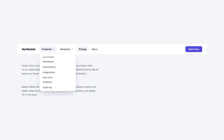
A navigation bar whose Platform item opens a full-width panel. The panel has three link columns, Build, Connect and Govern, each with two entries that pair an icon tile with a bold title and a one-line description, plus a violet gradient card announcing Release 4.0 with a Read the notes link. Pricing, marked as the current page, and Docs sit beside it as plain links. Use it for product sites with enough pages that a short dropdown would hide them, and when a description helps people choose. The panel opens on hover for mouse users and from a disclosure button with aria-expanded for everyone else, so click, tap, Enter and Space all work; Esc closes it, including when it was opened by hover, and returns focus to the button. The layout is a four-column CSS grid that drops to two columns with the card spanning the width below 900 pixels, and to one column below 560. The Bootstrap version uses a .position-static dropdown with the Dropdown plugin and the grid system, which switches at its own 992 and 576 pixel breakpoints.

What’s included

  • Three icon link columns and a promoted card
  • Opens on hover, click, tap or keyboard
  • Esc closes it even when opened by hover
  • Four, two or one column layout by screen width
  • The promo card link is a real, focusable link

Accessibility

The bar is a nav labelled Main. Platform is a button with aria-expanded and aria-controls, Esc closes the panel and returns focus to it, and focus leaving the panel or a click outside closes it too. Each column is a list named by its heading, icons are hidden from screen readers, and Pricing carries aria-current="page". Every link shows a 2px outline on keyboard focus and the panel transition stops under prefers-reduced-motion.

Customise it

Change the column layout in the grid-template-columns of .mm-panel, the icon tint in .mm-ic and the card gradient in .mm-promo (plain CSS). In Bootstrap edit the .row column classes and --bs-dropdown-* variables; in Tailwind the grid-cols- utilities and --color-mm-* theme colours.